02-22-2021, 08:56 AM
@Skeffin: Yeah - I'm not good enough to wing the perspective yet so I like to sketch them in - even when I'm just doing a figure drawing without an environment background. Also thanks for the crit about doing exploratory sketches - that would have definitely improved the pose on the Underwater Assassin - it looks a bit stiff now that I look at it.
@chubby_cat: Thanks! I'm glad I took the time to find the octopus reference - my tentacle drawings were so bad until I bothered to do that!
Anyway - I recently signed of for a Schoolism course: Digital Painting with Craig Mullins. I read somewhere a while back that one of the fastest ways to improve at something is to find yourself a good teacher and they don't come any better that Mr Mullins in my opinion.
The first lesson was about identifying light, shadow and half-tones. The things I learned from watching the video lessons were:
1. When rendering a flat shape - try to put in a diagonal variation in value and hue - makes it a lot more interesting.
2. When rendering light and shadow, you can have your light and shadow quite close together in value as long as there no variation in value within the shapes.
3. Near the terminator is where most of your texture and colour is. Use a texture brush and saturate your colours more here.
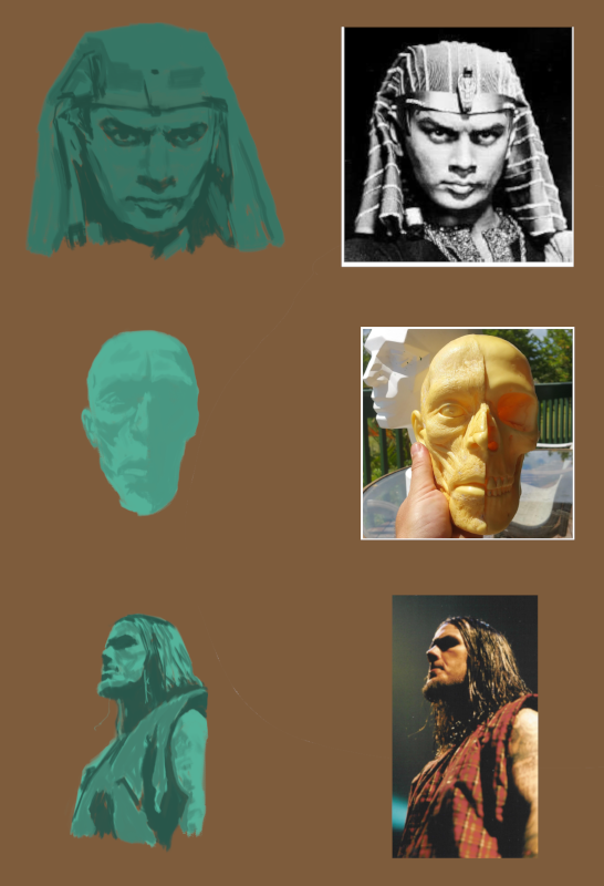
And the assignment was to do some studies of light, shadow and half-tones (I tried the low-contrast thing on the skull-head model):

“Today, give a stranger one of your smiles. It might be the only sunshine he sees all day.” -- H. Jackson Brown Jr.
CD Sketchbook
CD Sketchbook


