03-20-2014, 12:30 PM
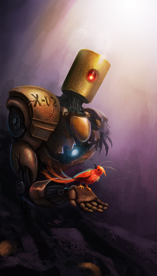
(03-18-2014, 07:17 PM)Kaffer Wrote: It's coming along nicely, I suggest tuning the chest-light down, it kinda draws attention from the bird (if that is our focus). I'd probably try to bring the values and colors of the bird a bit closer to the robot, I get it needs to stand out but maybe it's a bit too much. There are some pretty interesting textures going on there.. :)Thanks, Kaffer. That's pretty good suggestion. I will try to reduce the light on its chest
So here it is. Add some debris and wreckage. I also change the bird position, size and color into red. But after the morning, I did see the previous image with blue fat fluffy more interesting than new one. Lol. But I leave you guys opinion.

---------------------------------------------------------------
Devianart
Sketchbook
Instagram
Cara
Twitter/X
Artstation
Devianart
Sketchbook
Cara
Twitter/X
Artstation


