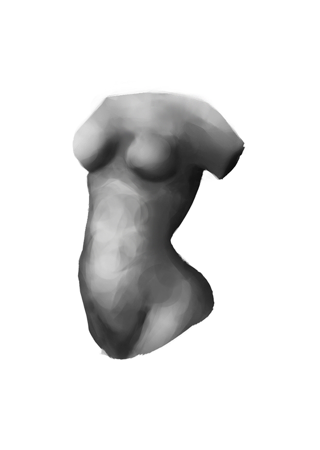
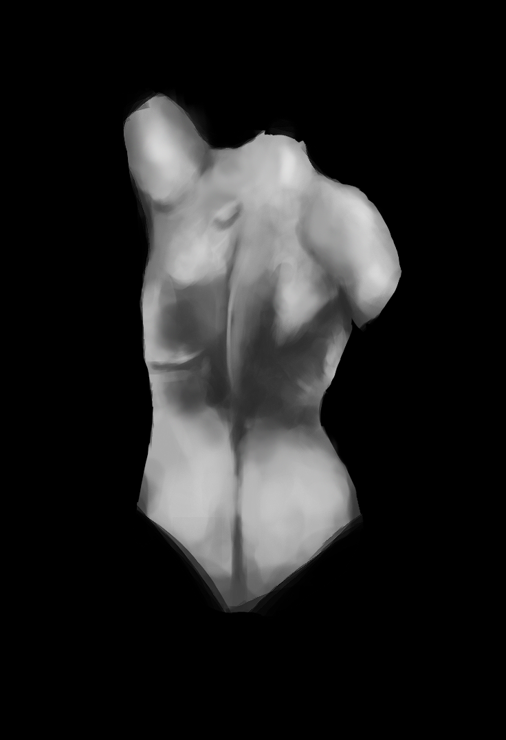
09-26-2014, 07:10 AM
(09-21-2014, 10:34 PM)Spolyk Wrote: Hey, i looked all your skecthbook, nice progression!
On the last portrait, my opinion is that you must use more medium values on the shadows of skin and some highlights in front of the lighting.
Here the hair has about same values than the back neck, it don't detach from the rest of the body.
But after that, anatomy looks like right :)
sorry for my poor english :P
Hey there and thanks for sharing your opinion, i have problems with my monitor displaying the values so my saved pics get darker than they should be but either way, i'll see what i can do.
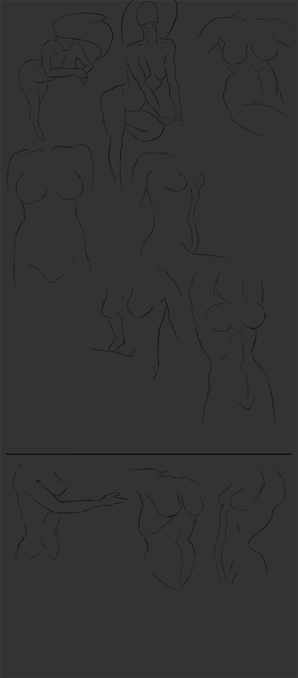
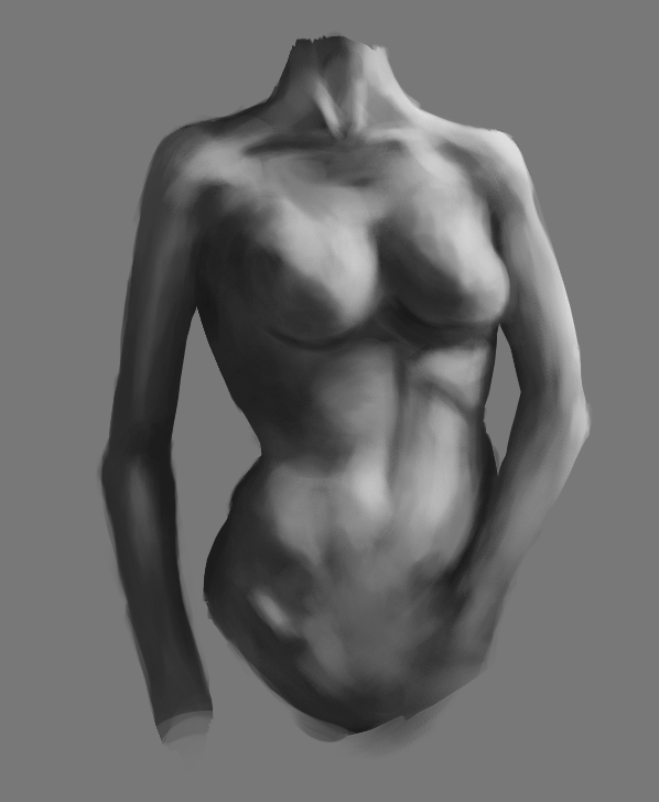
Now to attack on torsos..
-with reference


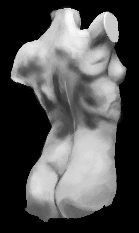
-crappy mind stuff
