11-13-2012, 11:31 AM
Allright thus here are my 10 Skull drawings,i`ll do the renders tomorrow i guess
|
Anatomy of a Pinup - Class Closed
|
|
11-13-2012, 11:31 AM
Allright thus here are my 10 Skull drawings,i`ll do the renders tomorrow i guess
11-13-2012, 12:41 PM
thanks for posting..maybe try to make the image bit smaller so we can see it properly :)
11-14-2012, 02:11 AM
Somr quick sketches I came up with. I was thinking a bit futuristic. But this was just some ideas, I'll be posting more before saturday. Cheers to everyone.
![[Image: Sketchy.png]](http://i1139.photobucket.com/albums/n558/Zesiul/Sketchy.png)
Available for Freelance - Portfolio | CD Sketchbook | Blog | Email
11-14-2012, 05:35 AM
Nothing says futuristic like a naked girl! hah, just a pose, maybe i'll throw some clothes on her and see what sticks.
![[Image: Pose_1.png]](http://i1139.photobucket.com/albums/n558/Zesiul/Pose_1.png)
Available for Freelance - Portfolio | CD Sketchbook | Blog | Email
11-14-2012, 11:26 PM
good start Chris, 3rd sketch in the first post has a lot of potential.
keep it up ! edit : couldn't resist so did some tweaking on your sketch..this is just a suggestion, feel free to do whatever you have in your mind..we will discuss more about it in the session. btw try to concentrate on proportions, balance, body language, expressions etc. oh and try to compose the figure in a frame, you can add some related background elements too. just my two cents 
11-15-2012, 08:45 AM
Ok so currently working my other two ideas - but thought I'd post this up now.
I admit I was really amped about this next assignment, and had a slew of options in mind when we got off the live stream last class - but my early week responsibilities saw me hit a brick wall when I sat down. Nothing was coming out right -.- - so I just started to go for some of my favourite obvious stereotypes. comments and crits away!
11-15-2012, 10:12 AM
Hey Toma, first one looks nice ! Steam-punk ?
you can try some different outfits/variations..maybe a long/small skirt, jacket, glasses etc. ?
11-15-2012, 01:39 PM
Ah shyam, I envy how great you can throw together a face. I'm so bad at the construction. Sweet paint over man :]]
Available for Freelance - Portfolio | CD Sketchbook | Blog | Email
11-15-2012, 01:53 PM
hey its ok Chris, we will work on it together :)
11-16-2012, 05:15 AM
I did some more poses, Next I'll play with concepts. I want to put down some more costume idea before I settle just yet.
![[Image: Poses_Nov_15.png]](http://i1139.photobucket.com/albums/n558/Zesiul/Poses_Nov_15.png)
Available for Freelance - Portfolio | CD Sketchbook | Blog | Email
11-17-2012, 10:36 AM
(11-13-2012, 12:41 PM)shyamshriram Wrote: thanks for posting..maybe try to make the image bit smaller so we can see it properly :) Sorry about that i think i made the resolution a bit bigger than usual :x,well is there any way i can reduce the image size on the forum directly or do i have to make smaller canvases from now on ??
11-17-2012, 02:46 PM
@Razvan Hey man, as always - great work! Small thing I noticed (or so I think) is that on your second concept the girl is turning her head a bit... well past the point you can turn your head. It might just be me though?
Costume concepts! I like how this class has really varied it's applications, yet still all goes to the one final goal. Nice! ![[Image: Final_Concepts.png]](http://i1139.photobucket.com/albums/n558/Zesiul/Final_Concepts.png)
Available for Freelance - Portfolio | CD Sketchbook | Blog | Email
Ok so like I said last time, had a bunch of ideas and they flopped on the drawing board - bad week -.-
But stuck to stuff I like (westerns - and no Shyam, wasn't planning on a steampunk look, but I admit it has that feeling for sure ... might be fun :) - space and amazons) so managed to push some intersting stuff out. Didn't manage to get a mage fleshed out enough, and I still have a rough started for some pirate wench, maybe tomorrow morning ... we'll see. Anyway, so I added some more variations on the western gunslinger, as per Shyam's suggestions (way more I could experiment with but that'll be for later,) the amazon with head/headdress variations (again, a whole world of variations I haven't yet explored) and a space marshal with some of the ideation process it went through. I also included the rough work for the magus so far. You guys might noticed that I quickly started working with a thicker thigh body type - wanted to discuss this tomorrow and ideas behind what body types we all find "sexy" - or at least appropriate for the final pin ups. I dunno, I was just liking the thicker lower body :blush: crits & comments away - tomorrows gonna be an interesting one! part two
11-18-2012, 12:01 AM
Talking about stereotypes! :P
the ideas are not well fleshed out yet.. but i most definitely wanna draw that space-biker-police chick! The hunter/pirate needs to be pondered upon a bit more. And the first one.. well she is just a random personification of evil witch or summin... not sure! I would also like to do a steampunk theme.. maybe the pirate chick. Ok here goes! 
11-18-2012, 12:05 AM
So here is what I've managed this week. I'm not liking having to make do with whatever time I have to draw for the assignments. I haven't seen my family for a couple of years and they all want to take me out and do things. I just want to draw and paint! I'm pretty down right now in terms of how little I can paint and can't wait to be back in Hong Kong with only drawing and painting on the agenda! I'm going to have to play catch up. Only one more week to go now and I'm back home in Hong Kong!
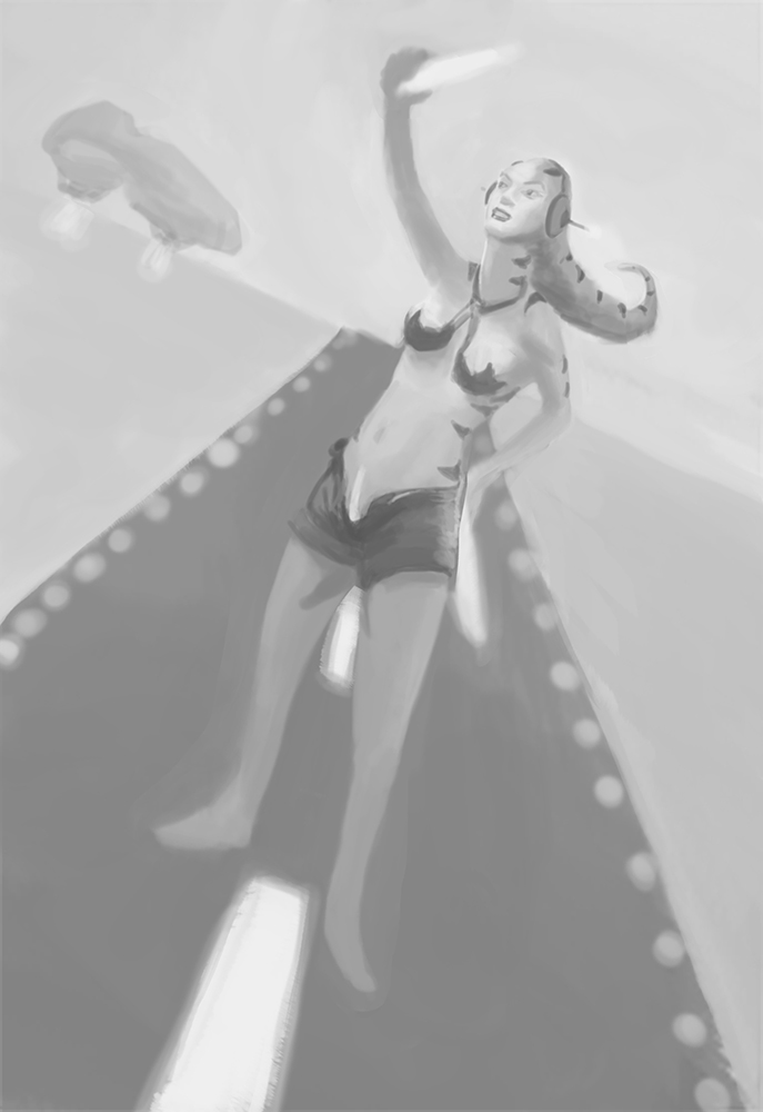
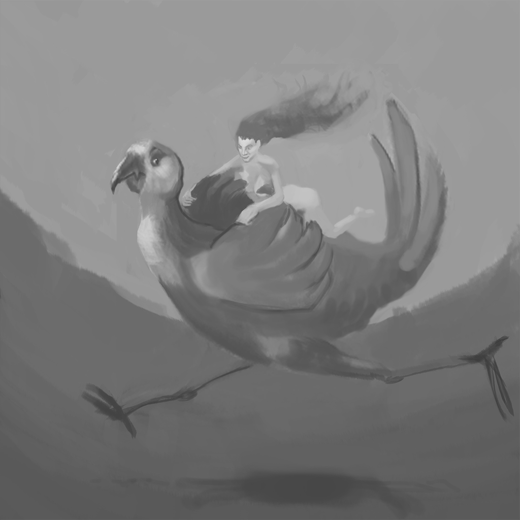
I developed small thumbs first and then enlarged them to work on them. I didn't work into the last one yet. I'm really sorry but I can't attend this class and didn't know I couldn't until 20 minutes ago. Suprise meal has been planned despite telling everyone my schedule. I'm so sorry guys, I feel like I'm letting the team, Shyam and myself down. The poses are pretty static, the last one is my favourite, it's the one I haven't yet developed further though.  Alien chick on a landing strip directing a ship (out of shot) onto the strip. She also has a 'landing' strip etched onto her lady bits!  Chick on a giant chocobo style bird. Not sure on the story here, just comedy from her being all serious angry and naked, not caring that her bits are flapping about in the wind (clearly on some sort of mission) and the bird is concerned and disgusted by her nakedness and is trying to cover her up!  The last thumbnail that still needs developing is just a girl about to be attacked/raped/captured by a mysterious horned monster! She's crouching and showing herself to us. King kong style. I hope this is ok, I'll rush back and try to catch the end of the class. Awesome work everyone, really inspiring! Toma, you're killing it with them sketches! I love the thick legs, Chun Li was easily the sexiest Street Fighter character for me because of her massive legs and smaller upper body coupled with delicate facial features!
11-18-2012, 12:10 AM
@lewislong - not sweat Matt, we all get busy some times! go enjoy - don't forget we'll have some time to catch up in december!
11-18-2012, 09:21 AM
Matt - its ok, i can understand..try to draw the figure as big as you can..that bird is a bit too much..you can add supporting elements in the final Pinup but not THAT big for sure, try to add more interest in your artwork, maybe try to think about the concepts again.
just wanted to say to everyone, try to spend at least an hour every day on your assignments and avoid working at the last minute. please do not post at the last minute i.e. when class starts or few minutes before the class, please give me at least 3-4 hours to go through your works and think about possible enhancement/feedback etc. for the next class - use reference to enhance your artwork, dont do the exact copy..you can use your own body and/or face as a ref. if you cant find the exact ref. for your artwork. try to work on the overall proportion, balance, rhythm, anatomy, contrast, background elements (if any) try to make the whole artwork clear/readable as in the overall pose, facial expressions. your artwork shouldn't look like a rushed job as you have a whole week. i hope i've made myself clear, please feel free to ask if you have any doubts. ![[Image: paintover171112.jpg]](http://img543.imageshack.us/img543/1862/paintover171112.jpg) examples for the overall artwork/figure/expression for the next class ![[Image: ChrisPaintoversml.jpg]](https://3.bp.blogspot.com/-sbEtYq39jvw/UKPG8dDoo6I/AAAAAAAAChM/8iKAuZF1v0U/s1600/ChrisPaintoversml.jpg) ![[Image: girlAxe-copy.jpg]](https://3.bp.blogspot.com/-f9kZcWEQNBU/UC-32iwWecI/AAAAAAAAB2M/9CxRlgkVz8U/s1600/girlAxe-copy.jpg) ![[Image: new-2-copia.jpg]](https://3.bp.blogspot.com/-odnFpHoo3dA/T2NNWfw7QII/AAAAAAAABTc/XB1lZuJuLsE/s1600/new-2-copia.jpg) good luck !
11-20-2012, 03:44 PM
Ok - just started making a few adjustments as per Shyam's crit:
-adjusted background (two versions, both with more width, the other with added height - added height doesn't keep you focused in the right places -.- ) -adjusted pose - re-created the pose in the mirror, found a happy inbetween with drawing to add more stability/balance but also keep the exagerated graphic silhouette from previous. Also adjusted her right arm, more in perspective (still working on it) -adjusted right hand gun size to make a little smaller -added some design elements to suit -added some design elements to BG -tried to keep the flying creatures to two and bigger, which I felt ruined the exagerated camera angle/feeling of depth. Reduced the number of smaller ones, I think feels less like birds now -playing with sexier face/hair combo in second version - just starting to see what I could do That's it for now, back to it tomorrow afternoon - likely to start adding some tonal passes crits away!
11-20-2012, 04:36 PM
Hey Toma,
thanks for posting the wip...still not sure about her legs..looks too stiff, especially the lower legs..maybe its because of that suit design..try to add some curves and work on the shoe design too..also, try to make her legs a bit longer and see how it looks overall. try to make 'her' left forearm a bit bigger to add some depth..right now both the hands have the same size so it looks like they are on the same plane. her body weight seems to be on 'her' right leg, so we can bend 'her' left leg (lower leg) to add some interest in the pose. please post a close up image of the face so that we can see the details. |
|
« Next Oldest | Next Newest »
|