Posts: 191
Threads: 1
Joined: Oct 2012
Reputation:
15
Well, some friends and I decided we could make a horror game in a kind of (admittedly long) game jam format. So we're going to give that a shot.
We've sketched out some random ideas for the villain character. We initially leaned toward 'frightening waifu' as the vibe. She will chase the player around while they need to collect items to progress.
These are rough still. The group liked the demonic nun the most so far, but we all agree she needs to be more scary. Ignore the lanterns or whatever. I thought it would be cool to see the enemy moving through the trees with a light source, but it would likely make things way too easy for the player.
![[Image: 329e27d9147adc49e3075640b43317c99dc213f8.pnj]](https://64.media.tumblr.com/efb5b30eb325a468dcd934f0f306c2c8/519e44fd0b7ab7d8-ee/s640x960/329e27d9147adc49e3075640b43317c99dc213f8.pnj)
![[Image: 532121a4d01f7bca35813656dd724268b0110995.pnj]](https://64.media.tumblr.com/894cbb01086f7c3bc23ec5d74afde4ea/698a22b287ec5cfe-ac/s2048x3072/532121a4d01f7bca35813656dd724268b0110995.pnj)
Posts: 397
Threads: 24
Joined: Dec 2022
Reputation:
25
Really great sketchbook thus far and I really enjoy your figure studies. Really nice linework and flow. Check out Posemaniacs.com if you haven't already for lots of great anatomy reference and consider supporting where you can. I will be making studies from there as well.
LEGEND'S SKETCHBOOK_001
To all artists struggling to create and are intimidated by A.I. (anti-imagination)
 "Everything has been done, but not by you" 
Posts: 3,359
Threads: 37
Joined: Aug 2013
Reputation:
234
The problem is that those design are comically proportioned this look more like a none western horror game at a certain point the breast just doesn't fit the western approach to game which is more toward realism i would argue.So what would be the audience that a question to solve also.I know i probably take it to seriously but who know...
When i look at those design.There nothing threatening about round form.The problem with lude character is that at one point ''you no longer want to run'' you accept your faith...something you would not generally expect but it somewhat a meme now... they would happly let themselve be ************ by 7 feet tall vampire.
I think you need way more sharp shape and a much less smooth skin and less skin showing or atleast have a more unappealing skin if you don't want this to be somewhat of a fan service type of concept. Do you want to go for scary or sexy in which ratio that the question. Obviously if it a visual novel you want that kind of sexual undertone i would argue it keep people on there seat... and it sooth the eye will they press on to keep playing.
What kind of game are we talking about animation or just board game that change alot about the thought process for the concept phase. For example if it was an animated project you would want to have a walk cycle in mind would it look scary if she was bouncing her asset around or would it be scary if she suddenly transform into a horde of insect that walk all over the celling wall and floor. In the case of a board game you really cut alot of the thought necessary to make thing immersive... in a board game you would probably favor and focus on harmony in the design and good and tastefully design.
This look more like a project guy project that fall in the category of a mature/mystery game i say guy project but in reality it isn't lot of lesbian would probably enjoy such project.
This borderline seem like r*pe and gore type of game.Like a cult that is being investigated where nun where murdered and r*pe for dark rule and they turn into age of darkness.A hide and seek /treasure search /exploring/puzzle solving game. The idea of fightning nun with big asset is just comical to me so i wouldn't go that route.
Posts: 852
Threads: 6
Joined: May 2018
Reputation:
116
I mean, personally I'd be runnin' from these characters. I'm probably not the game's intended audience tho lmao. I do feel like these are good drawings, but it is a little tricky to do horror waifu. There is definitely a grotesque aspect to each of them, but iI agree it's hard to see big round things as scary, which is why you see a lot more like skeletal imagery for enemies and monsters. I believe it can work though! Especially if it's more of a fun, silly yet mature vibe for the game.
Posts: 191
Threads: 1
Joined: Oct 2012
Reputation:
15
Yeah, the 3D modeler on the project has much the same ideas as you guys. He will likely tone it down to something more reasonable, and a little more monstrous.
I checked out posemaniacs, and it's gotten a big upgrade since I last checked it out. Last time I looked at it, I don't think it had a real 3D embed.
But even with that being the case, I find it is a bit distracting w/ the textures and some of the 3D model weirdness. I tried drawing this twisting torso pose and found the deltoid to be very strange looking. And the back muscles don't attach to the arm. I don't think it's bad to draw from these, but I definitely need to do more general anatomy stuff so I could fill in the gaps more accurately.
Which reminds me, I'm trying out Anki for studies. There was recently a breakthrough in spaced repetition memory algorithms and, well, the TLDR is that a more efficient and accurate algorithm means everyone doesn't have to review a card anywhere near as often as we used to. Anyway, we'll see how it goes.
Most of these I do w/ a 5 or 10 minute time limit.
Someone wrote a helpful explanation of the new algorithm here if you're curious:
https://old.reddit.com/r/Anki/comments/1...epetition/
![[Image: 4659de028c214ccffaefe740dc3e59af6f94dcb9.pnj]](https://64.media.tumblr.com/90f5dc4af696d0272cca77735bca0caa/0ff3ebf478361cee-1d/s1280x1920/4659de028c214ccffaefe740dc3e59af6f94dcb9.pnj)
![[Image: cf20f207a85766bb69849dd6d67acd019ba9e735.pnj]](https://64.media.tumblr.com/1c0ebb8ab745166071935faa26e52f07/0ff3ebf478361cee-63/s1280x1920/cf20f207a85766bb69849dd6d67acd019ba9e735.pnj)
![[Image: a44349023bb53f598b879f1e77797aaf32d841cd.pnj]](https://64.media.tumblr.com/d74ea9dfde55391057375da78002b4a4/0ff3ebf478361cee-82/s1280x1920/a44349023bb53f598b879f1e77797aaf32d841cd.pnj)
![[Image: 6f466b468b3c48bfe27fabb50ba77ef097c29dc2.pnj]](https://64.media.tumblr.com/5d70d42325df70b6b27658186c162ef3/0ff3ebf478361cee-84/s1280x1920/6f466b468b3c48bfe27fabb50ba77ef097c29dc2.pnj)
![[Image: 0a6d8ff58c1a1904edb5504c62b2b0c99b4055d0.pnj]](https://64.media.tumblr.com/dd3bd8ea4fbf9eec9dac97ed6932de28/0ff3ebf478361cee-73/s1280x1920/0a6d8ff58c1a1904edb5504c62b2b0c99b4055d0.pnj)
![[Image: 3e59fcbd12151102a528c679dbe2053ab1b2a3e7.pnj]](https://64.media.tumblr.com/a2497c3cf50f4dcd7bc48ee0aafce022/0ff3ebf478361cee-4b/s1280x1920/3e59fcbd12151102a528c679dbe2053ab1b2a3e7.pnj)
![[Image: 95221bb7148daffbd325953a32443f0e14e6f469.pnj]](https://64.media.tumblr.com/651d06de12600270cc080c3cc3ccf013/0ff3ebf478361cee-1d/s640x960/95221bb7148daffbd325953a32443f0e14e6f469.pnj)
![[Image: b2da95958d6d7c4c5c029f2006ef59f14157dbcb.pnj]](https://64.media.tumblr.com/754612e041895579fd6a34260756e0a5/0ff3ebf478361cee-c2/s540x810/b2da95958d6d7c4c5c029f2006ef59f14157dbcb.pnj)
Posts: 852
Threads: 6
Joined: May 2018
Reputation:
116
Dang okay Posemaniacs has definitely had an upgrade! I think the 3D anatomy models look useful, they are much better than average 3D human reference, but I i also see the same issues. It's pretty easy to generally know where the muscles go, but it's harder to figure out how they would change shape in extreme poses and 3D models don't really give you that. Especially around joints. That being said your twisting poses still look really nice, though!
I really like the sketch with the guy in the hat as well. Very traditional vine charcoal vibes.
Posts: 191
Threads: 1
Joined: Oct 2012
Reputation:
15
Posts: 106
Threads: 5
Joined: Nov 2023
Reputation:
31
Nice studies. I like that you're doing structural studies and more natural-looking studies that aren't too stylized. You might want to consider adding a few more types, and they are superimposed structural studies, detailed segmentations, and WYSIWYG renderings. I can show you some examples from my past students from their figure study assignments if you want to see what those look like, and I can explain more about what purpose they serve.
Posts: 191
Threads: 1
Joined: Oct 2012
Reputation:
15
(03-24-2024, 06:02 AM)Lunatique Wrote: Nice studies. I like that you're doing structural studies and more natural-looking studies that aren't too stylized. You might want to consider adding a few more types, and they are superimposed structural studies, detailed segmentations, and WYSIWYG renderings. I can show you some examples from my past students from their figure study assignments if you want to see what those look like, and I can explain more about what purpose they serve.
Sure, that would be cool. Hopefully that's not too much trouble.
Posts: 106
Threads: 5
Joined: Nov 2023
Reputation:
31
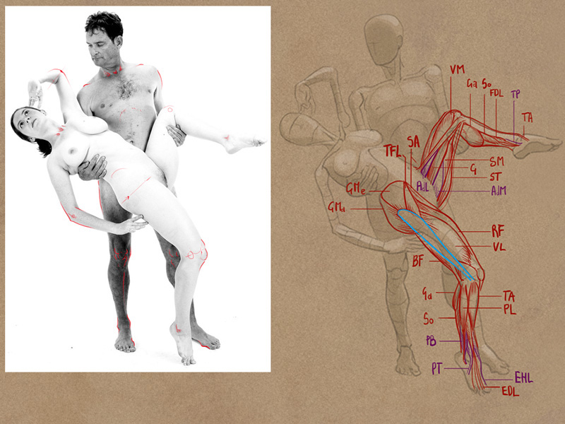
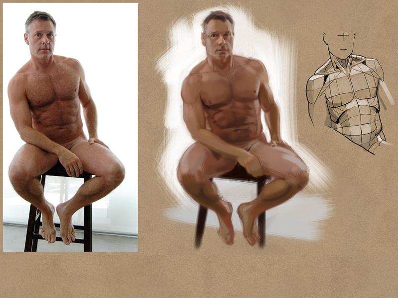
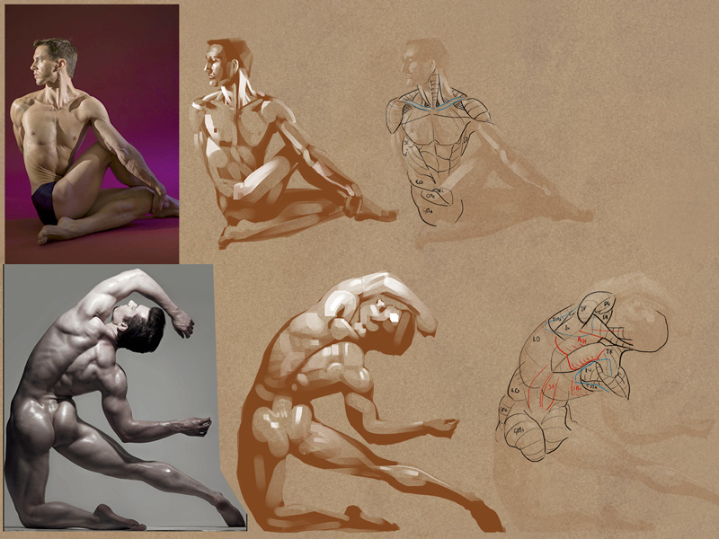
Here are some examples from past students who did the anatomy/figure studies based on my suggestion of different approaches. It doesn't mean you have specific problems that need to be addressed by these, but they're just different approaches that are helpful to anyone doing anatomy/figure studies.
This is what I meant by superimposed. You draw over photos of real people and superimpose the structure on top, which helps deepen your understanding of why the body looks the way it does in real life in that specific pose.


This is an example of detailed segmentation (kinda looks like a 3D model's wireframe). This is helpful because too often when we study anatomy we aren't totally sure of the exact level of volume each muscle or bone protrusion is supposed to have, so we draw in ways that obscure or gloss over those details and never truly learn them. With detailed segmentations, you can't gloss over any detail and you also have to get the perspective correct with the segmentations, so this forces you to know the exact orientation of each muscle and how much they bulge out from any angle.
.jpg)
These are examples of doing multiple approaches with a reference. Structural study, segmentations, and WYSIWYG rendering. We already know what the first two approaches are for, so that leaves the WYSIWYG, which is to render how a figure is supposed to look with skin over the bones, muscles, and a layer of fat, with the skin creases, the fat obscuring some detailes, and the how the surface quality reflects light. This one is more important than most people realize because too often artists who only do anatomy/figure sketches and drawings will end up rendering the figures like body builders' cadavers, with way too much deeply carved definition that are awkwardly unnatural looking.


Posts: 1,076
Threads: 4
Joined: Jan 2016
Reputation:
43
Great job with your recent figure studies, look very solidly developed. The armor pieces look great as well, some very solid designs there! Keep it up!
Posts: 191
Threads: 1
Joined: Oct 2012
Reputation:
15
Posts: 3,359
Threads: 37
Joined: Aug 2013
Reputation:
234
For a reason or an other i was lead to share this with you.This could be game changing for lineart and creating edge gradiant that follow specific direction.
https://www.youtube.com/watch?v=TgHw40QTV9s
Sadly this seem to mean you need to find second hand product or a supplier who as some stock of this discontinued product or you need to find a product with those feature.
Are you using any smudging to achieve the edge?I think that why i was interest to share this with you.This would help simplify the gradiant control as you would only have to paint or erase.
Posts: 191
Threads: 1
Joined: Oct 2012
Reputation:
15
(05-24-2024, 08:15 AM)darktiste Wrote: For a reason or an other i was lead to share this with you.This could be game changing for lineart and creating edge gradiant that follow specific direction.
https://www.youtube.com/watch?v=TgHw40QTV9s
Sadly this seem to mean you need to find second hand product or a supplier who as some stock of this discontinued product or you need to find a product with those feature.
Are you using any smudging to achieve the edge?I think that why i was interest to share this with you.This would help simplify the gradiant control as you would only have to paint or erase.
I have a Huion Giano tablet, and it doesn't have that tilt support. I've seen some artists use that to great effect, though. It would indeed be super helpful. You can kind of get a similar effect by changing brush size, or the rotation, etc, but yeah, it's nowhere near as convenient as having that ability to turn the pen.
I do use a smudge brush in CSP a little bit now. I've been experimenting with those as well, because for the longest time I hated them. I've got one now that works alright, but the main issue I have w/ smudge brushes never entirely goes away. They never give as much control as if I were drawing/painting directly. That's just the trade off of using them, I suppose.
Posts: 3,359
Threads: 37
Joined: Aug 2013
Reputation:
234
Personally i say if you want to achieve edge control you play with mask but that again not the same feeling for sure and mask are kinda annoying when you need to move thing around.
But also a tactic for edge control would be to set action if you use photoshop one for the brush you want .I think new version even have the capacity to have 1 brush set in memory so you can switch between a primary and a secondary brush not sure i use cs6.(On that i know that sketchbook pro as that function if that something you feel like trying.
Anyways you can set an action in photoshop to have specific brush you can switch between at will.
Basically you have 1 action for your primary brush
An other action for a soft brush
An an action for a soft brush ERASER (what i recommend)
and you also use the shortcut for your eraser but this one is set to hard or soft depending how you like your eraser
Those 3 action would be assign a short cut the problem is that it would put your hand away from the place you generally want the hand to be but that not so bad since you can always approch the edge work in it own phase so you limit your hand being out of place.
Posts: 18
Threads: 1
Joined: May 2024
Reputation:
0
Love your shading with that new brush. I hope you're able to draw more soon!
Posts: 31
Threads: 2
Joined: Dec 2023
Reputation:
0
You have really interesting, cool looking studies!
Because I am/was studying anatomy, it was interesting to look at your anatomy studies.
Also, you have some good looking female characters, that always adds a little appeal to a sketchbook.
All in all interesting sketchbook!
Posts: 1,076
Threads: 4
Joined: Jan 2016
Reputation:
43
Great updates here, the figures look spot on. Solid linework and excellent shading, keep it up!
Posts: 306
Threads: 1
Joined: Aug 2020
Reputation:
16
Great job. Nothing to add really.
Posts: 31
Threads: 2
Joined: Jul 2024
Reputation:
5
Wow, you draw some awesome legs! I really love the rendering of your studies. The last effect makes me think of beautiful pencil/graphite studies...
|
![[Image: 329e27d9147adc49e3075640b43317c99dc213f8.pnj]](https://64.media.tumblr.com/efb5b30eb325a468dcd934f0f306c2c8/519e44fd0b7ab7d8-ee/s640x960/329e27d9147adc49e3075640b43317c99dc213f8.pnj)
![[Image: 532121a4d01f7bca35813656dd724268b0110995.pnj]](https://64.media.tumblr.com/894cbb01086f7c3bc23ec5d74afde4ea/698a22b287ec5cfe-ac/s2048x3072/532121a4d01f7bca35813656dd724268b0110995.pnj)


 "Everything has been done, but not by you"
![[Image: 4659de028c214ccffaefe740dc3e59af6f94dcb9.pnj]](https://64.media.tumblr.com/90f5dc4af696d0272cca77735bca0caa/0ff3ebf478361cee-1d/s1280x1920/4659de028c214ccffaefe740dc3e59af6f94dcb9.pnj)
![[Image: cf20f207a85766bb69849dd6d67acd019ba9e735.pnj]](https://64.media.tumblr.com/1c0ebb8ab745166071935faa26e52f07/0ff3ebf478361cee-63/s1280x1920/cf20f207a85766bb69849dd6d67acd019ba9e735.pnj)
![[Image: a44349023bb53f598b879f1e77797aaf32d841cd.pnj]](https://64.media.tumblr.com/d74ea9dfde55391057375da78002b4a4/0ff3ebf478361cee-82/s1280x1920/a44349023bb53f598b879f1e77797aaf32d841cd.pnj)
![[Image: 6f466b468b3c48bfe27fabb50ba77ef097c29dc2.pnj]](https://64.media.tumblr.com/5d70d42325df70b6b27658186c162ef3/0ff3ebf478361cee-84/s1280x1920/6f466b468b3c48bfe27fabb50ba77ef097c29dc2.pnj)
![[Image: 0a6d8ff58c1a1904edb5504c62b2b0c99b4055d0.pnj]](https://64.media.tumblr.com/dd3bd8ea4fbf9eec9dac97ed6932de28/0ff3ebf478361cee-73/s1280x1920/0a6d8ff58c1a1904edb5504c62b2b0c99b4055d0.pnj)
![[Image: 3e59fcbd12151102a528c679dbe2053ab1b2a3e7.pnj]](https://64.media.tumblr.com/a2497c3cf50f4dcd7bc48ee0aafce022/0ff3ebf478361cee-4b/s1280x1920/3e59fcbd12151102a528c679dbe2053ab1b2a3e7.pnj)
![[Image: 95221bb7148daffbd325953a32443f0e14e6f469.pnj]](https://64.media.tumblr.com/651d06de12600270cc080c3cc3ccf013/0ff3ebf478361cee-1d/s640x960/95221bb7148daffbd325953a32443f0e14e6f469.pnj)
![[Image: b2da95958d6d7c4c5c029f2006ef59f14157dbcb.pnj]](https://64.media.tumblr.com/754612e041895579fd6a34260756e0a5/0ff3ebf478361cee-c2/s540x810/b2da95958d6d7c4c5c029f2006ef59f14157dbcb.pnj)
![[Image: 659623d094f4347489077b40c0bd3ec5291c65fa.pnj]](https://64.media.tumblr.com/dd07937ab274a598a5ce835aca3f196e/e527128207105f49-5c/s1280x1920/659623d094f4347489077b40c0bd3ec5291c65fa.pnj)
![[Image: b81780f639e7fd73deb09bfdccb86ebee995ac3d.pnj]](https://64.media.tumblr.com/ef234d7a37f34f940352dfac907608e6/e527128207105f49-c4/s1280x1920/b81780f639e7fd73deb09bfdccb86ebee995ac3d.pnj)
![[Image: 950c147abc8d2a9602740fe030713f1269c56b2d.pnj]](https://64.media.tumblr.com/81d80d5fec6e6ce1b8c0a0afcc6dcd46/e527128207105f49-8a/s1280x1920/950c147abc8d2a9602740fe030713f1269c56b2d.pnj)
![[Image: 91dbd2df951d699bfa2d7ce021721b2f27e1b43c.pnj]](https://64.media.tumblr.com/33f42da0dd9bfd81c741a7d68e743ab5/e527128207105f49-81/s1280x1920/91dbd2df951d699bfa2d7ce021721b2f27e1b43c.pnj)
![[Image: dc917bda1d6dcbd42ff0b618e5d9848b9eaf8cd0.pnj]](https://64.media.tumblr.com/2a3c5b9a8019530a7afdf8cec0d79d94/e527128207105f49-cb/s1280x1920/dc917bda1d6dcbd42ff0b618e5d9848b9eaf8cd0.pnj)
![[Image: c57350f2c45503383fec69fce80237774d9bb76f.pnj]](https://64.media.tumblr.com/342b682697c7e97d4eb84aba64a86e86/e527128207105f49-51/s1280x1920/c57350f2c45503383fec69fce80237774d9bb76f.pnj)
![[Image: bb20cc8c1f225d5e34a8f157d96a921c11d40403.pnj]](https://64.media.tumblr.com/39816e5dd43b18bc42b1c0d0863e7431/e527128207105f49-d5/s1280x1920/bb20cc8c1f225d5e34a8f157d96a921c11d40403.pnj)


.jpg)


![[Image: f9f73618462c51871498a68fd177c2fe702f1794.pnj]](https://64.media.tumblr.com/de69b8f0494053c3f079fcee1bf5756d/f90b2b3342a9e0e4-b9/s2048x3072/f9f73618462c51871498a68fd177c2fe702f1794.pnj)
![[Image: d1125324d69c00f3214260b9583a8c4279bf15ae.pnj]](https://64.media.tumblr.com/d8db88dfa23e429ff706c2bd9199a358/f90b2b3342a9e0e4-70/s2048x3072/d1125324d69c00f3214260b9583a8c4279bf15ae.pnj)
![[Image: 7b5eed102d3df743427aa28cb87a63c472438291.pnj]](https://64.media.tumblr.com/8a8e7c443f4a92eb4cee7a022ad8a932/f90b2b3342a9e0e4-f2/s2048x3072/7b5eed102d3df743427aa28cb87a63c472438291.pnj)