Posts: 537
Threads: 1
Joined: May 2012
Reputation:
8
Hey dude!
Thank you man! I'm trying to figure out it out right now actually! But I changed it around though, he's like a ravenbeast shapeshifter-guy! Thought it looked to similar to another design :P
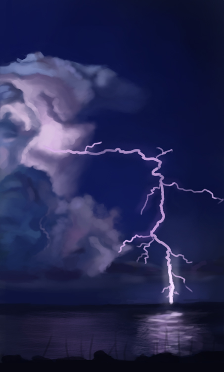
Anyways started enjoying my real sketchbook and gave it some love today. Nothing to post though. But here's a study and a sketch! Thought it would be fun to tackle lightning and something lit up by it. Surprisingly, it wasn't that strong as lightsource as I thought.
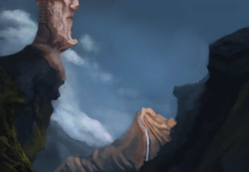
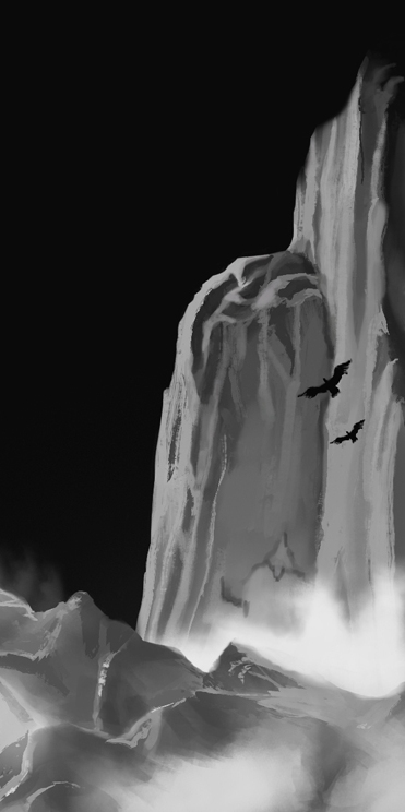
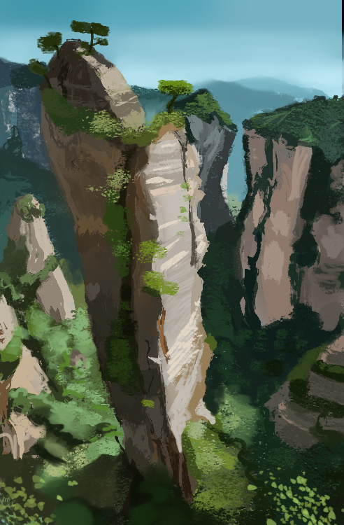
The sketch is just something fun. Everyone enjoys painting mountains.


Posts: 537
Threads: 1
Joined: May 2012
Reputation:
8
Posts: 537
Threads: 1
Joined: May 2012
Reputation:
8
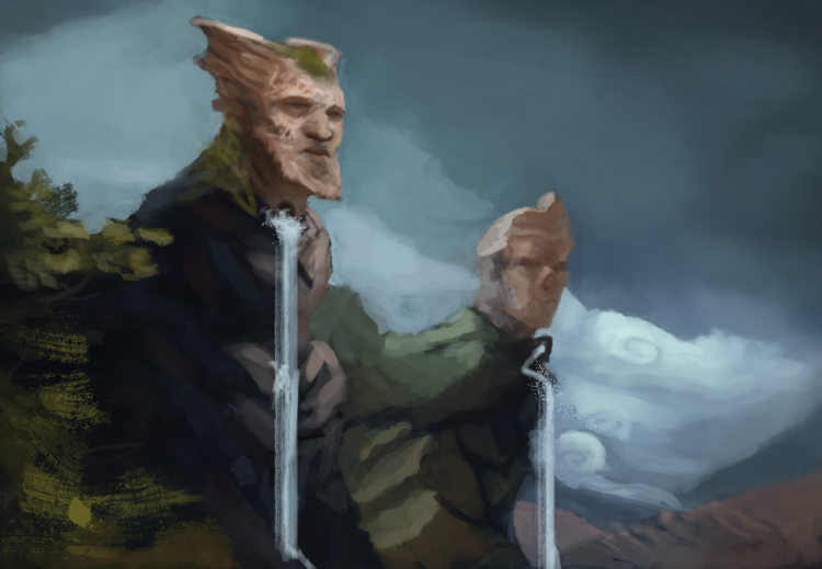
Another environment with the approach as the last ones.

LIttle longer Frazetta study. He's the man. Amazed by what he was able to pull off with such a limited (in my opinion) palette. Can't go wrong with his gestures either.

And check this one out;
http://frazetta.tumblr.com/
Posts: 537
Threads: 1
Joined: May 2012
Reputation:
8
Started doing Vilppu studies again. Probably won't post it here though, not cool looking at boxes and spheres linked together with invisible cloth :D
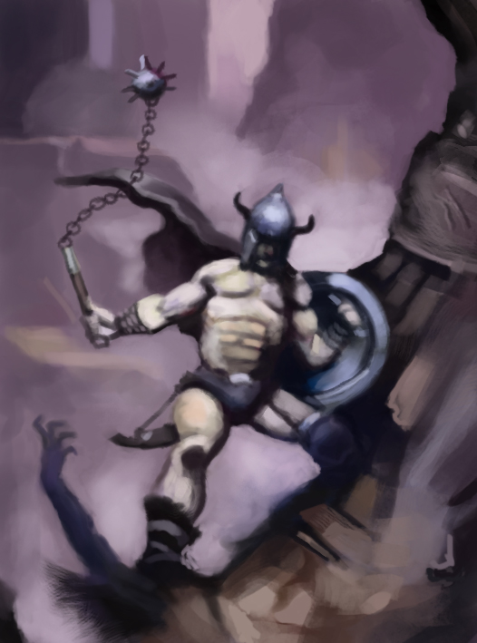
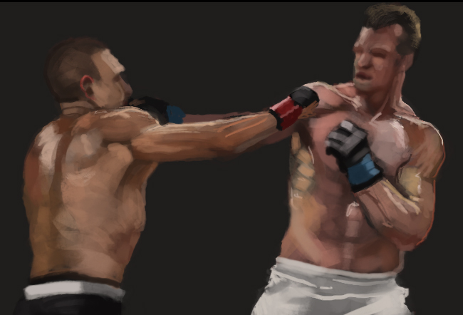
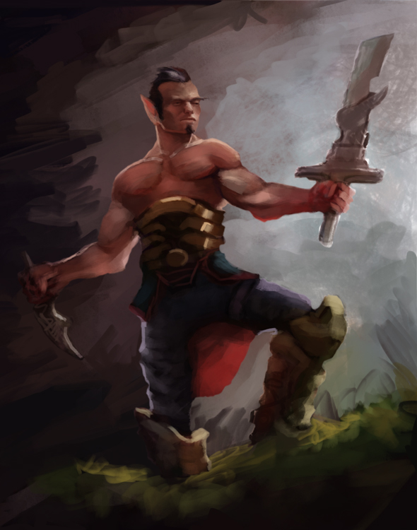
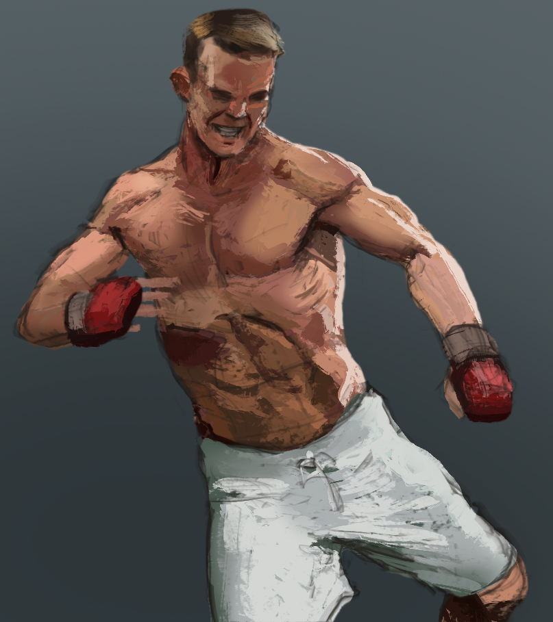
A quick fighter study and a sketchy warrior thingie. I'm gonna try and stick with this for a while. Need some hard edges. I can't do them!1


Posts: 411
Threads: 1
Joined: May 2013
Reputation:
11
Love me some Vilppu, so feel free to post those studies. For clouds, they adhere to the same rules that anything else that receives light does. If you're having trouble with them, then going back and tackling how to render spherical shapes should help you out.
Posts: 537
Threads: 1
Joined: May 2012
Reputation:
8
Nice man! Vilppu makes me feel warm on the inside. Might post some of them later then! True words, should start doing those texture spheres again. Thanks for the tip man.
Decided that I'll post studies and sketches that I'm not very happy with. Need to be more comfortable with that.
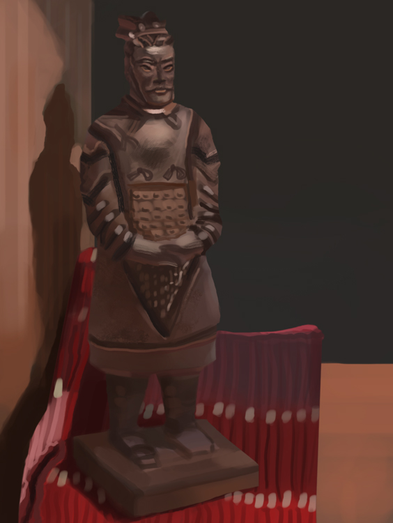
But here's a still life that I totally bombed. Took an hour or so, looked more towards the colors, but I notice that I never render or observe much texture.

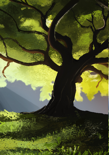
This morning's environment

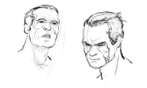
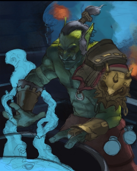
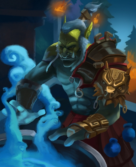
Warcraft sketch and a pair of heads!


Posts: 537
Threads: 1
Joined: May 2012
Reputation:
8
Posts: 556
Threads: 5
Joined: Dec 2012
Reputation:
8
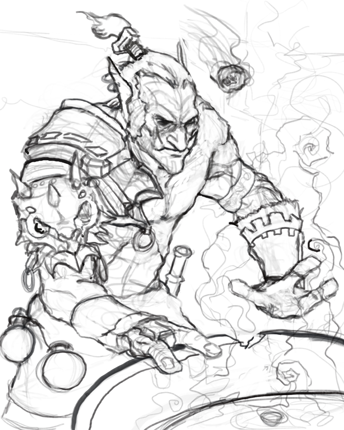
Hey, these last few pages are looking really good. I love the lines you did for this most recent WIP of yours. I'm also really fond of that bearded bird guy on the page before this. His design is real nice, I can't wait to see his illustration finished up. :]
Posts: 429
Threads: 0
Joined: May 2012
Reputation:
7
this entire page is looking dope! keep em coming man
Posts: 690
Threads: 7
Joined: Jan 2012
Reputation:
12
Damn, so much good stuff's happening here. Love <3
Posts: 537
Threads: 1
Joined: May 2012
Reputation:
8
Archreux Thanks a lot mate! That feels nice to hear :)
Yeah I liked him too! Started experimenting on one of the thumbnails, but I wasn't feeling it. I could get back to it later or just start over though, we'll se :D
BenFlores You look dope, man! Thanks a lot :)
ramalooke Thank you babe <3
Another environment with a harder brush, trying to do them semi-quick so that I don't sink time into unecessary things!

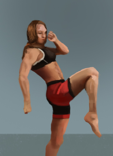
Anatomy mma thingie

This mornings gestures. Gotta say, the vilppu method isn't the easiest to transfer to digital :P

Posts: 537
Threads: 1
Joined: May 2012
Reputation:
8
Kyaa, 1 hour model to get things going

Posts: 537
Threads: 1
Joined: May 2012
Reputation:
8
This mornings quick environment studies and some character exploration


Posts: 411
Threads: 1
Joined: May 2013
Reputation:
11
Some good stuff going on here, man. One thing that I catch myself doing is using texture brushes for the sake of using a textured brush, when I really should be thinking about the reason I'm using it. It seems that more and more that I stick to using just 1 or 2 brushes to do my work, the more coherent and unified it all feels.
Posts: 537
Threads: 1
Joined: May 2012
Reputation:
8
Thanks man! Yeah I definitely catch myself doing the same thing. I guess that I don't use them to strengthen my work. It's like having a bunch of Tv channels, zapping through them to find something good :P
I suppose that the problem lays in not knowing different materials. Atleast for me, so I might fall back on certain brushes to do the work. Might no be a good habit!
Anatomy and values


a quick sketch from yesterday. I like the mood, but it's a bit unproportional right now

And a WiP!

Posts: 66
Threads: 2
Joined: Jul 2012
Reputation:
2
Hey Man. Thanks for stopping by my SB the other day. Those Shaddy vids are great.
I like the character in the latest WIP, and the comp is pretty good, but the values aren't quite working yet. If you convert to B&W, and make it small, the character gets totally lost.
Looking forward to the next update on this one.
Posts: 537
Threads: 1
Joined: May 2012
Reputation:
8
Hey mate, not a problem! Yeah they're awesome, using his brushes now!
Thanks for the crit. Hadn't noticed that! I'll see if I can try and fix it. Entered a more cowardly rendering mode right now haha.
After some squinting I've concluded that the smoke is way too bright. That's a start atleast!
Here's a quick character

Posts: 1,527
Threads: 24
Joined: Dec 2012
Reputation:
70
Duuuuuude! The lines for that warcraft piece is insanely good! Aaaah :D and it's looking great!
Before I saw that wip, I was going to suggest using some kind method to harden up your edges, but behold! Wonderful looking edges haha
And cool designs as well, dayum
Keep up the great work man :D
sketchbook | pg 52
"Not a single thing in this world isn't in the process of becoming something else."
I'll be back - it's an odyssey, after all
Posts: 411
Threads: 1
Joined: May 2013
Reputation:
11
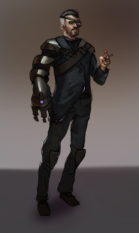
This last one seems to be leaning a bit too much to the right (his left). He's gonna fall over and ruin that cigarette!
Posts: 537
Threads: 1
Joined: May 2012
Reputation:
8
smrrfette
Haha thanks! Let's hope that the painting itself can overshine the lines then :D
I've come across a bunch of challenges while doing this. Edges included. I guess the problem now is trying to balance it out and not go either only hard or only soft!
Thanks, I'm in a design-mode right now!
MrFrenik
Haha damnit, gotta make sure that doesn't happen!
I've started painting more traditional portraits. Almost out of oil paint though, which is less good! But I'll show em as soon as I finish them off :D
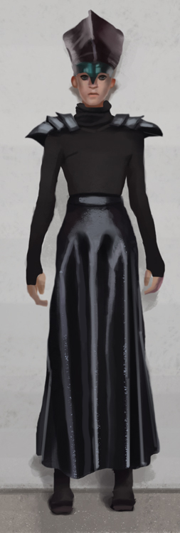
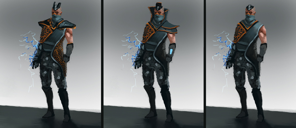
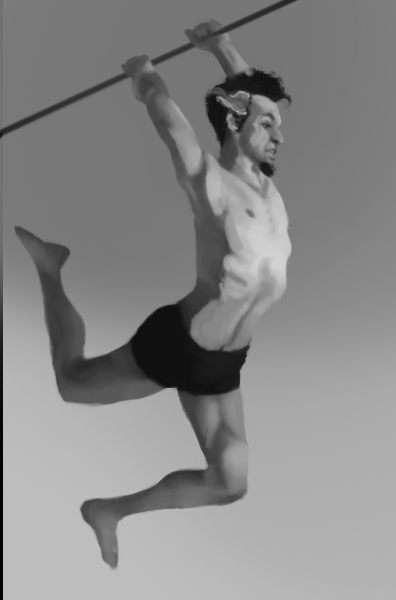
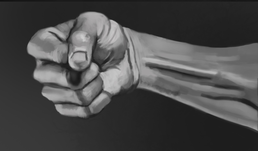
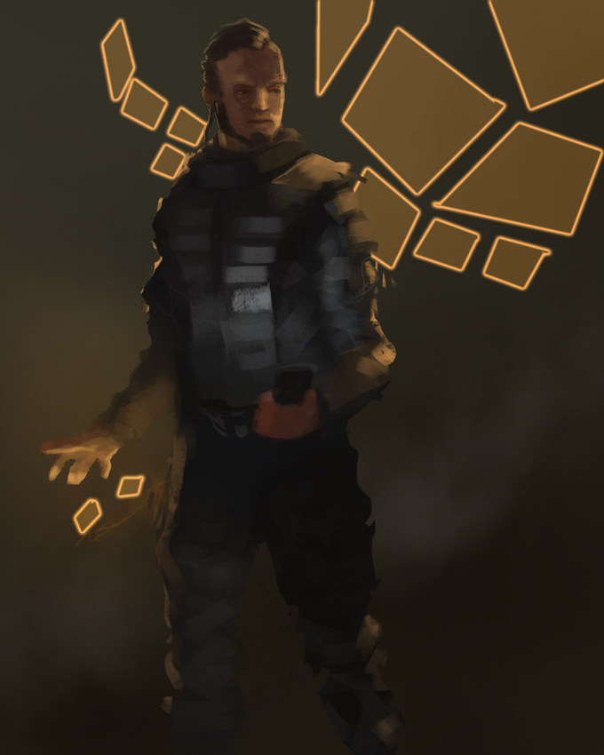
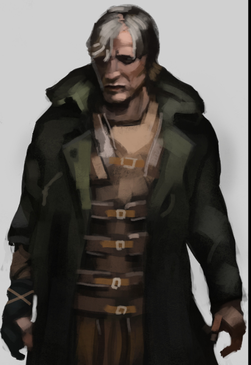
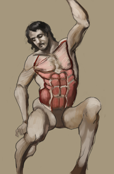
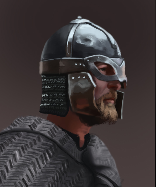
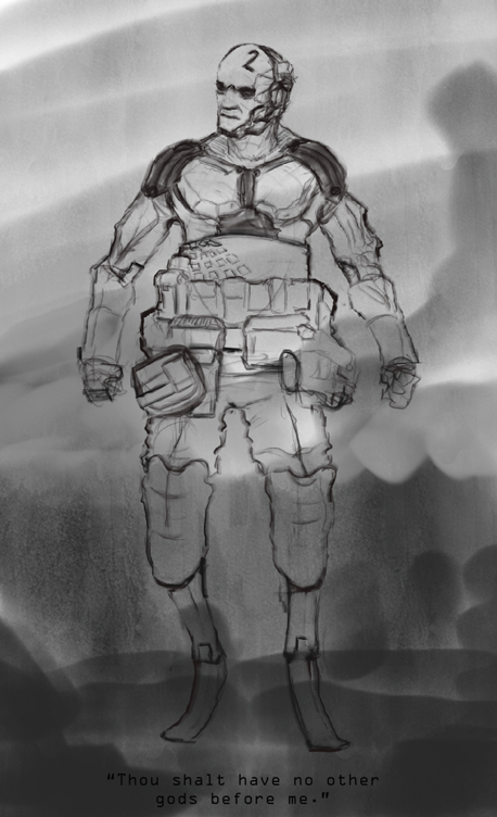
Here's three hot studies, except for the anatomy one. Just wanted to see where the muscles were, didn't care much for rendering. And a design made for fun. Thought it would be cool to have like a group of androids named the Ten Commandments!


|
