10-29-2012, 12:30 PM
got to take this to the next step
![[Image: character-development-7.jpg]](http://i1057.photobucket.com/albums/t398/eyedias/character-development-7.jpg)
![[Image: character-development-7.jpg]](http://i1057.photobucket.com/albums/t398/eyedias/character-development-7.jpg)
|
Portfolio Class- Character Development!
|
|
10-29-2012, 12:30 PM
got to take this to the next step
![[Image: character-development-7.jpg]](http://i1057.photobucket.com/albums/t398/eyedias/character-development-7.jpg)
10-29-2012, 01:09 PM
WHOAAAAAAAAAAAAAAAAA
today was fun. as promised, here everything. ![[Image: ARTHUR_THOMAS.jpg]](https://1.bp.blogspot.com/-V5riofI9MPg/UI3xN2nmeKI/AAAAAAAAAbo/JxGYyXoPrg4/s1600/ARTHUR_THOMAS.jpg) ![[Image: ARTHUR_MALAN.jpg]](https://3.bp.blogspot.com/-5-tJ0P1nfvI/UI3xMkV6GMI/AAAAAAAAAbY/WCGhtTQ9C0s/s1600/ARTHUR_MALAN.jpg) ![[Image: ARTHUR_TADAS.jpg]](https://1.bp.blogspot.com/-3tOpswlGweY/UI3xNc0QuHI/AAAAAAAAAbg/NzbPzYJqab4/s1600/ARTHUR_TADAS.jpg)
10-29-2012, 06:56 PM
Nice paintovers. It seems to me that costume idea-wise you're in the league with the best concept artists out there. Well your rendering is still few levels lower compared to their, but you're definitely getting better.
Sketchbook | Gallery | Twitch
10-30-2012, 07:24 AM
Changed my King arthur Guy tried that he looks more like a king
10-30-2012, 08:25 AM
Nice work Nimao!
So i'm just in the process of colouring and rendering, and applying changes as I go, based on Dans awesome feedback. I still have things to apply that aren't in this wip shot, so don't think I'm ignoring it :) Still need to do some studies to back the rendering up. ![[Image: ShogunAsa-KingArthur-2.jpg?t=1351549464]](http://i1255.photobucket.com/albums/hh638/thomasmahon/ShogunAsa-KingArthur-2.jpg?t=1351549464) (bigger size) http://i1255.photobucket.com/albums/hh63...1351549581 The vest thing has a japanese dragon embroided into it, but it's hard to see at this a small size, I still like it though.
10-30-2012, 09:45 AM
Nice work guys. Looking good Thomas, really like the white sleeve. Nice contrast :).
Did a couple studies, and painted over my final thing. Figured making it rough, and a bit loosed might help. It still feels a bit off though. Might move the fur onto the top layer, and add some more obvious armour under his cloak. Not sure. ![[Image: file-1863.jpg]](http://i1188.photobucket.com/albums/z416/JakeBullock/file-1863.jpg) ![[Image: file-1648.jpg]](http://i1188.photobucket.com/albums/z416/JakeBullock/file-1648.jpg) ![[Image: file-265.jpg]](http://i1188.photobucket.com/albums/z416/JakeBullock/file-265.jpg)
Website - www.ohbullocks.com
Blog - http://blog.ohbullocks.com Sketchbook - http://crimsondaggers.com/forum/thread-678.html Working towards 10000 hours at http://10000hourrule.com
10-30-2012, 11:17 AM
Still workin at this, really hard to get this culture to read as Arthur. Fun challenge, thanks.

10-31-2012, 01:45 AM
![[Image: line.jpg]](http://i1046.photobucket.com/albums/b461/ImSkeptical/Art/line.jpg) Yay, hopefully I'm in time for the mid week crit :D. As i mentioned earlier, i'm planning to more loosely interpret Excalibur, considering i couldn't come up with any good solutions if i had to give a big metal weapon within a Inca culture. Best i could think of was a spearhead, but i don't think it works as well as this cool staff head thing. Plus i got to add the rope knot thing, which is the Inca 'writing', and seemed like a cool narrative thing, where the ropes could represent all the lineages of the sun king. I'm so pumped to render so much gold xD!
10-31-2012, 05:45 AM
I decided not to copy exactly what Dan did. I think it's more beneficial to me in the long run to do that, because it forces me to think more for myself and not to copy something blindly. I took some of the things from his paintover, but I also tried to change it quite a bit.
It's still a quite rough sketch. I haven't been thinking much about rendering different materials, anatomy and stuff. Just trying to improve design. I think it doesn't look as good as Dans version, but it's more interesting than my previous sketches so it's all good. I might still make some quite drastic changes to the design. There's still plenty of time left till sunday ![[Image: 305fc.jpg]](http://img607.imageshack.us/img607/5543/305fc.jpg)
10-31-2012, 07:14 AM
Wow, great work everyone! a lot of great characters and stuff going on here! :D
So, I'm a bit delayed, due to the big character correction, and this time I used the same approach as the initial thumbs for this final character sketch, and to be honest, I'm way more happy with this one (something that didn't happen with the first I did...) so, hope it looks better now :D Thanks a lot to Dan and Dave for the crits on the class, was a bit hard at the beginning, but that was what I needed! :) Learned valuable stuff that day. Hope to have some color post later today. So, what's your thoughts on this? :) ![[Image: FBarthcorr2.jpg]](http://i1310.photobucket.com/albums/s641/langogh/FBarthcorr2.jpg)
También se habla español!
10-31-2012, 08:57 AM
@tadas- looking good man! just widen the lower part of his body (below the waist). try to push that triangular form down there so hes not so narrow up and down.
@malan- likin it! shrink the face inside the wrappings. i dont mind the size of the turban, but the face looks large inside it. cool use of the bottle, just make sure the ellipses line up! @thomas- starting to come together nicely. one thing to consider as you go forward- the white robe he has over one sleeve has to show somewhere below, either on the right or the left. it feels strange only having it up top, since their robes usually fell to the knees. balance it out by dropping it down somewhere. good stuff, all. ill try to stream tomorrow with feedback for everyone. best-
10-31-2012, 11:37 AM
Great work everyone!
I really wanted to attend this class, so i asked Dan for his approval. As soon as i got the green light yesterday i busted my ass off to catch up with you guys. the best choice for me was also the Japanese/samurai culture because i really like the style and think it would be great in my portfolio. The reason i never did it before was that i always stayed away from it because it is so detailed. So now it is the time to give it my best shot. After i did my research and build up my mood-board, ![[Image: moodboard.jpg]](http://erikmooi.nl/cd/moodboard.jpg) and watched the first feedback live stream. i decided to include the red dragon into Arthur's armor. Many brainstorm sessions went by and finally i roughly sketched my idea out ![[Image: 1.jpg]](http://erikmooi.nl/cd/1.jpg) The idea is to make the armor on his left side the red dragon, that protects Arthur but also let Arthur looks that he has become one with the dragon through Excalibur. Excalibur in my case is the tail. In my research i found that a emperor/king transformed into a dragon when he started to grow a tail :) Time for some study's. number 1 and 2 are study's and 3 and 4 are my designs for the helmet. I'm going with number 4. ![[Image: 2.jpg]](http://erikmooi.nl/cd/2.jpg) also made some nostrils from rope, so when he fights or moves it gives an extra dimension to the dragon/helmet to make it come alive. For his chest plate i didn't want to go wild out on the dragon idea. so i go with design number 4 and the plates from 3. ![[Image: 3.jpg]](http://erikmooi.nl/cd/3.jpg) Here's the design for his dragon shoulder pad and underarm ![[Image: 4.jpg]](http://erikmooi.nl/cd/4.jpg) As for Excalibur i dont want to go with the famous Katana sword so i choose the Nodachi type sword and turned it more into a dragons tail shape, number 5. ![[Image: 5.jpg]](http://erikmooi.nl/cd/5.jpg) Also did some Asian face studies to see what age/facial hair works best for Arthur. ![[Image: 6.jpg]](http://erikmooi.nl/cd/6.jpg) The strongest part so far was to get a good pose. I looked up some famous figures and other noble men to see in witch pose they where painted so i had some refs. The only thing i had to figure out was how to make the armor pop out. ![[Image: 7.jpg]](http://erikmooi.nl/cd/7.jpg) and i think number 3 wins. and i think number 3 wins.Tomorrow i paint my final sketch before i render it all out, and post it here as well. Sorry for the long post but hope my idea is clear :) any tips, feedback or critique is most welcome, and btw sorry if my English isn't so good Erik
10-31-2012, 01:25 PM
10-31-2012, 04:02 PM
So... As a report for tonight:
Having a hard time with the rendering and color phase... This has always been a hard step for me... Still not good enough for posting. Hope to have something soon. También se habla español!
11-01-2012, 12:25 AM
Hello everybody,
Still working on it. The few things i have to do left is to draw in the face, helmet and his feet plus the shinguard's. I wanted to post the update before dan is doing the mid week crits. Hope to post the final design tonight after my work :) ![[Image: 8.jpg]](http://erikmooi.nl/cd/8.jpg)
11-01-2012, 01:43 AM
Made quite a lot of changes. Gonna push ahead with this one.
![[Image: file-1691.jpg]](http://i1188.photobucket.com/albums/z416/JakeBullock/file-1691.jpg)
Website - www.ohbullocks.com
Blog - http://blog.ohbullocks.com Sketchbook - http://crimsondaggers.com/forum/thread-678.html Working towards 10000 hours at http://10000hourrule.com
11-01-2012, 07:47 AM
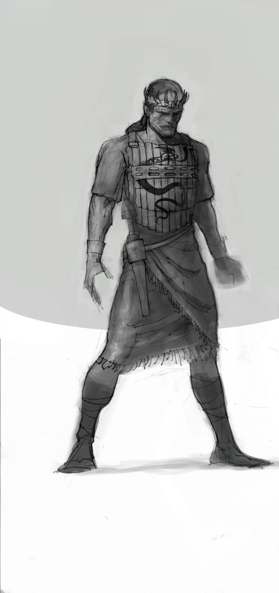
been slacking lately cause i got the flu, but heres an update
![[Image: egyptian-arthur-final-sketch.jpg]](http://i1057.photobucket.com/albums/t398/eyedias/egyptian-arthur-final-sketch.jpg)
11-01-2012, 08:08 AM
really awesome stuff all around, guys, particularly strong solution, Emooi. I know i said id stream tonight, but ive developed a small case of the flu. ill be on as soon as i can, promise. In the meantime, keep proceeding. everyones doing great.
11-01-2012, 08:33 AM
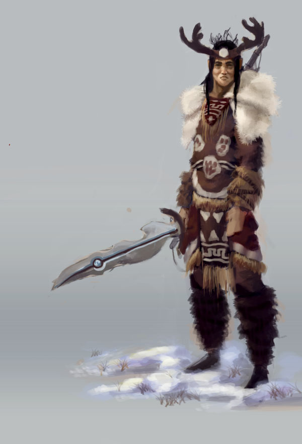
looking good guys keep it up, heres a quick update changed a few things and did a color pass still not great but im learning:) crits and comments..go!

11-01-2012, 10:42 AM
|
|
« Next Oldest | Next Newest »
|