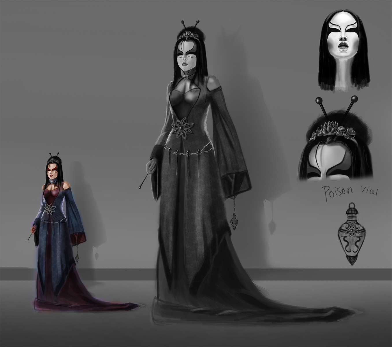
Portfolio Class- Character Development!
Nimao - Liking it man, If you're gonna go for the one of the left, maybe bring the snake in front of that piece of clothing in the center. Looks a bit forced thats all. Other than that, looking good man.

Cheers for the crit Dan. I know you said it looked like the ball was put there in a panic to make her look more magical. And that's because that's exactly what happened. So, I reworked it. Think she looks more evil at least.

I think I just got too caught up in making her look accurate and I needed to step away from the reference and just try to work on the 'character' of the design a bit more.

[Image: file-249.jpg]

Gonna push this to a finish, keep working on it, obviously I'll replace the scribbles with some more embroidery like the bottom right... I think I might end up redoing Morgan in the final week anyway though,

Reply
Hey guys,

First, thanks Dan for the crits! Really helped allot as always.
@jmob thanks dude, rocking it till it's done :)

Could t spend as much time on it as i wanted to. i had a busy week at work and home. i finally could sit and draw this evening. Still not done so i push another couple of hours into the night.
Yesterday i had some dinner with my girlfriend and her parents and i told them, he why don't we grab a bite at an Asian restaurant :p Once there i could sniff up some inspiration and have a good meal at the same time! I saw a geisha with strings of fabric wrapped around her arm like tentacles. Almost if they try to catch you. For my "foxy lady" i incorporated that idea and punt the "tentacles" in a sort of Z shape to guide you're eyes around the canvas. Also worked in the crits from Dan.
Her hand in the back is smaller, Asian face, crown, fox stitching on the dress, ropes wrapped around her waist and changed her hands so it doesn't looked cmd+c cmd+v ;)

[Image: 26.jpg]

Think I'm going with black, gold and red for her clothes. Trying that later this night.
Ow, i also added wind going through her clothes so its more dynamic and matches the "tentacles"

Hope you guys like it, any crit is more than welcome.

Erik

@Nimao I think it looks better if you put the snakes head on the left side of her hand, extend the body :)

@Ptimm Looks great man, the only thing that i would change is the lower dress part.
You've got you're wind coming from the right hand side. so the lower right side dress shouldt open to the right. i hope it's understandable what I'm saying :)
Reply
muuuuch stronger, emooi! youre really starting to get somewhere with the design. keep it goin!
Reply
Thanks Dan for the kind words.

As i spend most of the night drawing, i started to render a bit for a change :)
I thought it would be cool to design some different make up for Morgane.

After some tests i think it suits her better to not ware make up :)
Anyways, here a the results.

[Image: makeup.jpg]
1. No make up
2. Worn out geisha look
3. Geisha look
4. Geisha striped....
5. Geisha/warrior
6. Make up as a samurai mask (i thought it look cooler as i saw the result)
7. Dont know?!?
8. Warrior
Reply
I have been following these crits and I really like watching these designs develop. Would I be able to one of these just for the hell of it? I understand the cultural reference points have been assigned already but I would like to try my hand at this. keep up the good work everyone!
Reply
Hey Guys,

Wanted to post a quick update because i aint gonna make it this Sunday :(
Tomorrow I'll leave for four days to Milan, Itally. As planned on schedule I'll be back home Monday afternoon. I'll continue the drawing during Christmas eve.

So here's what i've got so far:
[Image: 27.jpg]
I adjusted her face (as seen in the last post) when i started to render her face i suddenly got Beyonce on my screen in a kimono......
Also adjusted her arm, it was way to long. Added some more laces and experimented with colors.
I feel more confident and cant wait to get back at it. Hope you guys like it.
One more thing, i didnt added to much patterns in her clothes because i wanted some places for the eyes to rest. But the fox in her dress together with her sleeve is pretty crowded place right?

I wish you all a merry Christmas and thanks Dan and every one of you for the help and inspiration during the class.
See you all in a couple of days.

Cheers,

Erik
Reply
[Image: morgane5_zpseb53a5d2.jpg]

here is my morgan, i couldnt see anything else to change for now, but im open to suggestion.

and I worked on the fixes dan talked about with Merlin, along with trying to redo my arthur, altho I think I might start over again, he doesn't seem to fit with merlin and morgan

[Image: merlin2-1_zpse357024b.jpg]

[Image: arthur_zps382f7dfd.jpg]
Reply
Hello everyone ,
just saw the videos on the livestream yesterday and i wish i had done that sooner so i dont miss out on Arthur and Merlin , oh but anyways ..

here's what i managed to do .
Black lotus morgane

Hope you like it :D


Reply
Lor - Nice patterning and face paint man. You could maybe distort the flowers a bit though. They look cool, just kind of flat atm.

PTimm - Looks great. Love how your Morgan came out, the staff, and the tiger theme both work really well, I think anyway :). And they look like a really consistent set. Nice one man!

I'm home for Christmas now, so I'll get to do little bits, but I'm gonna be mostly in family mode. ;).

This is how far I got with Morgan, the design's pretty much finalised (maybe), just need to flesh it out and add some details now.

[Image: file-1524.jpg]

Cheers for all the feedback guys, and thanks Dan for running this. It's been awesome.

See you all soon. :D

Reply
So it's not totally finished yet, her face still needs work, aswell as some details. But here is where I'm at for the moment

[Image: morgan_value22-1.jpg?t=1356286681]
Reply
i think it's finished. I tried not to overwork it where it's not necessary

[Image: 357s.jpg]

Reply
So, this is where I am right now. Not finished yet. It still needs a LOT of work, but Im currently on it. If I get another update before the stream, I will post it.
Learning a lot on this one. :)

[Image: MorganeWIP_zps26f79062.jpg]

También se habla español!
Reply
It's almost finished. I hope the changes work. It's still too dark i think and the colours and basicly everthing needs some work. Oh well...
Quick changes:
[Image: mor6.png]
Reply
Really awesome job Malan! love the rendering. I know you're probably aware of it, but just incase you aren't, theres a little problem with the legs. Just seems to be a big gap, I think changing the placement of the foot might solve it

[Image: paintover.jpg?t=1356302794]
Reply
Quote from Daniel Warren; mentor, guardian,

"so im on the laptop at home for the holidays and none of my passwords or login info are saved lol. that stream is gonna be late- a trend ill remedy asap i promise. enjoy the holidays and please inform the others for me!"
Reply
Merry Christmas, everyone!
Best wishes! :)

También se habla español!
Reply
[Image: comp-1_zpsd90b037e.jpg]

[Image: arthurcolors_zpsa73d7a6d.jpg]

[Image: thestance_zps4a5e9c79.jpg]

in the mean time ive been reworking the arthur to get it up to speed
Reply
So, finally, here is my finished Morgane :D

Better Res here --> http://bit.ly/WPnYLu
[Image: Morgana50-B_zps42442f40.jpg]

También se habla español!
Reply
Great job Malan :D

some samurai stuff in preparation for the next character
study:
[Image: stud.jpg?t=1356797021]
applying stuff:
[Image: sketchy.jpg?t=1356796988]
Reply
Update

Morgane.
I have to tweak the lightning more and finish the magic orbs in her hands.

[Image: 28.jpg]
Reply


Forum Jump:


Users browsing this thread: 84 Guest(s)