06-19-2019, 09:00 PM
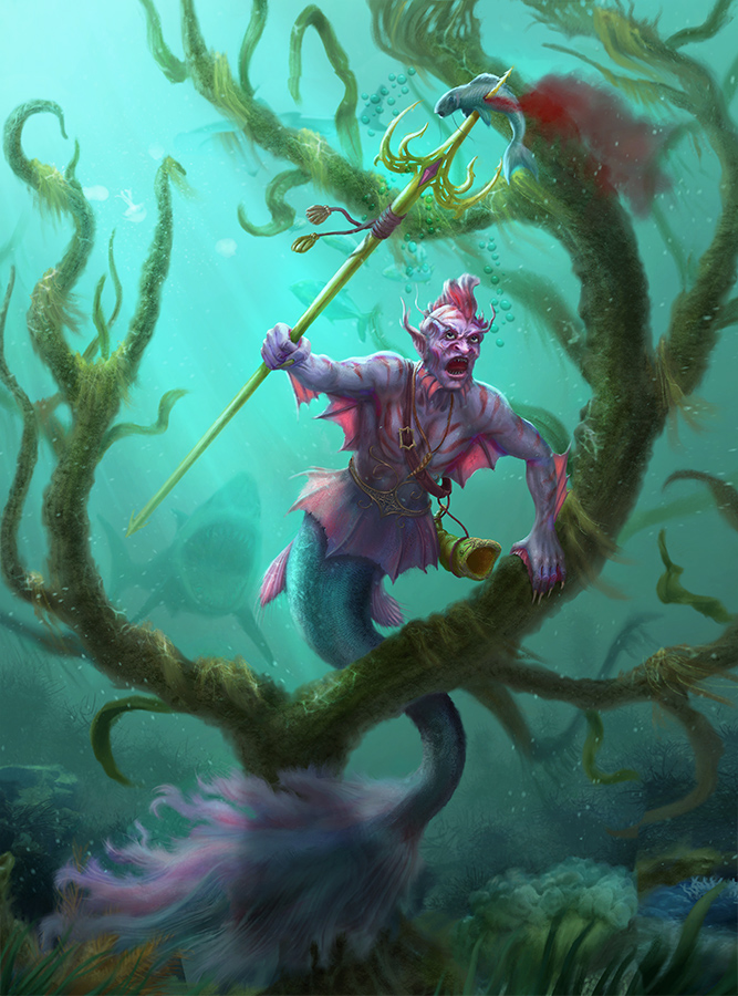
Done for Mermay... ended up being late :)

|
Elderscrollers Sketchy Stuff
|
|
06-19-2019, 09:00 PM
Done for Mermay... ended up being late :)

07-02-2019, 09:54 PM
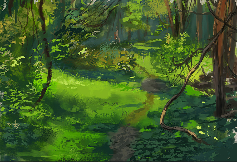
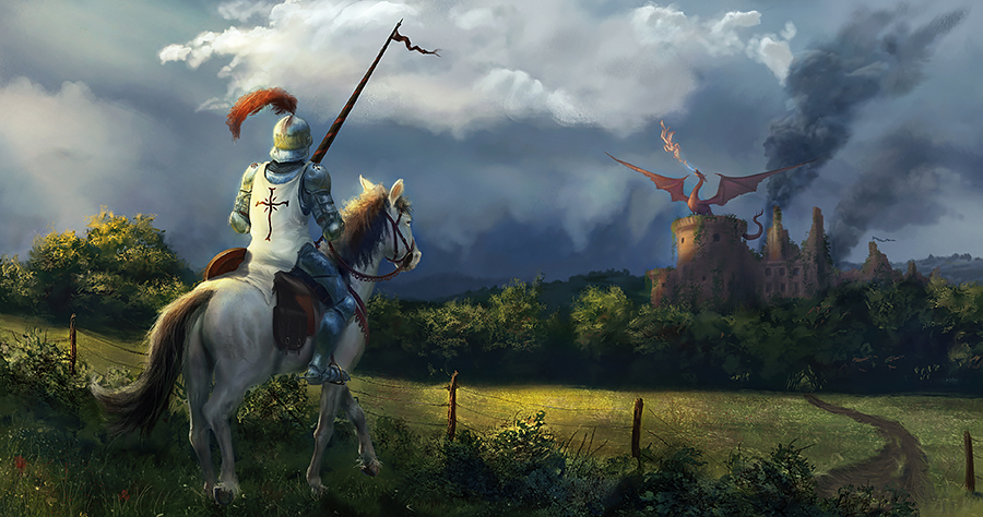
Some practice scene of a knight and dragon and a study of one of James Gurneys gouache paintings, where I tried to emulate the medium digitally
09-20-2019, 05:33 PM
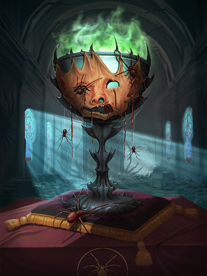
Some recent stuff
 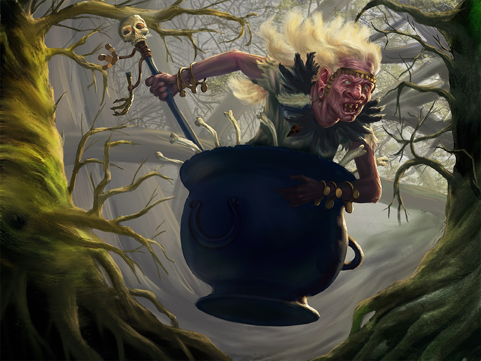 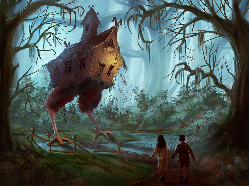
09-20-2019, 08:14 PM
First impression
Scale and perspective of the tree seem off on that witch piece and i feel like you give to much room for little detail to take away from the focus of the story telling. Here some of the touch up i did. I Increase the shadow inside the lower ground. I Add up some fog in the foreground to counter balance the strong foreground element. Overall i made the character more darker to make it pop against the light background. And Work in away to assure that i keep the focus toward the face of the character For suggestion i would say try to add some kind of leaf trail behind her to show movement so it not so ''static'' Finally simplify your shape to help the composition.
09-26-2019, 07:15 PM
@darktiste: Thanks very much for your insight and overpaint, it´s very helpful!
Some more stuff from recently...demonic vitruvian man and a stained glass window for a demonic deity 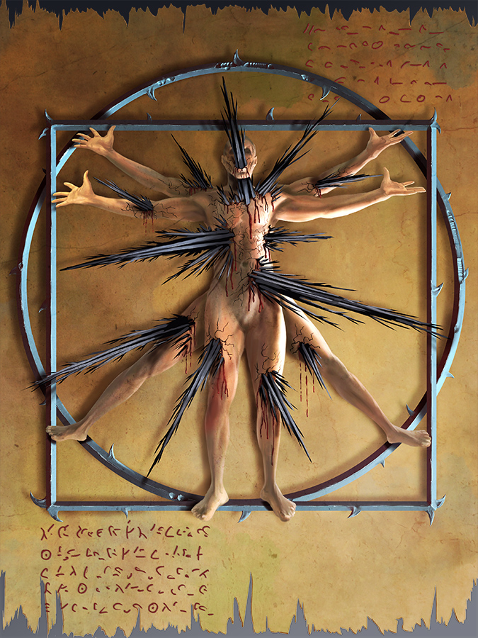 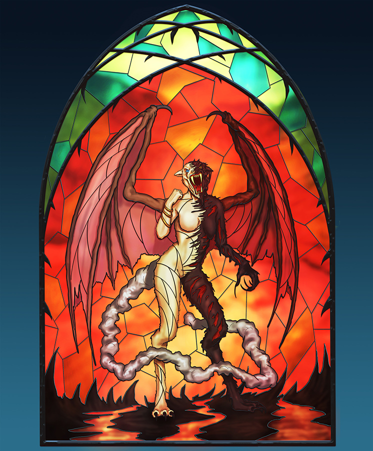
11-01-2019, 07:06 AM
I applaud your ability to paint complete scenes, with characters in environments. You have good ideas and are evidently pretty decent at drawing, however there's a couple things that are really holding you back.
Lack of strong, readable shadow shapes in your figures. In most areas of your paintings, light and shadow just blend together because your the edges of your shadows are mostly so blurry and vague, and there isn't much contrast in value/hue between the shadow and light. Most of your figures look evenly lit and flat. Focus on creating a separation in light and dark so that the difference is clear when you squint at your painting. Your brushwork could be improved a lot. It looks like you rely too much on the soft round to make shadows and transitions in values, I think this leads to muddy colors and flattening of the figures. But when its apparent you do use a hard round brush, it seems like you use one that's too small and the strokes looks too streaky and stringy. I think you just need to clean up how you define your edges from soft to hard and smooth out how you blend colors. Examine this piece by Zeen Chin, I think it illustrates what I mean pretty well.
11-08-2019, 02:13 AM
@darktiste: Thanks :)
@Nature: I´ll keep that in mind! Regarding shadow shapes: It also depends on the lighting setup. In your example there is a strong light from above, creating strong hard shadow shapes. If you refer to my witch painting, that has 6 different light sources, creating soft transitions Some more painting, as I just finished a commission: Hestia, goddess of the hearth. Not a highly polished painting though 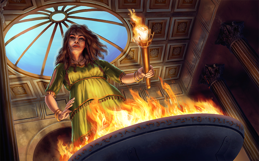
12-04-2019, 11:01 PM
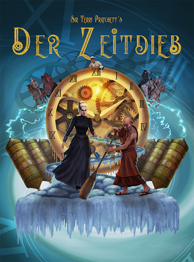
A poster for the Terry Pratchett book Thief of Time
12-08-2019, 05:15 AM
You have a great style that I enjoy. I love your use of colors and lights, and you have a very strong sense of composition and perspective which makes your images that much dynamic. Looking forward to seeing more of your work soon, keep it up!
12-17-2019, 09:31 PM
@cgmythology Thanks very much!
Done for https://www.youtube.com/channel/UCH4Bz5S...HSuCT_Hlxg christmas themed trashman from it´s always sunny in philadelphia 
02-26-2020, 11:20 PM
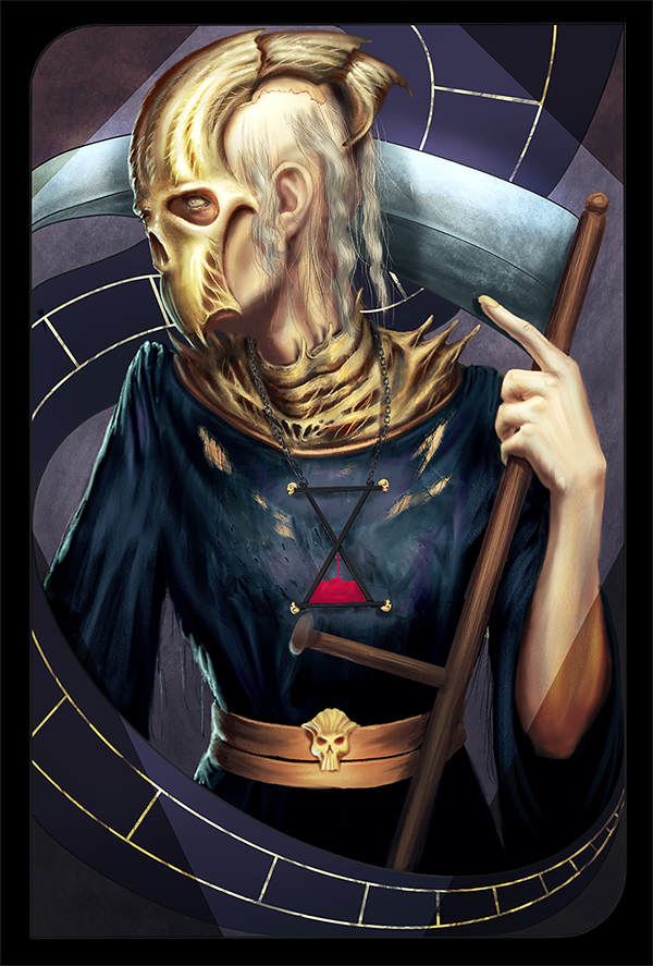
One of 13 tarot-like cards for an RPG game. Inspired by the dragon age inquisition cards
03-03-2020, 10:50 PM
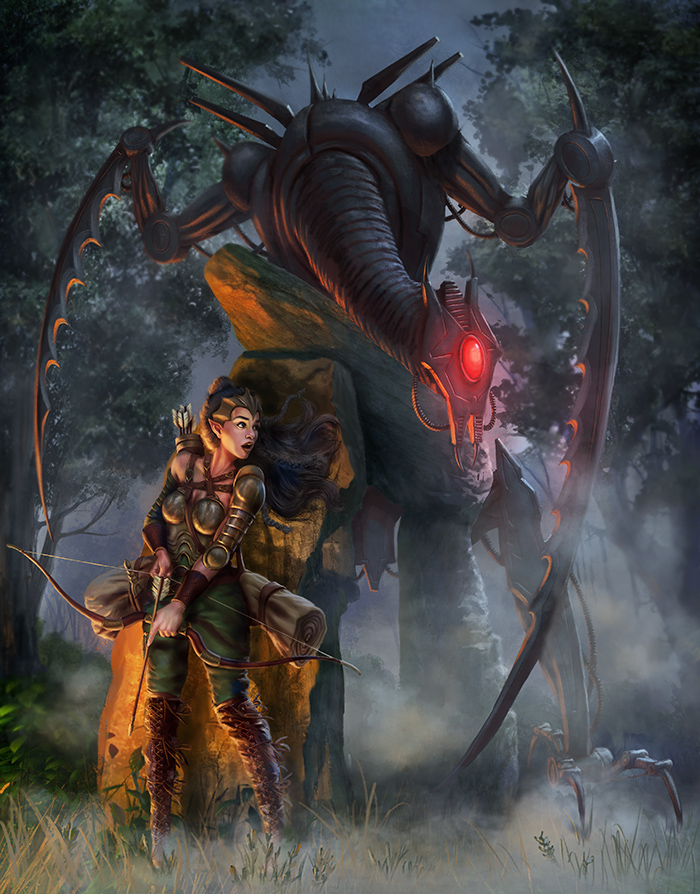
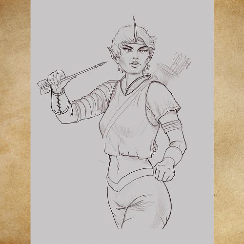
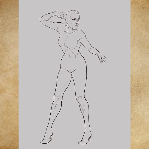
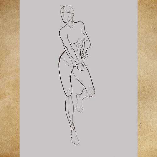
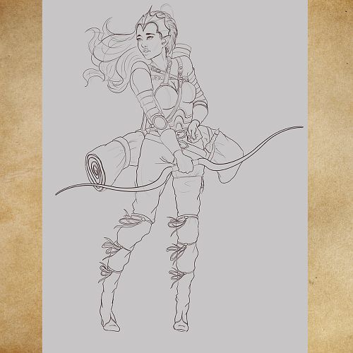
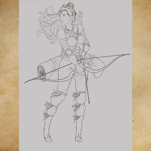
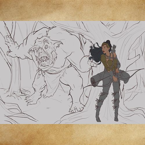
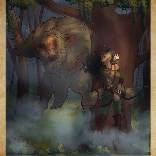
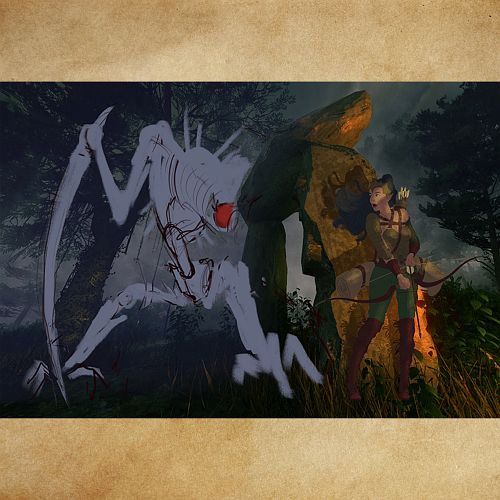
This image took a looooong time to develop. It started out with a simple doodle of an elf archer, which I then wanted to expand into a character rendering and then into something with more storytelling. After wanting to include a troll that hunts the elf, I decided to switch that into a robot in a fantasy setting which evokes a lot more interesting questions storywise
         |
|
« Next Oldest | Next Newest »
|