Posts: 488
Threads: 10
Joined: Jun 2013
Reputation:
38
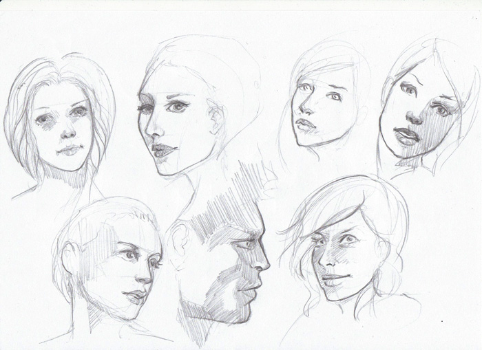
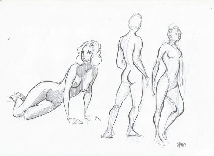
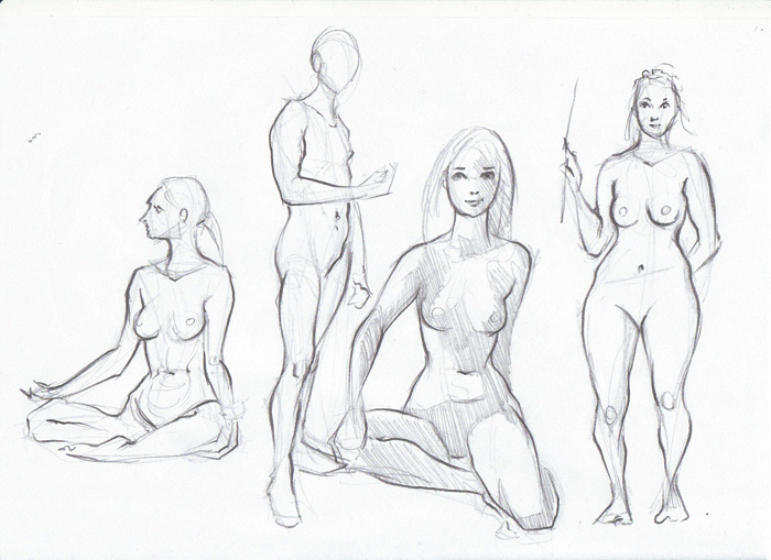
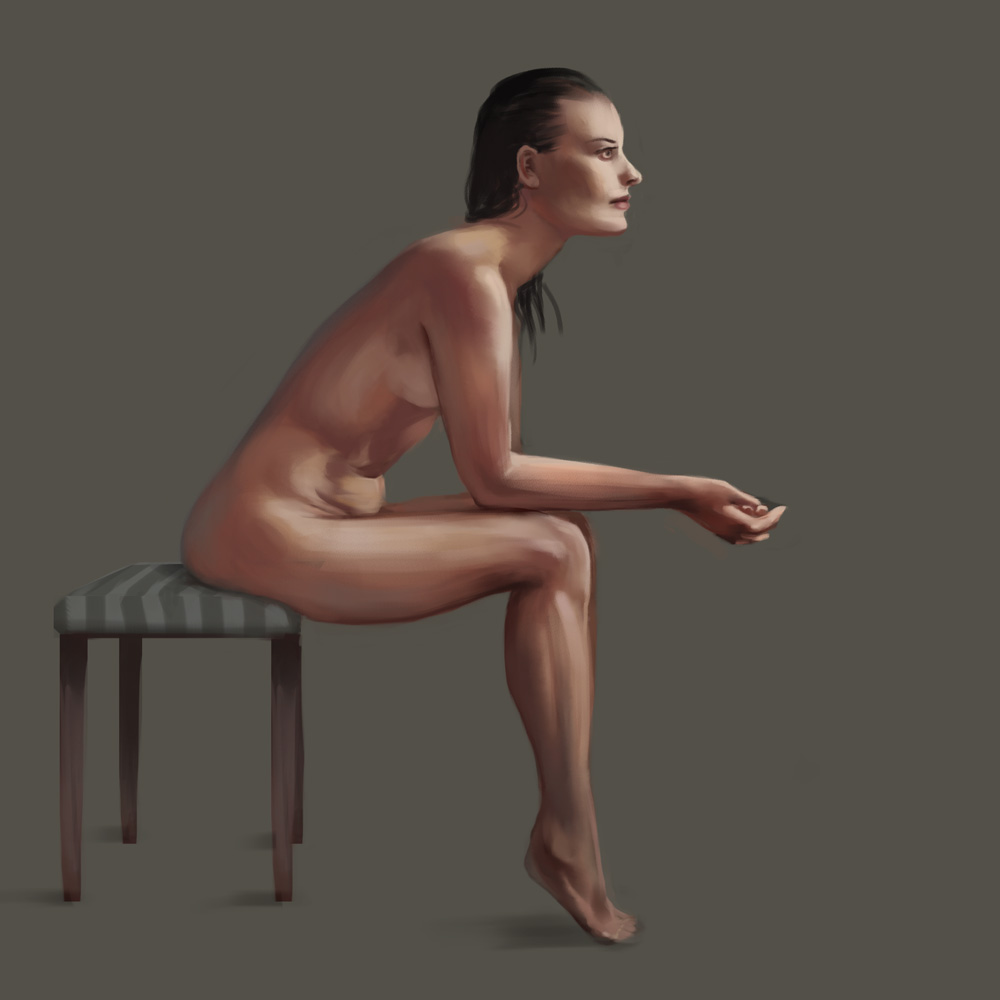
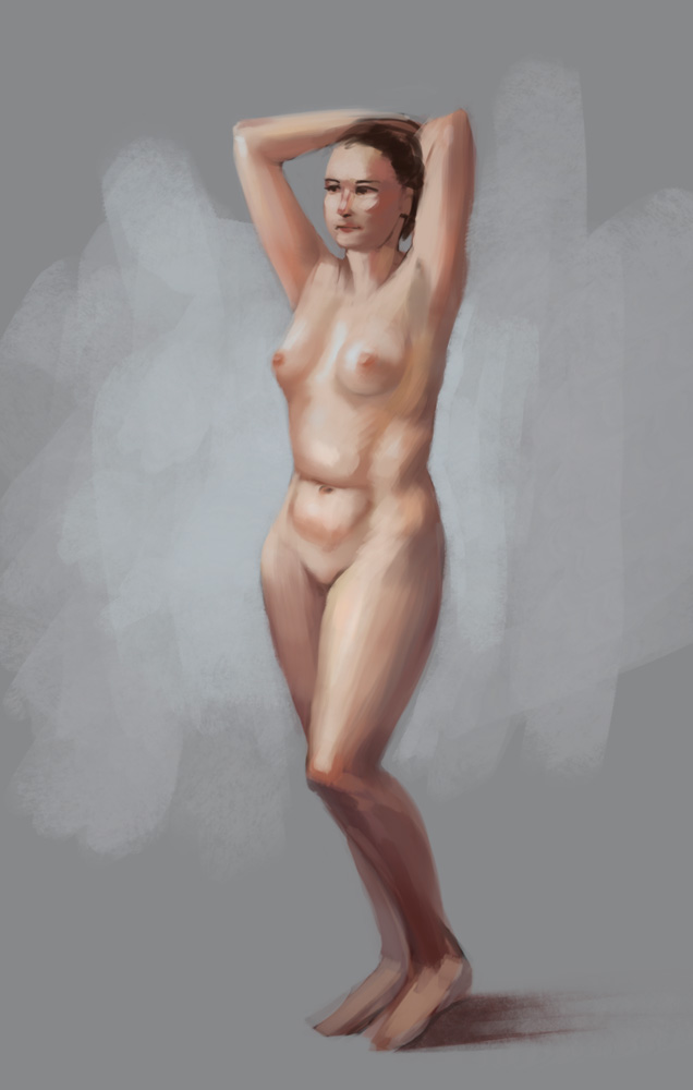
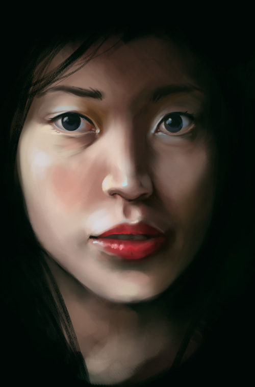
Nice studies.
I'm really feeling that maybe one of the things you should work on is how solid your forms are, te details and rendering are great, but there are thing's that feel a bit floaty and not so solid.
Spend a bit more time making sure all the facial features are in the same perspective.
Keep it up!
Drawing out of perspective is like singing out of tune. I'll throw a shoe at you if you do it.
Sketch Book
Posts: 1,074
Threads: 9
Joined: Jan 2012
Reputation:
53
oooh Lovely studies.
The nose and mouth studies and pretty nice!
Posts: 848
Threads: 20
Joined: Jan 2012
Reputation:
29
D: your studies are amazing. You really have a way with skin tones and your lips always look so full. But I agree with JakeB, the eyes are a little on the big side in some of the studies. Keep up the good work though :)
Posts: 850
Threads: 4
Joined: Mar 2013
Reputation:
21
JakeB: Thank you. Oops, big eyes (or other features as well) are very tempting, yes :P Still need to internalize that the face is more than eyes, nose and mouth...!
OtherMuzz: Thank you. I agree completely, underlying structure and placement of features is a major problem of mine - I tend to just not see the problems anymore after painting for more than an hour at a face... maybe I should do more sketching after all!
Ursula Dorada: Thank you, Sula! :)
Jaik: Thank you! I will! Seem to have forgotten everything about skintones again in this post, though :D
--
Here's just a tiny little something to get me back on track, hopefully I'll be more productive from now on again.

Posts: 850
Threads: 4
Joined: Mar 2013
Reputation:
21
Posts: 362
Threads: 10
Joined: Mar 2012
Reputation:
21
Very nice sketchbook. Keep going!
Posts: 114
Threads: 7
Joined: Feb 2013
Reputation:
1
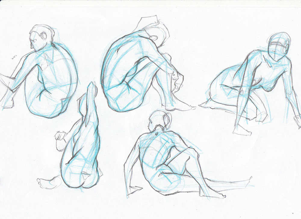
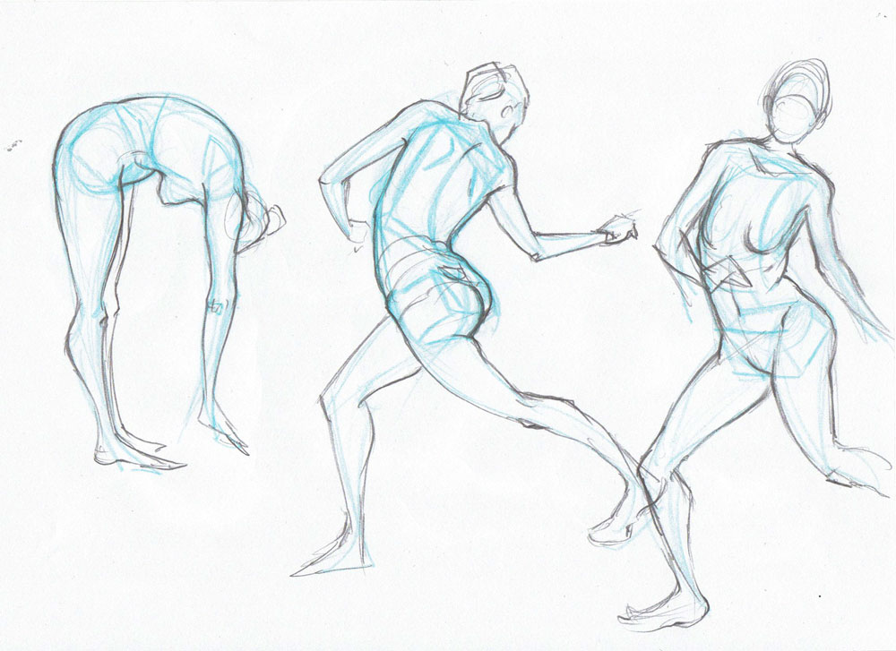
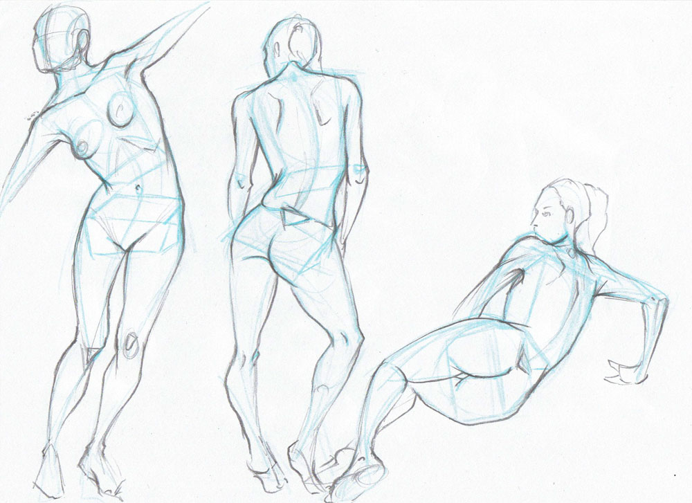
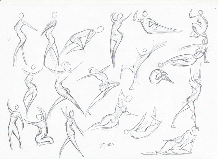
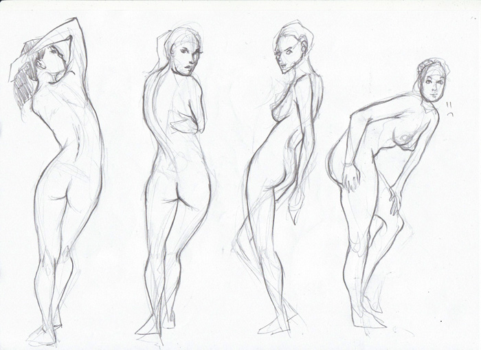
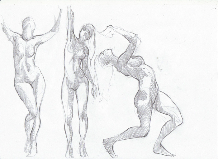
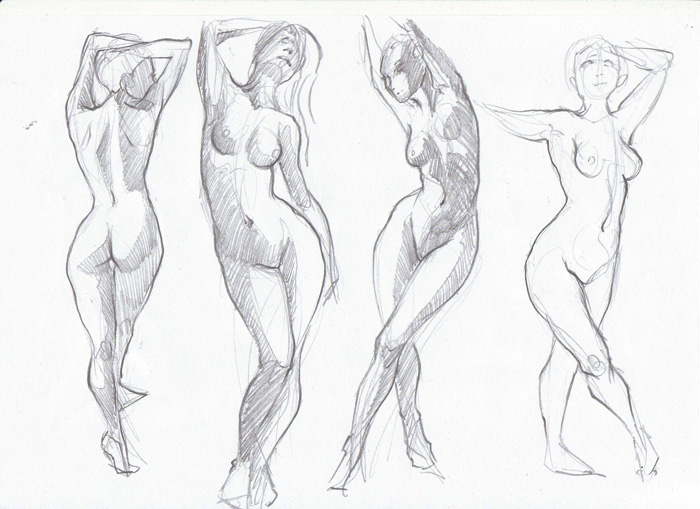
Nice Lady studies, I could learn a thing or two here, need to start more female gestures, Great work!
Posts: 848
Threads: 20
Joined: Jan 2012
Reputation:
29
You are totally the only one doing the VL these last couple of weeks. I've been so busy. Will totally get back into it soon and catch up on what I missed =/
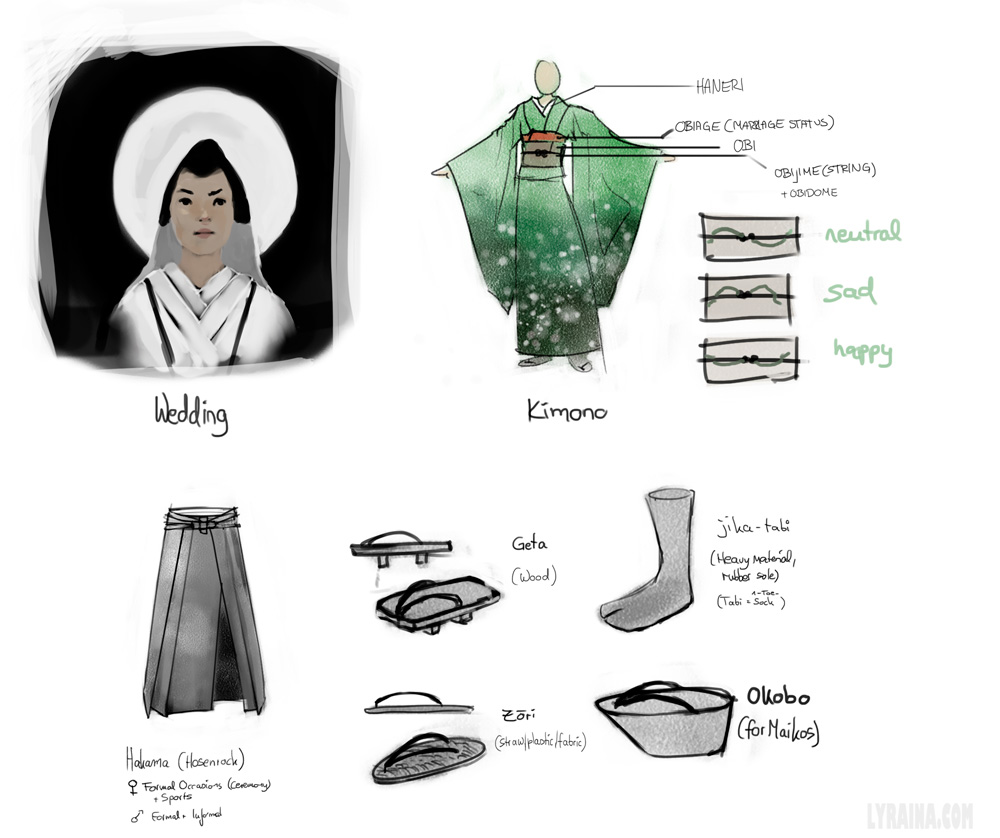
Looking good, hope you enjoy your trip :) That kimono looks wicked.
Posts: 850
Threads: 4
Joined: Mar 2013
Reputation:
21
Wolkenfels: Thank you, I will!
Trevor S.: Thank you! (Female) gestures are fun, curves everywhere! :)
Jaik: Thank you! Was struggling finding the time to do the VLs as well, there's just soo much going on all the time...
--
Back from vacation!
Photo study & quick still life, focusing on brush strokes


Posts: 850
Threads: 4
Joined: Mar 2013
Reputation:
21
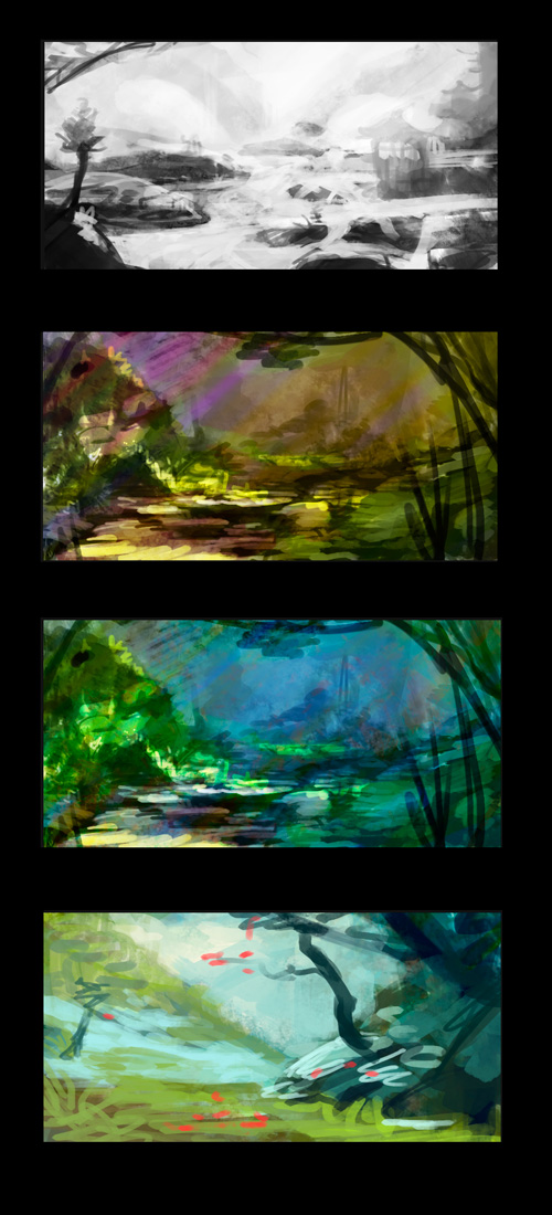
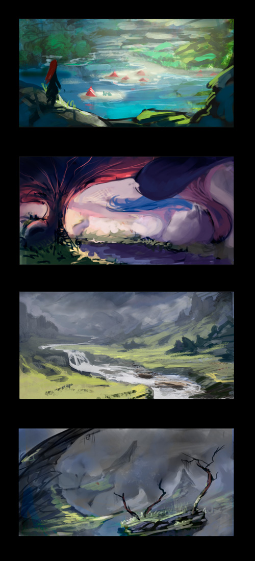
Thumbnails...took me longer than they should.


Posts: 848
Threads: 20
Joined: Jan 2012
Reputation:
29
I love the second last thumb in your last post, should push it to a more polished state, looks amazing. You seem to do a fair few thumbnails like this but I never see one pushed to a further level, you may learn a lot by putting a couple more hours into one, and just see where it takes you.
So jelly of your skin tones as well (i think i have said this before though), your brush storkes are coming along well too, I realized I developed a lot of bad habits with line work from gestures, but you dont seem to have that problem at all.. >.<
Posts: 850
Threads: 4
Joined: Mar 2013
Reputation:
21
Jaik: Thank you - it makes me happy that you like this thumbnail, because it's my favourite as well, everything just fell into place somehow... I actually try to finish more, but very often give up in the middle because I'm stuck. But I will try to finish at least one this time, working on four at the same time right now (Feng Zhu style, haha).
Skin tones are an eternal struggle I think ... especially without reference...
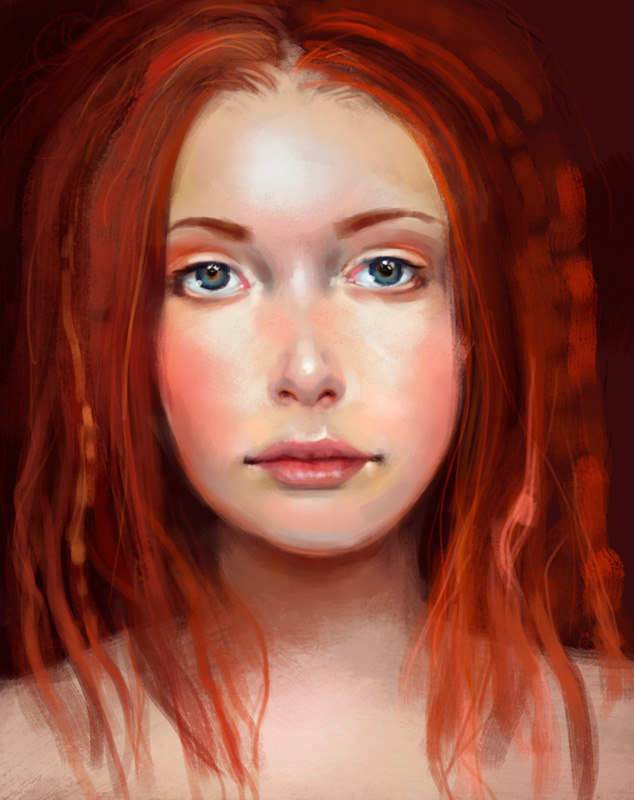
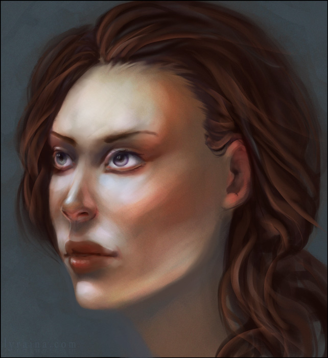
Small update ... portrait from imagination, I don't like it, but I don't know what is off anymore, I pushed around the eyes, nose, jawline etc so often...

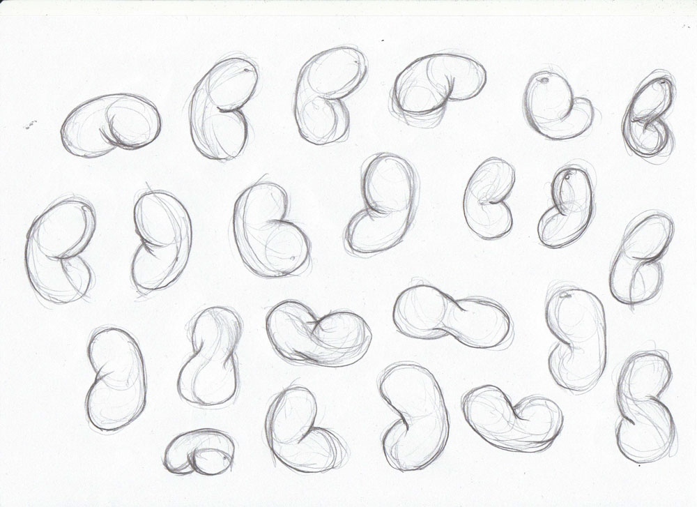
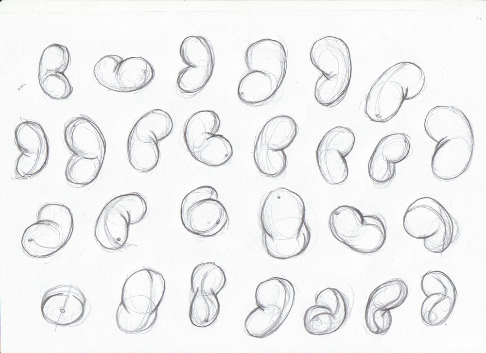
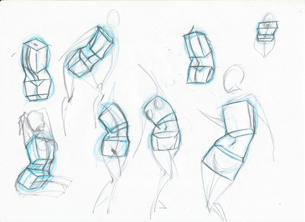
And I am starting anatomy studies from the basics again with Proko's figure class. I hope that this might actually help me understand form better and work against the flatness of my drawings. (But first it will make everything ugly again)


Posts: 850
Threads: 4
Joined: Mar 2013
Reputation:
21
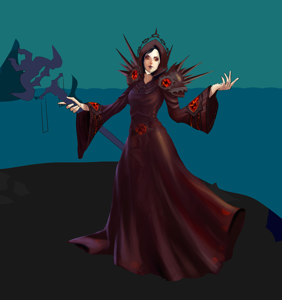
I miss playing WoW a lot lately. But I'm also afraid that I will lose control of my playtime if I revive my account...
So I dug out something quite old, my beloved warlock, critique is appreciated. I keep changing the size of her head..

Posts: 850
Threads: 4
Joined: Mar 2013
Reputation:
21
Posts: 215
Threads: 4
Joined: Apr 2013
Reputation:
3
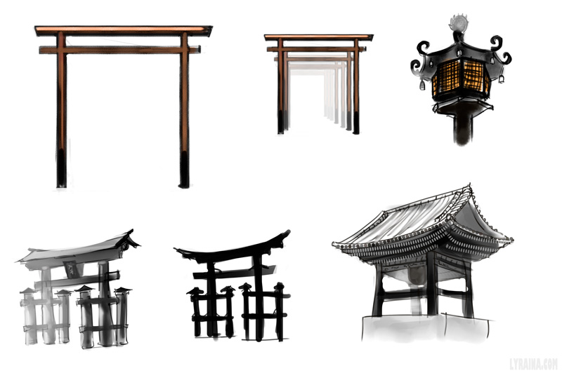
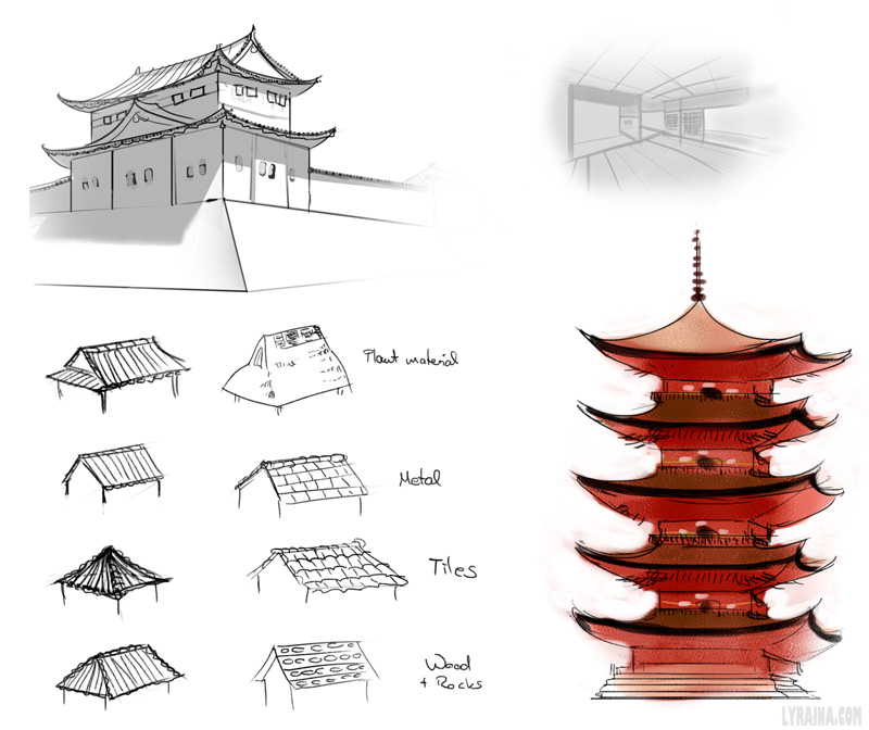
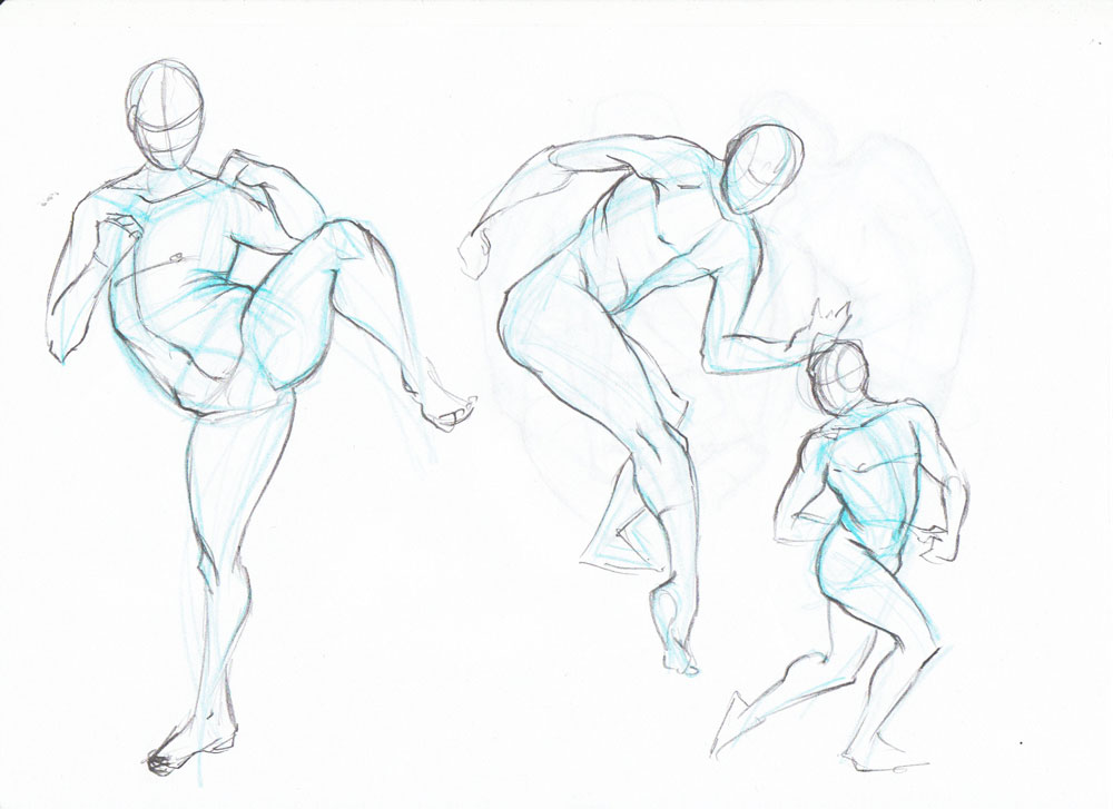
Beautiful gesture studies & visual library drawings.
Posts: 1,074
Threads: 9
Joined: Jan 2012
Reputation:
53
(yay for warlocks! :D)
Great sketches going on here!
Posts: 848
Threads: 20
Joined: Jan 2012
Reputation:
29
Some really nice updates here :) Your gestures/figures are definitely improving.
If you have the ability to get your hands on Ron Lemen's portrait drawing series from Gnomon I highly recommend it for taking your portraits to the next level and breaking through that barrier ;D
Posts: 161
Threads: 0
Joined: Aug 2013
Reputation:
9
Cool stuff, those thumbnails are great. They have a lot of energy in the brush strokes- sometimes it is hard to keep that when you try to finish them up more...at least that's what I have experienced :P
I have a question... I see these value and color studies in a lot of sketchbooks (like the one on the top of page 3). How do you go about doing these? are they just quick sketch type things or what? They look like something that could be useful.
Posts: 850
Threads: 4
Joined: Mar 2013
Reputation:
21
Prabu: Thank you!
SulaMoon: Thanks! Yes, warlocks are the best... I'll overlook that horde-ish look of yours :P
Jaik: Thanks :) I'll have a look at the dvd you recommended... can't wait to buy that Gnomon Sub after finishing university!
JJ Aaron: Thank you! Yes, I know that problem with losing energy.. in anatomy sketches as well as finished paintings. About the value & color studies: I spend some time browsing the old masters, looking for paintings with appealing value structure or color scheme (or whatever it is I want to learn). I then paste them into a photoshop file and try to do a quick analysis of what it is I liked about the image, and simplify it (i.e. using only 3 values and thus extracting the essence of the image). It does help to get a sense for good composition, value structure, color combinations...
This is only the way I do them though, I was inspired to do a few because I saw people post their homework for Noah's artcamp. I did not enroll myself in the course though, so I can't really tell you if there is a better way to go about the exercise, of if this is how the other people went about it. It's just my attempt to extract some skill from the old masters :)
--
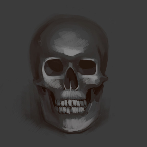
Photo study warmup

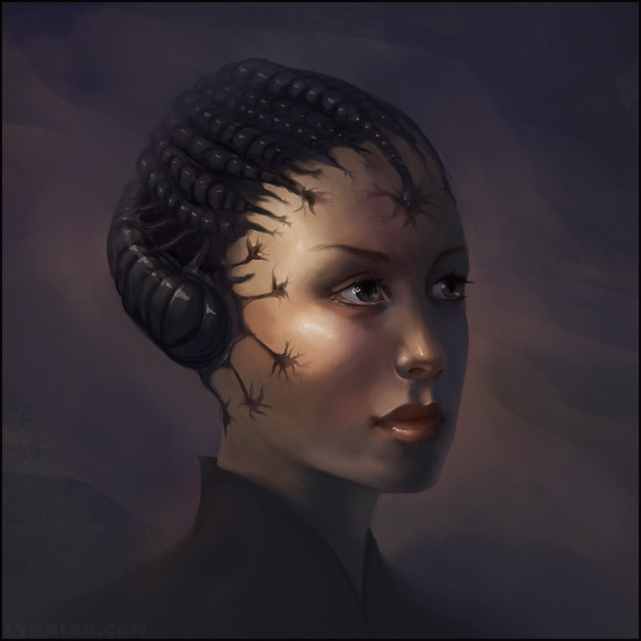
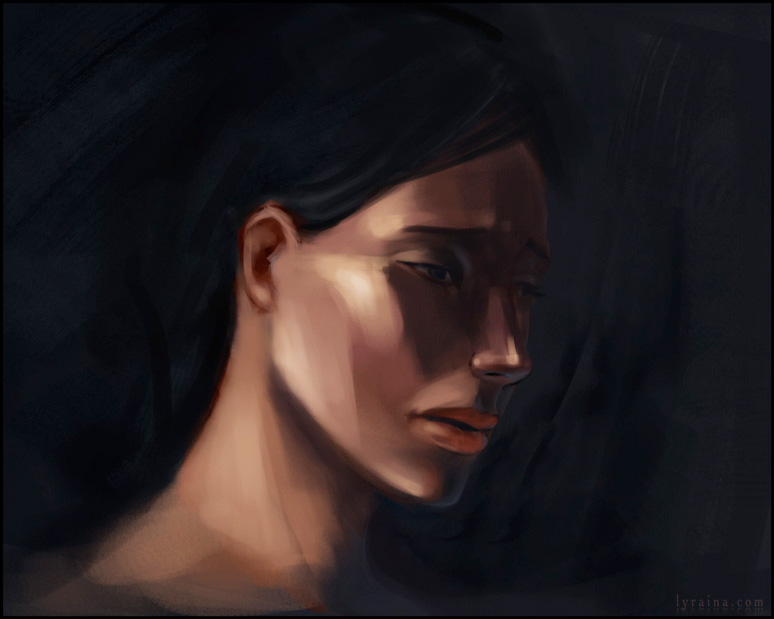
Sketch from mind (I want to stop doing those boring ambient light portraits)

Posts: 227
Threads: 13
Joined: Mar 2013
Reputation:
2
nice progress laura! This last portrait is looking great and that char looks awesome.
|


