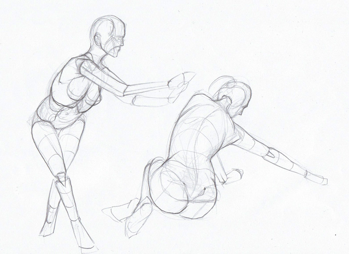
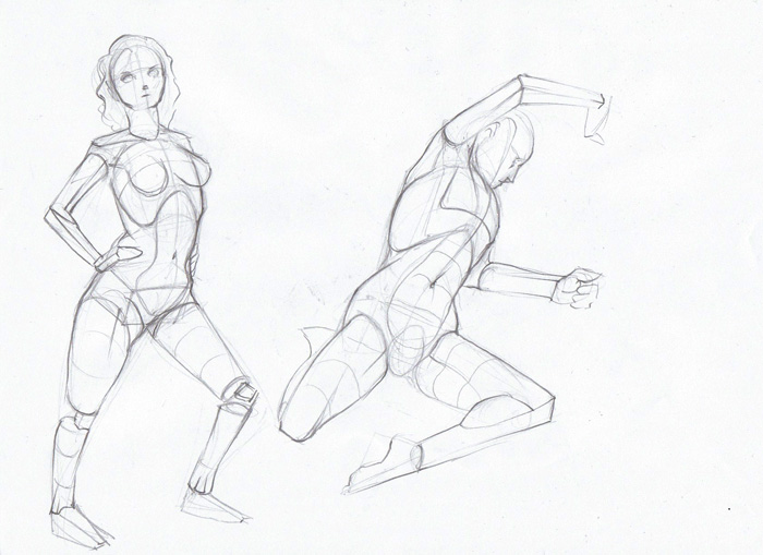
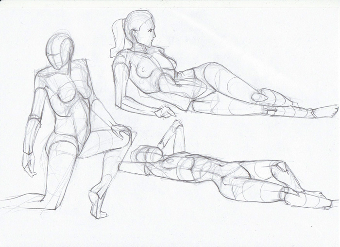
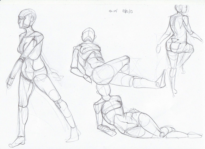
Posts: 850
Threads: 4
Joined: Mar 2013
Reputation:
21
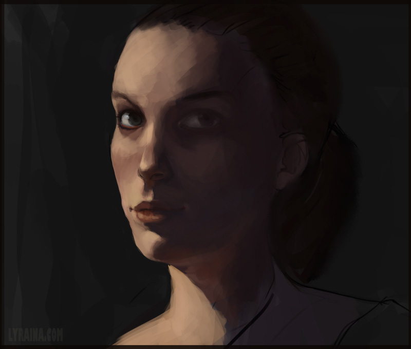
wanted to give Jaik's advice a try and also paint a self portrait which looks less grim, but then life happened, and I don't feel like looking at myself at all right now. So I'l just post this unfinished and move on for now.

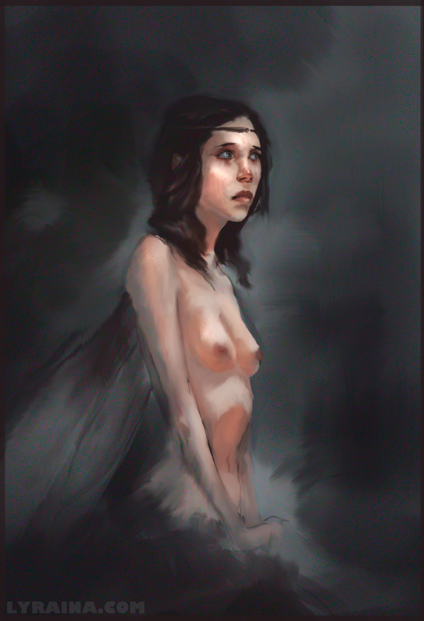
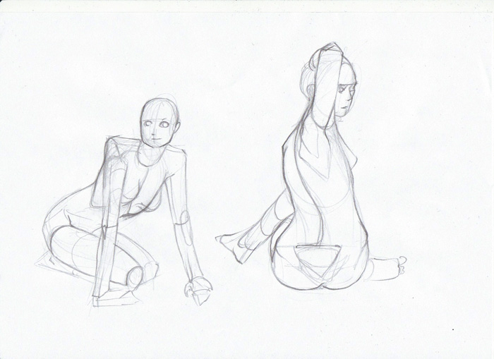
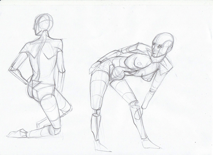
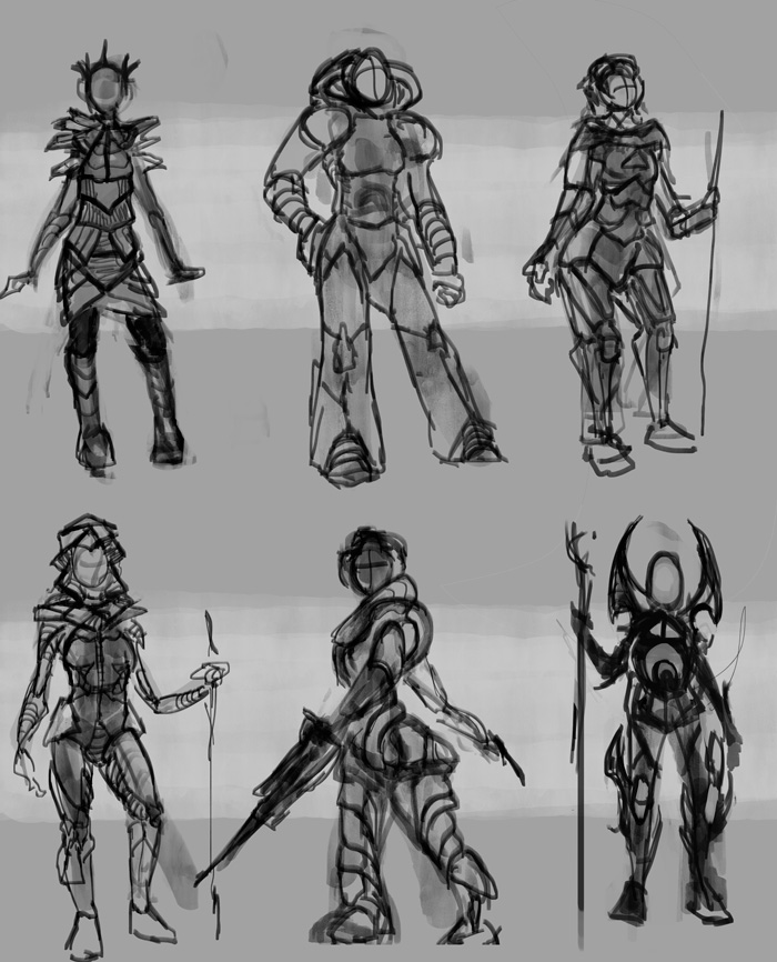
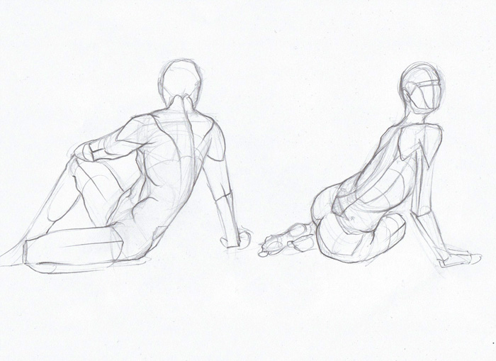
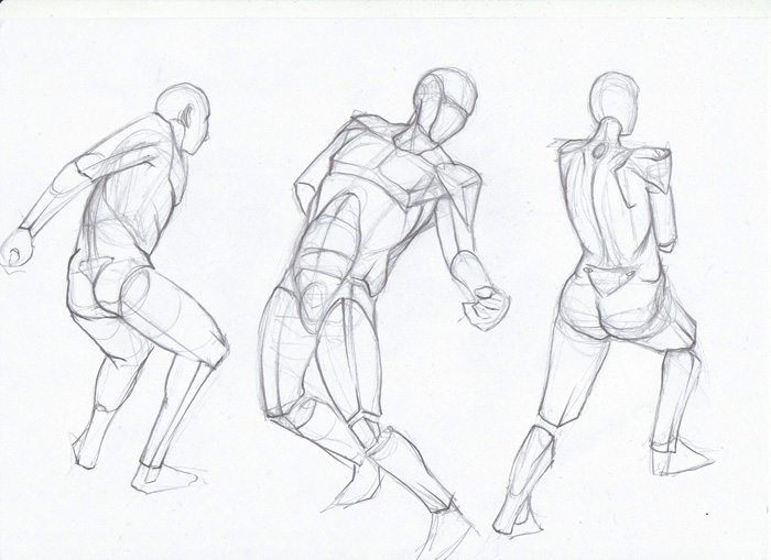
random sketch from mind (with experimentation), because I feel I should work more on painting figures as well

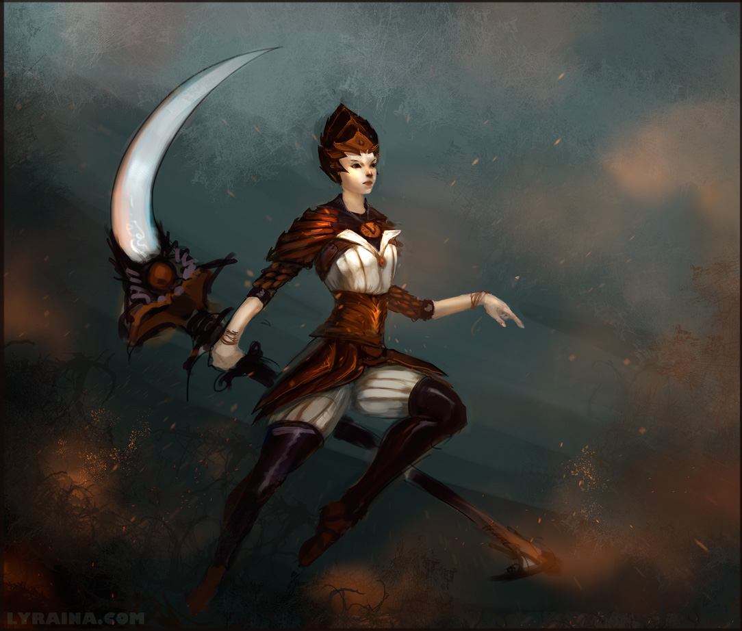
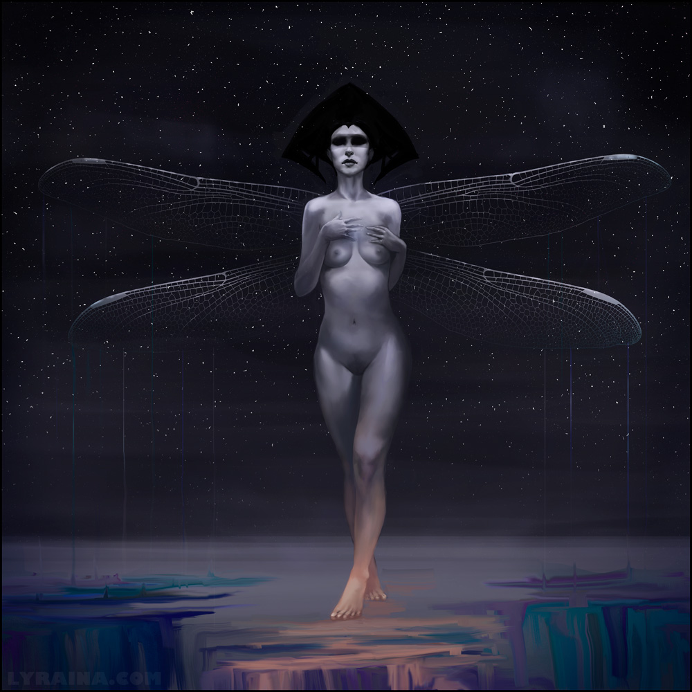
not very sober interpretation of sibling's suggestion to paint an apocalyptic angel (also trying out to start with a very rough base drawing, instead of tight lines. and started in values this time)

Posts: 850
Threads: 4
Joined: Mar 2013
Reputation:
21
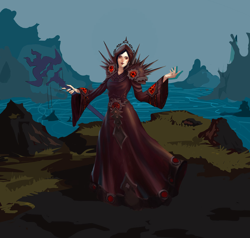
Also, could someone please tell me if the perspective is about right in this one, or if the character and background don't fit together? Never sure with this organic rock-stuff, horizons and such... and don't want to have too stupid mistakes in there (been there, done that).

Posts: 848
Threads: 20
Joined: Jan 2012
Reputation:
29
Those simple shadows look good, you could probably have gone a touch darker for the eyelashes above the eye in shadow. Your self portraits are definitely getting better. Though I can't comment on likeness xP
For the warlock I think you pretty much nailed the horizon line (cant say for sure since I am not great at figures and horizons..)
Try adding a tiny bit of a dark shadow underneath the front of the cloak just to get the character grounded on the ground plane but other than that I think the background and colours work well with the character. Careful of that tangent of the staff and the background mountain.
Keep up the good work :)
Posts: 850
Threads: 4
Joined: Mar 2013
Reputation:
21
Thanks Jaik. Dunno about likeness myself, but also not really my focus atm :P
I'll look out for the tangent, not too happy with the overlap anyway...
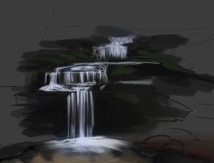
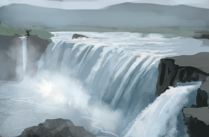
New painting... regular practice will continue soon.

Posts: 34
Threads: 2
Joined: Oct 2013
Reputation:
2
Hi there :) Very lovely rendering and colors! One little crit though, the space between her hands and shoulders could be a little shorter (at the moment it seems a bit as if she's trying to push down her breasts ;)), but other than that, the proportions look great, too!
Posts: 118
Threads: 2
Joined: Apr 2013
Reputation:
1
Lyraina, love the Corruptor tier. Great use of lights and shadow on that one. It really pops from the page. Nice expression on your last post 2. Keep it up, I hope to see more.
Posts: 850
Threads: 4
Joined: Mar 2013
Reputation:
21
Elif: Thank you! Ah, so that's the problem.. I indeed struggled a lot with the arms and hand position!
Nika: Thank you. Don't know why, but that warlock piece takes me forever :P
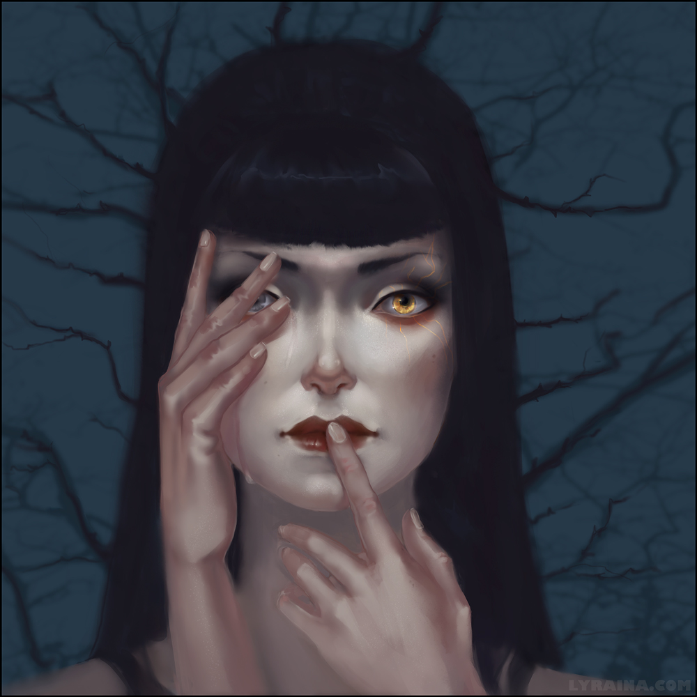
"Silence is golden". No ref this time for the face, but took a photograph for the hands.

Posts: 848
Threads: 20
Joined: Jan 2012
Reputation:
29
Nice stuff. If you arent happy with the overlap of the staff, could I suggest changing the mountain to maybe something with an arch in it and frame the staff instead? It has a very strong silhouette so placing it against a light background would work well, and compositionally, having a strong diagonal/line intersecting a circle is subconsciously viewed as a strong image. If that makes sense?
I really like the pic with the colour melting off the body and wings, really cool concept, I'm hoping I got that right and that's what you were going for lol. Maybe darken the background behind the figure a little more, even if its just gradient towards the center (I wont comment about any anatomy for obvious reasons c.c ) Look at some of Anthony Jones' work http://www.robotpencil.org/ his use of light and dark on figures like that is brilliant
Annnd the last piece: You did a very good job without reference, that eye is fantastic. My only crit is that you can kind of tell that you used ref for the hands and not for the other part of the painting. I'm not sure why.. I think it might be a difference in values. Maybe the pictures were in a different lighting situation than the painting? I'm not sure...
Looking back on everything I just wrote I feel like I'm ripping you work to shreds.. But I really do like all the pieces and they are just little superficial suggestions. Hope you don't mind!
Posts: 850
Threads: 4
Joined: Mar 2013
Reputation:
21
Posts: 850
Threads: 4
Joined: Mar 2013
Reputation:
21
Posts: 850
Threads: 4
Joined: Mar 2013
Reputation:
21
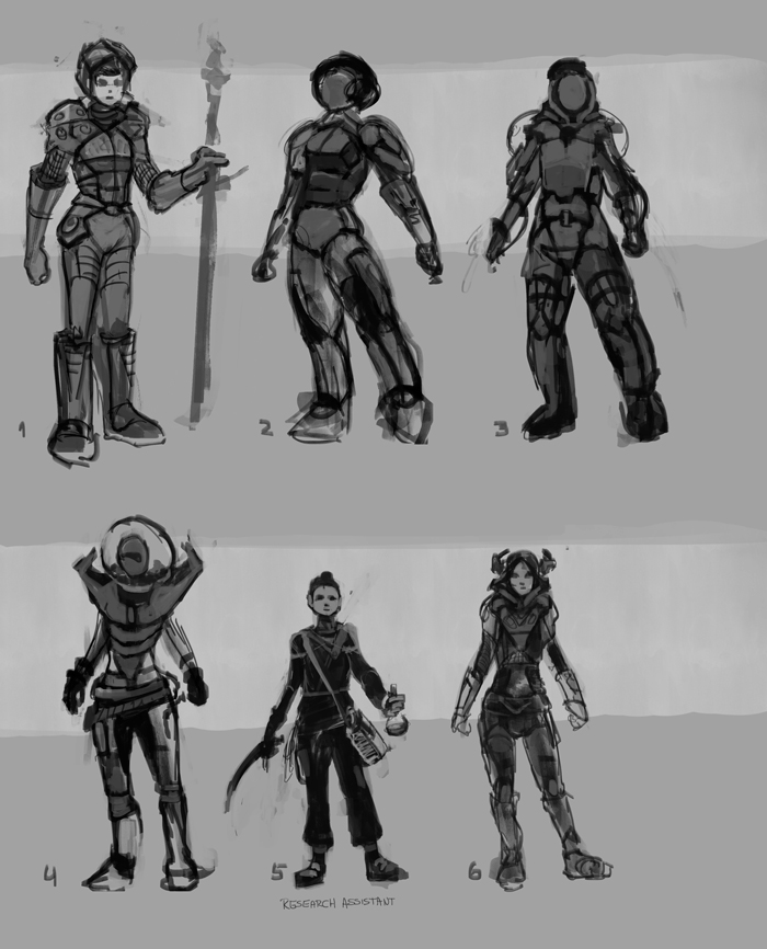
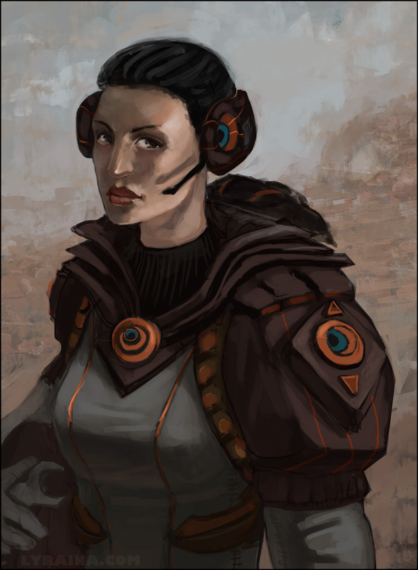
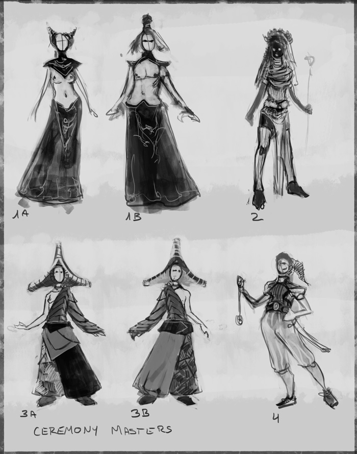
This is very embarassing. But I would love to get better with design in general and also everything hard surface / sci fi, so I need to start somewhere, right? Anyone can tell me what to study to increase the visual library for that? Google searching engine parts or car parts etc is quite overwhelming. And copying other people's designs/paintings feels wrong.


Posts: 133
Threads: 2
Joined: Jan 2013
Reputation:
2
I think those designs are a good start, just i would say they would look better if you stylize the figures, try to make them have 7-8 heads tall and make them thinner legs i know some of the outfits supose to have thick legs but do it with the rest. Use existing concepts as reference you won't necessary rip them off but try to see how they design, see the shapes they use and make it yourself.
Im not so good with sci fi stuff but this is what i do when im gonna design something :0, keep it up!
Posts: 850
Threads: 4
Joined: Mar 2013
Reputation:
21
Thanks Blewzen, good call on making them taller. I'll keep it in mind.
Sketch inspired by Marc Brunet (watched his youtube videos and my mind was blown):

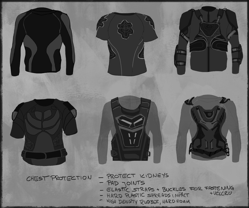
And tried to understand some real life protective gear. I didn't know motorcycle sport gear looks as cool as it does until I googled stuff like "roost guard" XD Now I know.
(Not my designs)

Posts: 850
Threads: 4
Joined: Mar 2013
Reputation:
21
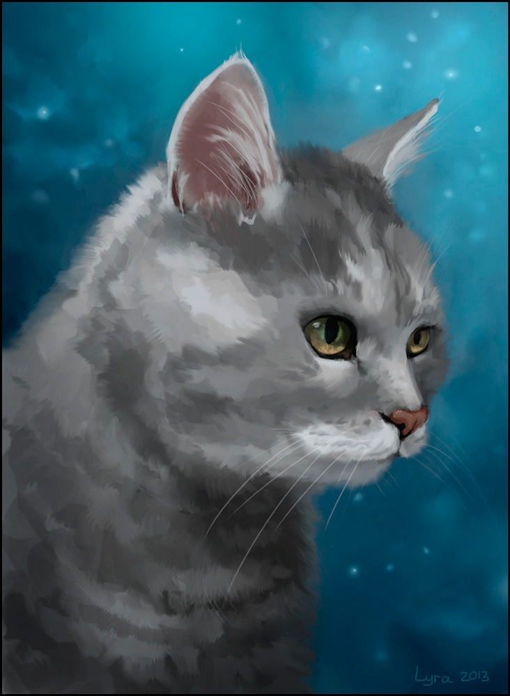
Sadly, this weekend we had to put down our beloved cat, Mia, due to her rapidly declining health. She's been with us for 19 years.

Posts: 848
Threads: 20
Joined: Jan 2012
Reputation:
29
That really sucks Lyra :( My condolences. I hate loosing pets, it sucks so bad. The picture is beautiful :)
For hard surface stuff, I got a book called Mechanika which I copied each step of the drawings in there, then did my own and that seems to have helped a lot. Once you get your head around how to fake machine parts it gets a lot easier.
As for visual library there are only so many things that go into a machine part. There are servo's which are the things that power joints (a google search for servo motor works), pistons which are the muscles of machines basically, and joints (which has the most variety but are still fairly easy to summarise. Thats what I remember, but don't quote me, its been a while since I have looked at hard surface. Nothin but Mech is a good blog to go through for inspiration.
Posts: 850
Threads: 4
Joined: Mar 2013
Reputation:
21
Posts: 60
Threads: 2
Joined: Oct 2013
Reputation:
2
Hi Lyraina. So sorry to hear about your cat. I hope you're feeling better - that's a beautiful portrait of her.
For visual library regarding sci-fi stuff (or for most things in general), what I feel could be useful is to learn about "how things work" (at least, on a very basic level) - that way you can really commit a design language to memory easier. Basically instead of trying to remember exactly what something looks like, you instead remember why something looks like that and what it's being used for.
For example, you can look at a diving suit - you learn, okay, so it needs an oxygen tank (for air), goggles (to see underwater with), flippers (easier to swim), skintight (why? better aerodynamics, maybe?), waterproof material (rubber?), in-built flash lights (for those deep, dark areas?) etc, etc. So when you adapt it to a fictional space suit, maybe you can remember those elements and then apply it to your own design.
Another example - you studied molecular biology, so you can use your understanding of - I don't know (forgive me if I sound like an idiot here) - how cellular structures work and replicate and try to adapt that to a design, perhaps? Like this space suit has a nucleus (acts as a power source?) and a membrane (outer protective layer?) or something, something, something.
I hope that all made sense, sorry if I'm just blabbering. All the best!
Posts: 850
Threads: 4
Joined: Mar 2013
Reputation:
21
Thank you LongJh! That is exactly what I'm trying to do at the moment - there's so much to learn! But I enjoy learning new things. Nice example with the diving suit :)
For some strange reason I really struggle to mix my biology knowledge to my art, not really sure why - maybe because everything is so abstract and I'm in a completely different mindset when working scientifically. But you're right, maybe I should just try to focus on that more. Thanks for all the advice :)
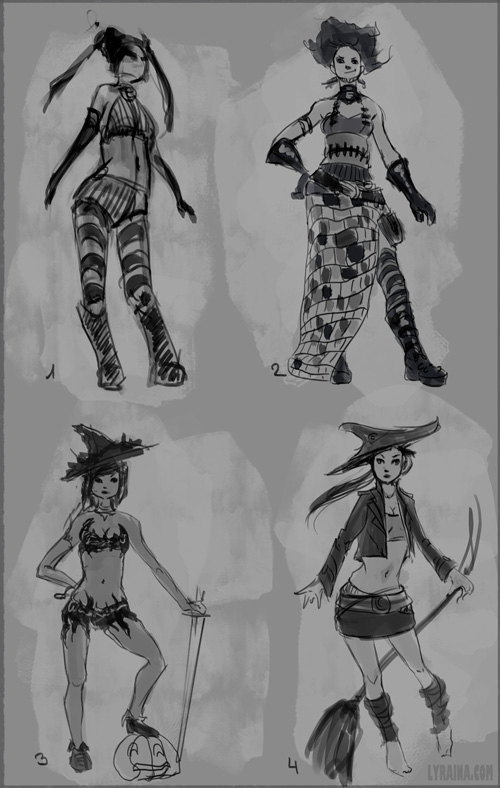
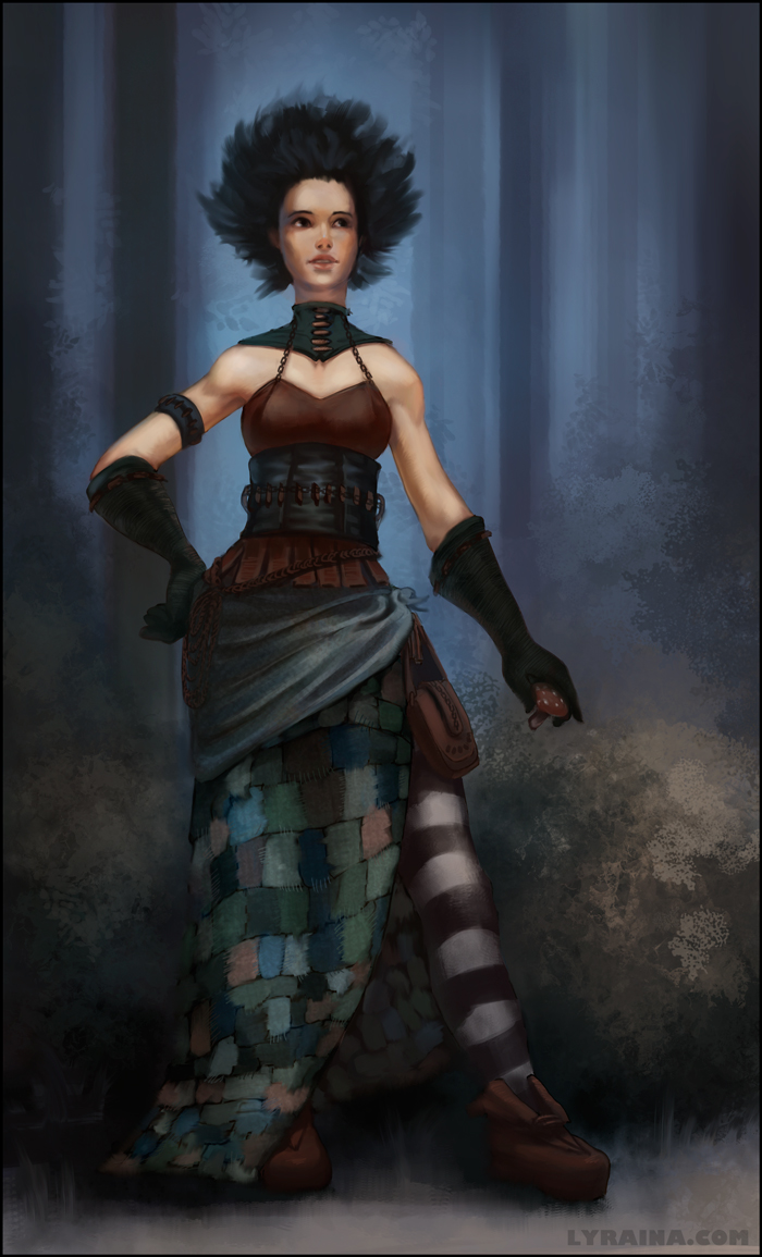
some witches

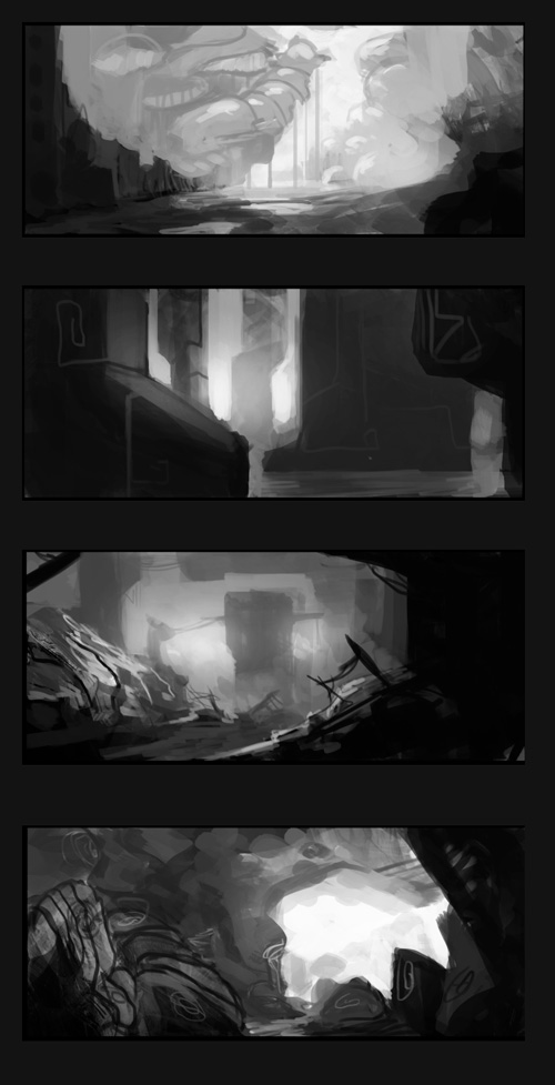
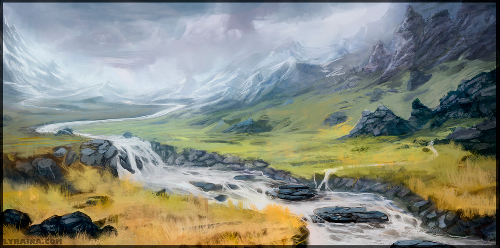
some random

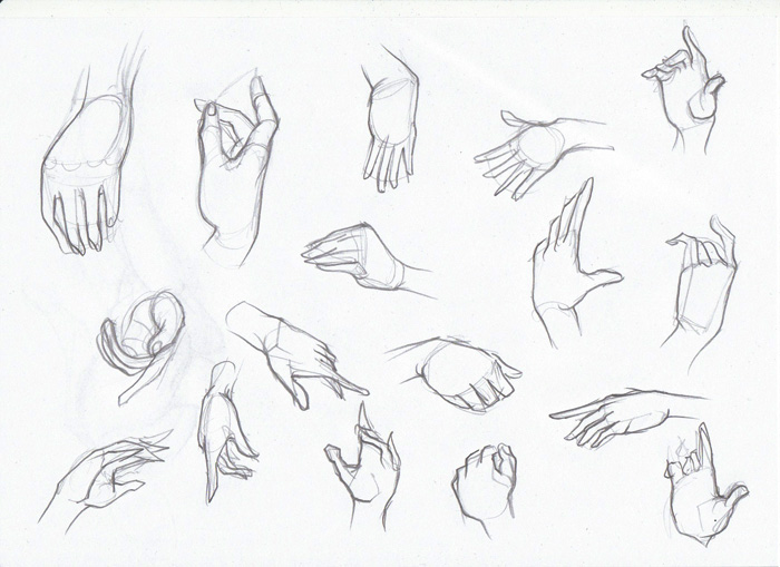
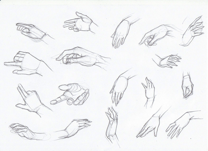
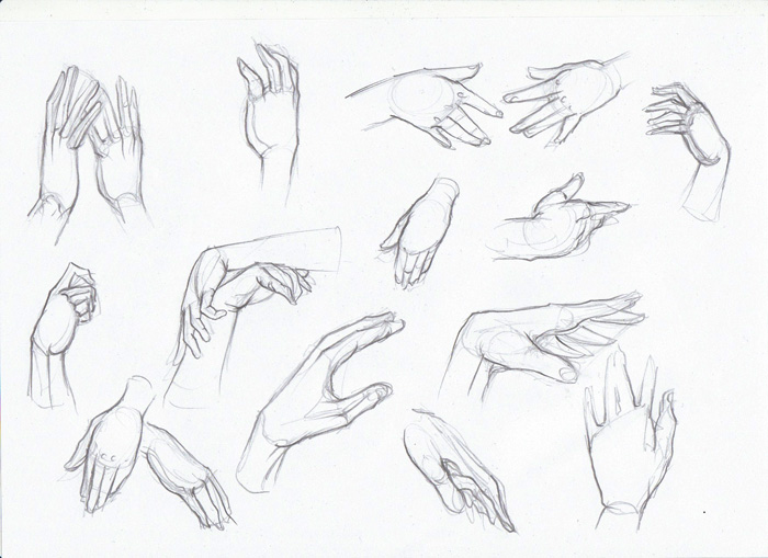
and some hands. I hate hands.


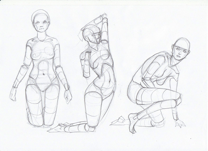
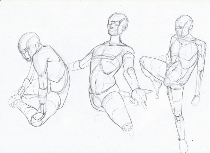
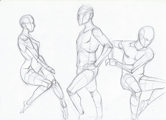
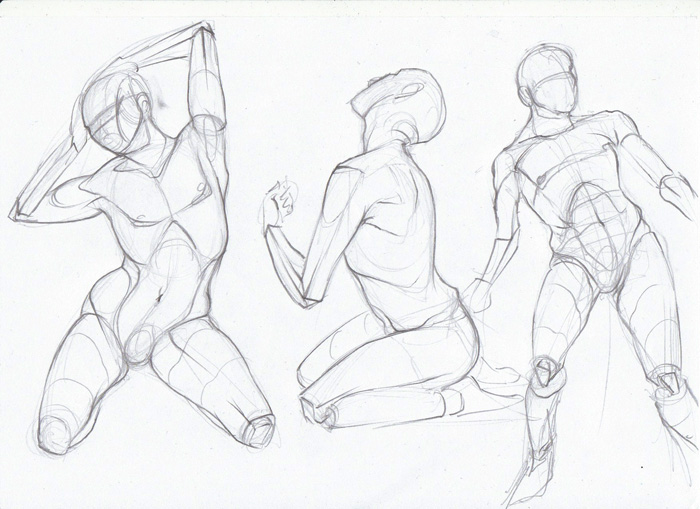
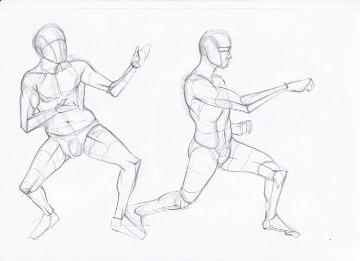
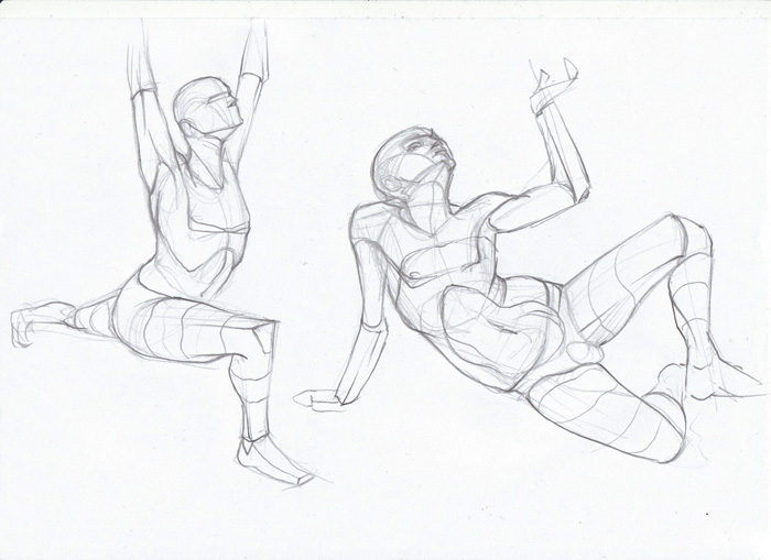
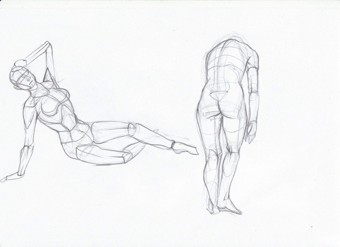
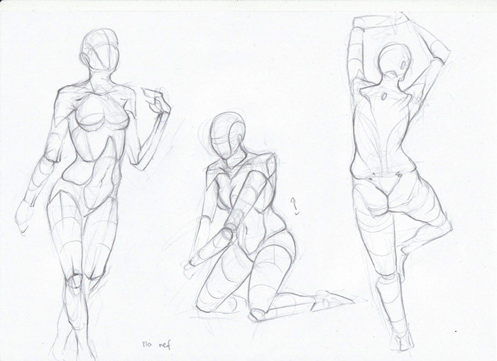
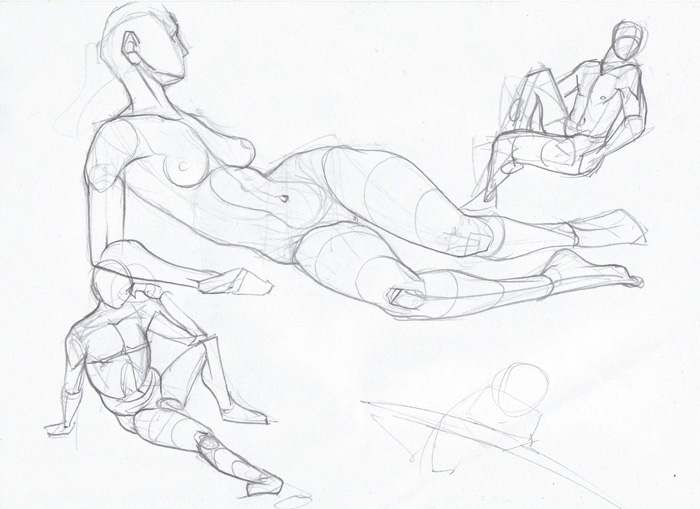
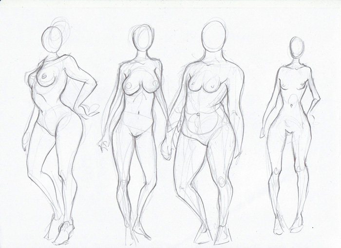
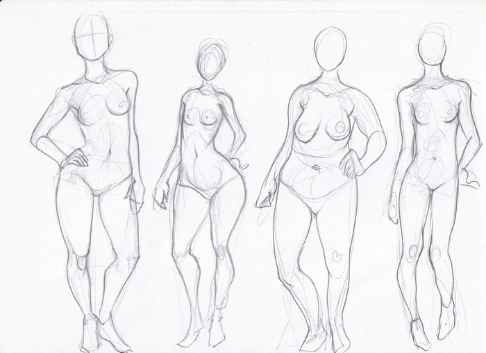
and some not-so-successful body type experiments


Posts: 850
Threads: 4
Joined: Mar 2013
Reputation:
21
I declare this finished ... I always like my thumbnails better than the finished work :( Colors seem to be better in the thumbnail stage, and my rendering always gets blurry at some point..

Posts: 850
Threads: 4
Joined: Mar 2013
Reputation:
21
Wanted to catch up on university stuff today, but then this happened:

|
