12-04-2013, 04:38 AM
That nose!
Very tangible, feels like it's really sitting in 3d space, great job!
Very tangible, feels like it's really sitting in 3d space, great job!
|
Lyraina's sketchbook
|
|
12-04-2013, 04:38 AM
That nose!
Very tangible, feels like it's really sitting in 3d space, great job!
12-05-2013, 06:21 AM
Sula: Thank you <3
Hypnagogic_Haze: Thanks! Lips are fun! DoubleThink: Thank you - I always struggle with noses, so I'm glad you like it ;) This time, no reference. Experimenting.. with things like... brushes... and such D: I'm not neglecting my anatomy and other stuff, I promise! I feel like the colors are lacking something, mostly in my unreferenced portraits.. no matter how fancy the colors, I never really get the translucency of the skin right, looks just dull.. anyone can tell me in which direction I have to go with this? 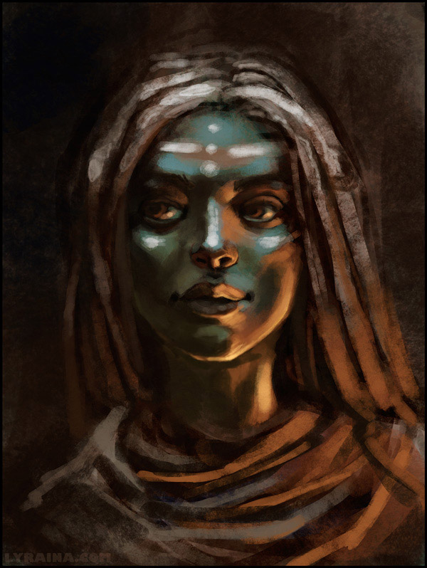 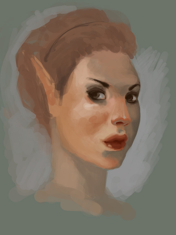 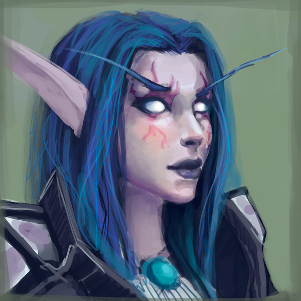
12-05-2013, 09:12 PM
Typically for translucency and subsurface scattering, the shadows will be a bit more saturated and warmer, since light is being passed through the object and bouncing around inside of it before escaping again. So try adding a bit of warmth to your core shadows, and that should help a bit.
12-05-2013, 10:09 PM
MrFrenik: Thanks, I'll give that a try. But what if my light source were warm (evening sun...), would that not make the shadows cool and less saturated?
12-06-2013, 12:31 AM
It's easy to test out for yourself, actually. Hold your hand over a warm light source (fire/lamp/etc) and see what happens to the shadow side of your fingers. You'll notice that they have a reddish hue to the shadow, and that's because you're seeing the warm light bouncing around inside of the flesh.
12-07-2013, 10:04 AM
Thanks MrFrenik. I'll work on it. :)
I felt the sudden urge to paint some arm pits: 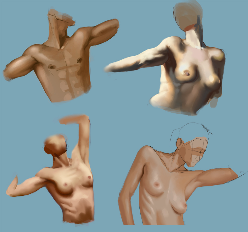
12-08-2013, 01:25 PM
yay anatomy... or yay for what anatomy will do for our work eventually.. not yay anatomy for doing it.. its kind of boring.. Gotta love the pits.
Gurney is your friend for making things look real. If you dont have both his books, you should :P Im gonna go ahead and recommend you do a master study, partly because it will definitely help, and partly because I just did one and it was fresh in my mind as something to suggest. Keep fighting the good fight.
12-09-2013, 05:43 AM
Jaik: I actually enjoy any exercise which gives me an excuse for doing some digital rendering :p Just need to remind myself not to zone out and start copying mindlessly... I own both of Gurney's books, but your mentioning them just reminded me that I wanted to do some studies with them.. thanks! :p
For now, some rusty anatomy with (again) too short legs - I swear, while I draw them they feel like 30% too long. O_o 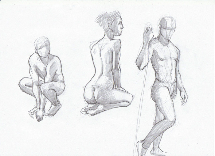 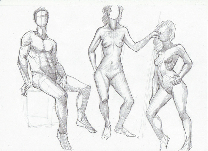 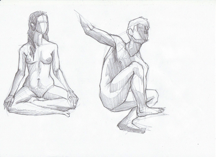 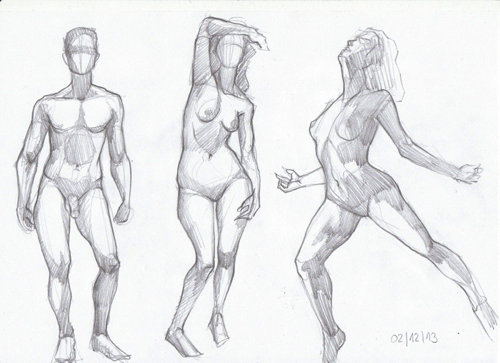 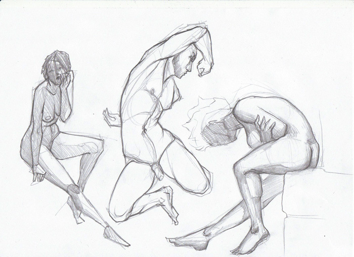 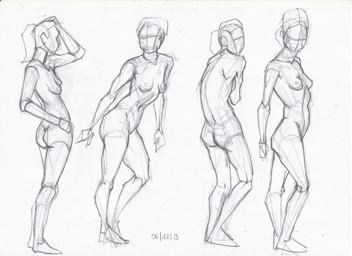 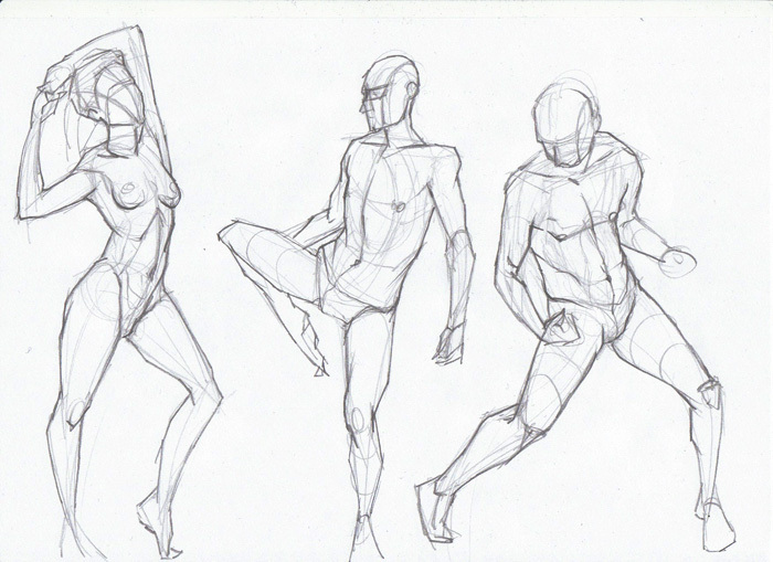 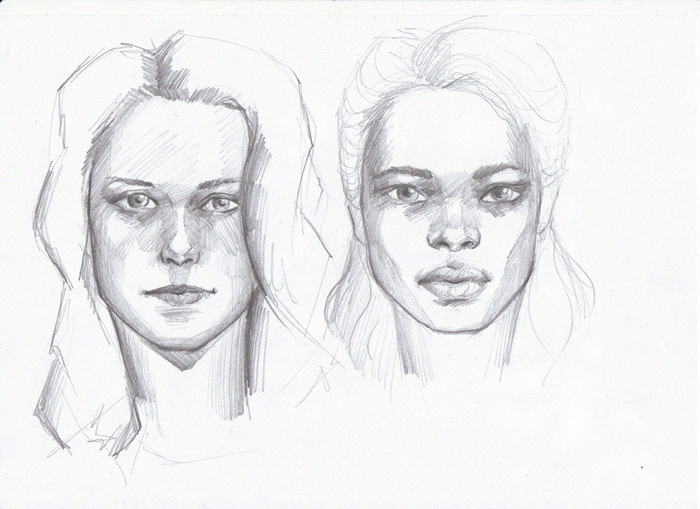
12-09-2013, 05:56 AM
Your "rusty" anatomy is way better than my "over a month of nothing but anatomy", anatomy :*(
12-11-2013, 06:56 AM
Hypnagogic_Haze: Thank you :) And just keep at your anatomy, it's really just all about practice I think!
Portraits again, no reference, trying to apply some things. Also, a not-handsome guy. I should not always neglect painting guys :< 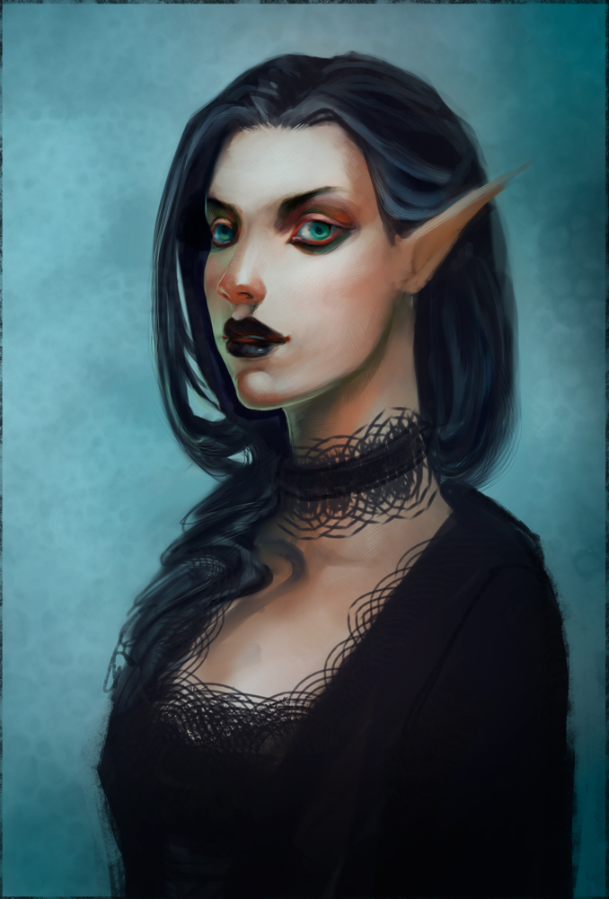 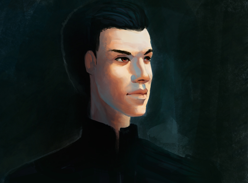
12-11-2013, 09:14 AM
You are right, you females are much better than your males, but I think the males are just a matter of practice.
I did a paintover on the chick of a couple of things I noticed were a little off. I hope it's not too presumptuous. 1. The hairline was a little too close to the eye and the eye was too far to cam right, so I moved it more towards the centre line and rotated it slightly I think. 2. The lighting was a little inconsistent, its the classic sort of portraiture light (no idea what its called, all I know is that my bougarauaurauara study had the same lighting and I jumped at the chance to apply what I learnt even though it wasn't on my own piece lol) So I downplayed the side plane of the forehead, lightened up the side of the nose because it would be facing the camera, added some light on the neck and the crease next to the nose since thats a very small plane change. 3. Applying the anatomy I learnt of the neck, I added a trapezius which was a little too low even for a female and a sternocleidomastoid muscle. I think the neck may still be a bit too long, not sure.. still something I struggle with myself. 4. I changed the make up a little since it made the eye look like it had makeup painted on the eye, because the bottom of the eye would be very subtle since it is in the light. I find it easier to paint no make up because I have no idea how make up works (I'd make a terrible drag queen, even if I do have the legs to pull it off ;) ) I hope this made sense and was beneficial... I may have wasted my time, and missed a tonne of stuff but I enjoyed doing it so.... at least I had fun :D
12-12-2013, 07:40 AM
Thanks so much Jaik. That paintover was an eye-opener and really showed me where I have to focus on (like that temple/forehead probelm I seem to have). I can't believe I didn't see how misplaced that eye was! It's glaring at me now that you showed me. Also, don't worry about the drag queen issue. I'm sure you just have to practice a bit :P Make sure to send me a photo if you do :P
Here's a master study, because Jaik told me to do one. Mostly for edges and skin tones. I might have gotten a bit sloppy around some areas (feet!), but I do feel like I learnt something about color and technique. 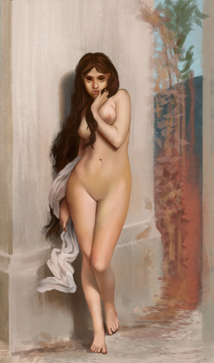
12-13-2013, 08:53 PM
Dissecting Frazetta. This was even more useful than I thought it might be! Observations:
- He is using (very) strong color contrasts in almost every image (green vs. red, blue vs. orange) even if it's not immediately visible - An exception seem to be greens, which he sometimes shifts slightly towards yellow instead of the direct complement to his red (maybe depending on mood of the image or to get a mossier look or warmer red?) - Great effects with limited palette - He's going all the way to black in huge parts of the image, but the lightest areas and strongest contrasts are reserved for the focal points - He is not afraid of using VERY saturated colors. Not sure how he makes his decisions in this regard? - Cluttering tiny pieces of complementary colors besides each other everywhere in the image - Strong use of silhouettes agains background (value difference) - Lower part of figures often melt together with the background (value/hue - often in the shadows) - Contrasting colors of the backgrond are often picked up again in the skin (shadow vs light area), unifying the image 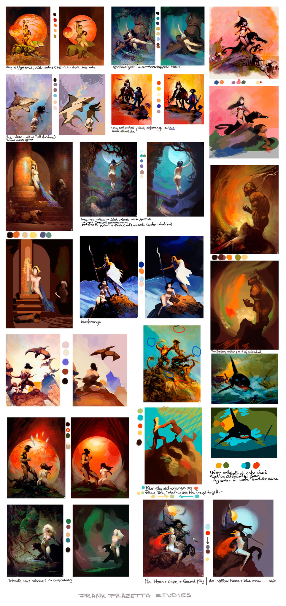
12-15-2013, 08:41 AM
These studies are great. You are really getting a good feel for colours. And its good to see you are applying it as well ;P I really need to do these studies myself. But I struggle to find the time lol. I guess I will get there when I finish anatomy and move on to colour and light lol.
12-16-2013, 03:54 AM
Thanks Jaik! Color is fun ;) And yeah, I try to apply the things (it's not THAT hard in theory), but I never like the results as much as what I see other people do with color theory... must dig deeper it seems.. o_ô
Anyway - Frazetta again: Composition - master study - nude without reference - master study - nude without reference. Done in that order. 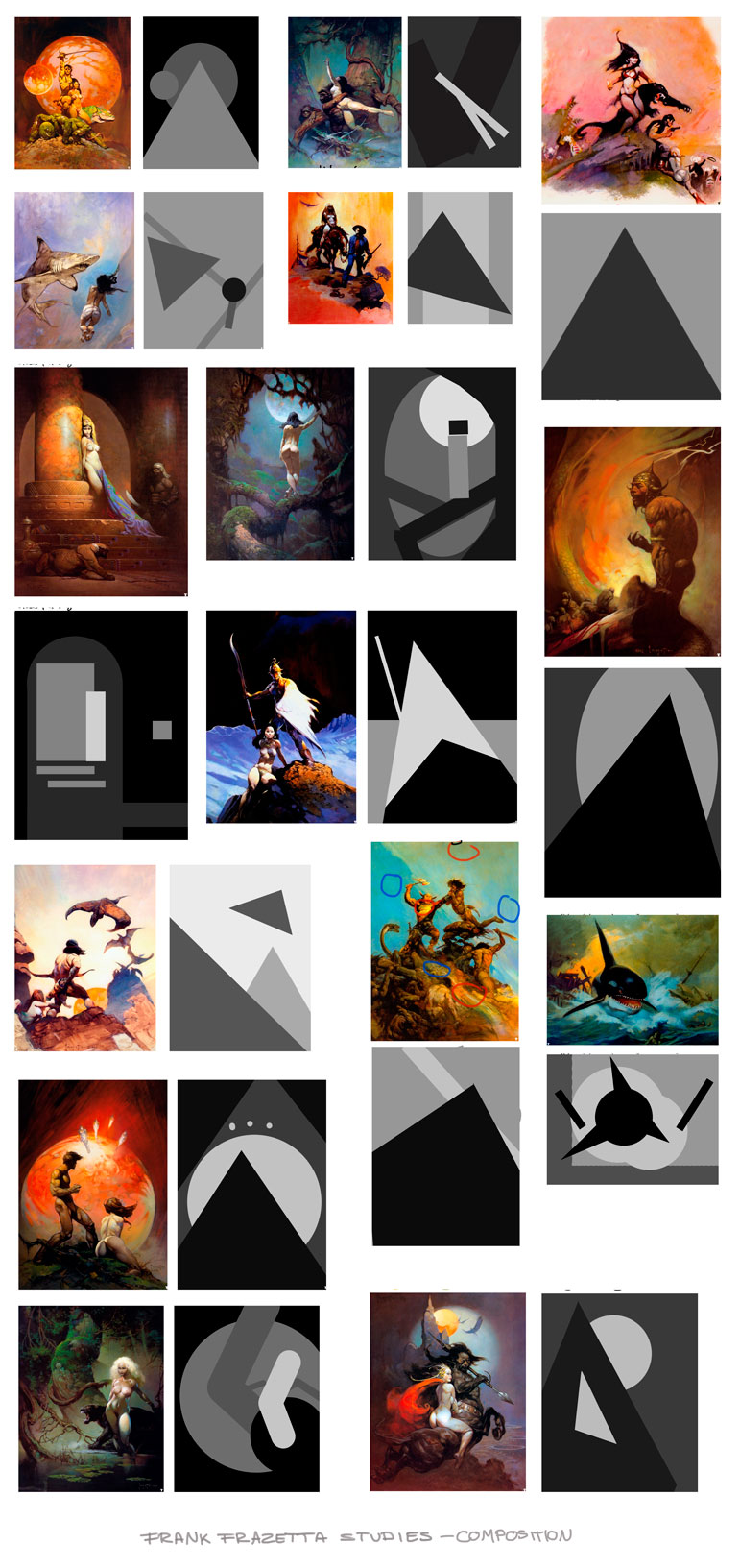 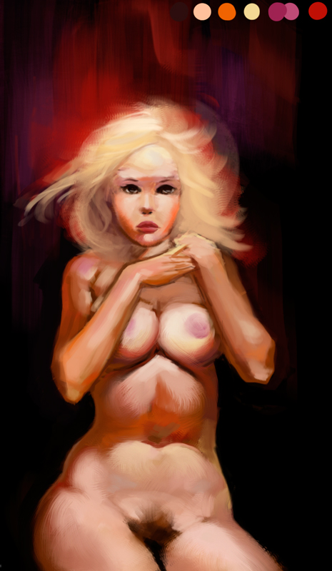 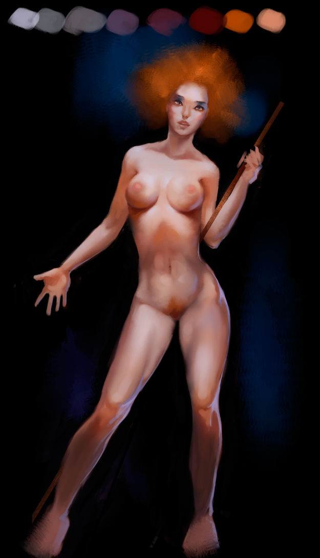 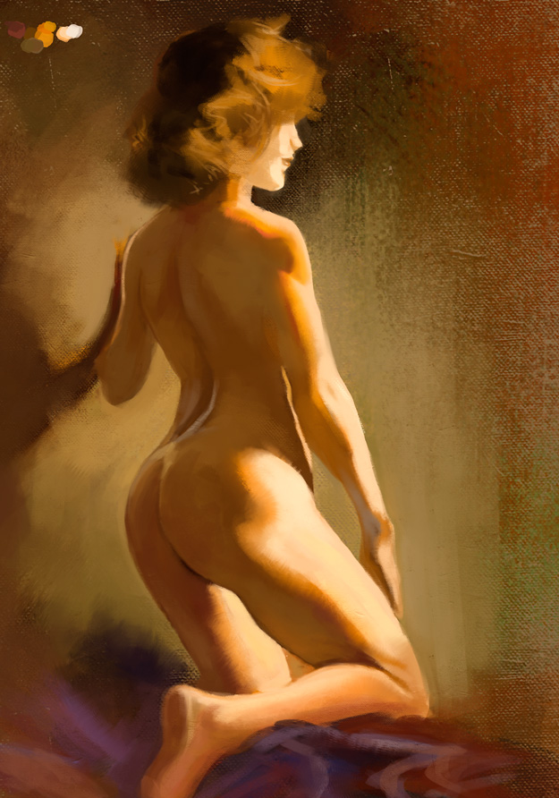 notes: - the brightly lit thigh reflects greyish on the wrist, while the lower arm gets hit by reflection of warmer flesh tones - different angled skin surface gets hit by different colored light (green/background, reddish/skin) - secondary light source (reflection from background) helps describe form on her lower back - be aware of subtle reddish/pink areas (not orange) 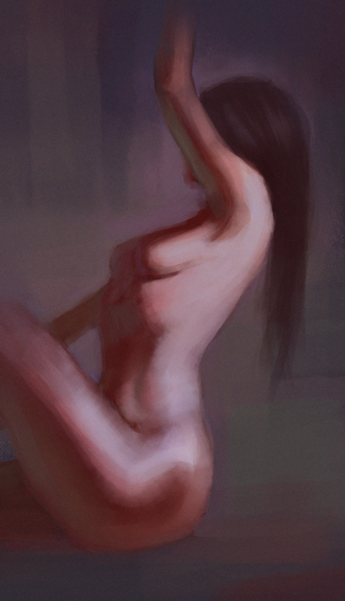
12-16-2013, 05:34 PM
Daaamn. I don't remember seeing your sketchbook before. And I have no idea how I could miss it ;oo. You have some really cool stuff here. I love that you are doing master studies and limited pallette paintings. I bet you've learned a ton doing it. The only piece of advice I can come up with atm. Try to watch out for your edges, sometimes you get to fuzzy or to hard. Keep that in mind next time. And keep up the awesome work. Can't wait for more ;3
12-17-2013, 04:56 PM
GREAT examples of how to go about doing value, color and composition studies!
12-18-2013, 10:07 AM
ramalooke: Thank you! Yeah, edges... maybe I should do some still lifes or something to practice those.
MrFrenik: Thanks! And yes, simplification always helps me learn/understand things better :) Tomorrow is the day...! Another Frazetta 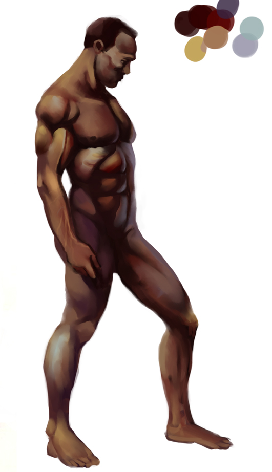
12-18-2013, 10:32 AM
Loving the studies Lyn <3
Don't forget to take away the white background, specially when working with dark tones. It can really messes up our sense of contrast. (loving the figure studies <3 <3)
12-18-2013, 11:20 AM
Wow great studies. Some of these portraits you did are actually really well done. You seem to be more comfortable with women's faces than men's though.
You also have a very good understanding for color so far. I'm gonna wait for some more personal pieces hopefully incorporating the things you learned about composition from frazetta :) Seeya |
|
« Next Oldest | Next Newest »
|