Posts: 905
Threads: 39
Joined: Sep 2013
Reputation:
51
" I love those huge, epic (concept art) pieces, but never seem to be able to replicate it."<---
You don't have enough layers. Layer isn't where things are in space, layer is created by overlaps and crossing paths. I sent you an image via FB attachment. It has at least 5 layers leading you from the bottom left corner to that last snow peak, then the cloudscape beyond. The green hill sides, 2nd image of Post 568, may stretch into distance, but nothing is overlapping. Try modifying that image so each hill overlaps each other, then slap a cheesy cumulus cloud in the sky instead of those wispy, stratospheric feather clouds (forgot its name), and see if that makes some difference.
Your enviro studies often has 2 shapes of something that reaches bottom to top on both sides pinching the image, and that kills sprawling, epic landscap feel, especially if your image is already verticle. If you want epicness, your image need to open up, and viewed from high view point instead of ground level or fish eye.
That said, I am still awed by all the work and study you're doing, as before, and will be so as long as you continue to do art. Whenever I feel lazy I come here and let it be a whip to my lethargic ego.
Posts: 850
Threads: 4
Joined: Mar 2013
Reputation:
21
Suira: Thank you. Glad you like the thumbs, then at least they are worth almost killing myself over them, haha. Thanks for your opinion about the lensflare. I was super insecure about putting it in there or not, 'cause it really is a bit cheesy. But since I'm not often doing stuff where it might fit in at all I just went with it :P
Samszym: Not sure if the Frazetta studies are useful, since I always have trouble applying stuff like that afterwards, but interesting for sure! And I guess as long as I pick up one thing at a time from doing them it's worth it :D Try doing some, it's fun!
meat: Wow, that is one high density of usefulness comment! I looked over my enviros and you're totally right about the top-to-bottom elements - I didn't notice that myself. I think it is my crutch for introducing a close/foreground element, which I feel like I'm supposed to have in every image. I will need to be more deliberate about that.
Overlap... that one hits home! I don't know what it is with me and overlap, but I know that I have that issue with avoiding overlap in figure work, so it only makes sense that it also shows in my environments.
Thank you meat. You're very observant and I appreciate you taking the time to analyze and critique my stuff, especially since those things are so hard to see by yourself... but seeing it is the crucial step to be able to improve.
The image you sent me is epic indeed. So much to see in one image...!
-
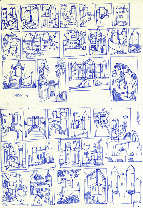
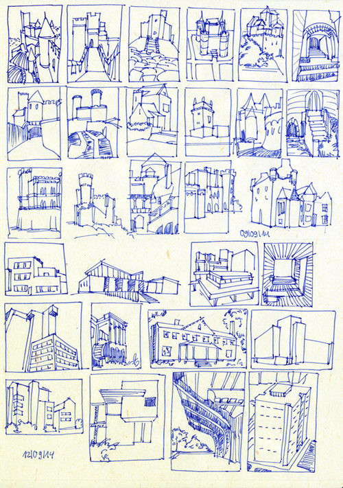
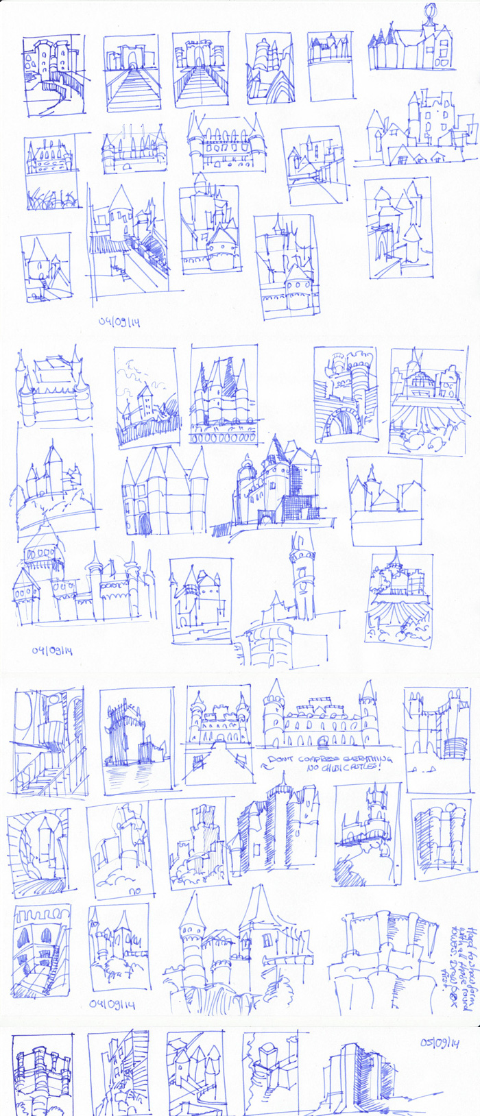
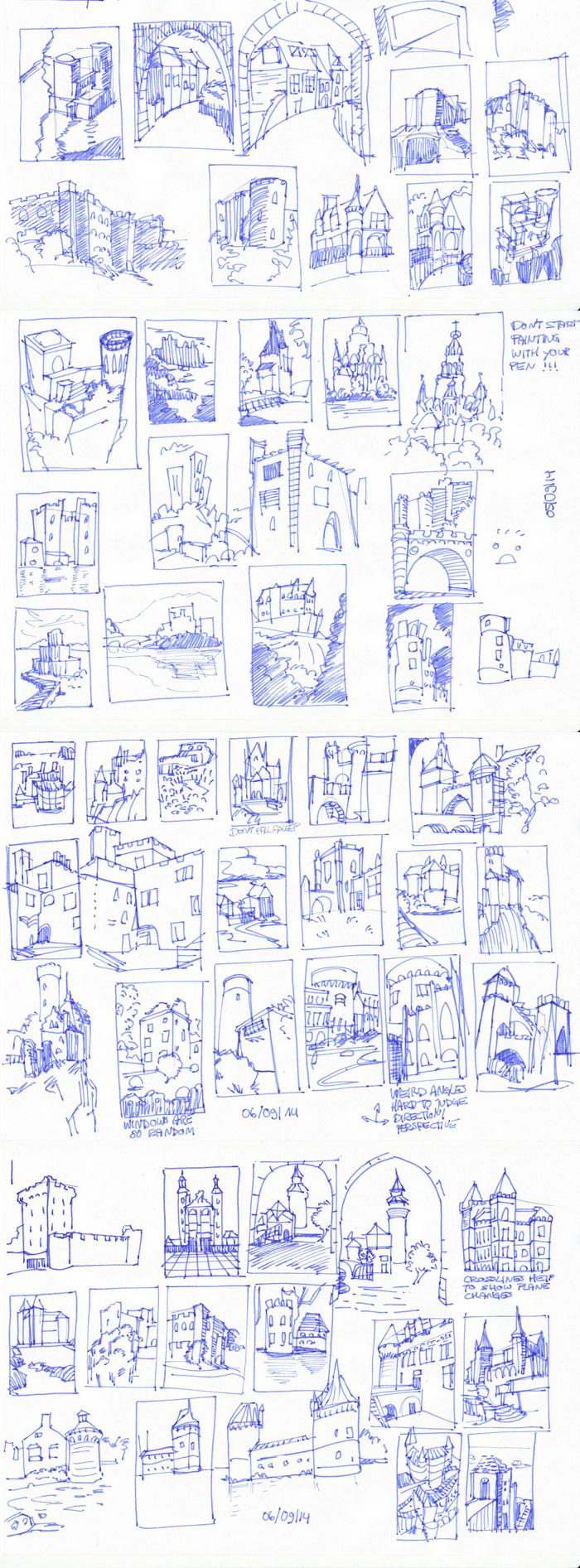
Not much to show right now because I concentrated on stuff I can't show yet, but here's some warmup and related studies. I realized (again) that my drawing skills and perspective knowledge is nonexistent, which is obviously not acceptible, so I will (again) focus on improving this (Thank you Jaik and whoever repeatedly points this out to me, even if I don't want to see it). I'm now doing what I call "architecture gestures" as a warmup (still like 1500 castles in my reference folder to go!). Once I have more time to focus on studies again, these are my plans:
- no digital painting/studies except client work, cgma homework, ChoW, oils or to stay sane
- work through How to Draw (again),
- sketch from life (my paper cube, still lifes and, if I dare to face the outside world maybe.. my neighbourhood or something)
- work through any other book on perspective (ideally one that helps me bridge the gap between theory (which I know) and application (which I fail at))
- ???
- profit
I appreciate any input on these preliminary plans. My problem is that I have always, always, always enjoyed painting and hated drawing. I think this was one of the reasons that made me quit art some years ago, because my drawings were shit and with a bad foundation no paint can save an image. It's not so bad anymore and I can now see how drawing can be enjoyable too (especially when there is no pressure that it must look presentable - and when there is hope that I might, one day, be able to draw things that actually look GOOD!), but I'm still very impatient with myself. My struggle with perspective is kind of linked to that I think, since it is all about lines pointing in different directions instead of just indicating volumes and pushing around paint. Or maybe I'm making that part up because I don't want to recognize that it's just one of those things I'm not smart enough to grasp quickly.
/End of wall of text ... what a post to start a new page D:
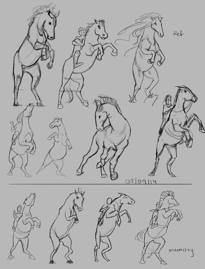
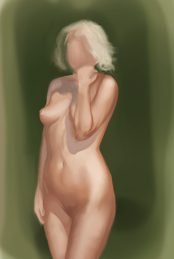
Also, this. Some weeks old, forgot about it. But can't not post some fun skin study right?
Posts: 448
Threads: 1
Joined: Feb 2013
Reputation:
6
The skin color is really good, kinda wishing it had some greyish yellows in some areas, but overall it's really good!
Fuck 1500 castles? Links please!
My tip for that plan is something I am realizing right now as I am studying too, tackle them once at a time until you're comfortable with the subject and you can add to your daily repertoire (I think I started on thumbnails, then caricature faces, and I'll probably lessen enviros next week and start armor/cloth studies).
About drawing much of it is about being confident, I can see sometimes that you have flashes of it, like the 3rd horse on the top row, seems like you just went with it and it came out solid. The others it seems you're kinda not sure how to proceed so the lines come out a bit messy. Try to make longer lines and don't get too attached on the little curves and bumps of the object, might be hard at the beggining but it'll help. :)
Posts: 198
Threads: 2
Joined: May 2013
Reputation:
5
Hey Lyra! First of all, woah with the architecture gestures, that's a fuckton of them and it's actually a pretty great idea to get a grasp on what main shapes work or conveym never thought of that, I guess I'll have to tackle that when I eventually find myself in the position of doing enviros xD And I agree with rafa 1500 castles? WTF!??
Ok, some advice for the draw thingie:
I'm not good at drawing but I have more experience with it than painting so my recipe would consist of basically combining three approaches:
a) Boring times: Basically do a basic structural decomposing of major shapes + joints on whatever you wanna draw ( needs to be organic ) take your time in grasping its proportion and try to store as much info on what makes that thing work visually and be appealing to you. Even if it's a subjective you're already comfortable with ,like human figure, it's good to take a good 45 mins+ 1 hour and something to really fill in new info that you might have disregarded in the past.
b) Fun Times: After having done a substantial amount of the previous kinds of drawings ( 5 to 10 per subject) go crazy and do gestures from mind of diferent angles and shapes and poses and whatever you want, make it simple , trying to focus on the basic shapes and joints you studied that made the thing work in the first place. You'll fin that at this stage there are tons of failures and a few good results. After you're done, try to find out why the ones that worked did : was it line confidence ? was it some basic shape you envisioned that resonated better? whatever that is, engrain it into your brain.
c) Annoying times: This is the final stage, in which you have studied enough as to be confident with your lines and you do the opposite from the fun times exercise. You take reference, and draw it with as little construction as possible ( you try and do the construction in your brain for the most part) and put the lines that really matter, trying to avoid petty detailing until the very end. Being really mindfull of what you put down on paper will slow you down as fuck, it will feel incredibly tedious and slow, and it will piss you off to no end having done all of those studies before just to feel so limited in the "end game" type of exercise. Drawings in this stage will take almost as lob as the ones from Boring Times, yet the results are likely to be far more dynamic and will feel as if you did them in 20 minutes, when you actually took probably three times as much.
If you follow trough with this whole thing, you'll start to see a major boost in line quality and confidence for your lines and your stuff from imagination relating to the subject won't be as hard to tackle or correct while working at it. Granted, it's a pain in the ass, but I found this trinity of exercises to be the most usefull to actually translate knowledge to your overall understanding. Hope that helps.
For Perspective:
- Since you say you're familiar with perspective theory I have a very simple advise on this one. Draw cubes, mostly without reference and draw-trough, meaning that you will draw transparent cubes so to speak. try to come up with fun comps overlapping them and shit. And always check your vanishing points. It's pretty much like figure drawing, after doing some pages you start to realise what your tendencies are ( I do heads to large or my back of the cube lines are always kinda skewed), once you know which ones these are you'll be able to fix them quicker. I diged a couple of pages I did for linear perspective at TAD.
The first was at the very begining where I had no methog to build cubes and shit and I was looking for a way to build them:
![[Image: FernandoSuiraCubesTurnaround.jpg]](http://i267.photobucket.com/albums/ii308/Suira/FernandoSuiraCubesTurnaround.jpg)
And the second one when I was more comfortable and jumped into the composing stage:
![[Image: FernandoSuira_FRM_A02_A.jpg]](http://i267.photobucket.com/albums/ii308/Suira/FernandoSuira_FRM_A02_A.jpg)
I'd say that for cubes it's better to avoid reference most of the time, since you can check your vanishing points without reference and still know if it's accurate or not.
Well that was a long ass post, I basically think that these two things will help you with what you're struggling right now, give it a try and see if it works for you, cause it did for me and I'm borderline retarded for these things xD
Posts: 848
Threads: 20
Joined: Jan 2012
Reputation:
29
Hey, thats a great idea with the architecture gestures, will really help to build a visual library. Not sure how much it will help you on getting from theory to application though.
My advice is to follow what Suira said, but also build things out of blocks in perspective, start with a cube, add a cube sticking out the side, cut a cylinder in on another side, poke out pyramid, chamfer an edge and just do that over and over. The good thing is that after a while they don't require much thought, so you can doodle while listening to lectures or other things. Just a suggestion but yeah, definitely keep up the good work - really loved the last post.
Posts: 362
Threads: 10
Joined: Mar 2012
Reputation:
21
I totally love what you wrote about drawing and painting. I hate drawing myself and it is good to know that you a) can get as good as you with still hating drawing and b) that there might be a chance i enjoy drawing too some time in the future.
Cheers and all the good for your wrist!!!
Posts: 850
Threads: 4
Joined: Mar 2013
Reputation:
21
Ah man, I love you guys <3 Thanks for always helping me out when I have a question.
rafa: Now that you mention it, I wish there were some yellows, too, haha. Castles? Pinterest man! Gotta love pinterest. It's basically other people spending their time to collect and sort reference for you. Quality isn't the best but for just getting an overview or inspiration it is perfect. Don't remember where I got mine, but try this board or this or this... or just choose your own. Not sure when they'll fix downloadmyboard.com, it still works for me since I run it on an old Safari instead of my Firefox... but there might be a workaround on their facebook site or somewhere... don't know. Since a few weeks you need an account though to see everything.
You're right about the confidence thing, I think I really just need more mileage and more courage to just go with it. I'll make sure to focus on not too many areas at once, that's why I want to kick out as much of the digital stuff as possible when focusing on drawing. Thanks man! Will send you a message on the cgma course on Wednesday night.
Suira: Haha it looks more than it actually is, because they are so small and quick (although I probably will need to do some slower ones soon), if I'm concentrated. See above for the castle thing :P I'm a reference-hoarder xP
Thanks for all the advice on drawing. I'll make sure to implement it, even if I'll probably not scan pages of cubes and stuff :P A promise of good line quality and drawing fundamentals will get me to do almost anything no matter how boring or anoying, haha :) Thank you!
Jaik: With those "gestures" I'm hoping to get a bit familiar with basic structures and stuff, kind of brute force method since everything else failed for me so far. Kind of like I now feel more familiar with some curves of the human body, just because I drew them a ton of times. Not sure if it will work but if not, I'll take the visual library experience as well :) Thanks!
Wolkenfels: Well, at least we're not alone then, right? I always feel like an oddball for having trouble and anxiety with/of drawing, since it seems to be what everyone else enjoys most/a lot. I think for the likes of us, who are not naturally drawn(!) to drawing, enjoyment will just increase with skill and confidence. Because IF I manage to draw something I like or I like better than what I did before, or for once nail anatomy in a gesture or something like that, it feels awesome :) Just need to increase that from 'lucky accident' to a higher success rate. Or at least that is what I am hoping for. Wrist is already a lot better, thank you :) I think the problem was really just my posture and weirdly enough my mouse. I switched to a bigger mouse now and sit on a cushion (which isn't very comfortable though) and it helped a lot. I hope it stays that way.
--
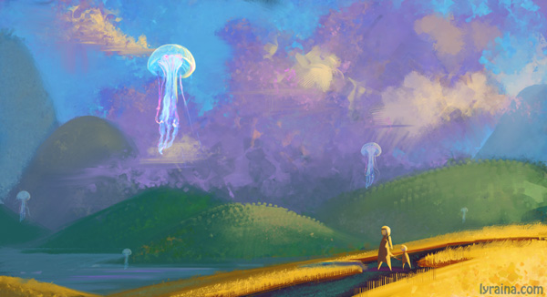
Ok. New attempt at that hill scene I hated last week. Going all in this time, less planning, les thinking, more gut feeling. Does this count as more overlap? *pleading look at meat* A lot happier with the colors this time, if nothing else. Although all this pastel colors make me want to go back to something with a lot of black and red before I start vomiting rainbows... I like those colorful pieces, but I get rid of looking at them extremely fast.
Oh, also, now with 100% more floating objects thanks to feedback from my instructor!

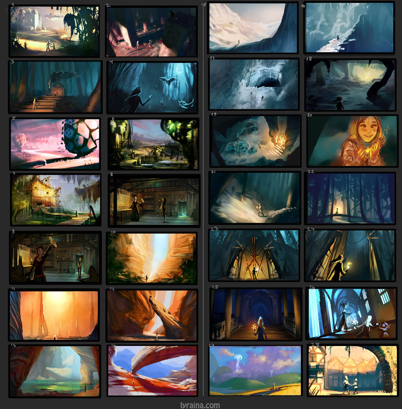
I promised you saturation, right? Don't say I didn't warn you. Starting to finish thumbnails from the last weeks. I'm a bit confused as to what I'm supposed to do, technique and level of finish wise... I don't even know what I want anymore. So I went default mode and just painted a bit.

Obligatory castles.

Also, sorry for spamming you so much with the same thumbnails all the time. I would appreciate if you could tell me which are your favourites, or which you would like to see finished, judging "visual impact" and also storytelling. Or whatever else is important for you in an image. I've made my own "hitlist" but would like to see if it is similar to how others view them. Thank you :)

Posts: 470
Threads: 3
Joined: Dec 2013
Reputation:
9
Hey there, been stalking your sketcbook inside out every time i see it, can't help it since it's very inspiring to see how much work you put into stuff, just keep going like this ! : )
As for your last question, honestly, i wanna see every one of your thumbnails finished xD
But my favs for now would be number 1, 2 and 16.. overall, finish up the ones that you'll have the most fun with : D
Posts: 198
Threads: 2
Joined: May 2013
Reputation:
5
My favorites: 7 , 8, 19 , 16 and 18. Colors , values, and nice story-telling potential :)
Lol with the saturation piece! You did warn us indeed xD Still I think it's not bad, since you focused it fairly decently, it's not like it's all over the place so it works. My main issue with tha piece is more the perspective rather than the saturation. The horizon line is kinda tilted, yet the character is looking like the horizon line isn't , that discrepancy kinda makes me feel weird about it. Tons of work, and good work at that, keep it up Lyra!
On a sidenote: we have encountered a black hole in the time space continuum, we need that quantum capacitator ready for monday! xD
Posts: 362
Threads: 10
Joined: Mar 2012
Reputation:
21
my favorite is 9 because of the storytelling. and awesome post. I really dig your architecture thumbs - i bet that is a great way to get a good visual library about castles.
Posts: 448
Threads: 1
Joined: Feb 2013
Reputation:
6
Thanks for the links! I don't even know which one to pick from your thumbnails, there are so many good ones.... you're in trouble, lol.
Love the saturation on the second, the first one might be missing a bit of value depth on the farthest mountains?
Posts: 905
Threads: 39
Joined: Sep 2013
Reputation:
51
23: Because the pastel color combo in that thumb actually feels harmonious but not lame. Plus floating jelly fish.
16 or 17: Because I'm biased towards cold snow scape, and the implied mystery and death in those.
That's a lot of castle studies - impressive! Is that the one you live in with beer fountain and all?
Posts: 206
Threads: 5
Joined: Aug 2014
Reputation:
1
2 ,8 ,19 ,21 ,24
But honestly they're all awesome. Just that in their own different way.
Posts: 556
Threads: 5
Joined: Dec 2012
Reputation:
8
Whoa, what is all this? Haha. Dear god, these are some amazing environments you've got going on.
13, 14, 12, 48 and 3 are my favorites. All of them are really solid and awsome. Honestly, you could just take any one of them and make it into something great.
Thank you as well for that link. Can't wait to see how some of these pieces turn out. :]
Posts: 850
Threads: 4
Joined: Mar 2013
Reputation:
21
ShinOkami: Hi! Glad you find my SB inspiring :D
Suira: Woah, good catch on the perspective. I don't even remember why I thought it's a good idea to make a canyon piece of all things with an tilted horizon. Adjusted the figure now though!
Also, quantum capacitator? I'm no physicist man! Plus you didn't even come get your youth potion, so...
Wolkenfels: Thank you! Glad you like the castles!
rafa: Meh, values again, and I've checked so often. You're right though, I pushed them back a bit. Thanks!
meat: Jellyfish are awesome! And yeah, all those castles are just 2 minutes walking time withing my personal beer fountain. Also don't forget the rivers milk and the pools of molten chocolate I'm bathing in daily. I didn't paint those yet though.
Adrian: Thank you!
Archreux: Thanks a lot :)
--
Another wip. Struggled a lot more than I'd like to admit to get to that point. Can only get better now I hope.

A (for me) weird kind of thing. Trying to explore how stuff actually works and use my brain for more than just shape creation. A bit lost how to proceed - I kind of wanted a sketchy approach for the life cycle, but having trouble to show what's going on without rendering/color. (Leaves are green outside, violet inside). Maybe I need to improve on the sketching side before this actually works like intended.

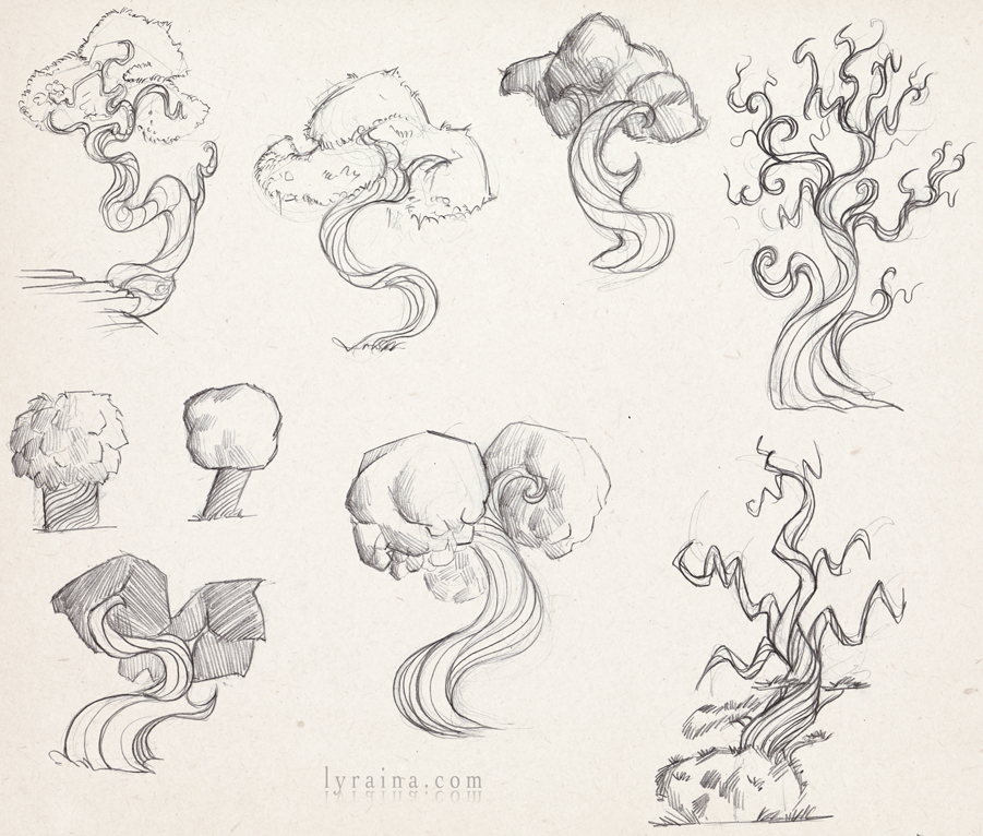
photo study. yay pencil! Trying to get to the essence of what made these trees special.

Posts: 903
Threads: 54
Joined: Feb 2012
Reputation:
18
Sweet castle thumbs, they capture all the essential stuff well in a simple way. And hey now, we all love saturation! And when there are places in the real world that exist like this it's not too fantastical really :) As a crit to the jellyfish piece, those values behind that yellow foreground look a bit muddied to me. I feel like everything in the mid and background are very similar in value, so it flattens it a bit. Maybe a lighter sky or darkening those mid ground hills would be my suggestion.
Woo you ninja posted before I was going to post :) Love the shape language on the tree.
Posts: 345
Threads: 4
Joined: Jun 2013
Reputation:
2
Woah, tons of improvement! Your colours & sense of shape language has improved a hellalot! Interesting compositions going on here.. Now after all the WIP's show us something polished & developed!! :)
Posts: 198
Threads: 2
Joined: May 2013
Reputation:
5
COol update Lyra, nice to see you tackle vegetation.
On the thumbnail wip I like it, but I have a suggestion, the figure seems particularly weak, in comparison to the rest of the environment. Maybe making a bold move and putting it in the foreground using and atmospheric perspective would increase the impact of the image. I don't know if this is what happens to you, but it did to me in the past when tackling enviros:
I was so concerned of following a correct perspective that it governed my picture making, in the end perspective is nothing but a guideline to avoid critical flaws, and should be used like a tool, not like a dogma, remember those asian people using nothing but atmospheric perspective ( overlapping basically) being able to pull off amazing pieces with little effort and massive simplification. Just give it a try, a figure cut from the middle in a stronger siluohette would sky rocket the piece to the next level in my humble opinion. Whatever you decide you already put together a quite awesome piece :)
On the pencil studies I think you're conveying the shapes and their nature pretty nicely and simply, so good job!
Ohh yeah before I forget: physics / chemistry / biomolecular / eingeneering / rocket science NO MATTER it's all SCIENCE!!! So it must be all the same! xD Now, I'll be waiting my shipments of the quantum capacitator AND my eternal youth potion for monday!!! If you don't know how to do the quantum capacitator just read a book and get it done, you math nerds need to learn to bend to arbitrary requests! hahaha ;)
Posts: 905
Threads: 39
Joined: Sep 2013
Reputation:
51
If you want to show the inside = violet without coloring your life cycle sketch, just take a leaf away in your full render sketch so we see the inside. Or render a single leaf on the side showing the underside.
Nice pencil sketches..... *runs back to desk and sketch furiously*
Posts: 850
Threads: 4
Joined: Mar 2013
Reputation:
21
pnate: Thank you. I have yet to visit a canyon like that, I think I've never seen one... with those smooth wave like stones at least (I know cliff-like stuff). Do they really look like that? I've always assumed lots of those colors are just pushed in photoshop...
Kaffer: Thank you! Yep, working on something finished next :)
Suira: I'll try out making the figure bigger. Not sure how it will work out though since it is kind of a top-down shot... but I'll see! Thanks :) Me and math, haha, if only you knew.. I'll ship out the potion once the 7-figure payment arrives in my bank account :)
meat: That sounds like a good idea, will try it! Thank you. Yes, you go and sketch, I want to see an update! :)
Mini update. This time, the ChoW design isn't coming as easily. I'm not sure what to think about the premature appearance of halloween costumes. If I had painted some more I'd probably started adding pumpkins next..


I'm getting the impression those ChoWs are all some kind of wannabe/idealized/upgraded versions of myself...
|


![[Image: FernandoSuiraCubesTurnaround.jpg]](http://i267.photobucket.com/albums/ii308/Suira/FernandoSuiraCubesTurnaround.jpg)
![[Image: FernandoSuira_FRM_A02_A.jpg]](http://i267.photobucket.com/albums/ii308/Suira/FernandoSuira_FRM_A02_A.jpg)
