Posts: 206
Threads: 5
Joined: Aug 2014
Reputation:
1
Hey .... nothin wrong about that! Who doesn't wanna be a wizzard irl ?! Like come on !
"I'm a wizard, bitch!"
Forgot to mention in my previous post what I based my picks on. It was 50% the POVs that did it for me. Usually those kind of angles have a very nice storytelling feeling. At least for my personal taste. But again ... they all have the storytelling part just that in a different way.
Posts: 198
Threads: 2
Joined: May 2013
Reputation:
5
Halloween time! You're eager to get to oct. 31st, I can tell, but I didn't know they celebrated it in Germany! As far as I know they celebrate oktoberfest or better known as "getting wasted on good beer and bellyfull of sausage and pretzels time" xD
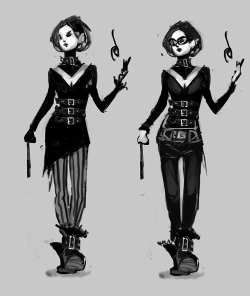
Top right would be my pick as of now. But I still feel these deisgn belong more to a fantasy setting than a contemporary character. Maybe you're going for a goth kinda chick or something, but when mixing stuff like wizardry with 21st century you gotta be carefull for it to not feel out of place, and a dangeours area to play with is fantasy-ish looks. It still is just my opinion, I mean, if you feel like doing it just do it, it's a contest for fun so who cares, but just my two cents.
Also seriusly diggin the architecture studies, that's gonna pay off big time in the long run so keep it up!
Posts: 850
Threads: 4
Joined: Mar 2013
Reputation:
21
Adrian: Thank you! That's really good to know, since I was trying to make the camera angle work for the storytelling. Glad it worked out :)
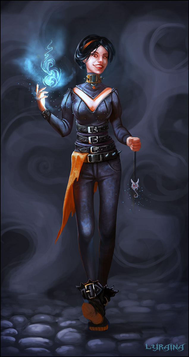
Suira: Yeah, that is a good point. I was thinking about it while doing those, but then again, since most of those designs are inspired by clothes I owned at some point in my life it can't be too medieval right? :P I definitely had goth in mind, but don't want to do leather this time, nor make it too cliché-goth. I also don't really want to go down the "hip urban chick plus magic" road because I imagine her wearing clothes that you can find in stores in 2014, but still stand out as weird/her personal style (also everybody else is doing that :P). I think I am missing some strictly modern accesoirs though, like a watch, or (sun)glasses or a phone or modern trousers or... something. Can't think of something that fits though...
Well yeah, Oktoberfest, but that's more of a local thing and you can drink beer or go in a beer garden all season :P Wouldn't say we "celebrate" it, it's just commercialized like everything else. But I just like the night, spiders, black magic, pumpkin stuff <3
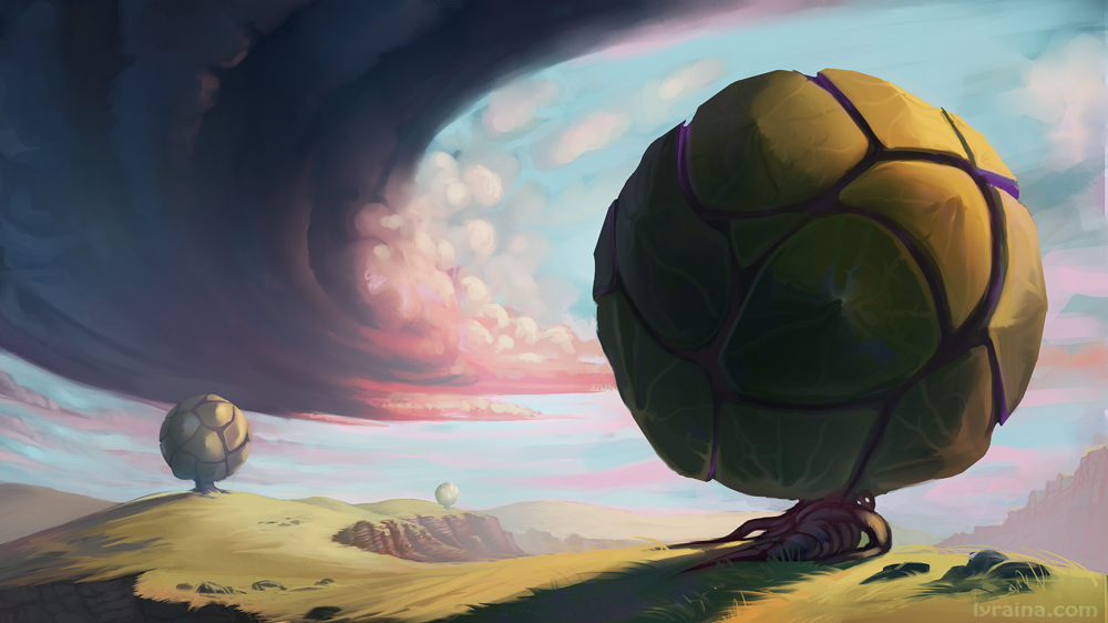
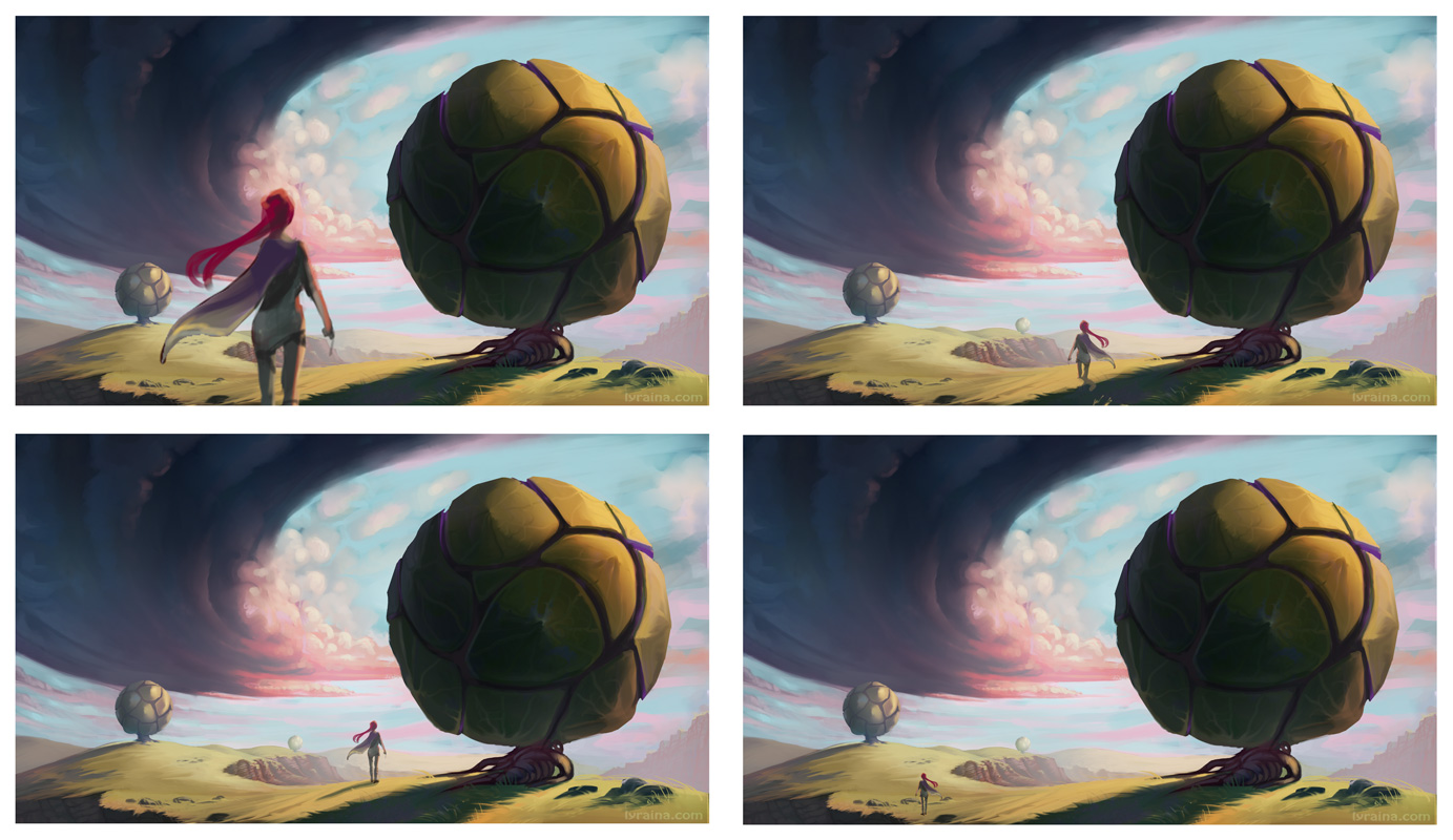
Almost done I think? At least I don't want to look at it anymore :P Having some trouble with placing the figure though, whatever I do looks wrong or out of place... help?
New chow attempt, but I really can't think of things to add to keep the style, yet push the 'modern' aspect...
Posts: 448
Threads: 1
Joined: Feb 2013
Reputation:
6
That tree piece is dope, just a nitpick maybe I'd go for more of a orangeish cloud instead of red.
For the figure it's a question of what is the focus of the painting, if you want it to be a woman gazing at this wonderfull landscape, add it to the foreground. But IMO it'd be better to let the focus be on the landscape and do something like #2 (top right) just to set the scale of the trees.
I'm liking the CHOW piece too, #1 is showing promise, maybe add a "back skirt" (google lina dota 2 on bing).
Posts: 227
Threads: 1
Joined: Jan 2014
Reputation:
5
I really like the forms in that tree piece, the colours are also very pleasing. I agree with rafa on what he said about placing the figure actually, and I'd also go for something like #2
I'm really digging the second design for the CHOW piece. I think the glasses could very well place a bit a modern accent on the design, depending on what kind of final design you go for, maybe colored glass here (depending on your final colour plans for the image of course), or some neon colours for accents maybe? I think, what also would push the modern aspect is the use of material as well. So you could maybe try to pay attention when you render the final image to let some of the belts or fabrics look like a more modern fabric, like Nylon for example, like here. Personally, I really like the design already as it is, because for me it just has the right amount of detail, so I'd try to push the modern aspect when rendering and finalizing.
Any way you decide to work on this, very curious on how it will look finished! (:
All your other studies, especially those little architecture studies on the other page are also looking very good and are very inspiring to see <3
Posts: 241
Threads: 3
Joined: Jan 2013
Reputation:
3
Looking forward to seeing how your Chow turns out this week. Seems you're the only one doing a female wizard (is there a difference between a female wizard and a witch?).
Sometimes, if I'm having trouble trying to decide on the outfit for a character, I try to picture the character's home and what kind of clothes they would have purchased to keep at home. Is this someone who puts a lot of thought into what they wear? Is their personality defined by their clothes? What choices did the character make while getting dressed that day?
Maybe I put too much thought into things that don't matter, but stuff like that helps me feel that I've gone someway to maybe help tell a story visually by presenting a character with a dimensional personality.
Posts: 198
Threads: 2
Joined: May 2013
Reputation:
5
Hey Lyra! Cool stuff!Loving the tree piece, even if you dislike the compositional choice I'd say they're pretty, them thumbnails are paying off! I agree with Rafa regarding the crits on the tree piece, it always depends on what you're going for so your comp should serve that purpose.
For the CHOW the design on the right is starting to look better regarding being modern. My only suggestion, even if it's silly, would be to give her a ver obvious cotemporary purse. For some reason I feel that would explicitly say that this is not a fantasy setting. You can also use the environment to convey that aswell.
Posts: 850
Threads: 4
Joined: Mar 2013
Reputation:
21
Rafa: Thanks for the advice, you're right about the figure placement... it's not really about the girl in that case.
Cyprinus: Thanks - modern fabric and devices is a good idea, your link actually gave me a new idea how to go about the belt buckles :) I think pushing the modern aspect with rendering will work out. Thank you :)
Craig: Wizard..witch..warlock..mage... I don't know the specifics, especially not regarding gender differences :p I don't think you're putting too much thought into those things, quite the contrary - making up stories for characters and environments (and illustrations obviously) is key to successful design. It's a weakness of mine so I thank you for the reminder!
Suira: Purse is a funny idea :D I was actually thinking about adding an iPod or iPad or something, but not sure yet. Especially since that idea already popped up in the thread now (I think it was meat's witch). Using the environment is a good idea, too!
*
Somehow I'm just not getting around to posting/scanning so here's just this to stay up to date with the ChoW. Hand will be made smaller later. Head (face+haircut/color) are giving me trouble. I'm also just seeing that her breasts are deformed, wtf! Will also be fixed later.

Recycle recycle
Posts: 850
Threads: 4
Joined: Mar 2013
Reputation:
21
this is a few months old, I think I never posted it:
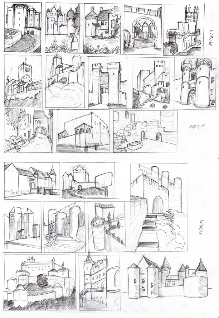
castles
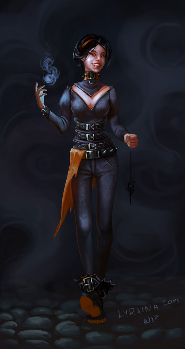
ChoW update, having a bit trouble to get the character to read ... very black or very light background works better for the character, but looks worse in total for some reason
Posts: 240
Threads: 8
Joined: Dec 2012
Reputation:
39
Heeey, I'm really enjoying all of the entries for the chow, and this one isn't an exception.
The bright background thing is a tricky situation, so I tried to do some comps that would maybe work, I found one that feels alright at least to me, but then I got really into it and ended up doing a paintover just for fun.
Since it's your entry for the contest, it's a WIP, and what I did was basically my take on your concept instead of problem solving/fixing anything, I didn't want to post it directly just out of respect ;).
But if you still want to see it I can post it or send you a pm.
EDIT--
Alright here it is:
![[Image: vZvnnqv.png]](http://i.imgur.com/vZvnnqv.png)
Posts: 903
Threads: 54
Joined: Feb 2012
Reputation:
18
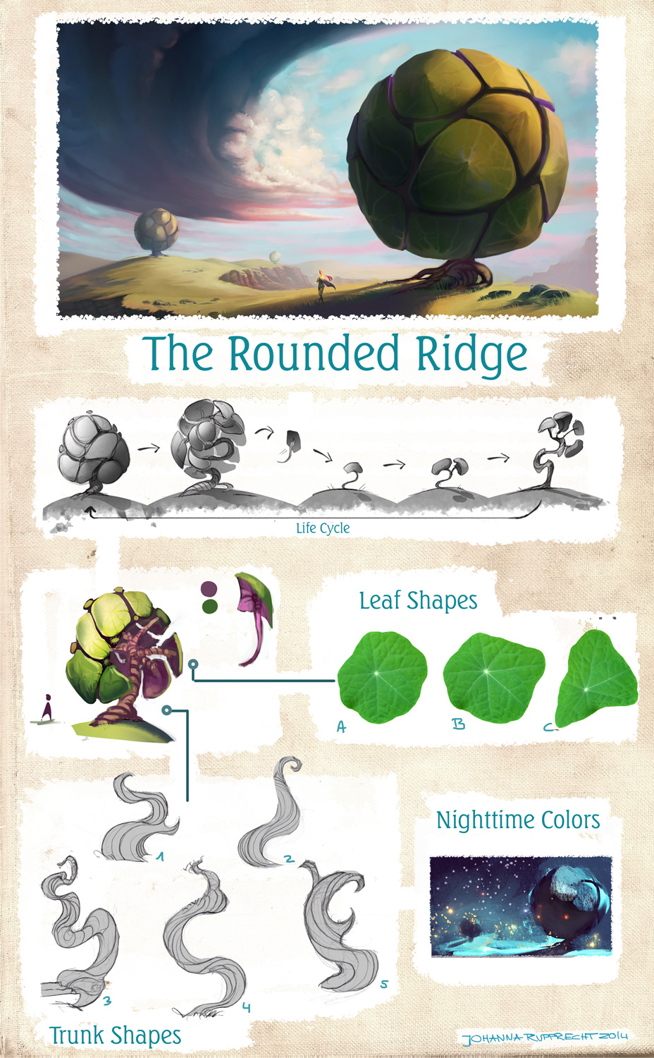
The scale in that tree landscape is awesome! Really feels huge. For some reason it feels like those clouds are bending around that second tree. Nighttime version looks so cool, hope to see that done up full size. For the CHOW, I don't think that choker would be bent up like that, even from that perspective. If you browse through the Degenesis designs for instance, their neckwear is always curved down even in perspectives where that part is above the horizon line. I think it's because the neck is naturally angled forward a little bit in resting position, but I'm not totally sure about that :)
Posts: 850
Threads: 4
Joined: Mar 2013
Reputation:
21
Gliger: aah, thanks for posting your paintover! Don't worry about it ;) Love what you did to her costume, especially the top part. That might very well be an alternative combination out of her wardrobe that she wears at another time :) Your background looks nice as well, I went for a "inbetween" version. Thx for showing me your paintover <3
pnate: Thanks. Oops, I see where the cloud is warping. Thanks for the crit on the choker, I was wondering why it looked so weird while painting but didn't think of actually looking it up :P
Could tweak this forever. But I'll declare it done now.


I wish I had logged the time this one took me:

Posts: 184
Threads: 4
Joined: May 2013
Reputation:
11
Hey Lyrania!
I love that tree landscape piece, personally I'd go with #1 or some variation on it, or #2 as my second choice. It has a really nice positive feeling to it. The tree concept sheets are awesome and I really like the idea with the tree and how it multiplies itself.
The last two pics you did are pretty awesome too, I think youre getting great at settings moods in places and making the pieces look unified.
I don't really have any crits to be honest, the only thing I can think to comment on is the position of the forward-stepping foot on the CHOW but you've finished work on that so I'll leave it
"If you want liberation in this life, there is no area that you do not watch. Watch the breathing, watch the posture, watch the flow of energy, watch the texture of the mind, watch the response to objects." - Namgyal Rinpoche
Posts: 362
Threads: 10
Joined: Mar 2012
Reputation:
21
Awww - i am in love with the last one - those colors let me feel comfortable and there is so much to find in the picture so i can watch it over and over again.
Posts: 1,074
Threads: 9
Joined: Jan 2012
Reputation:
53
This last one is great, Ly!
Just a suggestion - start thinking of saturation in hierarchy too. The orange and the blue are the same level on saturation - make one dominant over the other :) Right now, they're fighting a bit.
Great work girl, it's been amazing to watch you grow!
Posts: 389
Threads: 2
Joined: Jan 2013
Reputation:
13
I like the narrative of the last piece, though, a bit more dynamism in character would really make this more effective: stronger gestures would do well in enhancing the mood.
That's me just being nitpicky though! Keep up the great work!!
Posts: 850
Threads: 4
Joined: Mar 2013
Reputation:
21
aks9: Thank you. Yeah that foot has issues. Kind of run out of time in the end but was determined to keep the pose like I had planned, haha :) Thanks for all the kind words!
Wolkenfels: Thank you! Glad you like it!
Sula: Thank you <3 That was a good point on the saturation hierarchy. I tried to stick to it in my next piece! Must be more deliberate with those things.
Mannyhaatz: Thank you! Yep, still struggling with making figures dynamic...
Where is time going? In failed throwaway pieces, throwaway sketches and rushed finished paintings? D:
Anyway, not much has changed in this one, except for some details.

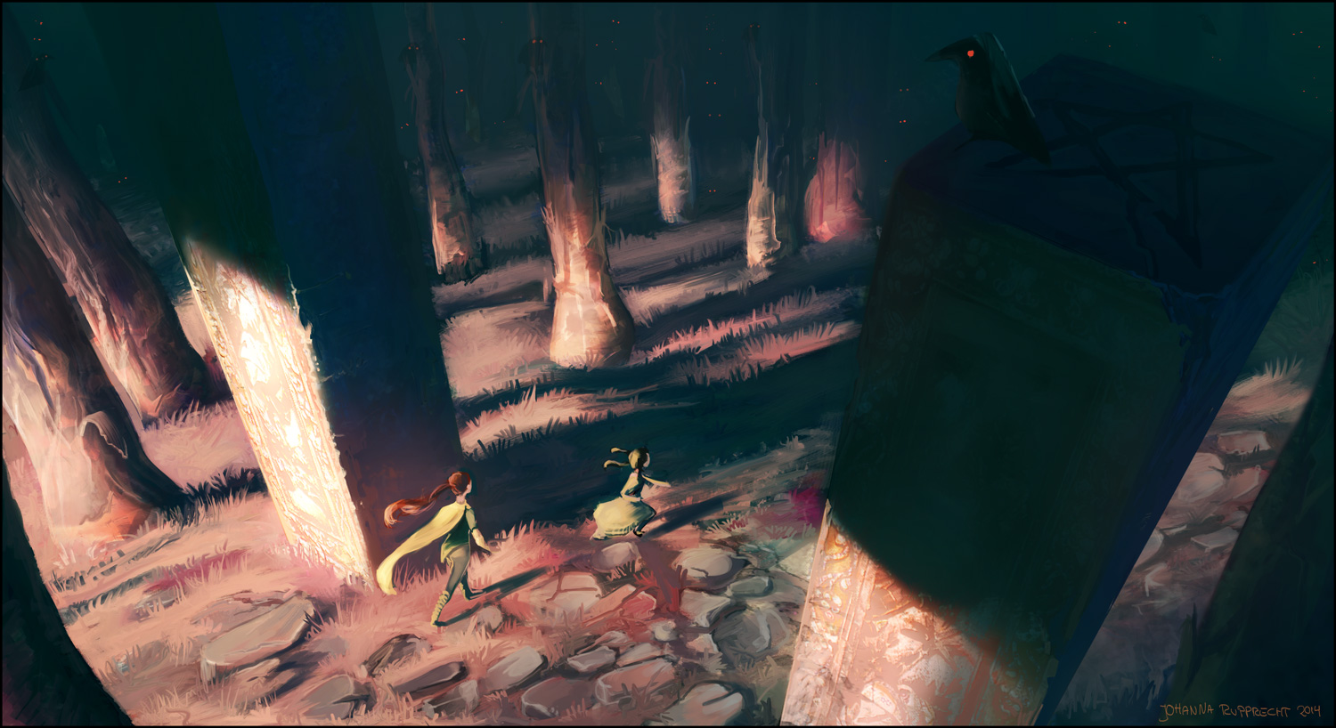
With this super-rushed-omgdeadline-piece I thought of Sula's hierarchy advice, pushing saturation only in the warm/focal areas, letting shadows and moonlight drop in imporance. Maybe I overdid it a bit, since the first thing my instructor did was pushing the blue in the top for more warm/cold contrast. I will figure out the perfect balance eventually!

CGMA course is over for good now which makes me a sad panda. Today is dedicated to writing mails to friends, catching up on sleep, reading a bit with a nice cup of tea and thinking about my next studies. Tomorrow I will hit the metaphorical drawing board hard. Feelin' good <3
Posts: 905
Threads: 39
Joined: Sep 2013
Reputation:
51
Where’s all that castle coming from again? In your area?
“I don't even know what I want anymore. So I went default mode and just painted a bit.” <--
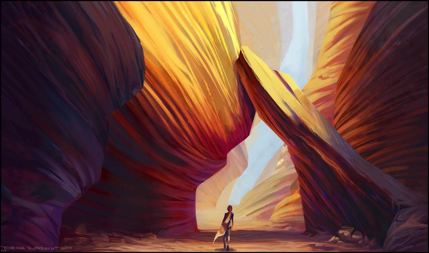
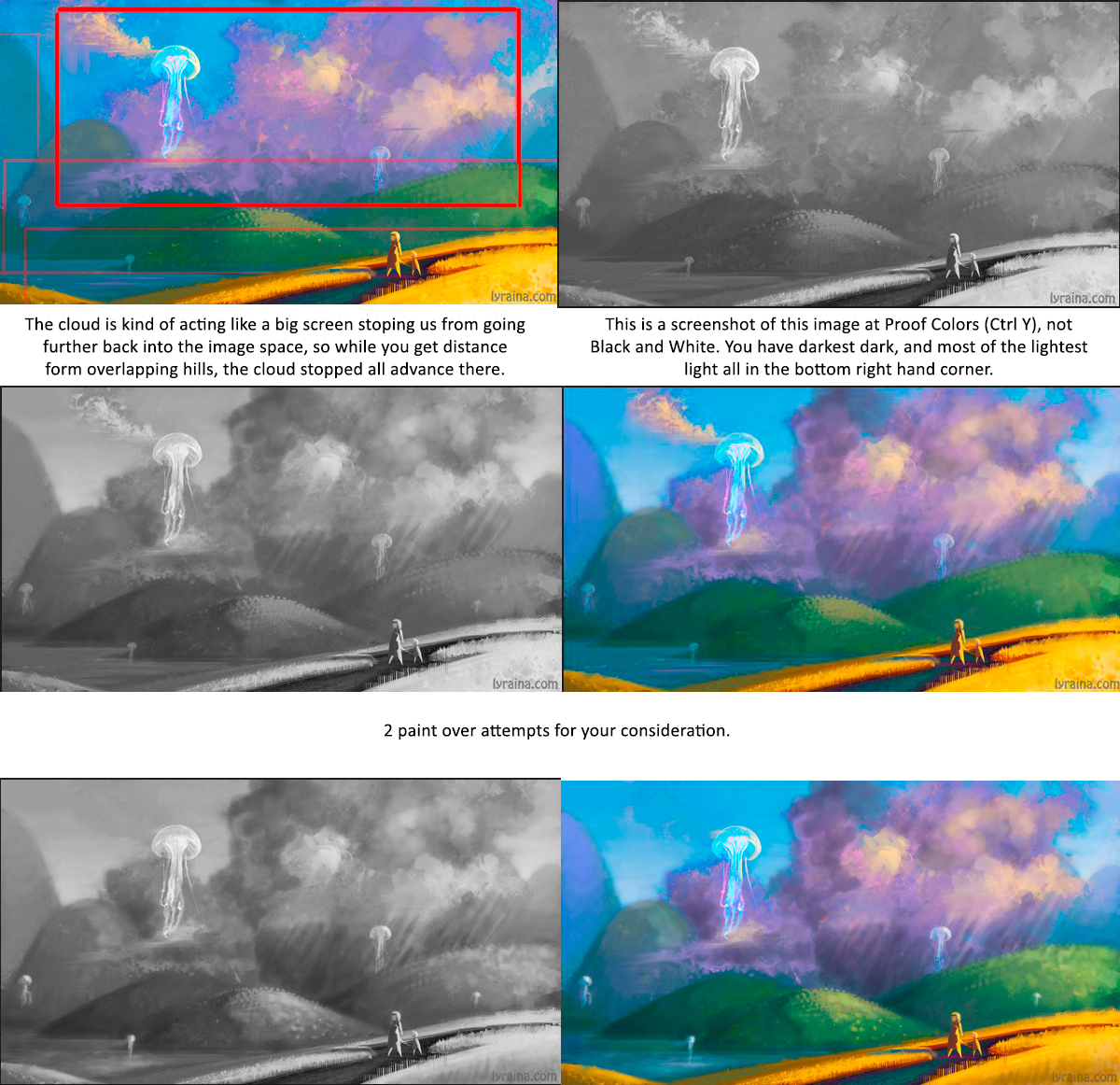
I wouldn't worry about that. I'll bet we all need to just paint a bit with no thought, no goal, from time to time. The grand canyon like piece has pretty good overlaps and sense of deep space even though it's a pincher. The faint blue in the far distance is probably key.
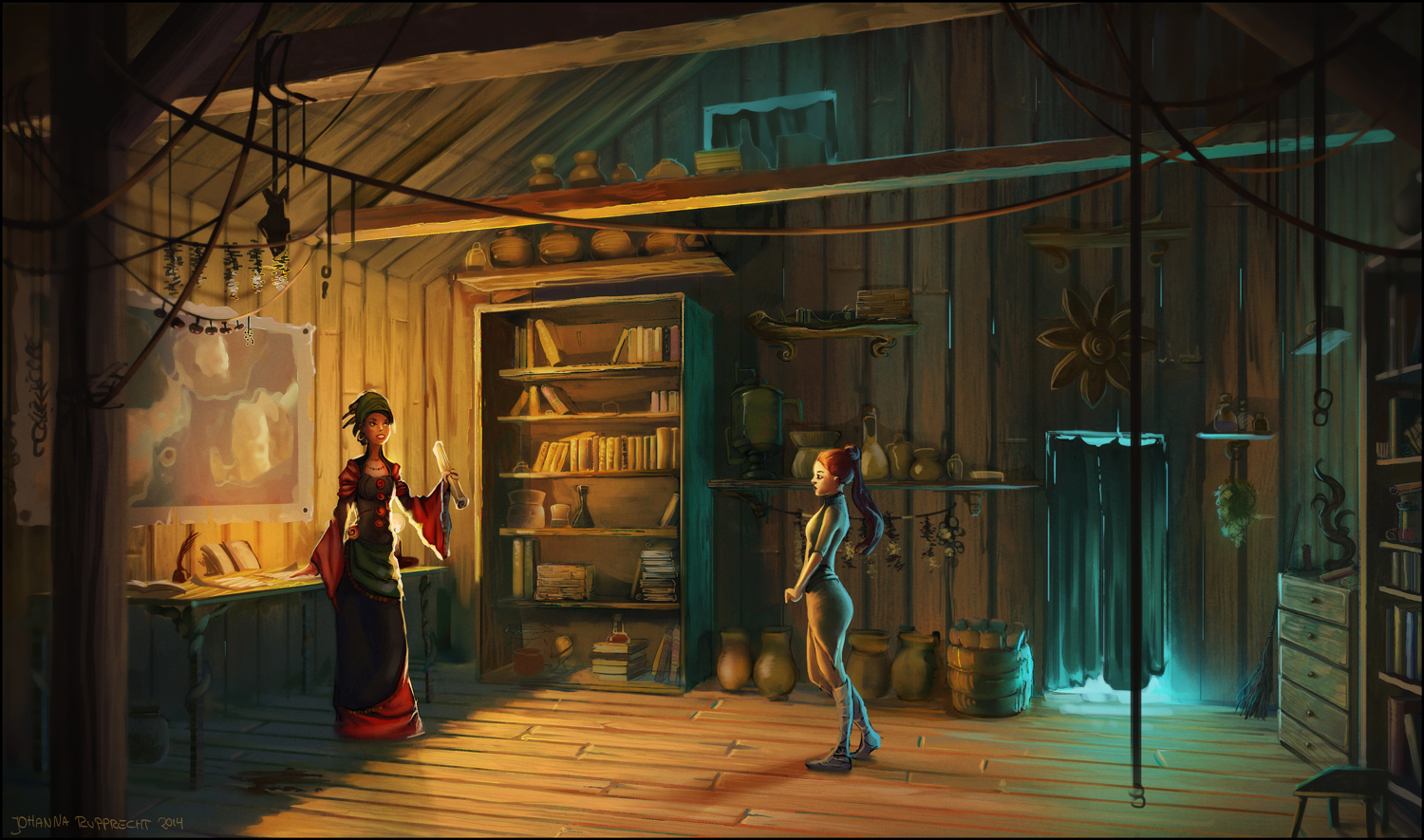
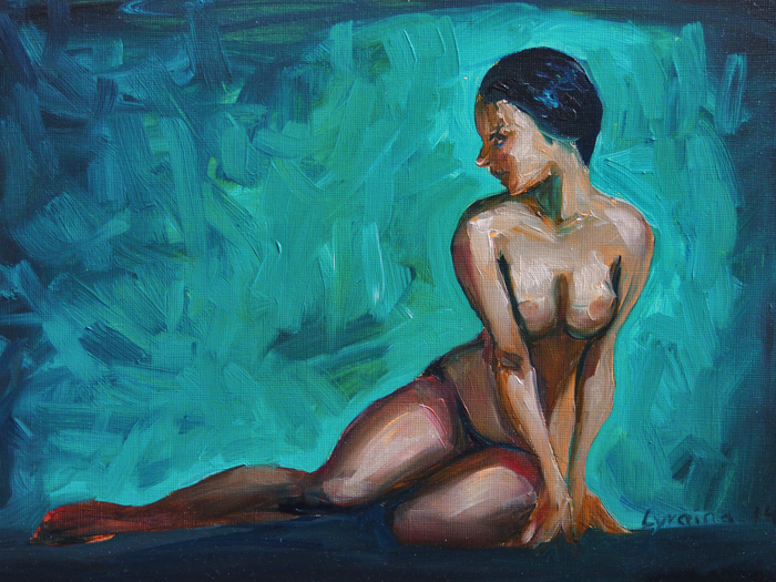
Looks like you're attempting to do your oil painting (I presume it's oil?) alla prima. Depending on the surface you paint on, there will be a certain amount of layers you can put on before the paint start to slid and not stick on at all, so when you put a color down, be pretty sure that's the color you want. Is there a reason you wanted the bright blue-green background with all that action? It's back-lighting the figure like a sun setting behind a dark forest whose details are faint but visible via a lamp under the woods, but at first glance you only see the dark outline. You could consider doing that for your figure, so you still see all the details in the figure, but it's all a notch darker than the background, so you have 2 planes of attention... if that makes sense.
Also, she's not casting a shadow on the ground. And it might be better to just make the resting platform uniformly flat from left to right, without a peak in the middle, despite what the reference shows.
Who's the caped character that's been parading around all your recent pieces?
I can see why your mentor pushed the blue up in spider palace... that's a big chunk of bright yellow orange dominating the entire center. It's almost impossible to look away from that area.
Sorry I completely missed the updated pastel, floating jelly fishes. To make it up, here's some feedback :P

Posts: 850
Threads: 4
Joined: Mar 2013
Reputation:
21
meat: The castle sketches are from various places form all over the world (photos), though sometimes I'm like "wait, didn't I visit you at some time at the past?", which is quite funny. Though I'm probably confusing them, since the photos repeat themselves all the time as well.
Spot on with the paint not sticking anymore at some point, got me :) Don't remember if I did an underpainting at least, but probably not many layers. The point of the background was using a color that makes the skin tones look good; although it really is too intense. All those darks in the skin weren't strictly intended either. Still figuring this out! :D Figures and fruit still feel easier than landscapes, though ...
The caped character is Mrs. Older Sister on her journey to find the magic artifact she needs to save her 'lil sister. Or something along these lines. I didn't have/take the time to develop a good character concept in the beginning, so she kind of just happened... Looking at spider palace now I see the lack of blue as well. Need to find a good balance!
Thank you very much for the jellyfish crit <3 I see what you mean. Still need to be more considerate with my values! Thanks again :)
Embarassingly small update.


Posts: 274
Threads: 0
Joined: Feb 2014
Reputation:
3
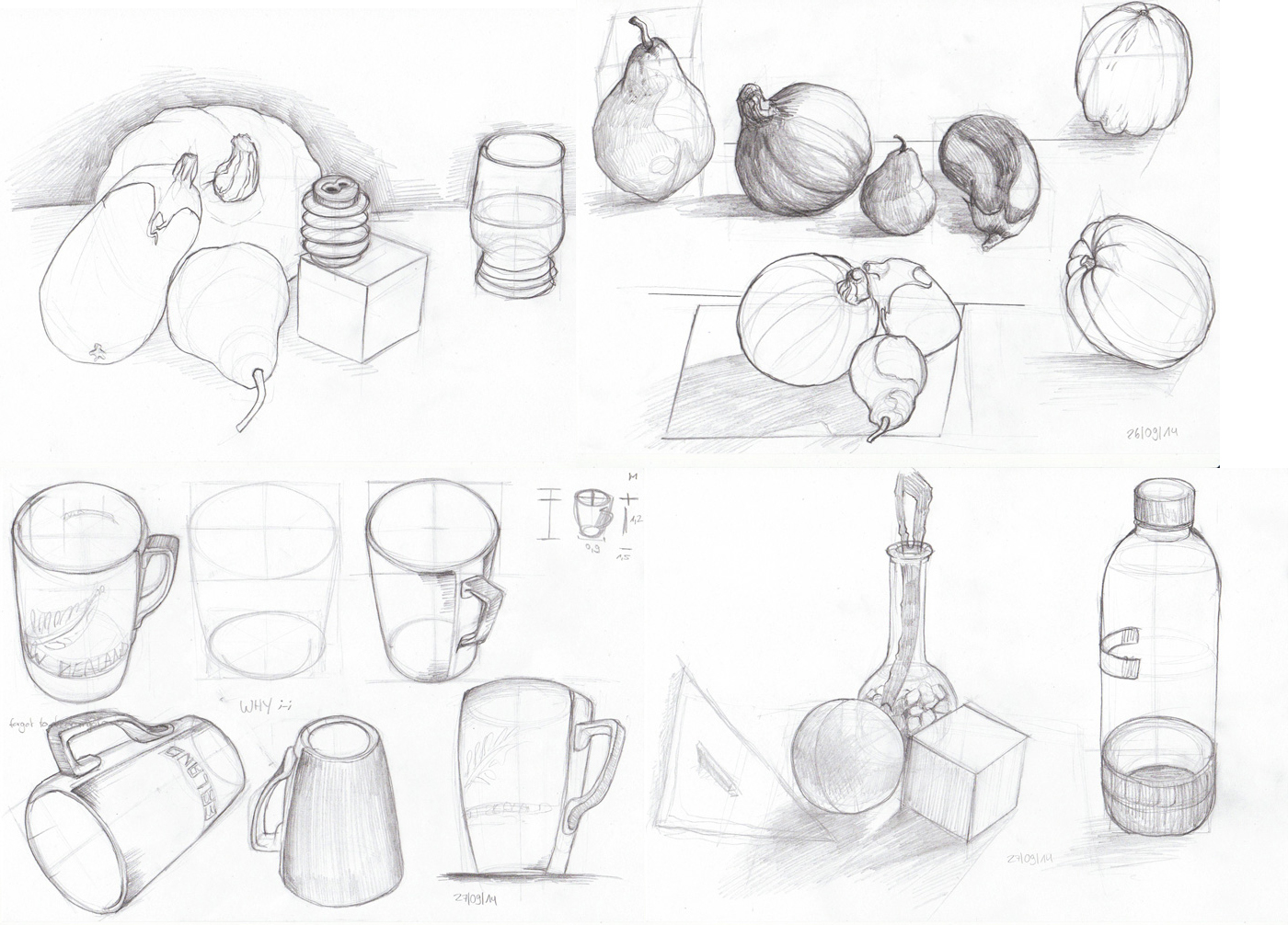
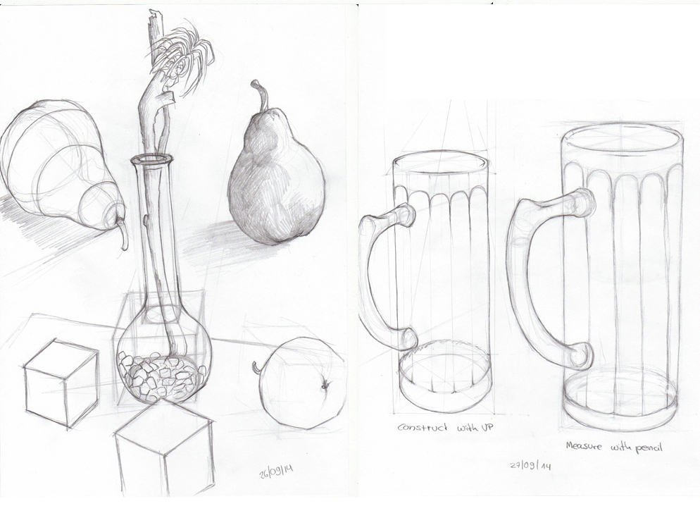
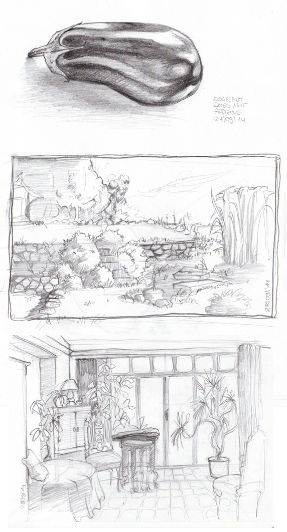
I'm liking those fruit studies. Good to see you're drawing the form of them as well.
|


![[Image: vZvnnqv.png]](http://i.imgur.com/vZvnnqv.png)
