Posts: 850
Threads: 4
Joined: Mar 2013
Reputation:
21
Aww you guys are the best <3
smrr: Thanks for understanding~ ugh, it always comes back to perspective, doesn’t it? Eww… I’m *haunted* by pespecitve. Y u so hard?! And thanks for the support, means a lot <3
The Koala: Thank you!
Angelique: Hahaha, awww thank you :)
Mariyan-Hristov: Thank you, lighting studies definitely are useful, yeah :)
meat: Ahahaha, why thank you~ that artbook will have to wait for a while tho! My thumbs don’t look awesomer~ just be nice to your creatures and give them the attention they demand!
dodeqaa: Thanks, and yes they are for Duality-52! Just being a pain in the a. to render/paint..
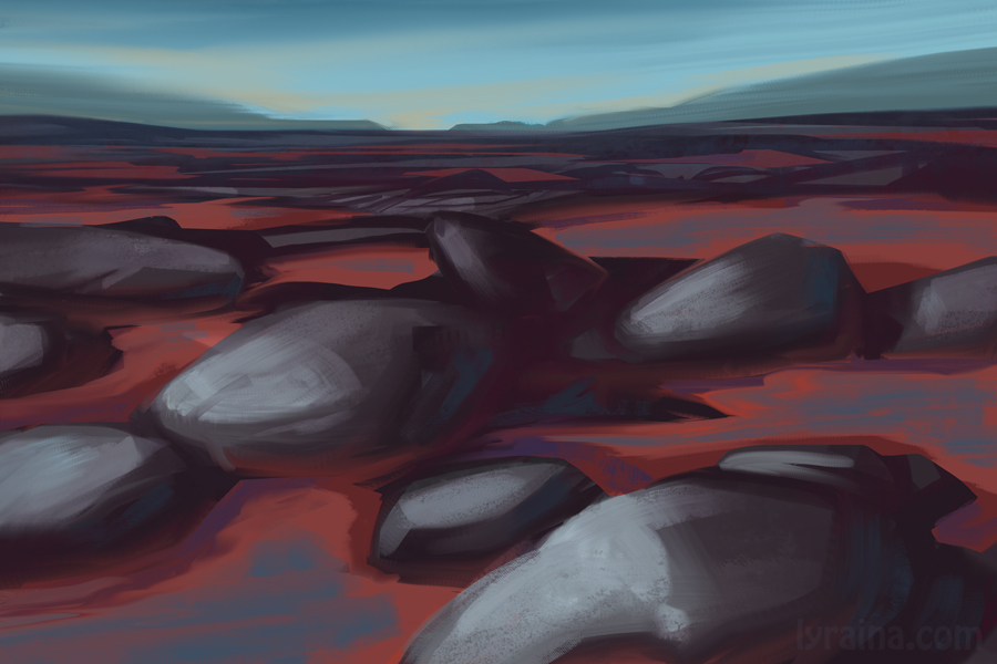
Yay selfie day! ... I started a bit late and ended up with same old boring desk lamp light.. and for some reason like it better mirrored... oh well. After seeing all the awesome selfies, I totally wanna do more.

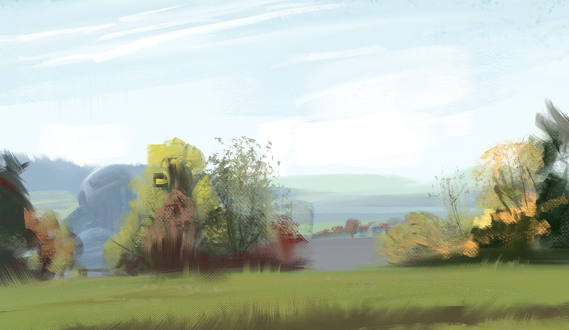
Also, more out of window views



Posts: 850
Threads: 4
Joined: Mar 2013
Reputation:
21
W00t! Character Design!
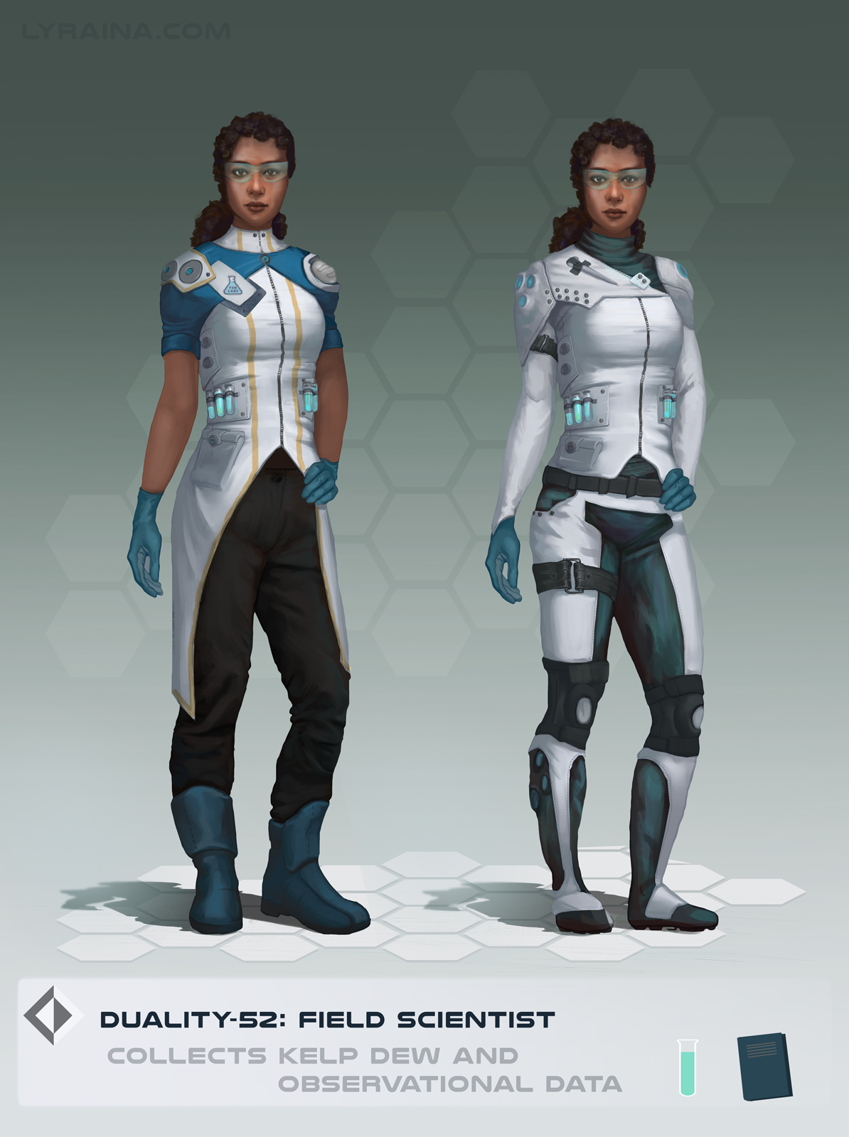

(Background story - feel free to fix my English, I actually struggled a bit writing this, but want to give some description on my portfolio sites etc:
The field scientist is part of a group of highly trained and specialized individuals venturing into the floating kelp forest, located in the windy valleys of Duality-52. Each group member has their own mission and goals, but travel into the wilds of Duality-52 is safer in company, so that’s how citizens of Duality-52 use to go about it - and maybe hire a guard or two, depending on destination.
Duality-52 is a tidally locked planet located in the habitable zone of its star, which allowed rich alien flora and fauna to evolve, and attracted humans and other sentient species to build colonies. Duality-52 is an ongoing personal project I am developing with meat)
Posts: 850
Threads: 4
Joined: Mar 2013
Reputation:
21
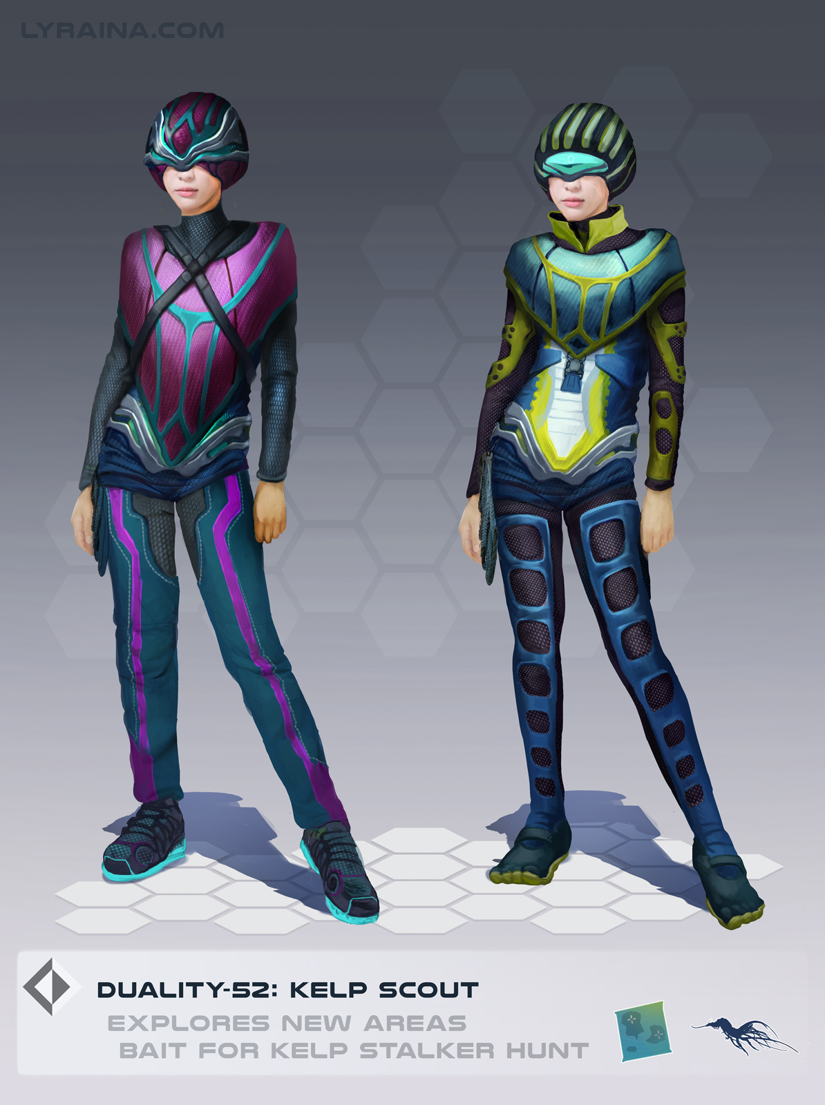
Back from taking some time off, now hopefully going right back to hard-work-mode (which I find increasingly hard to do all on my own...). New character designs - not entirely happy with how they're turning out for the time invested, but really need to move on eventually..


(Kelp Stalker Design by meat)
Posts: 905
Threads: 39
Joined: Sep 2013
Reputation:
51
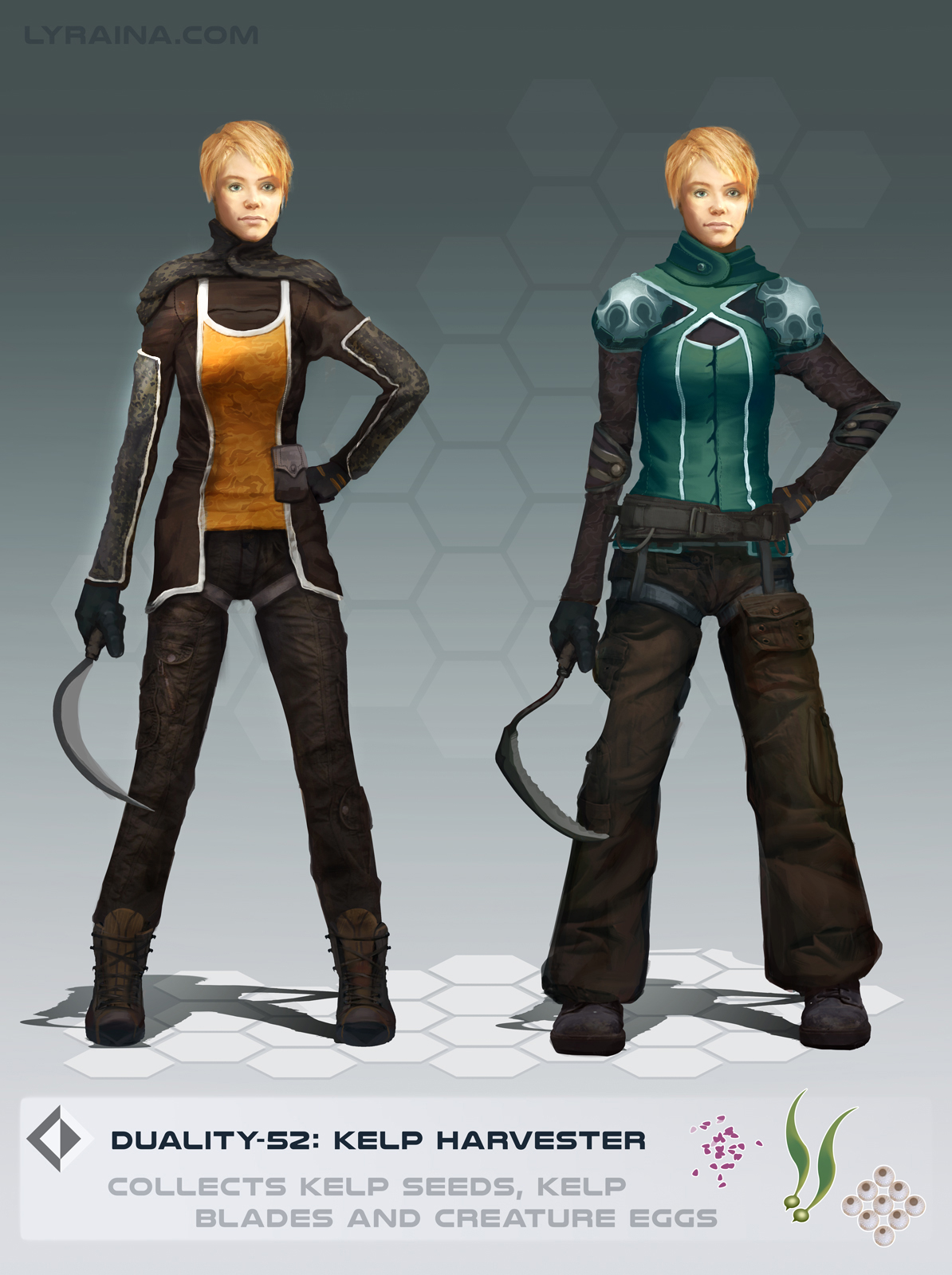
Watch your forms. They're flattening out in a lot of areas, and if they're paired with parts that do show more 3D-ness in form, the contrast makes it more outstanding to our eyes. Some areas flatten out with the application of the texture, some looks like you got frustrated and didn't want to spend another 10 hours on this painting anymore. Also, take advantage of what the pose of a character can do for ... well, your character's character. For better or for worse, you're selling this idea of - for example - tough job, physical labor, person who probably isn't talkative, and is resilient and used to dealing with a lot of out-of-her-control outside shit that comes with that rough work environment outdoors. So you can put her in a pose that says that. Or even if you do a standing pose, have her stand in a way that shows off different aspects of the design - 1 raised arm or something, so she's obviously posed on purposed like a mannequin.
Posts: 850
Threads: 4
Joined: Mar 2013
Reputation:
21
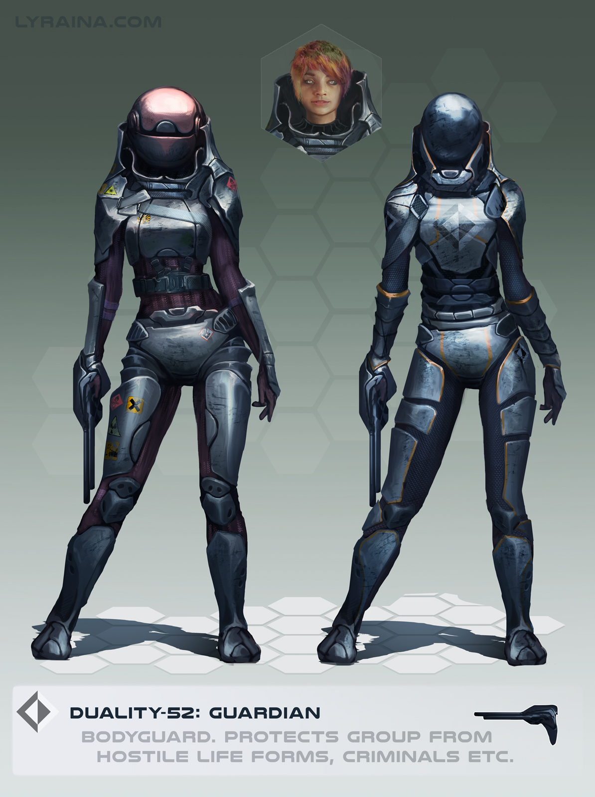
meat, thanks for the feedback. I should indeed have paid a bit more attention to the poses. Not just making them hopefully look natural, but also convey character. I also fixed the form-issue, thanks for pointing it out.
Last one. Now, on to new things.
Is the floating head too distracting in this one?
Posts: 905
Threads: 39
Joined: Sep 2013
Reputation:
51
Not if you put a sci fi neon blue outline to it, then connect it with a string of same neon blue to the guardian's helmet-covered face, like this: http://gamasutra.com/db_area/images/blog...pe_web.jpg or something along that line. Maybe it'll clash with the beige/mossy green background tho. Moos.
Posts: 850
Threads: 4
Joined: Mar 2013
Reputation:
21
meat - sci fi neon blue outline is always good, eh :D
Working on my design and 3d skills at the moment, which is a big struggle, and little to show.
To relax and practice „getting ideas started“ I want to also do 1 digital painting per day this month (just speedpaintings or sketches of 1-2 hrs max). I’m not sure if I should commit to posting them all to hold me accountable, or if that’ll ruin everything due to the pressure..
Here is day 1 (yesterday) and two that I made in November as a backup (meaning I can miss 2 days)
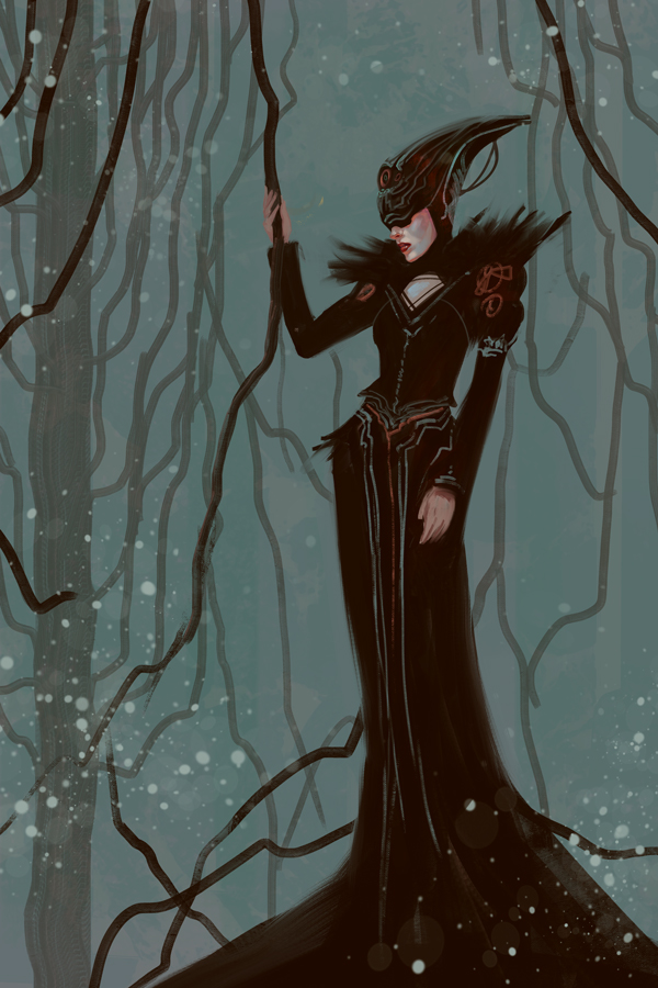
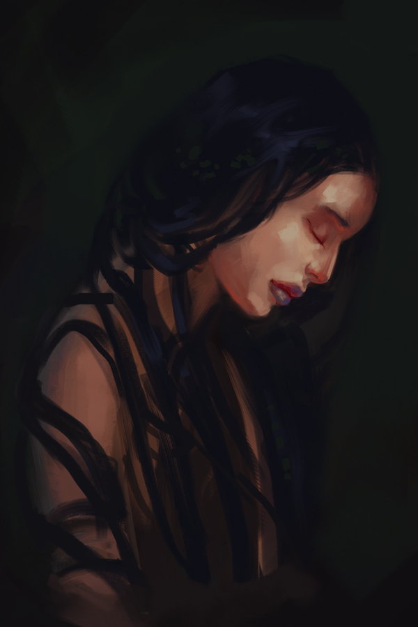
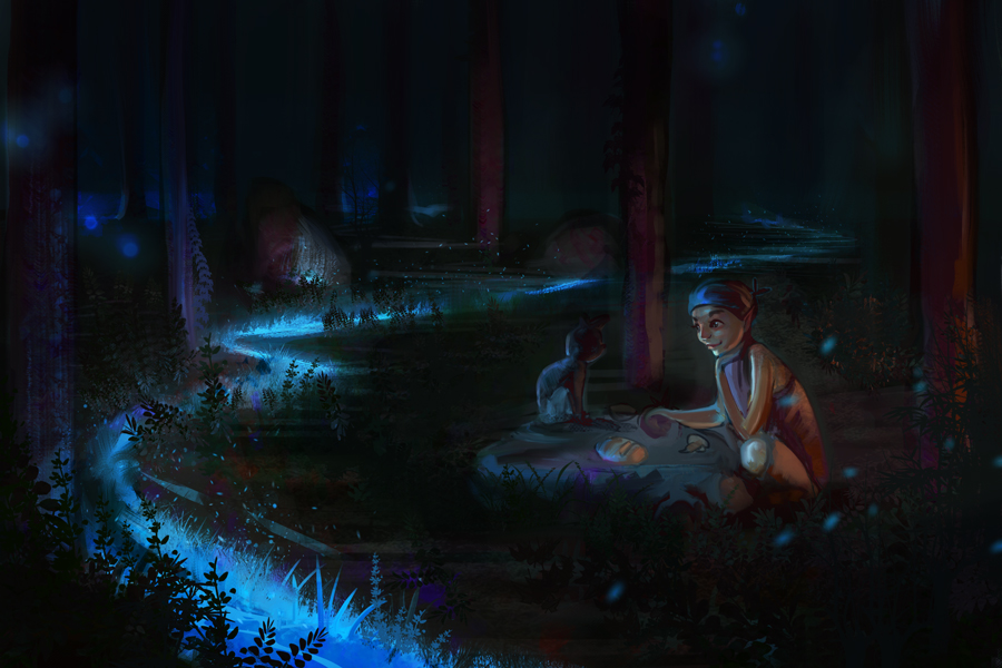
(I know this is horrible)
Posts: 2,817
Threads: 15
Joined: Jun 2013
Reputation:
109
But... u do no i luv u rite?
Posts: 850
Threads: 4
Joined: Mar 2013
Reputation:
21
Fedodika: awww :D You're my fav kolala!
Day2

Posts: 160
Threads: 1
Joined: Oct 2014
Reputation:
39
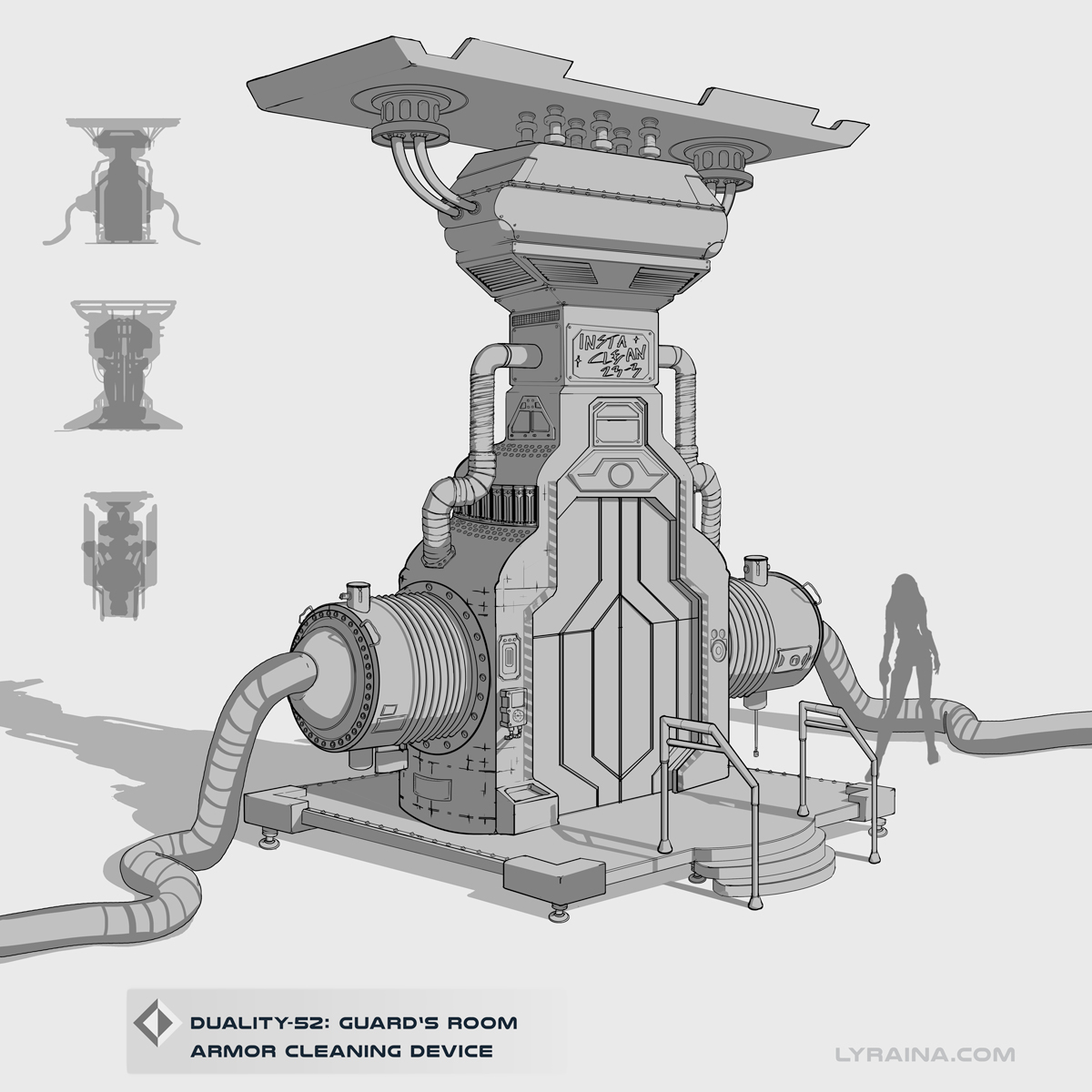
That Insta Clean Machineeee <3 Good work with the 3d Lyra! Is it sketchup ketchup?
Also, I'd love to see the daily paintings, no pressure, post them late or not at all :)
Posts: 850
Threads: 4
Joined: Mar 2013
Reputation:
21
dodeqaa: What I posted is the design "sketch" I made first, now I'm modeling it in Maya and also trying to do the room around it. Thanks for expressing your interest in seeing the daily paintings. Helped me push through today's ugly phase of self-doubt.
..
Day 3. DON'T GIVE UP
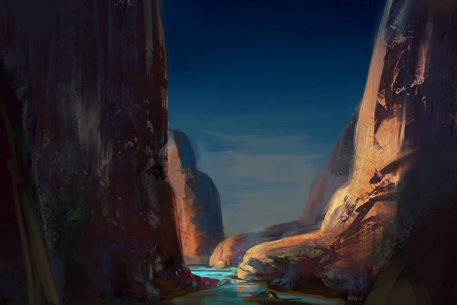
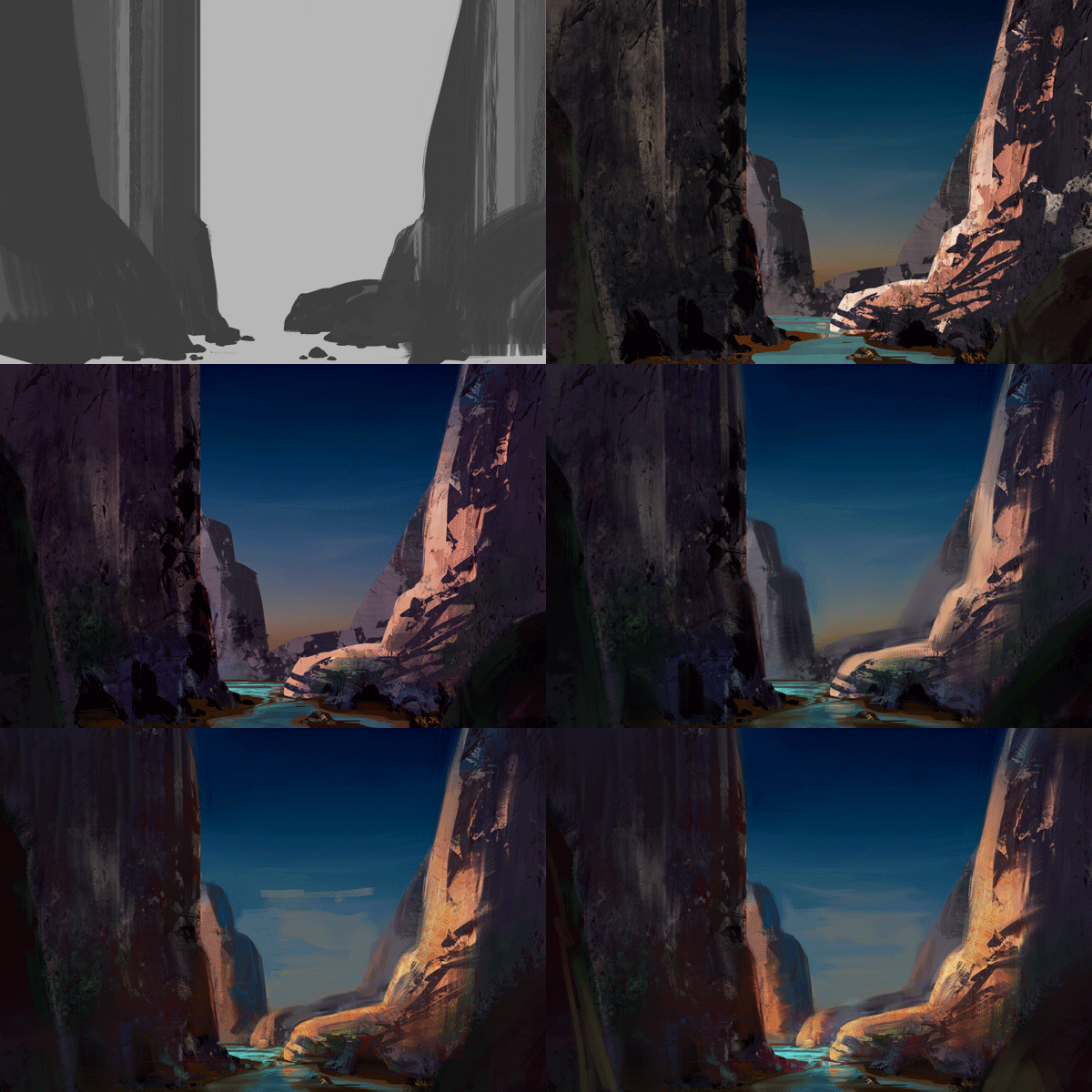
Also here's a process gif for anyone interested. To show you the ugly inbetween stage where it's important to keep going. What you can’t see here is the pushing back and forth in the very beginning while trying to find a composition/idea.
Posts: 2,817
Threads: 15
Joined: Jun 2013
Reputation:
109
try to maintain some of those hard shapes and contrast i see in the second round of the gif! they look really cool and when you blur em they lose a lot of power... ps i luv u... :3
Posts: 138
Threads: 2
Joined: Mar 2013
Reputation:
5
Really cool work Lyraina, look forward to seeing more :)
Posts: 117
Threads: 4
Joined: Nov 2014
Reputation:
1
I love that painting with the curled clouds <3
Posts: 850
Threads: 4
Joined: Mar 2013
Reputation:
21
Fedodika: Yeah, edge control is important.. and hard O_O
Xenzo: Thank you! :)
maggie: thanks, glad you like it!
--
Day 4 #sadpanda

Posts: 160
Threads: 1
Joined: Oct 2014
Reputation:
39
I thought that sketch was a 3d paintover from sketchup XD Great work!
Im glad you 're keeping up with these daily paints, keep it playful like storytelling time :D helps to keep the edge off.
I did a paintover of the landscape you did, I kinda felt you lost some of the shape and colour temperature contrast between the midground rock and background rock.
Hope it gives you food for thought.

Posts: 115
Threads: 2
Joined: Aug 2015
Reputation:
3
I really like your day3 painting. Nice and clean edges, and textures. I also like the clouds in day2 painting. They look so cute and dreamy. Keep pushing :)
Posts: 905
Threads: 39
Joined: Sep 2013
Reputation:
51
Aww, sad panda!? Come here *hug* you did good, and I believe in you!
Posts: 850
Threads: 4
Joined: Mar 2013
Reputation:
21
dodeqaa: Thanks a lot for the overpaint! I see what you mean. Gotta pay more attention to ...everything :D
PurpleScissors: Thank you :)
meat: <3 Thank you.
Day5: 1/2 break days 'cos of family stuff
Day6 Tried to remember some setting I saw outdoors, but should've paid more attention than I did

Posts: 850
Threads: 4
Joined: Mar 2013
Reputation:
21
Day7: Sushy

|


![[Image: 5NoWHsY.gif]](http://i.imgur.com/5NoWHsY.gif)
