Nowio pretends to can draw
#81
stuffs things

warmup, went straight into color on this one and booooy was it scary o.O


viking... we'll get there


Reply
#82
Aaand something a little different...
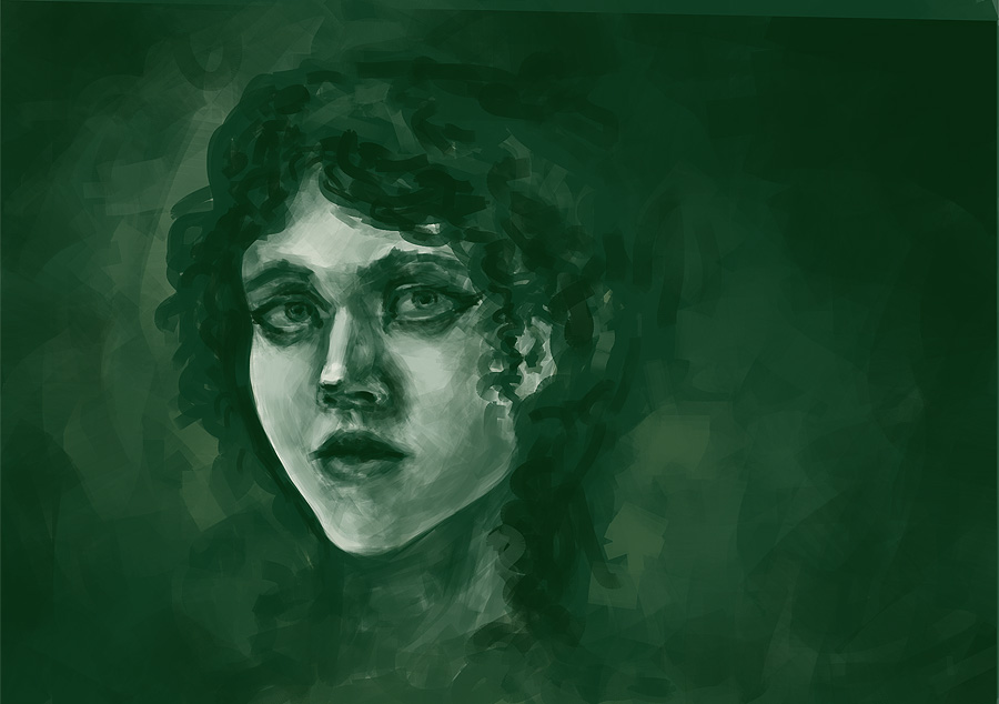
I drew a Girl and I liked it
Hope you guys don't mind it
<3


Reply
#83
Gonna go live in a bit :)
http://original.livestream.com/Nowio

and a random sketchie... look how bad it is D:


Reply
#84
Awwkay, let's try to get into studying :D

some happy buff dude as warmup


and then a color study and also vikings 2+3/28. was color always this hard?! x.X


anyway, here are some hands because I suck at hands...


Reply
#85
structures gettin better! liking the hands, try doing lots of gestures of hands from pixelovely perhaps :)

70+Page Koala Sketchbook: http://crimsondaggers.com/forum/thread-3465.html SB

Paintover thread, submit for crits! http://crimsondaggers.com/forum/thread-7879.html
[color=rgba(255, 255, 255, 0.882)]e owl sat on an oak. The more he saw, the less he spoke.[/color]
Reply
#86
sup man! i like those hands, you are almost there, just some intense practice left.
I would also recommend drawing your own hands all the time, at least that helped me a ton when i was focusing on hands last year.

Reply
#87
@EduardoGaray   Heya man! Thanks, yeah these are my hands you see there... but yeah, figured instead of searching on the web for hands (whill I WILL do at some point...) why not use my own?! :D


And here a random portrait of a chick from imagination, hope you like!

I'd love to do more studies at the moment but I have to concentrate on my term exams... Even if I don't really care about grades anymore I'd like to pass :D


Reply
#88
Your vikings are looking hot. I get what you mean about grades, I was in the same situation couple years ago. Good luck on exams.

Reply
#89
I really like the stylized approach of the colour study (: Don't worry about colour being hard. Maybe you're just a bit out of practice. It will all come back to you and get better the more you do. When I first started with this stuff I was so bad at it I thought I'd never get a hang of it. I'm still no good at it BUT I feel that it's getting better slowly, it's a matter of time and exercise.

Good work on the hands! For me it always helps for complicated forms like hands to find a simpler approach for the underlying structure, like more blocked forms for example, to get a grasp of the basic form of what I'm drawing and practicing that a bit as well. If you understand this very well you can then add the details.

Good luck on your exams!

SKY IS THE LIMIT

DeviantartSketchbook
Reply
#90
@crackedskull   Thanks man! Gonna go finish 'em coming monday! It's not that I don't care about my graduation... it's just that the grade system doesn't make any sense to me :D

@Cyprinus   Awww thanks for the compliment <3 (totally not lazyness, promise!) But yeah, gotta kick myself in the butt and do these longer color studies.... but there are soooo many distractions D: think I'm gonna go back to using livestreams for it


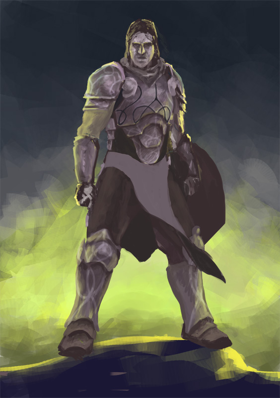
A longer piece I started. Heavily inspired by Daves Gideon piece. If you have any tipp or advise feel free to comment :)


Reply
#91
Hey Nowio! Awesome to see the rate you're going at, you're going to get crazy good if you keep this up. One thing I think I could give as advice is to try doing a round of master color studies. I notice some of your color choices in your imagination pieces are a little bit odd. I always had issues picking the right colors, but it helped me to do thumbnail studies of a bunch of pieces of artwork I liked and analyzing their color choices. Don't allow yourself to get into any real detail, but try to nail the colors they have in their work in a tiny little thumbnail and I think you'll get a lot from it.

Reply
#92
@Pnate   Hello! Sorry for the late reply D: Thank you for the nice words!!! But damn I only see all the mistakes in my images and have no clue how to solve them >.< For example I have no idea how color works and that scares the shit out of me.... Thought I fail myself until I somewhat good at it but doesn't work like that I guess... Gonna try some masterstudies und see how it works ou, thanks for the tipp! :D


Here are more steps for the current image.... stinn lnot finished and I need to render it but at least I'm coming closer to what I want


should have done studies....  D:

Reply
#93
Wow dude, like 5 posts ago you made a huge jump in skill level. So good to see. I really like how loose your brush strokes are but sometimes they get a little bit too crazy and some of the form gets lost, so keep an eye on that one. You are studying a whole bunch of the right stuff. If you need someone to study for the darker stuff, I recommend AJ or Brom, both have amazing works that you could get inspiration from.

Reply
#94
@Jaik   Wow thanks for the kind words! o.O And yes I know and LOVE BROM... UGH DID YOU SEE HOW HE DRAWS HANDS?! AND THE MOODIN HIS IMAGES?!?!?! <3 <3 :O Also I would recommend Bastien Lecouffe Deharme if you don't know him already, his words are amazing :D

Alright... calling it quits and finished. Mostly because I am stuck and don't know how to proceed... If you have any tipps or advices I'd be glad to hear them :)


Reply
#95
Wow, that's awesome, I really like all your rim lighting!

Reply
#96
@Punk-A-Cat  o.O THANKS! :O

here's something cool for painting and stuff :D


Reply
#97
Bruh.

Dat. Level. Up. Doe. O____________________________________O

AWESOME <3

This dude you spent a lot of time on looks bloody great, really. My only crit would be to really try and consider each brush stroke. Follow the direction of the forms you're painting, I feel this could really ++ your work in the future.

Also, omg, Interstella 5555 :'D my fave. So much yas <3 <3 <3

Keep up the great work meng, ^_^ !

sketchbook | pg 52
"Not a single thing in this world isn't in the process of becoming something else."
I'll be back - it's an odyssey, after all
Reply
#98
Hey, man. Good sketchbook so far! 
I think you should pay a bit more attention to form when painting. What you're doing when painting is to use color and value to communicate 3D form so pay attention to your approach/method. A lot of people (I used to do this too) just paint without any structure behind it and you just end up pushing pixels around aimlessly. Try and decide what you want to do before doing it. Just setup mini goals like "I want to paint this part of the arm as if it turns in space near the edges" and then you spend the time to make it happen before moving on. 

In some of your work you kinda have artist-ADD where you don't finish what you started. I think we all have this to some degree. What you've done is that you scribble something down but never take the time to make it look right before moving on. This results in muddy edges, unclean renderings and so on. 

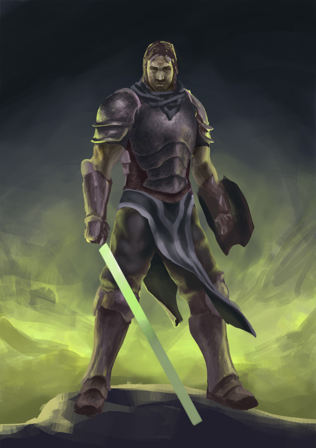
I did a quick paintover to show how you could push your latest painting further. A lot of the information was already there, you just need to get better at defining what you're painting. 

The main thing I had an issue with was all the yellow rim light. It was everywhere in such a strong amount that it was all you saw. I pulled back on it and focuses more on defining form. A lot of the ideas and groundwork were already there, it just wasn't implemented very well. If you structure yourself and focus on communicating form in a nice way, I'd bet that your work would look much better :)

This image has a lot of color but it isn't handled very elegantly. The same yellow is forced in where it should change in hue and value. When yellow light hits purple metal it doesn't color everything it touches yellow. The effect is more subtle. Slow down before you paint colored on a surface. If you spend the time to think "what will the color be if I add X light to Y surface with it being Z shiny/matte", it will look way better. 

You also don't have a lot of color variation. Don't be afraid of just painting in colors. This was one of the things that held me back for a long time. I just couldn't go in on a normal layer and paint in new colors in an image. Variation in hue and saturation is important. It's like the rhythm/gesture of color and finding a nice balance makes for some great work. 

Ruan Jia is a person that uses color masterfully. Check out this image (Link) in photoshop and just look around using the color picker with the color window open. There's not a lot of saturation going on but there is a lot of rhythm in the hue/saturation so it creates a nice balance. 

Anyway, I can see that you're getting better so keep on the good work! :)


Discord - JetJaguar#8954
Reply
#99
@Tristan   WHOA THANKS FOR THE BEAUTIFUL CRIT!!! adn the overpaint whoa!!!  :O And I totally get what you're saying. And yes I can't deny that I have some kind on artist-add. I will try to plan my paintings more in the future. About the colour I have to admit that I am fahking scared of it, it is sooo hard D:
As for the rimlight I mentioned it a previous post that the piece was hugely inspired by Daves Gideon piece http://davidrapozaart.deviantart.com/art...-346274944
But your overpaint is beautiful! Definitelly makes my image better, in a different direction but it improves it immensely ;)
Yeah Ruan Jia is awesome!


Alright, some demon chick and thumbs and a selfie for today... study scary is. more to do i need... :3


Reply
DUMDUMDUMDUMDUM

TADAAAAAA!!!!


Reply


Forum Jump:


Users browsing this thread: 33 Guest(s)