Posts: 8
Threads: 2
Joined: Mar 2013
Reputation:
0
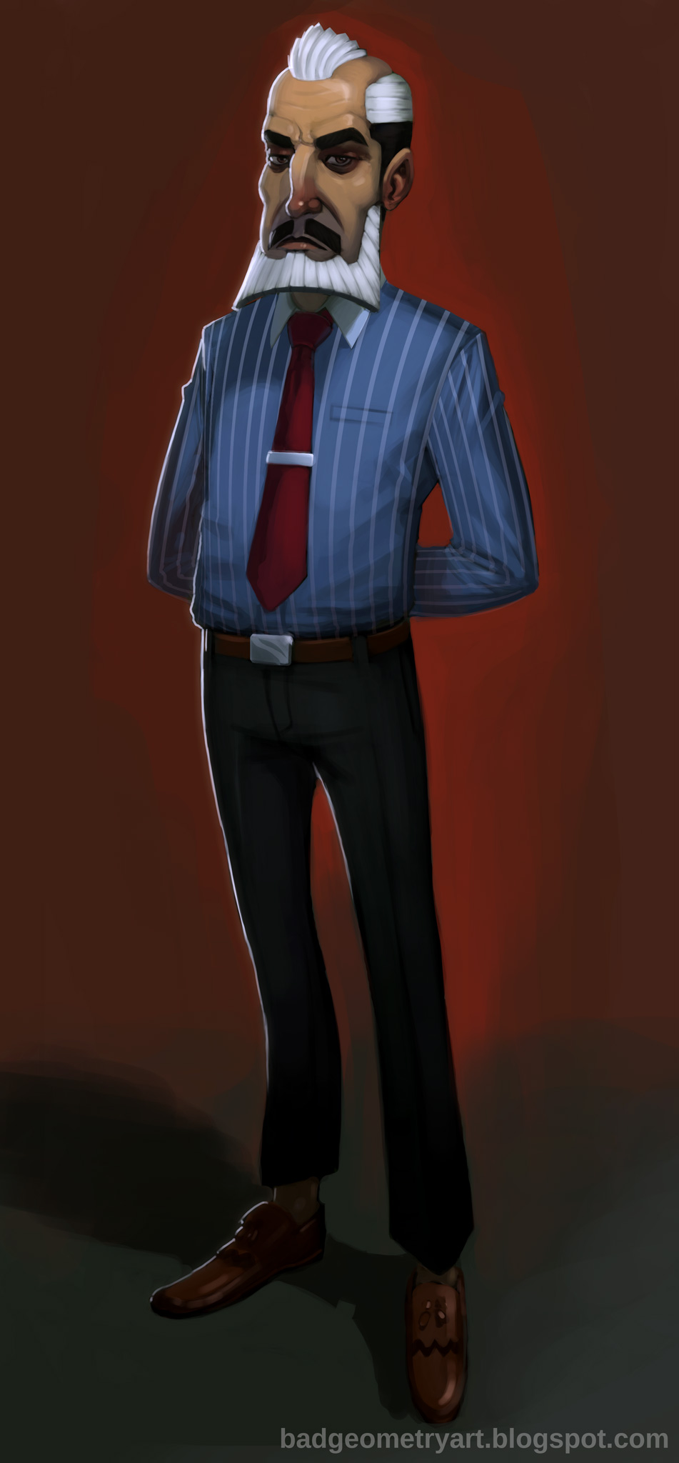
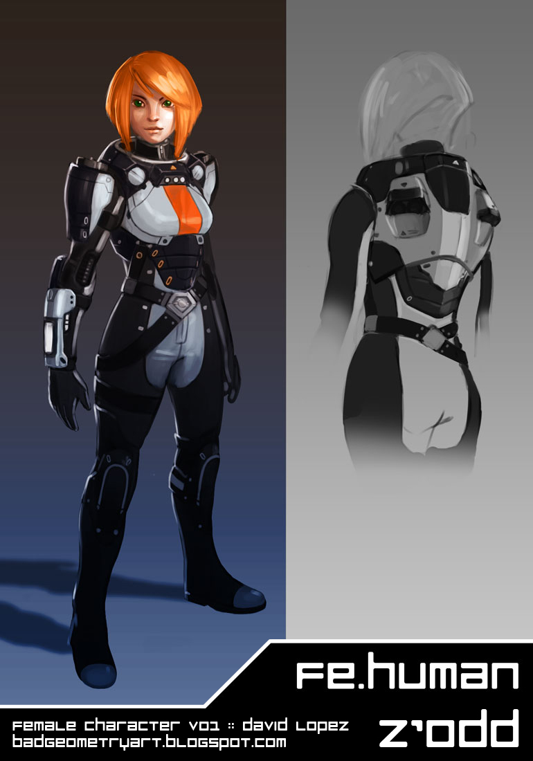
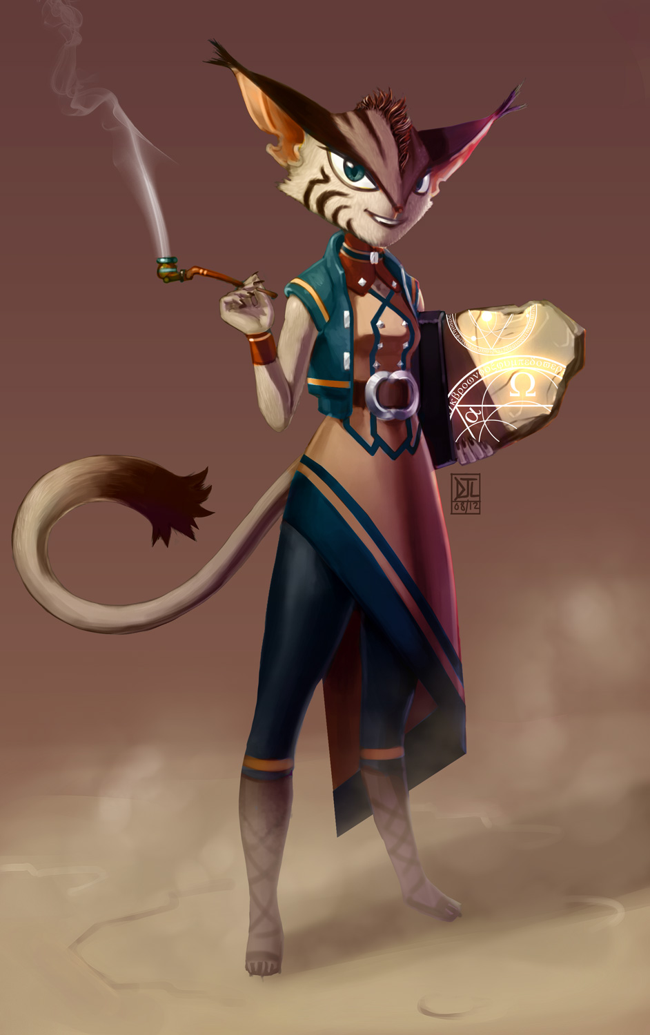
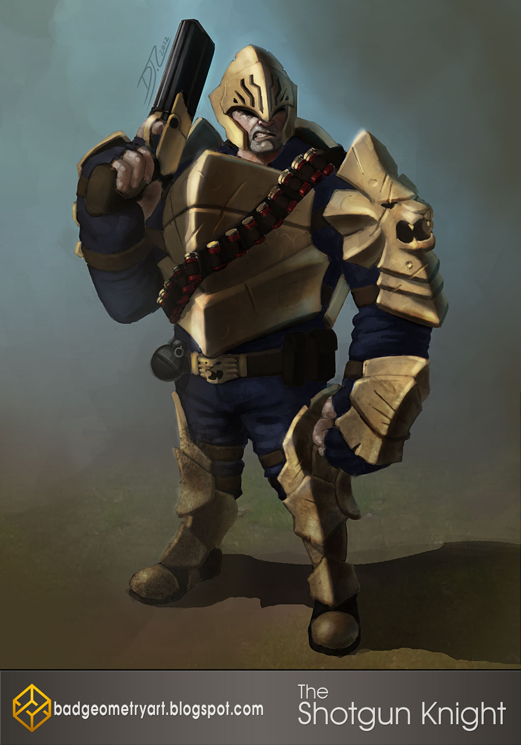
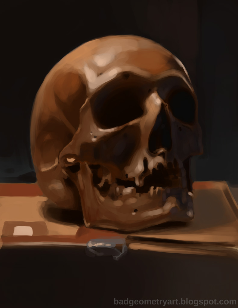
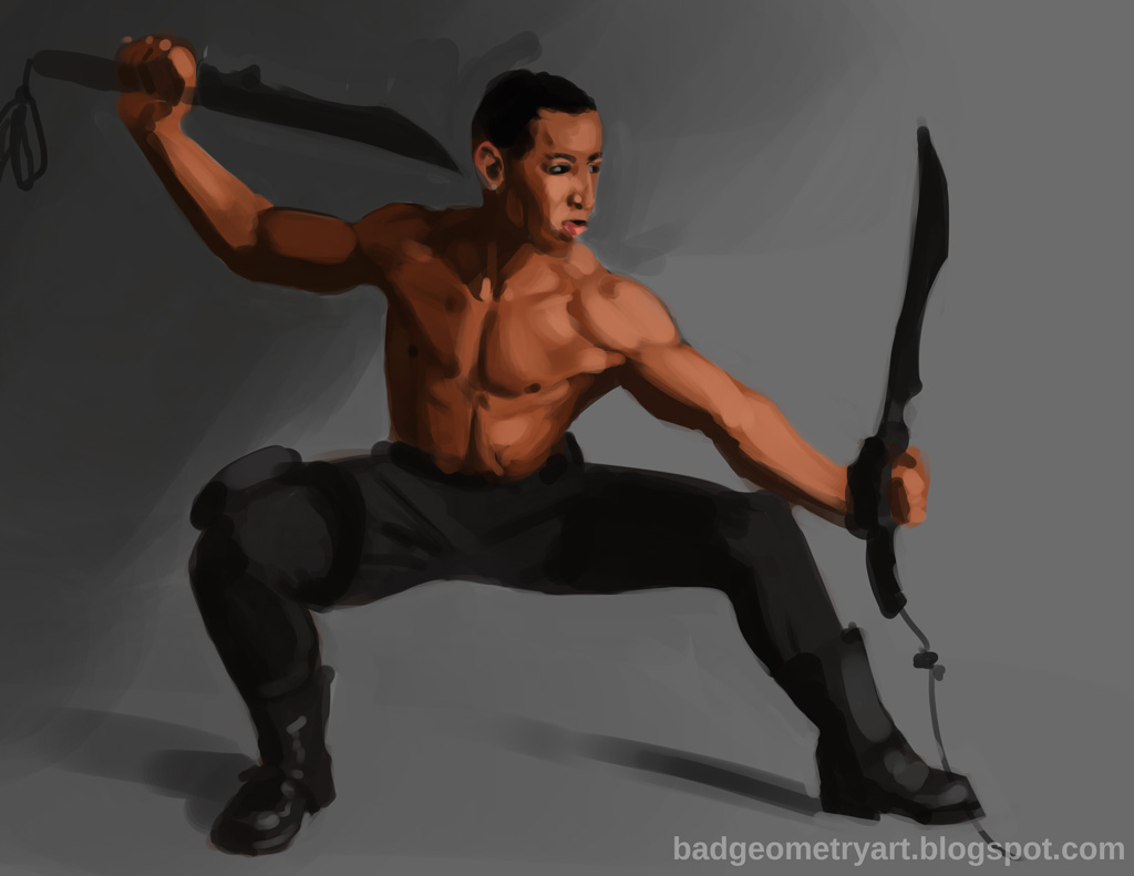
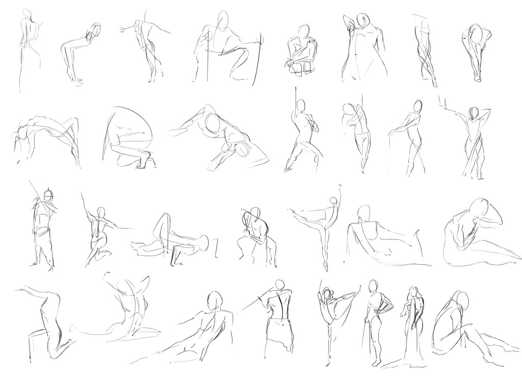
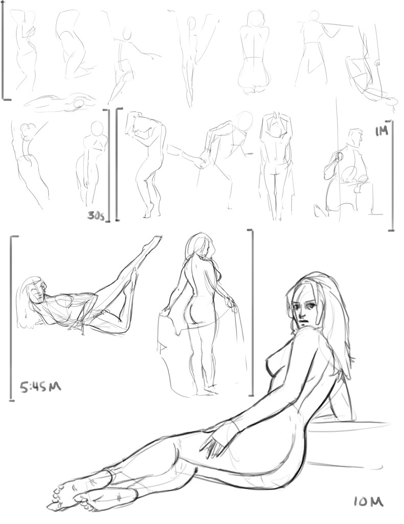
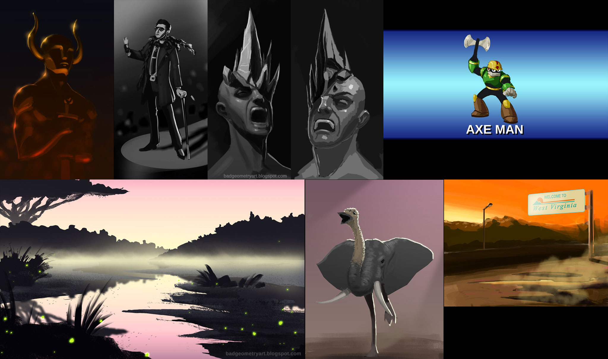
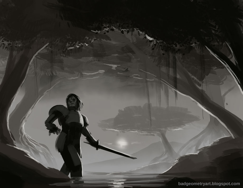
Hey everyone, so I guess I'll just post a few of my most recent finished pieces to give you an idea of where I'm at, and then follow it up with some studies I've done in the last few days, along with a WIP of my latest under taking.
Finished Stuff!


Studies!
About 2hrs

About 45mins


WIPs!


My biggest weekness is with a lot of foundational stuff, so I want to focus plenty on that. I also love to do characters (in case you couldn't tell), but I want to (read: need to) diversify and add environments and industrial design to my repertoire.
So yeah, this where I'm at. By the end of this year, I hope to get good enough to start working on more exciting professional projects. Here's to git'n gud in 2014!
Check out my blog!
badgeometryart.blogspot.com
Posts: 8
Threads: 2
Joined: Mar 2013
Reputation:
0
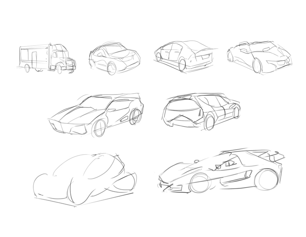
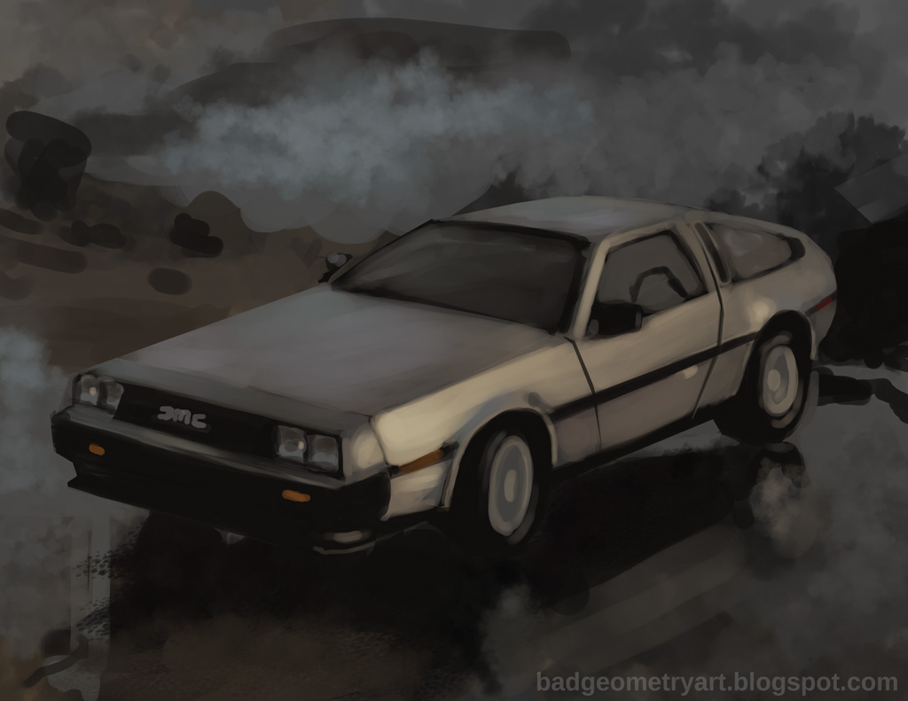
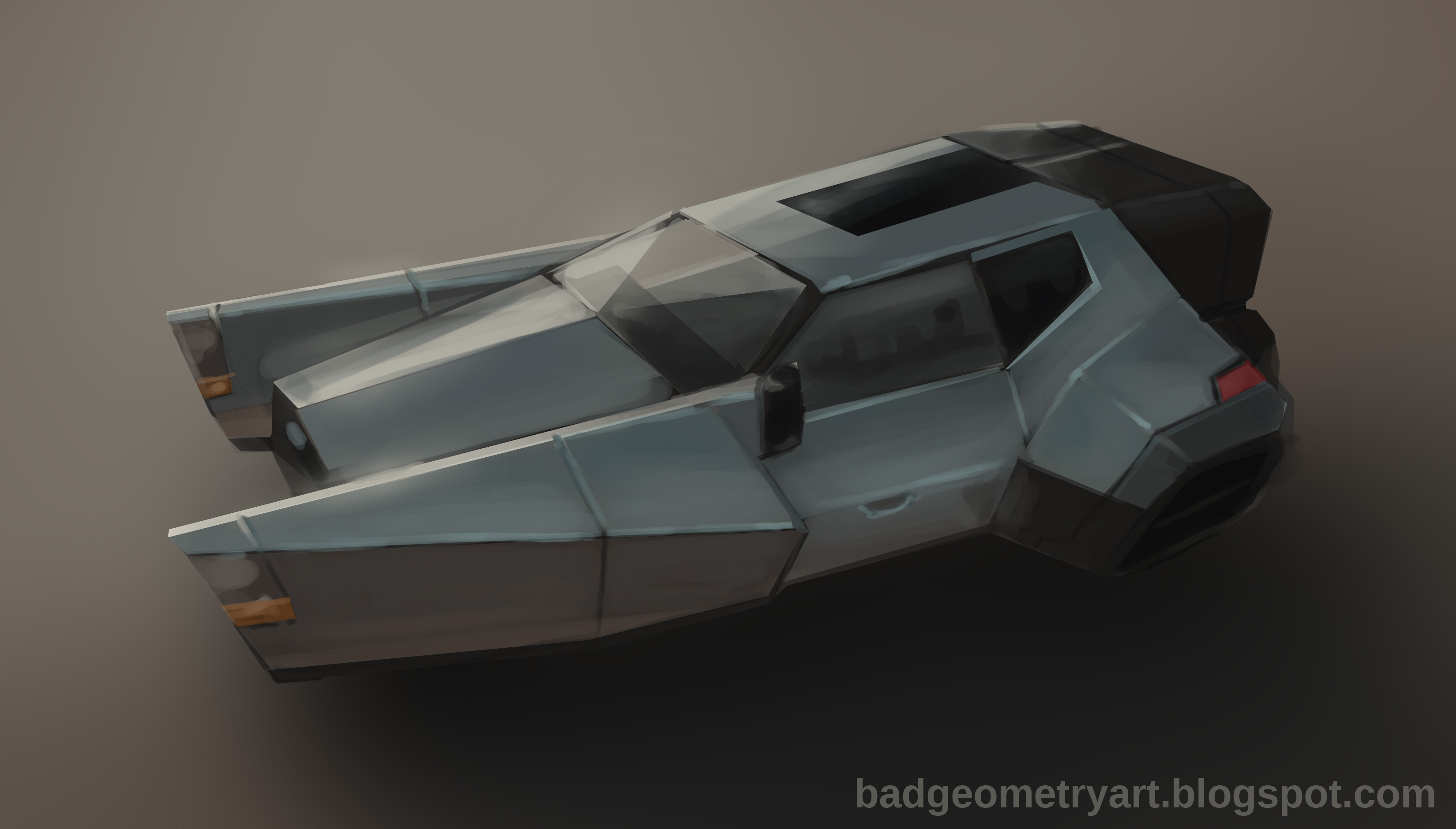
Hey guys. Did some car studies tonight. A few warm up sketches about a minute each, a one hour study of the best car ever, and then a hour rendering of a hover car sketch I did some time ago.


Used the lasso tool like crazy on the hover car, which really reduced the clean up I would've needed to do. Unfortunately, there were some perspective and design issues in the original sketch the I didn't get around to ironing out, but that's OK. The rendering itself looks pretty good, so that's a small win in my book.
When I do vehicles again next week, I'll focus more on construction so the drawings will be more accurate.
If you got any tips on other ways I can improve, let me know!
Check out my blog!
badgeometryart.blogspot.com
Posts: 1,118
Threads: 12
Joined: Nov 2013
Reputation:
63
Nice work man! I like your screen name too :D
Posts: 41
Threads: 2
Joined: Jan 2014
Reputation:
0
Posts: 8
Threads: 2
Joined: Mar 2013
Reputation:
0
Haze: Thanks! Got my 3D modeling teacher to thank for that! Not that I was bad at topology or anything.
PButler: Thanks!
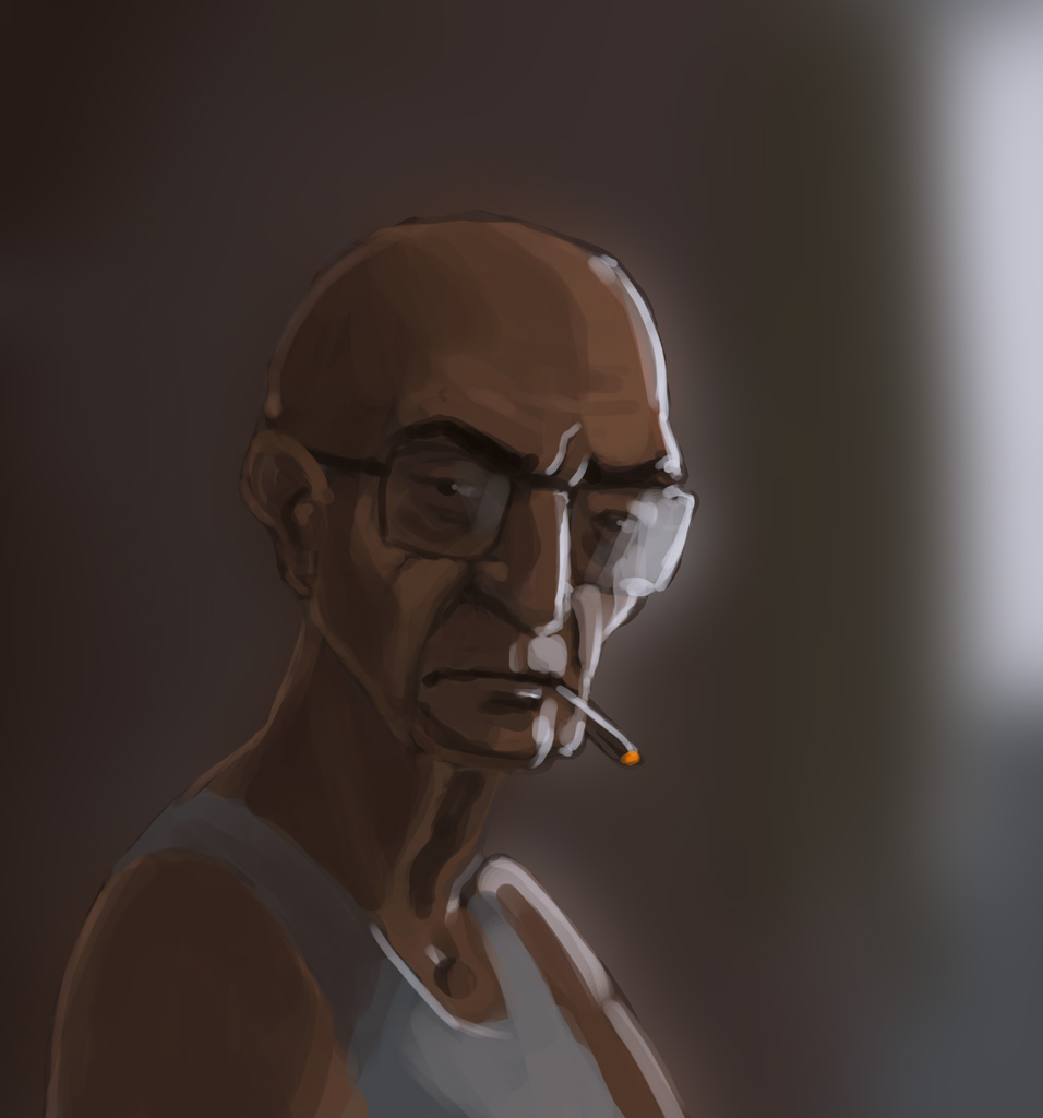
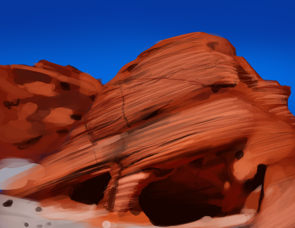
Bit of an off day today. 30 Minute Spitpaint with too-medium values, and a 45 minute enviro study. The block out was OK, but woof, I did not get the grooves right. Got a little overwhelmed with all the detail there.

Grumpy Old Man

Reference Image: Link
Crits would be much appreciated.
Check out my blog!
badgeometryart.blogspot.com
Posts: 8
Threads: 2
Joined: Mar 2013
Reputation:
0
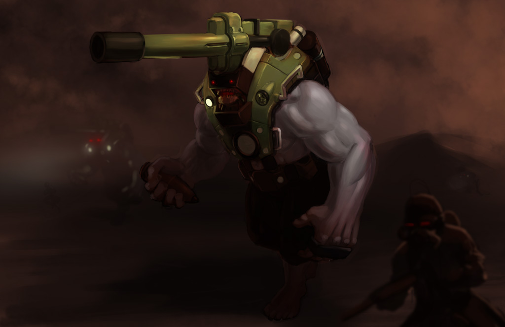
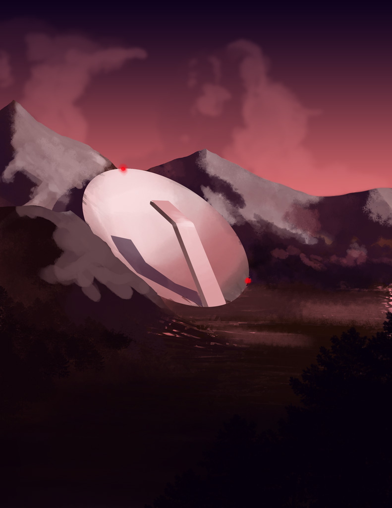
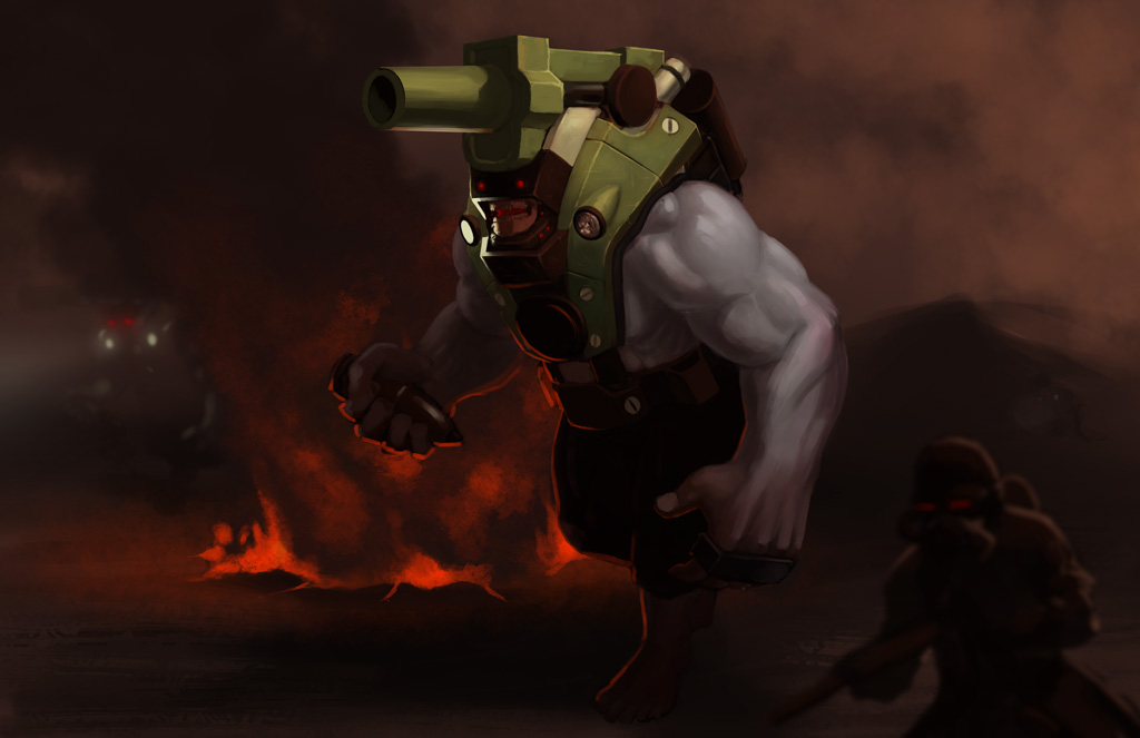
Hey Chums! I had a friend come in from out of town this weekend, so I didn't get as much art done as I would have liked. Here's a spitpaint I did tonight (theme: Satellite Dish) and a progress update on current painting.
CnC is always appreciated. Lookin' to get back into the swing of things this week!

Spent too much time noodling with the environment.

Made lots of corrections, and I have more corrections yet to make. How's the perspective on the cannon? I've been struggling with it for a bit (my own fault for not planning it earlier). I'm not sure if I should keep that third light source (the single floodlight on his shoulder). What do you guys think?
Check out my blog!
badgeometryart.blogspot.com
Posts: 320
Threads: 2
Joined: Jul 2012
Reputation:
7
Hi there! Awesome to see so much personality in your work ;D
I think that cannon looks good, and it's a nice added touch with the headlight, or what you call it, on his chest there. So there's strong light in the facial area focal point.
The only thing that looks a bit off to me is his foot there, looks like it doesn't quite alignt with the ground considering the perspective. Like the horizon line should be higher up for his foot to look like that. No master of perspective here, just an observation, but might be worth to think about *humble mode*
Keep churning out the good stuff!
Posts: 8
Threads: 2
Joined: Mar 2013
Reputation:
0
Adzerak: Thanks man! I see what you mean about the foot there. I'll do a few tests on it to see if I can't make it work better. As for the circular portion on his chest, that's going to be his loading mechanism. It's been a bit tricky to render out, given its angle and lighting, but I'll get it right!
Thanks again for your feedback!
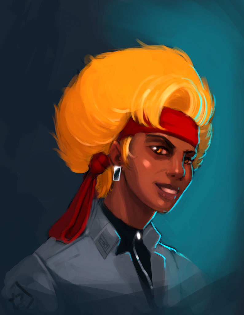
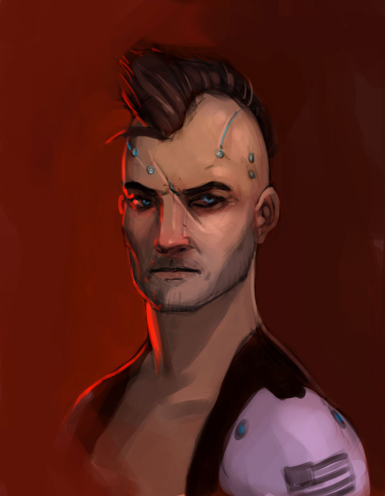
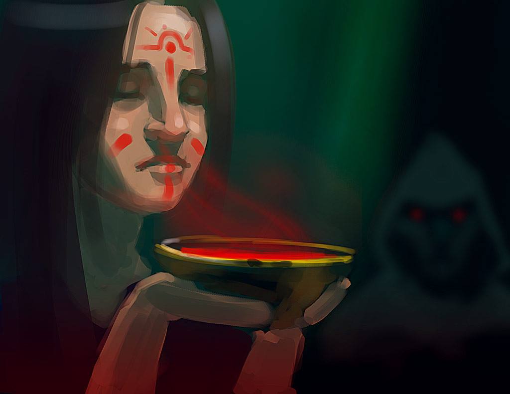
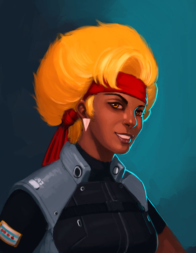
Another small update tonight. One spitpaint, and some progress on one of the portraits I posted at the beginning of the thread.

I'm actually pleased with this spitpaint for a change! Theme was "Red Mist". It was an expecially cool theme this time around 'cause the other spitpainters had a lot of different interpretations of it.

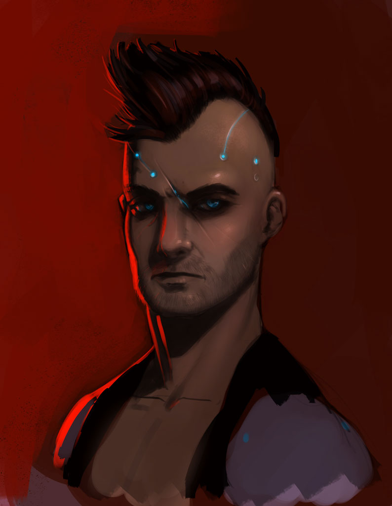
Corrections, additions and refinements. A lot of the major stuff is in, now I just need to work at the fine details. CnC is always appreciated!
Check out my blog!
badgeometryart.blogspot.com
Posts: 345
Threads: 4
Joined: Jun 2013
Reputation:
2
Nice stuff! Lots of good ideas here - my only critique is that maybe if you used less vibrant colors on the latter pics, you achieve a more lifelike result..
Posts: 307
Threads: 8
Joined: Apr 2013
Reputation:
33
Nice sketchbook, its looking real good !
I have two recommendations for you:
1. Have you read scott robertson's new book? It goes really in depth on perspective and drawing hard surface stuff from imagination. I think you might like it!
2. Check out shaddy safadi's videos on youtube. They're mostly about his process for painting landscapes. I recently applied his techniques to a landscape study i did and it helped a lot! Its not perfect but its much better than what I was doing before. It might help you feel less overwhelmed by the little details and focus on the "essence" of things as he puts it. He might look a bit anal-retentive while he paints but the end result is great and the technique is pretty solid
Keep up the good work !
Posts: 8
Threads: 2
Joined: Mar 2013
Reputation:
0
Kaffer: Thanks! I hear you on the color saturation. I work at a slot machine manufacturing company and all of our art is at max or near max saturation, so it's a bit of a hard habit to kick. That said, I'll be sticking with the more vibrant hues on the cop portrait since I'm trying to achieve a certain look with it. That's the goal anyway. Thanks again for your feedback!
Beardly: I've wanted to get my hands on his book for a while! I'm probably going to buy it for my birthday next month. Also, thanks for recommending Safadi's channel (just subscribed). I'm always on the look out for good youtube art channels. Will be watching his stuff tomorrow night when I get back from the office!
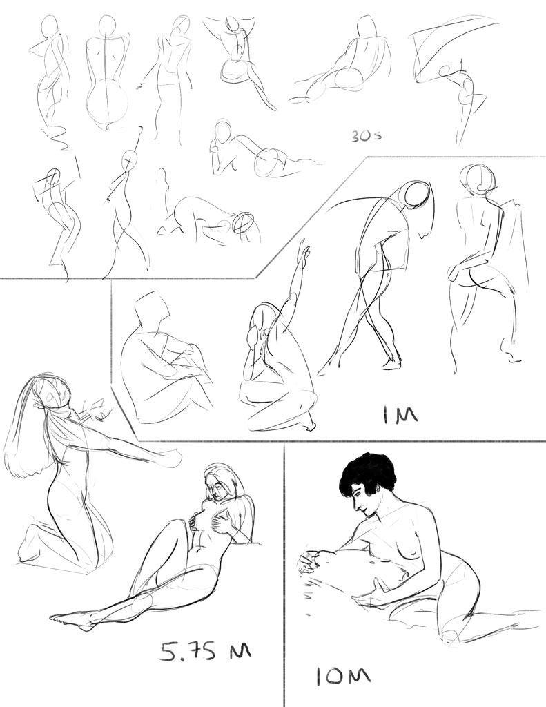
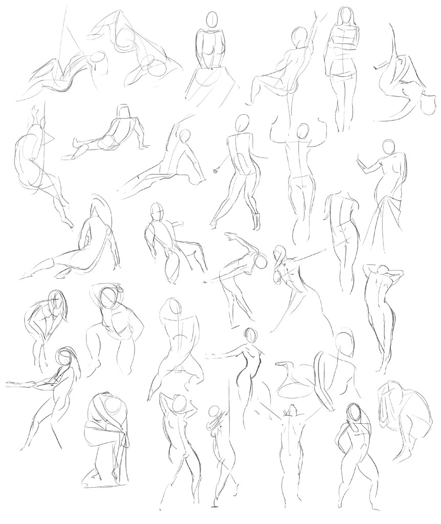
Sorry for the missed updates yesterday, and lack updates on the portrait or Howitzer tonight. Here's an hours worth of figure drawing!

30 minute class on Pixelovely

30 1 minute poses. Pixelovely again.
At somepoint, I'm going to need to get my butt to a real life drawing studio because I'm already starting to get repeats at pixelovely. It's weird though. When I'm doing these (especially the 30s/1m poses), I think they look like crap. But when I look at them again later, they don't seem so bad.
One snag I feel I'm hitting as that, while I feel I can capture the gesture just fine with lines of action, my drawings seem to stiffen up once I start blocking in the body parts. I've tried a couple of different approaches with varying degrees of success. Maybe it's something that'll improve with just raw practice?
Check out my blog!
badgeometryart.blogspot.com
Posts: 1,118
Threads: 12
Joined: Nov 2013
Reputation:
63
Those gestures look really good, man. I always get the same feeling that while Im drawing they look worse than when I look back after. Proko says somewhere in one of his videos that your drawings are always going to stiffen up at least a little when you draw with careful measuring. He says to just practice both quick gestures and careful measured drawing to eventually find a balance of looseness and precision.
Maybe you're in need of more loose gesture practice because youre figures look pretty damn precise to me. Even the 30 second poses look like youre nailing them pretty easily. I've heard somewhere that you want to find the shortest amount of time you can do a gesture in so you have no time to think and you draw with pure instinct. Perhaps 30 seconds is too long for you for quick gestures ╮(─▽─)╭
Posts: 8
Threads: 2
Joined: Mar 2013
Reputation:
0
Hey guys. It's been too long! I'm sad to say that I've been slacking. I wish I could just blame life, but I have no one to blame but myself.
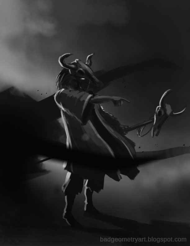
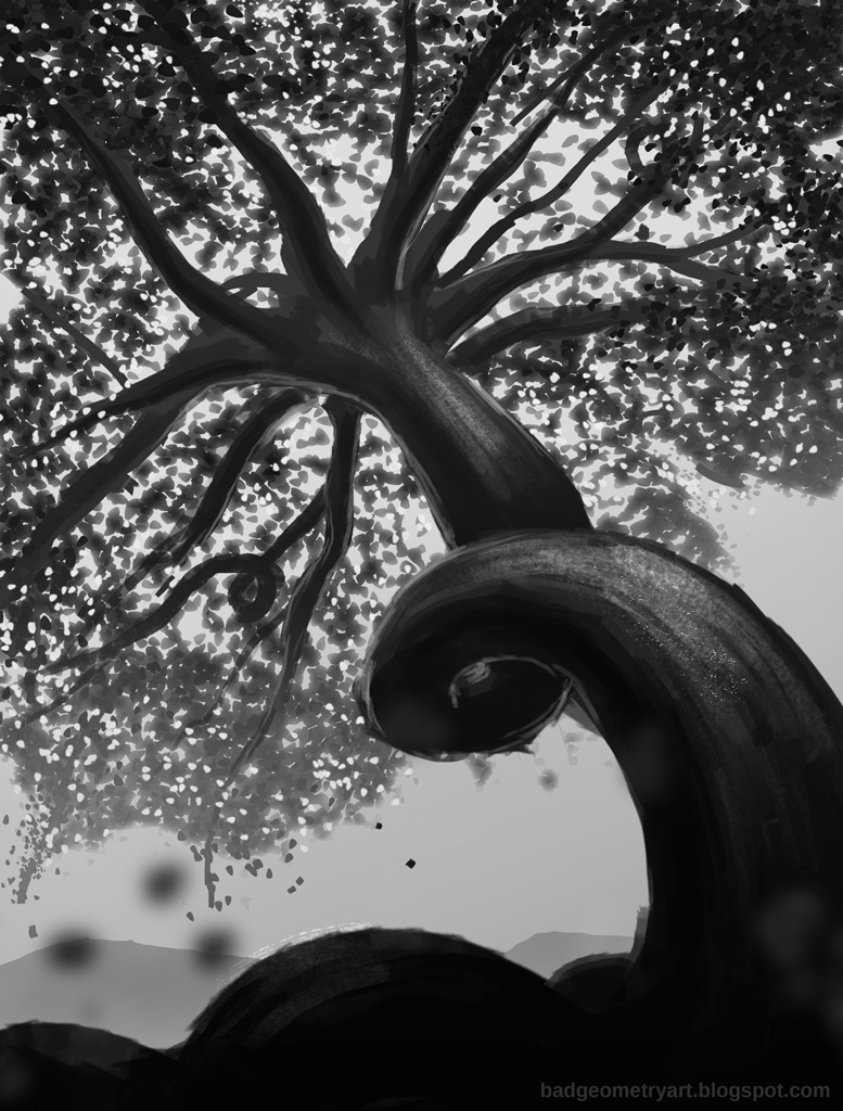
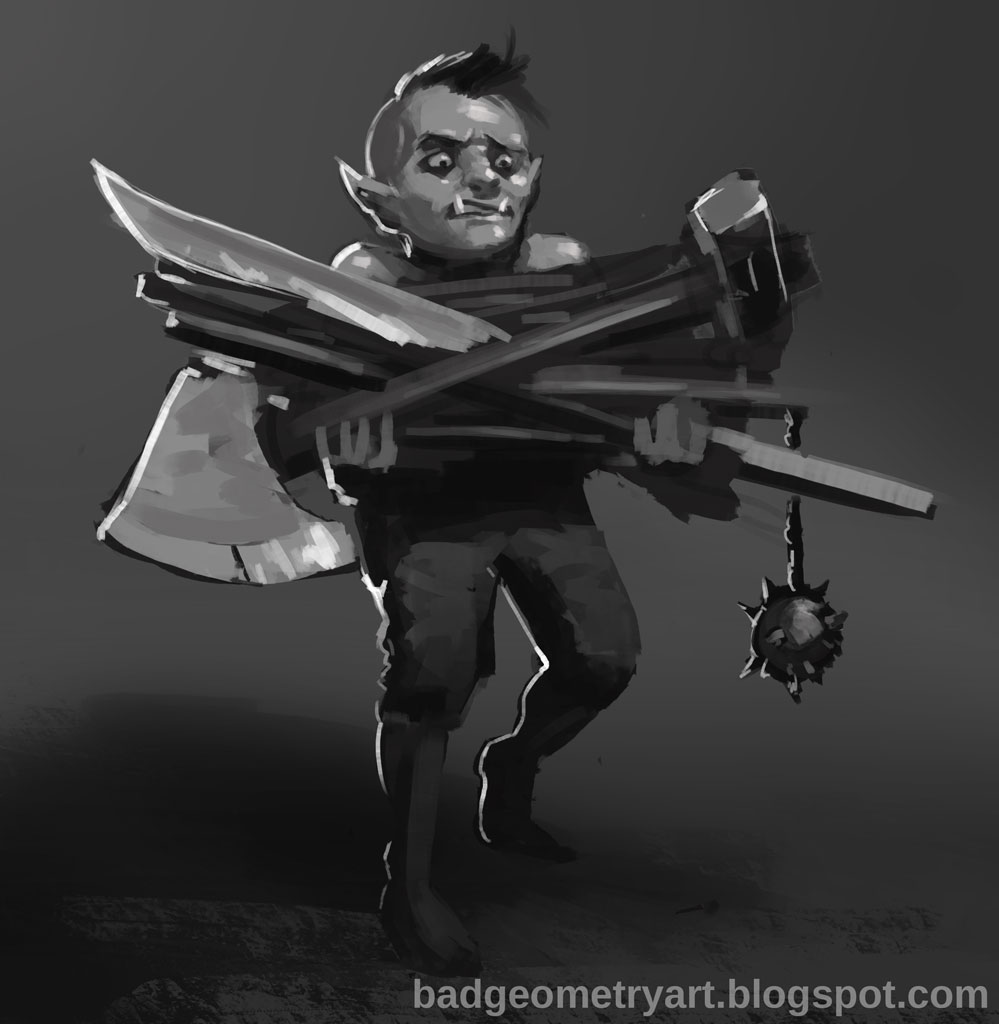
But, just 'cause I haven't been posting here doesn't mean I haven't been painting. I've been pretty active on the Spitpaint group on facebook and I've polished up a few other things. Here's a few of the Spitpaints I was really happy with, along with one image containing Spitpaints I didn't like (shitpaints, if you will).


(Happiest with this one here)

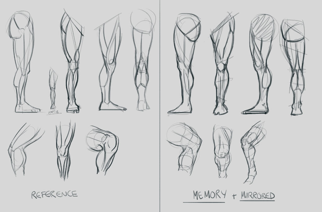
Managed to squeeze in one anatomical study here. Left is referenced. Right is memory.

Made some more headway (heh) on this portrait. Real happy with it so far, but there's still a bunch of stuff left to be done. I also gotta bring Sascha's portrait (blond cop above) more in line with this guy since she looks way more stylized.
So, with that big update, here's what I learned I need to work on:
Economy and stroke confidence. I noodle around like crazy and I think it's big reason why most of my spitpaints suck, and why it takes me forever to work on more involved pieces. I know studying Sargeant's paintings or just studying photos with an arbitrary stroke limit will help with that.
Can you guys recommend any other exercises that will also improve stroke economy?
Check out my blog!
badgeometryart.blogspot.com
|
