11-13-2013, 08:53 AM
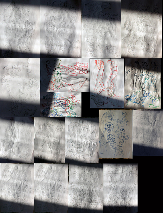
Sorry for the photo quality!


|
Nika's Sketchbook
|
|
11-17-2013, 12:07 PM
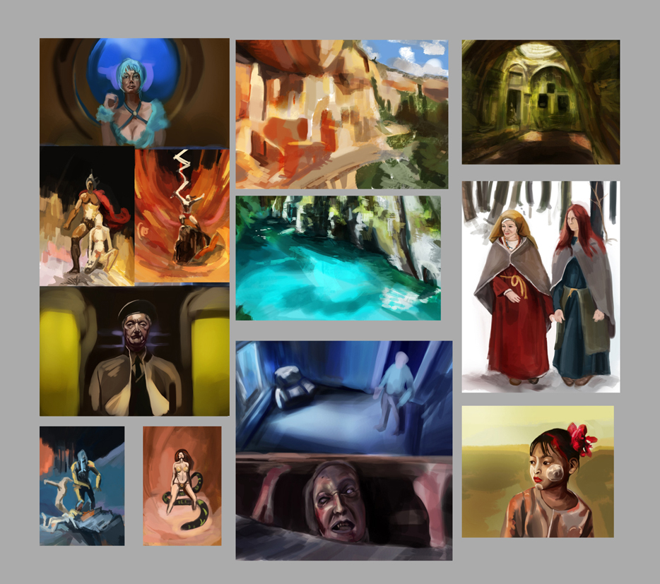
Here's more colour sketches and some from imagination
11-17-2013, 12:13 PM
while your sense of color and values is really good.Your lacking alot of fundamental construction and basics that ruin the otherwise good pieces.I'd suggest you to practice construction,proportions ,do quick sketches and study the figure in perspective., body part relations.Things of that nature would give a nice foundation for those colors and values.Keep up the good work
11-25-2013, 01:28 PM
Nice sketch book. One piece of advice about photographing your sketch book. Take it outside and place it in the shade. You'll get just enough ambient light without it being too much light. You're doing great with being consistently working it looks like. Keep it up!
11-27-2013, 09:30 AM
Hypnagogic_Haze, thanks for dropping by and I'm happy that you like my work! I would work more with contrast but on that piece I was entangled in Overlay and I had tryied out some effects. Thanks again for checking my stuff out!
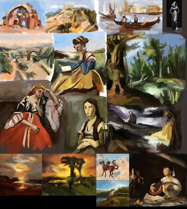
Some Random Portraits... 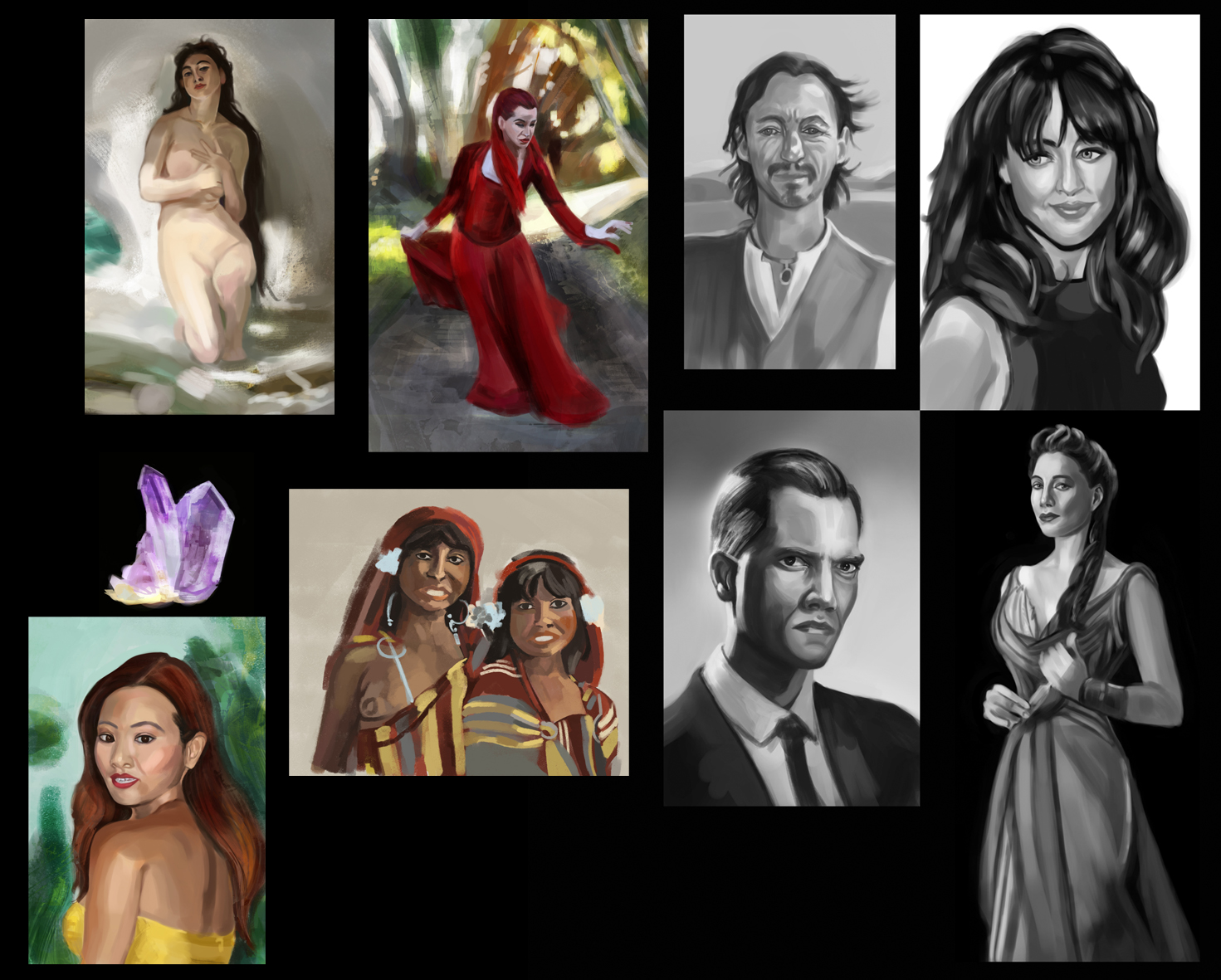
12-06-2013, 05:01 AM
For a while I will focus on my sketches and imaginary things. I hope everyone enjoys all my pieces :)
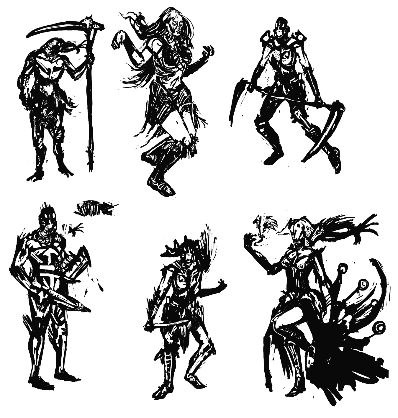
12-11-2013, 09:27 AM
So many studies! You're working hard :) Those pen (?) environment sketches are really lovely. I'd like to see you push some illustration to a more finished level though - while studies are important, it's good to actually put the knowledge to work as well. It will also help you see which areas you need to focus on more.
Keep it up! :)
12-11-2013, 12:39 PM
How have you been, Lyra? Thank you so much for your nice words, It is always a pleasure to see you in here!
Here is My Alien "Shark" Raider, female and male version. I wanted to participate in the contest CHOW # 341 :: Alien "Shark" Raiders. But I didn't comply with all requirements. 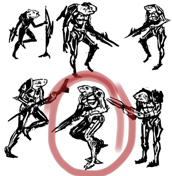 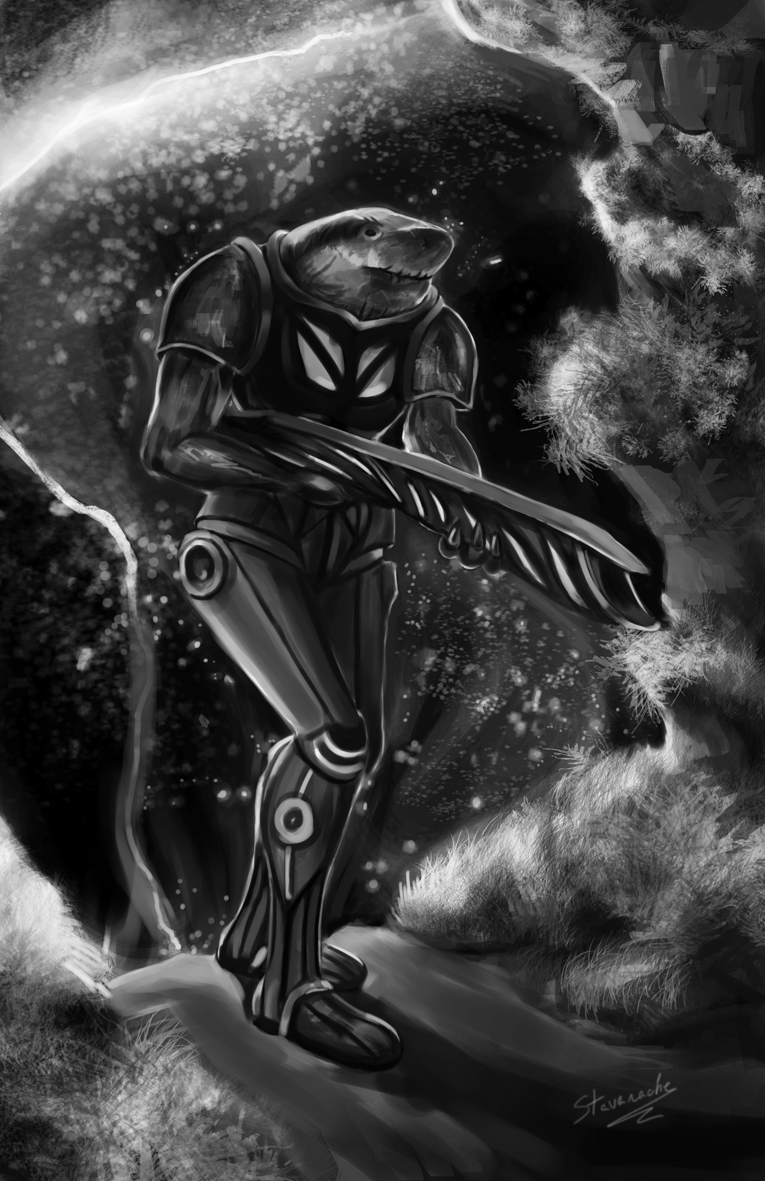 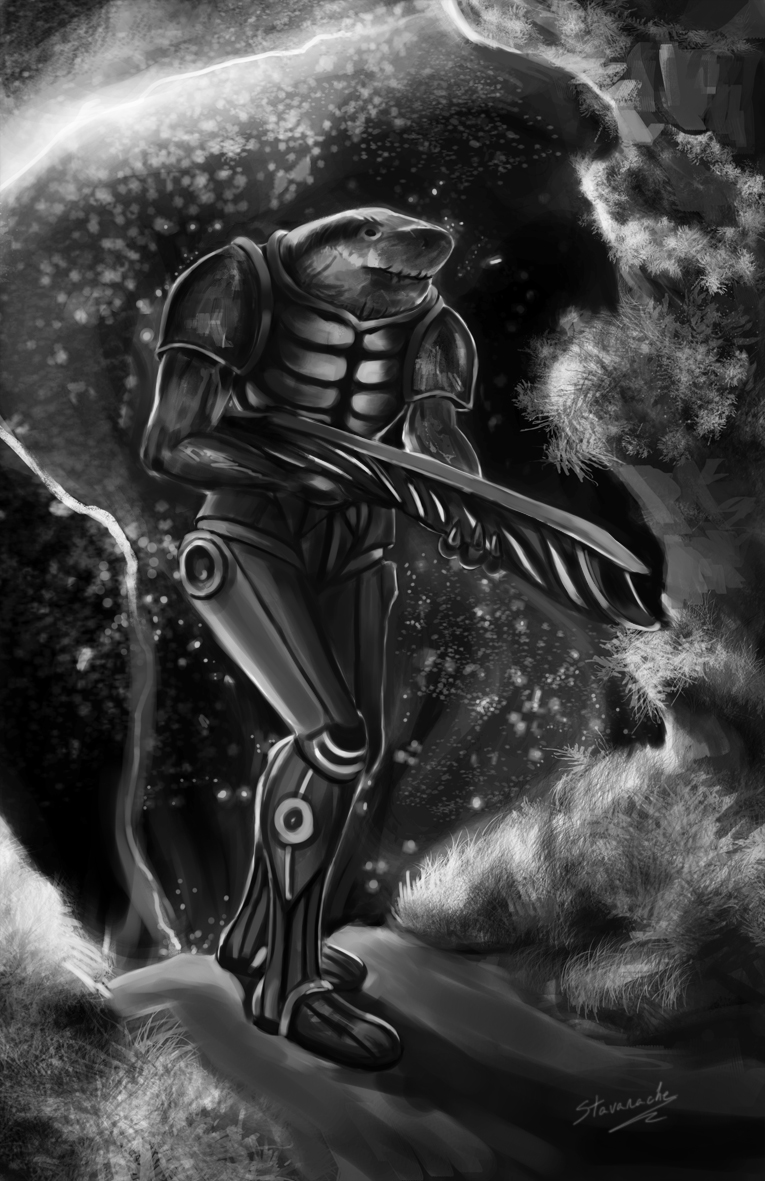
12-13-2013, 12:21 PM
I was too lazy to color the Shark, but I have done some 5min color studies.
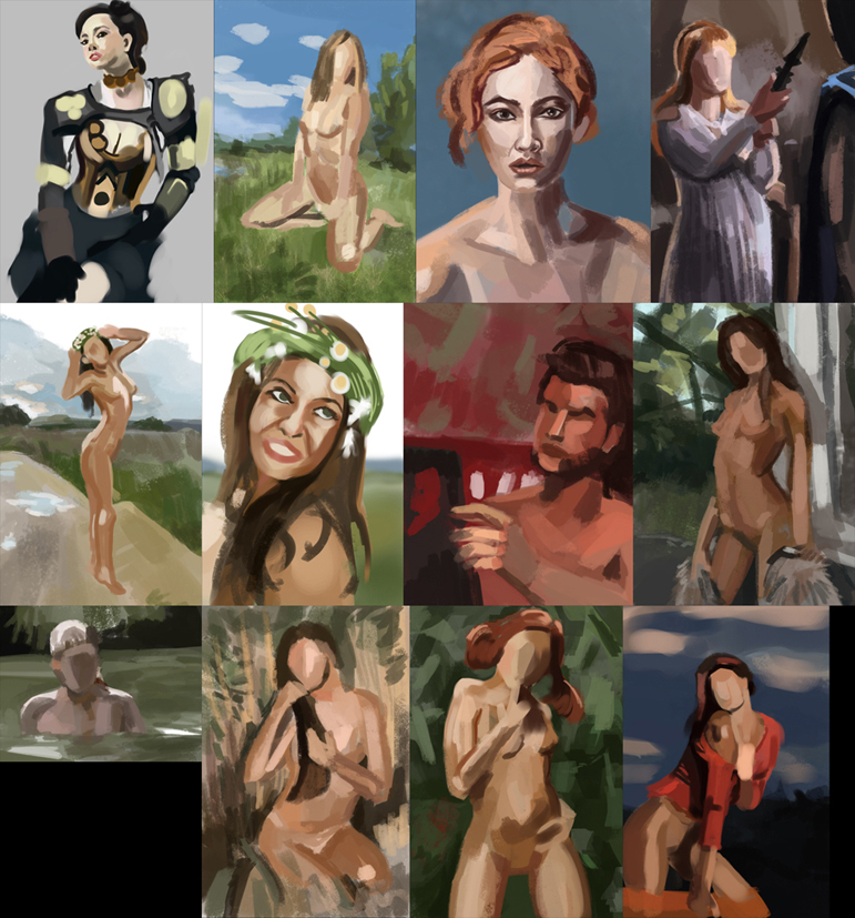
12-20-2013, 01:43 AM
Hi Nika! Hey, I love how your paintings are looking less and less line-dependant and more composition-oriented from the beginning to now!
Keep the good work up!
12-20-2013, 05:17 PM
Lots of hard work going down, well done! I would like to suggest spending more time on an image or a study. Rather than get x amount done, maybe concentrate on a study so you can get more out of it. Spending more time on the colour and details will help loads when you work on your own stuff.
12-23-2013, 02:57 AM
Lots of work in here, great! Don't forget to flip your paintings every now and then (sorry if you already do!) - it helps with to see compositions with a fresh eye and also makes it easier to spot things. Like the quite asymmetrical lips in the portrait on the upper left in your last post. Same with turning the image to black and white to see if it still reads (which it should, if your values are good).
Happy holidays to you :)
01-08-2014, 09:11 AM
Kidult, thanks for checking out my work! I always notice all mistakes when it's too late, but for now I read a lot of color tutorials from Linda Bergkvist, they are the best.
Lyraina, thanks a lot! You're right about the critique... arggh I need to work harder. I will practice, practice, practice. I wish you a great new year ! I wish you all a Happy New Year! Cheers. 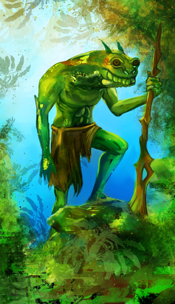
01-09-2014, 07:48 AM
Happy new year to you, too!
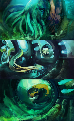
That last creature is so cute... I guess it's not supposed to be, but it just looks so curious and almost smiling!
01-14-2014, 07:13 AM
Really glad you like it, Lyraina! You're doing some super cool stuff yourself, especially your character design stands out from last post.
01-14-2014, 07:32 AM
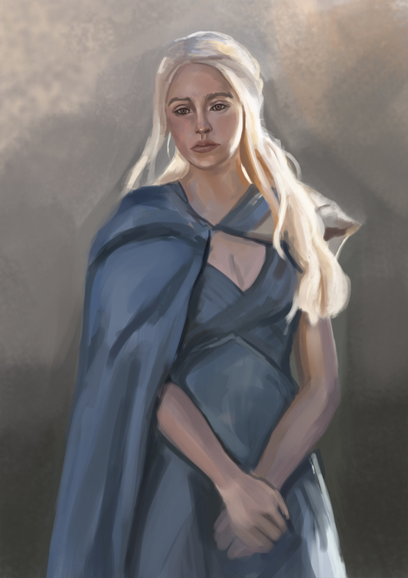
The colors look nice on those last 2. Daenerys' mouth is a bit off. Try to stick to basic shapes and nail the forms before you start adding detail. I find it easiest to use a hard round brush with the width set to how wide I want the shape Im making to be. That way you can make a very quick blob of the shape and then refine it while thinking about the 3D form of the object. Just my 2 cents. Great work, keep at it!
01-16-2014, 07:43 AM
Thanks Nika :)
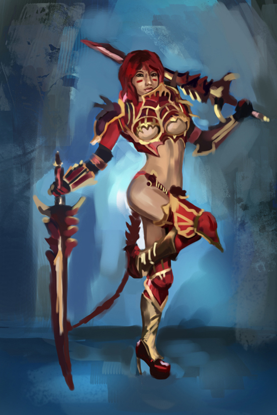
Hypnagogic_Haze is right about Dany's mouth, I think it is basically the lower lip that is extended a bit too far towards the corners of the mouth. Nice muted palette though. The armored girl looks cool, I like the gold/red/blue combination. But are you sure that this is where you want your viewer's attention to be - right at her butt? ;) Placing that contrast/light background near her head would pull the focal point a bit more upwards, where also the most interesting design is happening. But this obviously only depends on where you want our attention to go first. :)
01-18-2014, 06:21 AM
Hypnagogic_Haze, hey and thanks man! Your critique is highly appreciated and you are right. I just begin to notice that. I need to work on that part much harder!
Lyraina, I must to admit, I haven't done so much studies of lips and noses. I'm still in the process of studying their anatomy. I hope it would be soon :) That girl with armor, was created especially for men :D This piece was inspired by exotic fish. 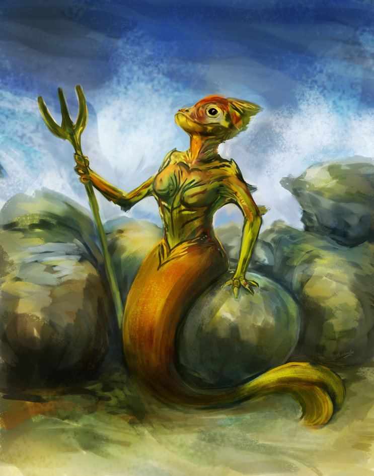 |
|
« Next Oldest | Next Newest »
|