06-22-2014, 02:12 AM
|
Nimao's Sketchbook - things and stuff
|
|
06-23-2014, 01:55 AM
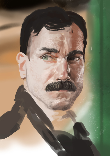
Sick studies man, really like your little bust sculptures too. Keep working hard :D
06-23-2014, 03:01 AM
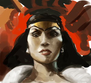
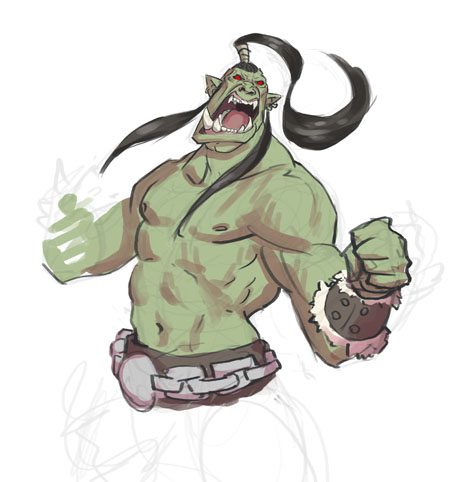
Awesome job on the warcraft portrait on the previous page man, It came out great. Loved the little sculpt you did before it too :p
06-23-2014, 03:06 AM
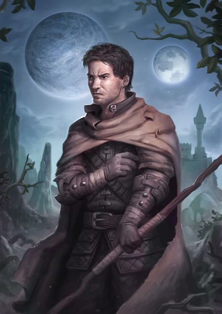
Dude! wow... your illustrations get better and better!
The only thing that i would recommend to practise more are landscapes. Keep it up!!!!!!
06-30-2014, 06:11 AM
@ Sir-Lex: yeaah i have to. thanks im trying hard^^
@ warburton: thanks man! ;O @ ImSkeptical: I will!!! ;D 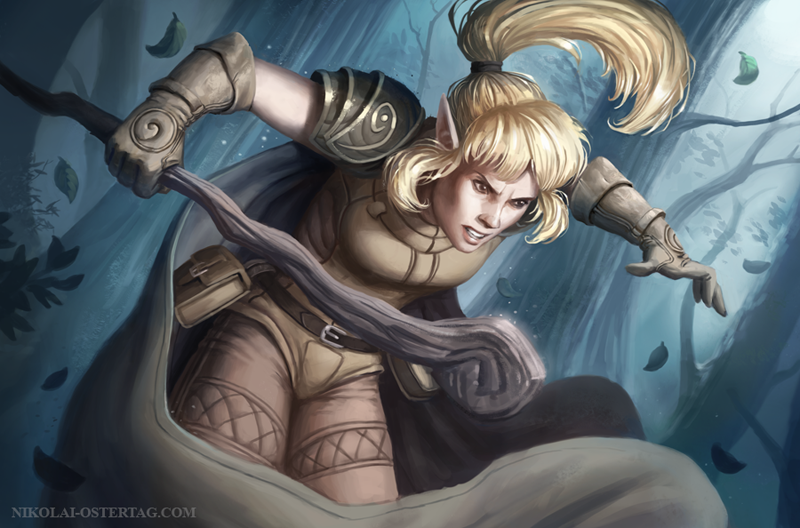
06-30-2014, 07:12 AM
Hooly crap.
The improvement since the last time I dropped by us substantial. This is great. In the last piece I think you may have been able to push the different materials a little more. She looks like every piece is made from the same stuff. If that is what is intended then maybe also vary the different materials in the design. Keep up the good work :D
07-07-2014, 12:06 AM
Meet Pog The Beatiful
@jaik: yeah really having a hard time with materials =/ and thanks^^ 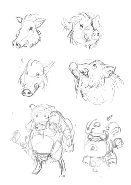 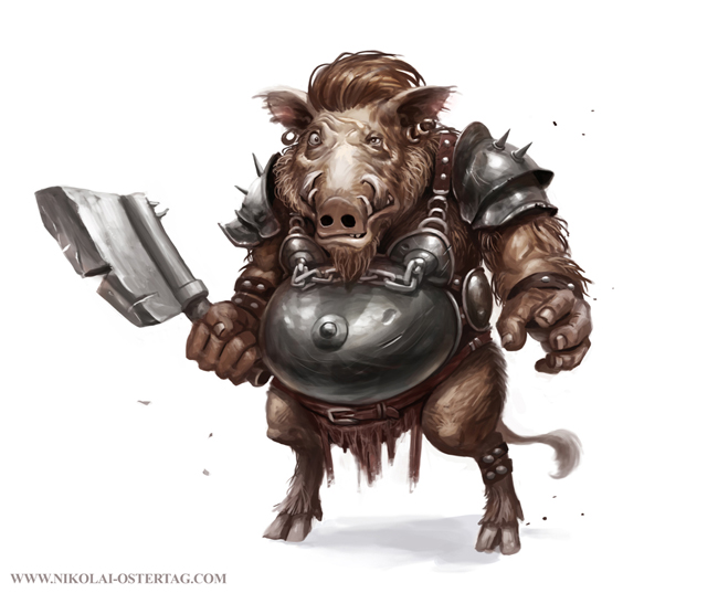
07-24-2014, 12:00 PM
Looking great! These updates are sick! Keep 'em coming! XD
08-16-2014, 12:23 AM
Man, have been following your sketchbook for some time and it's really inspiring. Are you making some work for paizo? these last few pieces totally fit their style. Also, Nipppple chains!!! love it!
Need to post more man!
08-22-2014, 08:21 AM
@rafa zanchetin: yeaah i'm so slooow ;( i dont work for paizo but i got theses question a lot the last weeks maybe i should send them a email. really enjoying those ;O. yeeeeah nipplechains ;D
finally finished o.o 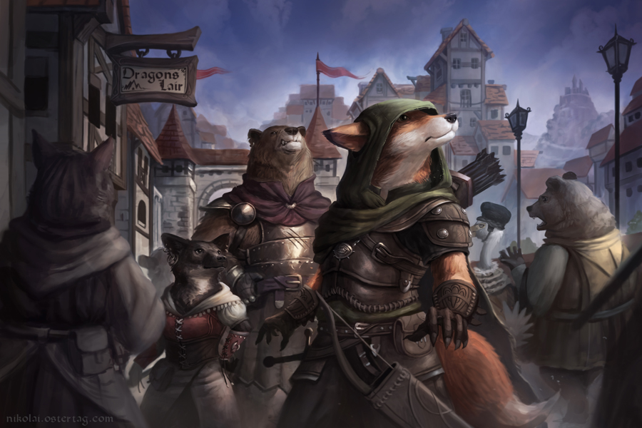
08-22-2014, 11:01 AM
Man, those animal characters are seriously cool. Love that loast painting, really makes me want to know what's going on and what they are looking at! Only crit would be the character on the left/foreground, looks a bt unfinished because it's so monochrome in comparison to the rest.
Keep it up!
08-22-2014, 03:27 PM
Yea that last painting is amazing, I'd also crit that maybe the background has too much contrast on the left of the left bear, where in the right yo applied some fog, it'd be even better if you did the same. Just a small nitpick. :)
08-27-2014, 06:37 AM
@Lyraona & rafa zanchetin: You both are totally right. i'm gonna keep that in mind in my next pieces thanks for the crits ;O
08-27-2014, 07:46 AM
Definitely kicking some arses with your last illustration Niko! Though I think that desaturated character in the foreground isn't bothering me at all. I feel like watching some animated movie thing and seems to me like sometimes they focus the attention that way so... Looks fien to me!
Anyway, awesome work and pretty inspiring! Keep it up! :)
09-23-2014, 04:15 AM
started to learn some perspective =/ the design sucks and i think i put the pointy things too near together
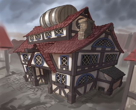 stuff i did over the weekend 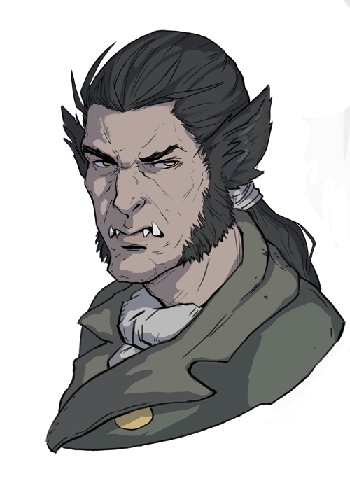 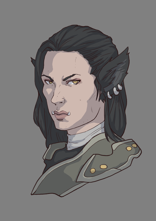 |
|
« Next Oldest | Next Newest »
|