10-12-2016, 04:11 AM
hey that face looks kinda like a face. looks like her cheek is swollen though :P
|
Crackbook
|
|
10-12-2016, 04:11 AM
hey that face looks kinda like a face. looks like her cheek is swollen though :P
10-13-2016, 08:30 AM
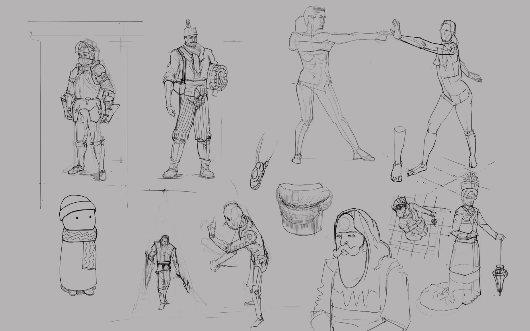
Thanks, the ref had like puffy cheeks so I might have exaggerated.
10-20-2016, 08:50 AM
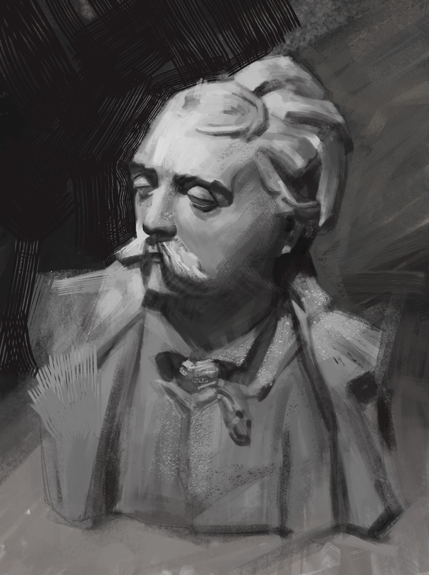
Master study of Yizheng Ke's work. Original can be found here https://www.artstation.com/artwork/YOx4P
10-21-2016, 10:39 AM
Hey Cracked, wanted to drop by some feedback for post #975. I'd say if you plan to do some studies of another artists work, I wouldn't go through the trouble of mimicking the brush or small specs that I see you tried to add in. You can try to acquire/make a similar brush but don't go out of your way to make it look 100% exact.
The important thing you do want to focus on when doing a study like this, is getting the values, form, and measurement correct. You also want to inspect why this artist did some of the things he did with the values or edges and how this applies to what you see in real life.
10-22-2016, 01:49 AM
Thank you for the feedback Dennis :D
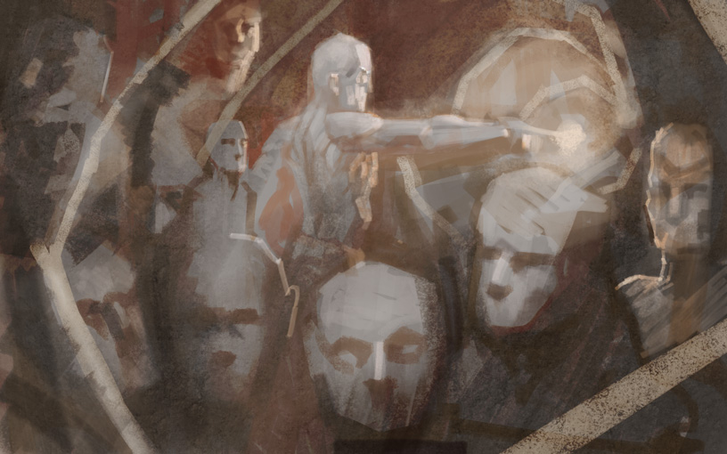
tried to do a lighting test from head. 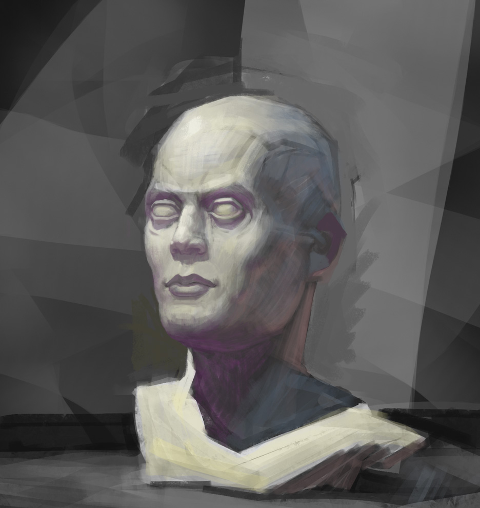
10-24-2016, 09:08 AM
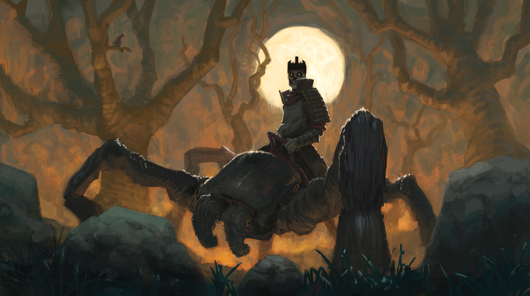
Love your linework man, the drawings look really good. However, in your recent piece with the spider and skeleton dude, it lacks clarity more than anything. I understand it's supposed to be a nighttime scene with a fire, but try pushing the contrast more to sell the idea.
Look forward to seeing more!
Sketchbook: http://crimsondaggers.com/forum/thread-7776.html
DeviantArt: http://epoch-owen.deviantart.com/
10-26-2016, 04:03 AM
Thanks, Nick, I pushed contrast where I saw fit :D
   |
|
« Next Oldest | Next Newest »
|