11-03-2016, 12:25 AM
|
Crackbook
|
|
11-09-2016, 05:24 PM
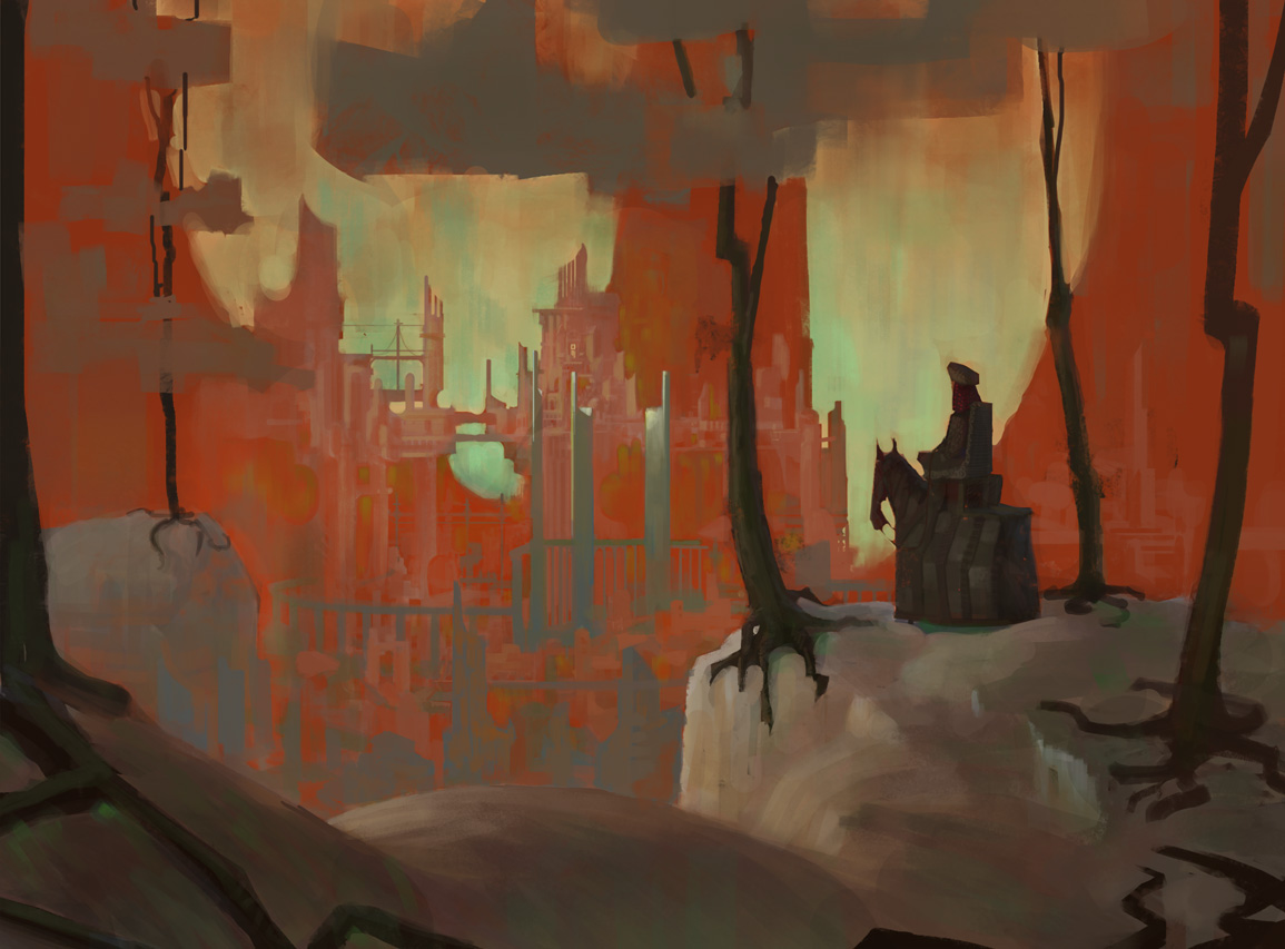
Wow I love this last landscape piece, the thick angular brush strokes look fantastic!
Keet it going Cracked!
“Today, give a stranger one of your smiles. It might be the only sunshine he sees all day.” -- H. Jackson Brown Jr.
CD Sketchbook
11-23-2016, 06:17 AM
Hey, I really liked that Halloween CC submission of yours! Great color and light in a lot of these, too. I remember seeing your stuff maybe 20 pages or so back, and you've gotten a hell of a lot better since then.
Some of the drawing could use some more work, and the separation of values a little more clear. Your lighting is one of your strongest assets imo. A good example of all these things working together is the dwarf you painted back on pg.47. Solid drawing, painting, and everything else. Keep applying that process to future pieces because whatever you did with that turned out a great result! :]
11-25-2016, 05:07 PM
Thanks man :D
The process on the dwarf was quite time consuming too, but you are correct, gotta cover all aspects of an image and really give it all I got, in every stage.  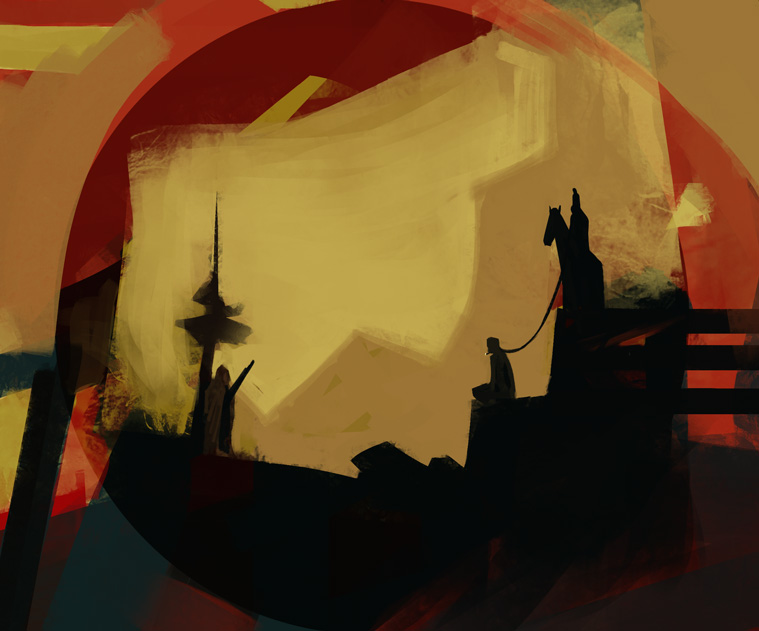 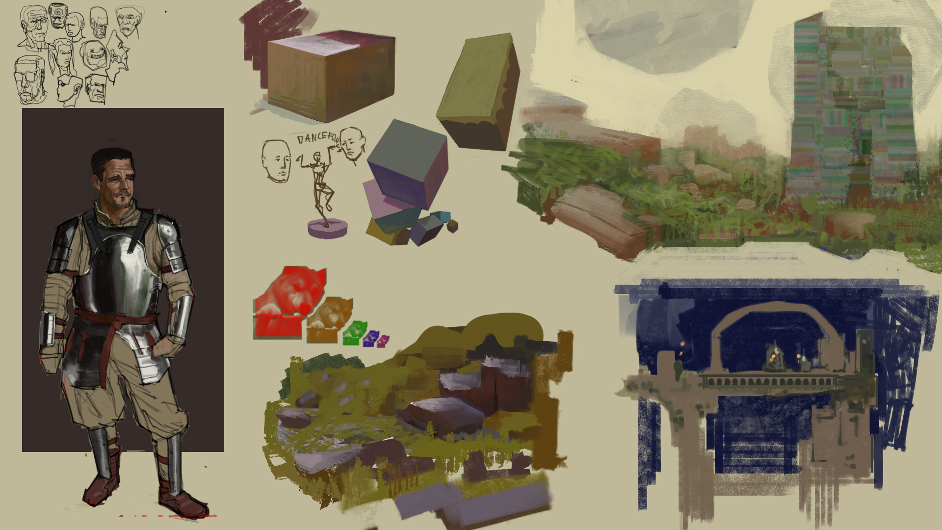
11-28-2016, 02:00 PM
Tried to put some thoughts about work down, following it seems to cancel out distractions, but I seem to get worn out faster.
To know oneself is to know how to make oneself act however deemed necessary. In the case of painting, a controlled work speed and patience are required to enter a state of optimal production: a flow. Both negative and positive occurances can disturb that control. If I do something I percieve as ugly and in opposition to my ideals then it has an effect on me: I might get slightly nervous and speed up my working speed, more often than not, this leads me to be less focused about the process of painting itself and more focused on the good result of it. It can lead to detachment from the process which will end with me stopping painting. If I do something I percieve as beautiful I am filled with joy, I end up getting more distracted and carefree. Once that occurs I will more often than not be in tune with the actual process of painting which leads to random work speed and me stopping work entirely. To be in control and to carry on painting for a great period of time, requires that you devote your attention to it and acknowledge the different distractions the mind experiences, once acknowledged I seek the reason and the effects of the said distraction and reach the conclusion on how to act next. "Have a controlled work speed, focus your attention fully and be patient." and heres stuff. 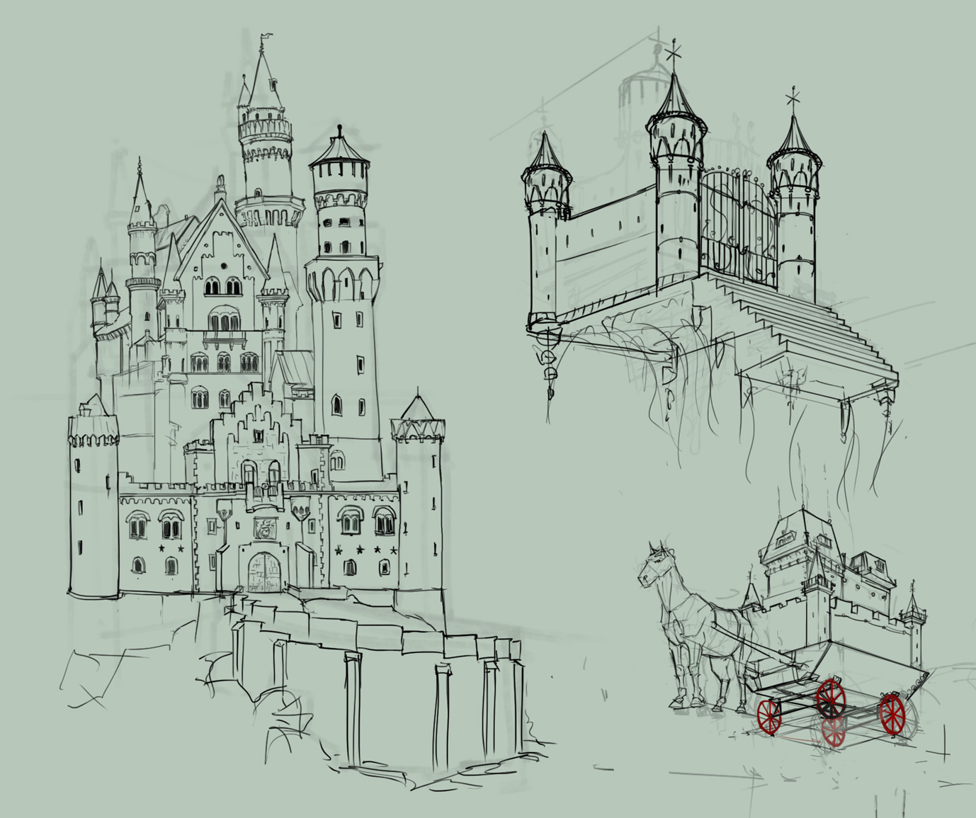 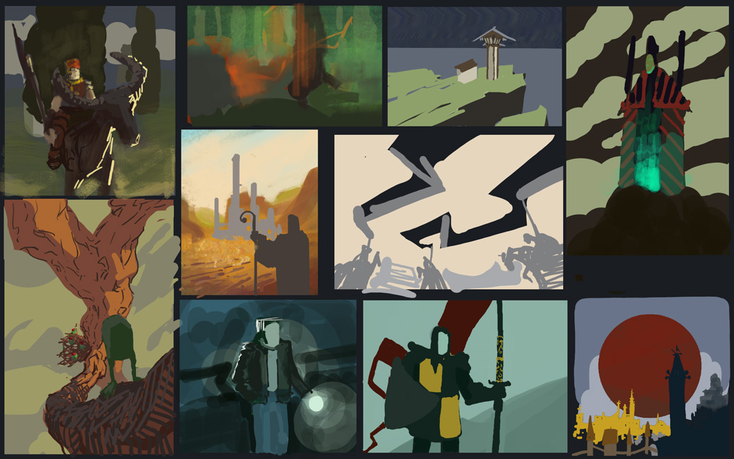
12-20-2016, 10:32 AM
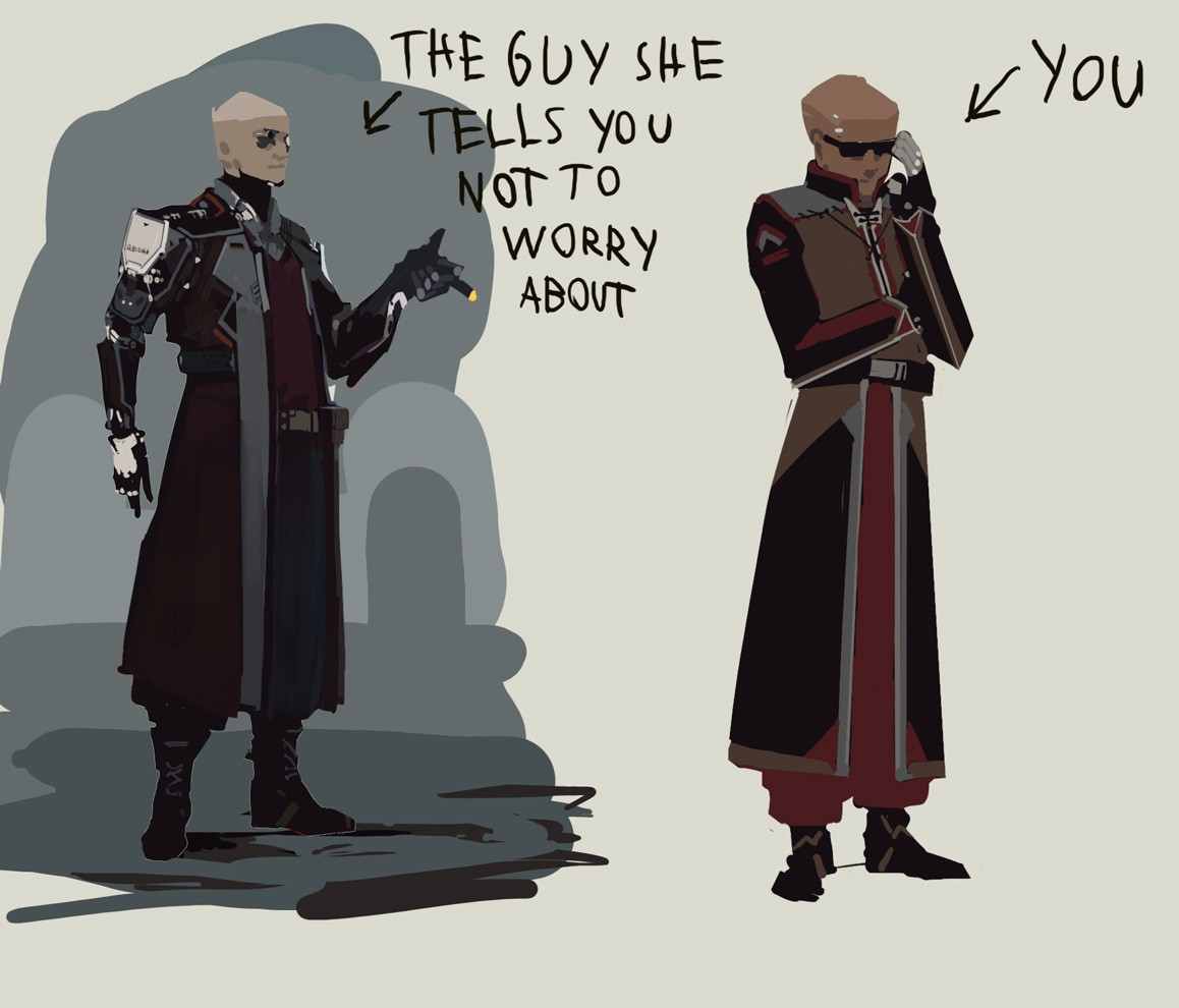
Studued Caisne's(Ihor Pasternak) design, found it quite helpful to produce an accurate copy.
12-30-2016, 06:33 PM
(edit) The earlier design iterations, I made before the below post, for reference
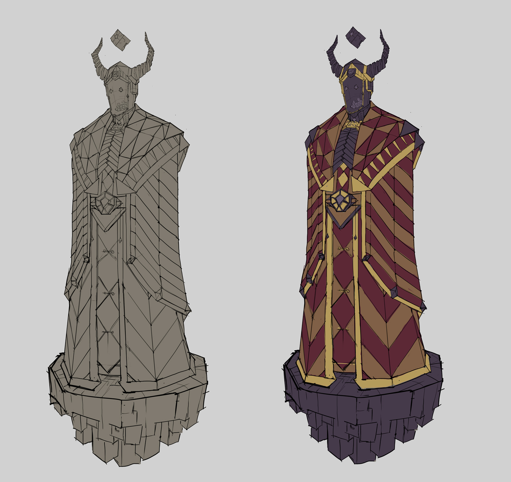
  Here is my continued progress in the character I'm developing, for reference here is a loose idea that this character is based on: An ancient sorcerer king, that has awoken from death. I've realized that the base design I was making iterations to was flawed enough that I should start from scratch, once the new base shapes that make up the character have been found, I can refer back to the succesful parts from the earlier designs and draw from them if needed. By flawed I mean that the visual impact of it was low, infact one of the iterations that I kept going with lost even more power, since the base shilouette of it looked even more boring. Thus looking back at the earlier shilouette I felt that it was stronger. Upon more detail designs on the earlier shilouette(with minor alterations from the base design) I finally realised that I need to start over, because of this corner I've backed myself into with the base design(in essence a neutral pose with arms hidden and not a lot happening). I believe the mistake I made was, being too attached to the first draft and the work that went into it, to start over from scratch. Essentially I had the knowledge of how to proceed(from "The skillful huntsman"), but I believed that the base design shape was good enough, likely enough I decieved myself to believe it was good enough, because it was the easier way to proceed. I write this in hopes that some of you notice, when this sort of situation happens to you, to take a good look at the base shilouette of the character. I would also like to mention to trust your feelings and try to investigate and articulate why you feel that one design is better than the other. The 3rd design below has a very dull basic shape(might work for a background statue, but not a character that conveys power). Even though the details can pull their weight(variety/some rhythm/fit the character, they are heavily hampered by the bad base they are on. I didnt even noticed it until I looked back to the earlier designs and saw that they were better at parts. The 2nd design is in my opinion the best one, due to subtle triangular shape, with lines going towards the focal point, "face". 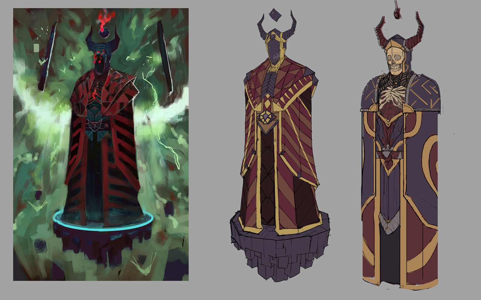 Thus, I went back to the 2nd design and iterated it again, until I realized that I'm not going to get the best depiction of the character Im going for from this base design.  So I went back to the start, even though it was somewhat of a hard decision to do so, I found that ultimately it should pay off.  I would like to mention that I did not go with some very promising looking designs from earlier due to the fact that they did not convey the character I was going for. So the challenge is to make the best possible depiction of the said character, meaning that not only does the shilouette need to look good along with the details, but the character must give the feel of an undead sorcerer king(so it has to hit these attributes, for example: power, elequoance, wealth, the aspect of death. Not only does it have to hit them, but it has to be a right balance of those attributes.)
03-14-2017, 02:32 AM
Your progress has left me speechless dude. holy shit!
03-14-2017, 06:13 AM
Nice work man, I really like your latest clothing designs. Especially number 6, it has a strong silhouette, good design and repetition. The lacing on the torso being asymmetrical is a stroke of genius. I hope you'll think about using that sketch for something, some day. On the last picture I like the antler like crown in the center. You have some very inspiring work here.
Awesome stuff, keep it coming!
Learning is not the same as performing.
Sketchbook
03-16-2017, 02:51 PM
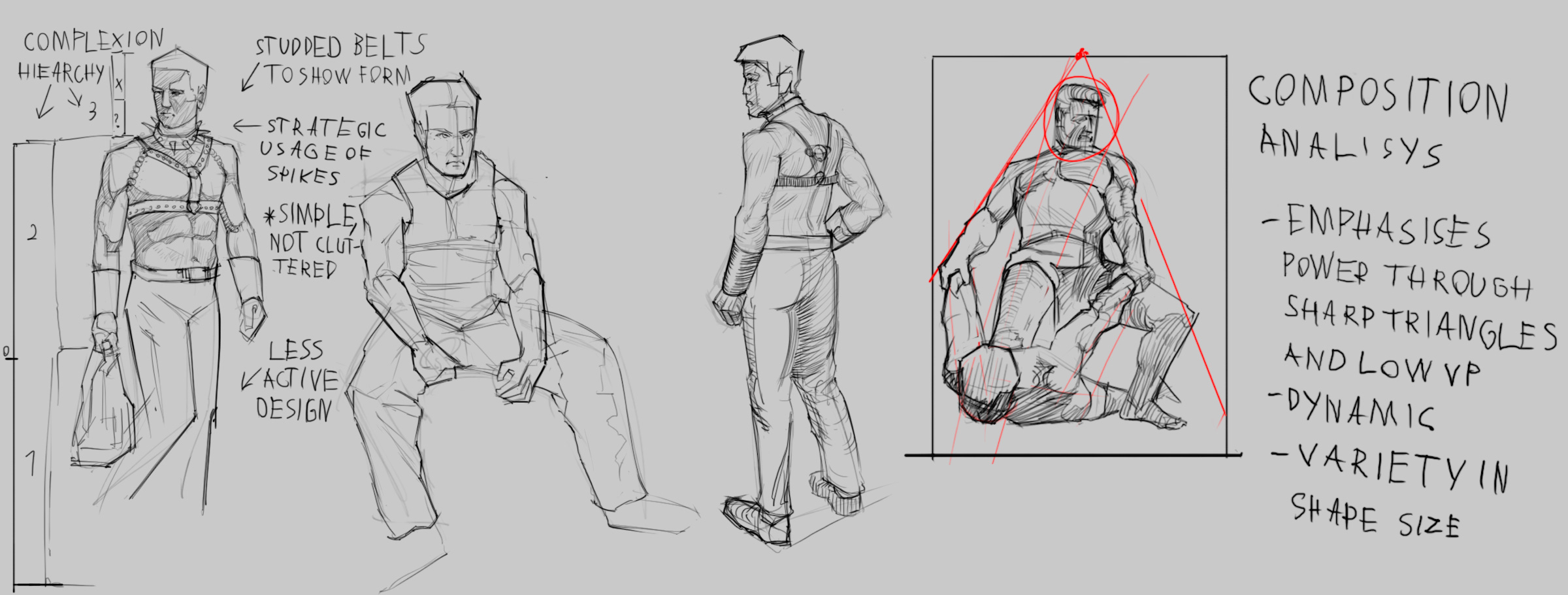
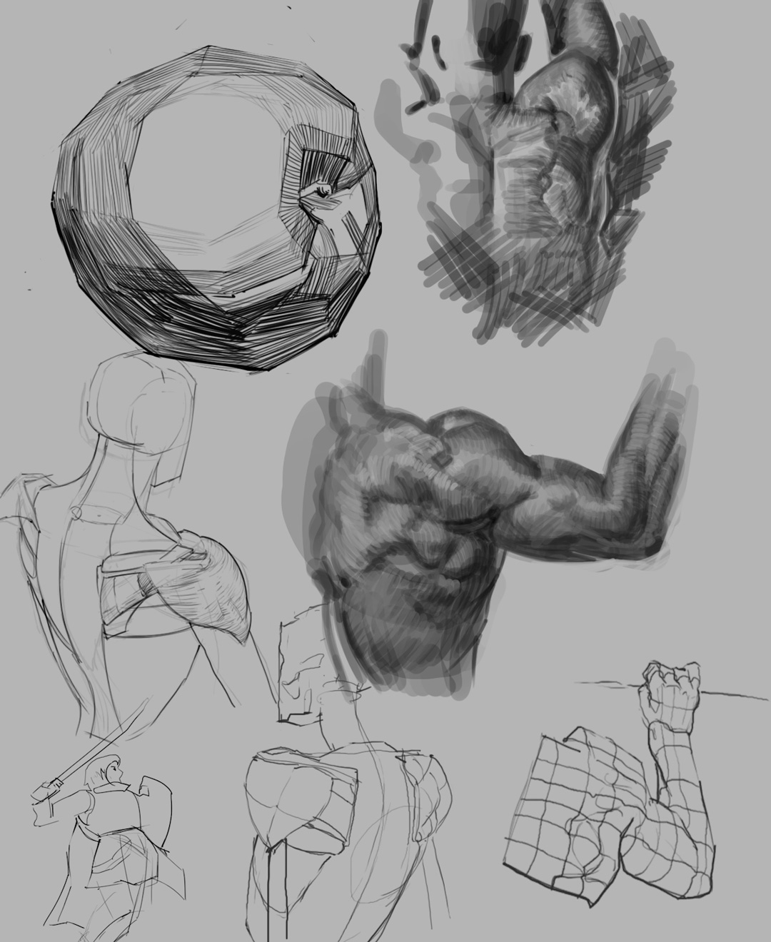
those gains doh...your study hustle is strong! O_O -Really digging these dynamic form/perspective studies of the figure. I should really hop in on that! ^^
03-28-2017, 11:13 PM
Amazing inspiring energy into these studies! Thanks!
Sketchbook : http://crimsondaggers.com/forum/thread-7501.html
04-30-2017, 05:48 AM
Hey crackedskull, you used to post few times a week and now you went missing for months, is everything alright mate?
| Sketchbook | Artstation |
|
|
« Next Oldest | Next Newest »
|