Posts: 850
Threads: 4
Joined: Mar 2013
Reputation:
21
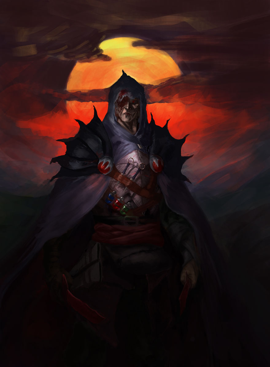
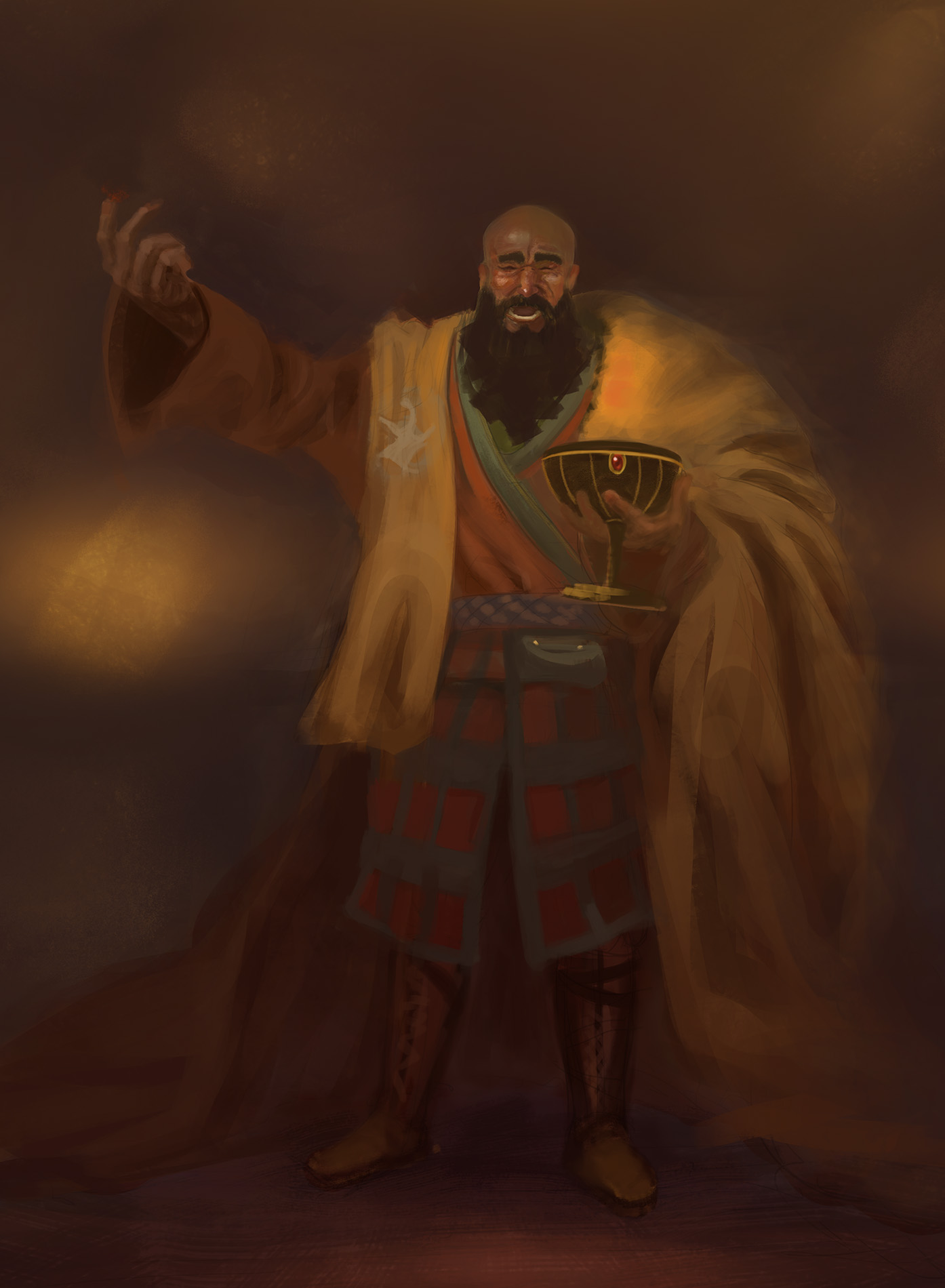
Now that's what I call intense colors! Almost gives me a Frazetta-ish feel. The face looks a bit flat to me so far - maybe play with a little bit of light hitting the tip of the nose or something like that to give it some depth? Or let the top part of the face dissolve into shadows...?
Very nice silhouette with those shoulder pads.
Posts: 850
Threads: 4
Joined: Mar 2013
Reputation:
21
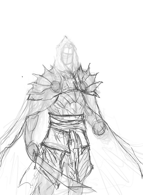
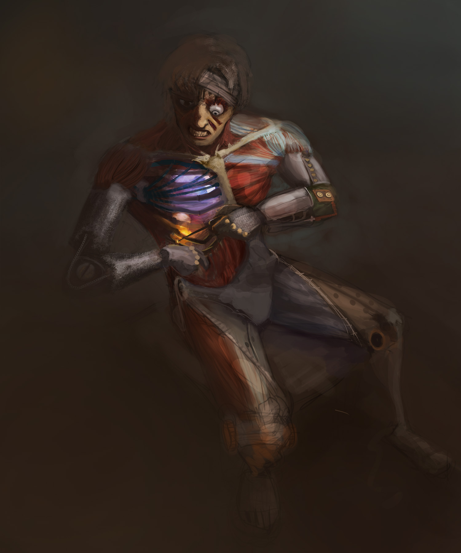
That's actually some really good things you learnt there cracked! Been there, done that ;) I don't know how people do it, who start really rought and painterly, and yet have nice and correct proportions etc in the end. I guess it comes with a whole lot more practice understanding and doing anatomy stuff until it really becomes second nature. Until then, going more tight with sketch/lines is probably the way to go. Although every now and then trying out different ways of working, like jumping right into rendering is a good reality check :)
Keep it up!
Posts: 198
Threads: 2
Joined: May 2013
Reputation:
5
Woah man, I feel you sooooo much on the4 chow piece struggle!! SOOOO MUCH! I had a diferent problem but I've been reworking and erasing shit all the time till I hated it xD
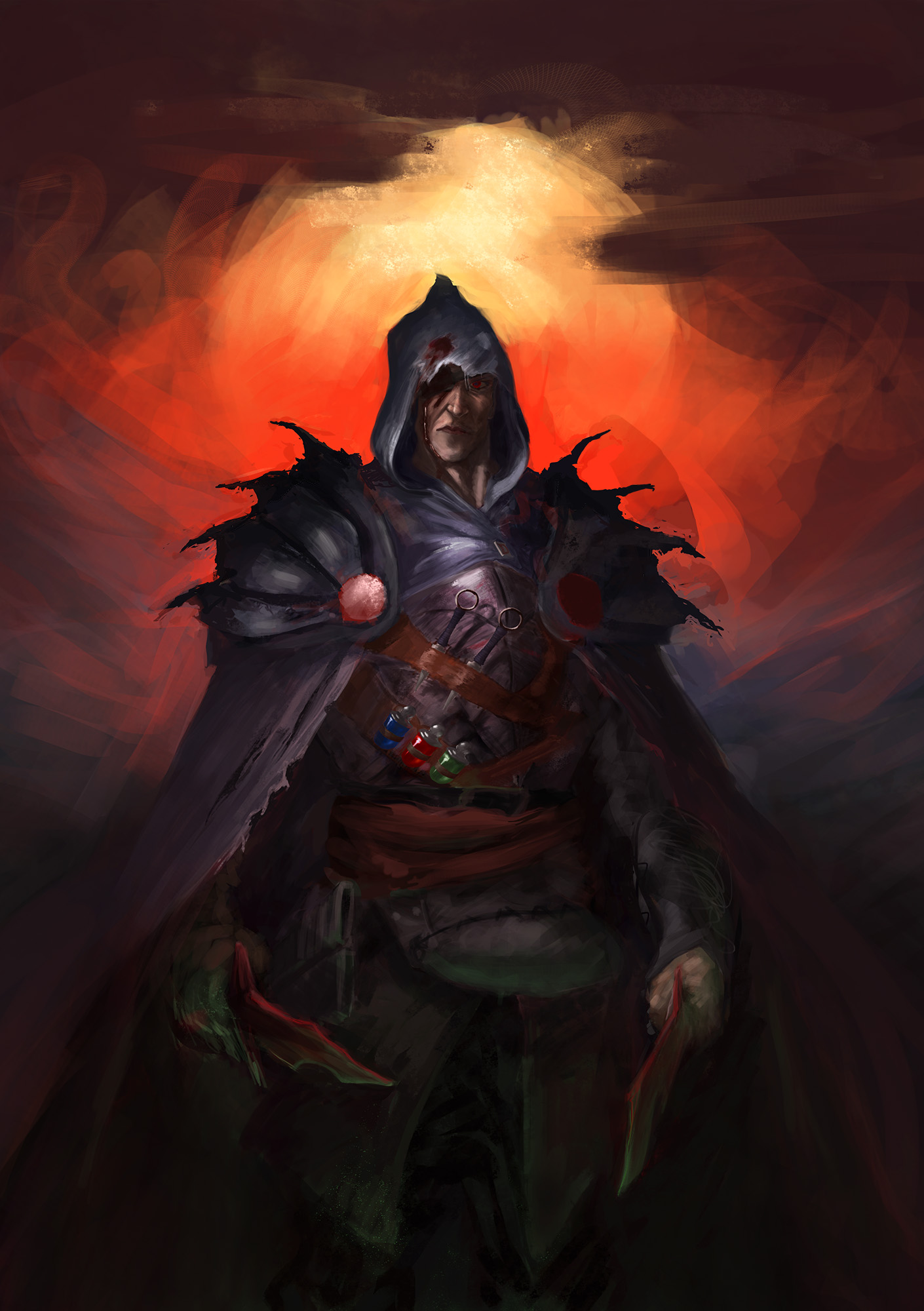
This new version is so much better in the structured sense, I also really dig the props, I'm into that myself, adding some spice to the whole thing. Yours really pop it :)
I only have a couple quick things to say about the piece:
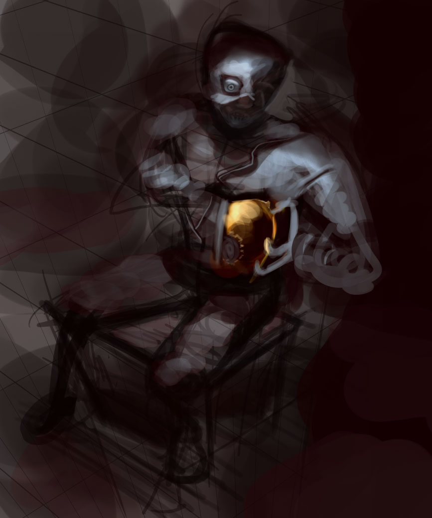
- Watch out for those red pins/balls thingies, they're too saturated, and if you add that to the background it starts to hurt the realism of the piece, so one of the two needs to be tonned down a bit so the other pops.
- Try to be less tight on the face, and focus on getting your hood and basic lighting to work with the rest of the body in a cool way, you can even blur some parts of the face , it will also add to the mystery, while saving you the nightmare of working endless hours to make the face super convincing.
Still I dig a lot your piece man, I think it's one of the best so far, so keep up the hard work ;)
Posts: 274
Threads: 0
Joined: Feb 2014
Reputation:
3
I like the contrast between the figure and the sky in that one. You've done well with the lighting there.
Posts: 241
Threads: 3
Joined: Jan 2013
Reputation:
3
Cool Chow this week, buddy. Great work.
Posts: 288
Threads: 8
Joined: Nov 2012
Reputation:
9
Solid work man! I'd say just keep an eye on your values and edges, some of your character work seems to get a little lost in the background. Coming a long great though!
Posts: 6
Threads: 2
Joined: Oct 2013
Reputation:
0
It's really nice to see progress like yours. Like the colors in that assassin alchemist piece ;)


