Posts: 345
Threads: 4
Joined: Jun 2013
Reputation:
2
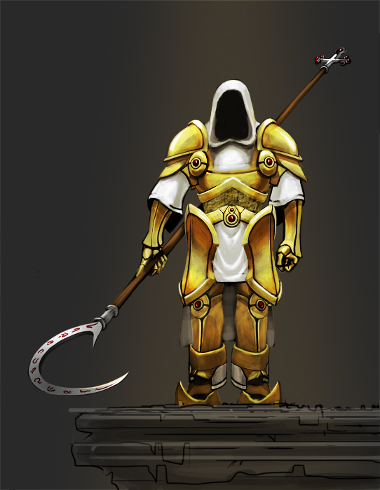
Hmm maybe his legs are a bit short?... I'm not absolutely sure though, you might wanna try and draw the skeleton in, that usually helps in such situations.. Nice scythe :)
Posts: 1,342
Threads: 17
Joined: Jul 2013
Reputation:
45
Dont be afraid to darken and lighten the values to add contrast push the values and add a definite lightsource, right now the character looks flat. Also its a good idea to do studies for the armor and clothing. Besides that the pose looks kind of stiff. Look up some dynamic poses and practice them. Hope this helps you Archon :)
Posts: 16
Threads: 7
Joined: Jul 2013
Reputation:
0
Oh my god guys, thank you so much for the tips and critique, I really appreciate the time you`ve put to help me! :D
@Samszym - I like your idea about this and I think it really helps loosen the character and make him look not so dull. On a side note, the idea was my character to be looking down :D
Thanks for the paintover :D !
Posts: 16
Threads: 7
Joined: Jul 2013
Reputation:
0
oooh my god
THANK you SO much for this paintover, really I never thought anyone would do a paintover for me :D
About the stuff you were concerned -
I usually want to do concept art but every now and then I try to give stuff a more finished look which comes out as an illustration (but since I`m not good at it it doesn`t look polished enough)
The first idea was that his head would be tilted down, and looking down from this rock (it`s not a building ;D )
Another thing (about the blackness) is that, I actully know that things shouldn`t be too dark and I strive not to use 100% black anywhere and I haven`t here but my laptop screen makes everything brighter and on a normal screen it looks very very dark. You`re right that I used black for the shadows, though I thought that that was the right way to do it.
About the hood I honestly agree about the stuff you said, though it was intended that the hood stays on top of the armor as opposed to come out from underneath or something like that.
Again, thank you for doing this :D
![[Image: file.php?id=7886]](http://www.sycra.net/forum/download/file.php?id=7886)


![[Image: 4echQ2t.jpg]](http://i.imgur.com/4echQ2t.jpg)
