Posts: 905
Threads: 39
Joined: Sep 2013
Reputation:
51
Tygerson: Thanks! They're fun to do, and I meant to do that for a while, and with other things like food and minerals (another, way better, artist had also done a series of gem/mineral inspired creatures)
Kaffer: Yeah, you're right. One of the keys is just keep doing more. Another one of the keys, I think, is to set some kind of generous time limit, while willing myself to let a drawing go after time's up.
Lyraina: Doing finished pieces is my current biggest weak point/fear. That's why I hover on the outskirts of all those forum events but never join... . But one does not grow by being comfortable... or chicken.
~~~~~~
Those flyers got me into the second round of art test, doing a 10 feet by 60 feet banner. Which means it has to be done in Illustrator, something I've never used before. Several tutorial lessons later, now it's down to 2 days, and coming up with design stage.
I want to be able to partition my days - "business hours" for job/commission/art test/stuff I simply don't love doing but must. Then morning/evening doing art stuff that either contribute to the science illustration career I want, and sometimes chip away at the Miscellaneous List. Instead, I concentrate entire day of a few days on the art test I don't really love, doing nothing else but eat/etc. Then in between kind of scattered-effort-ly doing something for sci-art, or studies, or the never ending gift/volunteer art, dragging things on instead of intense focus as required for growth and breakthrough. It's like I never out-grow the work style as a student.

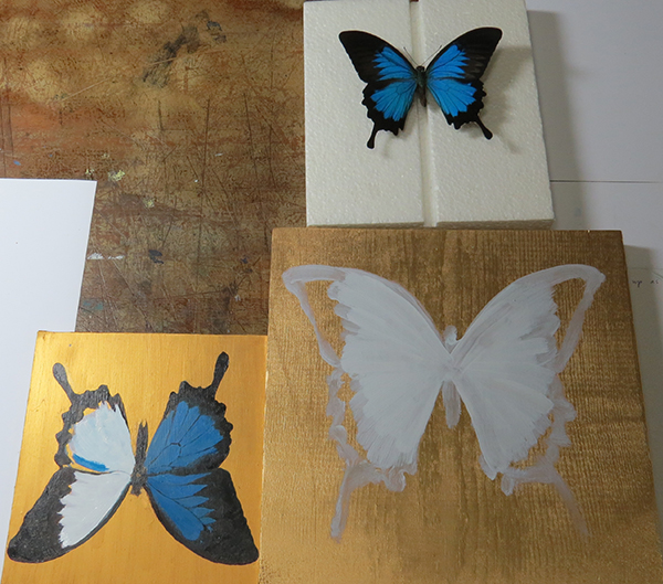
The gold background might be a mistake now because the blue part can't shine against it at some view angle. Experiments on painting luminescence on gold, blue, and white bases, the illusion of light from the painting surface from the gold background, how oil paint gold and spray paint gold differ, different blues, how to layer thin coats of other colors to mimic the luminescence, and which colors to layer.

Best friend from high school became a homeowner. This is for her barren walls. Maybe one of the butterflies if they don't end up total disasters.

Posts: 905
Threads: 39
Joined: Sep 2013
Reputation:
51
...what I've been up to the past...3? 4? Days? And all but the last day were basically "wasted" because I ended up not figuring out how to do this in Illustrator, so had to do it all in Photoshop anyway the evening before. Right now I'm slowly trying to redo this in Illustrator like this was supposed to be done the first time around. I have now a whole new level of respect for graphics designer. If I have to do this everyday as job, I might die.
Imagine this 10 feet by 60 feet.... .....I should probably have blurred the brand so I'm not advertising for them. .... but that "brand" took me hours to redraw in ai.....

Posts: 79
Threads: 2
Joined: May 2013
Reputation:
21
Hi Meat,
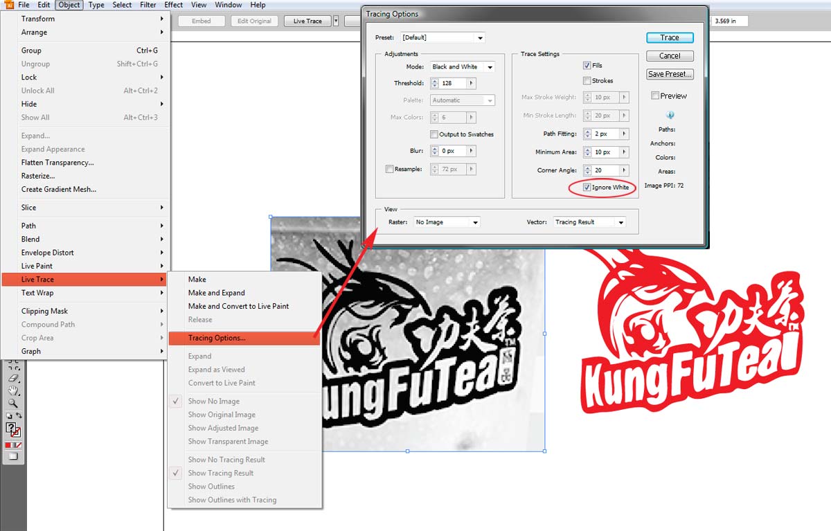
Here is tip for converting logo graphics to vector format in Illustrator. I am using CS3, so I am sure later versions will work also.
Usually if I am given a raster version of a logo at a decent resolution (around 1000px to a side) I can covert it to vector 'automatically' using the 'Live Trace' feature in Illustrator. It is found under the 'Object'[ menu. Live Trace works best when the logo is a black and white image, with the logo being black and the background being white. Adjust the settings with preview turned on and you can see what your result will be before Illustrator traces the image. Choose 'ignore white' in the options to eliminate the white area and you will have a clean graphic that you can resize however you wish. You might have to trace some smaller elements by hand if there are lots of thin lines and details, but Live Trace gets you most of the way there in a few minutes. In my example, much of the fine detail was clipped out because I started with a low resolution file. However with a little more manual tracing I could get a perfect result. Total work time to trace the image in the example was about 3 minutes. Hope this helps.

-Sketchbook-
"... for drawing is a thinking person's art." - Walt Stanchfield.
Posts: 905
Threads: 39
Joined: Sep 2013
Reputation:
51
JavierP : I...I...the hours... *streaming tears* Thank you Javier! This lesson shall never be forgotten..... So how can I add on to it after a Live Trace? I used the blob paint brush(?) so it's basically one big piece with some small island pieces. Or does that kind of stuff not matter as much in Illustrator or graphics design?
Posts: 850
Threads: 4
Joined: Mar 2013
Reputation:
21
I know that fear of finishing pieces all too well! Basically just started with that some months (?) ago. And still feel like they don't look as polished or nice as they should. But I think those forum challenges would be a good start, especially because they have a deadline. Meaning you'll have to finish, for better or worse. Maybe even coming up with time-saving methods or whatever and on the way discover some useful new technique/trick etc. But that's obviously only relevant when you're not occupied by art test stuff like you seem to be at the moment.
I don't think those days were 'wasted' because every minute you spend in a program trying to figure out stuff you're learning something on the way. Discovering menus, what you can/can't do etc. Unfortunately I can't offer any help because I too failed using Illustrator several times already >_>
This is going to sound very antisocial, but could it be that you are doing too much stuff for other people for free? I'm getting that impression a bit reading your comments. If that's the case, and you feel like you're spending more time for others than for yourself/working on what is important for you to achieve your goals, maybe you should be a bit less.. nice? Say no more often? It's important to do what is best for just yourself sometimes. Or maybe you could combine volunteer/gift stuff with studies in some way? If I'm getting a wrong impression here, I apologize, just feel like mentioning it.
Anyway meat, keep your head up!
Edit: Forgot to mention - the butterfly project looks lovely!
Posts: 905
Threads: 39
Joined: Sep 2013
Reputation:
51
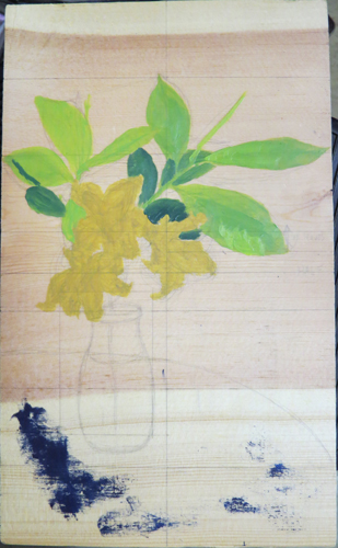
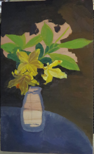
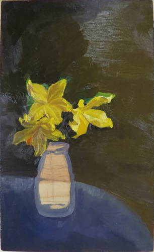
Lyraina : Naw, no apologize. I have been doing nothing but freebies for a long time. The oil paintings are because 2 of my good friends (one of 14 years and going, and one faced down a giant raging man in my defense) both became property owners recently, so I promised living room wall decorations to them. The rest, yeah, I need to take a stand and start making decision and sacrifices.
I also need to hunker down and face down that fear of committing to a deadline. You've already started, and been beating deadline after deadline. I'd say that's a major progress right there. Inspirational, even. Don't ever stop doing what you're doing there.
Thanks, about the butterfly. They're looking rather clown-like now with various test color patches on them, lol!
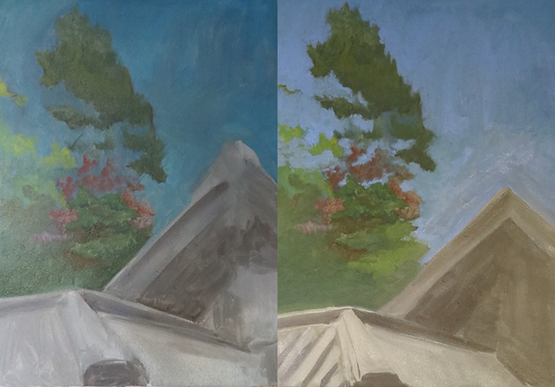
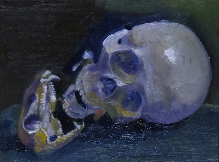
[edit] Added art to post. The odd colors are because I was trying to use up left over paint on the palette before wiping it down, but didn't finish all of them anyway. Was just a fun sketch, oil on canvas. Original intent was to make studies of this still life though. Next time.

Posts: 905
Threads: 39
Joined: Sep 2013
Reputation:
51
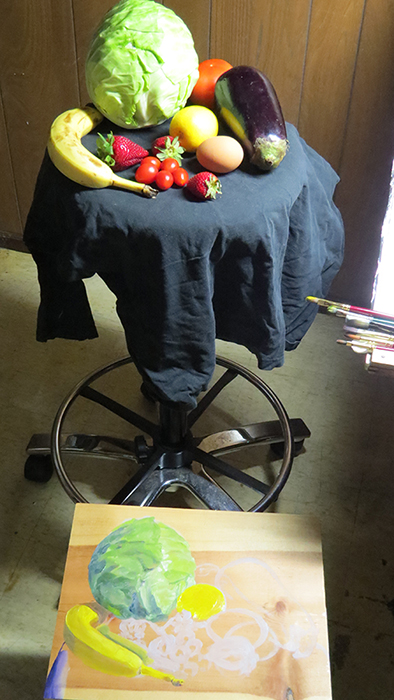
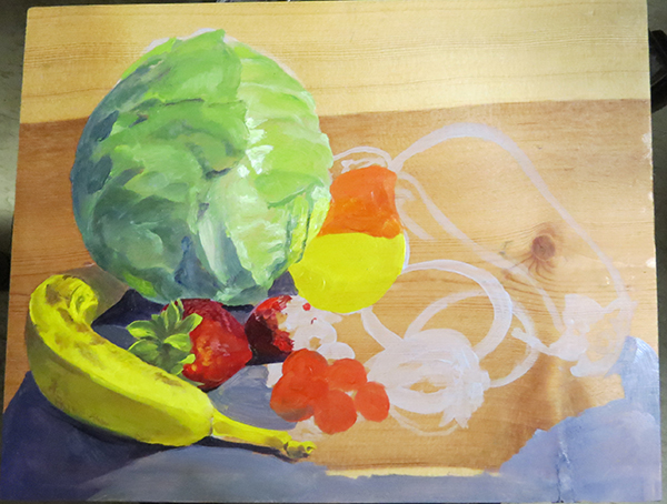
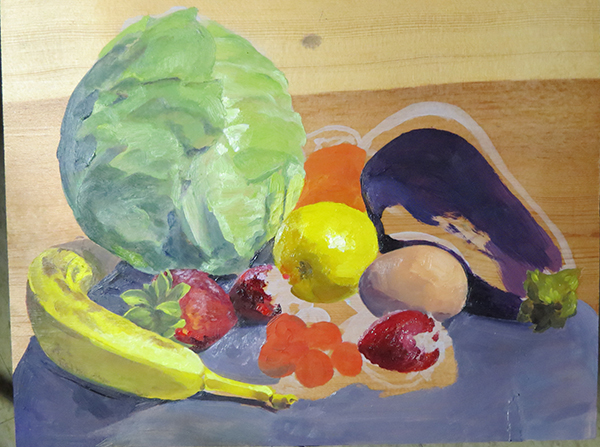
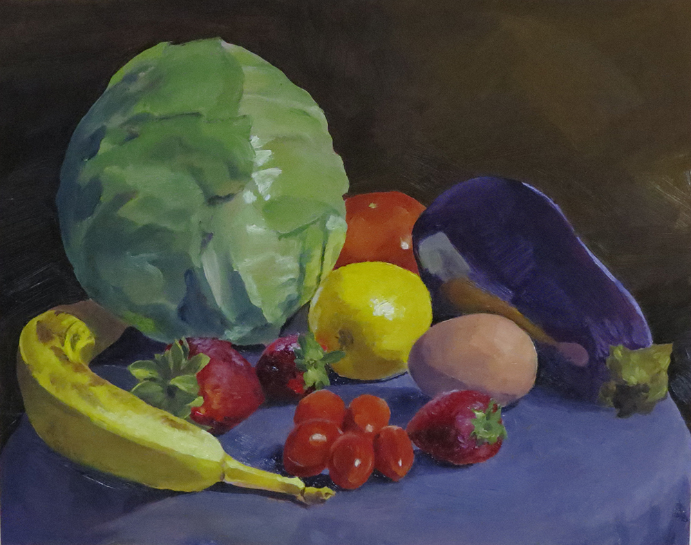
Color and light study inspired by the latest package of vegetables and fruits. I aimed to study the reflective color lights from all the veges, and compare the different red and yellows. The fruits were fading fast, so it's basic shapes and colors. I didn't feel like making this into a Met still life with veins and dew drops, so I didn't bother taking a photo of it.
--------------Observations:
Yellows: Despite its name, Cadmium Lemon Yellow is not the hue of lemons. Or at least not the bunch I bought. These lemons were warm yellow - warmer than banana. I used Windsor Yellow for the lemon, and Cadmium Lemon for the banana. Purple for shades of yellow objects.
Reds: Strawberries starts with Alizarin Crimson, a dark and cold red. They have purple instead of blue in the darker areas. Blue changed the hue too much. Tomatoes are mixes of Cadmium Red or Orange, and Cad.Lemon.
There are no blues in strawberry sepals shadows, they are only brown. Blue is a presumption. Strawberry light area has yellow tine.
The egg has gone bad.
Eggplant is like a mirror and it is really hard to paint reflected color objects on it without the color shapes looking like stickers.
Colors do not reflect all that much onto other objects unless they're glossy and dark like an eggplant, which is kind of how mirrors work. The only other reflected color I saw was a hint of yellow on the cabbage from the lemon and banana, but the cabbage did not pick up red from the strawberry. Strawberry isn't reflective enough. Lemon did pick up a hint of blush from the strawberry. Tomatoes are glossy, but they didn't pick up the banana next to them. Egg did not pick up strawberry red.
I'm committing suicide by fume and zero-ventilation.


Posts: 1,342
Threads: 17
Joined: Jul 2013
Reputation:
45
Fruit livestudies are always a good thing. Perhaps add some METAL aswell and learn the differences in rendering. Keep it up!
Posts: 140
Threads: 2
Joined: Oct 2013
Reputation:
2
Yeah! This is awesome!
I'm going to jump in on the Oil paint bandwagon myself very soon. Just keep killin' it dood!
I'll try and crit as I see the updates :D
Posts: 465
Threads: 2
Joined: Mar 2013
Reputation:
18
Dang, great job on that still life! That looks like it was really hard to control
Posts: 850
Threads: 4
Joined: Mar 2013
Reputation:
21
Didn't mean to say you shouldn't do paintings for friends, just... don't forget to look after yourself as well.
Painting something from just whatever colors are left over is a cool idea, so far I've either used leftovers to tint my next background, or stored them in a vial in the freezer. Might use your method next time though, could lead to some nice spontaneous results :)
Awesome still life! And very nice of you to add your notes, very interesting to read especially since I'm trying to get a grip of oils as well at the moment. I think the reflective surface of the eggplant turned out rally good.
Did you prime or prepare the wood in any way before painting on it? (I'm trying to figure out the best/cheapest surfaces to paint on at the moment, but reading up on that is really confusing)
Keep it up, meat :)
Posts: 133
Threads: 2
Joined: Jan 2013
Reputation:
2
Those oil paintings and knight studies look great, I would like to see more of your personal stuff!
Posts: 905
Threads: 39
Joined: Sep 2013
Reputation:
51
Posts: 905
Threads: 39
Joined: Sep 2013
Reputation:
51

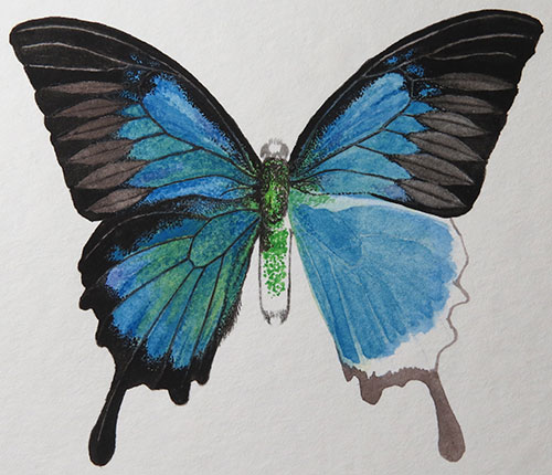
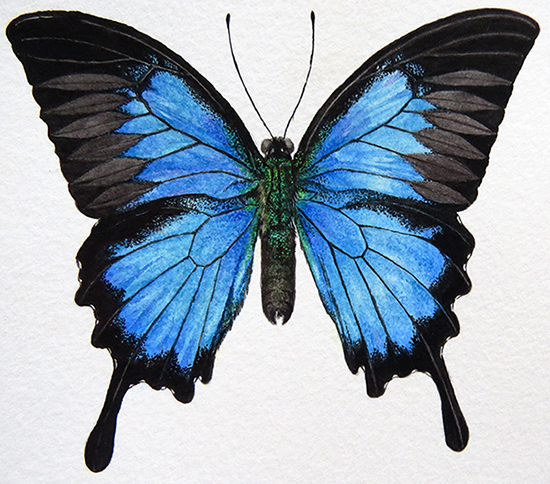
Practicing watercolor on luminescent butterfly wings. Learning experience....
I think I understand now why scientific illustration is rarely done in oil. 1.) Long drying time means both you and your client have to be extremely patient for the required amount of accuracy and detail. 2.) Before oil painting on paper was common, oil paint on board or canvas probably did not make easy storage and publishing for the working scientific community and environment.
Historically there have been numerous examples of scientific accurate oil illustrations, and the tradition lives up to now (the Dahlia by Ingrid Finnan) . But if I have to grind on a beetle or a plant painting for 6 months, I might claw a tunnel out instead.
Posts: 848
Threads: 20
Joined: Jan 2012
Reputation:
29
Holy...... this stuff is amazing meat. Becuase I started out on digital media, I don't really have the patience for all the activities and rituals that have to go along with traditional stuff. But I still want to give it a try eventually.
Don't forget to try a mixture of materials, it will make for a fun exercise rather than more of the same stuff.
Keep up the good work :)
Posts: 905
Threads: 39
Joined: Sep 2013
Reputation:
51
Jaik: Thanks! I usually feel insecure and a bit inferior for doing observational illustration from life because people probably consider it unimaginative and boring compared to creative concept art paintings.
########
Yellow was not a good idea. Don't include next time.
The light in a watercolor painting comes from the white of the paper. It is harder to paint the light back in once the white of the paper has been painted over several times.
The light in an oil painting isn't dependent on the white of the canvas. In fact, when the white of the canvas is visible through thin layers of oil paint, it has high risk of looking not brightness, but bad planning. However there were paintings in museums that the white of the canvas was used through thin layers of oil paint to indicate reflective light in tall grass that were not directly in sun light.
Painting on a computer screen has the light literally coming from the "canvas", so in that regard it's similar to watercolor. But painting digitally still feel more akin to oil paint's opaque paint. Thin layers of not-100%-Opacity digital layer behaves differently than thin layers of oil paint, but I don't know why. I can only assume physical light interact with and bounces more unpredictably with the chemical and varied sizes of pigment particles in paint layers, than digital.

Posts: 465
Threads: 2
Joined: Mar 2013
Reputation:
18
Quote:I usually feel insecure and a bit inferior for doing observational illustration from life because people probably consider it unimaginative and boring compared to creative concept art paintings.
dude that is suuuuuuuuuuuuuuuuuuuch BS
anyone who legitimately thinks that is probably just doing the same kind of art they see other popular artist doing, refusing to look at the life that's around them and just doing what's cool in the art world is about as uncreative as you can get.
Observing stuff from life and taking in observations that nobody else is is the best way to make your art fresh and new and help you stand out from the crowd. If you can get these observations of nature and life into your concept art stuff[/i] I think you'll be able to make stuff that's 20 times more engaging than Artist Who Paints Boobs Dragons Mechs and Space Hangars #347 ™
keep doin ya thing!
Posts: 850
Threads: 4
Joined: Mar 2013
Reputation:
21
I enjoy observational illustration as well! Especially interesting to see how different people observe, interpret and transfer similar things (or things from which we know what they look like, like fruit) in different ways. Unless it's a 100% photorealistic copy of what's visible withouth any selection or adaption of course.
The butterfly is lovely, I like how you achieved that powdery, metallic texture. Would love to have a closer look.
Long drying time isn't much different in any kind of (commercial) illustration though, isn't it? But you're, (drying) speed and ease of handling has probably always influenced the choice of medium, even before the digital age. Never really thought about that topic before.
Posts: 26
Threads: 1
Joined: May 2014
Reputation:
0
Drawing from life is so inspirational, it is not boring and unoriginal at all. People who don't see the value in life drawing will indeed not develop a great visual library, so continue doing drawings from life and get inspired by the world around you :D Besides people who are able to draw creative concept art stuff will most likely have done lots of observational illustration themselves. People who say drawing from life is boring just don't understand this, just let them be.
I really like the butterfly, it is so detailed!
Posts: 905
Threads: 39
Joined: Sep 2013
Reputation:
51
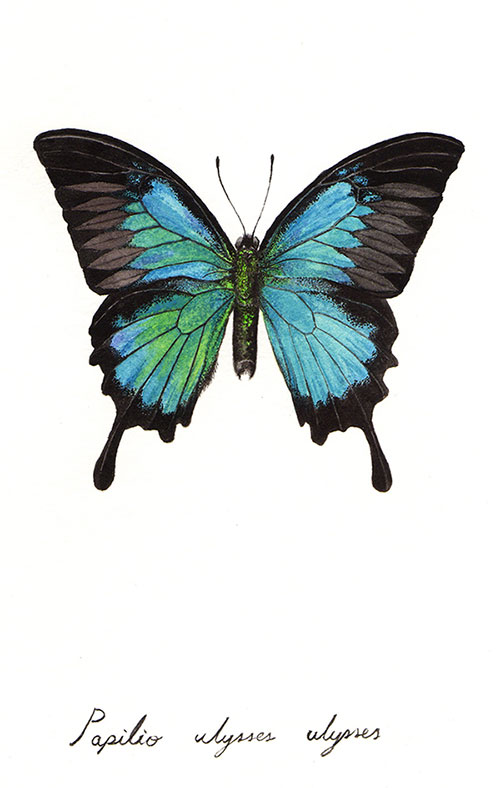
Thanks for the encouragement guys! The colors of that previous butterfly is actually very off, if you look up Blue Mountain Swallowtail. Since the purpose of that was scientific illustration, it can't pass. So I made a new one, testing new techniques. This is the last time I'm doing this butterfly I think. The oil versions will still finish, in "painterly" style.
###########
Previous hypothesis: A first layer of lemon yellow to simulate real wing hue. Wing hue is Cerulean with Phthalo for darker areas.
Previous conclusion: A first layer of lemon yellow is indeed needed, for lighting, not hue, and at much, much reduced amount. Cerulean isn't enough.
Hypothesis: A very thin first layer of lemon yellow to emulate shimmering lighting effect. Juxtapose warm and cool blue hues to emulate shimmering effect. Put darker hue first, then layer lighter hue on top. Use all 4 blues with Cobalt as main.
Underlayer: Lemon Yellow, very thin.
Blues: Cobalt, Cerulean, French Ultramarine, Phthalo.
Others: Veridian Green, Ivory Black, Yellow Ocher, Mauve.
Conclusion: Even very thin lemon yellow still shows through, meaning watercolor is more transparent than first thought. Cerulean good for lighter area because it sits well with lemon yellow under layer. The use of all 4 blues emulates the real wing hue better than previous attempt. Unable to determine shimmering is achieved with juxtaposition of warm and cool blues, or if that only works for opaque oil paint.
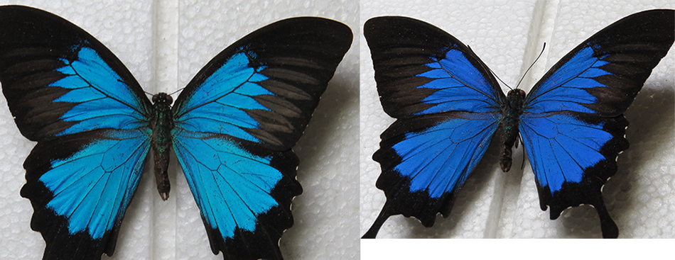
Blue Mountain Swallowtail:

Thoughts: After testing layering paint on scrap paper, I decided lemon yellow is still needed as first layer to somehow nudge the blue hue in the right direction, and to provide the feel of light that butterfly wings give. Paint and layering order testing should also be done extensively on scrap paper prior to starting actual painting. Much like thumbnail-ing. I'm not a patient person... The idea of using warm and cool blues next to each other came from internet search. I'd never have thought of that on my own, or not for a long long time after many paintings from life later. Research is important, be it internet or the slow leafing of books.
Reference: left = front view; right = angled view.

|
