Posts: 32
Threads: 0
Joined: Jul 2015
Reputation:
6
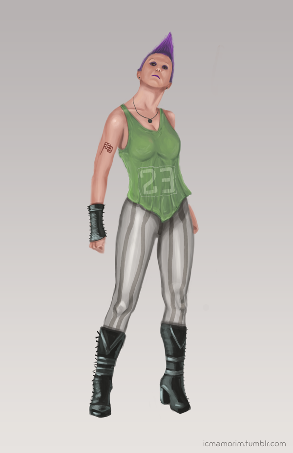
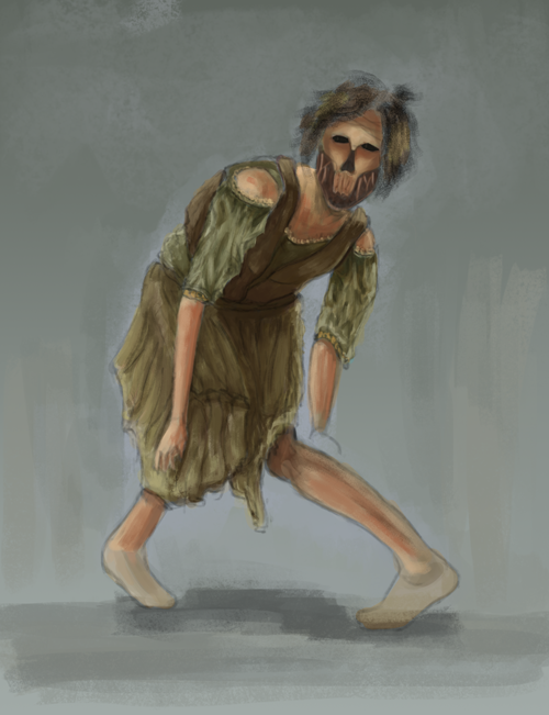
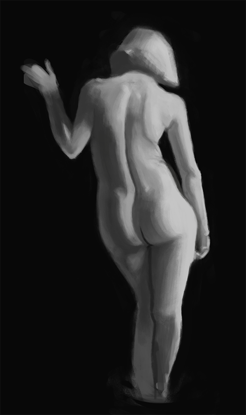
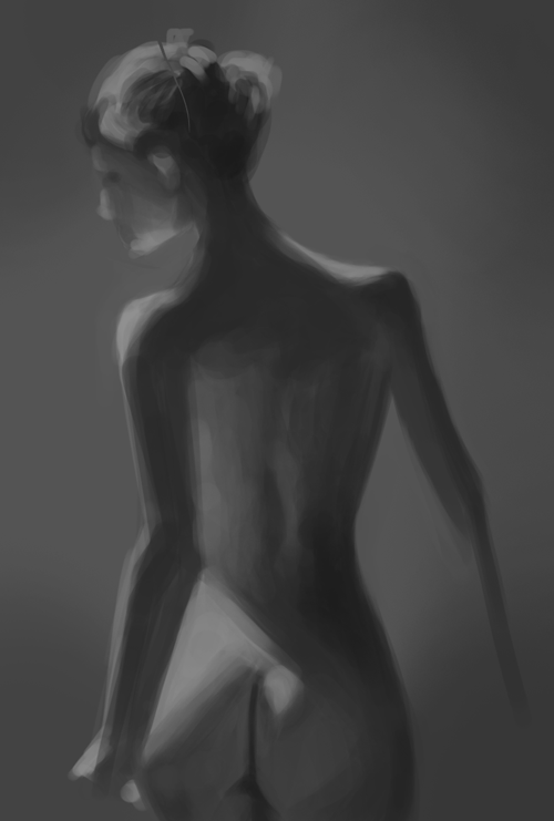
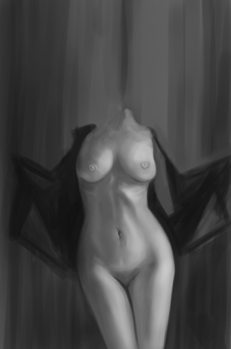
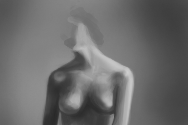
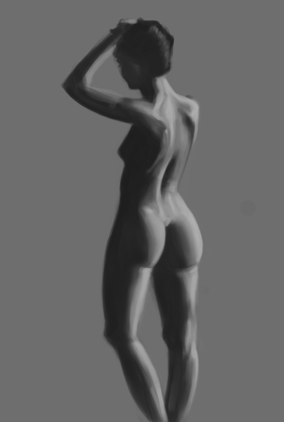
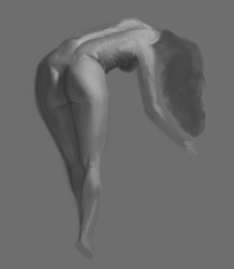
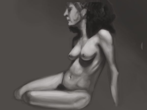
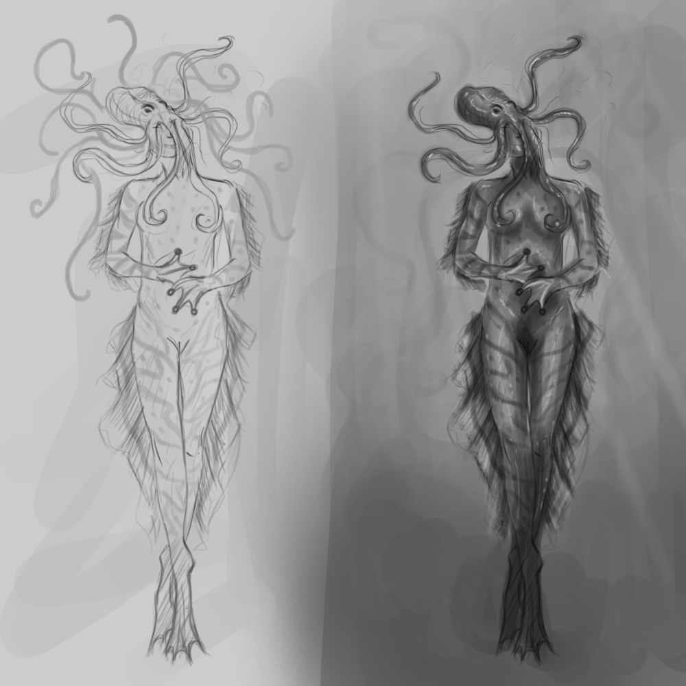
These look great so far (the second one actually scared me a little! haha)! The only thing I can think of to improve is your shading and contours on the girl don't match. It looks like there should be a lot more shapes and variety of depth, based off the shading. Other than that, you got this! Keep up the good work!!
Posts: 1,527
Threads: 24
Joined: Dec 2012
Reputation:
70
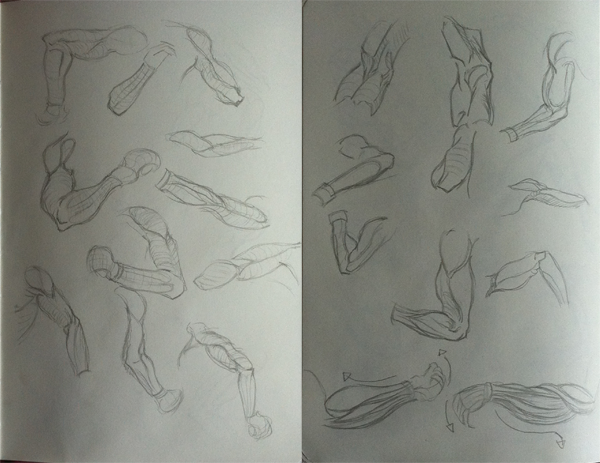
iamorim, great stuff with the CHOW - the way you rendered her arm = on fleeeeeeeeek. Great effort, I can't wait to see when you come back to her with some gained knowledge.
The great thing about you is that you _finish_ your sketches. Oh man, that truly is a great thing to be doing... even though it may not turn out how you see it in your head, never stop finishing your sketches, because you'll level up loads and understand what it takes to finish a piece. So it'll make building your portfolio easier and submitting your work to different art sites.
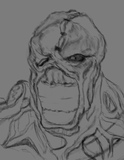
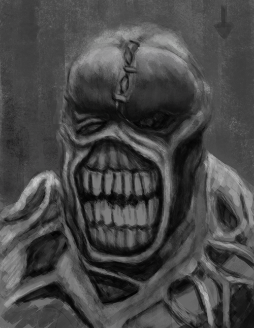
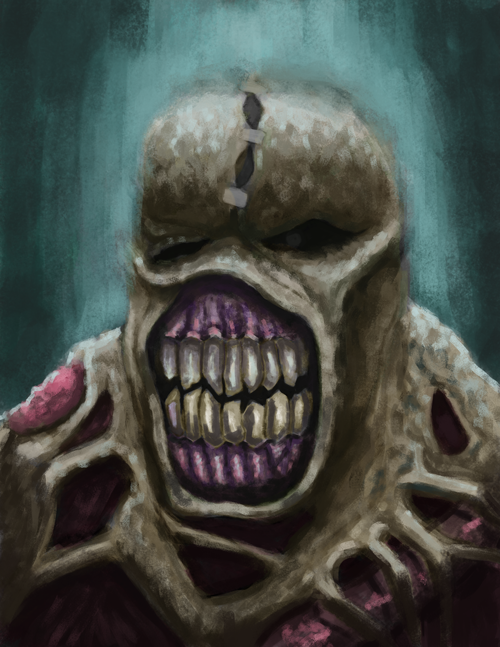
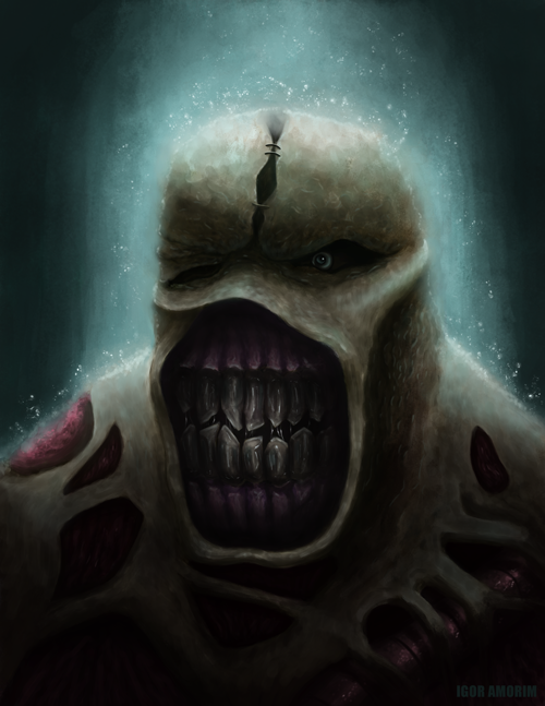
Looking forward to where you take this Nemesis piece.
Keep pushing man! :D
sketchbook | pg 52
"Not a single thing in this world isn't in the process of becoming something else."
I'll be back - it's an odyssey, after all
Posts: 129
Threads: 1
Joined: Dec 2012
Reputation:
11
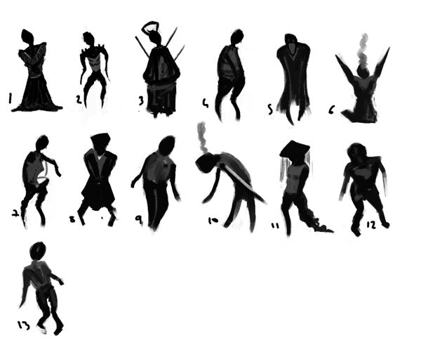
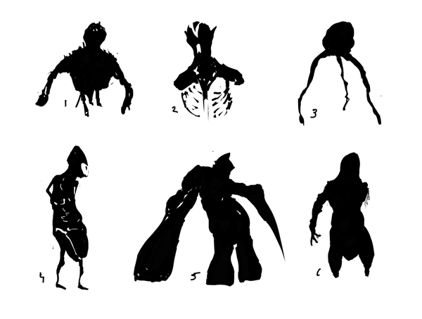
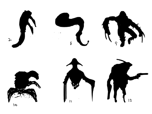
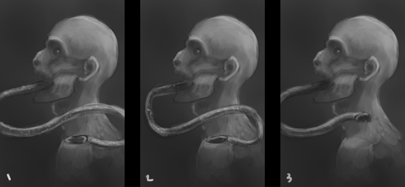
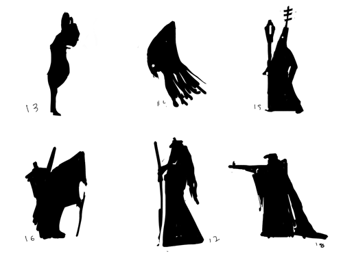
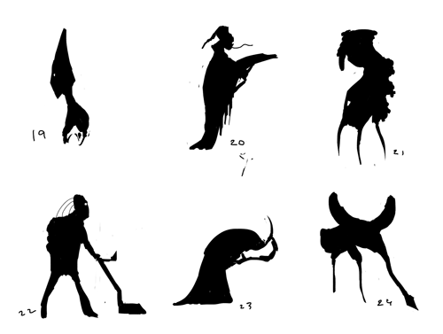
Ill choose #3
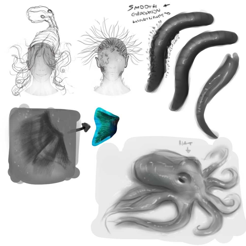
The full 8 or infinite symbol the tongue is doing is too much.
Where does the tongue goes where is not outside?
I would make some room for it with a wider neck or jaw or both :)
How can he keep that long tongue suspended on air with such litle musculature to it.
I would make the tongue thicker at origin and tapering down.
Maybe the tongue resting on the shoulder.
Have you checked anteaters? Maybe make his face goes outwards like anteaters does.
Posts: 63
Threads: 3
Joined: Jul 2015
Reputation:
7
Sweet! You're on the right path!
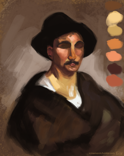
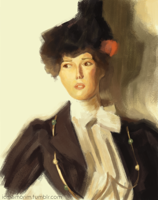
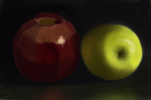
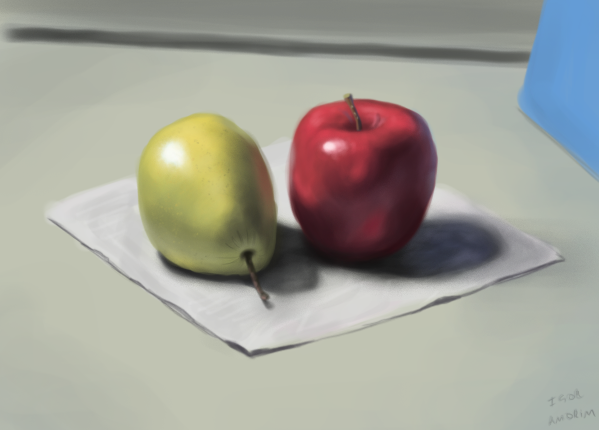
The thing that is hurting you the most at the moment (in my opinion) is your lighting... I can see you're thinking about the light sources, but you're not properly thinking about how does they behave. Do some lighting studies in black and white... try to think of the direct light path, all the bounces, local values, fill lights...
It alone should improve a lot the quality of your paintings!
Posts: 115
Threads: 2
Joined: Aug 2015
Reputation:
3
Great effort, your enthusiasm has inspired me thanks a lot. I am sure that you will develop your skills very quickly. I really like the finished version of the nemesis. I look forward to see your progress.
Posts: 202
Threads: 5
Joined: Jul 2015
Reputation:
14
Oh the chow concept! Awesome!
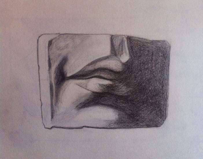
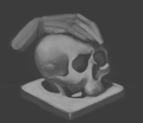
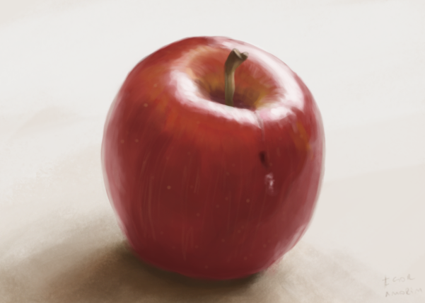
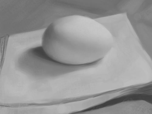
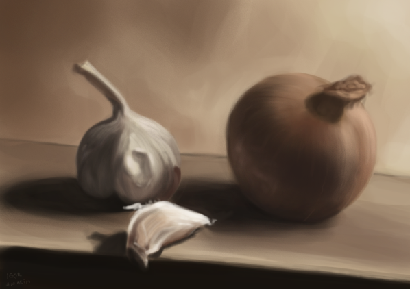
Love the still life work too, beautifully rendered,
Posts: 37
Threads: 7
Joined: Jan 2012
Reputation:
1
I love those sticky gross tongue/centipede things you have in your most recent post. Definitely solid values and material/light play. Also the confidence of the edges on them, keep doing that. That shit is awesome. Do you study much of Anthony Jones's work with his black and white values? Darkest he goes is about an 05-08%, and then lightest being around a 75%? Either way, it helped me a ton with values with close up people and objects.
Keep it up!
Posts: 733
Threads: 7
Joined: Dec 2014
Reputation:
32
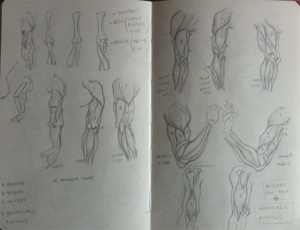
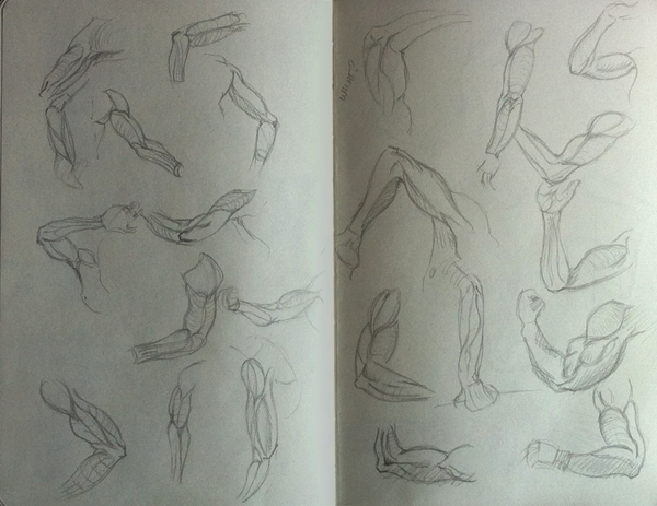
Absolutely gorgeous studies-- There is high quality here that is very visibly paying off. I don't think that I could critique you, because you're going in the right direction, and I think you already know where your weaknesses lie. Continue!
