Posts: 470
Threads: 3
Joined: Dec 2013
Reputation:
9
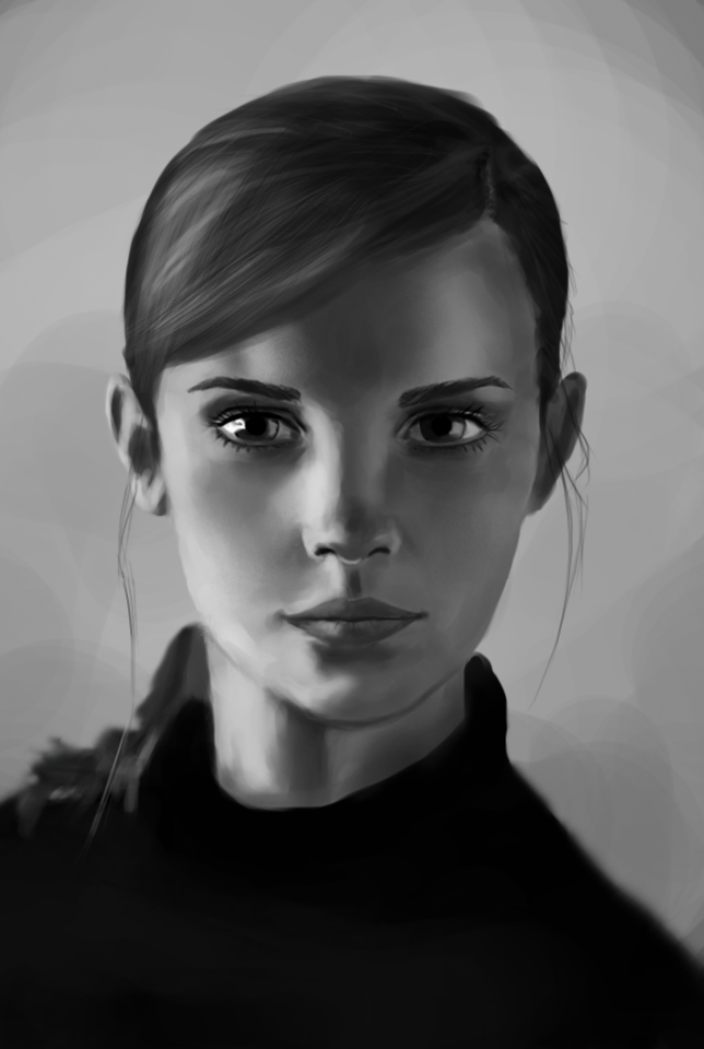
Little update..
Something i was doing to take my mind off from school tests..

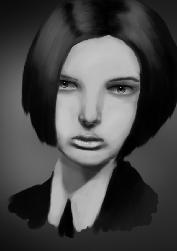
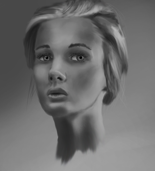
And value study from today.. maybe i should start to use different brush cause this looks flat to me..

Posts: 470
Threads: 3
Joined: Dec 2013
Reputation:
9
Quick little update, will post more on saturday..

-was trying out one brush

Posts: 88
Threads: 1
Joined: May 2014
Reputation:
5
Your really working hard on your portraits, keep on pushing and don't get discouraged. Your impromving even you might not notice!
Posts: 470
Threads: 3
Joined: Dec 2013
Reputation:
9
Posts: 470
Threads: 3
Joined: Dec 2013
Reputation:
9
Posts: 1,109
Threads: 18
Joined: Apr 2014
Reputation:
68
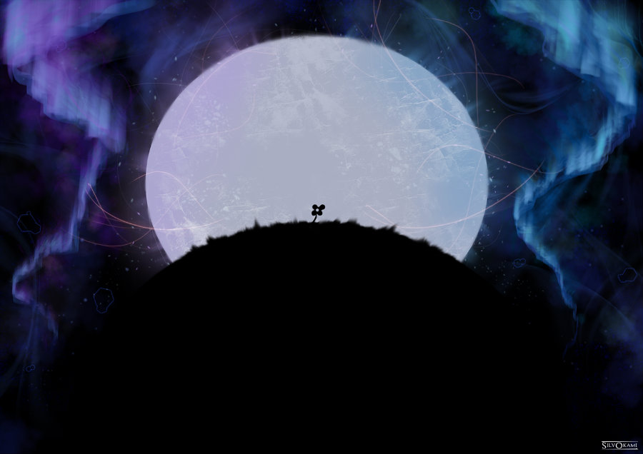
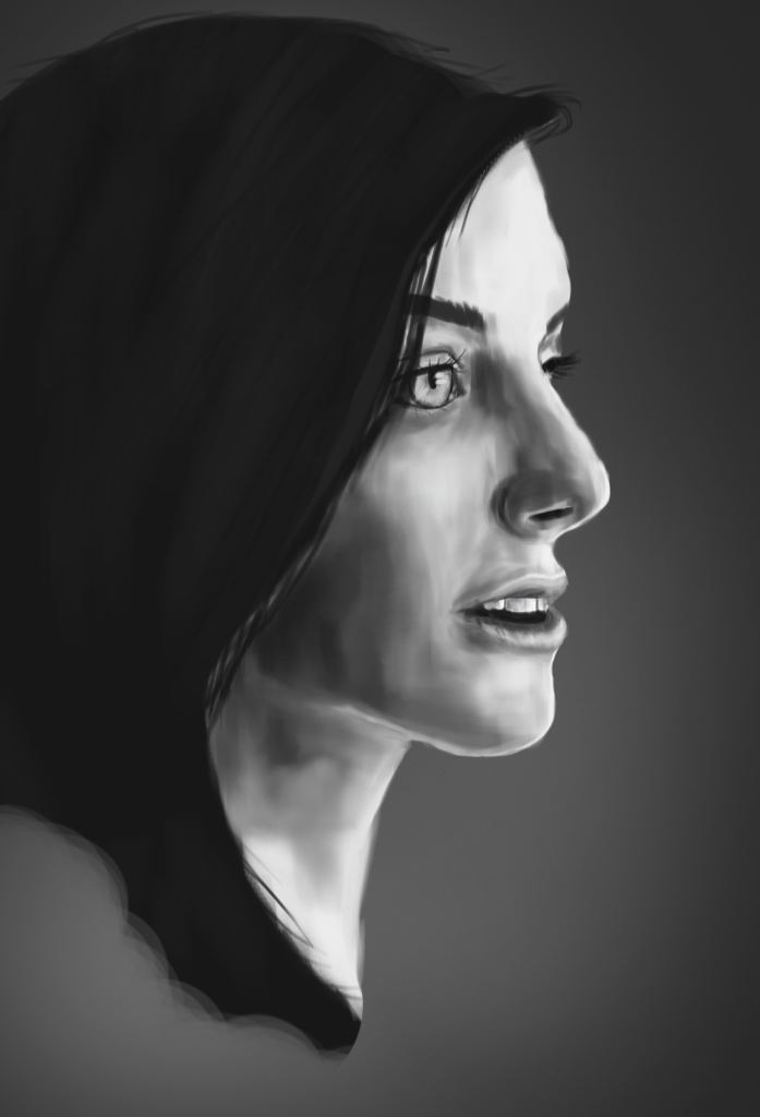
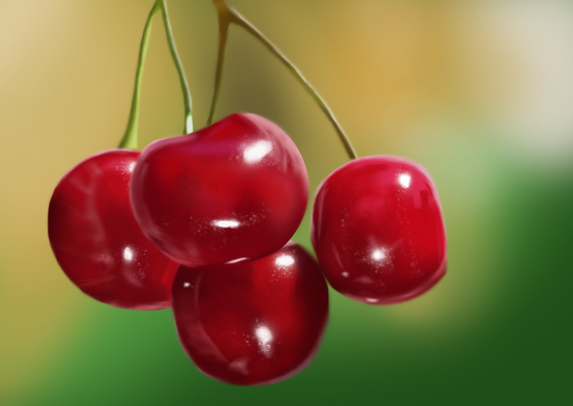
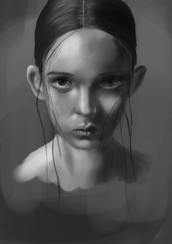
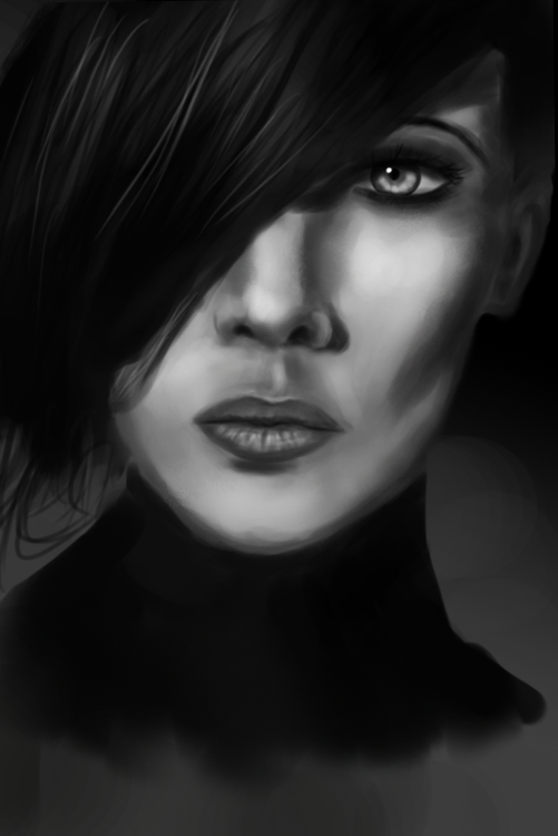
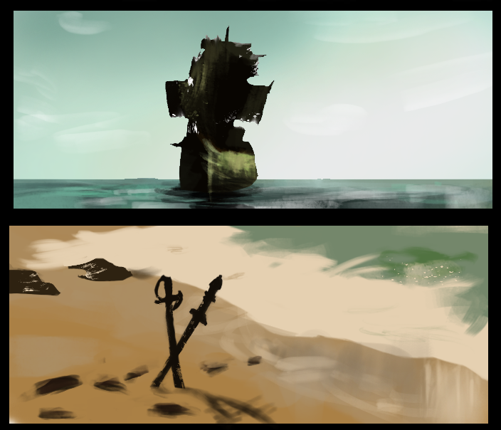
Love that colour study in #66, it's really breathtaking! Great job : ) The girl in black and white in #62 is stunning as well, the contrast is really great!
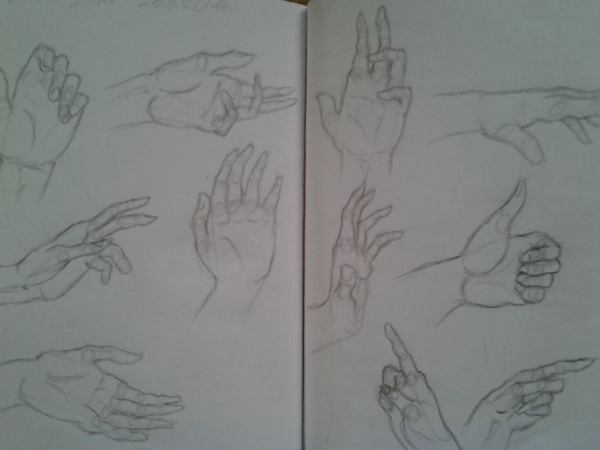
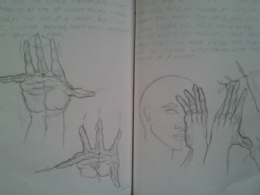
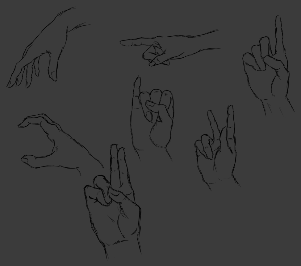
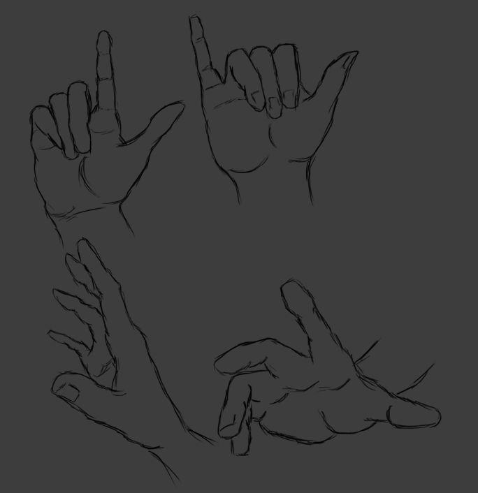
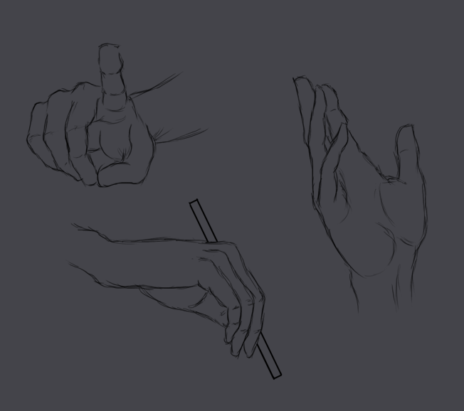
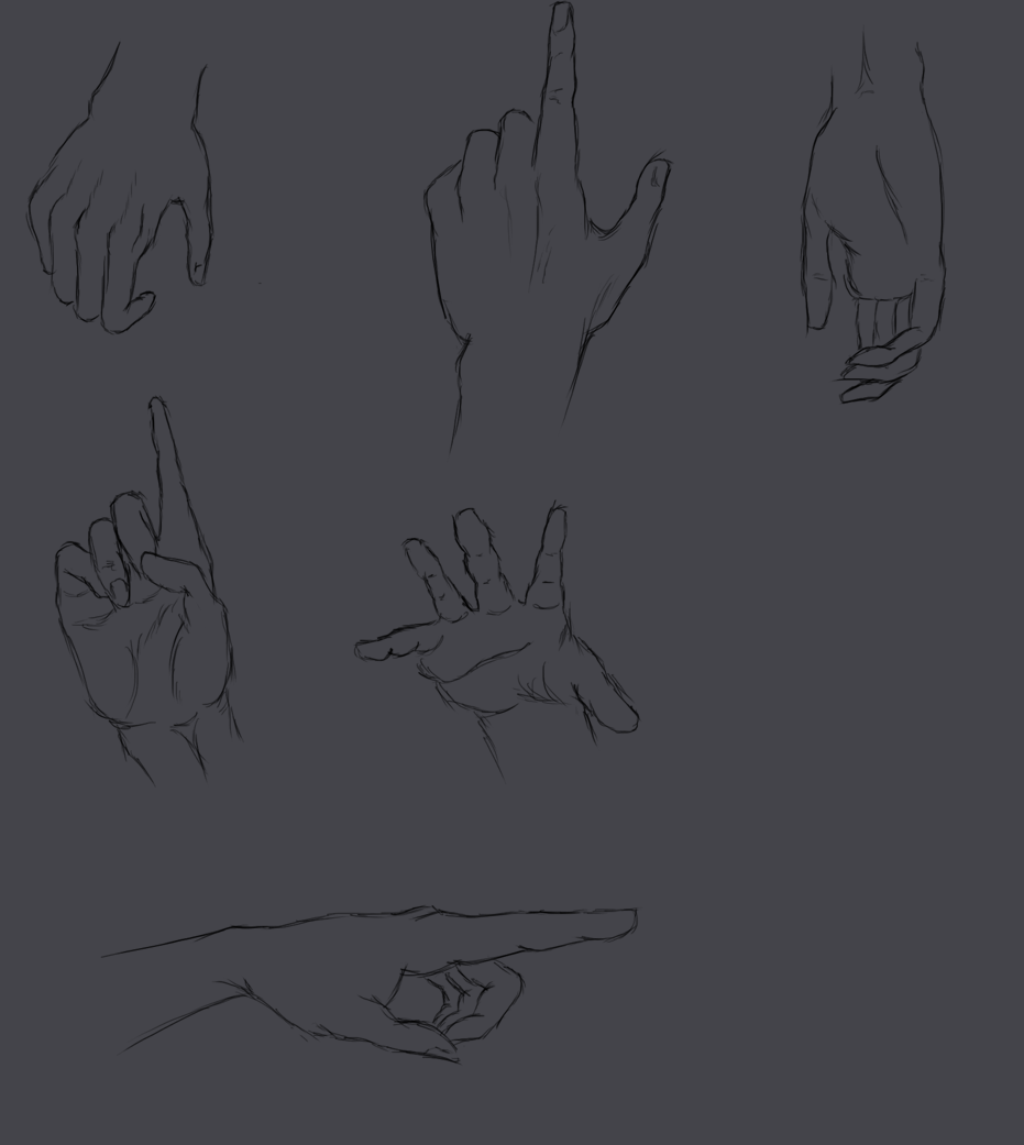
Great work with the hands too - keep pushing it : ) and your material studies and portrait stuff is coming along great!
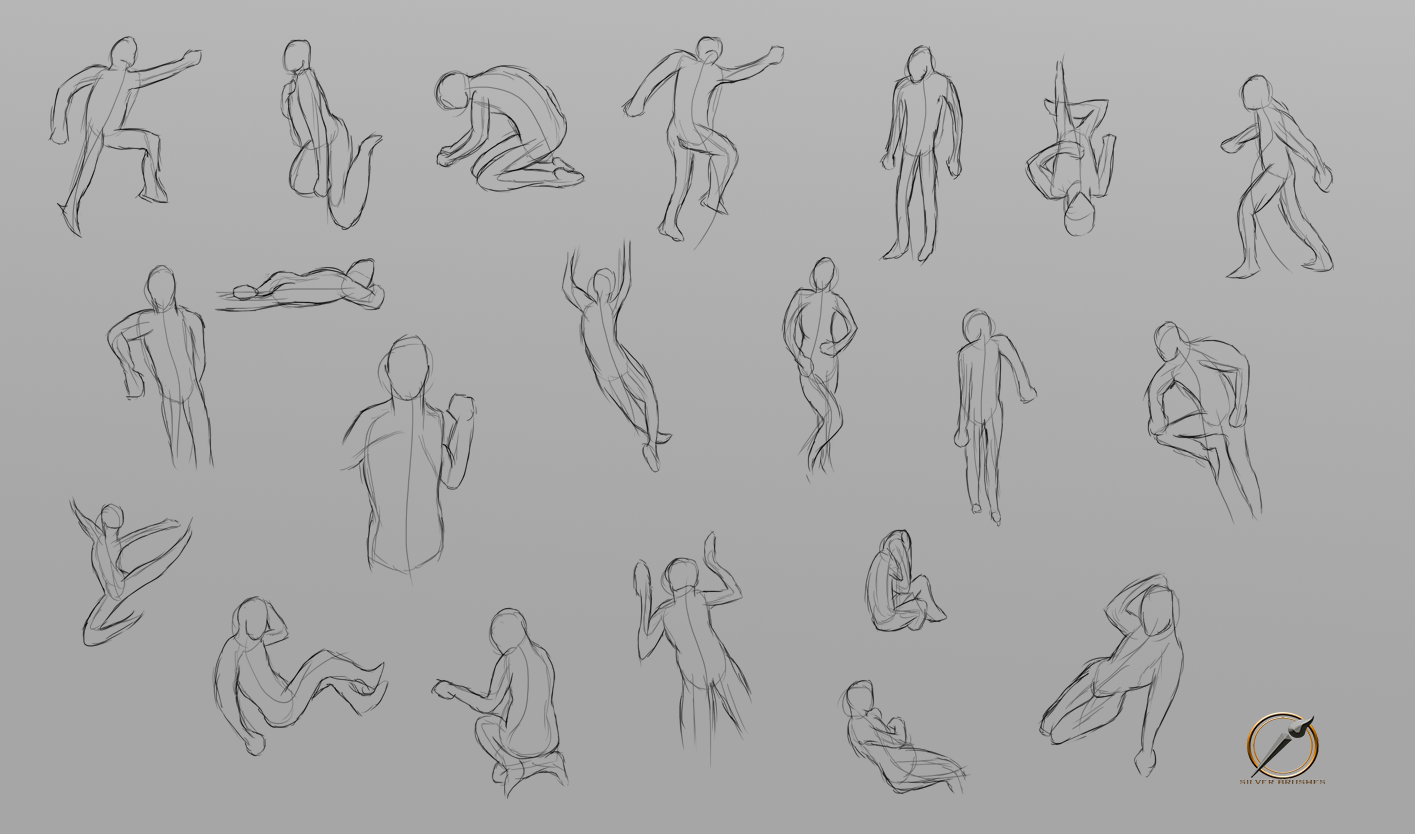
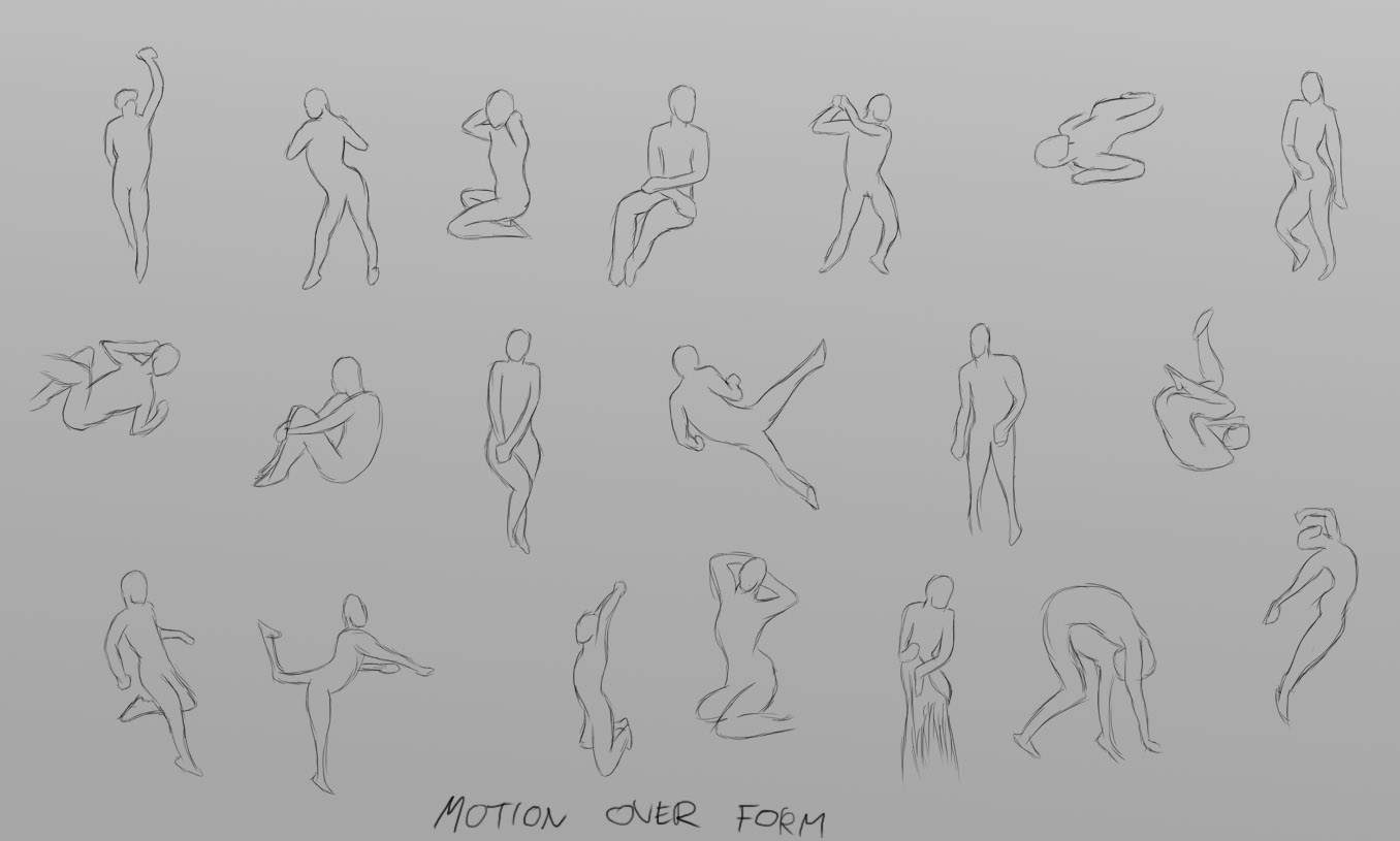
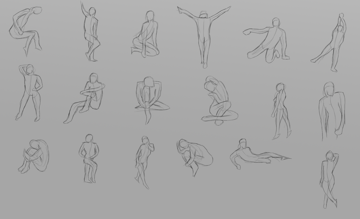
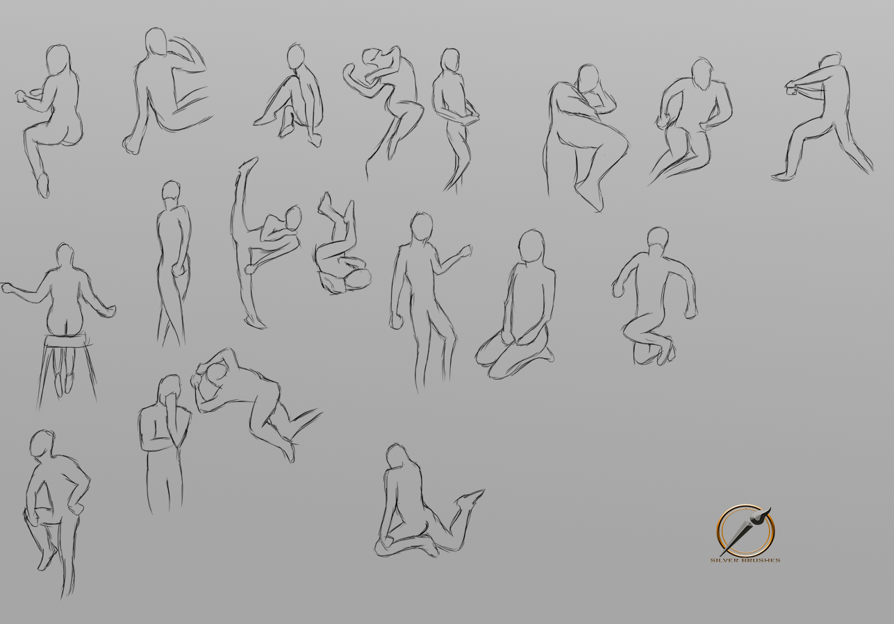
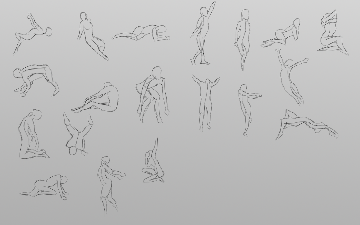
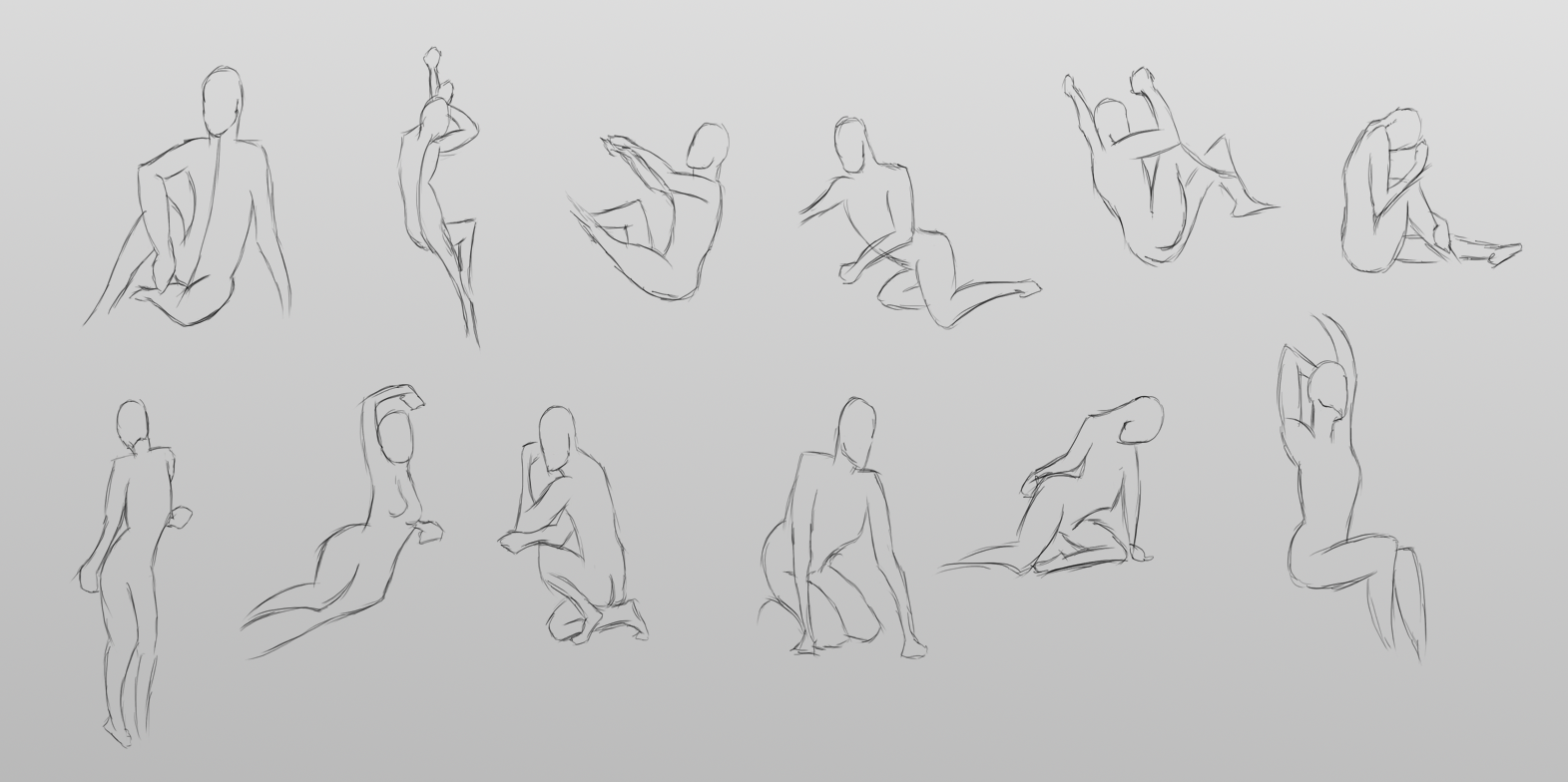
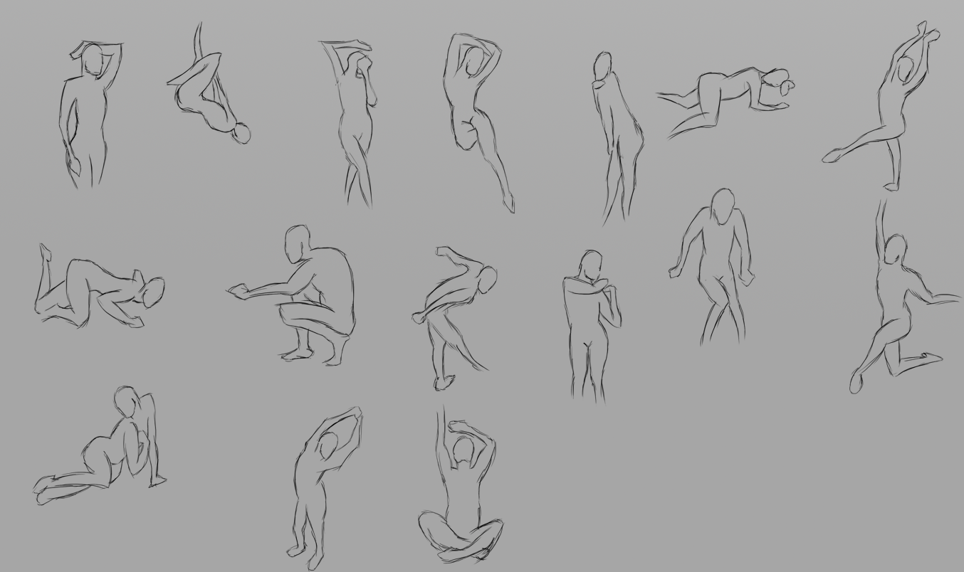
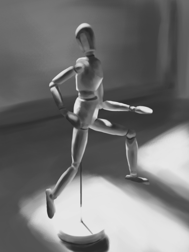
Your gestures look a little lifeless though... did you have any kind of rhythm / action lines on another layer that's been hidden? They look nicely proportioned just don't seem to have much energy. I'm no expert but that's what I see. Have you ever watched Glenn Vilppu draw gesture? It's really eye opening if you haven't - there's a short clip here: https://www.youtube.com/watch?v=rbSuMvdluvQ and few other things if you search him on youtube.
He has a full 1 hour or so class on it on DVD, but it's not on youtube it seems - I borrowed it from somewhere, it's a really great lesson if you can get hold of it.
Posts: 470
Threads: 3
Joined: Dec 2013
Reputation:
9
Tnx for the nice comments, i try to do various style's every time i start a new portrait study so i can see with what i can be comfortable with and in the same time i study about values as well..
About the gestures, yes i had another layer with all the rhythm and construction lines but i hid it at the end, tought it would look really messy with them, next time i'll add them up..
Tnx for the recommendation but unfortunately i won't be able to have it so i'll go with something else..
Posts: 1,109
Threads: 18
Joined: Apr 2014
Reputation:
68
I don't think it's because the construction lines are hidden that they look like that - I mean they are nice clean, well proportioned figures, just something is missing. Maybe try a few different gesture styles and see how you find the results!
Posts: 122
Threads: 1
Joined: Jul 2013
Reputation:
0
Hey Shinokami!
Your portraits are getting better and better!
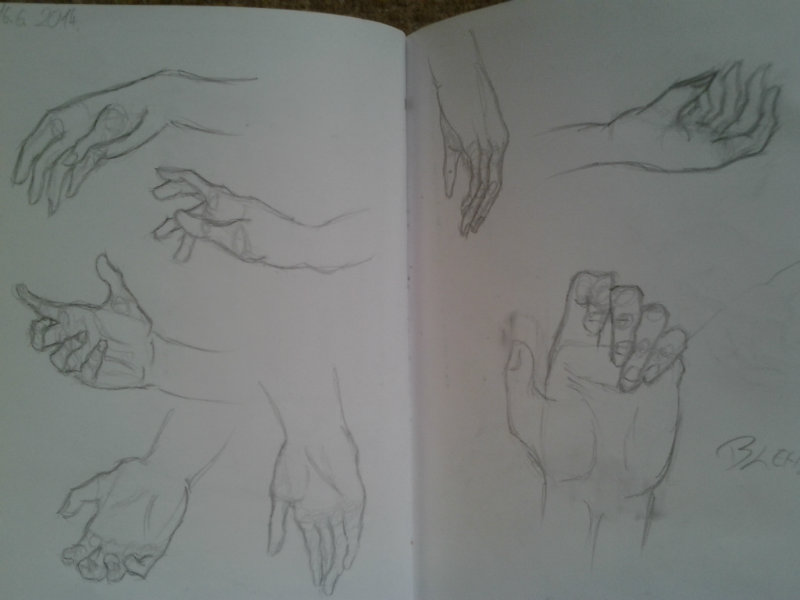
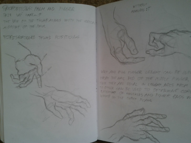
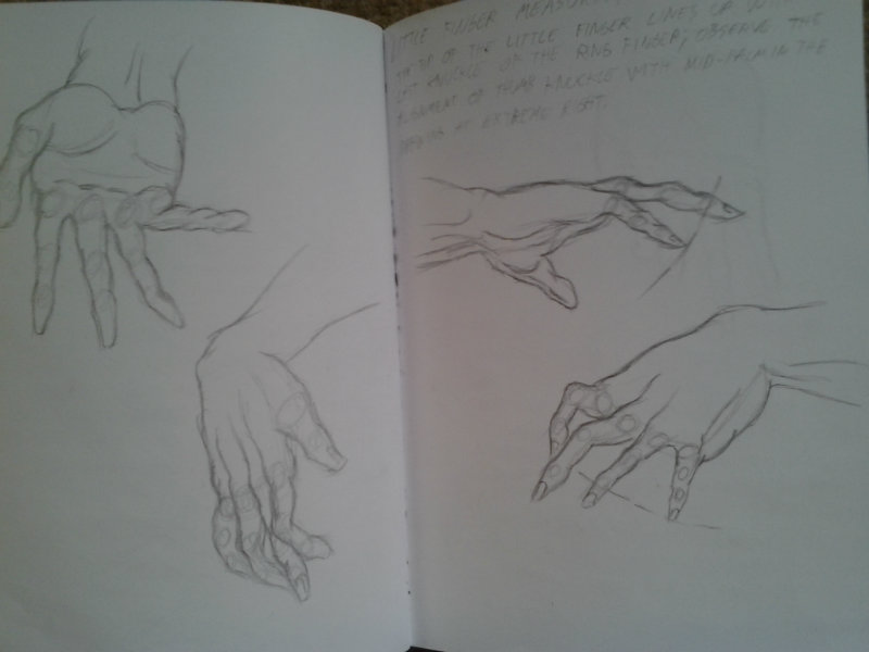
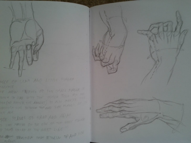
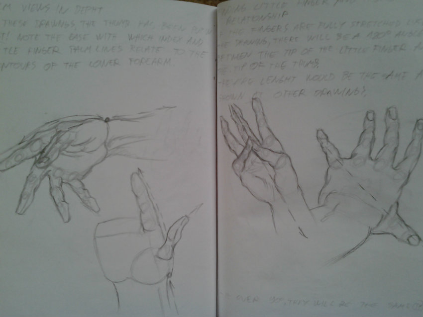
I also liked the hands studies from B.Hogarth! try to find something from Michael Hampton too, i felt easier when i did this kind of studies :)
Maybe it works for you too.
o/
Posts: 470
Threads: 3
Joined: Dec 2013
Reputation:
9
(06-28-2014, 12:40 AM)Rosolino Wrote: Hey Shinokami!
Your portraits are getting better and better!
I also liked the hands studies from B.Hogarth! try to find something from Michael Hampton too, i felt easier when i did this kind of studies :)
Maybe it works for you too.
o/
Tnx, i'll check him out for sure, hands are still kinda hard for me to draw, especialy when i'm seting the base, sometimes i totaly miss the proportions and need to start all over again.. well i just need to keep on training
More stuff
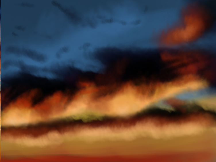
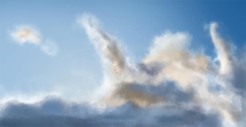
-some clouds study


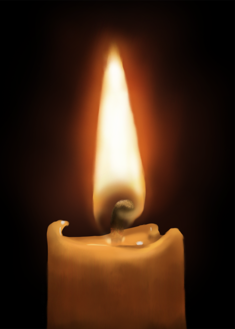
-photo study

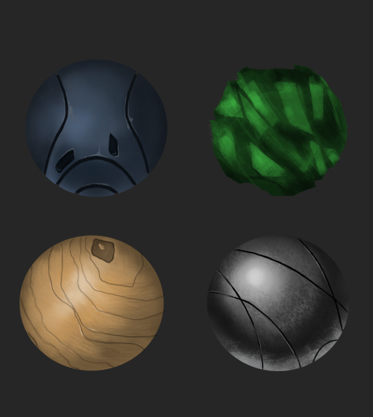
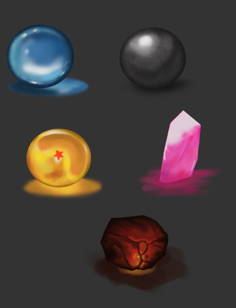
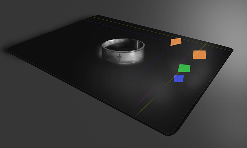
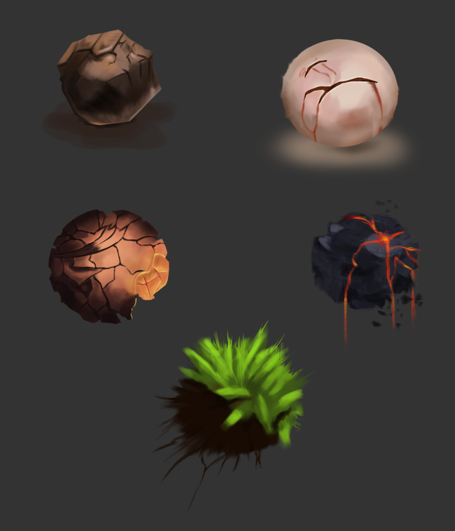
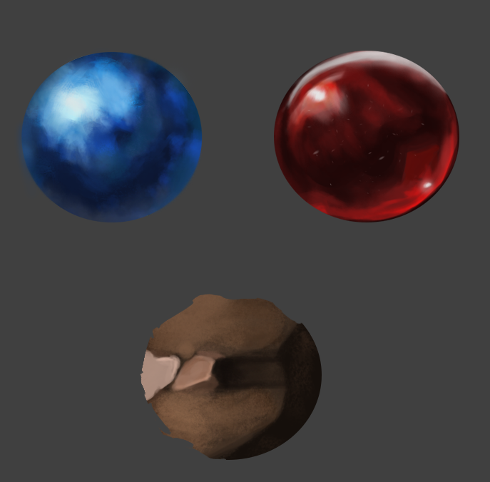
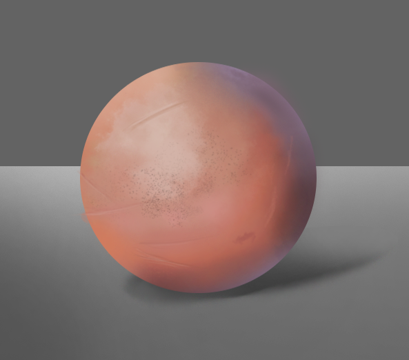
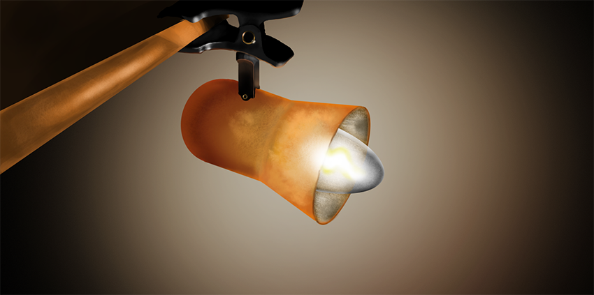
-material study

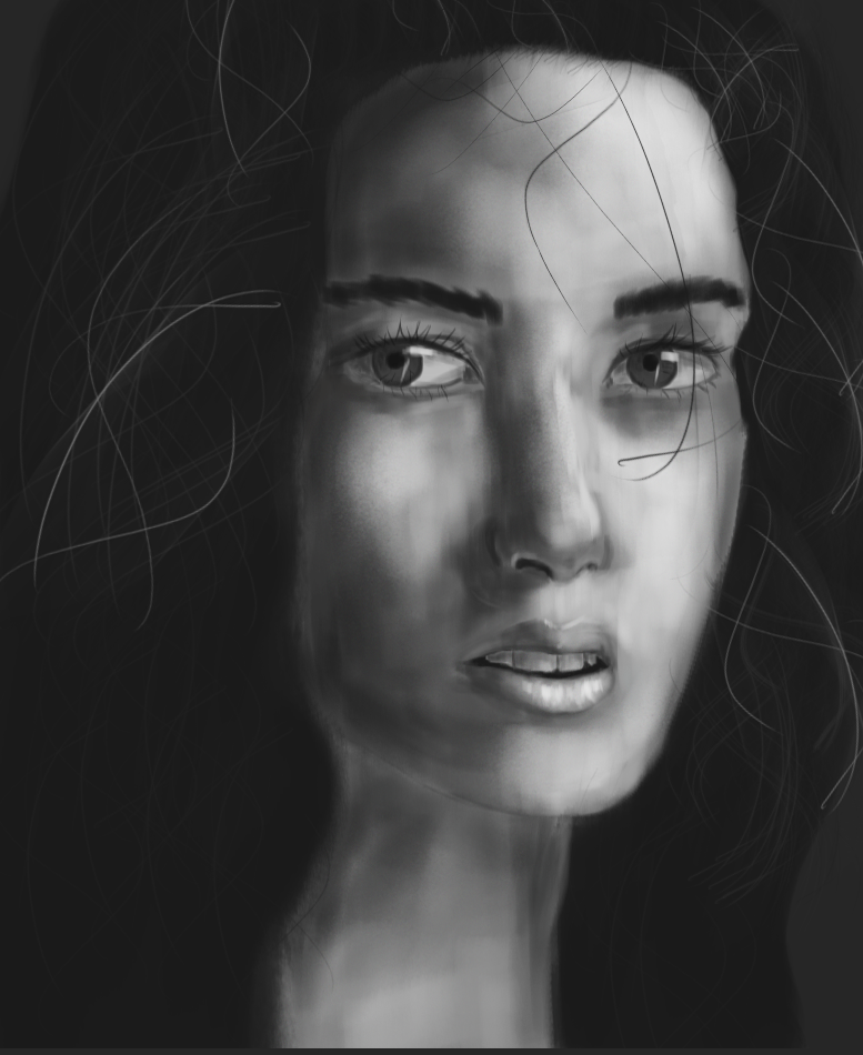
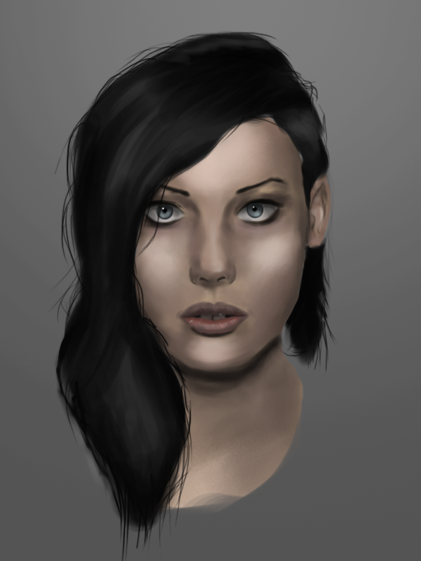
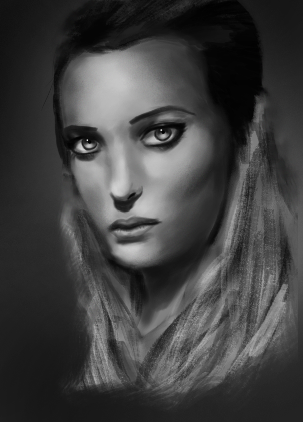
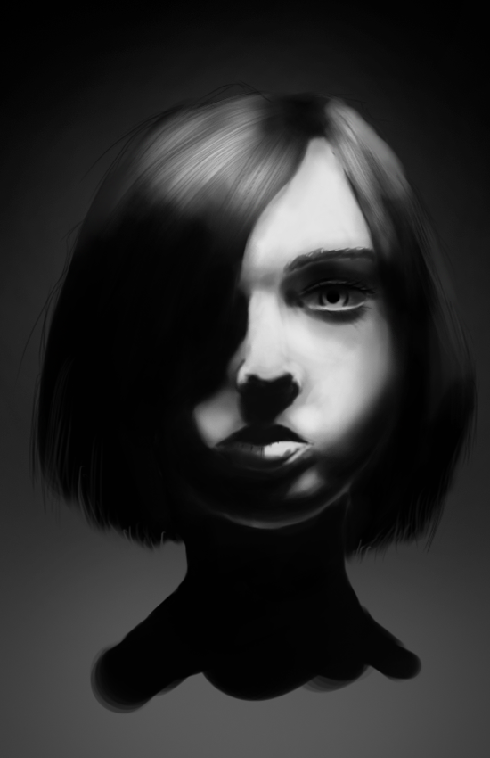
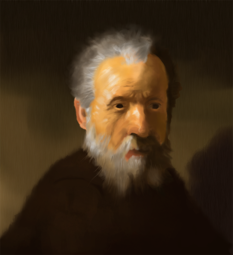
-portrait study with different kind of lighting and values


*got this one wrong..

-master study, didn't get the likeness right but had lots of fun painting it

Posts: 470
Threads: 3
Joined: Dec 2013
Reputation:
9
Posts: 470
Threads: 3
Joined: Dec 2013
Reputation:
9
More stuff..
-something quick for warm-up


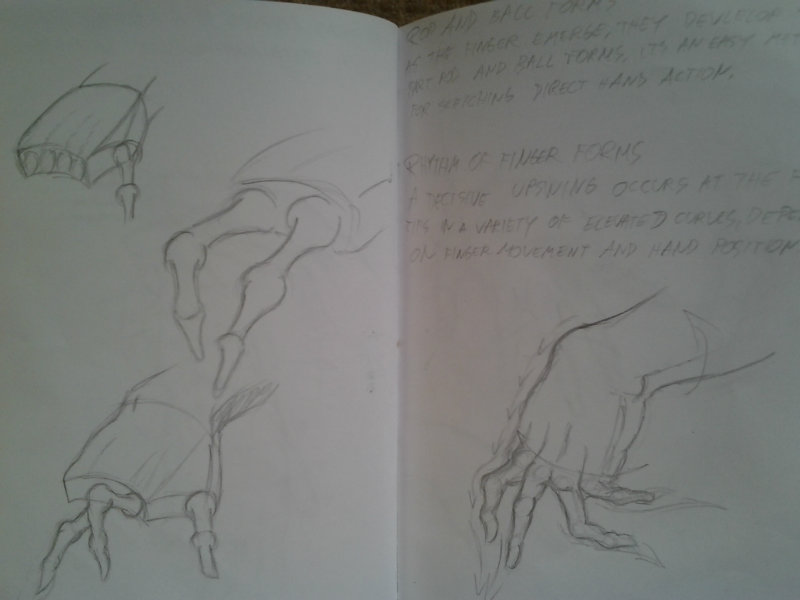
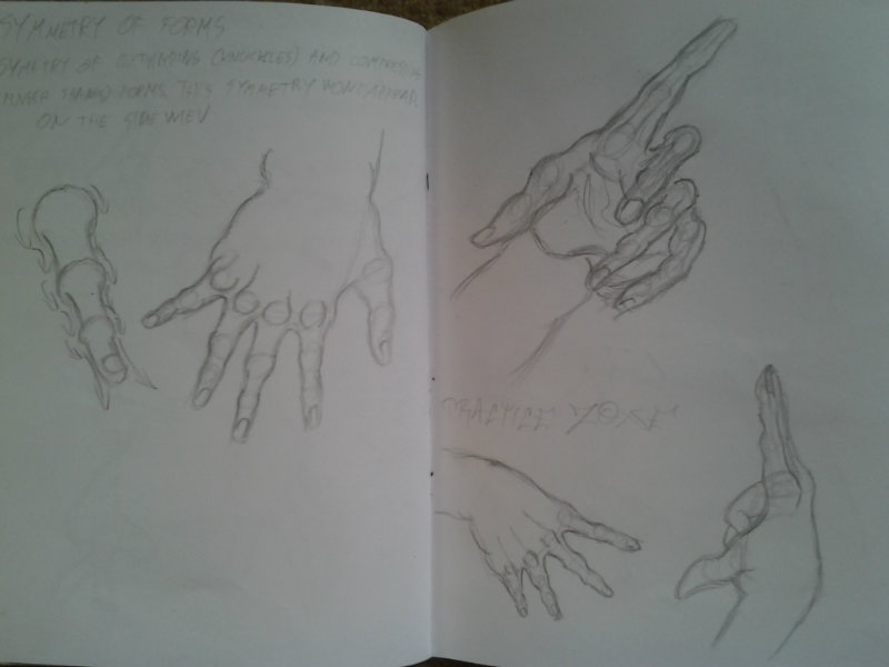
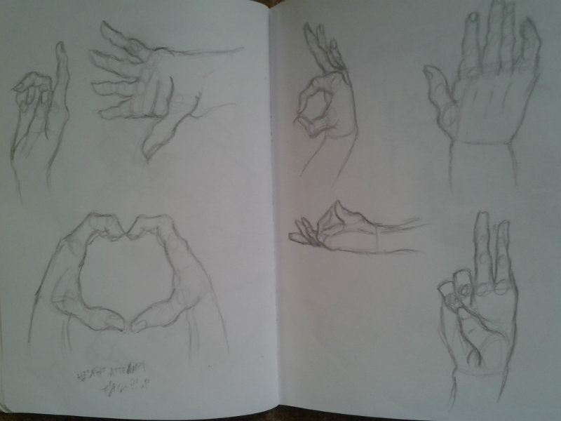
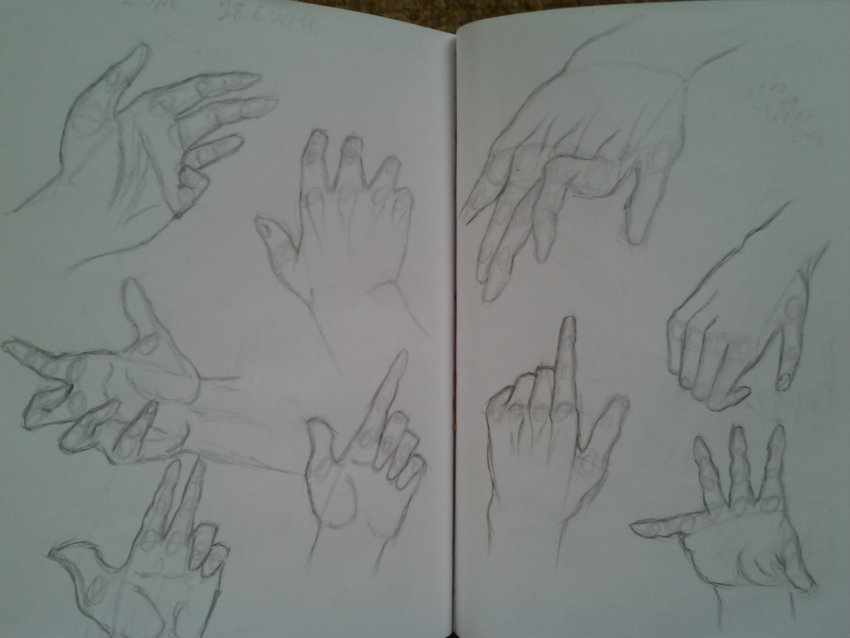
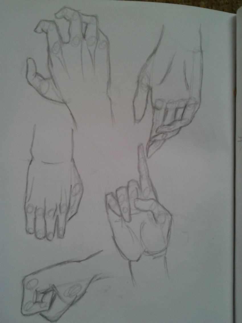
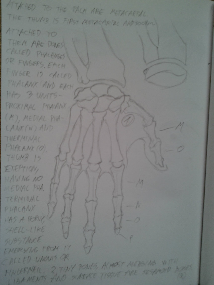
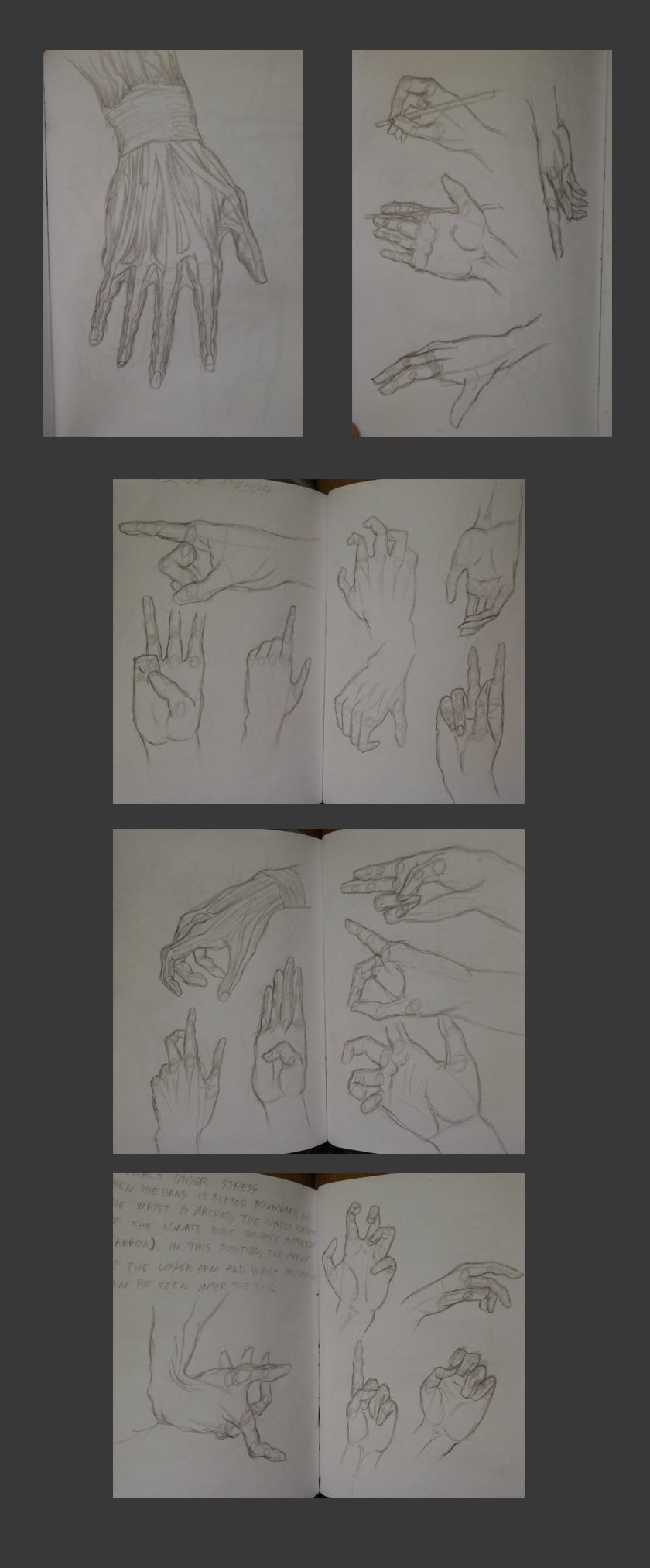
-hands

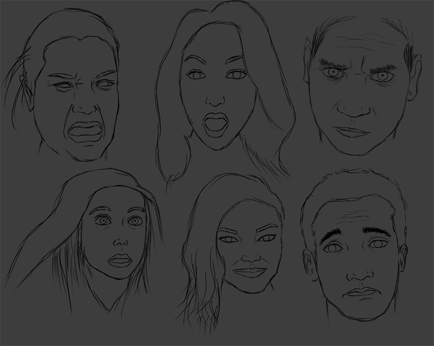
-expressions

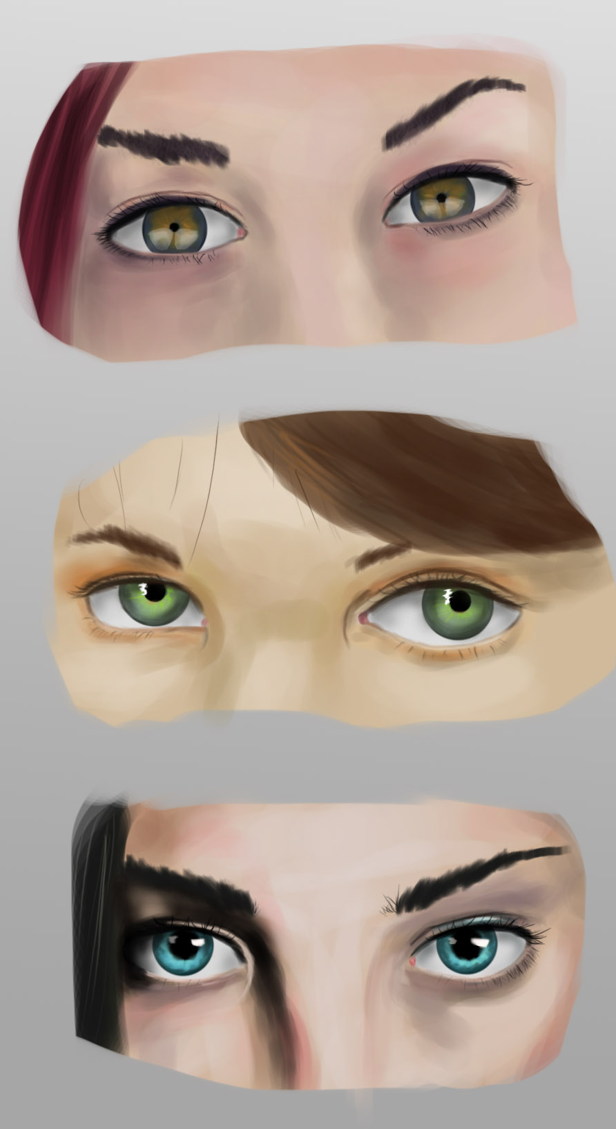
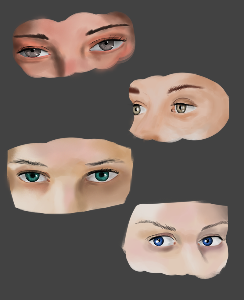
-eyes study- really have hard time puting down the skin, any advice is welcome..

-photo study

-material

-value

Posts: 470
Threads: 3
Joined: Dec 2013
Reputation:
9
Posts: 470
Threads: 3
Joined: Dec 2013
Reputation:
9
Posts: 1,109
Threads: 18
Joined: Apr 2014
Reputation:
68
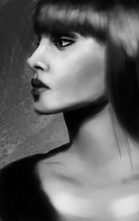
You're producing such beautiful work these days Shin, really awesome stuff! Especially the girl in #75. The wooden mannequin almost looks like an (artistically) out of focus photo!
Don't think I can help you with the skin too much... but as an idea maybe try and do a few of your material studies on a few different photo's of skin? See if you can discover any patterns or similarities. The under eye skin especially tends to be different from the rest of the skin on the face.
Just a thought anyway, keep it up brother!
Posts: 470
Threads: 3
Joined: Dec 2013
Reputation:
9
(07-08-2014, 07:09 AM)JyonnyNovice Wrote: You're producing such beautiful work these days Shin, really awesome stuff! Especially the girl in #75. The wooden mannequin almost looks like an (artistically) out of focus photo!
Don't think I can help you with the skin too much... but as an idea maybe try and do a few of your material studies on a few different photo's of skin? See if you can discover any patterns or similarities. The under eye skin especially tends to be different from the rest of the skin on the face.
Just a thought anyway, keep it up brother!
Tnx, i'm trying different stuff with different lighting every time so it will help me with actual skin tones
great idea about the materials, might do it :)
-some more warm-ups

-and simple lighting this time

Posts: 470
Threads: 3
Joined: Dec 2013
Reputation:
9
Posts: 470
Threads: 3
Joined: Dec 2013
Reputation:
9
Some older stuff, didn't plan the studies for the week so i just goofed everything in one day >.<
-little hand study


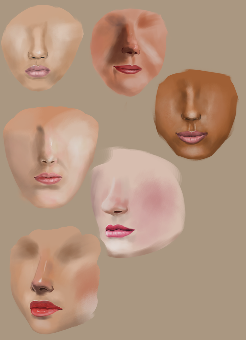
-skin

-quick still life

Posts: 54
Threads: 1
Joined: Jan 2014
Reputation:
0
Nice improvement man!
Portraits are pretty painfull, but it will be worth it in the long run :)
Keep going, will be checking back at your progress.
Posts: 470
Threads: 3
Joined: Dec 2013
Reputation:
9
(07-12-2014, 09:12 PM)Birchgrove Wrote: Nice improvement man!
Portraits are pretty painfull, but it will be worth it in the long run :)
Keep going, will be checking back at your progress.
Tnx man, i know what you mean, i plan on doing more skin studies so it gets more colorish around here :)
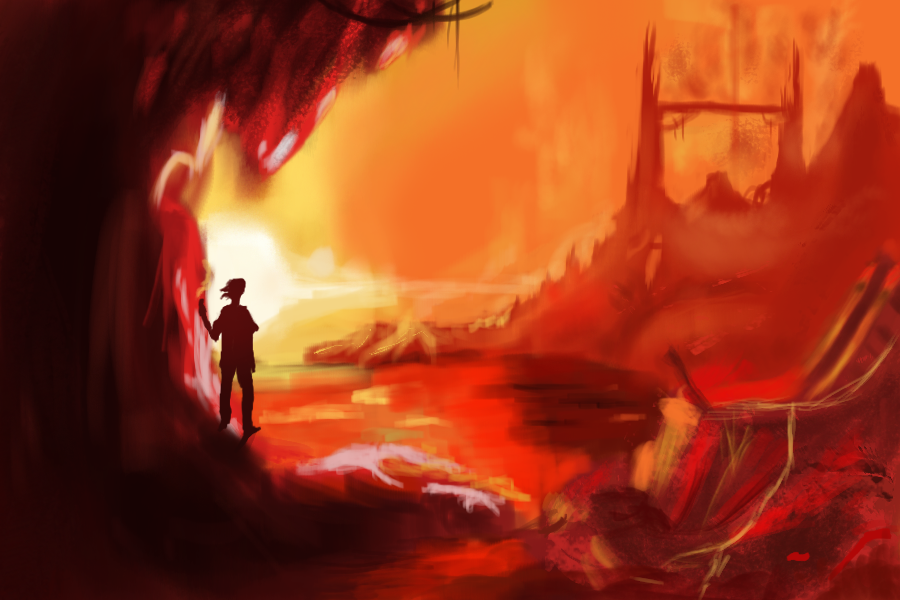
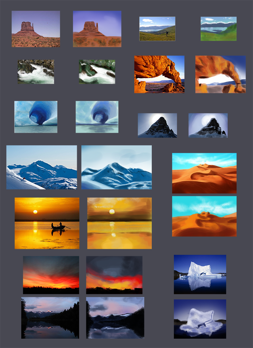
-some quick color studies

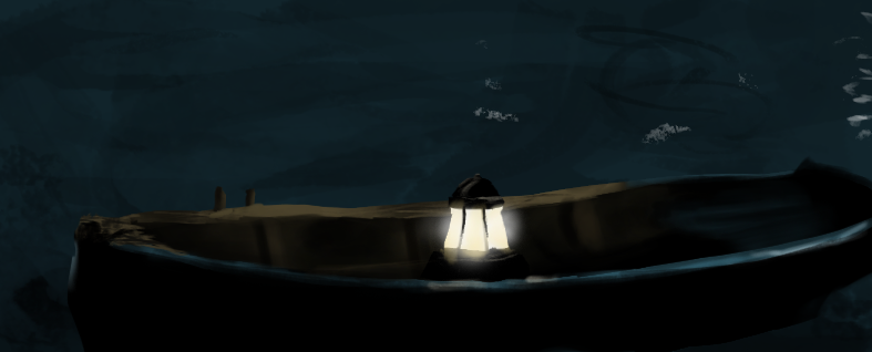
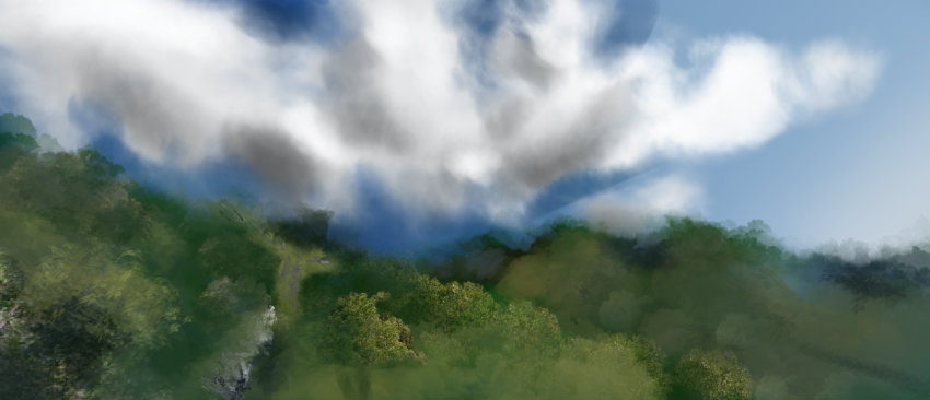
-some enviroment stuff

|
