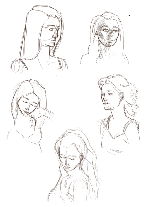
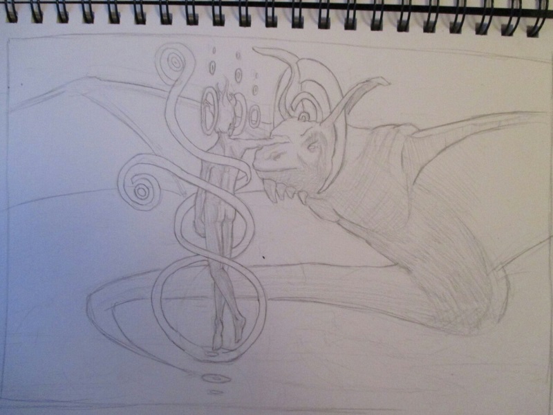
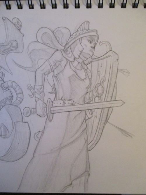
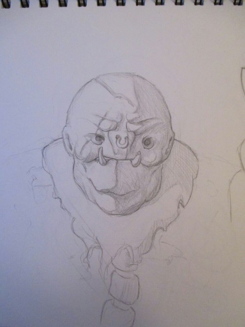
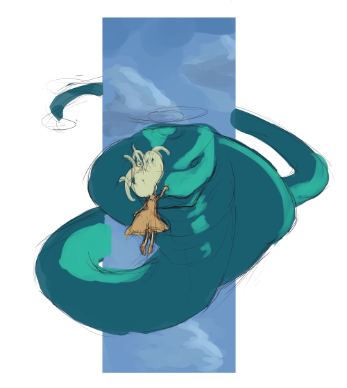
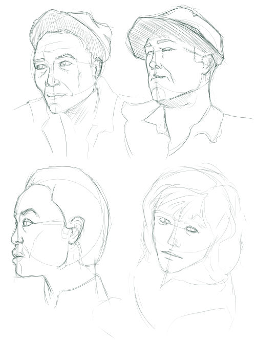
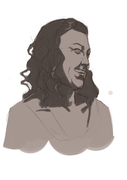
Great work, I can see you are thinking a bit more about structure in these latest sketches as well as those hands. I really like that you are pushing with trying different angles of the head too! Actually the general variety to your work is nice to see.
I have a couple of crits that are sort of anatomy-structure related. Firstly, with the hands, the fingers look rather uniform in width through their length, and a bit too cylindrical. In reality, they have a slightly squashed cross section that changes through the finger due to the joints/tendons and fatty tissue between them. There are a lot of little anatomy details to hands, but I think that after getting to grips with the proportions (good to see those finger-guide arcs!), it is helpful to start thinking with 3D shapes to understand their structure - cubes/cylinders and their variants.
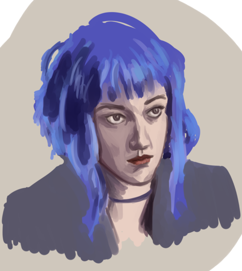
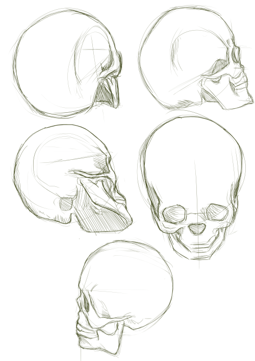
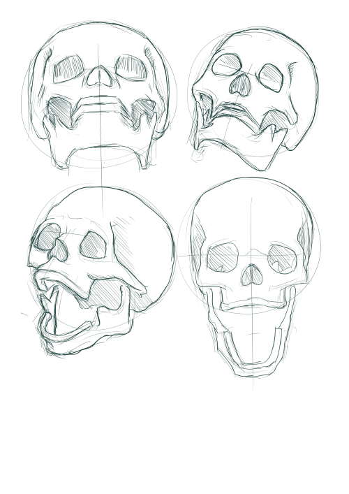
The other thing I was going to mention was that the eyes don't recess into the face far enough in a number of your pictures, and the brow ridge above them appears too flat as a result. It was something I had a lot of trouble with too - a few things that I found helpful were: drawing skulls to learn the structure (free skull reference pack
over here), drawing from photos and then drawing the skull over the sketch in a different colour, and my favourite, getting a photo or master painting, and using it as a guide to construct the face from the skull up.
Finally, as a general tip, it helps to identify 'corners' - or approximations to such - on hard areas where the form changes direction abruptly (common ones are the temples of the head, and boney joints like wrists and knees) as you draw through the forms, and use them to place boxes that help you understand their orientation/add shadows/etc.
Sorry for the long post, I hope it made sense. Keep up the hard work with all these studies!


