Posts: 95
Threads: 1
Joined: Aug 2014
Reputation:
1
Hi I am new the Crimson Daggers, and art forums.
My goal is to one day be a professional artist but I have a ton of practice to do. Right now i want to study fundamentals a lot.
I'll start by posting a portrait I drew.

Posts: 274
Threads: 0
Joined: Feb 2014
Reputation:
3
Greetings, welcome to Crimson Daggers. That's quite a nice portrait, you've captured the expression quite well. Though I would say you could refine the edges a bit more, some of them look a bit rough. Post more when you can.
Posts: 114
Threads: 5
Joined: Feb 2012
Reputation:
2
Yeah, I agree with stardustlarva, its a very nice start, now keep posting so we can follow your improvement :)
Posts: 95
Threads: 1
Joined: Aug 2014
Reputation:
1
Thanks RenatCaria and Stardust Larva! I'll definitely make sure to take note on the edges in my piece because I see what you guys are talking about.
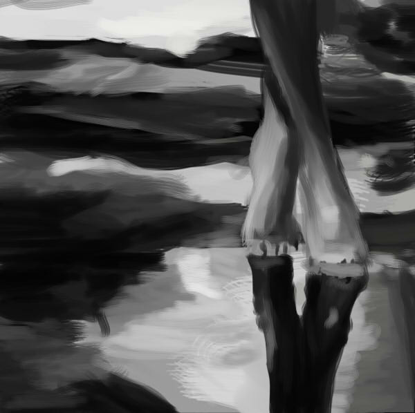
I've been studying a lot this past week, focusing on value.
Trying to make my stuff less midtone

Posts: 95
Threads: 1
Joined: Aug 2014
Reputation:
1
Posts: 274
Threads: 0
Joined: Feb 2014
Reputation:
3
I like the perspective work with that still life. I'd say you'd need to focus more on contrasting the hues with the second one. If you're focusing on blending, then if you haven't already, take a look at this CtrlPaint tutorial:
http://www.ctrlpaint.com/videos/brush-te...e-blending
Posts: 95
Threads: 1
Joined: Aug 2014
Reputation:
1
Thanks StardustLarva, and I checked out ctrlpaint and it was great.
Need to work a lot more on brush control, and blending.


Posts: 95
Threads: 1
Joined: Aug 2014
Reputation:
1
Another study trying a new method.

Posts: 95
Threads: 1
Joined: Aug 2014
Reputation:
1
Haven't updated sketchbook in awhile.
Been trying to apply studies more and do more imagination stuff. Also trying to focus on value, brushstrokes/blending, and basically everything. Here is a study I did of Jamie Jones, and then how i tried to apply it.


Posts: 288
Threads: 8
Joined: Nov 2012
Reputation:
9
Hey nice work in here. Definitely would put a lot more focus into your edge quality, example in #8, and the first picture in #9 - the background rocks should be so soft that they look to be blending into the background. Thatll bring your foreground elements forward a lot more and help the depth of your picture better overall. :)
Posts: 95
Threads: 1
Joined: Aug 2014
Reputation:
1
Thanks for the feedback Corey. I will definitely focus more on edge control, and having it be neater, and make more sense with were the object is in the picture based on atmosphere.
Today, I did a few studies of apples, trying to focus on different blending techniques.


Posts: 95
Threads: 1
Joined: Aug 2014
Reputation:
1
The cage with the hand thing is a WIP for school, and the other one is just a study of dirt for the CHOW.


Posts: 26
Threads: 2
Joined: Oct 2014
Reputation:
0
Hi there!
Nice sketches! I really like the colors of the sky on that sunrise painting :) Keep going! You know what is interesting? Our sketchbooks have exactly the same name :O I never met anyone who write Lilly like this. Kinda funny
Nice to meet you! :)
¤
Posts: 95
Threads: 1
Joined: Aug 2014
Reputation:
1
Thanks Lilly, and yeah most people have one only 2 l's in their name. It's cool to see someone else rocking the two l's.
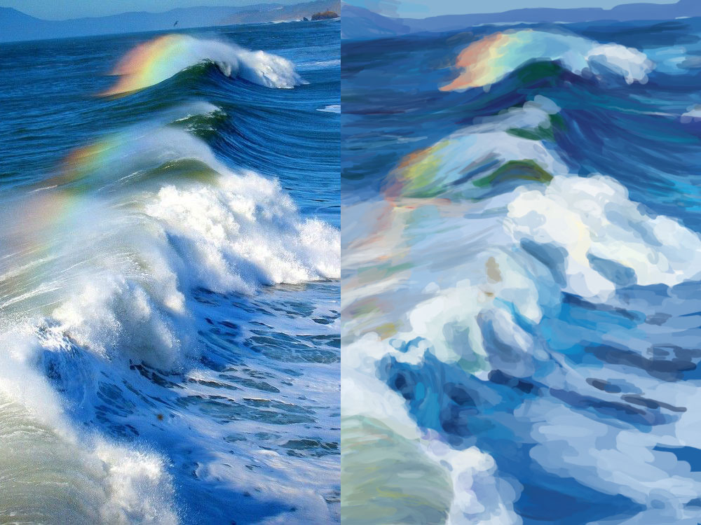
Here is a study I did of John Singer Sargent. I was trying to work on brushstrokes, I don't like how it turned out, and I am for sure gonna spend more time studying him, and other masters.

Posts: 1,109
Threads: 18
Joined: Apr 2014
Reputation:
68
Hi Lilly, thanks for looking at my sketchbook. Your stuff looks great! I don't have much to offer cause I'm not much of a painter but keep practising and you'll improve fast : )
There's this series of videos that might help with getting your edges nice (and landscape style painting in general) - https://www.youtube.com/user/shaddy1100/videos it's a long series but checking out the first 2 or 3 will give you enough to get started.
Posts: 117
Threads: 4
Joined: Nov 2014
Reputation:
1
Hey Lilly, great sketchbook.
I think it would be very useful to do master studies. One thing I would suggest though is to start doing them in black and white first. Not worrying about colour at first could really help you focus on values, shapes, edges, etc. So when you learn to get them right and understand them, you could start using colours, too.
I think colour is a bit overwhelming and hard to understand so maybe don't jump into it right from the beginning.
Posts: 95
Threads: 1
Joined: Aug 2014
Reputation:
1
Thanks Jonny. Those videos are great and I need to start trying to use the way he does edges more for sure.
And Thanks Maggie, I wanna try focusing more on value for, and master studies would be a good idea.
I think this month I wanna focus more on values and perspective, and edges in environments.
Here is some perceptive practice I did last night, and though they are off, I think I learned some from them, and they were fun to do!
Also a WIP thing.


Posts: 95
Threads: 1
Joined: Aug 2014
Reputation:
1
I accidentally deleted the other thing I was working on yesterday which is a bummer.
This is an drawing I did of outside the window of my house, it is really unfinished cause my laptop ran out of power, and I had 5 minutes to slop on value. I spent most of the time trying to get the perspective right. It was really challenging so I am gonna work on 2 point some more today.

Posts: 95
Threads: 1
Joined: Aug 2014
Reputation:
1
Study and then application.


Posts: 95
Threads: 1
Joined: Aug 2014
Reputation:
1
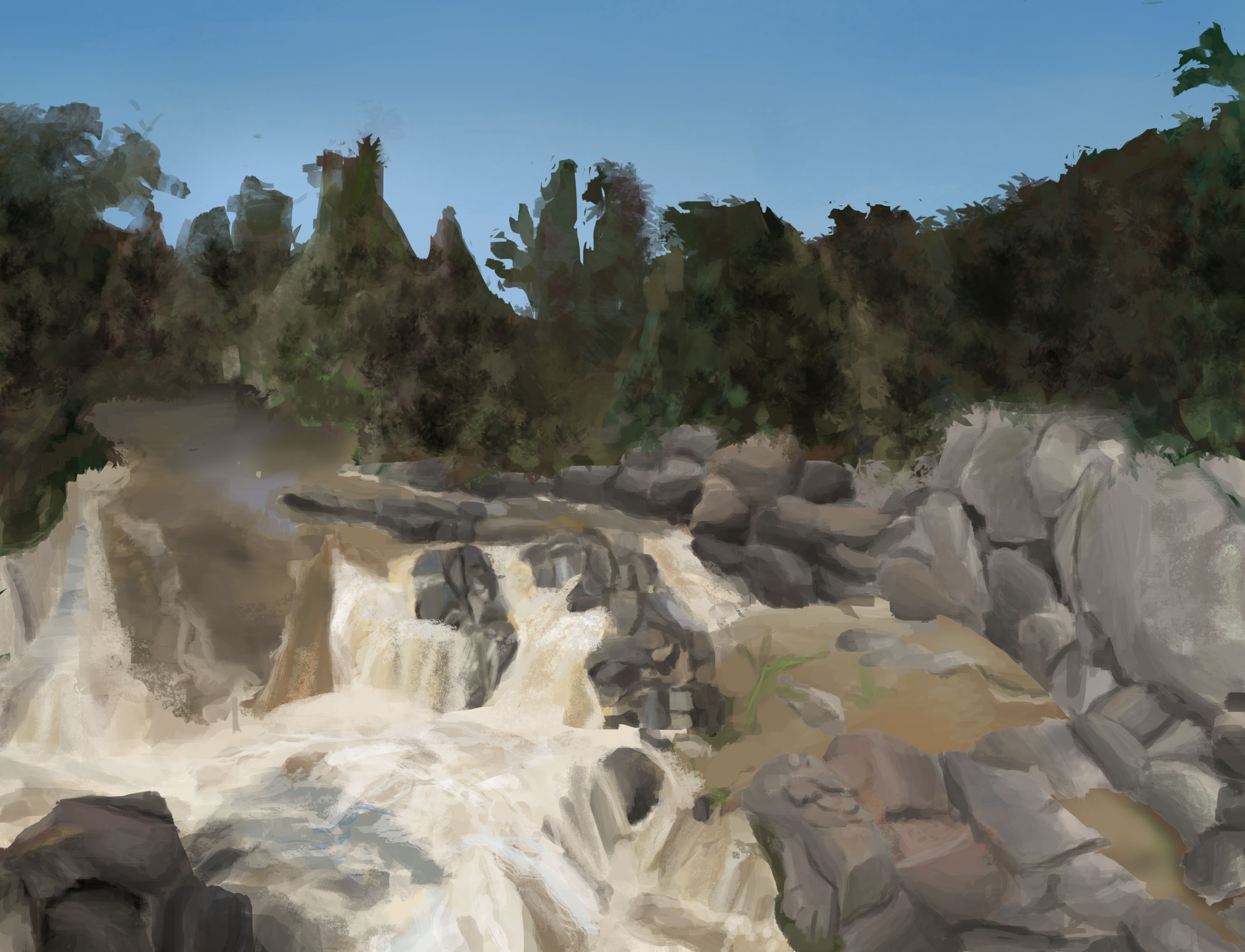
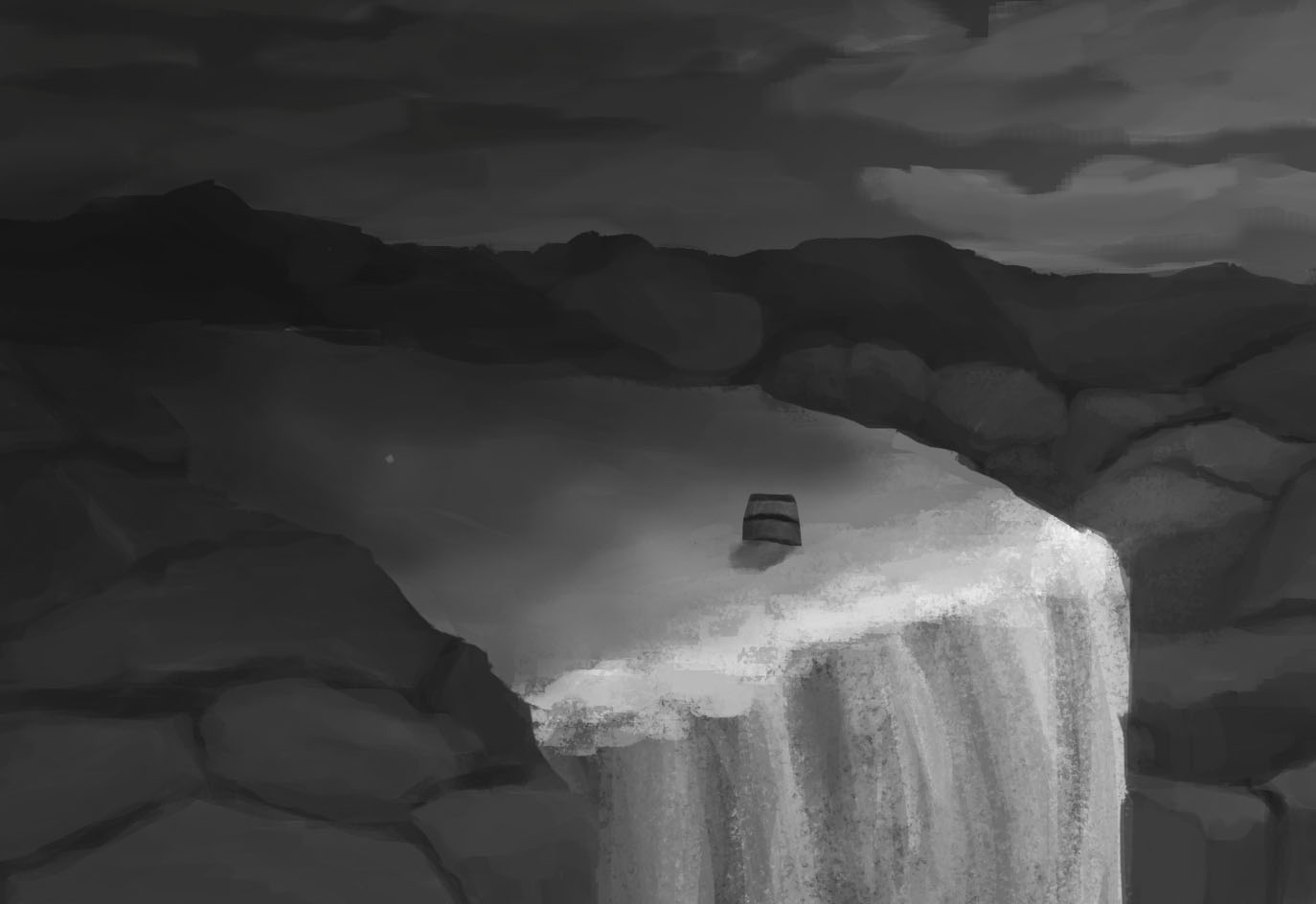
Studies I did. One was quick and other I spent more time on. Gonna apply it for a piece I want with the same lighting. I am currently thumb nailing that.


|


