07-14-2015, 02:35 AM
Hey, sorry it took too long i wanted to do it on a weekend but i had to sell my computer this saturday. Unfortunately i cant stream from my mashine at work, so ill just to da paintover with commentary.
Heres a few problem i see in your picture.
1. Poor perspctive & detail density on the architectural elements.
2. Kinda awkward composition, points of interest takes pretty much equal space on the frame.
3. There could be more values,
4. And there could be more noise, details in the picture.
I corrected perspective and changes the size of the objects in the frame (First shot). The really awkward thing for me was that the door way, where the character is probably want to get you, is hot closed. Its may be ok for a concept for a game, maybe theres a lever somwhere that will open it, but for illustration - it kills continuety of the story. You want the viewer to fantasise and continue the path of a character beyond that door. Also i corrected the lightening a little bit. i thought that there s little bit too much of a light right in the middle of the frame. its been drawing too much atention. on the last shot i just added a little bit more details.
Hope it will help you a little.


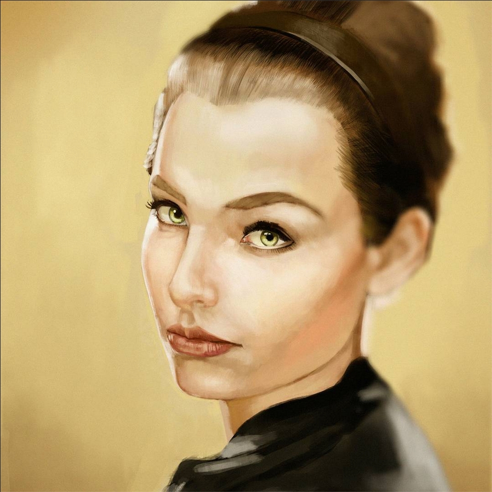
![[Image: Rg9B1Rw.jpg]](http://i.imgur.com/Rg9B1Rw.jpg)
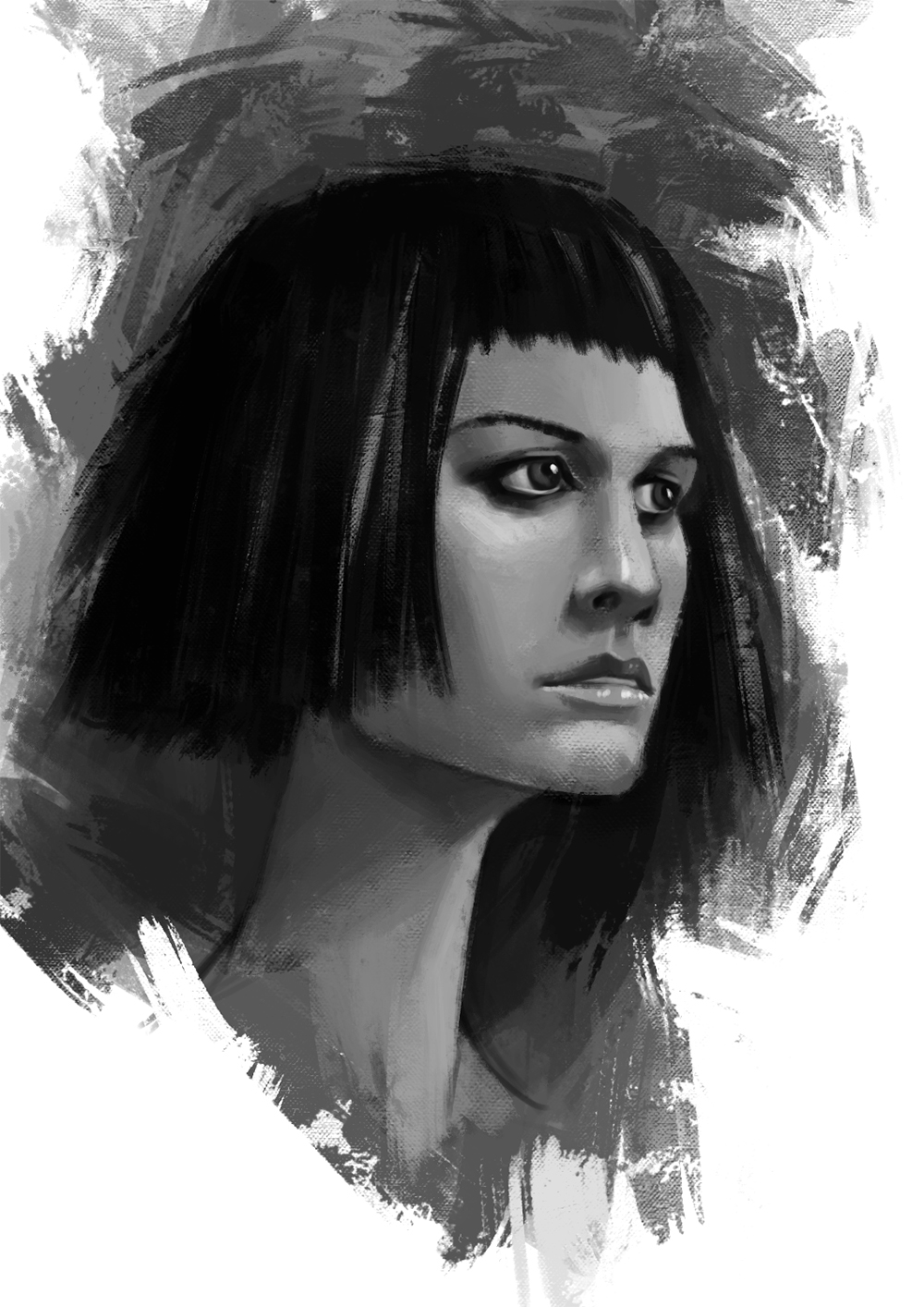


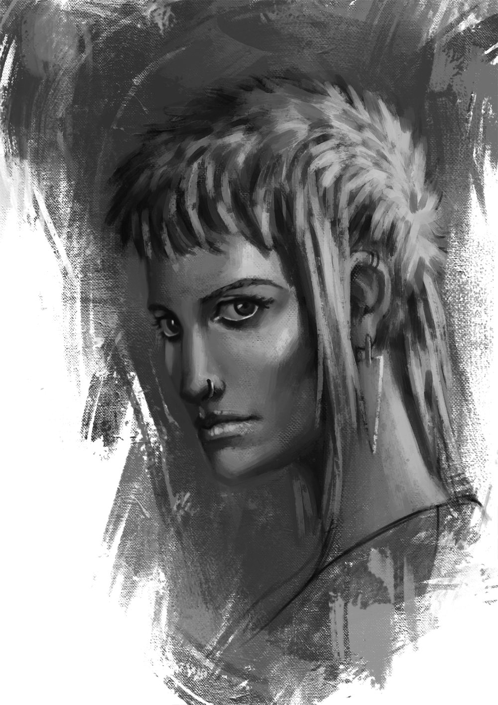

![[Image: kSMmKaC.jpg]](http://i.imgur.com/kSMmKaC.jpg)
![[Image: 5WS0XuE.jpg]](http://i.imgur.com/5WS0XuE.jpg)
![[Image: 7Tw6quY.jpg]](http://i.imgur.com/7Tw6quY.jpg)
![[Image: IOvi3Ku.jpg]](http://i.imgur.com/IOvi3Ku.jpg)
![[Image: 8nNxkF2.jpg]](http://i.imgur.com/8nNxkF2.jpg)

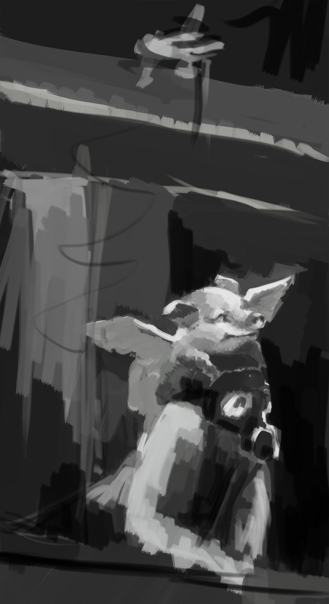
![[Image: d3d9217a763bc5a93fb850bf5697c0d1.jpg]](https://s-media-cache-ak0.pinimg.com/originals/d3/d9/21/d3d9217a763bc5a93fb850bf5697c0d1.jpg)


![[Image: Screen%2Bshot%2B2015-07-30%2Bat%2B5.36.31%2BPM.png]](https://2.bp.blogspot.com/-JTfq1mCjV2s/Vb3H5wLLCFI/AAAAAAAADQY/7zRjx4Xs-4Y/s1600/Screen%2Bshot%2B2015-07-30%2Bat%2B5.36.31%2BPM.png)


![[Image: 1_zps9dckrclr.jpg]](http://i1150.photobucket.com/albums/o620/ramalooke/1_zps9dckrclr.jpg)
![[Image: 2_zpswedvdpge.jpg]](http://i1150.photobucket.com/albums/o620/ramalooke/2_zpswedvdpge.jpg)
![[Image: 3_zpsijhbklrk.jpg]](http://i1150.photobucket.com/albums/o620/ramalooke/3_zpsijhbklrk.jpg)
![[Image: 3a_zpsudsauik8.jpg]](http://i1150.photobucket.com/albums/o620/ramalooke/3a_zpsudsauik8.jpg)
![[Image: 4_zps13ybepnn.jpg]](http://i1150.photobucket.com/albums/o620/ramalooke/4_zps13ybepnn.jpg)