echo´s sketchbook
Wow guys, thanks for the awesome paintovers. It is always refreshing to get other artists point of view. I really, really appreciate it!

I will take every note in consideration and analyze them. Unfortunately I have a lot going on in my personal life right now, and I dont have the time, energy or motivation to draw or paint... But I will be back I just need some time.

Thanks for the support guys and again I really appreciate it!

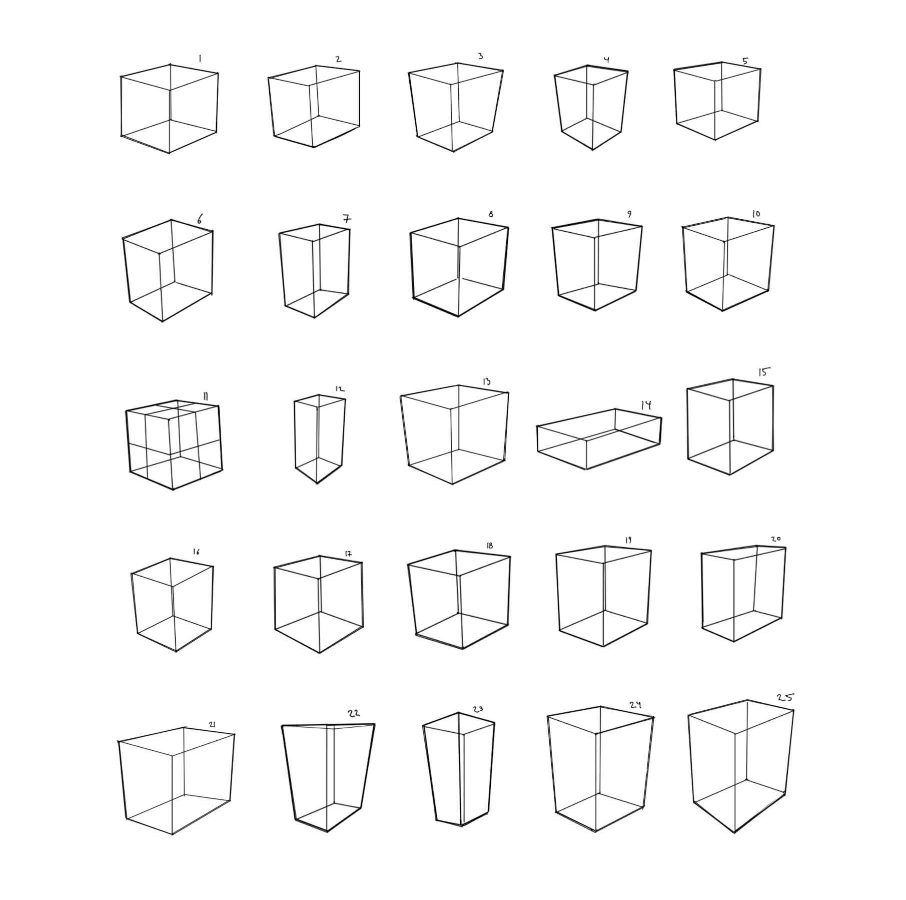
These few boxes are the only drawings i've done since the last post :/

Reply
Quick update, I still have a lot going on. But I succeed to squeeze in some quick sketches or two once in a while.


Reply
Well done for fitting in some art mate, sounds like you're up to your eyeballs in other stuff. Nice lines on that lady in the last post.

Keep doing what you can and don't beat yourself up when you can't :).

“Today, give a stranger one of your smiles. It might be the only sunshine he sees all day.” -- H. Jackson Brown Jr.

CD Sketchbook


Reply
Thank you Artloader!


Not pleased with how this one turned out, at least I learned a lot:


Reply
the women faces you draw look very nice in line but when you add tone they look really like lumpy and unnappealing, id reccomend trying to maintain the line drawing for as long as you can and try not to make everything so rounded out and plastic looking in the finished rendering

70+Page Koala Sketchbook: http://crimsondaggers.com/forum/thread-3465.html SB

Paintover thread, submit for crits! http://crimsondaggers.com/forum/thread-7879.html
[color=rgba(255, 255, 255, 0.882)]e owl sat on an oak. The more he saw, the less he spoke.[/color]
Reply


Reply
Hey Echo!

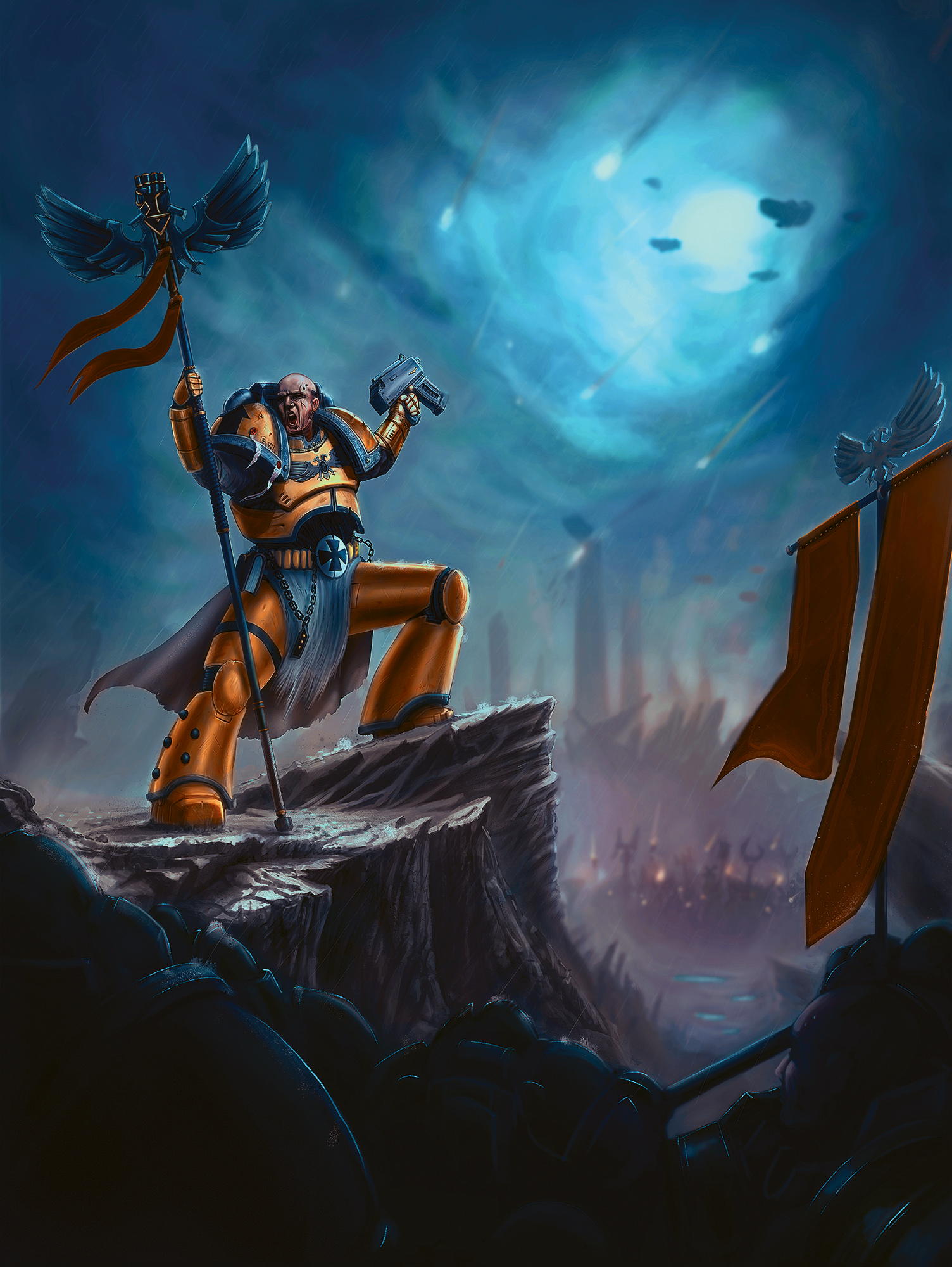
I like the Warhammer piece, you´ve picked the contrasting colour pallete and it works.
The army colour and the Background colour work pretty well, the rock shape is also very nice.
Just two considerations, the colour of the soldier is very saturated and it does not match the blue hue of the atmosphere, maybe a blue blending can work and desaturating a little bit. Also, the piece hits two fronts; lineart (cellshading) and painterly style, and i´m not really sure which one was picked.

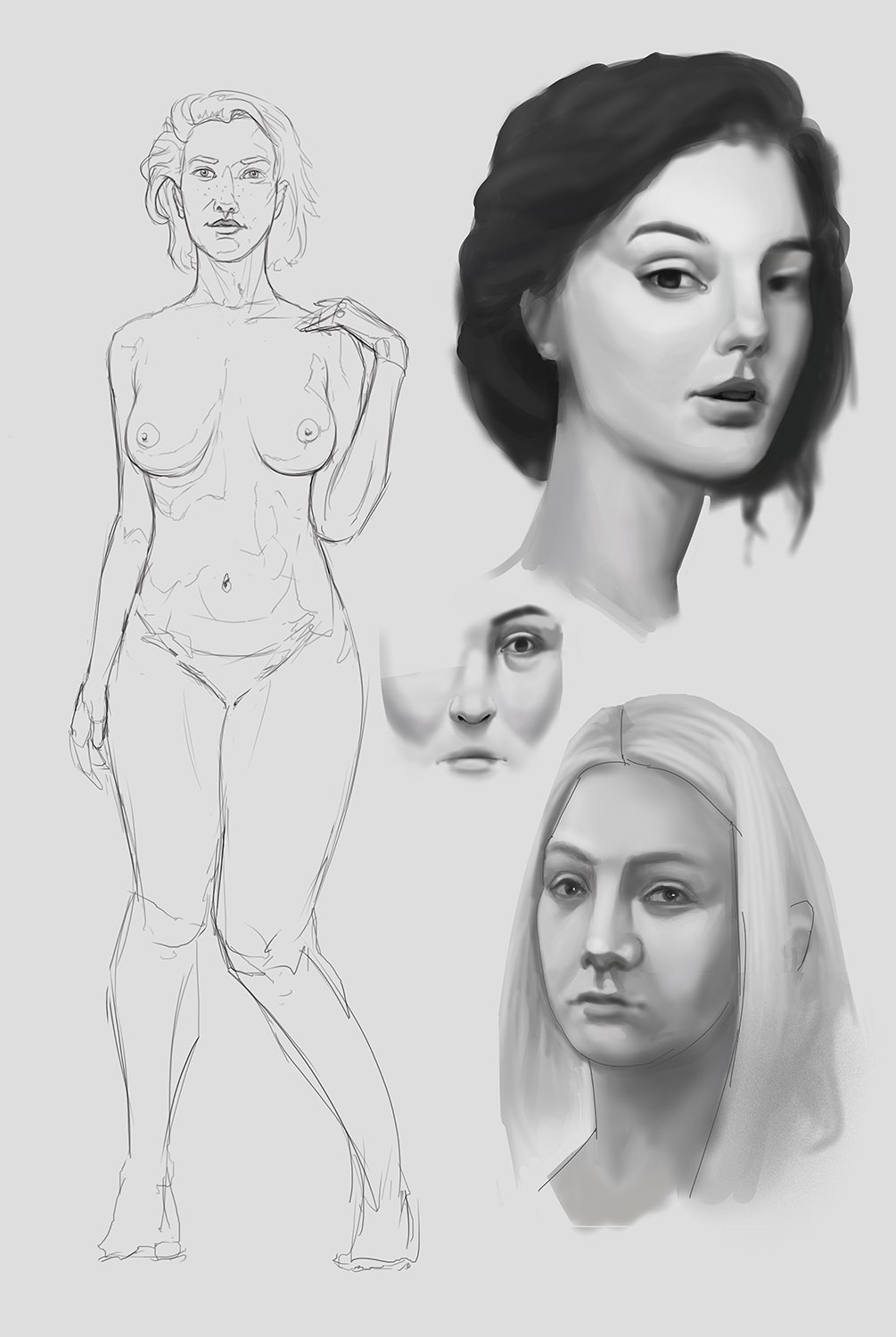
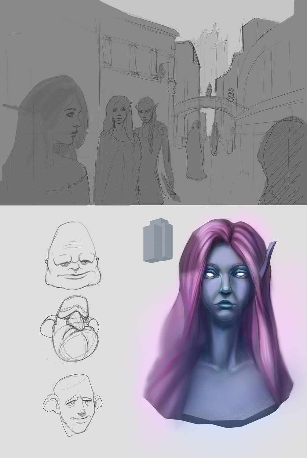
I really like the studies you´ve put on post  #182, specially the edge control of the top right portrait.


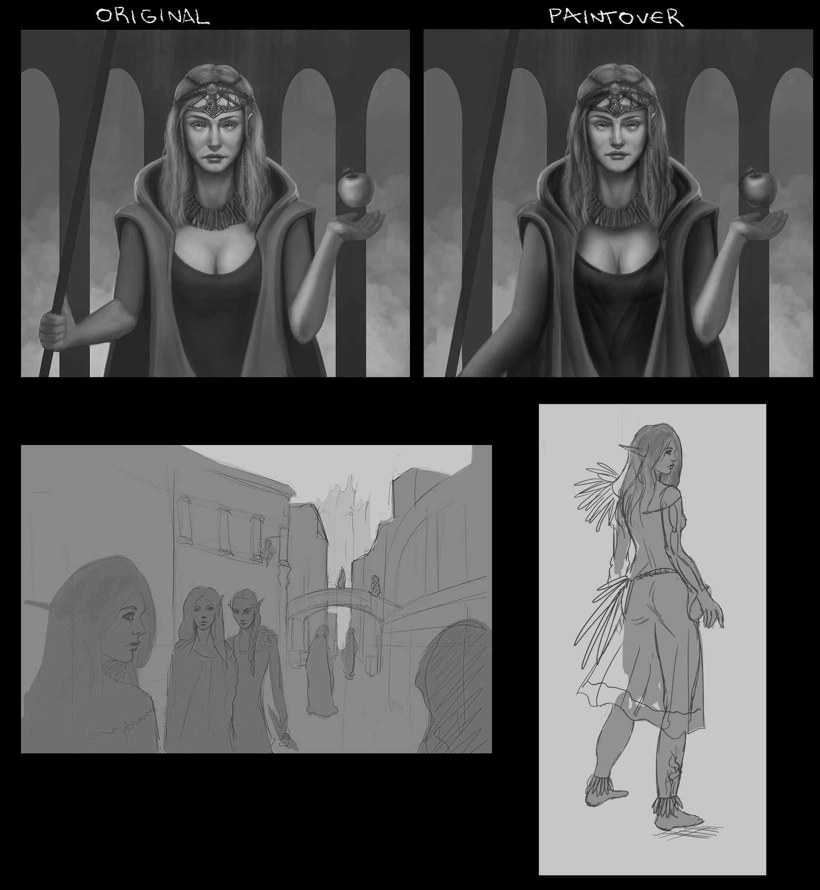
Now, i´ve made a very quick overpaint of two pieces of yours, the first one, a study that you´ve done, the face of the elf lady is really cute, and to show you the kind of potential it has, i´ve done a very quick full body sketch/character design-ish.

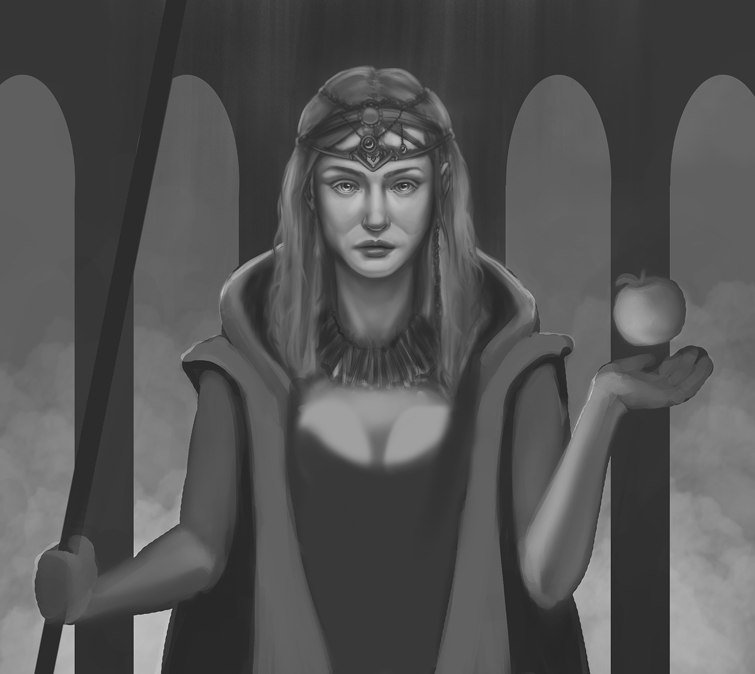
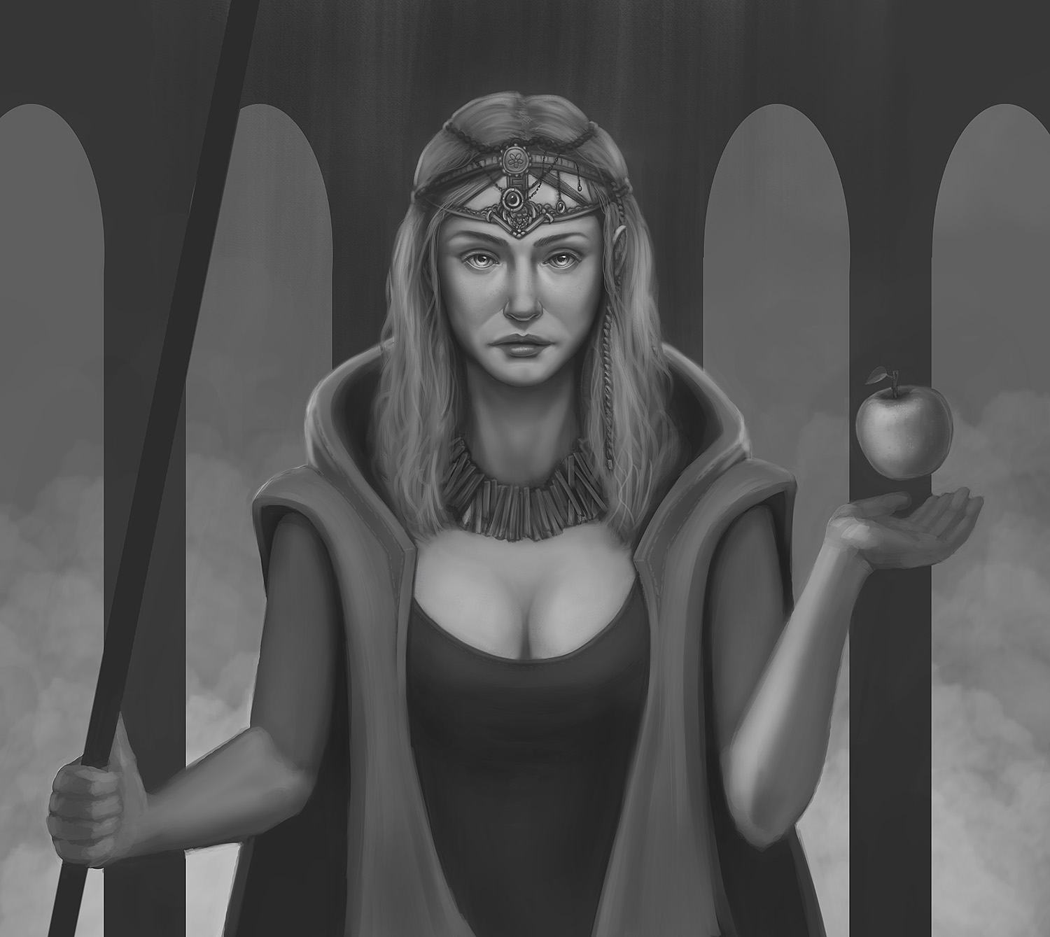
Regarding the piece of the lady and the apple, i like it too, has potential. The BG is pragmatic and simple, it works, it is nicely rendered ( i suppose not finished yet but close) and, hope you don´t mind a few adjustments i´ve done, just to better illustrate my points;

1. Face- The structure is fine, the placing can be better; reducing the nose, pushing it up, pushing the mouth up and softening the cheeks helps to create more femininity, not sure if it was the intent.

2. Materials. Used a simple brush to push like a silk-ish vibe to her clothes.

3. Values and arm- Her left arm is a bit too small. Haha, do not be afraid to place the hand out of the picture, you aren´t a less artist for doing so if works to match the goal and the proportion is realistic.
The mid values are well-placed, maybe pushing edgier values to break the dullness.

BTW, awesome work dude.Hope everything works for the best in your persona life. Cheers!!


Reply
My biggest critic would be to take reference for the grip of the hand it just doesn't seem right to me.Also i would encourage you to practice foreshorten arm they don't look right.

My Sketchbook

Perfection is unmeasurable therefor it impossible to reach it.
Reply
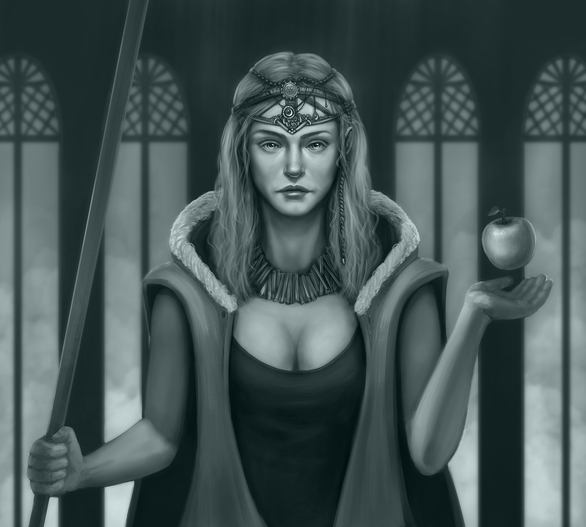
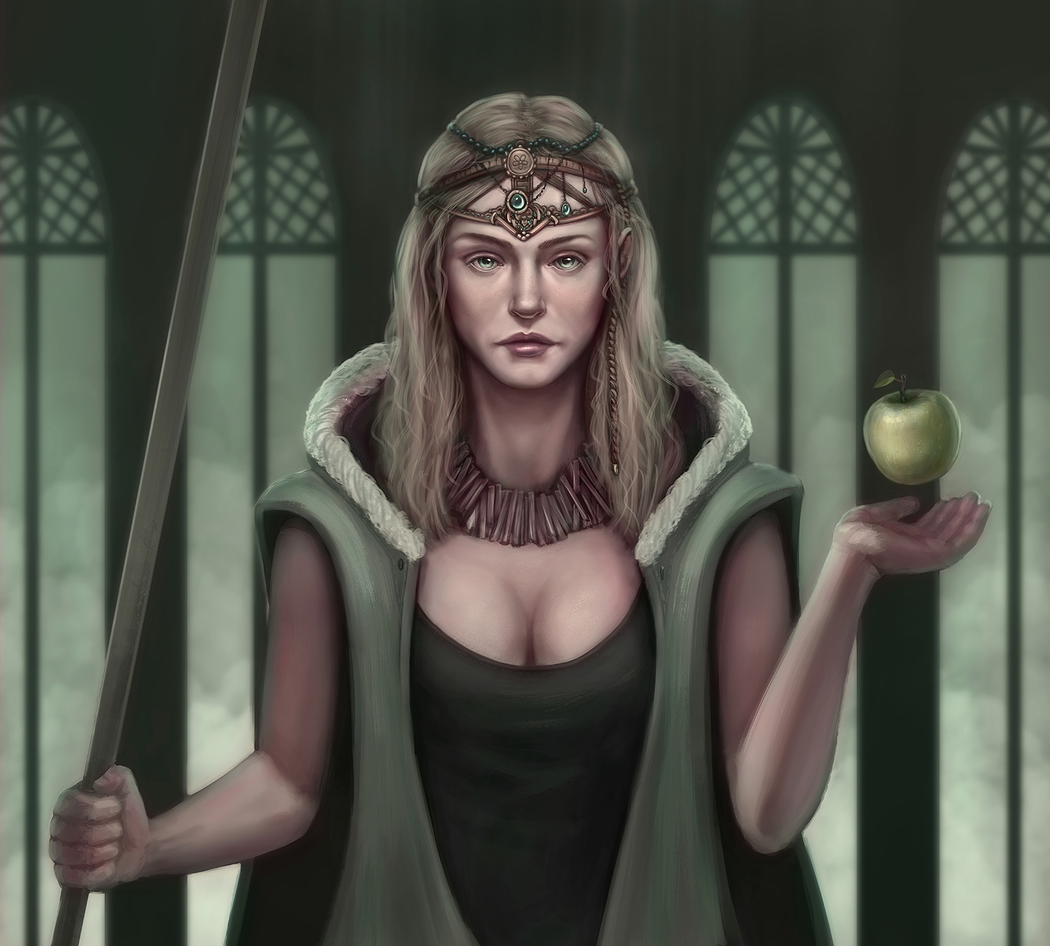
Thanks guys, I really appreciate it! I Could probably still render a lot more of her clothes/hands/staff, we´ll see if I do it tough. Did a quick colored version, but I kinda like the monochromatic one better, so I will just post both versions.

Monochromatic version:


Colored version:


Reply
You need some reference for the hands because look, put your hand in a fist, are the knuckles a straight line contour like youve indicated? Same with the other, you have the ring finger bigger than the middle finger, there are lots of attractive charming curves in the palm of the hand, dont draw everything like this like barbie doll super round stuff, more angles

https://www.proko.com/wp-content/uploads...00x338.jpg
http://drawingbooks.org/bridgman2/1.jpg
https://i2.wp.com/uncannycreativity.com/...=434%2C267

Also i really think the crown, necklance, and face are a decent design, but the rest like the stick, its just a plain stick you know, and her shirt, its low cut but thats it, like its just a lowcut shirt like from walmart, and her cloak is just, very symmetrical and not interesting, kinda even looks like its made out of rubber? what is this cloak made of, you know, show that. the background is cool, its alot of design things you need to consider. even the apple you know, design that apple, daniel keyes uses just straights, heavy impact for just a mundane object

https://scottsdaleartschool.org/wp-conte...24x763.jpg

70+Page Koala Sketchbook: http://crimsondaggers.com/forum/thread-3465.html SB

Paintover thread, submit for crits! http://crimsondaggers.com/forum/thread-7879.html
[color=rgba(255, 255, 255, 0.882)]e owl sat on an oak. The more he saw, the less he spoke.[/color]
Reply
Thanks for the comment fedodika :-)
But like I said in my last post, I didn't really rendered all the stuff you mention (staff, hands, clothes even necklace). I mostly focused on the face/crown. The rest I just did for storytelling/mood.

The thing is, for me anyways, a good way to learn painting is to just focus on small particular things in every painting. The painting itself does not need to be perfect, even appealing. Small achievements like this matters in the long run.

Masterpieces are for masters and I have a long way to get there.

Reply


Forum Jump:


Users browsing this thread: 17 Guest(s)