Posts: 1,424
Threads: 12
Joined: Dec 2015
Reputation:
139
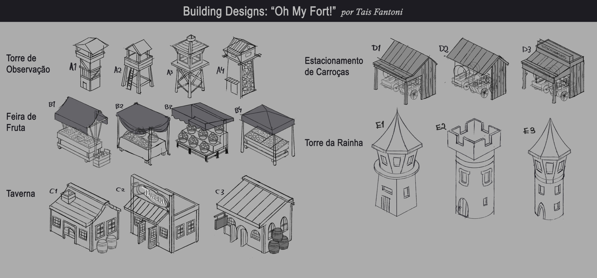
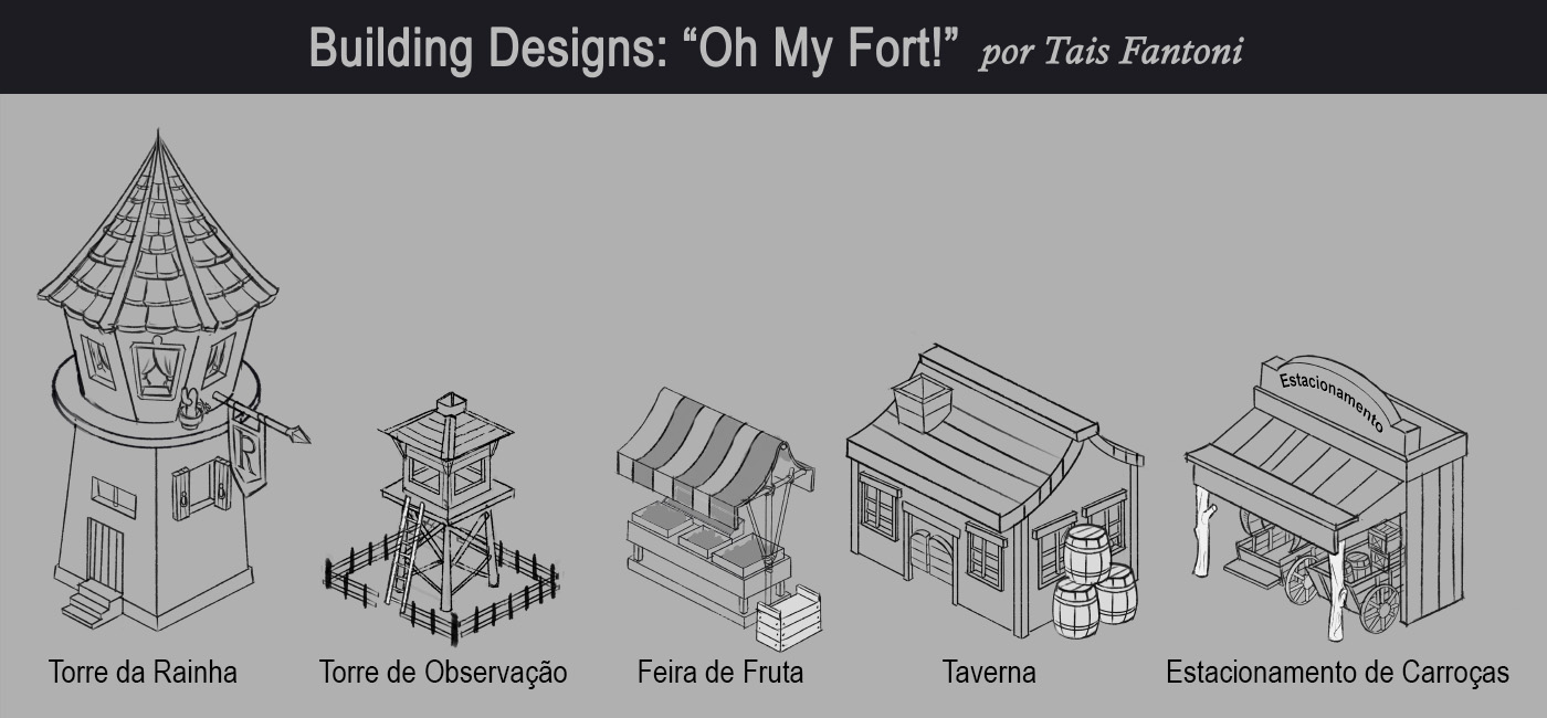
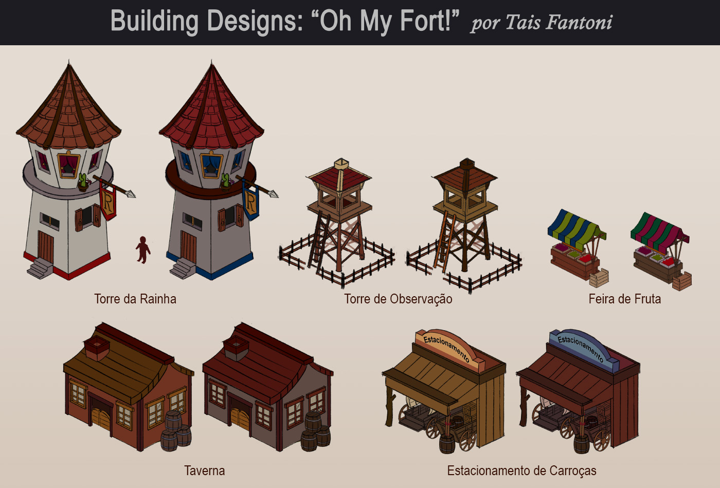
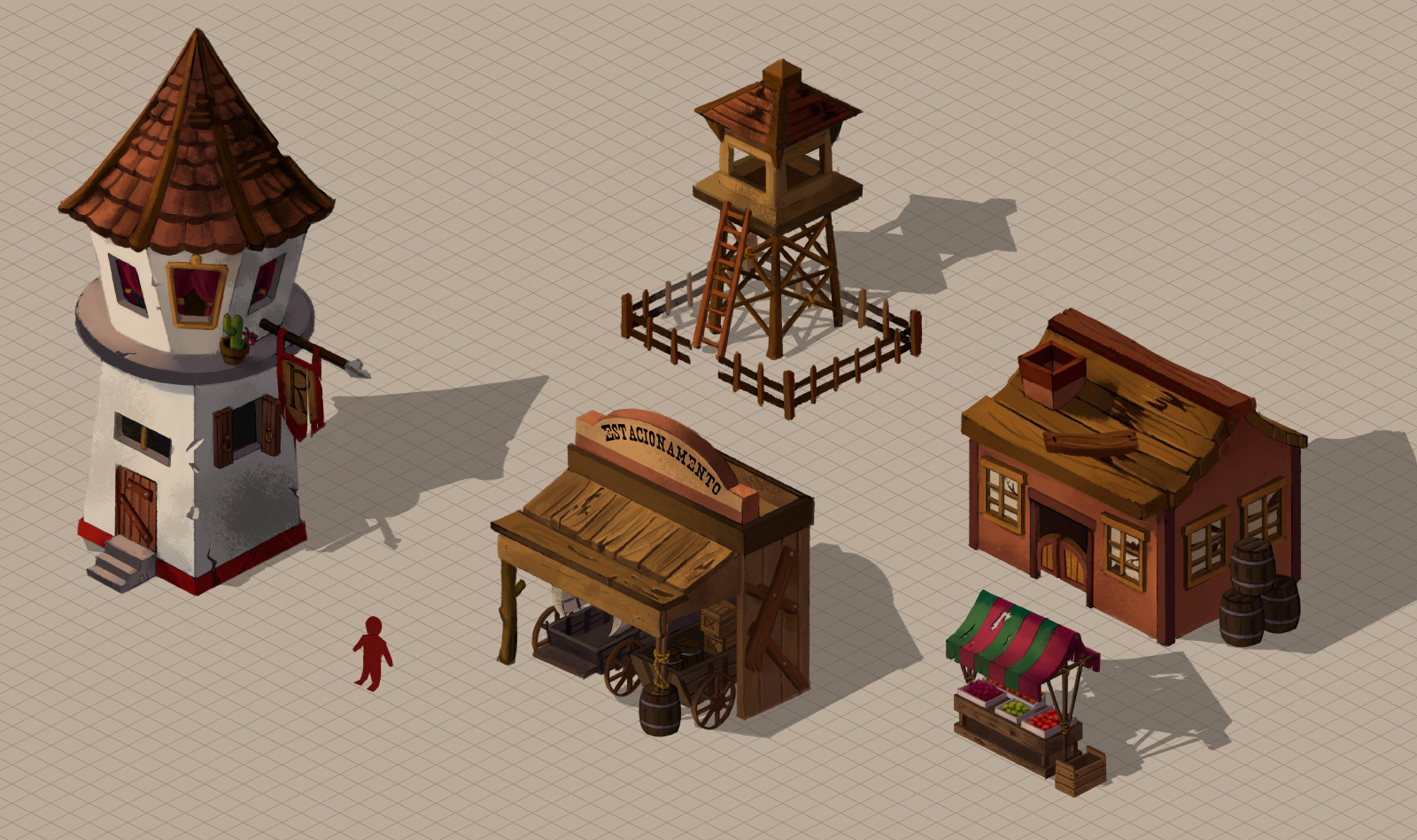
Cool building designs here Tfantoni :). Nice tight lines.
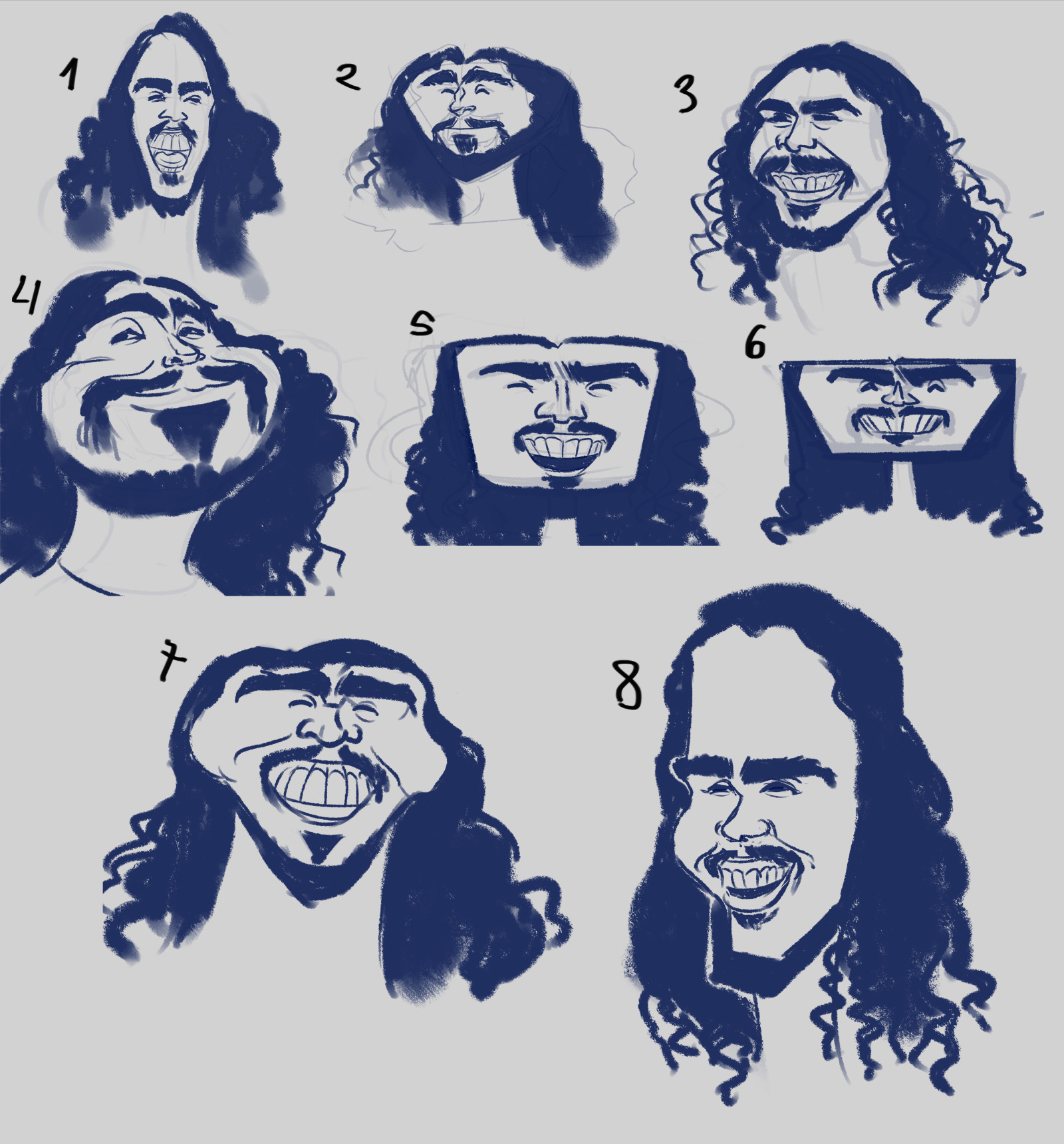
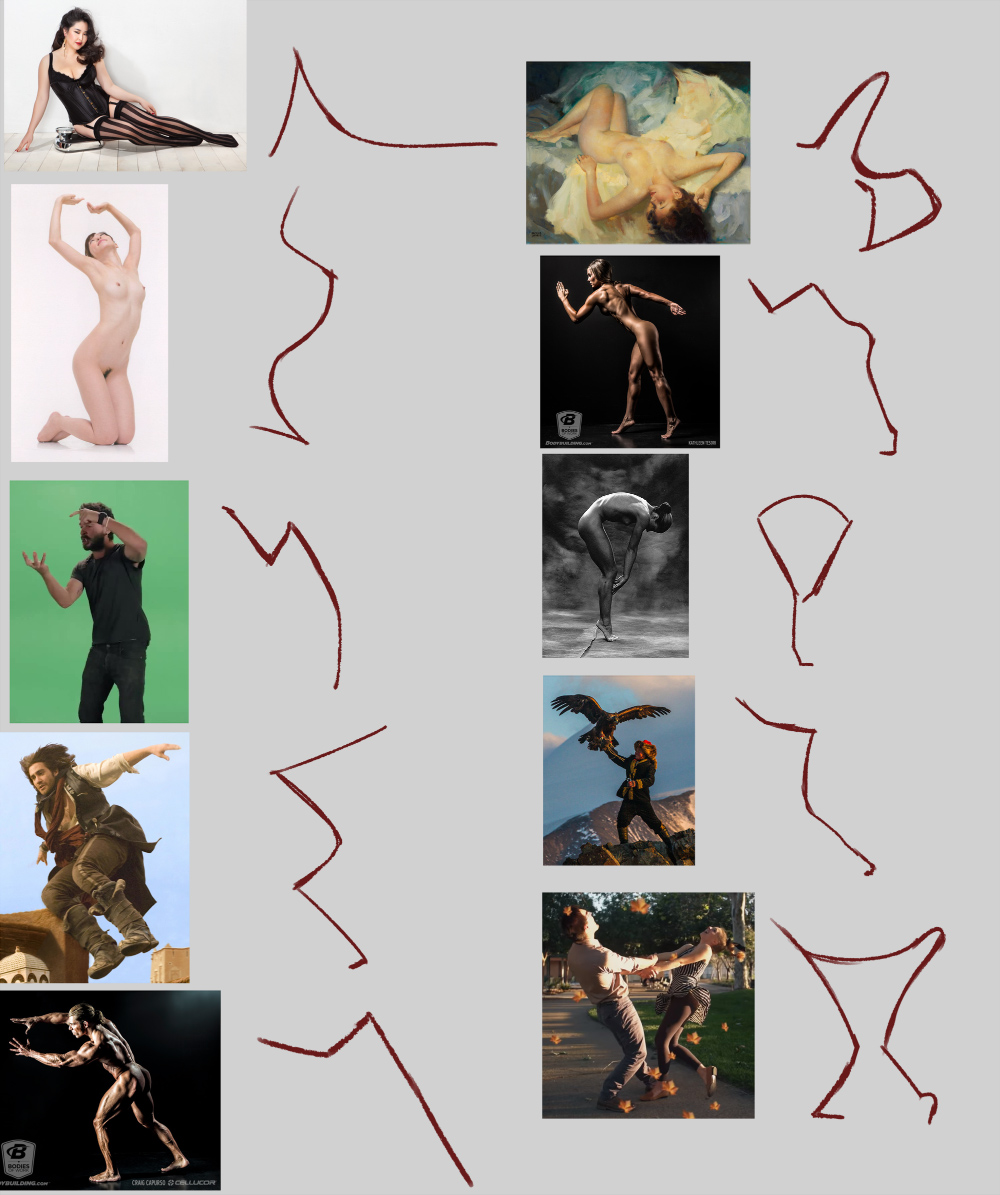
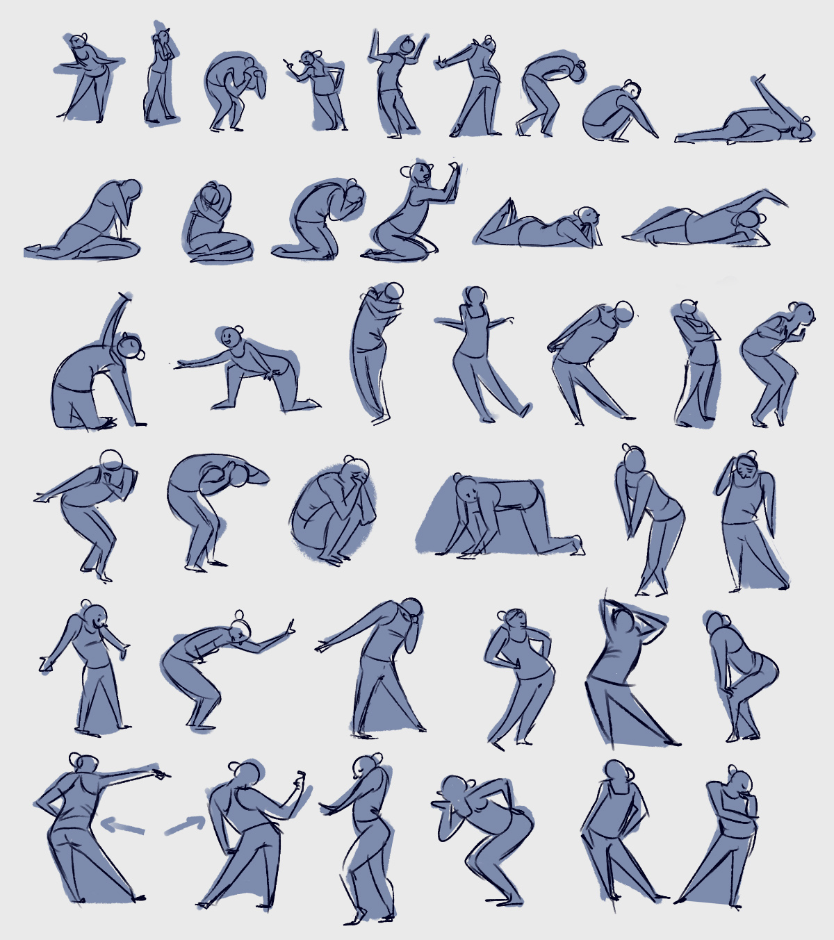
Also, great work on those Alex Woo gestures, keep it going!
“Today, give a stranger one of your smiles. It might be the only sunshine he sees all day.” -- H. Jackson Brown Jr.
CD Sketchbook
Posts: 671
Threads: 8
Joined: Feb 2016
Reputation:
113
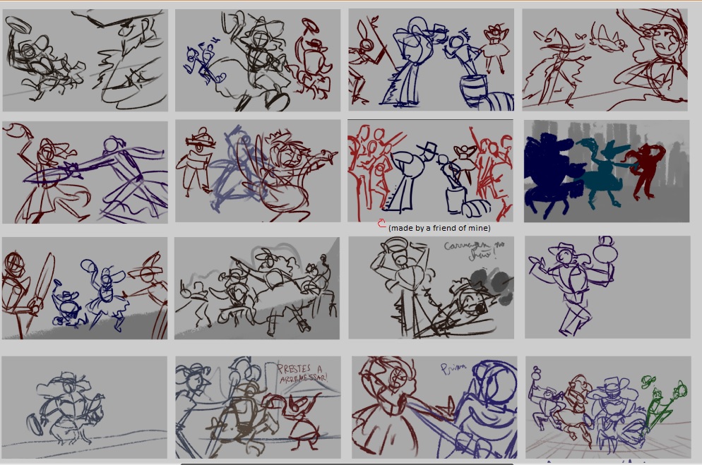
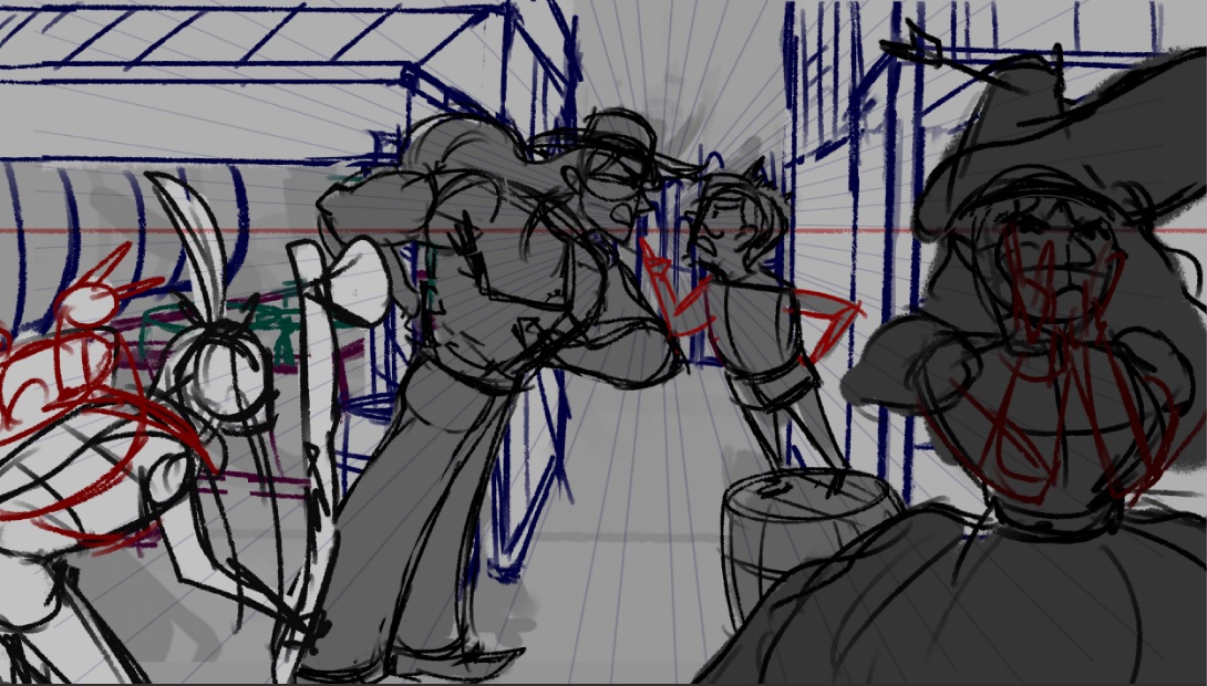
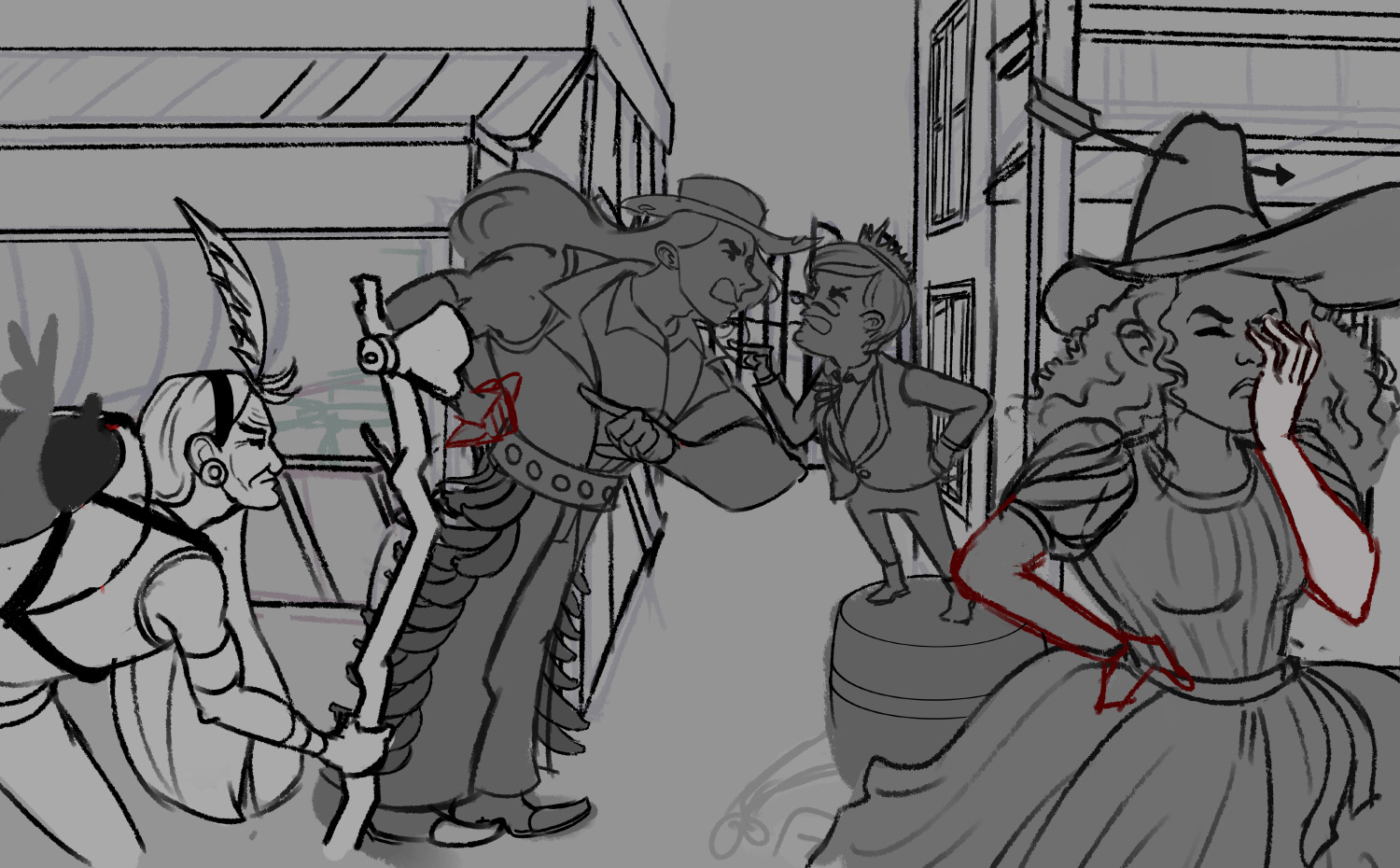
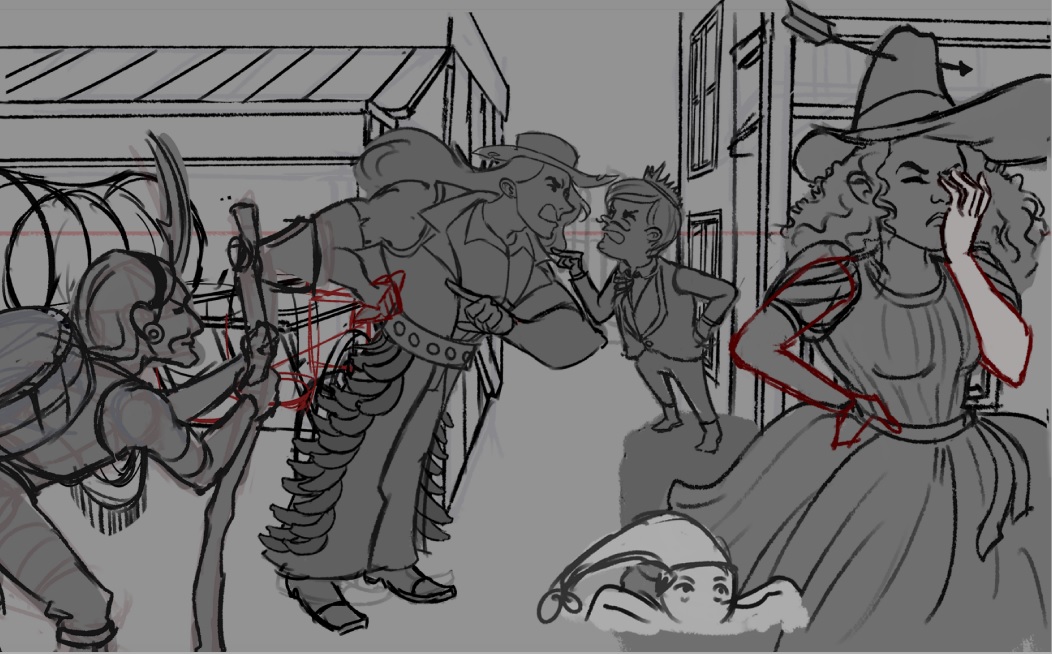
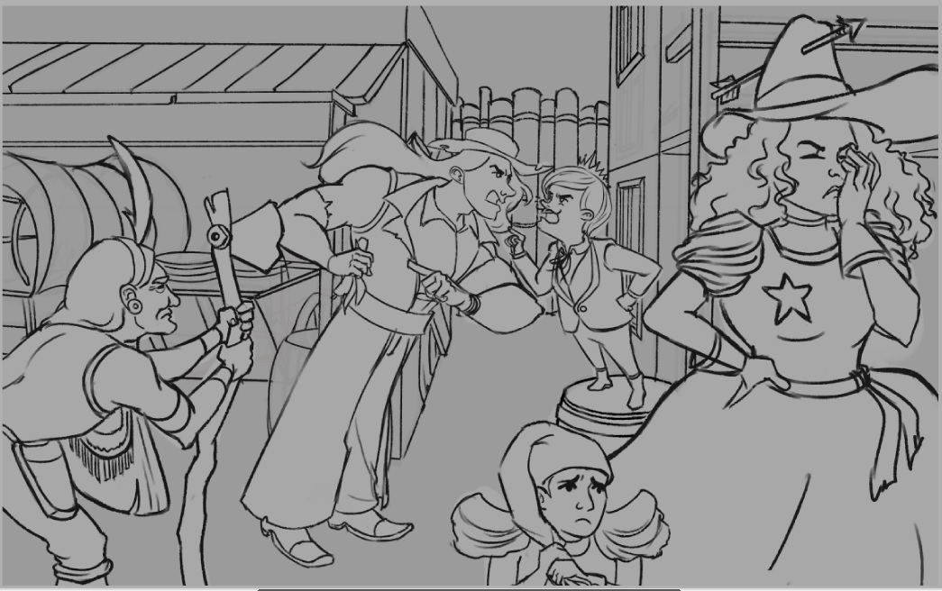
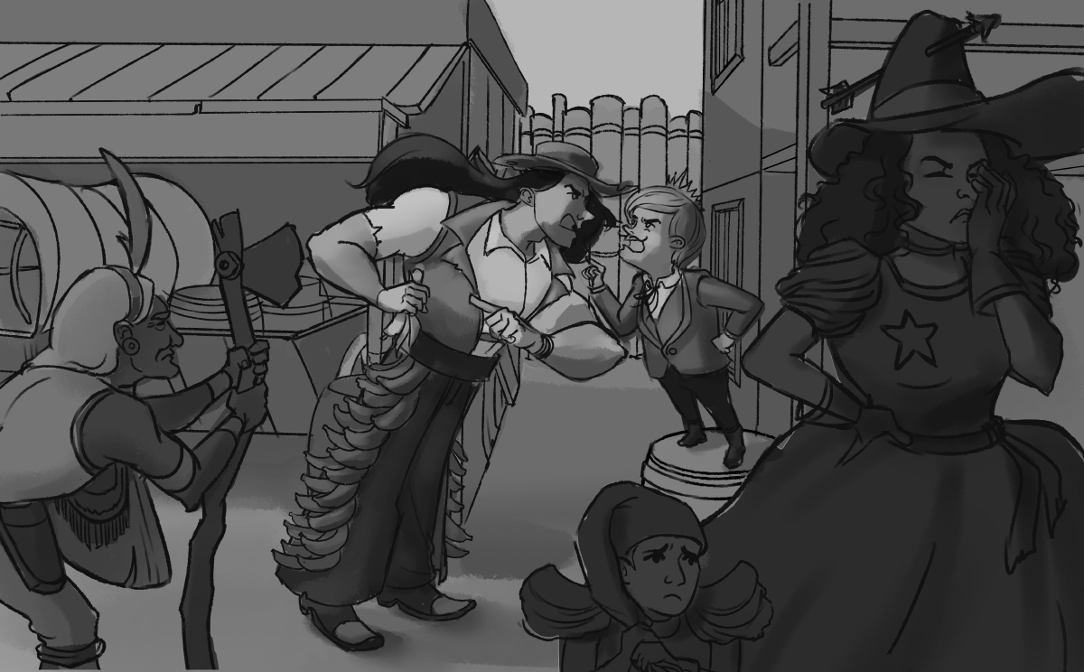
I'd rethink about how you do line weights. There are parts where the thickness aren't thought out as much (like that guy in the center with the hat, line weights in both arms are thicker than the rest of the body).
Line weights are great indicators. Thick line weights can indicate the form is in it's shadow side. Thicker line weights can indicate the subject is in the foreground, while thinner ones are pushed out back.
If you are reading this, I most likely just gave you a crappy crit! What I'm basically trying to say is, don't give up!
----
IG: @thatpuddinhead
Posts: 530
Threads: 14
Joined: Dec 2015
Reputation:
51
Love your bulidiings sketches!
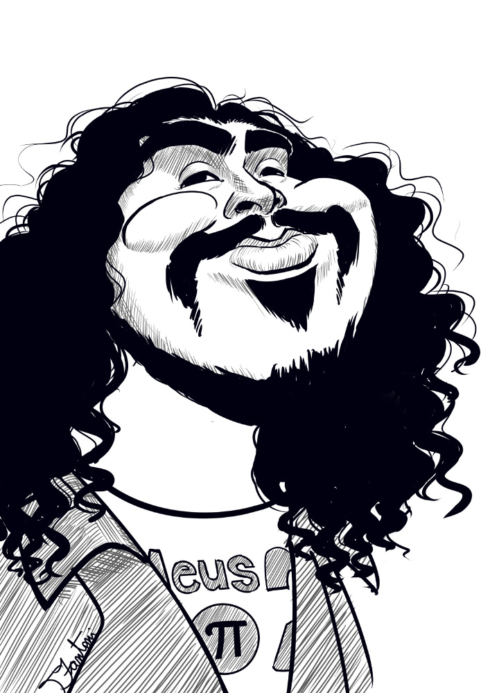
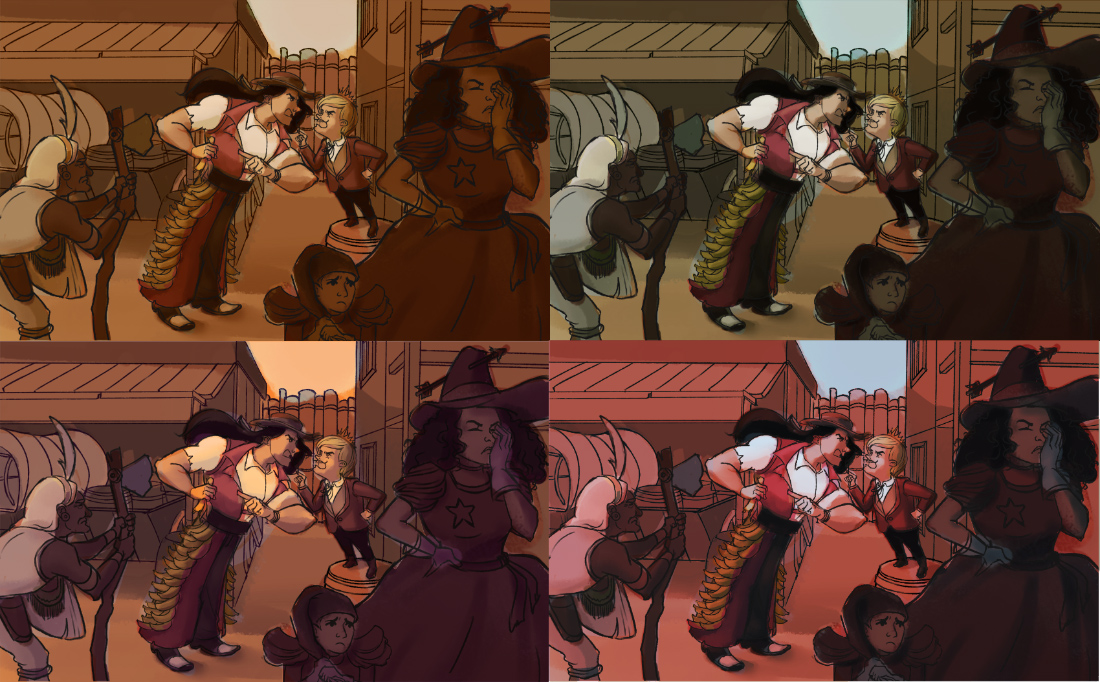
Also good to see color iterations of your piece, I like the top images.
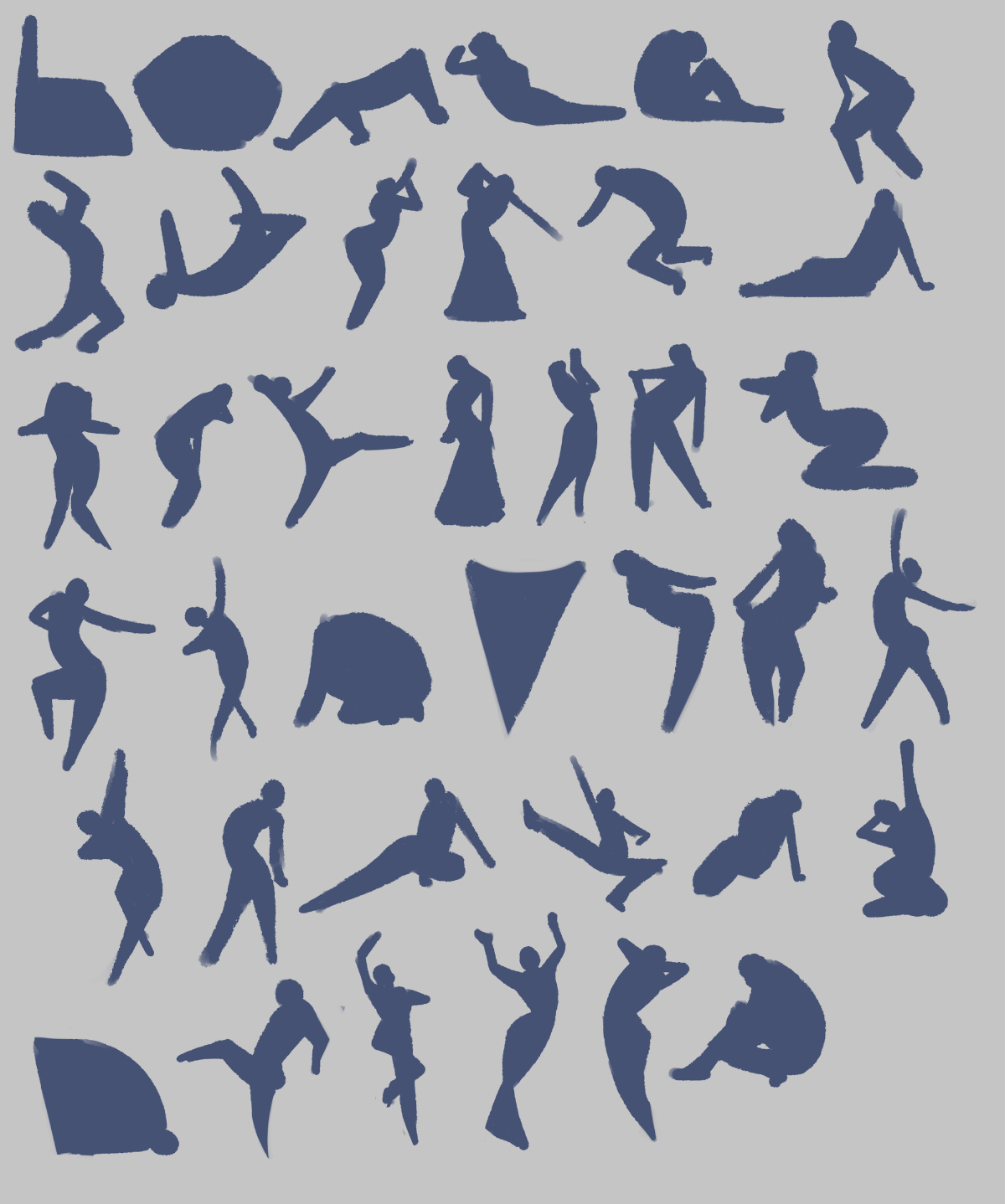
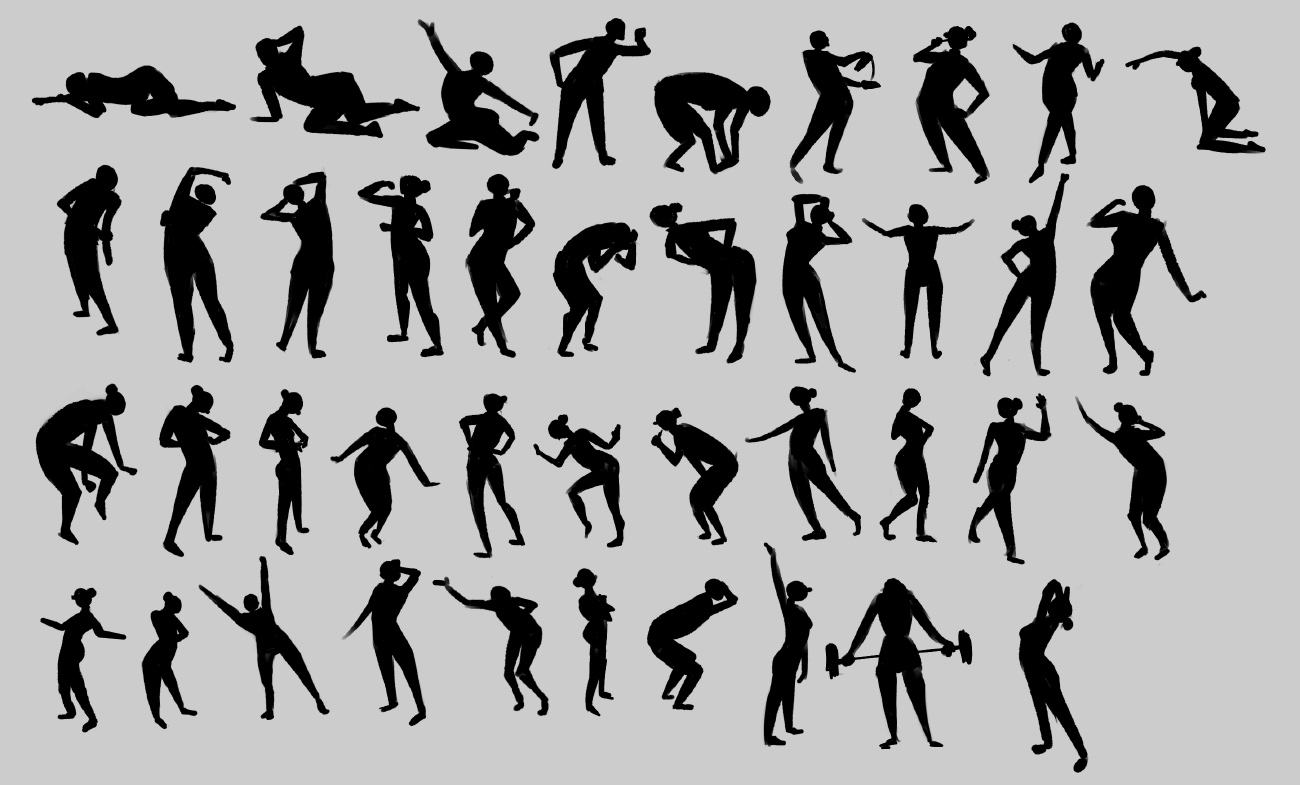
As for the gesture, many look a bit stiff for me but you're getting better with every page! Do you enjoy the course so far?
