Posts: 671
Threads: 8
Joined: Feb 2016
Reputation:
113
My name is John.
I am starting this so I can track my progress. I do not like my work, not by a long shot. But oddly enough, I love making them. There's probably a name for that kind of disorder but I'd rather not look into that too deeply. Hopefully, your honest critiques pour in and my oversized art ego deflate.
Long live the Crimson Daggers.
Left: Original

Left: Original

If you are reading this, I most likely just gave you a crappy crit! What I'm basically trying to say is, don't give up!
----
IG: @thatpuddinhead
Posts: 501
Threads: 10
Joined: Jan 2013
Reputation:
20
Welcome to the "i hate my artwork" club! and as for advice start from lines and values those are the pillars of good art atleast thats what i think it is.
Posts: 671
Threads: 8
Joined: Feb 2016
Reputation:
113
(02-11-2016, 09:45 AM)Hobitt Wrote: Welcome to the "i hate my artwork" club! and as for advice start from lines and values those are the pillars of good art atleast thats what i think it is.
Cool cool cool.. I didn't do any of those in the first two. I would in the next. Thanks!
If you are reading this, I most likely just gave you a crappy crit! What I'm basically trying to say is, don't give up!
----
IG: @thatpuddinhead
Posts: 671
Threads: 8
Joined: Feb 2016
Reputation:
113
Left: Original

Left: Original

If you are reading this, I most likely just gave you a crappy crit! What I'm basically trying to say is, don't give up!
----
IG: @thatpuddinhead
Posts: 80
Threads: 3
Joined: Jan 2016
Reputation:
2
Hey there John, that's the spirit - love creating but knowing one's limitations..
so good thing you're tracking your progress now.
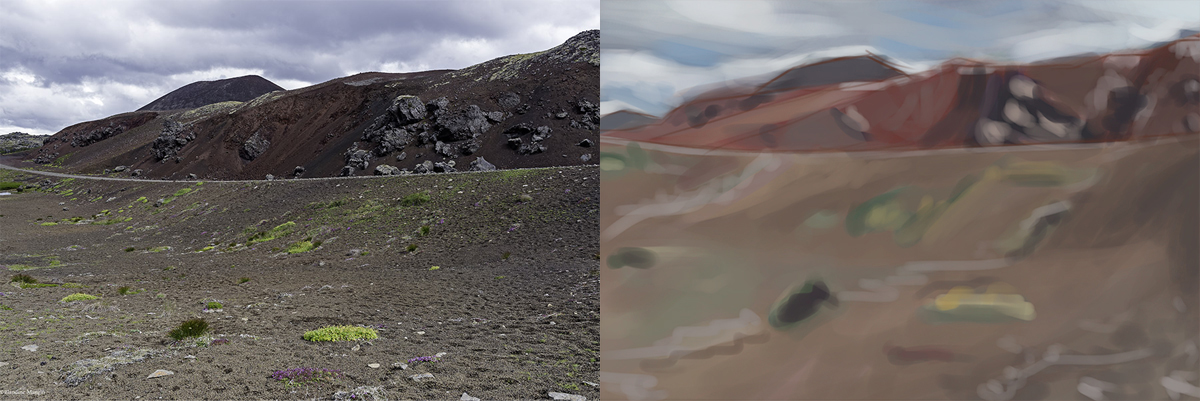
Color Studies look pretty good already, just slightly off:
The last one at the beach looks too greenish/ cold
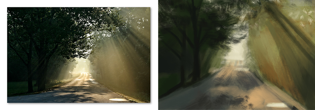
The one with the road I see too much saturation on the right
The sunset on the beach has too much violets instead of oranges.
Might be a Monitor issue, check your pics on different screens.
I wouldn't go back in and paint over, you can color balance it, values look good to me!
Keep it up! :)
Posts: 671
Threads: 8
Joined: Feb 2016
Reputation:
113
(02-11-2016, 11:04 PM)nutriman Wrote: The last one at the beach looks too greenish/ cold
The one with the road I see too much saturation on the right
The sunset on the beach has too much violets instead of oranges.
Might be a Monitor issue, check your pics on different screens.
I wouldn't go back in and paint over, you can color balance it, values look good to me!
Keep it up! :) I really appreciate the critiques! I kinda see what you see.
I have an inquiry, if I may. How would you fix the greens on the beach? I tried laying on a darker valued, higher saturation yellow-orange but somehow ended up looking like mud.
I'm not copping out on this one. It's not a monitor issue. I made bad color choices, given the limited time I let myself to finish the piece (around 40mins to an hour), which brings me to this question..
Is it better to limit my time on painting or finish when I think it is? The problem with giving myself unlimited time to finish is, it stretches into weeks and sometimes it feels like its never done!
If you are reading this, I most likely just gave you a crappy crit! What I'm basically trying to say is, don't give up!
----
IG: @thatpuddinhead
Posts: 80
Threads: 3
Joined: Jan 2016
Reputation:
2
If the whole picture has the same color bias I'd use Color Balance or R/G/B Level Adjustments,
if it's just partial then the same with a mask.
If you want to correct it by painting over try out different blend modes if normal gave you dirty colors.
For example if you want a certain spot to be darker and more saturated I paint over it on a multiply layer.
Sometimes when starting a color study I make test strokes next to the color I want to recreate,
see how they match.
Maybe for some that's already cheating but IMHO only colorpicking in advance is cheating
and so I avoid that.
But testing out colors and then correcting it is a good learning exercise with instant fedback I think.
Posts: 671
Threads: 8
Joined: Feb 2016
Reputation:
113
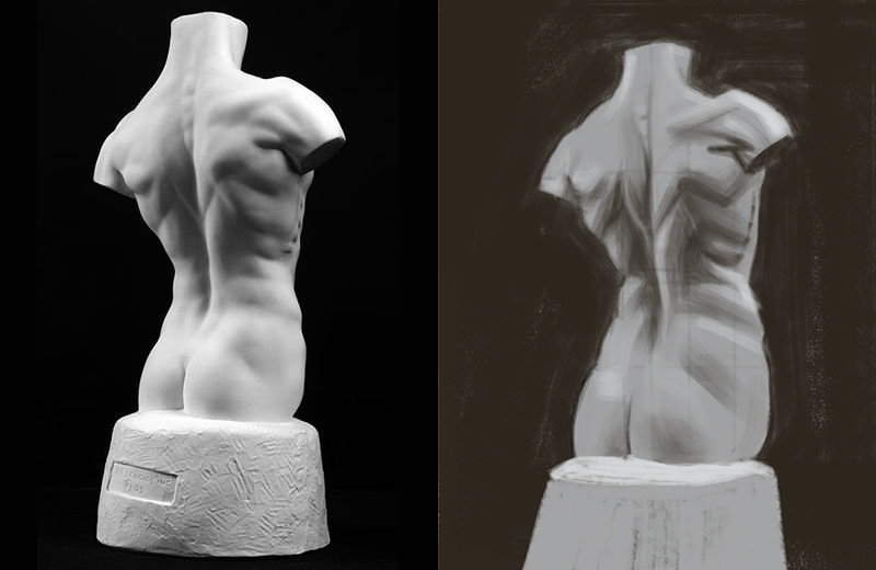
Another 1 hour study
Left: Original

If you are reading this, I most likely just gave you a crappy crit! What I'm basically trying to say is, don't give up!
----
IG: @thatpuddinhead
Posts: 671
Threads: 8
Joined: Feb 2016
Reputation:
113
(02-12-2016, 02:47 AM)nutriman Wrote: If the whole picture has the same color bias I'd use Color Balance or R/G/B Level Adjustments,
if it's just partial then the same with a mask.
If you want to correct it by painting over try out different blend modes if normal gave you dirty colors.
For example if you want a certain spot to be darker and more saturated I paint over it on a multiply layer.
Sometimes when starting a color study I make test strokes next to the color I want to recreate,
see how they match.
Maybe for some that's already cheating but IMHO only colorpicking in advance is cheating
and so I avoid that.
But testing out colors and then correcting it is a good learning exercise with instant fedback I think.
I avoid adjustments as much as possible. I am trying to train myself to have a better judgement on my color choices. I am used to rely on those heavily to the point that it feels like I am using that tool like a crutch.
But nonetheless, thank you. I got those tips noted. Expecially the side by side color testing. Never did that. I'd probably will in the future.
If you are reading this, I most likely just gave you a crappy crit! What I'm basically trying to say is, don't give up!
----
IG: @thatpuddinhead
Posts: 671
Threads: 8
Joined: Feb 2016
Reputation:
113
Time: 1 Hour
Left: Original

If you are reading this, I most likely just gave you a crappy crit! What I'm basically trying to say is, don't give up!
----
IG: @thatpuddinhead
Posts: 1,109
Threads: 18
Joined: Apr 2014
Reputation:
68
Hey, welcome to the forum, i think it's not such a bad thing to enjoy making your stuff more than looking at it - they always say it's about the journey not the destination.
What are your goals with your art, where do you want to take it?
Posts: 671
Threads: 8
Joined: Feb 2016
Reputation:
113
(02-13-2016, 06:21 AM)JyonnyNovice Wrote: Hey, welcome to the forum, i think it's not such a bad thing to enjoy making your stuff more than looking at it - they always say it's about the journey not the destination.
What are your goals with your art, where do you want to take it? Thanks for the warm welcome Jonny!
I honestly do not know where. My knee-jerk response was, "where ever there's money to be made". I know people who draw boobs for a living. I even met a guy who got himself through college just by doing those. But I can't see myself doing that, for a lot of reasons.
I do not know what making 'it' means to me at this moment in time. What's 'it', you know what I mean? I envy those people who got their trajectory all planned out. I can only wish to have their resolve.
If you're wondering why I even bother doing this in the first place if I am this goal-less schmuck, I got into art through the process of elimination. I am not a math guy. Not athletic nor built like a rock. I have trouble with forming words and throwing them out for someone to hear. Sometimes, I can't even read right. But, I think, I am halfway decent in drawing.
So, it's a toss up between a janitorial career or this. If this fails, can I interest you with a weekly bathroom cleaning service?
If you are reading this, I most likely just gave you a crappy crit! What I'm basically trying to say is, don't give up!
----
IG: @thatpuddinhead
Posts: 1,109
Threads: 18
Joined: Apr 2014
Reputation:
68
lol you got a good sense of humour too : ) you can use that in your art! comics or something maybe : )
often though, we don't find where we want to go until we start walking. The process of drawing and painting, should, hopefully, lead you to find what it is you want to do! Good luck ^_^
Posts: 671
Threads: 8
Joined: Feb 2016
Reputation:
113
(02-13-2016, 07:49 PM)JyonnyNovice Wrote: often though, we don't find where we want to go until we start walking. The process of drawing and painting, should, hopefully, lead you to find what it is you want to do! Good luck ^_^
I agree.. Thanks for the well wishes! Let us be successful!
If you are reading this, I most likely just gave you a crappy crit! What I'm basically trying to say is, don't give up!
----
IG: @thatpuddinhead
Posts: 671
Threads: 8
Joined: Feb 2016
Reputation:
113
Oh god. There must be a simpler way to do the trees...
Time: Around 5 hours.
Left: Original

If you are reading this, I most likely just gave you a crappy crit! What I'm basically trying to say is, don't give up!
----
IG: @thatpuddinhead
Posts: 107
Threads: 4
Joined: Sep 2015
Reputation:
9
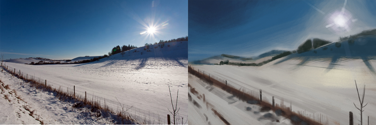
Nice job with your studies! I really love that last study you did, and I think you did really well with the reflection and your edge control. One thing to remember in landscapes is that when objects are further away (in most cases mountains) they get less saturated and lighter (atmospheric perspective).
Also for all of your studies, I think that you could push your values more. If you have strong darkest darks and lightest lights, then you studies will really stand out. :) Overall, great job and keep up the good work.
Posts: 80
Threads: 3
Joined: Jan 2016
Reputation:
2
agree with Axrel plus one tip: You can color dodge the sun in, it'll give a nice glow..
don't overdo it though. ;)
Posts: 671
Threads: 8
Joined: Feb 2016
Reputation:
113
(02-15-2016, 02:49 PM)Axrel Wrote: One thing to remember in landscapes is that when objects are further away (in most cases mountains) they get less saturated and lighter (atmospheric perspective).
Also for all of your studies, I think that you could push your values more. If you have strong darkest darks and lightest lights, then you studies will really stand out. :) Overall, great job and keep up the good work.
Thanks for the tips on the atmospheric perspective. I should have known. And you are right. The time I was painting, I thought I was pushing the dark values hard. Apparently not hard enough. Thanks.
(02-15-2016, 09:23 PM)nutriman Wrote: agree with Axrel plus one tip: You can color dodge the sun in, it'll give a nice glow..
don't overdo it though. ;)
That never crossed my mind. I will give it a go! Thanks!
If you are reading this, I most likely just gave you a crappy crit! What I'm basically trying to say is, don't give up!
----
IG: @thatpuddinhead
Posts: 671
Threads: 8
Joined: Feb 2016
Reputation:
113
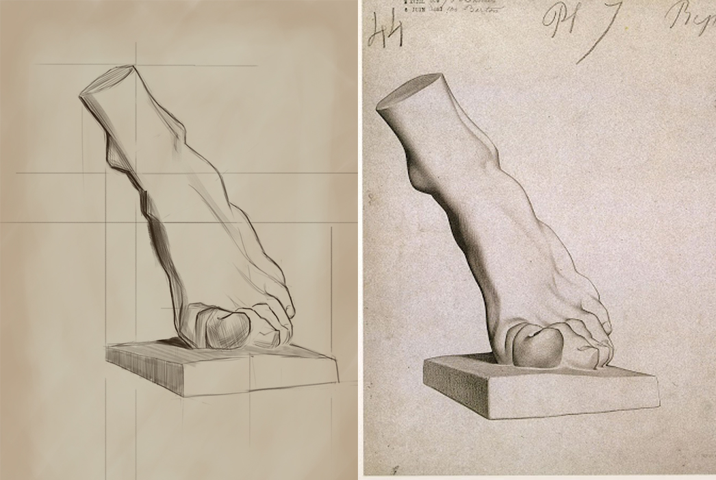
Time: 1.5 hours
Left: Mine
Right: Original

Time: 1 hour
Left: Original
Note: Only used round brush

God, I hate my environment study. What a total miss. Time to go forum-diving for information!
If you are reading this, I most likely just gave you a crappy crit! What I'm basically trying to say is, don't give up!
----
IG: @thatpuddinhead
Posts: 1,109
Threads: 18
Joined: Apr 2014
Reputation:
68
Hey man, there's this study group: http://crimsondaggers.com/forum/thread-7175.html
it's about materials but we've been doing mostly environment stuff so far, join in if you like, it's nice to struggle through this stuff with other people~
Great bargue drawing btw : )
|

