03-09-2016, 03:47 PM
I think the piece might need a bit more contrast in the foreground so it will feel more like atmospheric perspective in the back
|
Rip's Sketchbook [NSFW]
|
|
03-09-2016, 03:47 PM
I think the piece might need a bit more contrast in the foreground so it will feel more like atmospheric perspective in the back
03-09-2016, 05:24 PM
Yeah I think you're right. I'll give this a try tomorrow. Thanks : )
03-10-2016, 07:15 AM
Hey Riprap, really nice studies you have here! I can see you're going to improve pretty quickly by the way you're studying (taking notes and correcting yourself), and very good taste on the masters you're choosing to study from! :)
On your figure studies I'd recommend you to first take your time and simply analyze the pose and ask questions (what is the model doing?; what could be the story he's/she's is trying to tell the viewer?; which leg is bearing the weight and how that influences the many angles of the body?; In which direction in space/perspective is the model turning? where are the pinches and stretches of the body and why?; where are the hands placed?; etc.) - that alone will help you a lot remembering poses and understanding how the body works. After analyzing, you should try to represent the body's gesture with few lines, where after you can build a construction on top of with simple shapes like cubes, spheres and cylinders. I too recommend Michael Hampton's book like BlackDelphin said previously. As for the illustrations, I think they seem a bit flat, mostly due to the lack of value contrast and form turning in my opinion. The exercise Hobitt suggested is a really good way to tackle it! Also, don't be afraid of trying to do illustrations in grayscale, you can make really great things with just that... Color is a bitch and steals a lot of attention from other more important things. BUT your last illustration shows a lot more depth and value than the previous, which means you're making great progress on the illustrations :D I also really like the drawing, composition and storytelling there! Keep up the great work man, and keep doing thumbnails, they save lives!
03-10-2016, 02:36 PM
Amaral: Thanks for the kind words and advice! I'll have to try and really think about the poses I'm doing, it seems like common sense but sometimes I just get into that brainless study mentality which I need to kick myself out of. I see now what you mean with the image being flat, so i tried to have the pattern wrap around a little more along with applying other peoples advice of adding darker value to the foreground. Hopefully this makes it look a little better. Thanks again. : )
So got back into the thumb nails along with applying all the good advice people gave me. I've started a new piece based on one of these which I'll work on tomorrow and post what I have done. 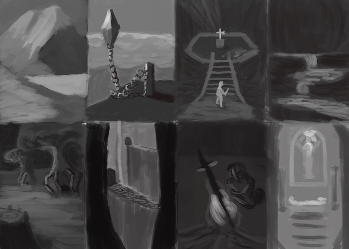 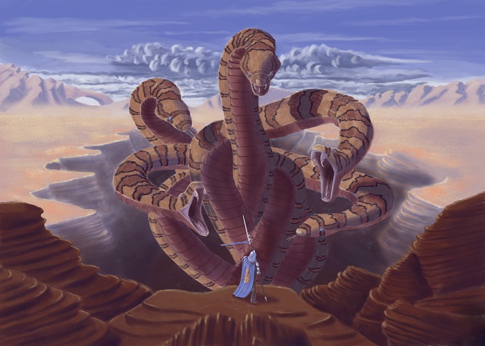 Thanks for lookin'!
03-11-2016, 03:25 PM
Hey man, great work ethic and ambition! You're gonna go far!
The recent snake piece is really nice, good read on the shapes and values. I would strongly suggest that you ditch the soft brush for now! At the moment it's muddying up a lot of your edges, especially in your studies. Try starting with a hard brush, then blend afterwards where it's needed. Your edges could use some work on the whole, try to study how edges differ on different planes. Some edges are very sharp where there is a sudden change in 3D plane direction (for example, the sides of a square), others are curved and this is where you blend them softly. Having a good transition between the two will help your forms read better. The other thing that stands out to me is that a lot of your colours are looking very washed out. You're doing a good job of avoiding blending with black, but try also to avoid using whites too much in your highlights. One exercise that really helped me was doing studies using an opaque brush with no opacity blend. This forces you to pay attention to the shapes and colours and helps avoid overblending. Otherwise keep up the awesome work ethic and you will be improving a load in no time!
03-12-2016, 04:27 PM
Eristhe: Hey thanks for the advice and kind words! Really appreciate it! It does look pretty washed out, doesn't it? Not sure why that is unless I need to use more vibrant colors mixed with the highlight advice you mentioned. I'll have to experiment and figure that out.
I didn't know that about edges, it's a clear weak point for me haha. I plan on going back to more general studies after this next piece and I'll have to try what you said. Thanks a tonne! So I wanted to try one more personal piece as a break to the more general studies. It's really helping me stay motivated and get my but into gear which is awesome! Not sure if it reads well in the sketch but it's fanart from Zelda, the scene from A Link to the Past where you get the master sword in the lost woods. I tried playing around with the colors a bunch but I'm having a hard time figuring out the background. I need to do another study I think. Anyways, thanks for lookin'. 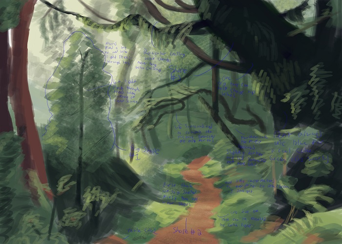 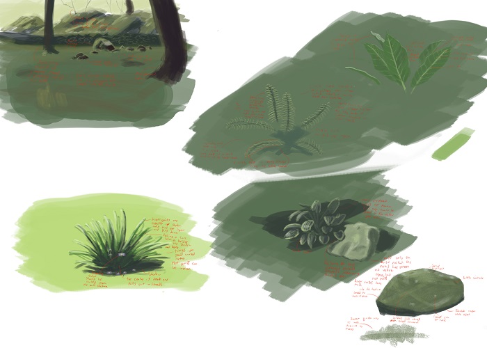 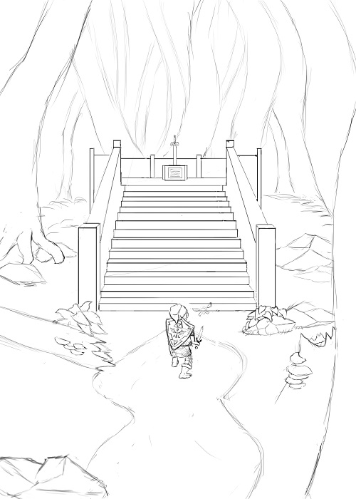
03-16-2016, 03:48 PM
Sorry, I've been lazy with updating my progress on here haha. I think I'm done with this one for now unless someone sees something that needs work. I'm not really sure what else to do with it at the moment, but I think it turned out OK.
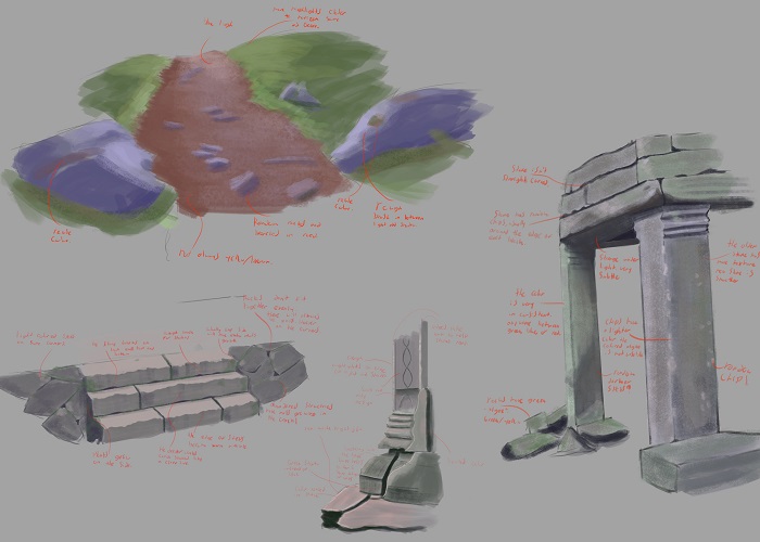 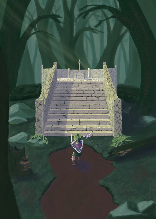
03-17-2016, 03:16 PM
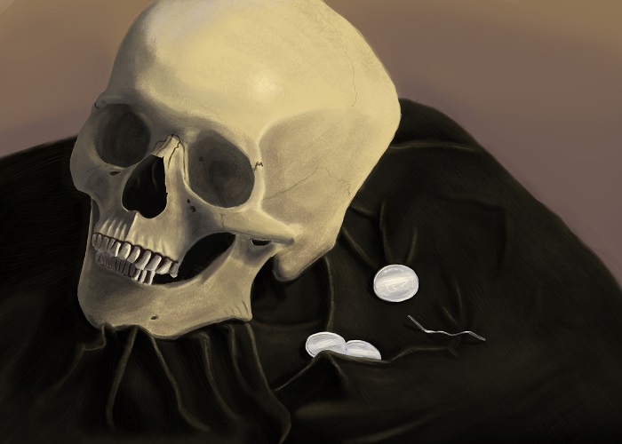
So I've been trying to figure out how to make my colors less washed out and I always heard doing still lifes were good ways of doing this. I might just try and work on value a bit along with some anatomy. Thanks for lookin'!
03-18-2016, 02:38 PM
Hey man! Your still life is looking really nice! I def recommend doing some studies of film stills to improve your colour picking. Alternatively studying the masters is a really good way to go. Try to pick the colours by hand first, then colour pick using the eyedropper and see how your colours differ. This should help you out! I think part of your problem is with tone - in your imagination piece, everything is looking very mid-tone at the moment. Try to also vary your hues across your piece - at the moment you're looking at only a few different hues, whereas you would see more colour variation in real life. If you look for some analysis of Bougereau's paintings, you can see how he uses different colour tints to create realistic skin tones and some of this applies to other paintings too. Hope that helps: Keep up the great work!
03-20-2016, 01:38 PM
Eristhe: Hey thanks, that means a lot. : ) I've seen people do the movie still studies but haven't tried them much myself, good idea though! That will be the next thing for me to try. Thinking back on my other master studies, I'm remembering what you mentioned about different hues, with skin especially. I'll have to keep this in mind.
I think part of the reason my stuff is washed out is because I would try and stick to a color plan too much (like red,blue, and yellow with the snake one) so I end up sticking with these set of colors too much even though there's a huge array of colors on everything. Thanks again, you're advice helps a tonne! : ) So I only have these two studies since I last posted ( I suck, I know) and I have family plans for the next two days so it'll be pretty barren here. I did manage to get Forrest Imel to crit my Zelda picture (thanks again), so I'll be updating and applying all the gold advice he gave me. After this little break I'll be working double hard to make up for it!! 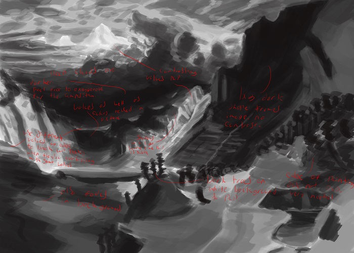 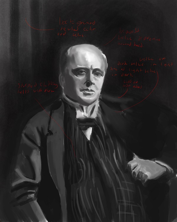 Thanks for lookin' and all the help : )
03-21-2016, 08:52 AM
Nice sketchbook! I can't wait to see the zelda piece finalized :) Make sure you seperate all the elements and have a clear foreground, middleground, background. I like where this is going so far, i can see improvement on rendering already. The figures on page 1 were really soft, and now you are kind of in between, which is great! Good job!
04-05-2016, 10:15 AM
AngeliquevdMee: Hey thanks! Working on a clear foreground/background is something I need to do, for sure. I've been trying to push my values to help with this but still need some practice with it.
Sorry for the lack of posting, life getting in the way and all that. I've tried adjusting my snake and zelda images with the help of you guys and Forrest Imel on his stream. Hopefully things read a little better, trying to push my colors and values to try and dig myself out of that "washed out" look, but I'm finding it tricky to work through the layers to change things on an already "finished" image which you can see with the snakes. Anyways, I'm going to keep with the anatomy and maybe try out some characters since that's something I've always been interested in. Crits are always welcome, thanks for lookin'! 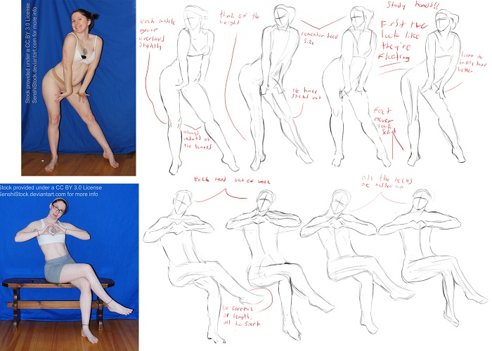 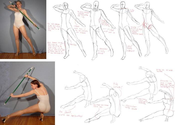 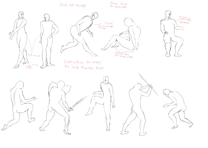 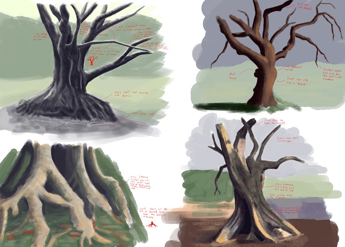 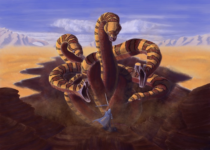 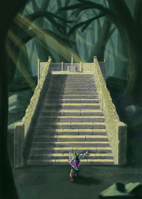 |
|
« Next Oldest | Next Newest »
|