11-25-2021, 01:08 PM
Probably because it's a Halo?
|
CGMythology's Sketchbook
|
|
11-28-2021, 02:37 PM
darktiste: Good eye! I had the layer on top of the curtain by accident, just fixed it!
RottenPocket: I do feel the horizontal lines work better behind the curtain so I adjusted it! : Thank you, much appreciated! .................. And the image is pretty much finalized! I attached the current preview here. Of course there's still some time for tweaks if necessary, so any final input would be more than welcome! 
11-29-2021, 01:42 AM
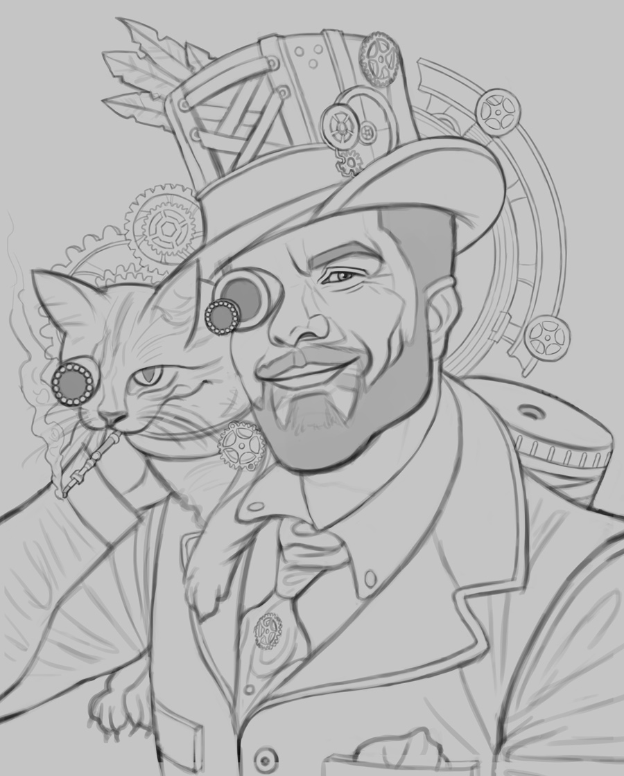
Time for a new illustration! This is a portrait of a friend and fellow artist Diego Fraustro. I decided to go with a steampunk theme as I feel it suits this image perfectly... and it's a theme I love exploring! Reference is here, and I did my best to capture his likeness while giving it a steampunk theme, and I feel it works quite well, thankfully. Any input would be appreciated before I begin the painting process!
11-30-2021, 07:29 PM
I began the painting process, made sure to get the values right as early as possible as that seems to make things go easier. I'm probably going to introduce some subtle desaturated bounced light to the shadows as they're a bit too dark at the moment. Here is the current progress:

12-01-2021, 01:51 AM
I resumed working on the image, continued blending the tones and made some changes throughout to improve the image as a whole. The light background seems to be working quite well as it helps the figures pop so I'll stick with it for now. Below is the current progress, any input would be appreciated as always!

12-01-2021, 03:02 AM
The hat is wierd to me it like a marching band hat but put sideway? I don't know how to explain it more clearly. The issue is in regard to perspective i am not sure if it was intented to be like that or not.Sure i would expect a baseball cap to be put sideway but here it confuse me as to which type of hat i am looking at and if it should be curved or flat.From what i see in my reference in steam punk it the first time i see a hat like the one you did.
Will be interesting to see how you develop the beard right now it more like he as painted is face with a beard i would say.One thing perhaps to try will working is not to push the face so much i know it tempeting to secure a feeling of confidnece but by detailling the face right away you create the standard of rendering of what follow if you would work on everything in pass you could probably get way with less work .I feel like there still work to be done in term of suggesting more with less if you see what i mean. The real mastery i find isn't in the rendering of thing but in the suggestion. This doesn't mean that rendering is thrown in the garbage it simply mean that the level of detail isn't consistent across the whole surface.For example in area of light the texture get wash will in the terminator it the most visible until it fall into the shadow. There also a principle of texture related to the distance of the object to the viewer the further way the less texture and the nearer and object the more detail it as. There also the use of texture in term of where you want the focus to be less busy for area where you want the eye won't go vs area of detail where you want people to look. Why i tell you that is because beard is alot of noise so being able to suggest a texture is much more effective than to try to render ever hair.
12-02-2021, 01:32 AM
darktiste: Thanks for your input! I reworked the hat a bit; I don't want the cap to cover his eyes/face so I took a bit of artistic liberty in that regard. Hopefully it works well enough! I kept your feedback in mind regarding texture and detail work as well as I continued to work on it, thanks for your suggestion!
................... I resumed working on the image. The background wasn't working for me, too desaturated and didn't compliment the figure as well as I would have liked, so I repainted it. I refined it heavily overall and introduced some texture and detail work. I think it's pretty much done at this point, but I'm open to any final input! Here is the image: 
12-02-2021, 04:47 AM
The cat fur is kinda over powering in term of highlight. Where is the bottom light coming from ??? Also i think the yellow reflecting from the cat gear necklace might be over done so reduce the yellow specially since it shouldn't be all around since there a slight wrapping of undershirt around the neck .
Remember that value control and planning is a better solution to putting glare on object to make them ''pop''. I added a blur to certain spot to diminish the overall focus of those area.I also kinda ajusted the cylinder behind it back and adjust it to reflect how i think the light should affect it. Also remember to take time in the line art phase to check for tangente there one with the hat and the cat ear. I ajusted the collar value since the light come from the top left. I also added a little bit of stronger shadow where two surface touch for example the forearm against the upper arm creating a crease.
12-04-2021, 04:50 AM
darktiste: Great input! Appreciate the paintover as well, really helped me better understand your input and I was able to improve the image based on it, thank you!
............... Made some improvements here and there and finalized the image. I'm calling it finished, thanks again to everyone who offered their input, made for a much stronger image so I'm very grateful! 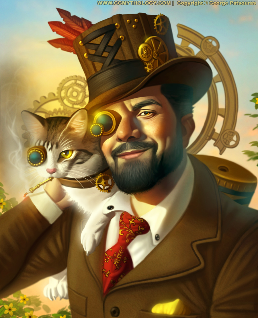
12-04-2021, 04:56 PM
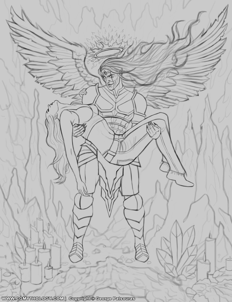
And it's time for a new illustration! I'm going for something a bit more complex than my recent paintings, so I spent a lot of time on the line art here to bring it to life. This depicts the 'Angel of Death', was going for a bit of a 'Dark Souls' vibe with this one (although I never played the games I'm a huge fan of their art style!). Here is the sketch, any input before I begin painting would be greatly appreciated!
12-05-2021, 05:21 AM
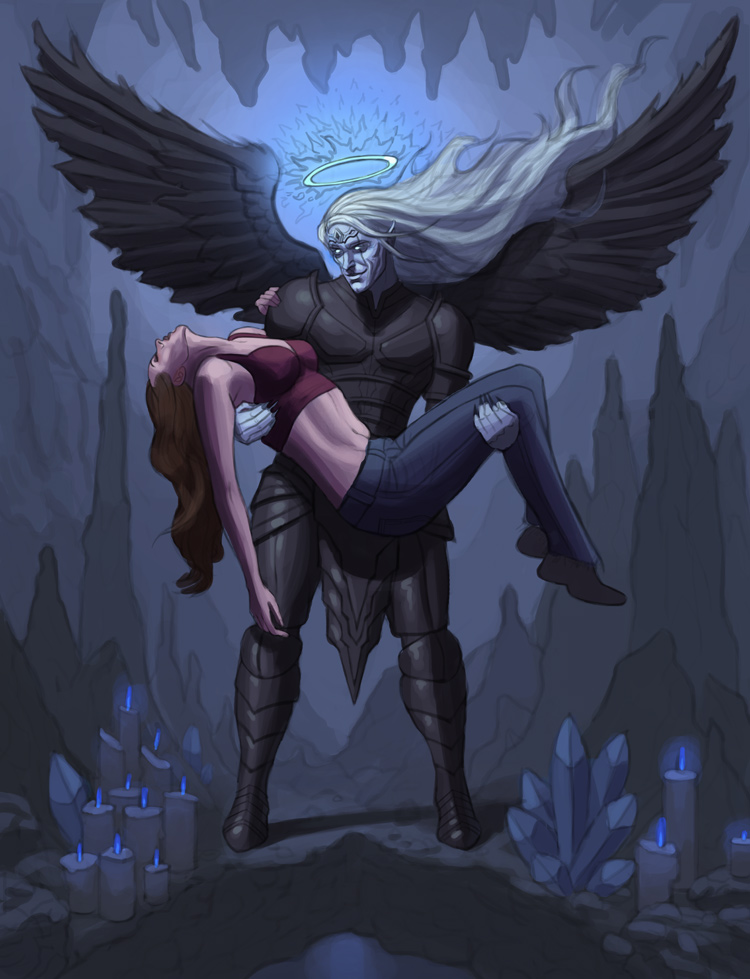
I began the painting process, focused on my values above all else and I feel they're fairly strong at this early stage. I attached the current progress:
12-05-2021, 06:11 AM
Yeah! Spooky cave BG, it frames them nicely. I only have a couple of anatomy things to point out. Some of his fingers disappear to a taper - especially his left (our right). His hips also appear very wide-set but I think that's personal preference. Some boys are thicc.
12-07-2021, 05:06 AM
RottenPocket: Glad to hear it! Great point about the fingers, I'll see what I can do. Agreed about the waist, just fixed it and it works much better now, thank you!
............ I resumed work on the image, spent a lot of time on the figures in particular. Pretty pleased with how it's progressing so far. Here is the current progress, any input is always appreciated! 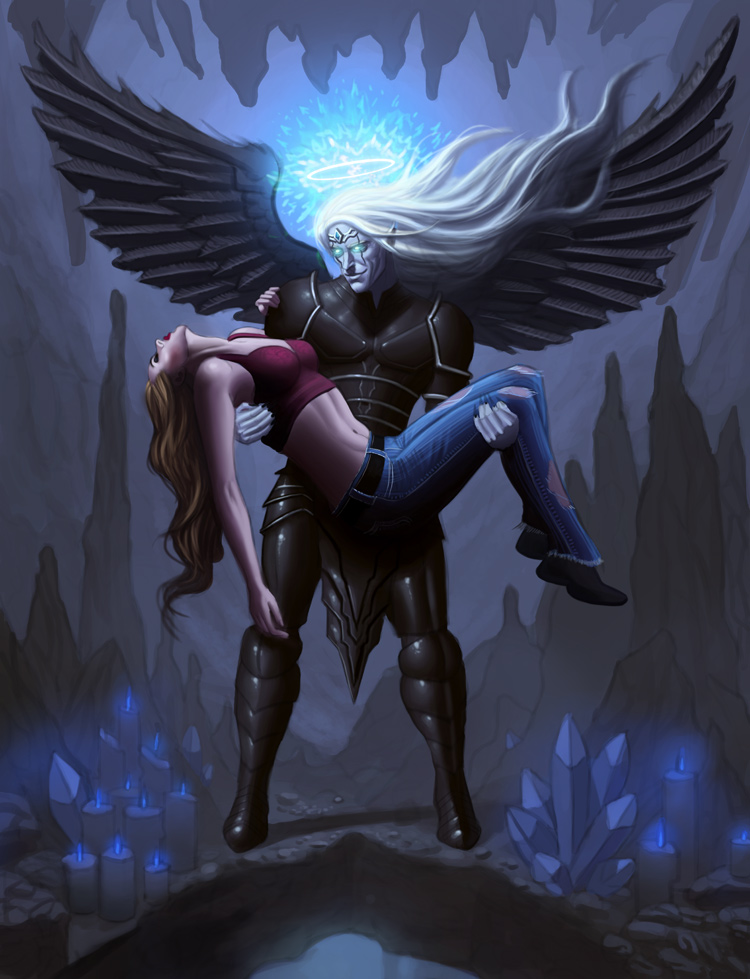
12-08-2021, 05:10 AM
I resumed the painting process, did a ton of texture and detail work. It's almost there I think! Here's the current progress:
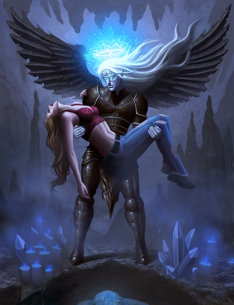
12-18-2021, 02:48 PM
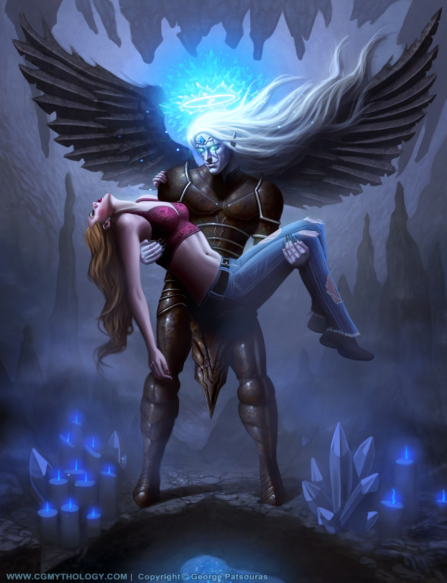
I finalize the image, pretty happy with how it turned out. Of course there's still time for some final tweaks if necessary, so if something appears a bit off please let me know!
12-18-2021, 04:40 PM
I think her head should be more on the side leaning toward the viewer .If you squint you can barely see her face which i find it should be more of a secondary center of attention right now you got the chest and the belly highlighted with a much larger zone of highlight that not really where you want the eye to go i would say it doesn't help the storytelling i would argue. Always try to think in term of 1,2,3 where is your 3 brightest spot or where it your saturated color...You got light on the bottom do they help the story or do they distract from it .You can always move the candle and crystal where you want the light to be so it less of problem. But it seem to me like you gone for a triangle composition here so it would make sense to have those there.
12-19-2021, 03:15 AM
darktiste: Great suggestions! I'll try to keep that in mind for future pieces regarding the points of interest. And yes, I was going for a triangle composition which I think compliments the subject matter fairly well. Thanks again for your input!
................ I started work on a new sketch, a dragon slayer. Pretty pleased with it but I'd love to hear any input before beginning the painting process, so any feedback is encouraged! 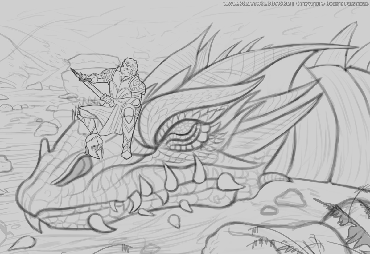
12-19-2021, 05:09 AM
Careful with the pointy element they move the eye to the right where there no really anything to look at.The dragon as a nice flowy head but it not necessarly playing to your advantage so try to play with different iteration of the head. Also one of the tooth isn't convince the last one on the the right it sit between the jaw and the mouth opening.Try to make sure your character and object really sit on a wrapped plane your showing is foot and the helmet as if it sit on a flat surface when the scale show it a curve surface.The neck is kinda flat not sure if that intented.
I think it would be interesting to see the paw of the dragon in the foreground instead of what ever is there right now.For the background a village in flame would be really nice or a volcanic landswamp with volcano erupting would be pretty epic not necessary just an extra mile to push yourself.
12-19-2021, 06:11 PM
Darktiste: Great feedback, thanks. I agree about the tooth, I tried to give the impression that it's broken but I don't think that's showing through just yet. Might rework it as I continue to paint. I like the volcano idea, might incorporate it as I continue, thanks!
................ Current update, made some changes to the composition and began the painting process... It's coming along pretty well I'd say. Still has some ways to go but I'm open to feedback as always. Here is the current progress: 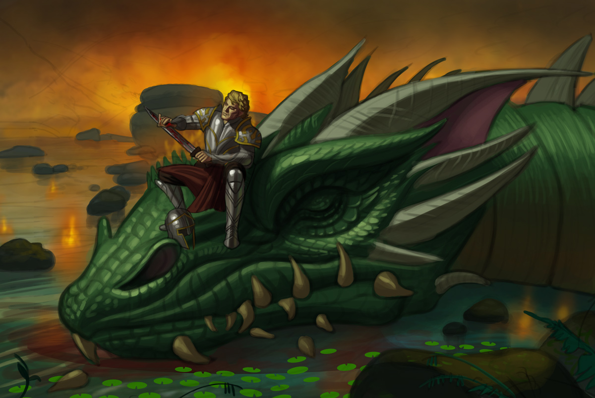
12-20-2021, 05:00 AM
I continued painting the image... and then I painted some more! Here is the current progress:
 |
|
« Next Oldest | Next Newest »
|