Posts: 297
Threads: 7
Joined: Mar 2016
Reputation:
14
@Piotr Ah cool, that should not be a problem, a druid knight ^^
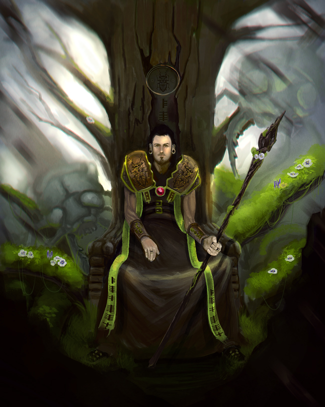
@PurpleScissors Thank you, I was actully thinking something like the first and perhaps bit of the third.
Posts: 1,970
Threads: 22
Joined: Apr 2012
Reputation:
243
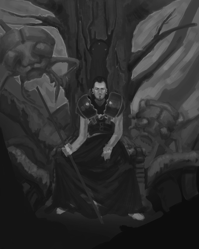
Hey man, good stuff. Check your sketch as you go. I think you are losing some of the power in the sketch. There are some nice diagonals of the branches behind the throne that you are missing in your value work. Also the sketch feels more intimate a view in scale which I think works better, so I would make the character a bit larger. You have some nice foreshortening in the sketch which isn't coming through in the value work because you've hidden most of the chair with that flat robe. I'd like to see more of the character fitting into that intital sketch foreshortening. Tweaking things as you go is fine, but be careful not to lose the good stuff. That's what the legwork is for...to solve those fundamentals so you don't have to as you paint!
*Edit, ok I realised what you posted was flipped, but the value scheme and emphasis suggested in the sketch despite being a simple gradient is working better than the value sketch. The comp also feels a bit too top heavy and symmetrical with the larger amount of dark value at the top of the canvas than was in the sketch.
Posts: 297
Threads: 7
Joined: Mar 2016
Reputation:
14
Yeah it's flipped indeed, I forgot to flip it back haha. But I'll remove the robe and make the background more lighter as intended. I know it's not an excuse but I'm really struggling with workflow so that's something I'm exploring aswell. Like what sort of studies should I do and when I should do them. I notice I sometimes change my mind while painting and then adjust things while I paint. But for next month I hope I have a better process and workflow :D
Posts: 297
Threads: 7
Joined: Mar 2016
Reputation:
14
@jonhop thank you, good thing I have some time indeed for some fixes. Will follow up your advice, thanks again!
@amitdutta that's a good example, I'll look into that and make the saturation less towards the edges. Thanks for pointing that out.
Posts: 501
Threads: 10
Joined: Jan 2013
Reputation:
20
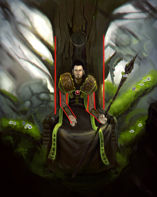
Since you are going for a central iconic composition make sure to add even more diagonals because you must balance it, so add more or make the ones you have already more prominent, loving to look of it so far, keep it up!
Posts: 297
Threads: 7
Joined: Mar 2016
Reputation:
14
@Hobitt I'm truly sorry but I don't quite get what you mean by diagonals, do you have an example perhaps?
Posts: 297
Threads: 7
Joined: Mar 2016
Reputation:
14
@hobitt, @jyonny aaah like that, I understand now and will try and fix that, thanks alot!
Posts: 1,970
Threads: 22
Joined: Apr 2012
Reputation:
243
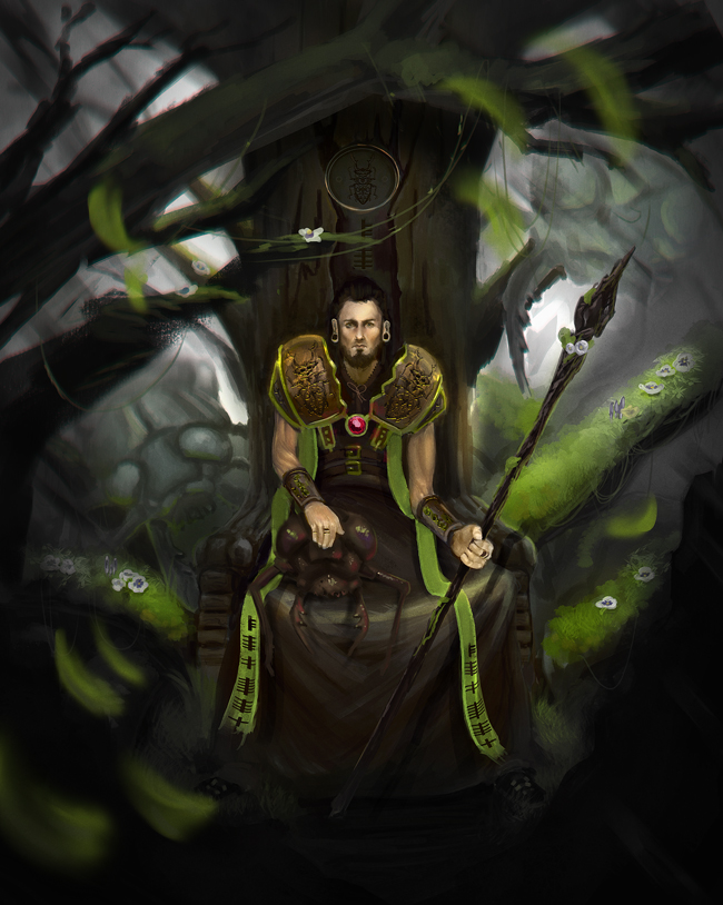
Great improvements. Haha that pet beetle....eek.
I think you should Take a few of those leaves out, especially some of the lower left ones. Again a bit too repetitive, all the same size and depth. I would look at examples of paintings that have used this to great effect and see how the arrangement affects the comps.
Posts: 297
Threads: 7
Joined: Mar 2016
Reputation:
14
@AmitDutta Will do that tommorow and then post the final I think before I'm to late :p.


![[Image: frank-frazetta-catgirl.jpg]](http://www.matt0guest.co.uk/wp-content/uploads/2014/04/frank-frazetta-catgirl.jpg)

![[Image: 4Sr8mTJ.jpg]](http://i.imgur.com/4Sr8mTJ.jpg)

