03-14-2016, 09:14 AM
Hi.
Heres some notes.
"Both characters have a hard set face, a look of determination. The house itself is quite reclusive and does not involve itself in many events of Westeros. They live in secluded forestlands. They still keep contact with kings landing through ambassadors and their trading convoys offer a unique selection of herbs, medicine and craftwork. They are also higly skilled in hunting, medicine, poisonmaking, botany, woodwork. They live in treehouses and caves mostly. They are fairly capable warriors and specialize in archery and scouting, rarely do they get ambushed due to their ability to scout ahead. When It comes to close combat they gravitate towards spears, they are not very adept in swordfighting. They usually wear light clothing that is made up from leather. Some wear little to no clothes.
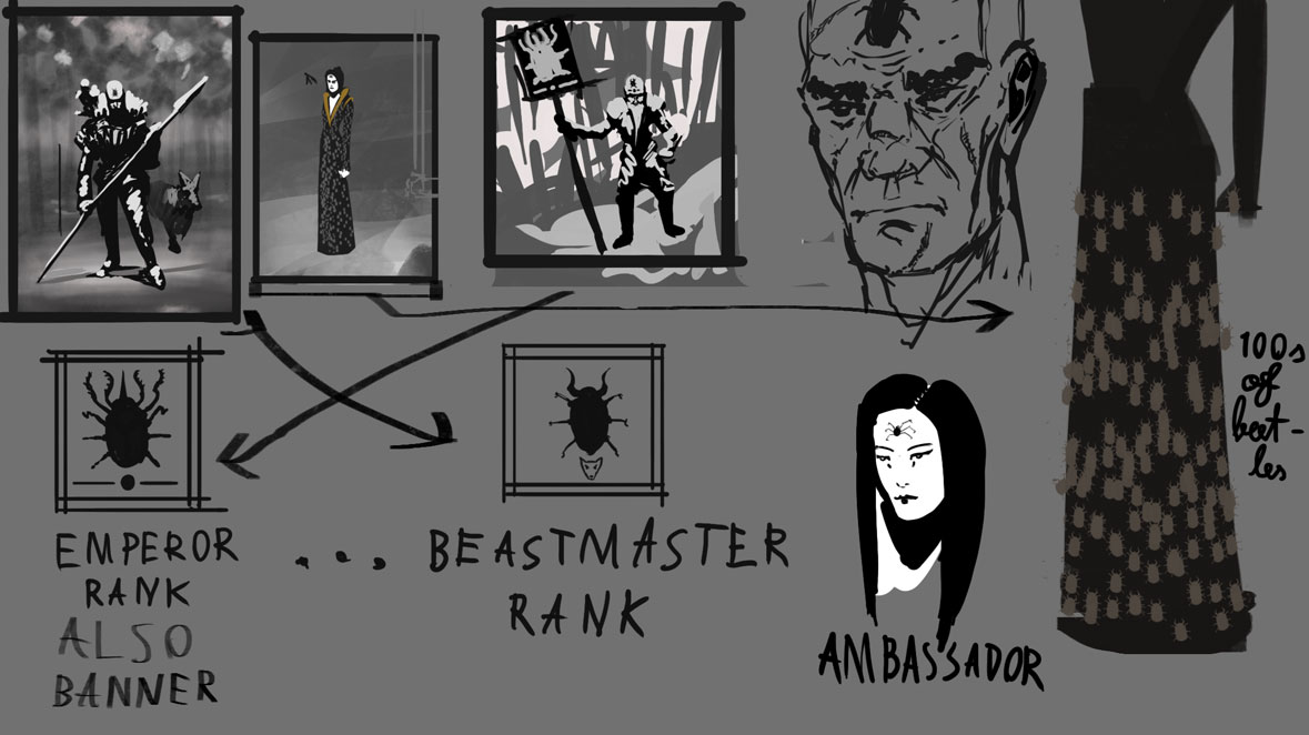
-bodypaint is an important part of the house, it marks the role of the person in the society and represents a different bug for every ranking. For warriors it is different beetles, for ambassadors it can be butterflies or even spiders.In a sense they can be compared to the wildlings, however they have built up a much stronger civilazation and culture and are officialy accepted as a house.
In the land of westeros the house of Negrea is considered mysterious, intimidating and wise. Due to that the other houses dont mess with them, but they are unlikely to be on good relations with them aswell. Their poisons and medicine are valued higly and some vagabonds with the house orgins are higly sought after due to their good scouting abilities.
The house has 2 sects: The beetles and The spiders. Leader of the beetles is the lord and his queen is usually the head of spiders. It is usually the spiders that do the poisonmaking, pigment extraction and medicine. The beetles go and hunt, they also specialize in protection. Both the beetles and the spiders are gatherers. It is more common for the spiders to act as assassins, they wear small knives coated in lethal poison.
There are also those who are unspecialized they help both the spiders and the beetles in their tasks, but are usually the lower class of the society.
Also in the unspecialized are children and adesolants who havent passed the tests.
The beetle on the banner represents the emperor of the house, who has the highest ranking beetle insigna on his head "the emperor beetle".
The main reason why other houses will not perform hostile acts towards Them is because they will mark their leaders and nobles. The ones who are marked wont live long. The house of negreas assassins are nearly unstoppable in completing their tasks.
One of the most dangerous tools in their possession is the poison incence. A candle is placed in the room of the target and withing coming into the contact with the poison scent, the target will die.
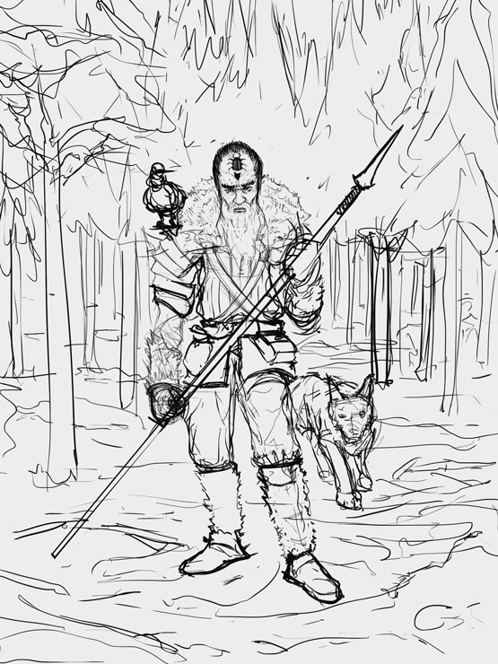
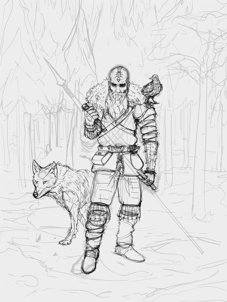
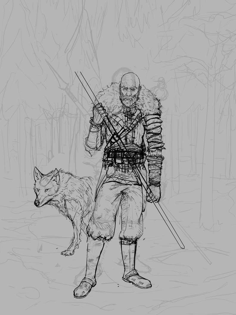
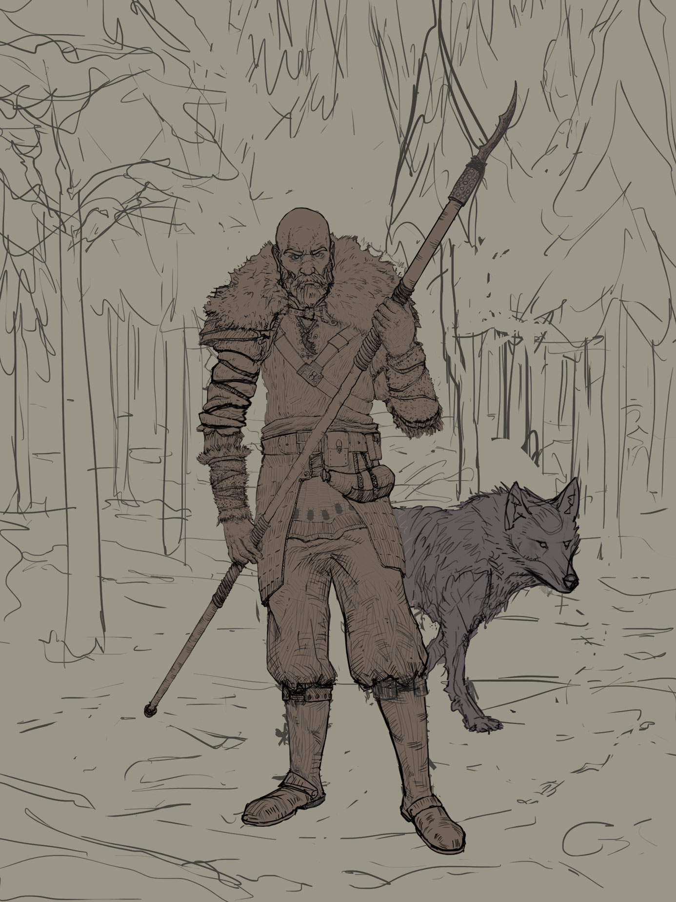
-burly bearded man with numerous scars and ragged hands, covered in nature made armorset. Reddish shade of face. Similarities to wildlings. A front line soldier of house negrea.
Has a spear.
A beetle facepaint on his forehead.
To show the beetle the hair has been cut and looks like a certain samurai haircut.
Light fur and leather armor
travelling supplies(pouches and satchels
short bow and arrows
intimidating appearance
An eagle on his shoulder
A tamed wolf by his side
-ambassador woman with a cloth embedded with 100s of beetles, spooky headwear and outlook, similar to melisandre in mysteriousness and implied evil. Gaunt face. Tanned skin tone.
scroll pouches
clothing combining gold and dark red with greenish tones.
unstettling appearance.
Face painted white with dark pigment make up accentuating lips and eyes.
Spider on forehead
sleek look."
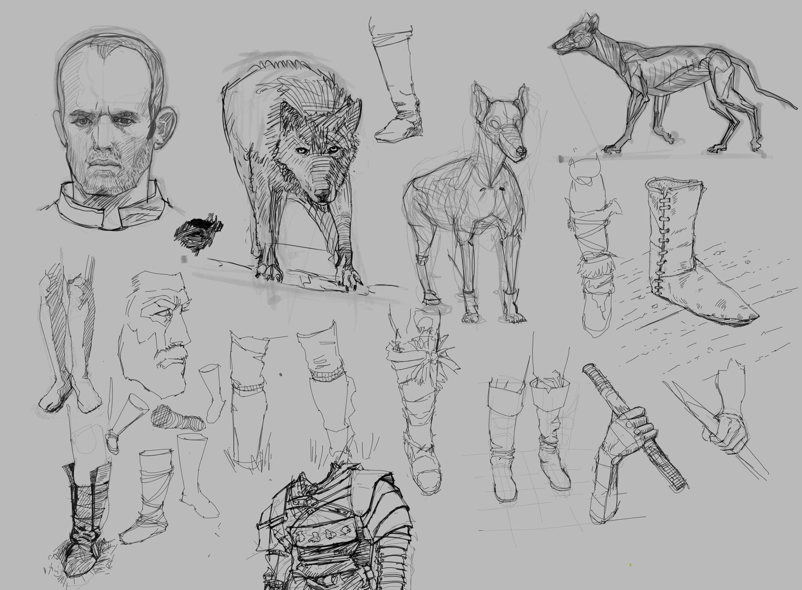
With all that stuff figured out its time to get to the drawing part.
Here is some initial sketches.
