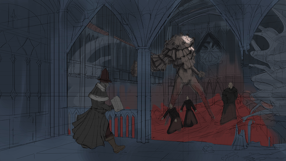
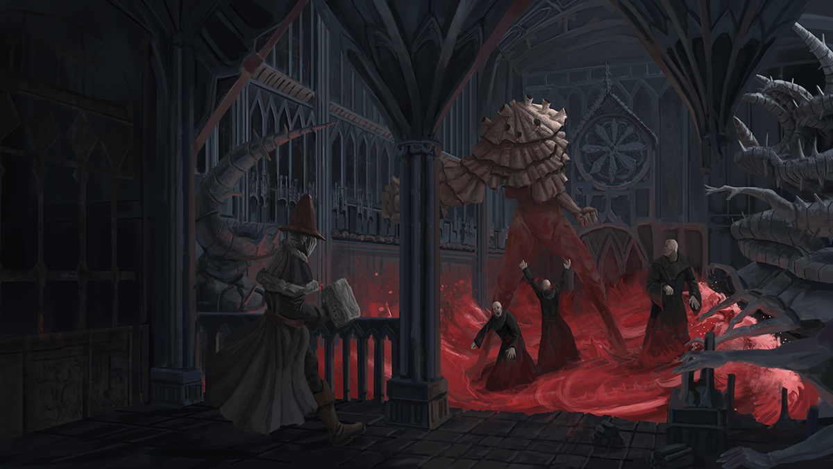
CC2 WIP Hobitts depository of cosmic horrors
#21
massive studys in this thread, such great work
I agree about the robed dudes, simple design so the focus is more on the great one, right?
love the statues btw
Reply
#22
Man, so many concepts!! Awesome work!!

DeviantArt YouTube | My Books and Comics

[url=http://arapersonica.deviantart.com/][/url]
Reply
#23
@Nada Thanks! Yeah the fantastical that is grounded in reality tend to work best.
@Thanks!

I was not productive today instead played around with software and techniques, need to stop that and draw more!
I think i should start working on the final now since the designs are solved at this point... i may do some color comps since the sketch colours don't look nice to me.

Exploring some techniques might use some of it in the final.


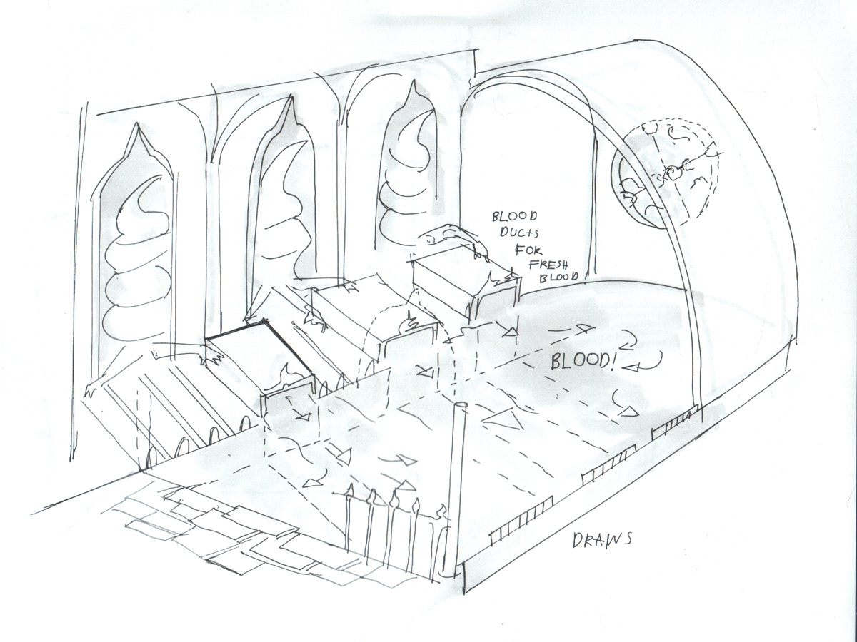
And basic room layout just to have a clear picture in my head


Reply
#24
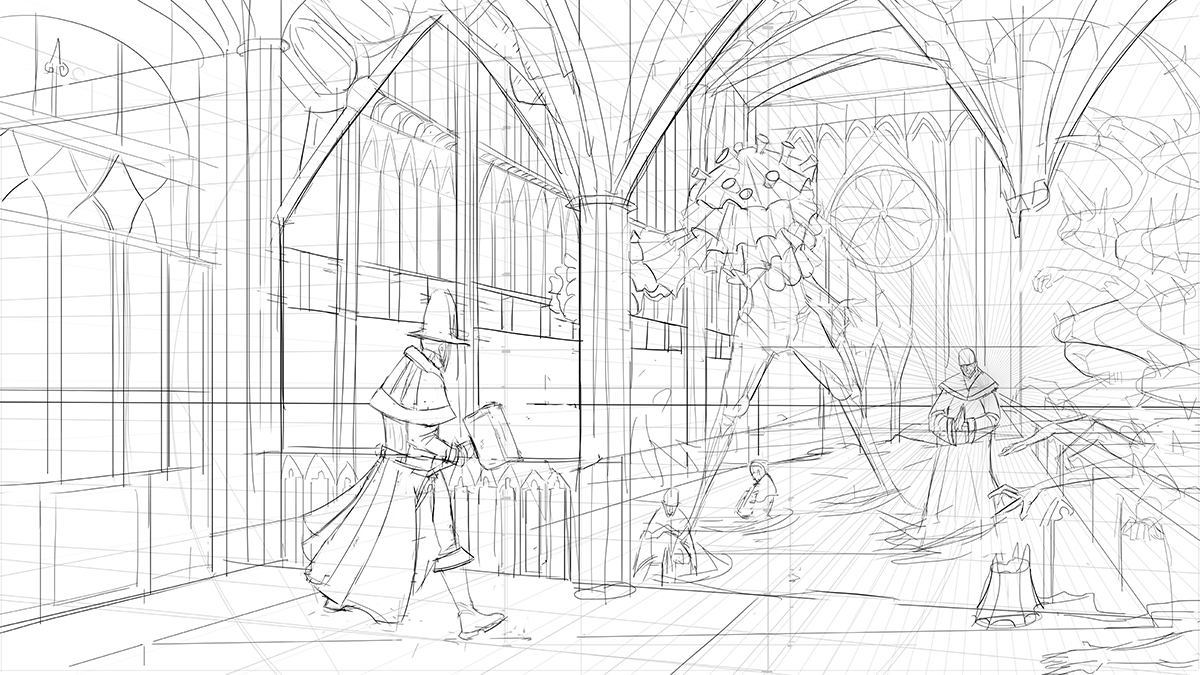
Alright started working on the final.


Reply
#25
Fark dude, that's looking great

 YouTube free learnin! | DeviantArt | Old Folio | Insta
Reply
#26
Hi Hob! Watch out for scale! the guy on the surfboard seem to be so much bigger than the guy in the forefront near the Great One's leg!

Man.. Awesome depiction of the source of the Great One..

If you are reading this, I most likely just gave you a crappy crit! What I'm basically trying to say is, don't give up!  
----
IG: @thatpuddinhead
Reply
#27
@Amit Thanks!
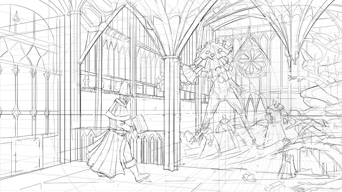
@John Thanks ! you are right messed up the scale

Alright after some feedback reworked the drawing a bit made the cultist's less static


And quick colour to make it more clear


Reply
#28
Whoaaa an ocean of blood!!? So fricken sweet~

DeviantArt YouTube | My Books and Comics

[url=http://arapersonica.deviantart.com/][/url]
Reply
#29
Damn you are really pushing it, love the dedicated linework. Hope you nail the painting and atmosphere aswell :)

Reply
#30
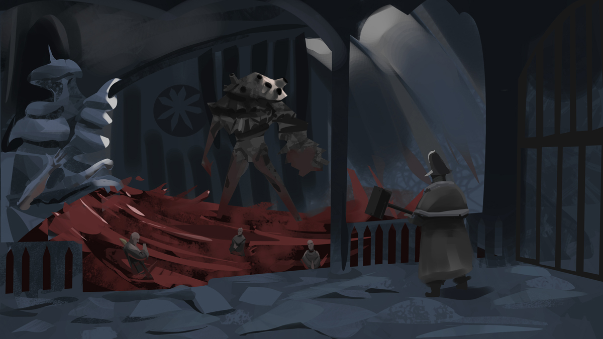
@Arapersonica Thanks! and yes huge pools of blood are fun to paint!
@crackedskull Thanks!

It is done.


Reply
#31
Hey Hobitt! gonna try and do a some crits on the crucible entries starting with you - so here it goes

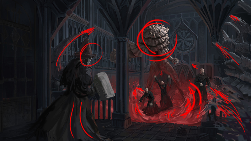
- You put too much time into some of the wrong things(only 'wrong' because it pulls too much attention from whats going on), the background is all very sharp and detailed, and the hunter is hardly noticeable. That's not to say detailing things out is bad, you can totally do it and it could look awesome, but you'd have to have your focals even further rendered then the background, can't be a fight for attention.

- His placement in the image also makes things feel very flat, it doesn't really pull you into the illustration. 

- The light wave in the corner grabs far too bright and pulls too much attention.

Here's a paintover and red line for where the focals would be. tried to tailor things to make rhythmic leading and framing lines. You already did a good job on making the priest dudes looking at the focals!


And the paintover without -
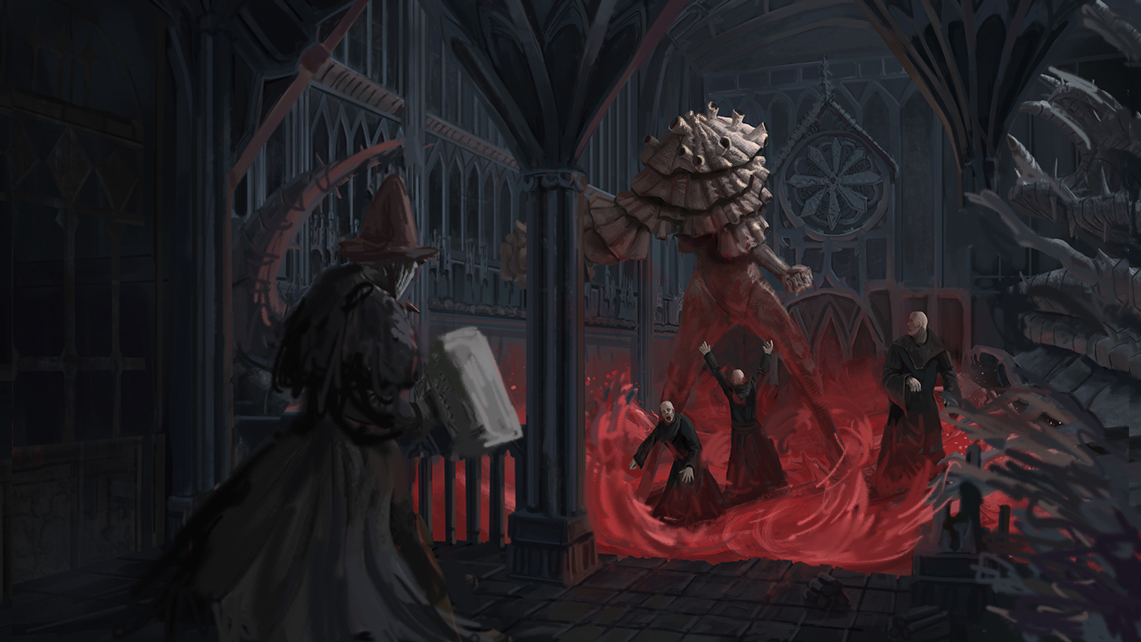


Basically I changed the guys placement, so it looks like he's not just walking in from the side but from closer to us. You could even do it quite a bit more for a more dramatic effect. painted in darker darks and lighter lights on the monster establishing him as the main focus. I cropped the image a bit as well. 

Anyway I really like the concept, definitely has potential! Just gotta figure what the image is about, what the focus is and put the most work into those places :)

Sketchbook ▲  Website ▲ TwitterArtStation ▲ Twitch ▲


Reply
#32
@Jonesoda Thanks for the paintover! yeah i went overboard with the detailing i want to move to a more painterly approach so trying to figure things out right now,and i did not plan the composition well enough, appreciate the paintover. Will try to do better next time.

Reply
#33
So Hobitt don't forget to pay for your 3rd place licence this month.

Reply
#34
(04-25-2016, 03:32 PM)Piotr Jasielski Wrote: So Hobitt don't forget to pay for your 3rd place licence this month.

Ofcourse! lol

Reply


Forum Jump:


Users browsing this thread: 4 Guest(s)