Flo's sketchbook
and I brought home some water-color paintings. I feel like I am still a beginner with these and sometimes struggle to find the right color and value. But it was fun nonetheless and I hope I learned something hehe. Some of them aren't finished but to me they work because I just wanted to get some more experience and experiment.

I use a Pentel Waterbrush and Windsor & Newton Watercolors in a Bösner water-color-sketchbook.

Hveragerði


Hveragerði was our first stop. From there we did the Golden Circle tour, saw Geysir (which is in fact a name, not a thing but all other geysirs are named after him) and Strokkur (which is a geysir, that erupts almost every 5 minutes!), the big Gullfoss (a waterfall) and some other beautiful Icelandic scenery.
Skaftafell

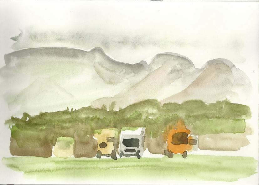


The next big stop was Skaftafell at the Vatnajökull national-park. I had some issues to find the right colors and keep the shapes together. Although it is not the most colorful I kinda like the one in middle.
Austurland
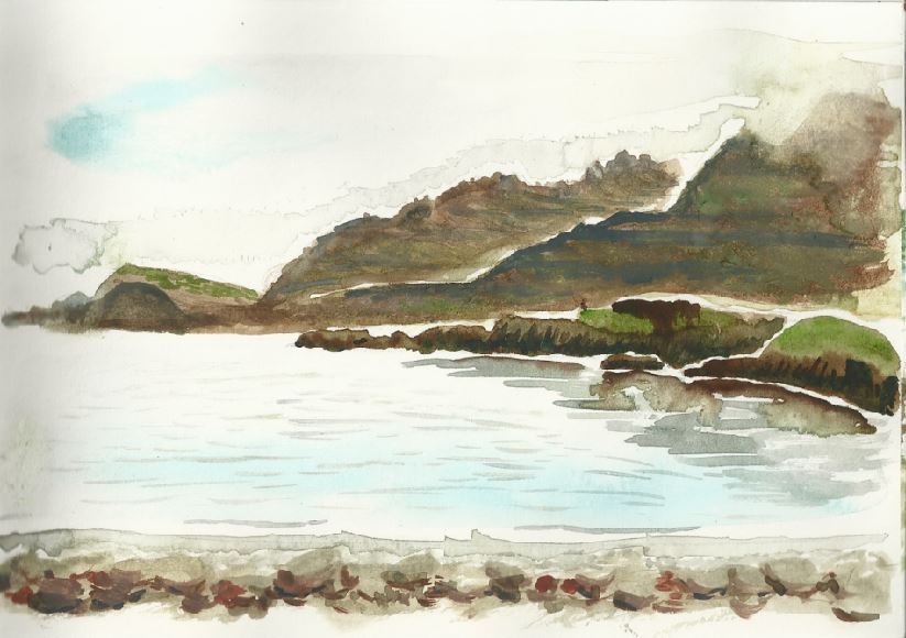

The weather wasn't too great here so we didn't stay very long in the Eastfjords. But it was enough for one painting. The Fjords kicked my butt, I just couldn't make it work the way I wanted. But the big stone in the foreground, a bit left from the middle, I quite like. It has some nice bounced light and the values seem more or less correct. Not that it looked like that in reality, though ;(
Vestfirðir


The Westfjords were beautiful and we hat great weather. We actually could get out in short pants and t-shirts.
Látrabjarg


This wasn't painted on site, but after doing some studies and then taking time while staying in Reykjavik. It was fun do work on these and the result is showing the effort. Probably my favorite of the bunch. But still, I am not saying that I am good at water-coloring ;)
the local beer
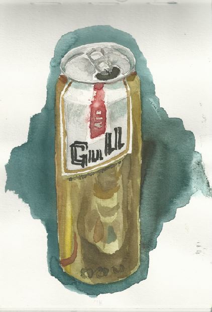

tasted okay. I tried to paint my red pencil and pocket water-color-set in the can.
on the plane back
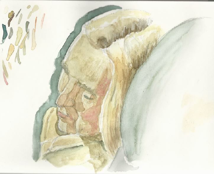

just some random woman sleep on the plane.

It was really frustrating doing some of these, others were more fun. All in all I liked the experience and I will keep doing them. At least on the next trip ;)

Hey guys, I did another still-life yesterday and wanted to share the process I used yesterday.

1) establish the rough composition
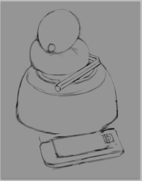

2) Lay down the base color of the objekt. Not the color of the shadow-side or the color in the highlight but something in between.


3) create another layer above your object (i.e. the lemon) and set it to be a "clipping mask". That way you can't paint outside of the pixels of the layer beneath. Now brush in the shadow-shape. The color is not important, you can change that with ctrl+u (or cmd+u for mac) which opens the "Hue and Saturation"-adjustment-menu.


4) now ad another clipping-mask and add reflected light where-ever you see it. Reflected light is where 2 or more objects are so close to each other, that light bounces of one object onto another one. Often these bounced lights have taken on the color of the object they first touched, because it absorbed all the other colors of the light. That way bounced light is often more saturated than direct light.


5) What has changed? Only something small: occlusion shadows. The places where 2 or more objects touch or are really close together, the light has a hard time getting in and out of. At those spots "occlusion shadows" occur and they are often the darkest part in the picture. Brush them in with a soft brush and erase out what you don't need.
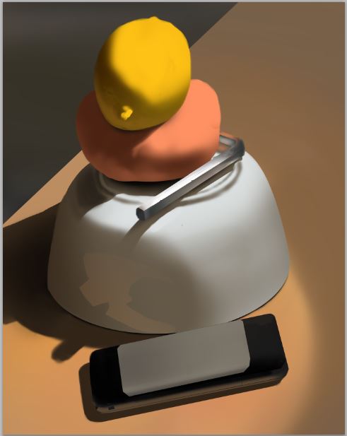

6) Ok, this may seem like a big step, but the foundation is laid and all I do now, is to look more or less carefully and paint in what I see.

I used mostly the soft and hard round brush that comes with PS and 1 or 2 custom brushes by the great and powerful Shaddy Safadi. http://www.shaddyconceptart.com/download
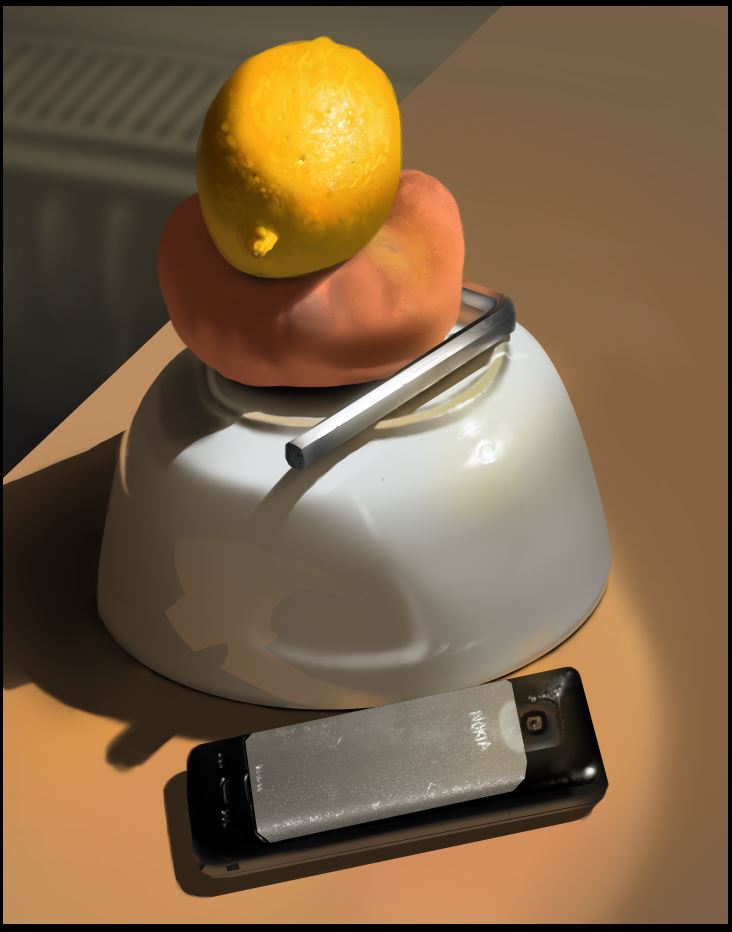

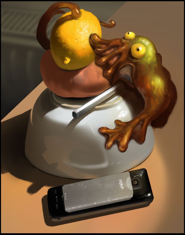
7) Add silly stuff. I hope you have fun trying this process ;)


Please help me getting better by checking out my sketchbook

HOMEPAGE http://floart.weebly.com
Reply
hey guys,

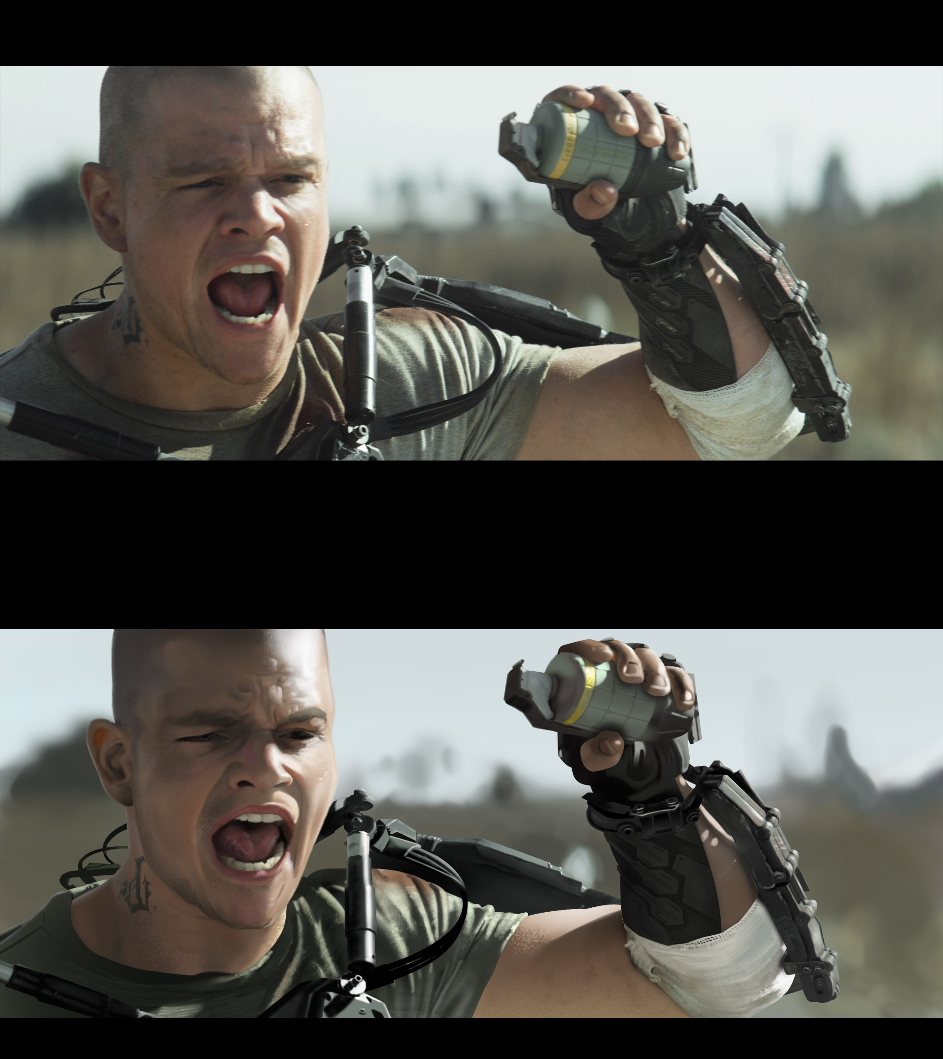
here a movie study I tried to push really far. was a lot of fun :D


Please help me getting better by checking out my sketchbook

HOMEPAGE http://floart.weebly.com
Reply
Very nice study there. You've captured the tones well. I think some of the lines around the head look a bit unusally straight though that may just be me.

Reply
Hey Larva,

thanks for the feedback. You are right, there are to many sharp edges in the picture. I will work on that.

This will the most image-heavy post in a long time, since it contains a lot of really rough sketches from my different sketchbooks. It's gesture-drawing, learning about environments, some character and creature design, portrait-practice, figure-drawings from a figure-drawing class I like to attend and a water-color-painting from street-festival in Berlin.

Enjoy :)


The above figure drawing deserves its own space, since I was not 100% responsible for the outcome. A very experienced and humble dude at the class showed me some of my mistakes, after I asked him for advice. He was super-nice and really helped me out a great deal in understanding how light works on the human form and get better results with my lines. In the result he erased some parts and drew over them, which was super-helpful.


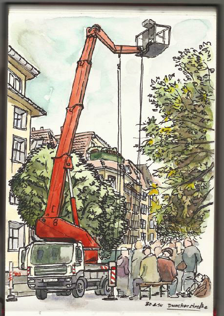
The above painting was done in the Dunckerstraße Berlin. I tried to remember the stuff I learned this week and apply it. It was a lot of fun :)

Check out:

https://www.youtube.com/watch?v=oJ7WHuvdsjI

and

http://www.youtube.com/watch?v=v-2MnmBQAic

both are jewels!


Please help me getting better by checking out my sketchbook

HOMEPAGE http://floart.weebly.com
Reply
Nice figure study work :) love the shadow work and that still life process is sweet
Reply
The creature added to the still life was nice touch at the end :D.
Reply
Can't get over those water colours and the still life at the beginning of the page! Great stuff, Flo! And thanks for the tutorial on the study, will have to try it out for sure.

Its cool that you met that experienced guy at your class -the gradations on those life drawings are killer!

Keep it flo-ing (see what I did there hurhur)!

sketchbook | pg 52
"Not a single thing in this world isn't in the process of becoming something else."
I'll be back - it's an odyssey, after all
Reply
hey guys, great to see so many responses :)

@knives: thanks a lot, it was a lot of fun. Time flies in those figure drawing sessions :) the process is nothing special really, but still it works for me. I like to keep stuff organized I guess although I am a scatter-brain. At some point it can be limiting though, when I start to search for stuff in the layers and can't find the right layer. So there is a point where I just stack layer over layer and paint details in. I could upload the PSD if anybody is interested. (i.e. dropbox)

@Farvus: yeah man, monsters rule!

@smrrfette: Aaaaaaaaaaaah I saw it and I liked it :D

thanks a lot for your kind words, that's very flattering. At some point during painting the water color piece a little girl came by and touched it while saying: that is beautiful! That was the greatest moment :)

As for the process, I wanna see the result of you trying it out. Tell me if it helped in any way!

And yes, it was really cool to talk to that dude. Sometimes all it needs is to ask somebody for tips in order to get help. I think most people are more than happy to share. If not, that's okay too I guess ^^

Here more work:

the first are bacteria deisgns for the game I am working on. Go play it here and give me some feedback (it is hard as hell :D http://tajono.de/Protectus/html/protectus.html


The second is my first spacecraft design after the techniques I learned from Scott Robertson's book: How to draw. I wouldn't say it is great, but it is better than I expected. I was actually surprised by how easy it was. Check out this video and try it. Maybe you can already do it?

https://www.youtube.com/watch?v=25x7MuSrQGU


Please help me getting better by checking out my sketchbook

HOMEPAGE http://floart.weebly.com
Reply
Heyho,

I started learning about caricature and I find it really enjoyable. I think it is a great way to learn facial anatomy and design (to some degree) since you really have to pay attention to what to exaggerate and how to balance your shapes. I did 2 today but left one at work, so here's the one I just finished. It is just a sketch and may or may not resemble my brother :D

edit: the picture is pretty big, but I am to lazy to change that :D so now you can see all the pen-strokes seperately ;)


Attached Files Image(s)


Please help me getting better by checking out my sketchbook

HOMEPAGE http://floart.weebly.com
Reply
Yo Flo! Nice to see you're getting into caricature! I've been doing those as my job for a couple months now XD I agree, they're a fantastic way to up your observational skills and have some fun! The shapes in this one look pretty fun, keep in mind you can always push the shapes further. It's fun sometimes to do a caricature and then do a caricature of the caricature trying to make a more extreme statement, while still making it look like the person.
One tip I heard all the time in art school was to make sure when you cross hatch the lines don't go perpendicular to each other, it makes a flattening effect. That can look col in negative space or for flat surfaces but I don't think it works well for skin. When you need the hatching to go darker, try making the second set of lines like the first but tilted slightly, instead of almost 90 degrees to the originals. More like you did in the forehead, less like you did in the nose

Reply
Hey Samszyn,

I just wrote a long reply and hit the wrong button and it all was gone >.< so here it goes again:

thanks for the advice about the crosshatching, that is exactly what I needed at this moment. The subject is still new to me and I wondered if there was something like a "best practice".
Also the "caricature of the caricature" idea is great. I feel like I stick to much to the reference, so that should help :)

It is funny that you talk about jobs, because I am currently having my big switch to freelance and I have no jobs yet. So if you know someone who is in need of a little caricature and your schedule is full, I would be very happy to take it :)

And here is another workflow-post.
1. reduce the object to its simplest shape
2. fill it with the midtone
3. brush in the shadow
4. paint in the light
5. paint in the reflected light (it is always darker than the direct light, ecxept when there is a really reflective material reflecting it like chrome for example)
6. use the smudge tool on a seperate layer with "sample all layers" turned on and get a first pass of structure in. The good thing about the smudge tool is, that it keeps the light-to-dark pattern. I just took a soft round brush, set opacity on pen pressure and switched on scatter on both axes 7. take whatever brush you like and paint in details on another layer.
8. blur edge a little bit everywhere, except in the focal area

Have fun :)


Please help me getting better by checking out my sketchbook

HOMEPAGE http://floart.weebly.com
Reply
Ah, would totally keep you in mind! But my job is actually working at an amusement park doing quick marker caricatures for guests, I'm not freelancing yet either DX
cool onion painting!

Reply
heyho,

here two portrait studies. The first one was line-was with cross-hatching and later a tone-layer washed over it. I shouldn't have done the tone layer, it didn't work out the way I thought it would.
The second one was flat-color based. Both could have needed more attention, but I wanted to keep it loose this time. ;)

@ Samszyn: wow! you have all my respect! that is a job I would not have the balls (and the skills) to do atm. You posted some in your sketch, if I am not wrong? Anyways, those are great! and thanks on the onion painting :)


Attached Files Image(s)


Please help me getting better by checking out my sketchbook

HOMEPAGE http://floart.weebly.com
Reply
really interesting approach to the onion study! are you still doing any DOTA2 stuff flo?

Workshop enthusiast
Blog!
Steam
Workshop blog
Strim
Reply
Hey mr Toodles,

thanks a lot, I hope you can take something out of it.

I am not sure, what you mean with DOTA 2 stuff, but maybe you confused me with PKmike? Which would be an honour, of course :)

Here some recent stuff. I am kinda busy with getting my life organized, now that I am going fulltime freelance. I have to apply for unemployment-money and talk to different institutions so not so much time for painting but I wanted to share another "Dungeon League" - process with you.

Here is what I do:

1. I get the lineart by Lena Kuschke

2. I block in colors and shadows and send it for a review

3. I paint the materials and details after getting feedback by Lena and Julius

The whole process is done in roughly 4 hours for every card.

Crits and comments are highly welcome :)


Attached Files Image(s)


Please help me getting better by checking out my sketchbook

HOMEPAGE http://floart.weebly.com
Reply
MC Wyeth Study, he is the saturation god :)


Attached Files Image(s)


Please help me getting better by checking out my sketchbook

HOMEPAGE http://floart.weebly.com
Reply
This started as an anatomy study, the 2 additional arms where added from memory.

I used 2 new brushes which worked out great. one left a lot of subtle texture while sculpting in light and shadow and the other was good for an additional texture pass, after having worked in the biggest volumes.

they are pretty basic too, I can tell you more about them if you want. :)

the picture was taken from here: http://figuresfordrawing.tumblr.com/post/37342781457


Attached Files Image(s)


Please help me getting better by checking out my sketchbook

HOMEPAGE http://floart.weebly.com
Reply
Repin study, 1,5 hs.


Attached Files Image(s)


Please help me getting better by checking out my sketchbook

HOMEPAGE http://floart.weebly.com
Reply
Thanks for sharing that clipping mask info
and nice work!!
Reply
Heyho,

I redrew one of my line-art pictures.

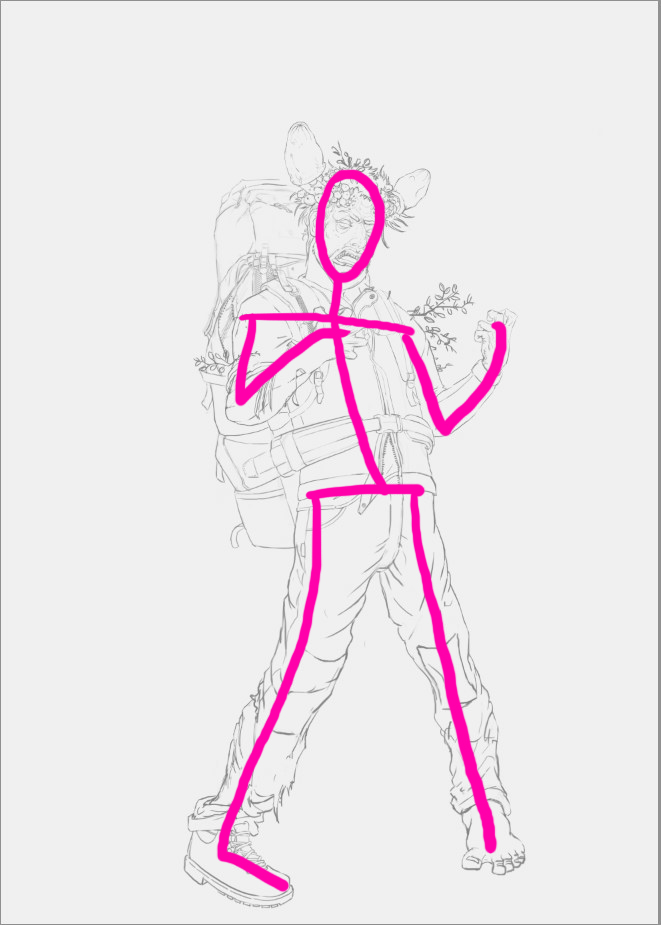
In the first the pose is okay but a bit stiff, which is all the more visible when you draw a simple stick-figure over your art. Smart people would do that step in the beginning stages of their painting, but hey... sometimes I get carried away and I need to make adjustments in the later stages of an image.


I put more emphasis on having a contra-pose, which means that the shoulder-line dips in another direction, than the hip-line. Also his stance is broader and his face is way more active. Looking at reference and acting the pose out helped me here a lot.

So try it out and see if it helps you.

@ FROZ3N no problem and thanks! :)


Please help me getting better by checking out my sketchbook

HOMEPAGE http://floart.weebly.com
Reply


Forum Jump:


Users browsing this thread: 199 Guest(s)