CC5: YÜA
#1
I'm super excited, really enjoying the brief! I'll start my thread with a bit of process description since I don't have anything to show just yet. Currently I'm collecting a lot of reference and generally just letting my mind wander through all the interesting stuff I stumble upon.

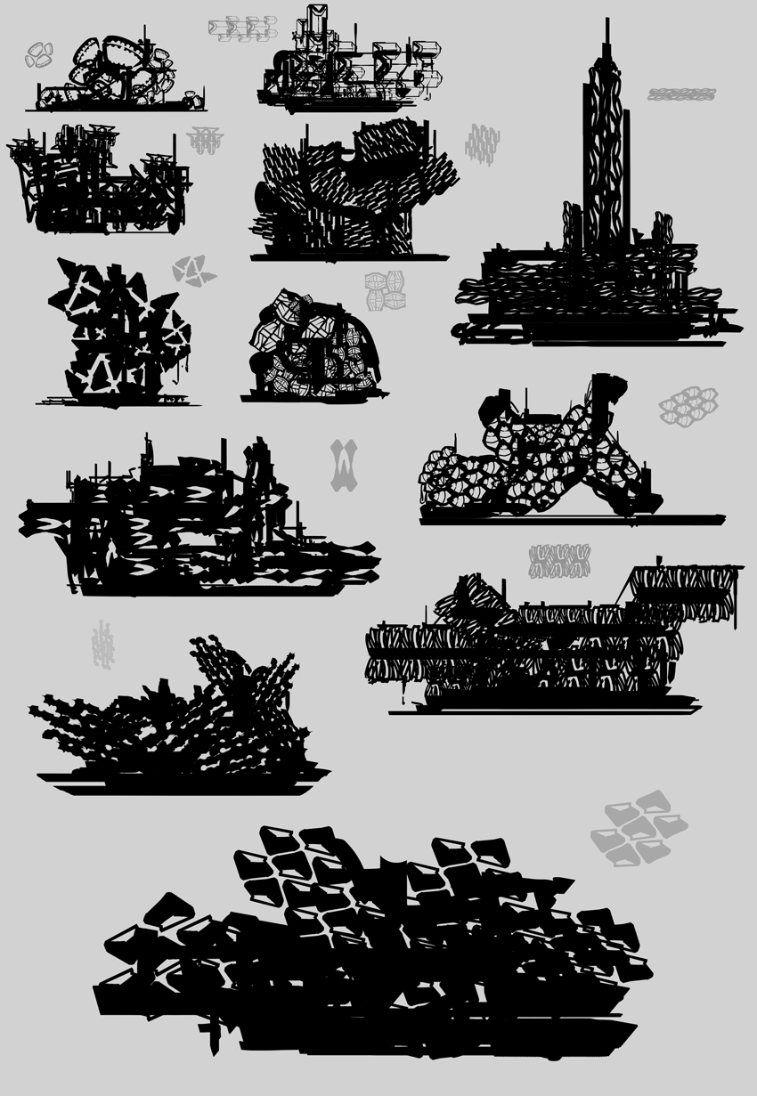
I plan on extracting all the different shapes I can find and start with some silhouettes out of those shapes. Lets see what I can come up with!

I keep you guys posted!

Reply
#2
Good luck! :)

Reply
#3
I just started exploring different shapes, forms and shape relationships. I think I made a step forward. Its great to reflect on the stuff you did and notice trends etc.


After I collected the silhouettes which I liked at least one thing about I noticed that all share kinda the same shape relationship/overall rhythm. I think my next step will be to break those up and exploring new directions. Also more geometric shapes/hard edge shapes. Might try that in PS.


Reply
#4
Did some watercolor today to find some interesting shapes. Worked quite good for me. I painted a bit on top in ps to see what i can some up with structurewise.

Will definitely spent a lot more time on my shapes. So hard to find something interesting.


Reply
#5
Yep, lesson learned. Reading the brief and understanding what it wants you to do is always a good idea :D

Shapes first, then patterns from those shapes and THEN ortho explorations. Since I now understood what I have to do I'll have to do a lot more exploration. See you the next days!


Reply
#6
Boom, there you go. We were surprised how few people appear to have even read the brief. It is kinda crucial really.
Develop develop, let's see what you end up with, these new iterations are heaps better already.

 YouTube free learnin! | DeviantArt | Old Folio | Insta
Reply
#7
Thanks Amit! 

Iterating and exploring is really fun actually, sooo many possibilities. I dug deeper into some of my favourite patterns and generated some new ideas. The last screen shows my current favs.

Most likely I'll try some other shapes and patterns, just to try some new directions.


Reply
#8
Nice works, you have some really cool shapes there :). To continue, maybe you can think of the functionality of the designs you choose? How do they work? They don't have to work on proven science, but known where the housing, how they enter etc. etc. will help I think.
Just as designing the front/back of the structures (assuming this are all side views).

Looking forward to more :)

Reply
#9
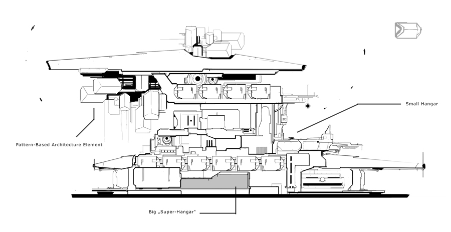
Thanks Eyliana! Perfect advice as well, thats exactly what I have to do now. I chose one of my favourites and started riffing off the silhouette. I really like the idea of a Hive-Like Center Hangar, wrapped in some architecture defined by the pattern. At the moment something is missing, I think I have to split up the forms a bit more to maybe strengthen/alienate the silhouette idk.

We'll see :)


Reply
#10
Nice job on the shapes study and exploration of different silhouettes they are looking good.

Reply
#11
Nice work on those patterns and the building structurs this looks really promising! It will be interesting to see how you work them in to a compostion.
Reply
#12
Thank you both!

REVISION, REVISION, REVISION!

Still changing a lot of stuff and trying things out. Definitely getting closer. I'm liking the result of the first screen, I reassigned the functionality and worked on a bit more rhythm in the structure. The last iterations looked a bit stiff.

Really excited to eventually detail one of these out.


Reply
#13
I like the designs which have a bit of asymmetry to them and a more broken up silhouette. Overall the designs you had while they have nice elements within them are basically big rectangular blocks. I prefer the ones that move away from this, but it's up to you. Carry on!

 YouTube free learnin! | DeviantArt | Old Folio | Insta
Reply
#14
Thanks for the feedback Amit! I chose the less blocky iteration. Expanded the form a bit and combined some shapes. Did a detailed linedrawing today. I think thats most likely the version I go with. Will refine it tmrw, then do the perspective drawing and then FINALLY render it.

The Idea of this design is to have basically a huge scale homebase/spaceport being the home for an alien culture. I plan on placing it in a kinda desert type of world with small vegetation. This building is the only way to leave the planet.


Reply
#15
Basic Geometry Block-In. Will fix stuff and detail it out tomorrow. Then assembling the final image und coloring. I really love linework but looking forward to use some colors soon :D


Reply
#16
Awesome designs, cant wait for the final, also good to see you updating regularly!

Reply
#17
Fantastic development workflow! Love it. Keep pushing it. :)

 YouTube free learnin! | DeviantArt | Old Folio | Insta
Reply
#18
Thank you both :) Really appreciate! :) You're giving me some energy to push through the last steps :D

Got some good result today, getting stuff done.


Reply
#19
You've made progress with your perspective studies! And I like the line weight control. How's your rendering going?

Reply
#20
Its going okay-ish :D I decided to go for a line-based approach since I never painted anything from scratch.

One thing I definitely learnt is that you need a lot more line information than I originally anticipated. I thought my drawing was quite detailed, but when colorized there are a lot of spots which could have a lot more high-frequency detail. Then its looking even techier/more scifi.

The challenge is so great because I'm spotting a million things to improve/change which I wasn't even remotely aware of beforehand. Thanks to you both, Amit and Piotr, for making this challenge!!!!

Will finish the scene tomorrow and then its presentation time :)


Reply


Forum Jump:


Users browsing this thread: 3 Guest(s)