Toranja Draws!
#21
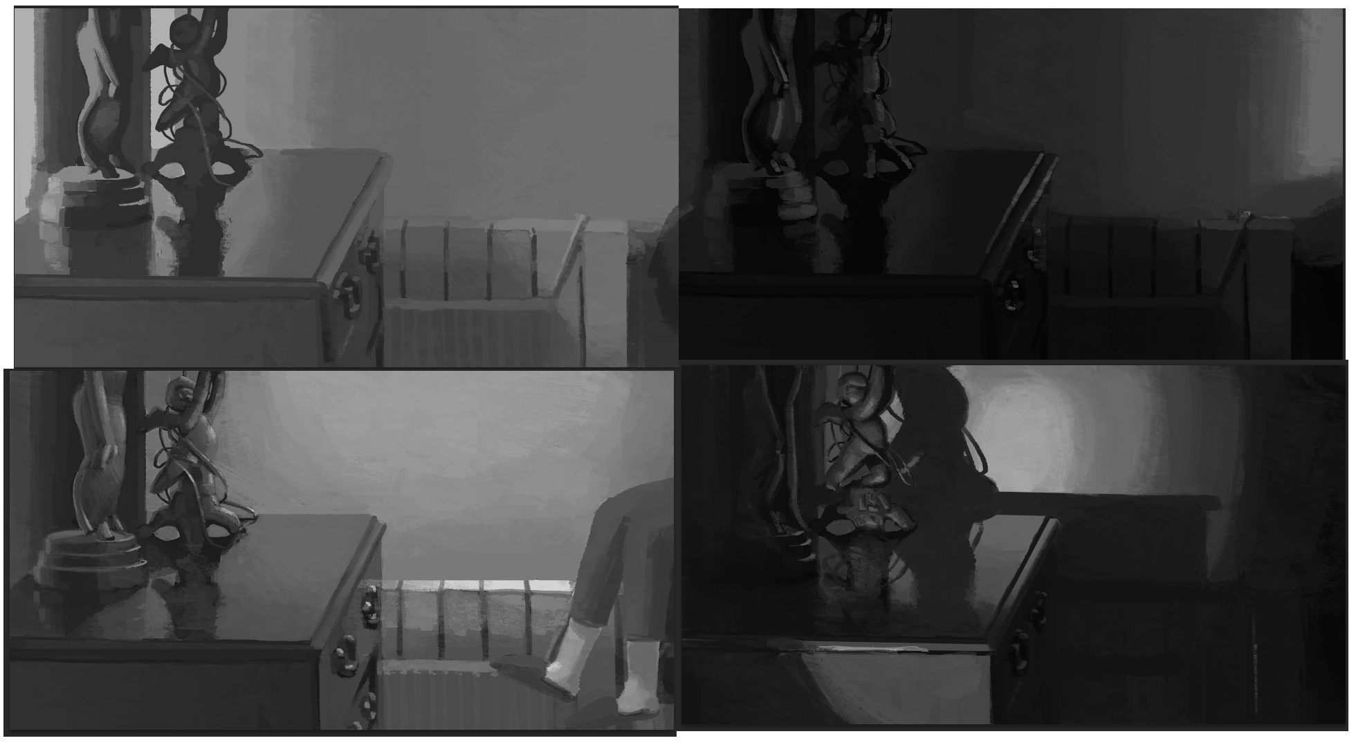
Oh man, this exercise is so hard I can't.


I think there is definetely a problem happening here in terms of exposure. I am unsure whether I should have or not dropped the value of the window and/or bounce light in that second painting. It feels messy somehow.
Reply
#22
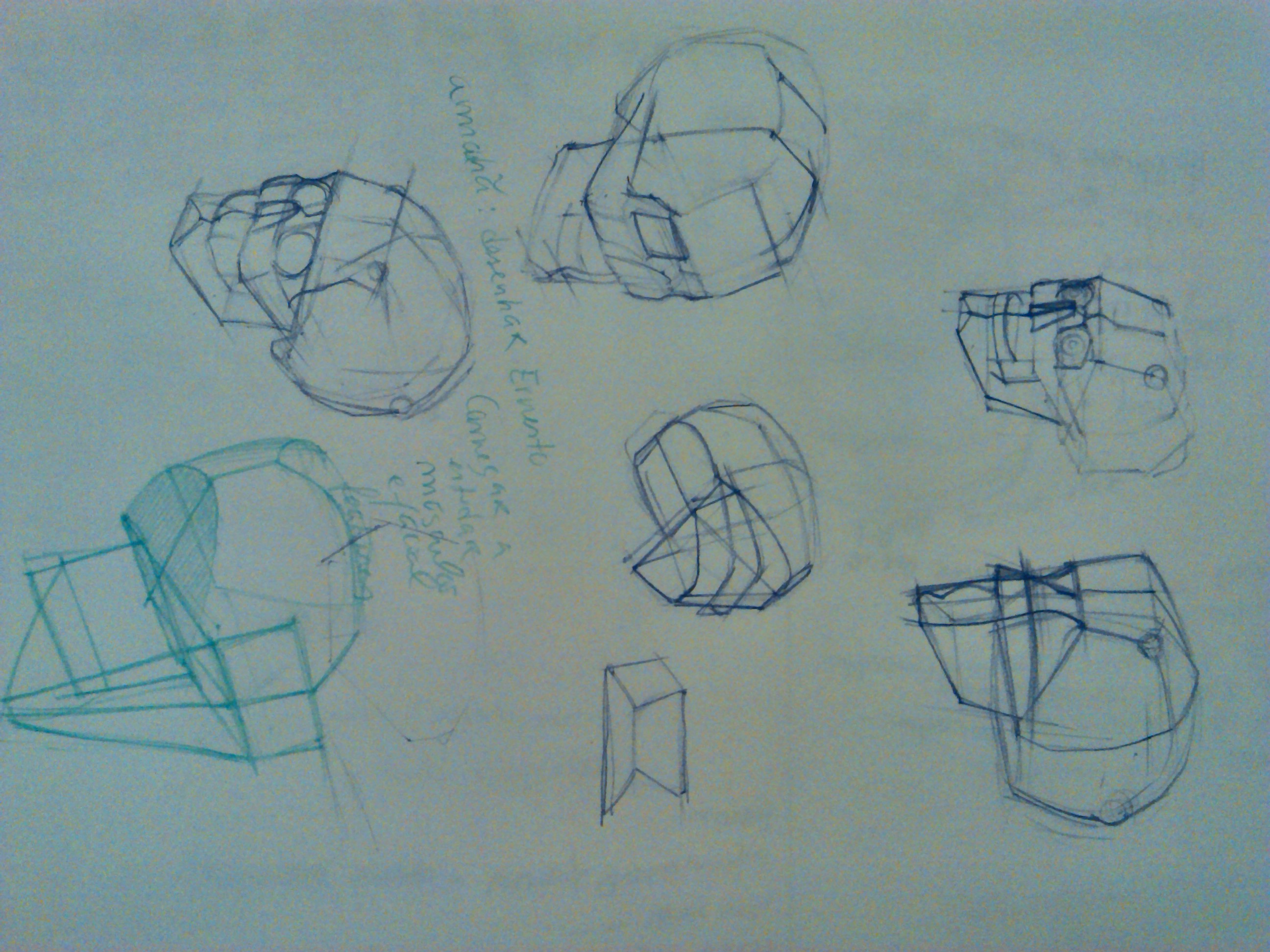
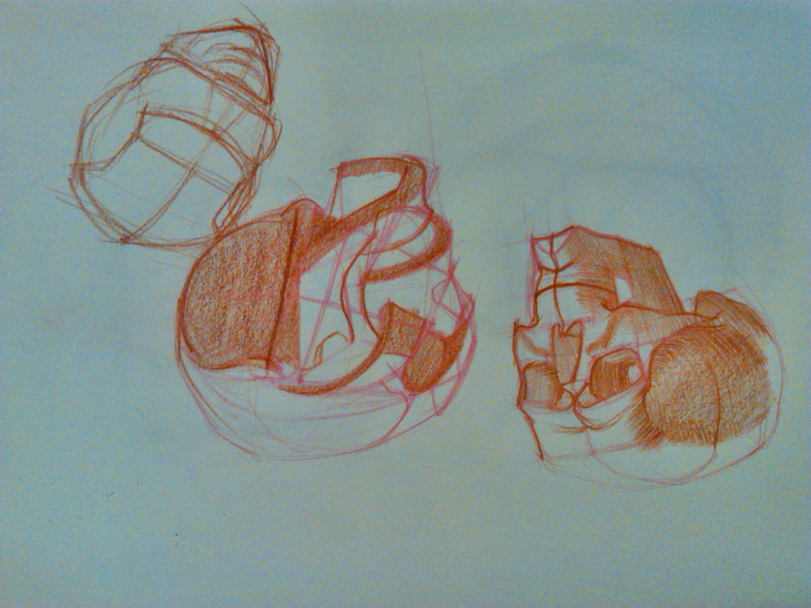
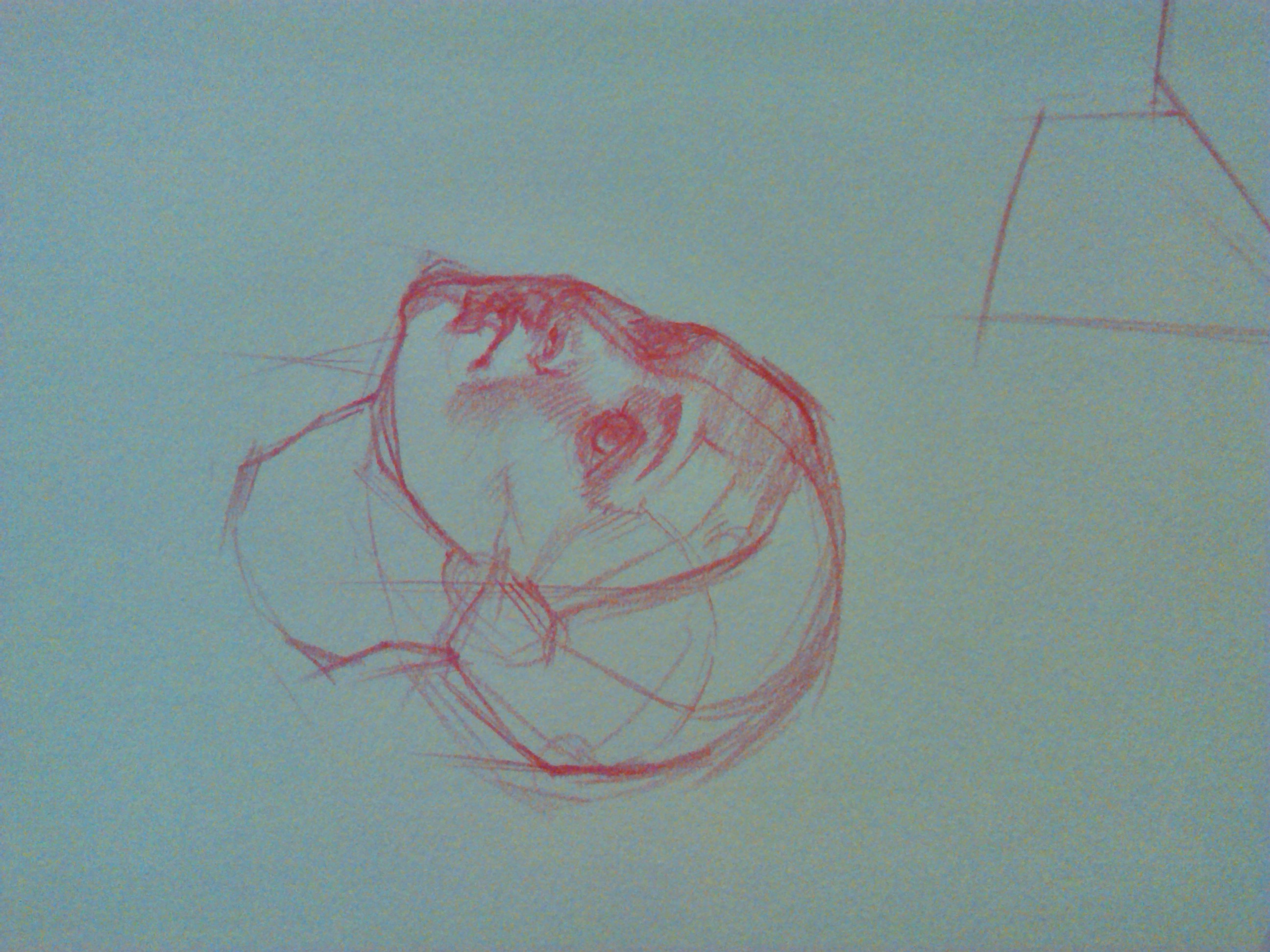
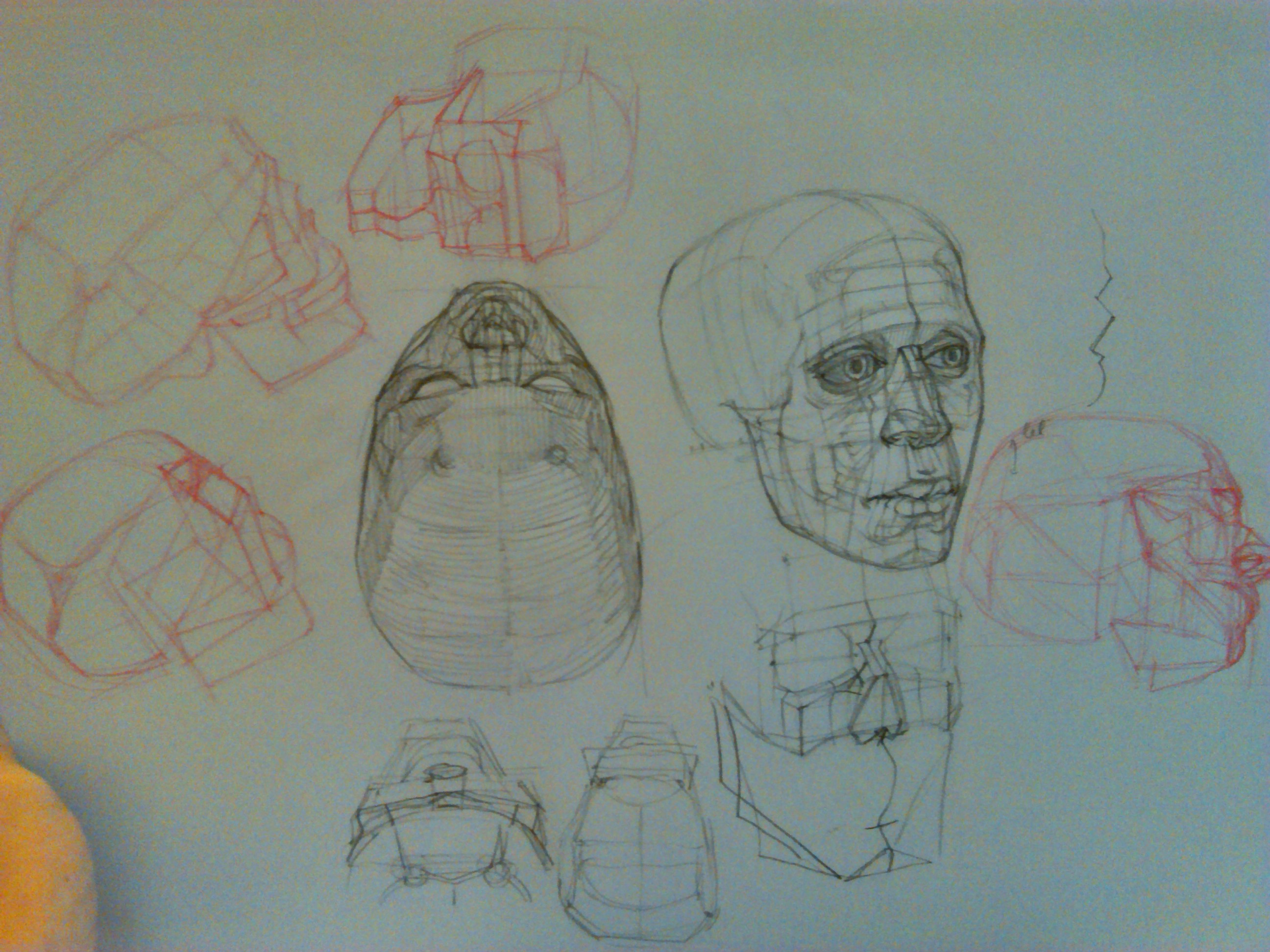
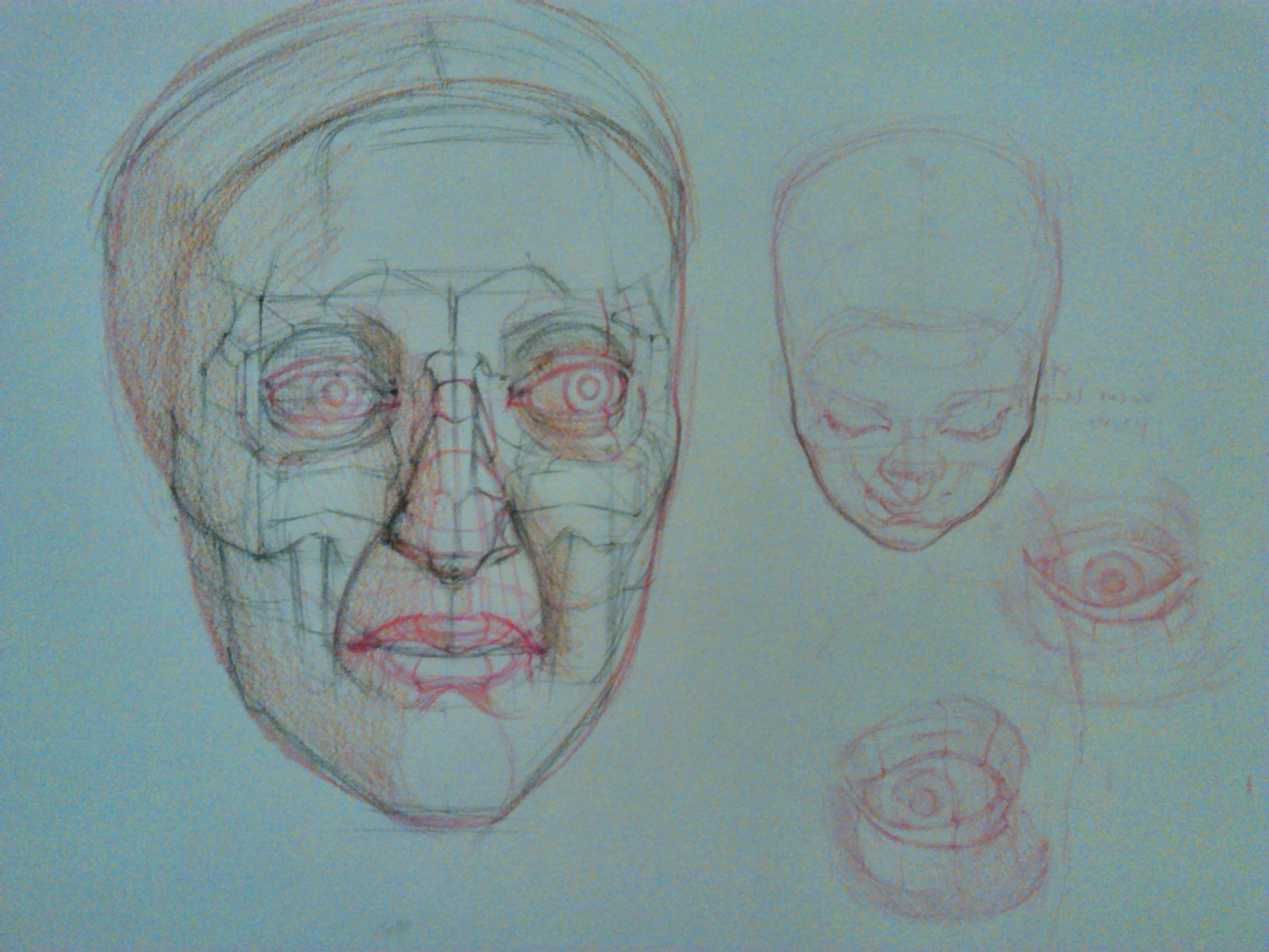
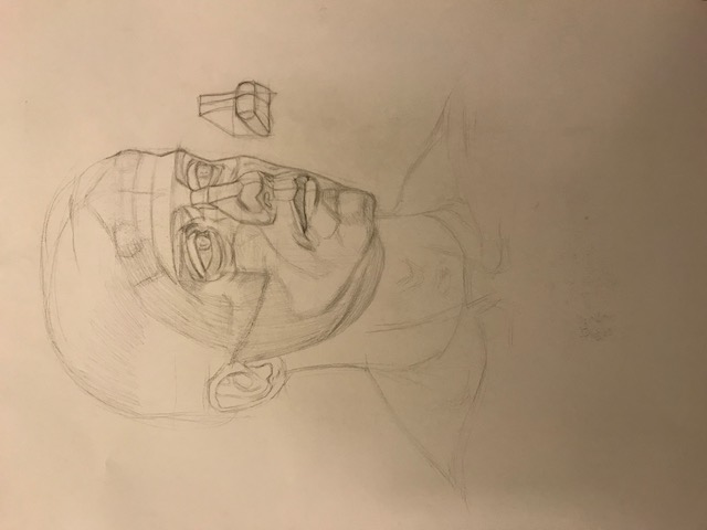
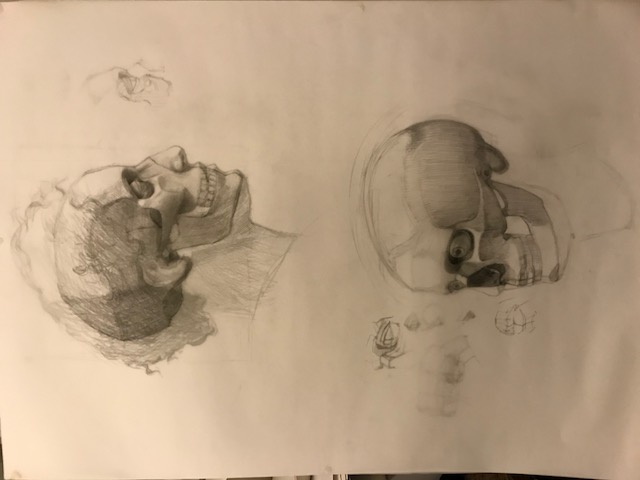
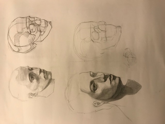
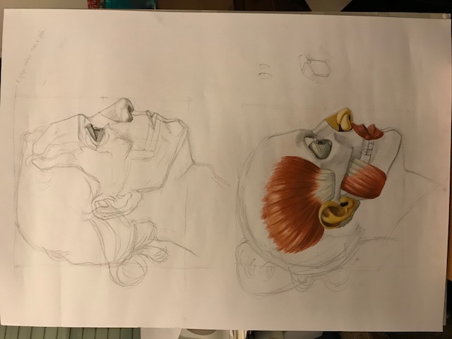
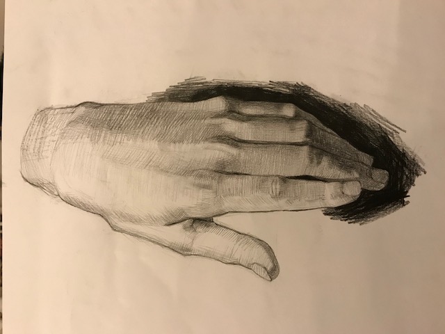
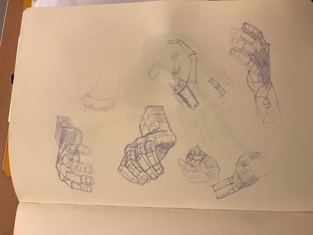
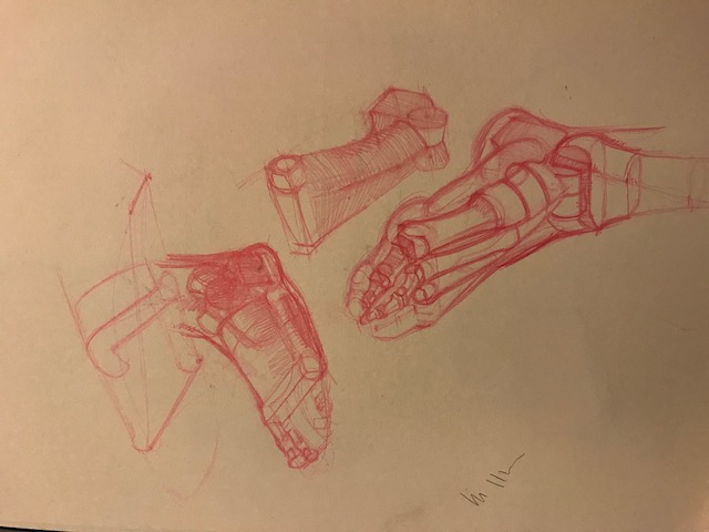
Hello people. The second semestre is starting soon and I decided to take a break from the course to briefly focus on preparing for it. Besides the regular model drawing classes, in our anatomy related subjects we will focus on the head and extremities, so for now I am studying the 3d structure of the skull and head and it's components. I also plan to do some hand and  feet studies soon.


Some images seem to be sideways even though I turned them. My apologies.
Reply
#23
Just had that problem updating my last post. Found importing them into Photoshop (I used Affinity Photo) and exporting them the correct way up as a jpeg sorted the problem.
Reply
#24
Solid stuff man, good work!

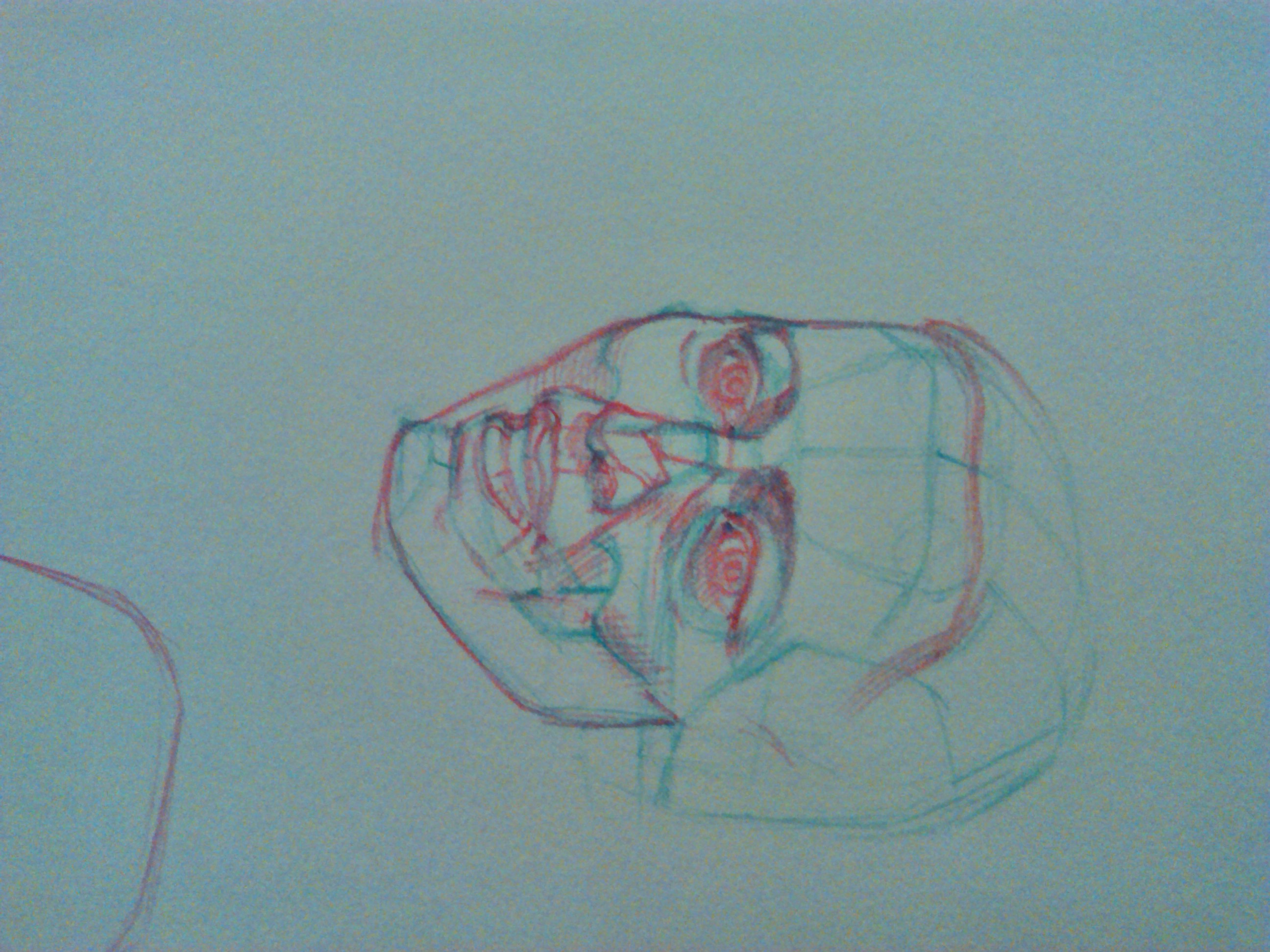
The last head gives me the creeps tho XD

Reply
#25
I have a new ipad pro and just realized it has a thing that can actually be called a camera so I can quickly share some school work now. However I haven't figured out how to resize them to an ideal size so here they are, very small.


Oh god, it's doing the flipping, I don't even care anymore.

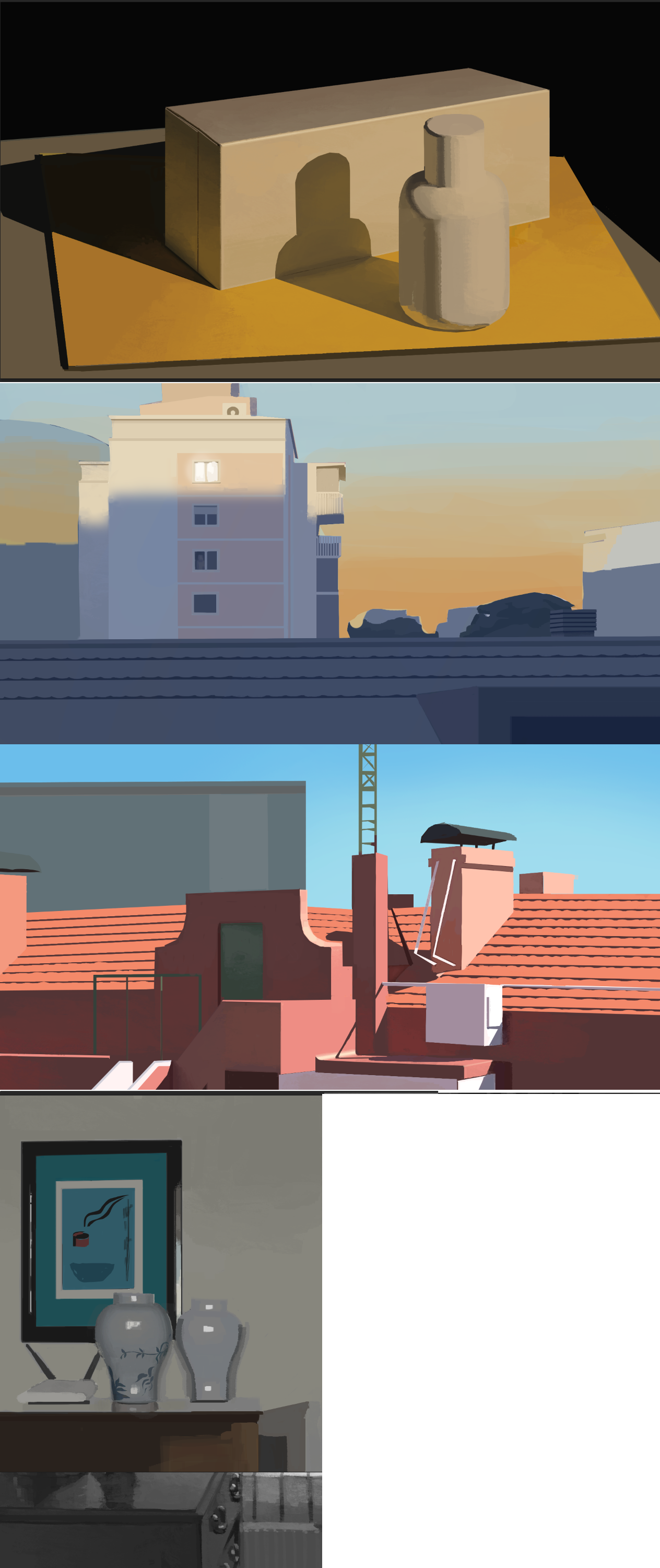
Also, a collection of recent digital paintings I had in hand and the latest thing I managed to make on my ipad.
Reply
#26
Some more things because I am half proud of them or something.


Reply
#27
Hmmm...


Reply
#28
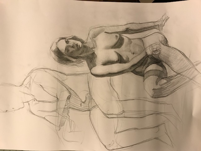
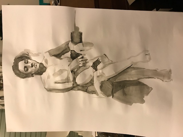
Beautiful studies! Loving the values on the figures. Latest still lifes are awesome too!! Keep 'em coming!!! :D

Reply
#29
Wow, I've got my eyes glued on this sketchbook! Great improvement! What art college are you attending? Also those facial planes diagrams remind of me of both Mogilevstev and Bammes, what anatomy books are you working out of? Lovely stuff, sorry I've got no critiques and only questions haha <3

Reply
#30
Hey guys, thanks for the comments.

Anteriorrhexis:
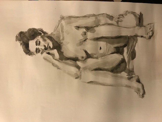
Thanks man. I'm attending a regular fine arts school where I live but I must say unfortunately it has nothing to do with my improvement, and I've got other reasons to attend.
Yeah, Bammes is my favourite, I use every book I can find by him. I am also a fan of the russian school, but then again, they are heavily inspired by Bammes so might as well use the source if it's that good.
-------------------

After exams, restarted study of rendering. Soon will be following a summer plan that will take me back to the basics of what is needed to make a picture.
Here is some stuff:


Reply
#31
Excellent value and edge control, your experiments with lighting look like a ton of fun. What type of images specifically do you want to make? It might be faster to try to create an original concept or painting that you love, and then study the areas that are holding you back. But from the looks of it, your pace of improvement is pretty good, so keep up the great work!

Reply
#32
Hello people. It's been a while. I guess I pretty much graduated or something. For the next year I will be focusing on self studying and finally consolidating the issues I did not have the time to develop in school, and preparing a portfolio towards the end of it. There is not much worth showing from my past year in school, as everything was very rushed.

Firstly I will be redoing the Painting with Light and Color course of schoolism alternating with the Fundamentals of Light Course. I was stupid to abandon so soon as I was starting to understand things my study of rendering in favor of other subjects so my skills have degraded. Now I plan to stick with it continuously. Also my bad that I did not adequately translate my observation abilities into a process I could use independently, for that purpose I will do the assignments of "Fundamentals of Light" which are mostly imaginative. I will complement this with master studies relevant to the theme being explored, and may occasionally decide to delve deeper into the subject.

After concluding these courses while continuing to keep sharp my acquired rendering skills I will do some more courses that focus on abilities to produce an end product and derive from them what I need to study further while also allowing me to have "something to show". I will likely do "Visual Development" with Victoria Ying and then pick something else up.

For now this suffices. 

Expect some slowness and awkwardness as I get back in shape.


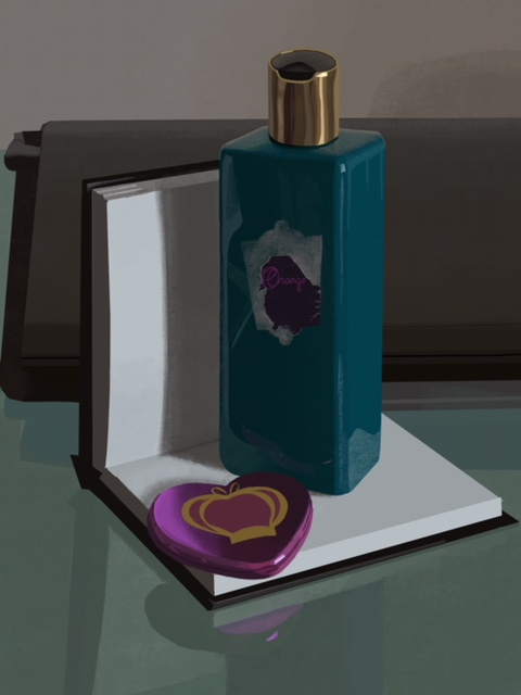
This is something I made for this contest by huion for some of their tablets which I won't win but that was a welcome distraction during my last moments of college despair. By the way, if someone with a screened tablet wants to recommend me one...


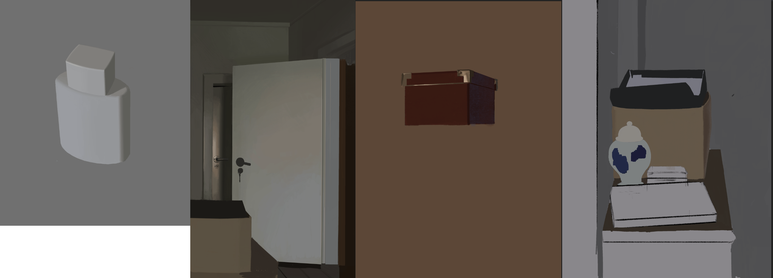
These are some beginnings of work for schoolism on my ipad. I guess i'll work on "light and color" when my ipad is running and on "fundamentals of light" on my computer, when the ipad is out of battery.
Reply
#33
BOY! My back is killing me. Gotta find a way to not be hunched over on my ipad.


So..


The first one... The objects are not sitting well with each other. Maybe they have different levels of contrast. Or maybe they are not interacting too well in terms of the shadows and reflected light. Perhaps I should have pushed the occlusions even though it's not anywhere near the level on the photograph. Also I did not manage to get the translucency of the file organizer thingy to read. I have to make sure i figure it out when I move onto materials. 

For the second one I'm having difficulties on managing the balance between the reflections and the shading on all the shiny plastics I picked. Also the reflection on the wood makes the actual colors ambiguous... I have to find a way to manage these reflections. Will have to experiment with further shiny objects. hmmmmm
Reply
#34
I am more concern about your value than anything right now i think you should invest more in understanding how the material reflectivity affect your object value at a greyscale level before you jump into color.

You manage to choose object with great bold color but you seem to have toned them down in favor of those sad less vibrant color

Sometime artist don't take the full advantage of photoshop and it can slow your learning process down.

Here i applied a few saturation correction and even throw in a auto color to see if i did like what i saw  and it did and it was actually pretty surprising.Sometime you have to go with the lasso and wand and select certain element to correct them individually.

My advise is don't be afraid of slider and menu it a learning curve like drawing you start by trial end error and i eventually you start to tame the beast.

One little note i am no expert in photography but when i zoom in there it seem to be like some kind of graininess randomness that shouldn't be there maybe it something concerning exposure idk if you see what i am talking about.Zoom on the red paper you should see it.


Attached Files Image(s)


My Sketchbook

Perfection is unmeasurable therefor it impossible to reach it.
Reply
#35
I am drawing on my ipad which makes the colors and values appear brighter and more contrasted than on the computer, so when I change it around it dulls things. Not sure if I can change it. However the photograph is not a good indication of the saturation of the colors, and your adjustments make the scene very garish compared to what I was seeing, and break the ambiance and kind of light that was illuminating the scene.
I am still going to adjust the plastic objects for their subsurface scattering to make them more vibrant (and just do what is missing lol) but not sure if I'm gonna try to bring it to Photoshop since these are not for show anyways.
Reply
#36
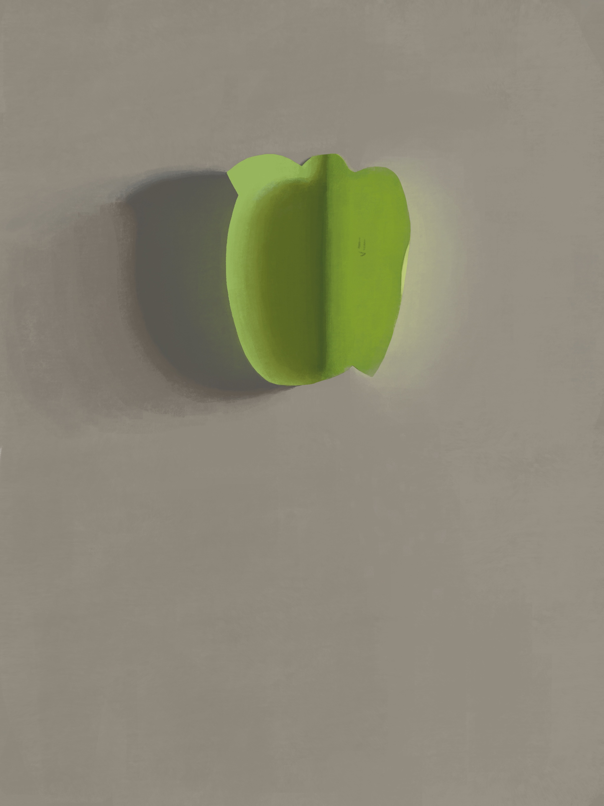
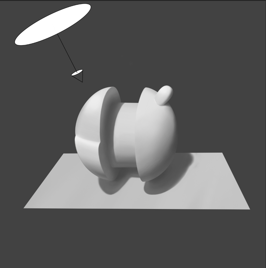
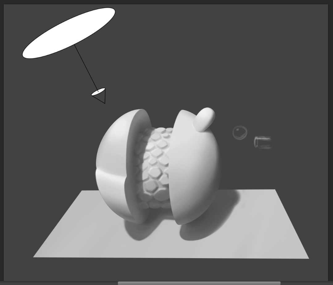
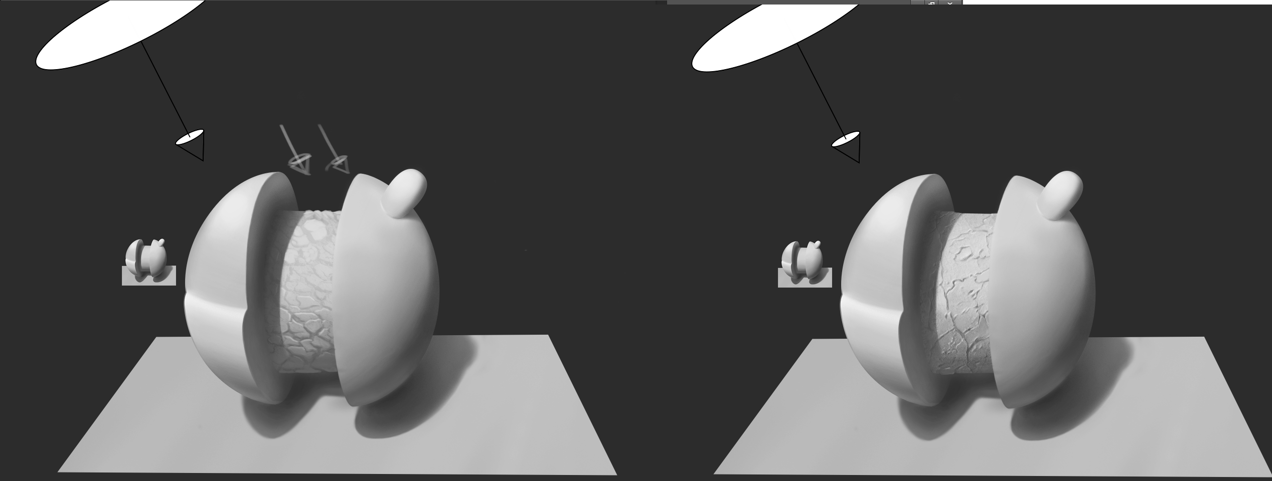
Assignment 1 of Sam Nielson's course. The objective is to paint the object with the given light source and the information that it is matte. I think I am still supposed to add some some texture and a fill light source. 

Hmmmm.... the cast shadow looks a bit crooked, although the perspective of the ball and lightsource were also ambiguous so had some difficulty plotting it. Also not sure if the lil blob's shadow would be visible and to what extent.
Can't wait to finish and compare with his assignment corrections to see what else I did wrong.


Reply
#37
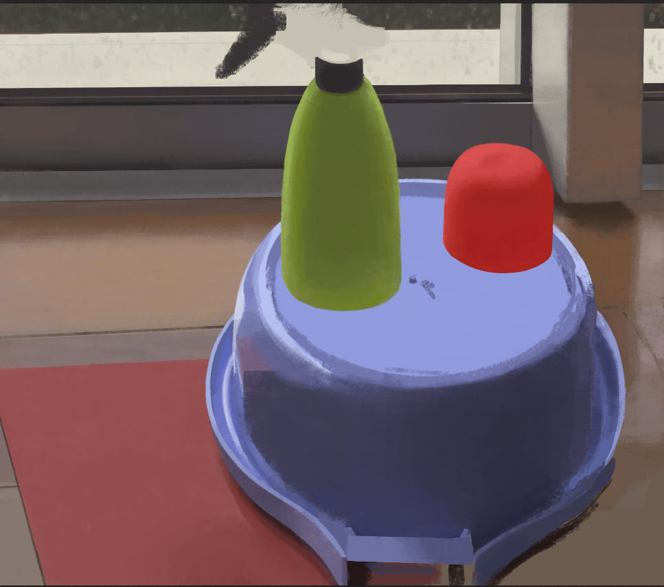
Notes to self as I redo the washbasin. I think I might start pouring the thoughts that come to me as I paint here so as to both organize my thoughts and keep them for later, since doing them on the painting is confusing.

Well, I have clearly relearned now that for an object both matte and reflective you DO have to do the whole object with the whole matte shading first before you add any reflections whatsoever because then you'd have to work around the reflections to get the full values which is so stupid I can't believe I was doing it. 

I am spending a long time on this but I man, I feel my brain finally coming back to actually being present during my painting process. Hopefully I can continue to make sense of these things.

Also, I must remember when I do the matte layer of the object I still have to add the soft reflected light bouncing on it as it would on a completely matte object, which is modifying the value and color of the surface, even before the reflective "coat" layer is applied. I must think of it as if the reflective layer is a superficial coat of polished and smooth particles but that not being dense (molecules far apart microscopically) in plastic let's you see into the matte and diffuse (still overall roughened) object that underlies it. This would be in contrast with metallic objects that appear to be inherently reflective probably because metal is microscopically so dense that when you polish it you can't see past the mirrored coat. 

Finally I noticed nicely a thing I remember being explained in lesson 5 which is the rim of the basic on the "shadow side" still catching a bit of the light coming from the portion of the window that is further up. Otherwise it is blocked but still manages to be a bit lit up, which is cool. I love comparing the relative sizes and shapes of area sources with the kind of effects they produce. Like a slim but vertically very stretched light source will produce an almost normal shadow side to side but soften it front to back.


Anyways here's the painto, still in progress.


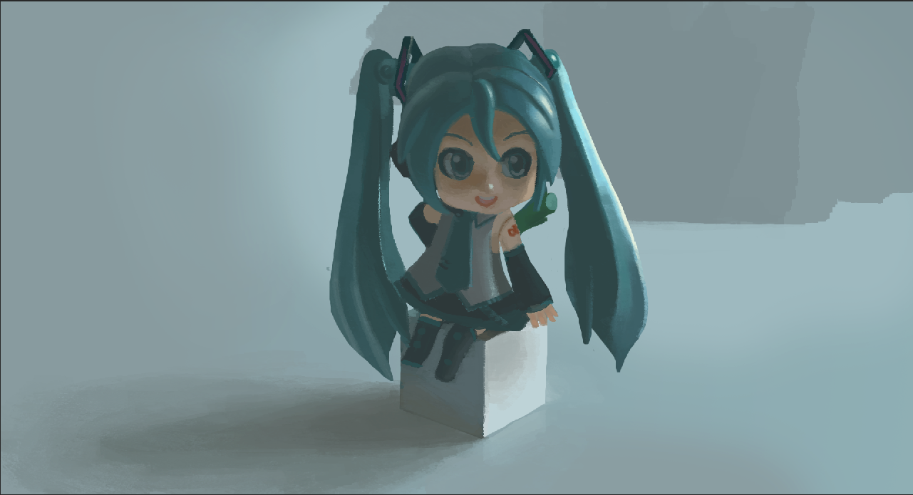
Also, I really have to find a way to have the ipad at my eye level. It is so uncomfortable to draw bent over it that I can't do it more than 45 minutes at a time.
Reply
#38


......
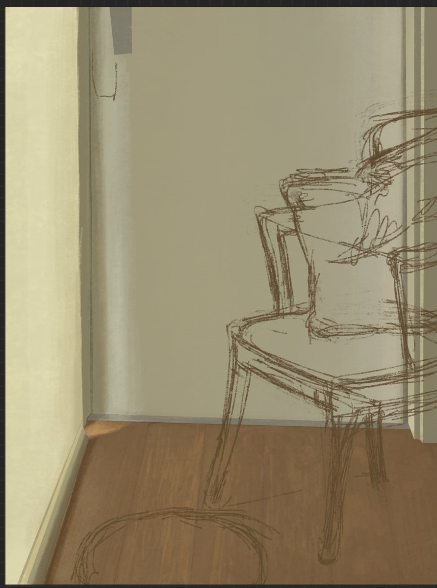
this is not going so well...
Reply
#39
Well. This is clearly not working at all. I will have to dedicate some study time for this subject. Need to do some study from life or reference, maybe from other artists. But right now noodling about is not having any effect.


Reply
#40


hmmmmmmmmmmmmmmmm


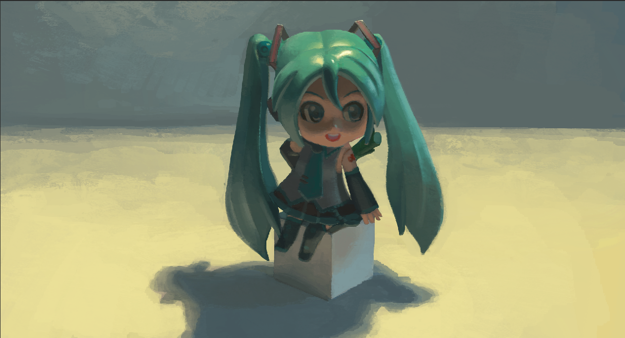
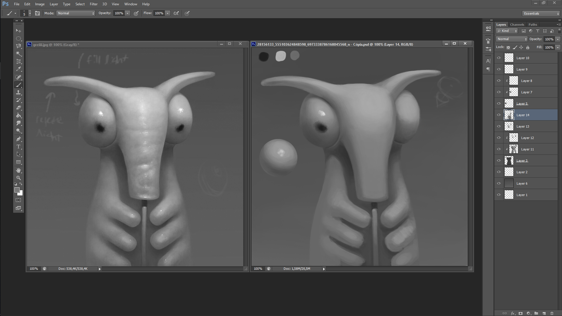
The master study's original is by roberto padula. Ignore the shapes as I didn't pay much attention to them. The objective was to look at the light direction and seeing how that affected the tones, how the process would work from scratch. The "sphere test" thing is actually pretty useful, even though I failed to describe the right light direction with it, that would come more from the top than what I painted.
Reply


Forum Jump:


Users browsing this thread: 20 Guest(s)