Posts: 235
Threads: 9
Joined: Oct 2012
Reputation:
6
Hey guys! Couldn't resist throwing my hat (and stylus?) into the crucible for this one.
I've settled on a sort of Japanese Strategy RPG theme and derived a small backstory to motivate my choices.
I'm fairly happy with these, so I'll likely just do composition thumbnails tomorrow. After that I'll proceed to steadily craft a final until a few days before due date.
Ref Board:

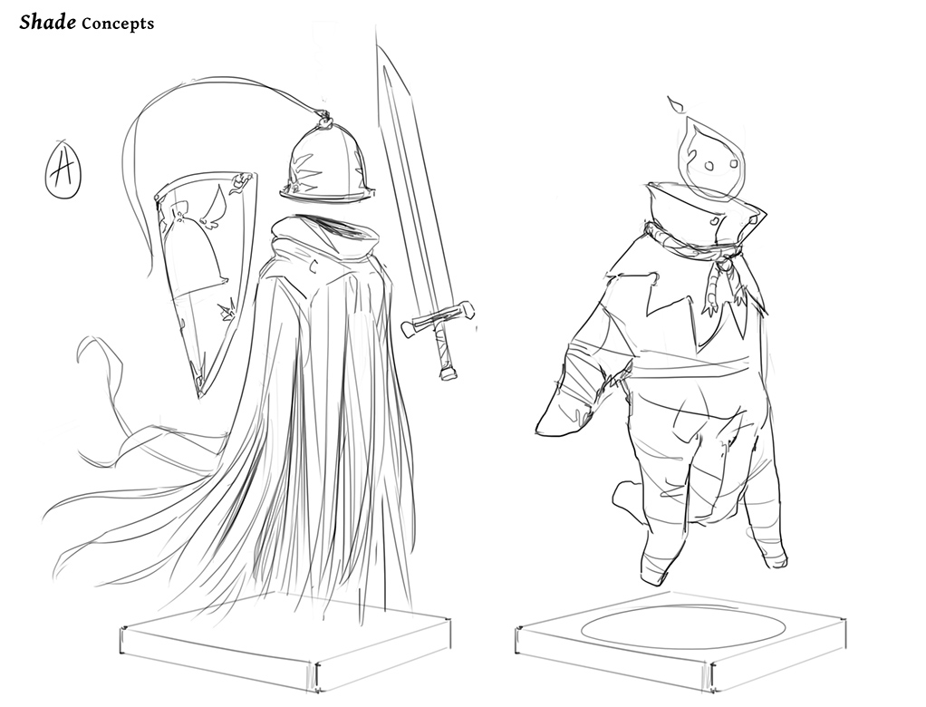
Initial sketches for Shade

Rough Sketches for Wisp & Shade + 1st value separations.

Posts: 559
Threads: 6
Joined: Jul 2015
Reputation:
68
Hey Einver,
Your preliminary designs are very well done - love to see them finished - BUT an important part of the Crucible Brief is that it's Halloween themed. I see in this a very Japanese fantssy theme, but in the final just make sure to bring it all back to what the Brief is asking of you. Keep up the great work!
Posts: 742
Threads: 28
Joined: Jan 2012
Reputation:
44
These are very interesting ideas and concepts. I really want to see the finished piece! Just as RP mentioned, make sure the theme is recognizable.
{Easy trick - just throw some pumpkins here and there in the environment}
Good luck! :)
Posts: 235
Threads: 9
Joined: Oct 2012
Reputation:
6
RottenPocket: Ah, that's definitely something I struggled with in the character designs. I have a hard time not associating Halloween with pulpy or cheesy things, and tried to stray as far away from that as I could, haha.
This is why the preliminary work is important though. I'll imbue more Halloween themes as I move forward! Thanks for the feedback.
Piotr Jasielski: For sure! I still have colors and comp elements (Like pumpkins!) To help me do this. Thanks for the comment.
**EDIT**
After a bit of consideration, I recycled what I had started on yesterday. Not trying as hard to juggle the JRPG theme with this one.

Posts: 1,424
Threads: 12
Joined: Dec 2015
Reputation:
139
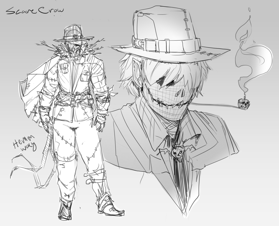
Really nice concepts here Einver - I love the glove creature scarecrow especially - great imagination.
Keep it flowing :).
“Today, give a stranger one of your smiles. It might be the only sunshine he sees all day.” -- H. Jackson Brown Jr.
CD Sketchbook
Posts: 235
Threads: 9
Joined: Oct 2012
Reputation:
6
Thanks, Artloader! I'm having way too much fun designing these themes and characters.
Little update today. I'm configuring the narrative and placement of elements.

I think I'll be able to make this piece ooze Halloween and still have it feel fresh to me.
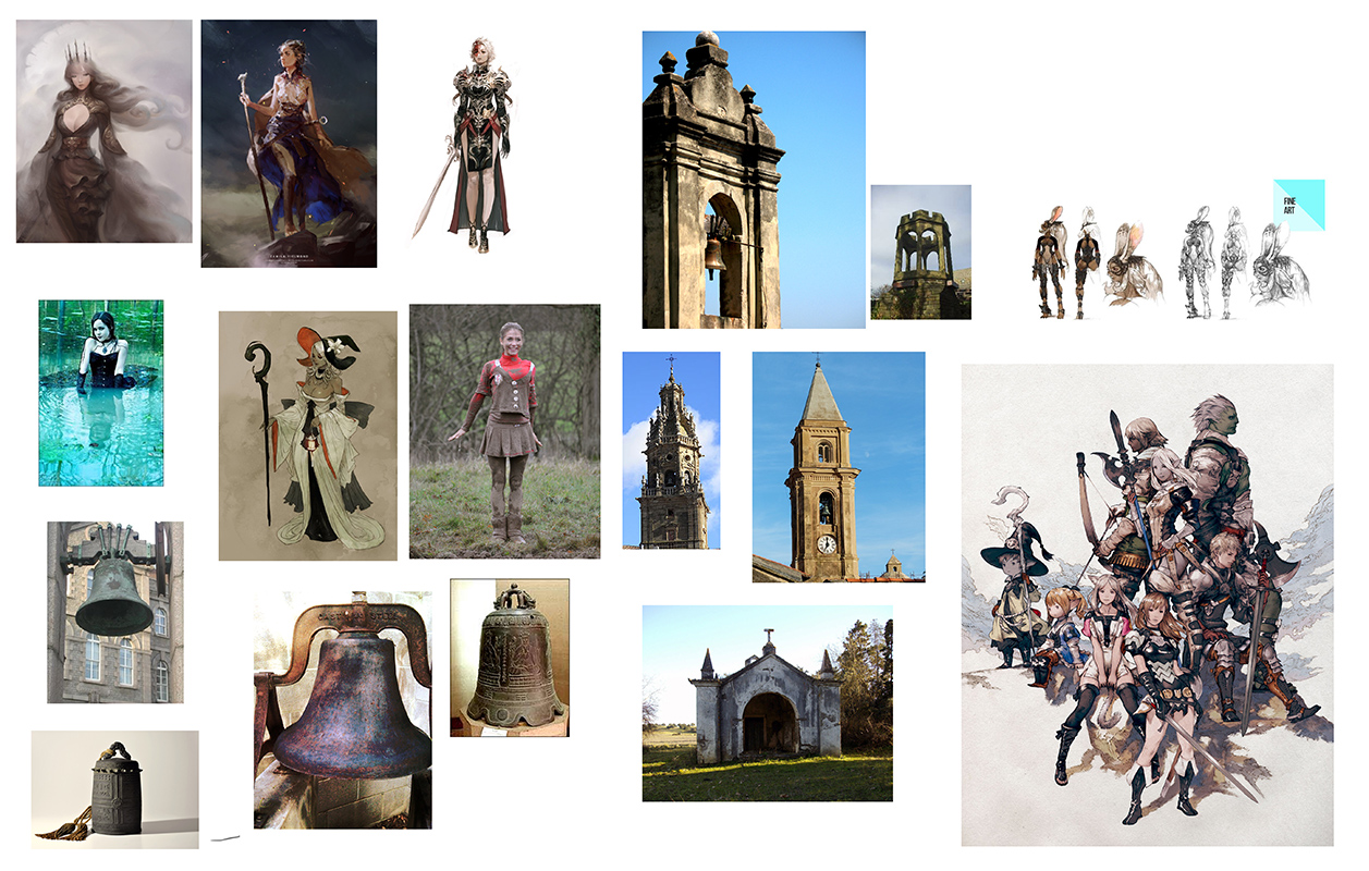
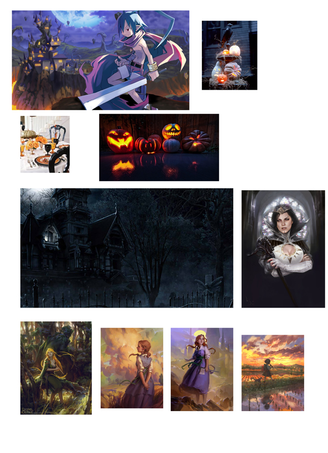
Here's my ref board for composition, mood, light, and style:

I like putting amazing art in my ref boards, because then I feel like I can more unashamedly stand on the shoulders of the artistic giants that inspire me to grow.
On a related note, I've recently had a small flood of commissions come down the pipeline-- super blessed, but also busy. Gonna have to really prioritize in order to make the deadline with the level of finish I'm aiming for.
10 hours minimum on the final is my plan at this point, started on Sunday after I do a few color/light studies.
The plan:
Strong, yet loose enough drawing of final comp - Convert the lines to a warm hue
Color pick from my studies and lay in a rough light/value scheme
Paint the nights away listening to podcasts and Jrock until done.
Posts: 1,970
Threads: 22
Joined: Apr 2012
Reputation:
243
Do it Boi! I like the feeling in the comp sketch, and I like the designs you got developing. hope you prioritise this to a finish!! :)
Posts: 413
Threads: 11
Joined: Mar 2013
Reputation:
10
I dont know what u doing brah, but i love them drawing you got going on. Love that hand character, is super cool. Keep it up!!
Posts: 1,424
Threads: 12
Joined: Dec 2015
Reputation:
139
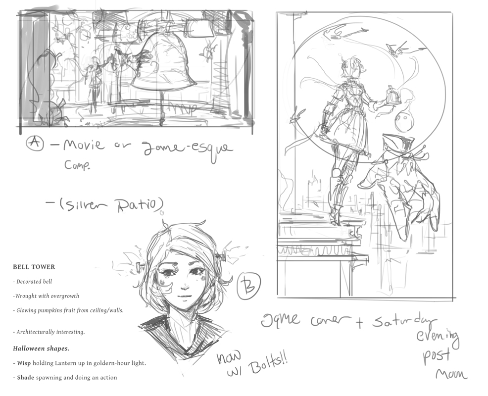
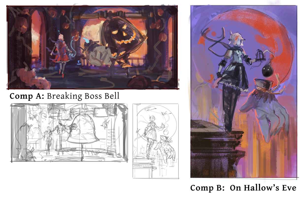
Very cool design work here Einver. The comp in the bell tower is calling to me somehow. Really looking forward to seeing where you take this.
“Today, give a stranger one of your smiles. It might be the only sunshine he sees all day.” -- H. Jackson Brown Jr.
CD Sketchbook
Posts: 742
Threads: 28
Joined: Jan 2012
Reputation:
44
May I ask where did you get this Min Yum stuff?
Posts: 235
Threads: 9
Joined: Oct 2012
Reputation:
6
(10-15-2016, 10:00 AM)Amit Dutta Wrote: Do it Boi! I like the feeling in the comp sketch, and I like the designs you got developing. hope you prioritise this to a finish!! :)
Thank, Amit! I'm enjoying that one as well. The color rough was interesting to work on. At this point I should be able to finish this up!
(10-16-2016, 12:40 AM)Jeso Wrote: I dont know what u doing brah, but i love them drawing you got going on. Love that hand character, is super cool. Keep it up!!
Ha, thank you! I took a break from just drawing today to work on some of the other fundamental aspects :D.
(10-16-2016, 04:43 AM)Artloader Wrote: Very cool design work here Einver. The comp in the bell tower is calling to me somehow. Really looking forward to seeing where you take this.
Haha, I like that one too! My concern is having it be too much about the bell, but I love the color I'd be be able to bring to it.
(10-16-2016, 10:23 PM)Piotr Jasielski Wrote: May I ask where did you get this Min Yum stuff?
Sure thing!
[url=https://s-media-cache-ak0.pinimg.com/564x/f3/cf/9d/f3cf9df567d0b9ddc434885ce6edf20a.jpg][/url]
https://s-media-cache-ak0.pinimg.com/564...edf20a.jpg
https://s-media-cache-ak0.pinimg.com/736...feba51.jpg
https://s-media-cache-ak0.pinimg.com/564...87e964.jpg
No real sauce unfortunately, just cruising google.
WIP:
Here's today's update! Trying some things with color and design.

Looking back, I think the bell tower was the easiest to work on during this phase.
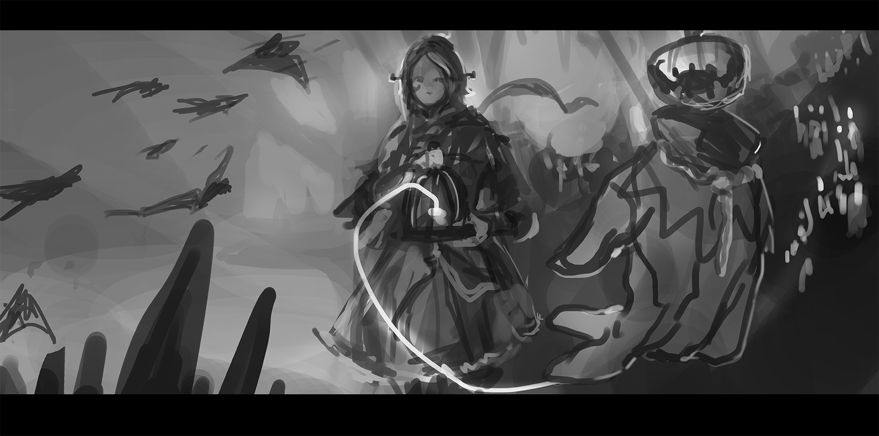
That being said, though I felt I should try at least one more comp without color. This one was about values and utilizing the silver ratio again.

I don't know which one I'm going to choose yet, I'll figure it out tomorrow after I sleep on it and proceed to work on some client stuff.
Posts: 501
Threads: 10
Joined: Jan 2013
Reputation:
20
Posts: 101
Threads: 6
Joined: May 2016
Reputation:
10
Love that last comp, but they all look great! Look forward to seeing it fully painted :)
Posts: 235
Threads: 9
Joined: Oct 2012
Reputation:
6
(10-18-2016, 04:46 AM)Hobitt Wrote: looks great so far! Thank you! Way more prep than I usually do.
(10-18-2016, 06:06 AM)BadWoolf Wrote: Love that last comp, but they all look great! Look forward to seeing it fully painted :)
Haha, I has a special feel to it. Thank you! I'd love to work with that ratio some more, but perhaps after this challenge is over.
UPDATE:
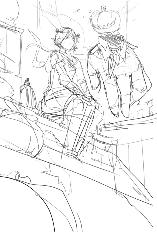
Finally set on a comp. I knew I was going to do 4-5, but the 4th one actually has the best fit for the challenge I believe. It's also a step away from my comfort zone comps and angles.


What better time to challenge yourself than during a challenge, no?
I feel like I've already learned a lot, haha.
Time to apply the magic of discipline and get this wrapped up before the 29th.
Posts: 413
Threads: 11
Joined: Mar 2013
Reputation:
10
This shit is looking dope bro. love the design, and the environments. only critique i have is to bring a bit more emotion to the girl's face somehow. Keep it up!
Posts: 73
Threads: 2
Joined: Oct 2016
Reputation:
12
Don't mind me, just going to add Min Yum to my list of favorite artists.
Awesome to see so much exploration. Nice line-work too. Hyped to see the result!
Posts: 742
Threads: 28
Joined: Jan 2012
Reputation:
44
Just one quick crit - i like your sketch a lot but I see one major issue which is the placement of characters in your composition. It would be probably better to move the whole sketch just a bit down. Of course you can still make this work with the value weight and color intensity tricks, but it will be much harder (if you did that would be actually very impressive, but don't think that way).
Posts: 235
Threads: 9
Joined: Oct 2012
Reputation:
6
(10-20-2016, 01:51 PM)Jeso Wrote: This shit is looking dope bro. love the design, and the environments. only critique i have is to bring a bit more emotion to the girl's face somehow. Keep it up!
Thank you! I tried to bring a bit more in the final version.
(10-20-2016, 03:06 PM)Hozure Wrote: Don't mind me, just going to add Min Yum to my list of favorite artists.
Awesome to see so much exploration. Nice line-work too. Hyped to see the result!
Min Yum is an amazing artist. He recently became one of my favorites too! Much of my final is inspired by him.
Here's a vid he did for ImagineFX in case you're interested - it's in 3 parts:
https://www.youtube.com/watch?v=ZQ2hOZn-fnI
(10-20-2016, 05:08 PM)Piotr Jasielski Wrote: Just one quick crit - i like your sketch a lot but I see one major issue which is the placement of characters in your composition. It would be probably better to move the whole sketch just a bit down. Of course you can still make this work with the value weight and color intensity tricks, but it will be much harder (if you did that would be actually very impressive, but don't think that way).
Great crit, thank you, Piotr! I bumped it down.
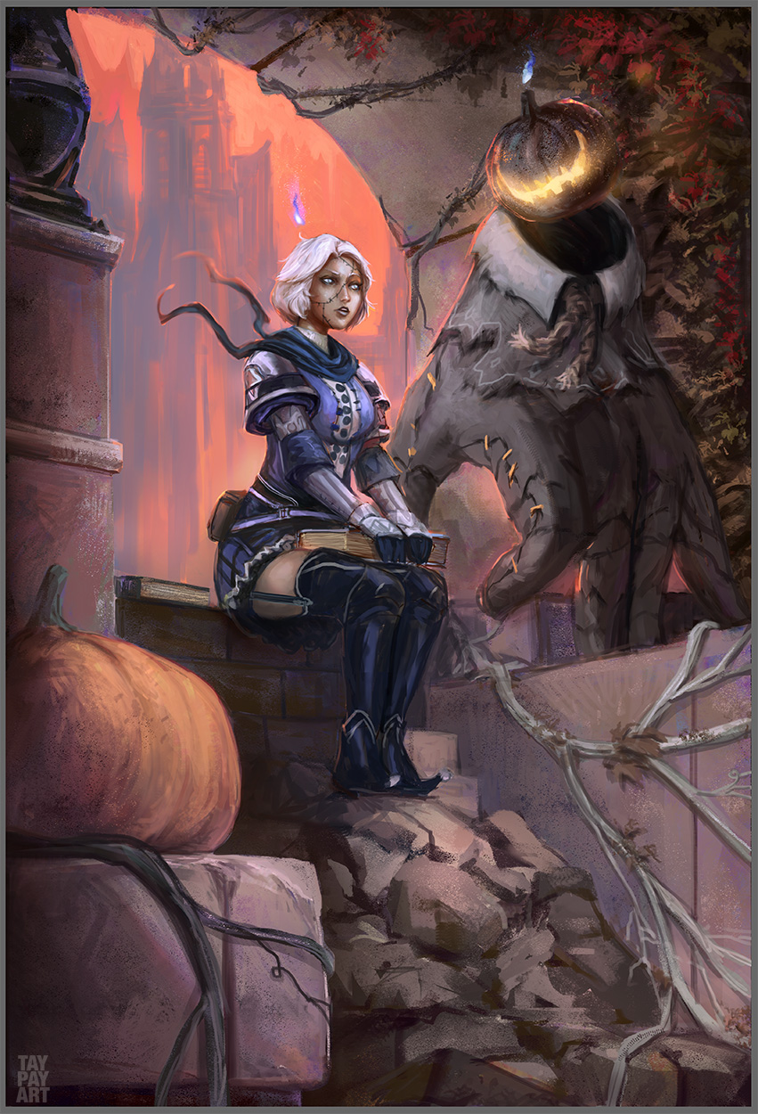
Aaaaaand here's my final.
hard to believe I had even MORE work show up in my inbox when I started to get obsessed with this piece.
I think I logged about 10-12 hours into the final?
Still, I can't divide my energies any further-- I get too involved in personal pieces when I should be serving my clients, so here's the final and a couple early steps to get there.
I'm pretty cool with the final image, however, I'm REALLY grateful for all that I learned during the process. I feel confident that the techniques I learned here will take me to the next level in terms of skill and execution.


|
