Posts: 530
Threads: 14
Joined: Dec 2015
Reputation:
51
Love the creature ideas!
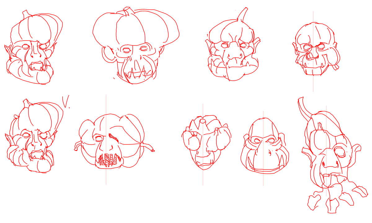
Not likely that you'll be showing its anatomy, but I still wonder how the 2nd pair of scapula and clavicles are attached to the ribcage.
Posts: 101
Threads: 6
Joined: May 2016
Reputation:
10
Love the pumpkin/primate mix, I think that will turn out really cool!
Posts: 1,970
Threads: 22
Joined: Apr 2012
Reputation:
243
I need to see more boxes in these designs...or fail. hah
A box primate pumpkin...yes yes
Carry on!
Posts: 73
Threads: 2
Joined: Oct 2016
Reputation:
12
Looking good so far. I'm interested in seeing how worn and torn you're going to make the creature (considering it's living long after it's owner's death) and how that contrasts with the person. Maybe think about the condition of the clothing-- that could draw up some ideas.
Posts: 235
Threads: 9
Joined: Oct 2012
Reputation:
6
I find it delightful that all the sketches are red, haha.
I'm particularly fond of pumpkin-monkey! The ghost is shaping up as well.
Posts: 530
Threads: 14
Joined: Dec 2015
Reputation:
51
Lots of exploration as usual!
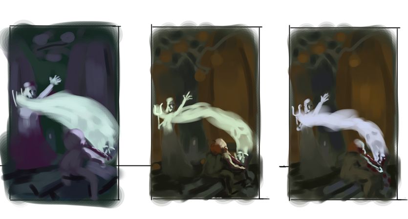
I like the 2nd comp as well (I kept a goose face in the dead soul lines until I really tried to see smth more ghost-like, but I still like the goose more lol).
Posts: 559
Threads: 6
Joined: Jul 2015
Reputation:
68
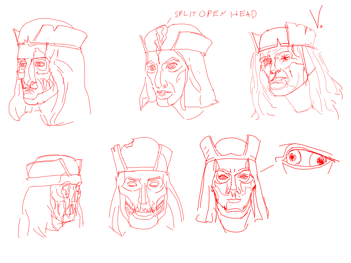
Dang, I would've gone for the 5th thumb in the top image but I know you'll rock your decision. I'm particularly a fan of demony faced vapours/soul sucking priests.
Posts: 413
Threads: 11
Joined: Mar 2013
Reputation:
10
Hey Hobbit! Nice sketches man, I like the color sketch no.8!
Posts: 28
Threads: 3
Joined: Oct 2016
Reputation:
0
Great studies there, totally different style from the sketches.
Looking forward to the final render.


