Failtome of scribbles
#1
Hello : ), I knew about this forum for a while but never made an account. So here I am.
My Permanoobs sketchbook

[url=http://permanoobs.org/viewtopic.php?f=3&t=712&sid=4fc0646fc9c73ed9d5d37b2071e3c579&start=480][/url]
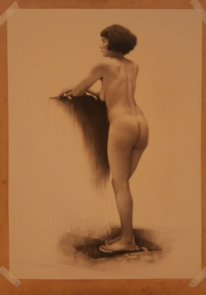
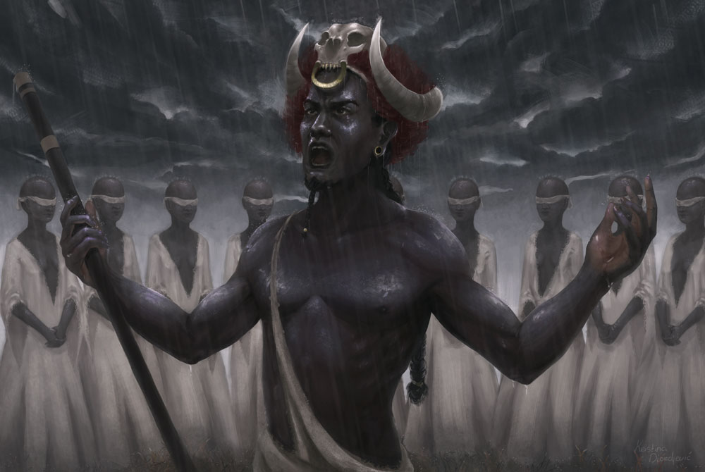
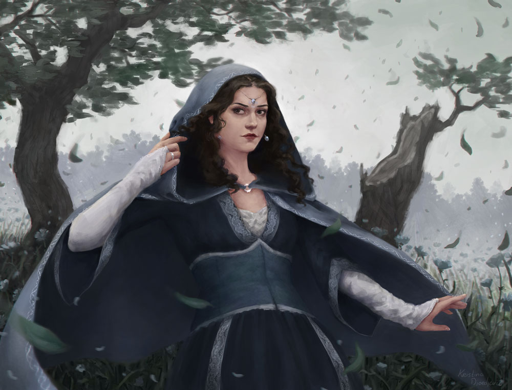
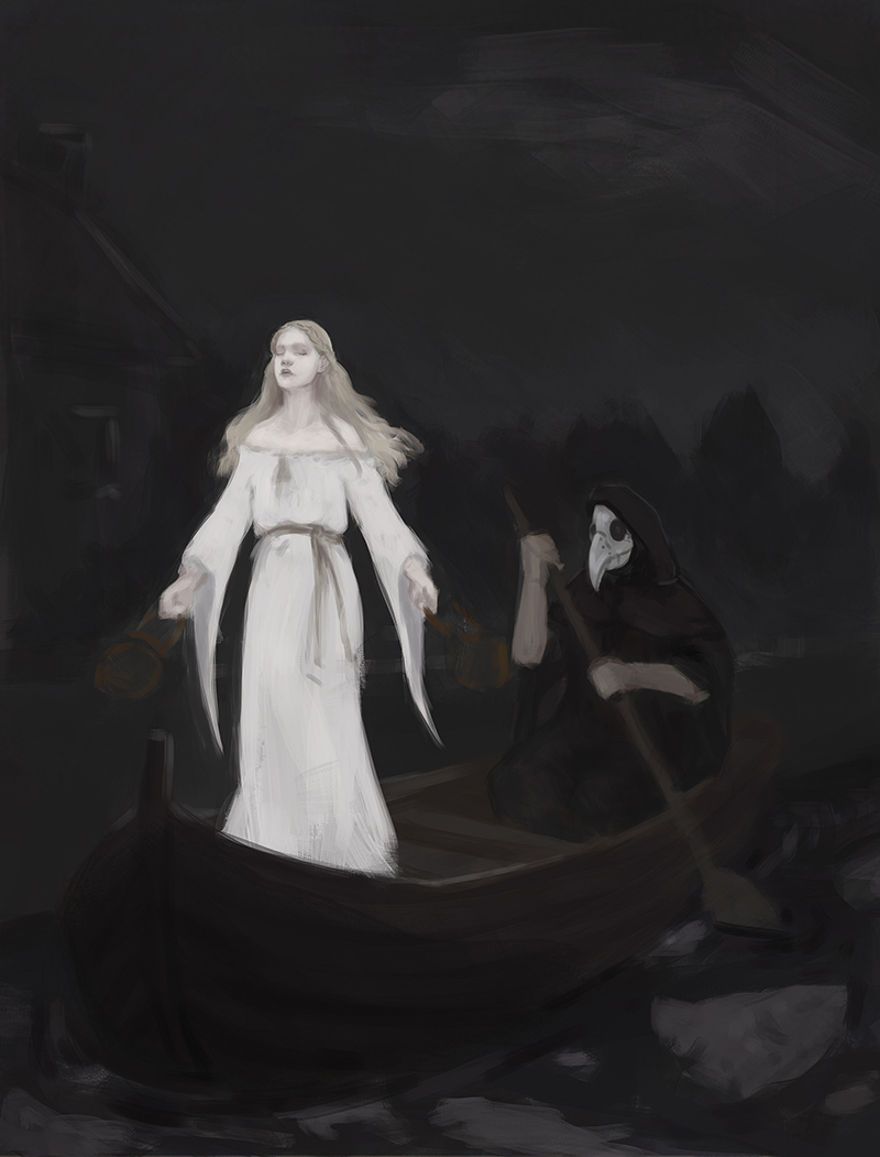
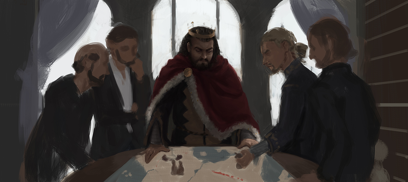
Some stuff:


I'll try to update often!

Reply
#2
Welcome, Good start so far.
Reply
#3
Hey welcome to Crimson Daggers Kristina - glad you finally joined us :).

Your work looks fantastic!

Looking forward to seeing more of your art journey - keep it going and good luck :).

“Today, give a stranger one of your smiles. It might be the only sunshine he sees all day.” -- H. Jackson Brown Jr.

CD Sketchbook


Reply
#4
Thanks guys : )!

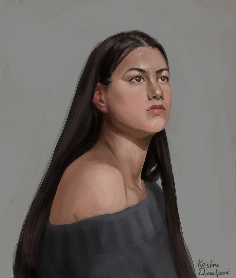
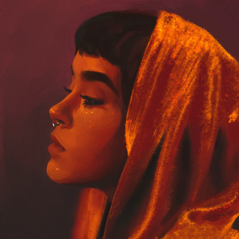
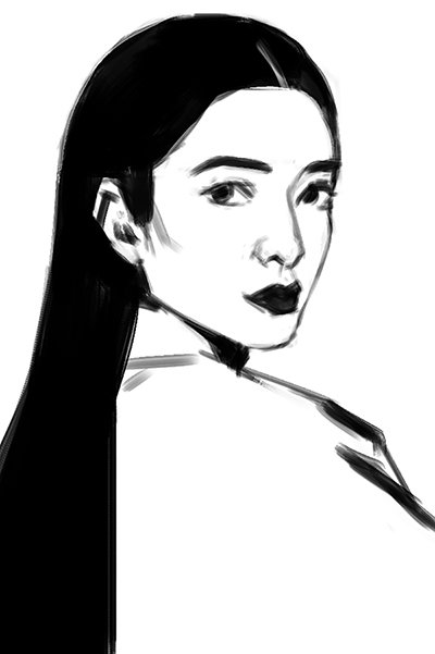
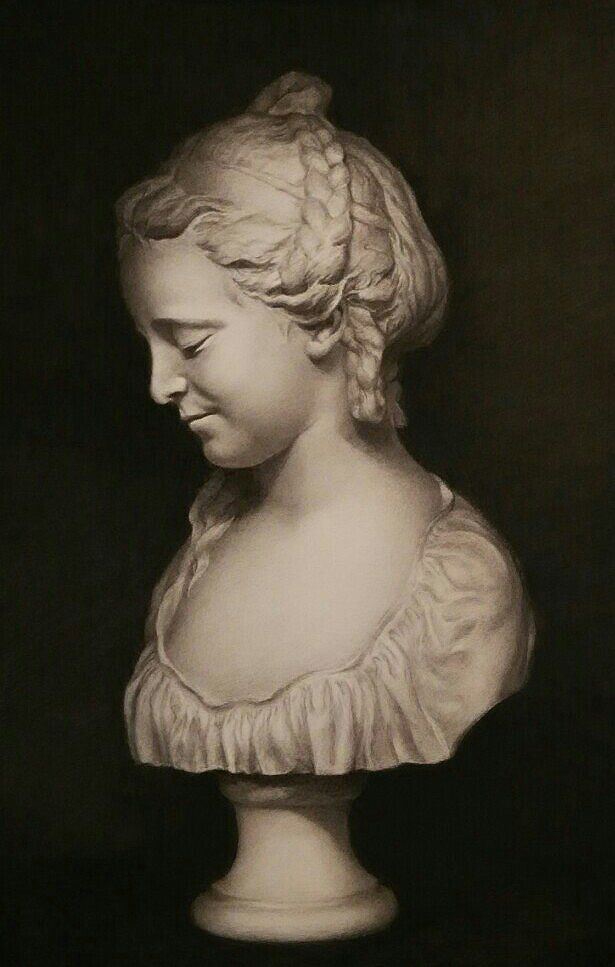
A portrait from life today:


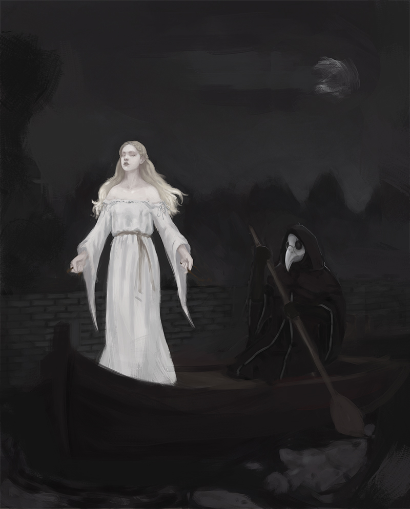
And 2 wips I might be very slow with because I'm not 100% sure about them. If anybody gets ideas or suggestions or critique feel free to tell me!


Photostudy from a few days ago:


I have some studies and imagination-studies but I'll just post those when I finish them and pile them up.

Reply
#5
wip and wip


Reply
#6
wippie wip


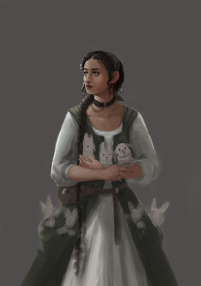
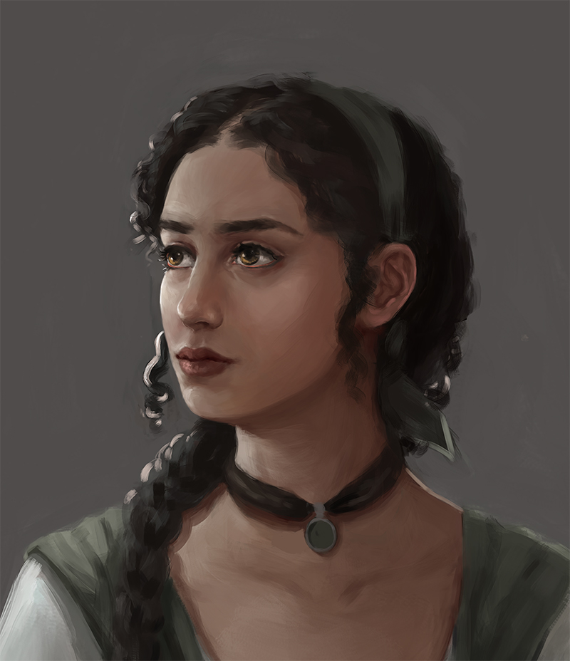
Most of todays work went into the face, cuz I like rendering one part and bringing the rest to that level


Reply
#7
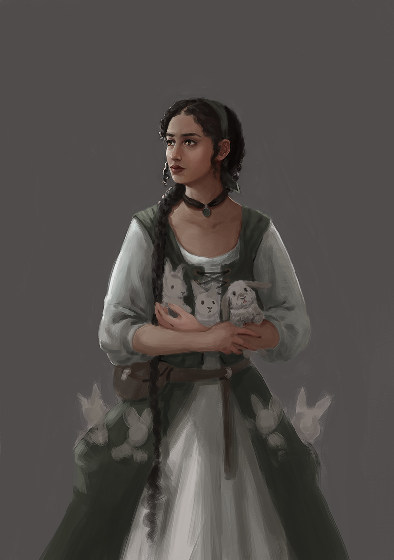
finished this..


For higher res, close ups, etc etc etc...
[/url]


[url=https://www.artstation.com/artwork/qbgkN]


Attached Files Image(s)


Reply
#8
Hi Kristina!
Great work. Most of your stuff looks really solid.

While your form rendering is pretty on-point, I've noticed in your color work that the lighting looks a little fake, or even clay-like. You might benefit from learning more about light physics, to help you conceptualize key points to look for in colored rendering.

These are some really great resources for light theory for artists:
Practical Light and Color by Jeremy Vickery - Amazon (This is also available on Gnomon)
Light for the Artist by Ted Seth Jacobs - Amazon

Reply
#9
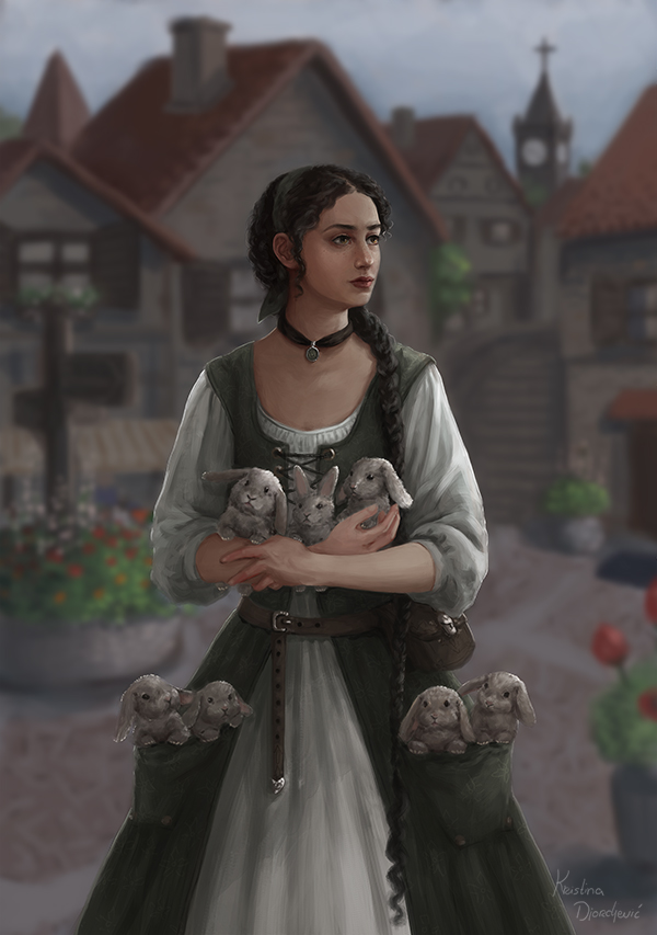
Totally agree with Vicianus, your understanding of forms is really great. I see that you have no trouble understanding this concept. Try find useful resources when it comes to colouring and rendering. I really liked the girl with the bunnies, but what really caught my eyes isn't the overall painting, but the hands of the girl they are very rich in colour where in the face I could easily say she is bloodless :P. Key is exaggeration in that part, try to Shift the hues when colouring (careful with the values though). The book recommended by Vicianus is good and I would also recommend you to look in James Gurney and his book, Light and Color. Amazon Book

Keep up the good work, looking forward to seeing more from you ^_^

Reply
#10
This is really minor thing to critique, but did you use reference for bunnies? Because they eyes are looking little unrealistic, which make them look like plush toys. Rabbits are prey animals, so they eyes are on side of head, not in front. So when you look them front, eyes don't look round at all. And If head is lightly turned, other eye goes completely out of view. But this front view isn't so "cute," so it may be hard to find reference. And actually, when bunny look at something, they turn they head. But these are really minor detail things.

Here is couple of photos, to demonstrate. Photos are my own, feel free to use any way needed.
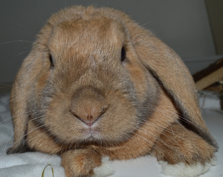

Almost straight from the front, you see very little of eyes and they look really narrow, with sharp points at bottom and top (sorry my English, hard to describe forms).
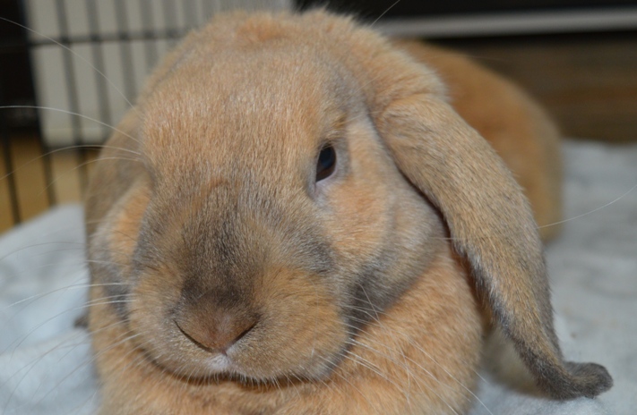


Here, head is only lightly turned and other eye is completely out of view. That's even more prominent with baby bunnies, because they have so fluffy face.


But you have really nice subtle variations in bunnies, which is great and make them look visually interesting and not like copies of each other. And I really like that you included lop bunnies and "normal" eared. Great variety! And really good job on bunnies thick cheeks, they look  healthy baby bunnies.
Reply


Forum Jump:


Users browsing this thread: 1 Guest(s)