razvanc-r's sketchbook dump
#61
Hi there!
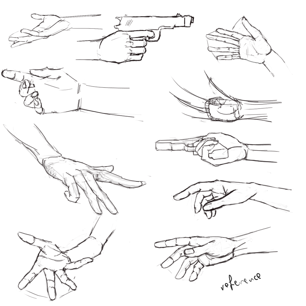
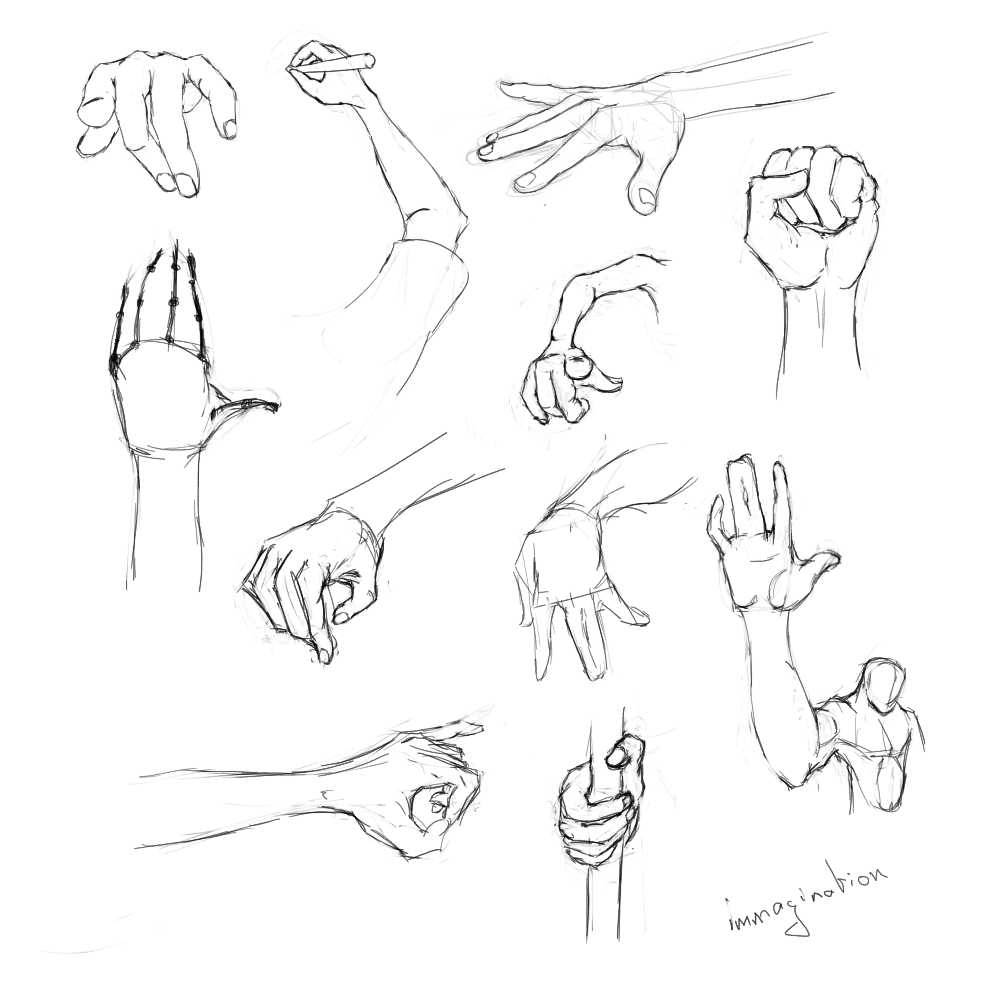
I think the thing that strikes me the most about these hand studies is that the palms are all very narrow.
As for the poses - omg is 01 even possible? :D
In 03 the left hand goes in a weird direction, I think.

Keep up the good work!

Reply
#62
Hehe, so you noticed :D. Yeah I have some proportion issues :/ among all the other things :). As for the poses well they are supposed to be gesture so they can be whatever... as long as you know, they don't look like having broken limbs or something :). Go check Proko gesture drawings, you'll see what I mean :P.

Thanks for the feedback!

Reply
#63
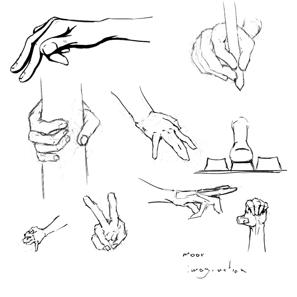
Yep, more hands! Hope they're better :D. Also trying out some stuffs with Krita brushes, experimental times!

ref.: http://artists-reference.deviantart.com/...-572358080


Attached Files Image(s)


Reply
#64
Hands are looking a bit better already! Only the fingers on #7 are super stiff though haha. It's all good though, hands are suuuuuper hard to draw T_T you'll get the feel for them once you start doing more. Good job so far! keep on going :D
Reply
#65
I intended for the fingers to be like that on 07 :D, I exaggerated the straight lines on the exterior, hehe, thanks :D

Reply
#66
Hehe, I'm not dead... yet, I was just a bit busy :P. I'mmmmm bakkckk!! mwhahahah :D

Reply
#67
Have taken a veryyyyyy long break from this due to... other businesses (life). But here I am trying to pick it up again :)....

Finally I refined those... drawings... a bit, well that's pretty much with that project.

Other than that just a few sketches and taking notes to better ingrain these things in my brain. It's good to be back :)


Attached Files Image(s)


Reply
#68
Still life study before bed... and I just realized that my laptop screen (where I had the reference) is way darker than my main monitor. I tried calibrating them to match better... we'll see.

Yah, I'm trying to mix it up with color as well since well, I have to get there somehow


Attached Files Image(s)


Reply
#69
The concept isn't mine, only the rendering, the concept is Ivan Valdivia, a guy posted the lineart in the Krita FB group, I liked the fellow and tried to render it out painterly style... yeah, long way to go!

[Image: IdYFApZ.png]


Attached Files Image(s)


Reply
#70
I think this is the first time I'm not ashamed of sharing a drawing of mine :)). I know it's really not that great but hey... I don't think it's too bad either... for a first try in this style.

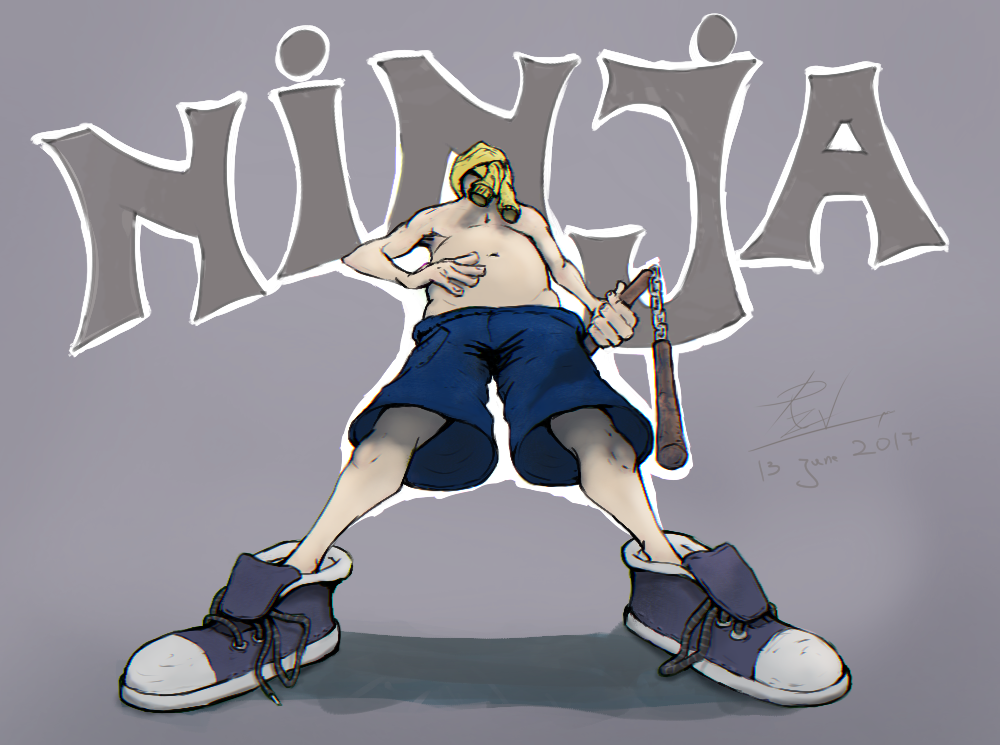
Was browsing the krita forum and I saw the monthly challenge, "childhood adventure memories" so my entry is... "Remember when you were small and wanted to be the coolest ninja on the block??!?! I DO!".


Other than that, yesterday I released my first krita brush kit :) https://goo.gl/Z8EofO... should anyone be interested. And in the project page I ask people to post their paintings done with the brush kit if they want. Today I got my first submitted image

[Image: 4daf73fe37dc63505c09212f518d468e65b7f9fe...87a5a9.png]

and I challenged myself to sketch something based on it... and here's the result. I think it's... ok-ish for a quick sketch.

[Image: 1bd6e4771e63aa9ff0830df970c108e432341c2d...39e800.png]

Reply
#71
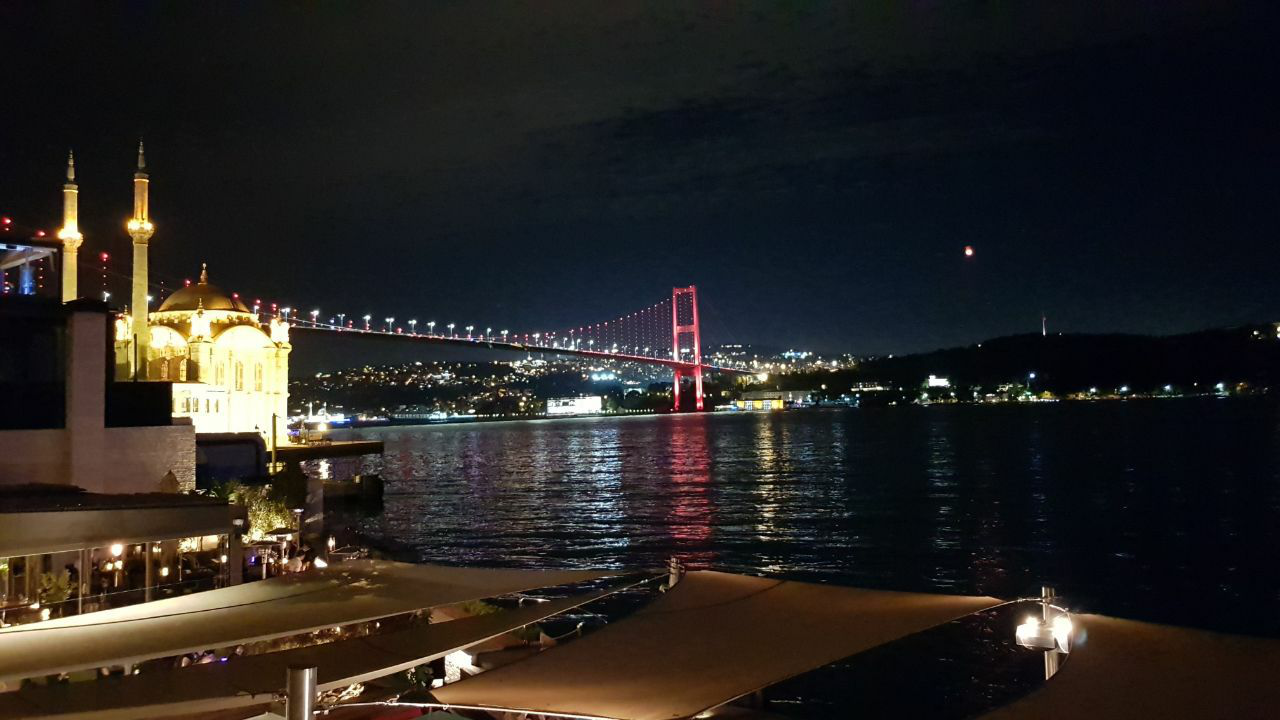
Finishing today with a photo study of a picture I found on FB, also gave me the opportunity to play around with some brushes I'm making for the krita brush kit.

Was tired so it isn't exactly copied like for like, plus I had the reference image be very very tiny so I didn't even see details... so you know, if you spot the imperfections, mainly in the foreground, now you know why.


[Image: 8Au8C6j.png]

Reply
#72
Been watching A LOT of Sinix Design... I just can't have enough of what the guy has to say and I absolutely love his painterly rough style. I think he's the main reason why I started getting into color a lot more lately.


Attached Files Image(s)


Reply
#73
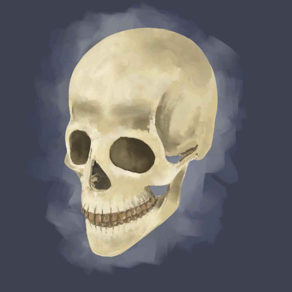
So remember how you want to draw/paint skulls and go to google for reference and get loads of crappy pictures? Well, it's finally time to present how I do it (the smart way :P).

Instead of randomly searching on google, first try blendswap, eg. For example, there's this human skull model, very detailed (https://www.blendswap.com/blends/view/21995) and most models are CC-0 or CC-BY, but in any case for personal use it doesn't really matter, unless you want to modify the model & redistribute etc.


I'll make a post with all the stuff I've been gathering (not that many yet :D), but I'm tweaking them for my needs as well, for example the skull, I took and added basic constraints for the lower jaw, it's very flexible now :D as you can see from the picture.

This is very cool, cause you can change lights, add props, whatever, to see how the material interacts with them and with Blender EEVEE around the corner it will be perfect! :) yep, this is my practice.


Reply
#74
One more night study, some place in Serbia (google maps)

[Image: KorBodr.png]

Reply
#75
https://goo.gl/maps/Fi8GKsYLKUx

[Image: 5RpPGq1.png]

Reply
#76


Reply
#77


Reply
#78
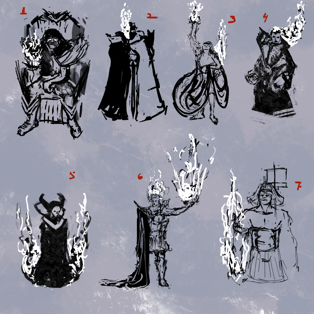
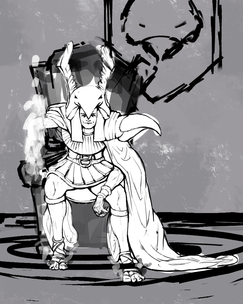
Decided to go over to conceptart forum and participate in the CHOWs, EOWs etc over there, so the CHOW is called Brimstone Monarch... don't know how well I fit the guy in the requirements but anyway!...

So we need to do this guy in two poses, one is "the good guy" pose, and the other is "the bad guy"... and here I start with the good guy of course... :)

Sketch phase


Selection


LineArt pass


Reply
#79
Going back to basics... not that I did anything else until now :)


Attached Files Image(s)


Reply
#80


Reply


Forum Jump:


Users browsing this thread: 9 Guest(s)