11-03-2017, 01:56 AM
![[Image: pOZn8hK.jpg]](https://i.imgur.com/pOZn8hK.jpg)
I hope this mess starts making sense soon
|
Coinhero's sketchbook
|
|
11-03-2017, 01:56 AM
![[Image: pOZn8hK.jpg]](https://i.imgur.com/pOZn8hK.jpg) I hope this mess starts making sense soon
11-04-2017, 03:24 AM
![[Image: jFOVQg8.jpg]](https://i.imgur.com/jFOVQg8.jpg)
11-04-2017, 07:59 AM
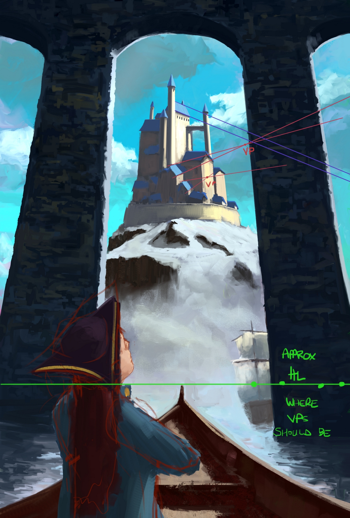
heya, was just scrolling by and saw your castle perspective is totally inconsistent with the scene as a whole. You might want to fix the castle into the correct perspective before spending any more time on rendering the illustration
11-05-2017, 01:25 AM
I tried to fix the perspective and did some changes here and there but I'm not feeling this one and by 'not feeling it" I mean I'm not good enough to paint this without it looking like shit. I'll probably try to come up with something new maybe with oil idk too angry to think straight
![[Image: TEjqjLr.jpg]](https://i.imgur.com/TEjqjLr.jpg)
11-05-2017, 10:21 AM
From such a low angle we would see the underside lips of the blue roofs and much less of the tops. You just haven't got the vps in the right place on the horizon for the sides of the buildings facing the sunlight mostly.
Just take some of the parallels of the roofs from that side and see what VPs they end up at: pretty much everywhere but the actual horizon line! They should go to generally the same vp if at the same rotational angle as each other or different VPs if rotated BUT on the SAME horizon line. Unless you are going for a slight fisheye lens which then distorts everything and makes the HL curved and thus changes where VPS will lie.  Doing some perspective exercise refreshers will be a proactive thing you can definitely do to improve, while you decide what to do next if you decide to abandon this and hopefully distract you from beating yourself up about painting skills. :)
11-05-2017, 11:30 PM
(11-05-2017, 10:21 AM)Amit Dutta Wrote: From such a low angle we would see the underside lips of the blue roofs and much less of the tops. You just haven't got the vps in the right place on the horizon for the sides of the buildings facing the sunlight mostly. I think I get it now and with the current vanishing points the castle should look something like this ![[Image: KnNY4d4.jpg]](https://i.imgur.com/KnNY4d4.jpg) Thanks for the help :D this is getting a little messy I'm not sure if I should try to paint this with the correct perspective now and start something new. I'll figure stuff out now and post again some time today when I'm done.
11-06-2017, 02:21 AM
![[Image: tumblr_oyyd4twEZl1suoh70o1_1280.jpg]](https://78.media.tumblr.com/7c2bbaace0cf49e06a8c405010057dfe/tumblr_oyyd4twEZl1suoh70o1_1280.jpg)
11-07-2017, 03:03 AM
Sorry for the crappy picture
![[Image: 4wmUzTA.jpg]](https://i.imgur.com/4wmUzTA.jpg) I did some digital sketching but its nothing interesting
11-07-2017, 06:56 AM
the castle is more consistent now, but some roofs still don't go to same vps (closest building to us in centre for example). Also, all ellipses of the conical roofs and the ring wall should also match the perspective. This also brings up the choice of vps: if too close together it can create a lot of distortion in the resulting image which may be too extreme. I'd recommend based on how you seem to approach things that you do some perspective exercises and reading to nail down your understanding more. Specifically, understanding how to rotate objects and constructing/troubleshooting ellipses. Scott Robertson's How To Draw has all you need.
It's a challenging image and involving architecture so any persp mistakes will be especially visible. Easy to go wrong! This is exactly why you should nail the basics in your initial sketch before rushing to rendering. Messy sketches for idea generation are fine, but they don't make for good technical bases to work on if you don't address basic problems up front
11-08-2017, 01:28 AM
(11-07-2017, 06:56 AM)Amit Dutta Wrote: the castle is more consistent now, but some roofs still don't go to same vps (closest building to us in centre for example). Also, all ellipses of the conical roofs and the ring wall should also match the perspective. This also brings up the choice of vps: if too close together it can create a lot of distortion in the resulting image which may be too extreme. I'd recommend based on how you seem to approach things that you do some perspective exercises and reading to nail down your understanding more. Specifically, understanding how to rotate objects and constructing/troubleshooting ellipses. Scott Robertson's How To Draw has all you need. yea I kind of half assed the whole thing I was sick of that painting and just wanted to get whats wrong and get it over with :D. I have Scott Robertson's How to Draw but haven't opened it in a while (not counting yesterday and today). I think starting a new painting that has the stuff I struggled with on the castle one would be more fun that grinding so yea I made this thing today ![[Image: UOzba5N.jpg]](https://i.imgur.com/UOzba5N.jpg) the perspective is pretty close to the castle one but this time I went with a horizontal composition and I've never done a crowded scene so this should be pretty hard (too hard prob). Sketch is a bit of a cluster fuck but it (mostly) makes sense in my head.
11-08-2017, 12:34 PM
Totally man. Anything you can learn from where you went wrong and get stuck into the next thing and make that better, is good in my books! I feel the same about that piece. Just make the next one better and half ass a bit less ;) Sketch looks promising, watch your ellipses again (that central tree planter thing.)
11-09-2017, 02:44 AM
Had a very busy day and by the time I got home I just wanted to go to bed -,- I did some painting but deleted it all because I just can't paint if I'm not in the mood. Anyway here is some low effort zorn lines I did just so I don't forget how to use a tablet.
going to bed now zzzzz ![[Image: 73E0JzU.jpg]](https://i.imgur.com/73E0JzU.jpg)
11-10-2017, 01:50 AM
aaaaaaaaaaaaaahhhh
![[Image: mQW5RBs.jpg]](https://i.imgur.com/mQW5RBs.jpg)
11-11-2017, 01:48 AM
I procrastinate in 5 min chucks and keep loosing focus while still feeling like I'm getting stuff done and its the worst
![[Image: Q01AkvB.jpg]](https://i.imgur.com/Q01AkvB.jpg)
11-12-2017, 01:58 AM
I wanted to finish this today but going out with friends and not being a zombie would be good for me
![[Image: FAAK4pF.jpg]](https://i.imgur.com/FAAK4pF.jpg)
11-12-2017, 07:53 PM
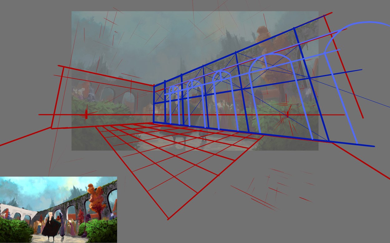
 Basically you are having both vanishing points inside the frame, giving you a REALLY REALLY distorted image. Because that distortion, your crowd people is miss placed or miss sized. Your arches near the frame arent properly resolved. Did you know that your walls are 2 times the height of the hooded guy but 3.5 times the height of the blonde girl in the crowd :) I just wanted to study your image, because it looked weird but I coudnt tell why, so I traced the perspective.
11-13-2017, 03:47 AM
yea I know shit is aaaalllll fucked up :D but I'm happy with this image, it was a pain in the ass and I'm glad I made it just as like a challenge, getting out of my comfort zone etc... I'll draw something simple next probably some photo studies idk
![[Image: KcyHZ8E.jpg]](https://i.imgur.com/KcyHZ8E.jpg)
11-14-2017, 03:07 AM
weekly oil paint class thingy
![[Image: jzU8TVr.jpg]](https://i.imgur.com/jzU8TVr.jpg)
11-14-2017, 04:21 AM
I actually like the painting of people in a garden. It looks cool, and man, is it so hard to do stuff out of imagination!
_________________________________________________________________________
The best time to plant a tree was 20 years ago. The second best time is now. -Chinese proverb Sketchbook
11-15-2017, 05:50 AM
I didn't do much today was just kind of lazy and tired. I found out that evangelion 4.0 (3.0 + 1.0) is coming out maybe probably but most likely wont. Drawing is a little messed up but I'll fixed it tomorrow
![[Image: b8gPyU0.jpg]](https://i.imgur.com/b8gPyU0.jpg)
|
|
« Next Oldest | Next Newest »
|