Posts: 2,817
Threads: 15
Joined: Jun 2013
Reputation:
109
youre certainly getting the idea of gesture just dont be afraid to start working in anatomical details, which im sure you will eventually. i might have already mentioned watching watts doing live figure quick sketch on youtube, but thats an example of taking what youre currently learning and making beautiful sketches with them. But yes a whole lot of great artists use the super simple stick man to make quick ideas.
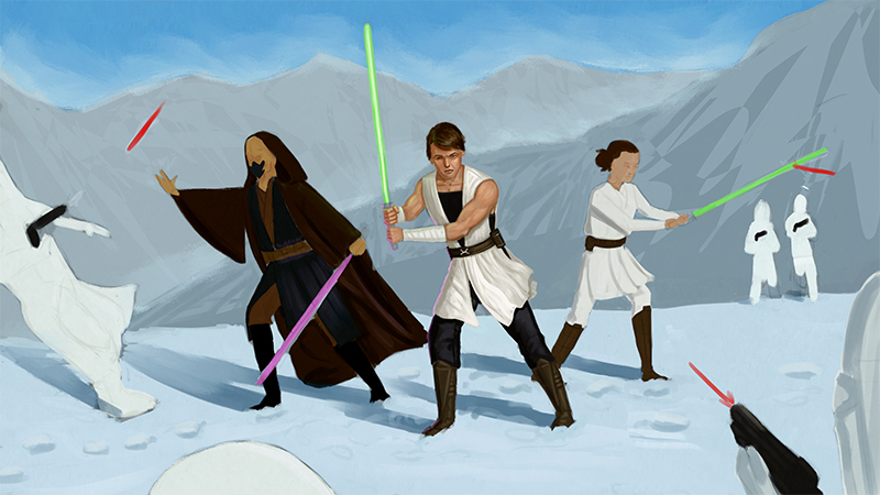
I hope your client likes the starwars painting, I think the center figures face is very creepy and emaciated looking, like his cheek bone is very visible, you dont want to age young heroic characters too much. Maybe try your best to do some different expressions on their faces if they are fighting after all. Their legs are also very sticky and wobbly, if youre going for that style, i understand, but looking at the realism of his arm, you should get some reference and make sure to show the density of the calf muscle and what not, specially the brown cloak character, id imagine his legs would have a least a little more thickness.
I think the white (bad guys?) near the front are hard to read as they blend with the bright value of the snow. Again, this comes back to composition planning, the best i think you could do without starting over is finding a way to light the bad guys or add some notan detail which is dark to seperate them from the snow. The bad guy on the left falling is a bit awkward,id even consider removing him, as well, hell you could remove all the bad guys and it might actually help the scene. Their poses dont feel like combat poses, more of like a poster pose. I could write so much about this picture..
My biggest suggestion is just to study composition more. Thumbnails and simple 2-3 value designs in like 6 inch tall and wide sketches. take notes in written word, learn things. Also try out Daz3d studio, its a free 3d software and can help you get a quick idea for lighting and anatomy and camera angles for sure ;)
Posts: 34
Threads: 1
Joined: Mar 2014
Reputation:
4
@Fedodika: Yes, I totally need to start practicing adding in detail to the gestures. I'm sure Woo will eventually cover it, but it's good for me to keep that stuff in mind while working anyway. It feels very awkward right now to add anatomy into the 30 second poses -- I'm not sure if this is because I'm not used to doing it at the moment or if it's because I'm too slow when doing it to make the time limit. Perhaps a bit of both, really. I feel like when I try to do this my proportions go completely out the window, so it's obviously an issue that time will need to be spent on to correct.
The Star Wars painting is still largely in a place-holder phase. The rendering I started is very harsh at the moment and will eventually be toned down (his face and arms, for instance, I'm mostly just lighting the planes, then I'll paint over them with lesser values so they're not quite as stark as I go). The Snowtroopers in the foreground will be darkened down to pop against the snow, the white is just a placeholder at the moment. (Their local color, not what their actual color will wind up being in future.) The other Jedi figures will be repainted over too, and they'll be a lot less wonky in the end, lol. I'm sort of painting this piece a bit inside out process-wise. I'm not even sure how it happened, really -- I think because I was focusing on switching my workflow over into Photoshop from Painter and jumping back and forth between Photoshop and iPad (testing various apps to see what was comfortable) that I did some things a bit backwards compared to how I would usually work, so my starting point for rendering is a bit weird. I sort of blocked in colors and figures without drawing everything out. So, now I have to work a bit backwards. I'm not thrilled with the inclusion of the bad guys either in this piece, but the client wants them, so they have to remain. (Their position/numbers may be swapped around as I work more into the piece. Some may only half be in the picture, getting their bodies force-pushed out of frame and whatnot. They're not going to be a focal point at all, just things happening that happen to be happening around the main figures, like, as you mentioned, on a poster.)
Overall I want the piece to be looser with more expressive brushwork than I usually do, so I'm pulling artists like Greg Manchess (his Above The Timberline stuff, specifically -- def check that link out because it's amazing) and Sargent for reference as I work. I really want to start breaking my habit of over rendering -- I feel like it's one of the things I struggle with the most when I paint. Very much a source of frustration for me.
Composition studies are a thing I need to do more of, definitely. I actually have an old video class series from Jason Manly (back from the conceptart.org days, if anyone remembers those, lol) that was on composition that was supposed to be really good. I have only skimmed through it lightly before, but this may be the time to watch it more in-depth and try to pull wisdom from it. I think composition studies would be good to do on my iPad with the smaller screen -- it may help me not to get too into details and just focus on the main aspects in any compositions I'm studying. (My attention sometimes gets lost when there are little bits to fiddle with and I get off-track.)
I've never played with any 3D software, but it does seem like it could be helpful to learn! I have male/female mannequins that I can use for poses, too, but I've rarely ever bothered with getting them out. (Sitting gathering dust is hardly the best way to be using them. I should slap my own wrist for that one, shame on me.) Getting dynamic camera angles / viewpoints is a weakness of mine and being able to physically shift a scene around may help me in opening up my visual possibilities when composing scenes. I tend to position things very statically when left to my own devices. I've also been thinking of doing some comic book / movie still studies to try and mix things up in that regard. They seem like they'd be helpful, too, for a multitude of reasons. (Composition, color theory, dynamic poses, etc.)
Sometimes I feel almost overwhelmed because there are so many things I want to improve on; it feels like it can be hard to focus. I need to do studies that combine several things I need to work on, so that I can tackle multiple issues at once. lol
Posts: 55
Threads: 2
Joined: Sep 2018
Reputation:
5
@Riley Stark: I see your point about separating construction from gesture. They really are two separate things. I do notice my gestures are often fluid and exaggerated, but my figures tend to stiffen up a bit when I am constructing. I guess the idea is to find a happy balance between the two.
I'm aware of the selective color adjustment mode, but I have only seen it applied as an adjustment later on in a painting. That's an interesting technique Julie uses. I will have to try that out.
Thanks for letting me know about the ArtStudio Pro app. Sounds great. And I wasn't aware of Procreate's limitations. I did year a full version of Photoshop will be available on iPad Pro soon. Then you would be able to import/export your brushes and crop as you would in the regular version.
I definitely do not get as much work done as I should because I don't always like sitting at the computer desk to paint or draw. I'm at a desk in an office all day. I hate sitting all day long. They say sitting is the new smoking. I even thought about getting a standing desk for my apartment.
Good luck with your renovation. I know what it's like living in a small apartment with a cat. My wife and I did it in Fort Lee. But we didn't go through a renovation. That's always fun.
Your Star Wars commission is coming along nicely and I like the second round of gestures. They are more expressive. Does Alex keep work with the stick figures through the whole course? I'm not opposed to that at all. I'm just curious. I've studied gestures by Proko, Vilppu, Mike Hampton, and Mike Mattesi.
Posts: 34
Threads: 1
Joined: Mar 2014
Reputation:
4
@Shinkasuru: The dishwasher, microwave, and sink have all arrived. (We ordered the big stuff so that we could get the points back on our credit card. Hooray for money back!) We also got all the hardware and faucet. Renovations are slated to start next week. Luckily, I have faith in the contractor team we hired -- they gutted and redid our bathroom two years ago and it came out great. Still, I do feel a bit bad for the kitty getting cooped up during the day, but some things just can't be helped.
I'm only through the second class of Woo's, so I'm not sure if he keeps up with the lines or not. I tend to lean more towards lines myself just because that's how I've always done it. (Whether successfully or unsuccessfully is very debatable. lol) We'll have to wait and see what happens as I work through the classes!
____________
:::::::::::::::::::
Worked a bit more on the Star Wars commission today. I think I'm going to leave the center figure for a bit and move on to one of the other figures and start work. (Don't want to spend all my time rendering just one place, after all.) Let me know if anything on the center guy is still looking wonky thus far (like that iffy back arm I'm not happy with) -- revised some stuff, added some wind to his clothes for movement (need to add some to his hair to match), adjusted the legs a bit, toned down the skin value differences some. Still a W.I.P (obviously) but maybe 65% done-ish with him? I feel like I'm starting to verge on over-rendering my brushwork.
Not sure why it's sharpening the image so much when I shrink it down to export it for upload. (Original file is approx 6,000px wide. Is it the way Photoshop is compressing it down to .jpg? Ideas?) Weirdness.

I think I may leave this for the night and do something like a still life on my iPad to relax. Haven't done one in a while and I enjoy those. <3
Posts: 55
Threads: 2
Joined: Sep 2018
Reputation:
5
@Riley Stark: It's always a bit comfortable living in the midst of renovations, but it's worth it in the end. Everyone gets excited about renovations. My brother and sister-in-law just had a house built down in Florida. They are temporarily staying at my brother's in-laws 30 minutes away from the new house. My brother, sister-in-law, two young girls, and two large dogs living under one room with the mother-in-law and her boyfriend. Not easy, but they all put up with it for now knowing they can relax in their new home in a couple of weeks.
I like the way the Start Wars commission is coming along. I can't say anything stands out for me as looking odd or out of place. I think the center character is shaping up nicely.
Doing a still life on your iPad sounds like fun. I haven't done a still life before. Well, not exactly true. I did one many moons ago in a color theory class I took at a local university, but I don't remember anything of the experience. I think it would be good practice for me to play around with lighting and values and color with a simple still life. I should stop talking about it and finally try it.
Posts: 158
Threads: 4
Joined: Feb 2015
Reputation:
12
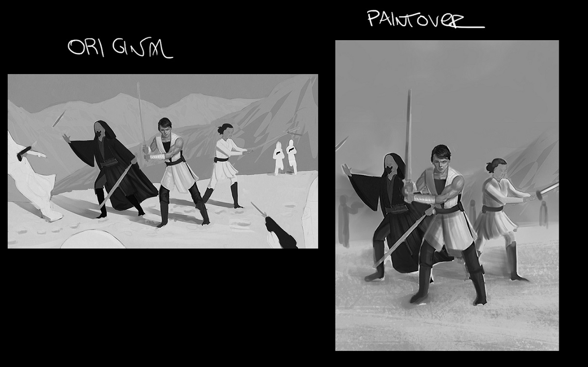
Hey Riley! I did a very, very quick composition paintover just to ilustrate a point;
Your Star Wars piece has a lot of character, i would just say three considerations ( and probably it´s late for you to change as much in the comp but it´s a 2 cent suggestion haha:

1- A vertical comp works better than a horizontal due the strenght of the piece being the three team characters, all of them with some unique elements and personality. They work well if you frame them together like a book cover/game cover/ movie poster. ( you can add storm troopers and they may work nice yet the focus is the team)
2- Did not have much time to delve into values but the piece has too much near white values, i would introduce sublte midtone shadows with very specific highlights (light saber, light source from right to left)
3- Movement dynamism & anatomy . The poses look very interesting and again, have a lot of character but i sense two issues; the poses are a little bit stiff anatomywise the center guy is on target, the two side characters have big heads in proportion to the body. ( if iyou intend realism/semi realism)
Don´t feel obligated to change the route of your piece just because of my suggestion haha. Just two cents, if they are helpful the better. Cheers!
Posts: 3,357
Threads: 37
Joined: Aug 2013
Reputation:
234
You can't fix stiffness by changing the composition.Thumbnail before result go messy if need but find a pose that is dynamic.
Posts: 34
Threads: 1
Joined: Mar 2014
Reputation:
4
@Shinkasuru: I hope they weren't in the path of the hurricane activity down in Florida this past few months. That could really mess up a home, never mind doing a regular renovation.
@RickRichards: You're absolutely right that the portrait crop you did for the composition is 110% better. I tend to favor portrait compositions; I rarely ever work landscape. (Perhaps that's part of my discomfort with this piece is that it's just sort of out of my left field, so to speak?) Unfortunately, I can't change the dimensions, even if there are definitely much better ways to execute things. The commissioner wanted very specific dimensions, so that it can be used as a background for multiple things. It's stuck as it is. There used to be a fourth character in the composition, but that person apparently dropped out of the group, so the character was removed. I spread the remaining figures out a bit more to fill the suddenly vacant space -- I originally had them more like your figures are positioned, closer together.
You're also right about the values. I'm trying to re-work them slightly, but it's proving difficult. References for snow scenes are all over the place lighting-wise, which I'm not sure if it's due to the reflectivity of the snow itself or what? I've actually reverted to looking at paintings people have done of snow. They're a bit more helpful, but I need to deconstruct them a bit and figure out how they're working, I think.
@darktiste: Very true.
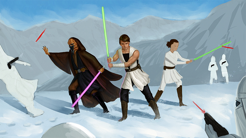
Anyway, this is where I'm currently at. Added in the Kel Dor male on the left side. (He still needs some work.) I'm aiming to have this finished before my renovations start, which will be this coming Thursday.
I've also been building up my cinematography reference libraries to start doing some composition studies. (And other general practice.) If anyone has any favorites that they think would be beneficial for me to check out (or artists/artworks that might also be helpful), let me know! :D

Posts: 2,817
Threads: 15
Joined: Jun 2013
Reputation:
109
id reccomend film noire, and grab the PDF for Loomis' Creative Illustration. Alex Hayes got mad shizz
Posts: 55
Threads: 2
Joined: Sep 2018
Reputation:
5
@Riley Stark: No, my brother is on the east side of Florida, so they did not get hit with hurricane. Thank you.
I like the way your scene is shaping up. I'm sure you are still working on the details of the characters, but I just wanted to mention that the clothing on the center character appears more detailed than those on Kel Dor. I understand this is in-progress, so I might be out of line for pointing it out, but it looks like the clothing needs more detailing (planes and values to define the wrinkles and such).
I agree with the RickRichards regarding the composition, but I understand your position for this commission, and I think what you have still works -- at least for me. One thing I will mention is that the characters looks a little "posed" and still to me. What I mean is that in an action scene like this there is a tenseness in the arms and legs when they are in a battle. A current of adrenaline is coursing through their bodies and that is evident in the way their feet are planted on the ground and the way their hands grip their weapons.
That said, I am also thinking this scene is supposed to have that "posed" look, almost like a movie poster. In which case, pardon me for my comments. I'm just pointing out something I observed and thought could enhance the scene, as long as that is the vibe of the painting. Otherwise, I think you are right on target. Hell, I shouldn't even be commenting on such things as I have never attempted such a scene myself. I'm sure it's very challenging. And I think you are doing a great job so far. Looking forward to seeing the finished commission.
Posts: 34
Threads: 1
Joined: Mar 2014
Reputation:
4
So this is literally my first night back at my computer since my last post.
It's been a while. Feels weird.
The kitchen renovation sort of temporarily took over my life, but we're about halfway through now and things are somewhat returning to normal. (Aside from everything being displaced.) For several days I didn't have access to the room my computer was in (and that particular branch of electrics wasn't working anyway while some things got rewired) and I was in a bit of a funk with all the upheaval. It's been harder to work than I thought it was going to be, but hopefully I've turned the corner and things will be on the up swing now! I was thinking I'd be able to watch my classes at the very least while I was holed up in my bedroom, but I realized I couldn't watch my classes AND draw along with them like I needed to on just my iPad. (It's one or the other. With the split screen the video was too small to really see what was going on in the class.) I did make a little progress on my commission, but it was touch and go. It felt like every time I sat down to really do something, my attention was needed elsewhere and I was (unexpectedly) mentally exhausted by sundown to work once the apartment had finally quieted down.
That all said, I'm not dead yet.
@Fedodika: Studying film noir is an excellent idea! I hadn't thought of that, but your bringing it up definitely makes sense. I'll start investigating it and see what I can pull up!
@Shinkasuru: Yeah, it's more pose-y than action-y. It sounds like the guy is using it as a background while streaming some stuff and he wants to be able to have the characters easily viewable for whoever is watching. (So more poster-ish than actual scene-ish.) That said, I do need to work on creating more dynamic poses in general. I think the gesture class will help with that a lot. I also think maybe studying some Marvel comic panels might actually help, too. They usually do dynamic/action shots very well with their characters/compositions and I could certainly learn a lot in that department. (Definitely one of my weaker areas.)
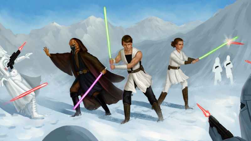
So, here's where I'm presently at with the Star Wars commission. I'm hoping to finish this piece entirely in the next few days and push onward from it.
Having trouble with the female's face. (I always have trouble with female characters.) Need to do more targeted female face studies to get more variety in their looks because mine always look the same. For some reason I'm way more comfortable drawing male faces -- I think it has to do with all the angles. I tend to find angular stuff a lot easier to sketch out. (All those solid lines for placement. Can you say 'crutch'? lol)
Started adding in the Snowtrooper on the left, but he needs a lot more contrast to match up with the other figures. I still need to paint in the smaller two troopers on the right to help balance things out. And add some detailing to the mountain, ground, etc.
Feeling very 'meh' about this piece, but I know that I have to wrap it up at some point, regardless of whether I like it or not. (The client likes it a lot so far, which I guess is all that really matters, but still...) Everything is a step in a process of improvement -- I just need to keep reminding myself of that and make sure I do studies to try and improve the things I'm not happy with after the fact. (Which is a lot at the moment. *SIGH*)
Just keep trucking', right?

Posts: 2,817
Threads: 15
Joined: Jun 2013
Reputation:
109
"I just keep working and when i hate absolutely everything about my painting, thats when i know im done."
Peter Mohrbacher
|


