03-26-2019, 09:48 PM
Here is a couple of sketches from imagination, focusing on perspective and mass, I'm kinda happy to where it's going.
|
Baldgate Sketchbook
|
|
03-26-2019, 09:48 PM
Here is a couple of sketches from imagination, focusing on perspective and mass, I'm kinda happy to where it's going.
04-09-2019, 09:55 PM
Hi! This is an immense improvement in almost one year!
 Did you learn some bones by heart?
04-10-2019, 03:45 AM
It's very kind of you, thank you !
Yeah, I learnt a few, but I still have trouble remembering joints structure, because they bend and twist. Still a long way to go :p.
04-21-2019, 01:04 AM
More studies. Pirate girl was studied after an amazing picture from Mjranum.
04-30-2019, 04:10 PM
Hello,
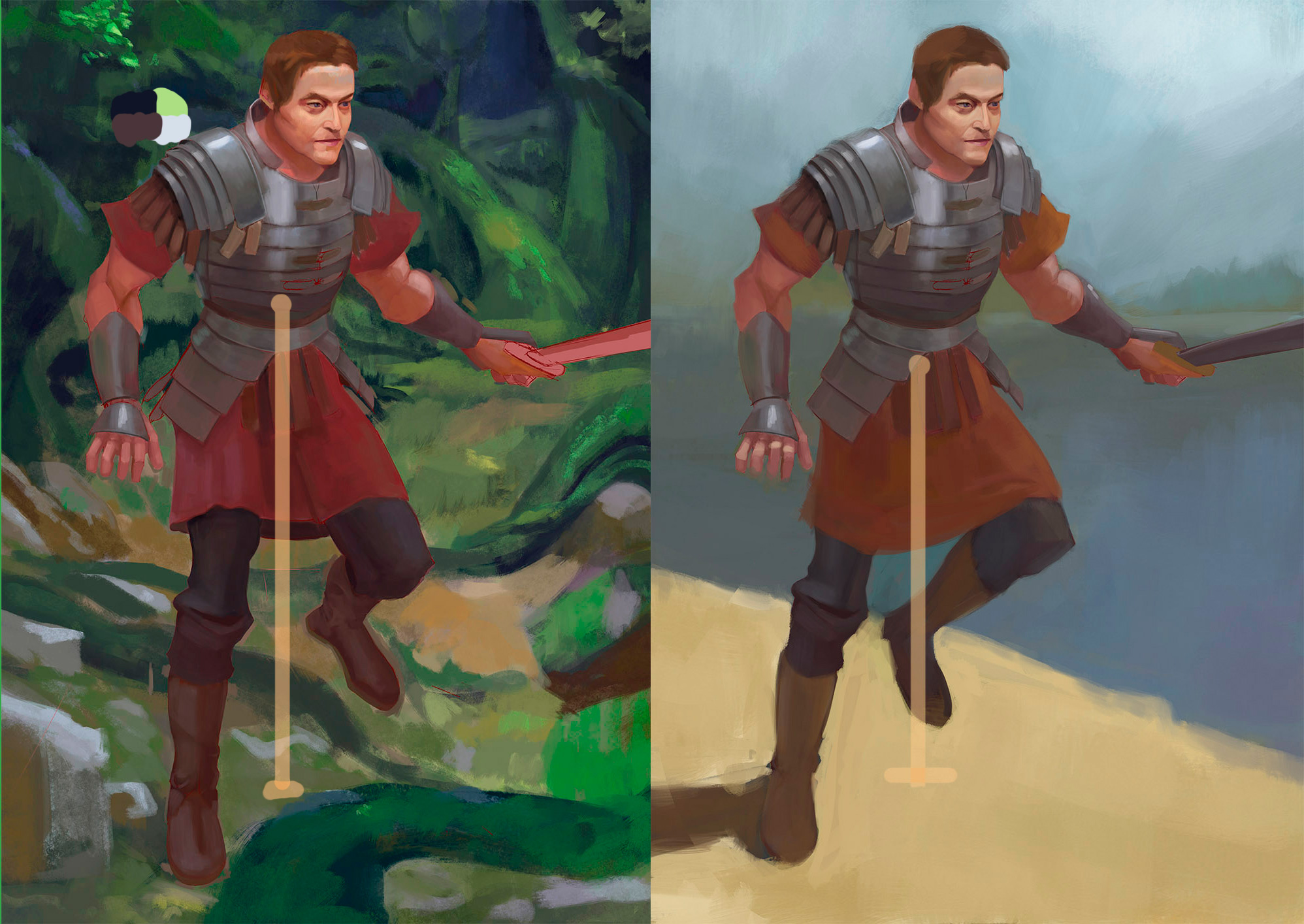
Currently working on something personal, but i'm not sure where I want to take it. I first did the one in the green, but i'm not sure about the overall comp. may be too busy, and probably need a lot more softening and rendering. I tried to give this guys a much simpler background with easier read, to see if it was better and now i'm not really sure which one I should finish. Also open to constructive criticism.
04-30-2019, 04:36 PM
I want to focus your attention on a few point
The use of area of rest vs area of interest.Noisy vs simplicity Intelligently alternating the value to move the eye around where you want the view to look at in order of importance.The stronger a value difference is between the value around it the stronger it will catch the attention of the viewer. Since he wear reflective material he should be catching some of the surrounding color much more than on the other materiel. I find the pose to be weak in term of exaggeration.The face is emotioness and it drag the whole thing into feeling stiff and still even if he is moving.Remember that using the face help alot to convey a story.Since human brain are naturally wire to look at face it important to spend most of the rendering phase on it in my opinion slowly decreasing the noise of rendering as we go toward the feet but not into something that resemble nothing the feet have to anchor the figure into a 3d space. You don't have to render everything to the same level suggesting texture should be enough the brain of the viewer fill the rest .Simplification is an art in itself if you can draw not zoom in and still make your texture believeable you will save alot of time i am sure.
04-30-2019, 08:52 PM
Hello, Baldgate.
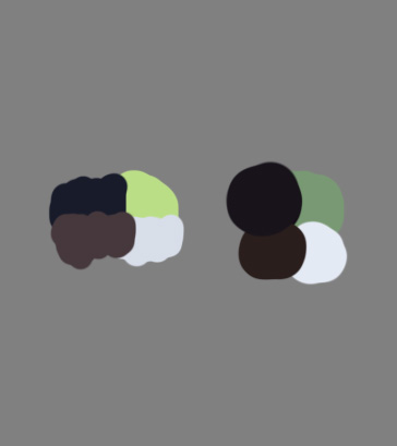
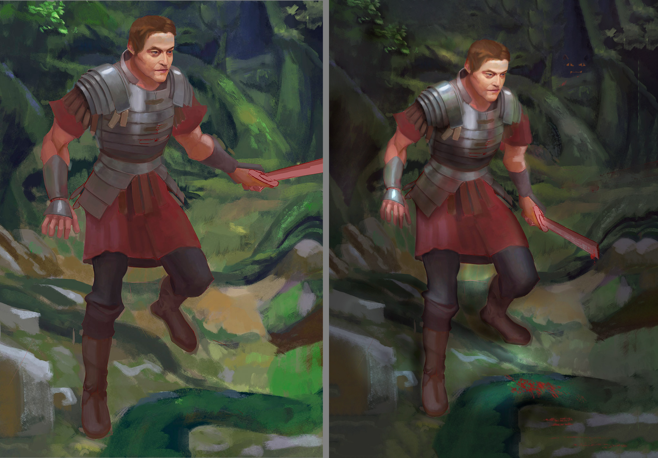
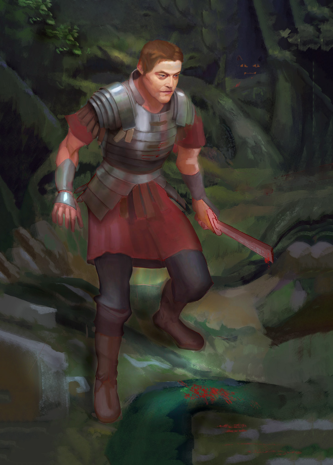
It's always interesting to see personal work, to my mind it shows a lot about what person is into at that moment (hopefully). And I have some suggestions for you. Although take into the account that I'm not good at practice only at theory, so my thoughts might not work for you. First of all what is your piece about? When I'm stuck with something I always try to create a story behind the drawing so that I could push it forward at least at some direction. That's why according to "story potential" I prefer a version in forest. Suppose, mainly because I myself is working on a foresty piece right now, and the second reason it feels more mystical for me, more dangerous and open for interpretation. When guy is at the open space it fells like "straightforward", so he must be fighting with someone, in this case why didn't you show that other guy? If your character is running, then it's not clear whether he is running from or to somebody. Or maybe this is a kind of spartan or roman training, in this case I need sweat, sweat dropping from everywhere XD And one more thing, the char on the beach is out of balance, he is like falling, the first variant is more sturdy.  So, this was my thoughts about potential of two pieces. But because I prefer more the forest one, let me talk solely about it down below. So, first of all, as you and darktiste noticed your background is indeed too busy, it's happening not because you have too much details (the piece might need even more), but because your background is competing with a char for attention, it is as light as char, have even more contrast than the most contrast piece here (his armor) and saturation is the same or even a bit higher as char has. So, very first treatment to make the forest less busy is to lover contrast, brightness and saturation. You might have some areas of light somewhere around head and sword to bring attention to the person. Here on the left is samples of the lightest and darkest areas of forest and armor of your version, on the right same but for my version. Notice that my "lightest green" is the area under his left foot where I suppose direct sunlight is hitting the ground. Overall this forest has even less contrast.  Secondly, I don't like your composition. Although your piece is about one person, to my taste there is too little space around him, he is like in a cage, not in the open world, you need to play around and add a bit more margin around the figure. Thirdly, his sword is cutted by the picture plane, which is odd, cause this leads the viewer out of your picture and you don't want it. Fourthly, he seems like jumping, but there is no clues that someone is attacking him. So, you might add a reflection of some creature into his armor, strong shadow onto his body, and, of course the whole figure should be pointing into the "invisible" attacker. Take a look at some Frazetta's painting and notice how much space he leaves around his figures in order let them "breathe": ![[Image: Frazetta.jpg]](http://www.scottmcd.net/artanalysis/wp-content/uploads/2010/12/Frazetta.jpg) ![[Image: 20841367_10203242034449833_1525059372_o.jpg]](http://frazettamuseum.com/mm5/graphics/00000001/20841367_10203242034449833_1525059372_o.jpg) ![[Image: 51zKCQKvxoL._SY679_.jpg]](https://images-na.ssl-images-amazon.com/images/I/51zKCQKvxoL._SY679_.jpg) The last thing, as darktiste mention you should work more on the pose, face emotion and material rendering. I was too lazy to do this (ha-ha, as usual) so I grounded him more and tried to create a feeling of being on the alert as if he knew that someone is watching him (obviously, cause he previously broke his sword in the fight with the monster). I tried to bend him a little with liquify tool (yeap, I'm that lazy), put his leg on the ground, changed his arm+sword position, added some blood near the area with high ligh\dark contrast, resulting in color contrast. Tried to add reflectivity to the armor (but I've never ever painted metal, so I'm suck with it) and also monster on the back supposed to be evil and mysterious but I'm suck with painting animals too.   I hope this huge post help you to push your art forward. And yes, these all are only suggestions, if they interfere with your opinion or ideas than F*CK them. Cheers.
05-01-2019, 09:09 AM
Hey,
@Darktiste Thank you for your critics, it's very helpful. I agree with everything, I'll try to fix it. Thank for bringing out these concept and pointing out weak points. @Roanna Thanks a lot for the great and very in-depth critic.I agree with everything here too, should have though more about storytelling and acting, and contrast and... everything. Also thanks for bringing out some keypoint about Frazetta (the great master) and the overpainting, working on the value structure and saturation obviously made the whole painting a lot more clear. My brain is still processing all these informations but I'll do my best to rework everything . Thanks a lot !
05-04-2019, 04:06 PM
Hello,
So, I started to rework this thing, by simplifying the background, changing the pose and the overall composition . At some point I felt I couldn't just change a bit of the pose to make it work, I had to keep up with it or just restart. So I decided to start over. Since the overall composition felt a bit lackluster I did some mannikin, some black and white thumbnail and some colour sketch. I was thinking about what Darktiste wrote about value, so I went back reading my Gurney books and found something I wanted to explore, counterchange, basically light to dark character against a dark to white background (opposing value gradations). Also I remembered many illustrators like to do two value sketch so I though maybe it could help me simplify the whole thing and think more about light than drawing. I wanted a character on a dark background so I though maybe this guys, as Roanna suggested , could be raggedy and tired, like he is going out of a super dark and creepy forest and finally he see the light. With some broken swords, blood, twisting vines and maybe evil nyan cat in the darkness xD... I had a few other idea like, waiting on a tree trunk, or a victorious looking guys walking forward on a bright background. Or even a wounded guys leaning against the wall.I kept some space around the char to let him breath though (just a bit!). I should mention that I'm doing this guys for a mentorship. The goal of this exercise is to do some clothes rendering on an imagination piece. the character must have leather, light clothes, heavy clothes, metal on him. So I'm limited to only one character for this piece. So anyways, here are the sketch I did. nothing fancy . I wanted to try making the top left one of the first page work, since this was the idea I liked most on paper. I joined the sketch that I'm working on atm. I don't have the design of the armor yet so he is naked, I'm not sure of what I want to do. I'm not sure its really necessary to do silhouette design for a oneshot illustration, but maybe I should. I Though it could be more efficient to just try working with shape and find something pleasing. Hope I didn't bore anyone through this long post. critics always welcome!
05-04-2019, 04:24 PM
Great use of the invert option to generate more iteration i will try to remember that if i ever do some composition.Just a reminder before you go in with the color and more rendering.Try to remember about the storytelling don't just put stuff to fill up the space make every element work for you.Shape language to renforce the story and color for the mood can be strong ally.
05-16-2019, 05:49 AM
Hey,
@Darktiste Yeah. Actually I failed at this attempt. Tried to make this idea work, couldn't make it so, and at some point I just let it go and I restarted a character on a uniform background, focusing on the material and proportion, with a simpler pose. I need to study environment hard, I'm not used to this kind of composition. So here are in order : a new character, the failed version, a reworked study I pushed a bit further, and a couple of portrait study I did trying to focus on broad stroke and softer edge.
05-28-2019, 02:19 PM
I'm a big fan of the way you handle edges in your studies; the variation of hard / soft edges in your planes instantly describes the form to me very nicely and adds a lot to how "correctly" I percieve your works. Good stuff!
06-06-2019, 09:36 AM
@Algae : Thank :) ! glad you like it, I hope I'll be able to translate it into my personal pieces too. I saw your sketchbook, good drawings studies !
Adding a gandalf study
08-30-2019, 03:42 PM
Hello everyone .
It's been a while since I have posted. Here are some study I have done.
08-30-2019, 03:50 PM
And a few personal work... I have been looking up a lot to Yoji shinkawa work recently, I love it, it's totally insane.
09-16-2019, 04:02 AM
A Jaimes jones study, a Sargeant study, and a random gangster dude I painted for fun.
I'm actually much more happy with the Jaimes study than the other too. Sargeant one feel too soft and smooth compared to the original, but its hard to emulate bristle work in digital. The dude probably suffer the same issues, I think. |
|
« Next Oldest | Next Newest »
|