Posts: 6
Threads: 1
Joined: Jan 2019
Reputation:
0
Trying to improve my skills, crits appreciated. I'll start with some recent commission work I've done, but I will be adding more sketch stuff one I get my new scanner, old one just died.
I used to be really active on Conceptart.org back in the day, like around 2004. Shout out to any old school CA'ers still knocking around! I missed the old forum vibe so decided to come here to chill and share my art :)
I have a big problem with self-confidence as an artist so I think sharing and caring here will be nice and help me get in a better mindset to create and grow.
Here's some of my stuff anyway, fire away
![[Image: ICgE8Qx.jpg]](https://i.imgur.com/ICgE8Qx.jpg)
![[Image: f6GchN5.jpg]](https://i.imgur.com/f6GchN5.jpg)
![[Image: YlpMhra.jpg]](https://i.imgur.com/YlpMhra.jpg)
![[Image: 3q9PrYk.jpg]](https://i.imgur.com/3q9PrYk.jpg)
Posts: 6
Threads: 1
Joined: Jan 2019
Reputation:
0
Here’s a couple of studies
![[Image: 1IioOrP.jpg]](http://i.imgur.com/1IioOrP.jpg)
![[Image: ha9p060.jpg]](http://i.imgur.com/ha9p060.jpg)
Posts: 3,345
Threads: 37
Joined: Aug 2013
Reputation:
234
I don't think you want to show study that not what people who wanna hire you wanna see.
Posts: 671
Threads: 8
Joined: Feb 2016
Reputation:
113
I dunno about Darktiste, but last time I checked, this isn't exactly the place the entertainment industry's recruiting new talents :)
Hey waronmars. Love doing portraits myself. Not the greatest p.o. but here it goes.
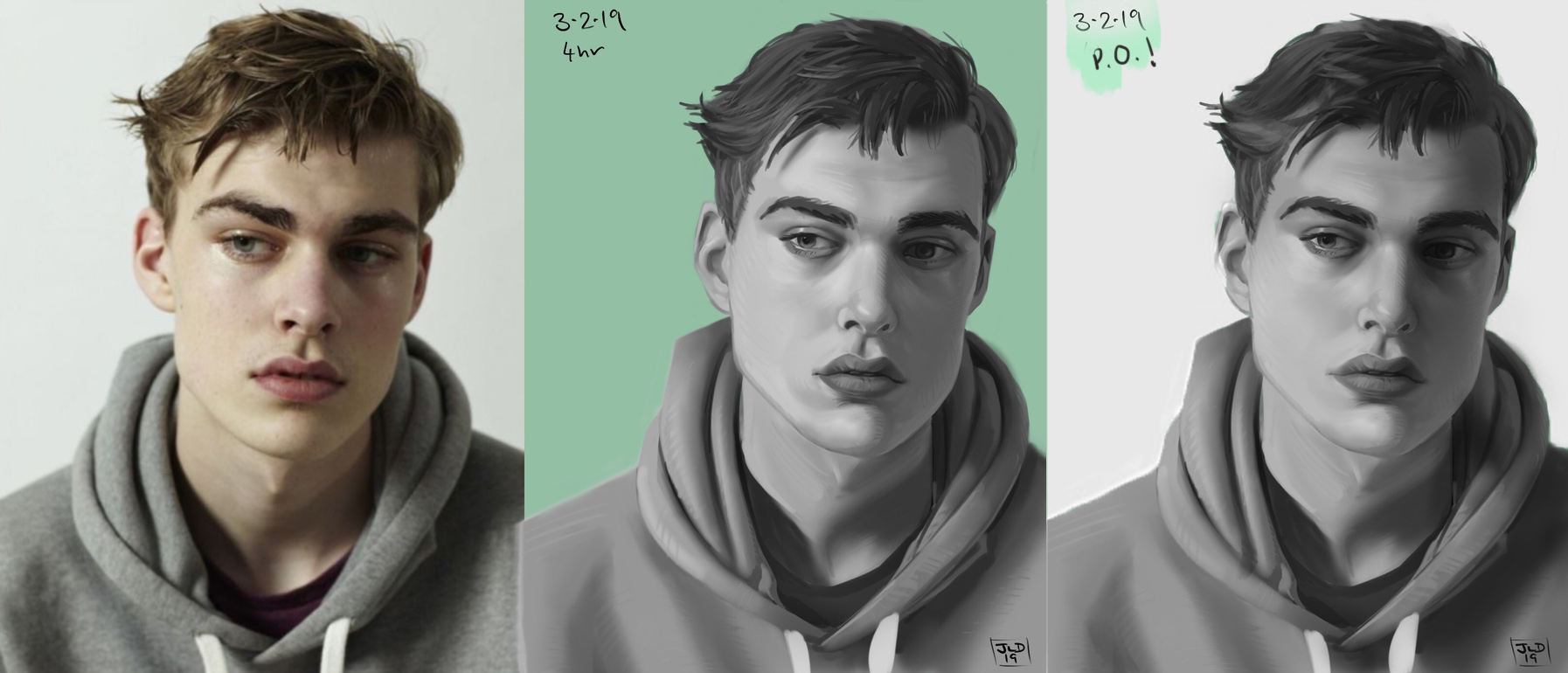
Seems like the values of the study isn't grouped together as tight as it should. The tell was the darkest part of the hair should be as dark (or close enough of a value) to the cast shadow on the right eye (the reference's left eye). These little nuances can make a big difference when it comes to the finished product. Not sure if you were attempting a value study, and not sure if you stumbled upon this https://www.dorian-iten.com/value-study/
Any artists influencing your art? Welcome to the Crimson Daggers btw. I should've started with that.
If you are reading this, I most likely just gave you a crappy crit! What I'm basically trying to say is, don't give up!
----
IG: @thatpuddinhead
Posts: 3,345
Threads: 37
Joined: Aug 2013
Reputation:
234
(02-04-2019, 02:11 AM)John Wrote: I dunno about Darktiste, but last time I checked, this isn't exactly the place the entertainment industry's recruiting new talents :)
I wasn't talking about them being here either i am speaking about putting study in a portfolio.For me it a no no.Also i kinda fail and i didn't see that this was a sketchbook i though he was posting some porfolio stuff since it wasn't that bad.
Posts: 1,424
Threads: 12
Joined: Dec 2015
Reputation:
139
Love the name Waronmars :).
Nice start here, your work is already quite accomplished in my humble opinion.
I agree with John about the values, so important in making a convincing painting. You know about squinting to help with judging values right?
Also, what are your goals for your art, are you going for more realism or stylised? Being clear on these will help you target your studies and attract the feedback you need.
Keep posting and good luck with your journey :).
“Today, give a stranger one of your smiles. It might be the only sunshine he sees all day.” -- H. Jackson Brown Jr.
CD Sketchbook
Posts: 164
Threads: 5
Joined: Feb 2016
Reputation:
7
great start.... nice Illustrations.....
your strength is definitely your painting and rendering skills but I do think your drawing skills are lagging behind, if you work on say gesture/ construction/ anatomy you'll will see a huge difference in your characters.... just pick up a pen and paper no erasing no ctrl z for a couple months and just study and draw and take your art to the next level
Posts: 364
Threads: 11
Joined: Dec 2013
Reputation:
73
Rendering is looking pretty good and its great you have some finished pieces and with a considerable amount of characters.
a couple of things that stand out at a glance for me.
-you can do more with the lighting color
-you have quite allot of close to local colors all competing for attention.
-you can control what stands out by selectively using saturation, contrast and detail level.
-particularly evident in your portraits, your forms look a bit flat partially due to the direction of your brush strokes. Give it a try painting over imaginary 3d forms
-sizing and spacing of character is are very similar making things feel more still and uninteresting as a composition
-your overlaps are also very minimal which adds to the lack of depth
-posing and anatomy has some good and not so good moments here a couple of figures look off balance or a bit awkward
-you could inject allot more interest with more color variation particularly in the skin
-with your face studies i think you need to focus on the stepped back image a little more as some of the details look well rendered separately but could work as a whole better.
you have allot of good going on so I hope you don't take these points as discouraging.
keep picking away at your weaker areas and keep improving
give us a shout if I can help with anything
power to ya
Posts: 6
Threads: 1
Joined: Jan 2019
Reputation:
0
Darkiste: Thanks I guess. I’m a she by the way.
John: Thanks for that paint over, you’re spot on. I definitely lost some of the darker tones. I randomly tried what it looked like with an instagram filter on it and saw that it looks way better with the contrast up a bit. Better separation between light and shadow really made a difference. Edit: I just checked out that image you linked, that is really helpful. I wasn’t quite sure what you meant by grouping tones but that makes it clear!
In terms of influences I have a bunch, I love energetic fantasy art like Wayne Reynolds and Jesper Ejsing, but I also dig more highly rendered stuff like Tyler Jacobson. James Gurney is a big influence as well, I love his ability to draw and paint what he sees and to paint historical scenes and fully realised fantasy environments with crowds, architecture and everything. I like an old historical illustrator called Angie’s McBride, look him up if you don’t know him. I have also been digging some weirder stuff like Zao Dao and Zeen Chin as well. I study at a local atelier so get some more of that sort of influence too. I have some more classical influences, like Edmund Blair Leighton and Orientalists like Jean-Leon Gerome. That’s all I can think of right now lol.
So basically a big melting pot, I’ll have to start some master studies I guess. Thanks for the welcome!
Slash razor: Thanks man, I think you’re right, as they say, ‘most painting problems are drawing problems’. I have been doing a heap of pen and pencil drawing lately, I’ll post some up.
I have been doing these based on Feng Zhu’s Advice in design cinema 89, kind of confidence building, building visual library and drawing skill at the same time. Its’s taught me to sit down for hours doing studies lol. I do 5-10 studies a day usually, about 20-30 minutes each. I have done 50 rock formations. 50 trees and am up to like number 20 on skulls. Here’s a couple.
![[Image: haoIhs0.jpg]](http://i.imgur.com/haoIhs0.jpg)
![[Image: moZCStH.jpg]](http://i.imgur.com/moZCStH.jpg)
![[Image: gdrWjsq.jpg]](http://i.imgur.com/gdrWjsq.jpg)
Posts: 3,345
Threads: 37
Joined: Aug 2013
Reputation:
234
Sorry for the misgender that wasn't intentional.
Posts: 6
Threads: 1
Joined: Jan 2019
Reputation:
0
Here's some recent work.
Self portrait. Experimenting with starting out with big soft brushes, thinking about form and light sources, moving in to smaller harder brushes at the end. I am happy with how it turned out. Around 6-8 hours?
![[Image: ULpzq7H.jpg]](https://i.imgur.com/ULpzq7H.jpg)
![[Image: zY0OP8B.jpg]](https://i.imgur.com/zY0OP8B.jpg)
Faster study, experimenting with a more colour shape style approach and some different brushes.
![[Image: BhA5fBm.jpg]](https://i.imgur.com/BhA5fBm.jpg)
A couple of character commissions. Experimenting with rim lighting and pushing my rendering. Pretty happy with them.
![[Image: uruZ3Ie.jpg]](https://i.imgur.com/uruZ3Ie.jpg)
![[Image: QmdeYxs.jpg]](https://i.imgur.com/QmdeYxs.jpg)
Just getting started again with some oil painting. I have done a bit of gouache painting but oils is always the 'rolls royce' of mediums I guess. I really enjoyed it. I drew the linework straight on the canvas in pencil last night and sealed it with acrylic matte medium, then today started with a thin wash of turps and burnt umber I think. Went over with some coloured wash on the red but decided to be more direct and just start painting as I go. Pretty happy with how it's going. Size is 9x12"
I was using citrus turps but the smell is still overpowering, went out and bought some Gamsol to save my lungs. I used 50/50 turps and linseed oil as a medium, which I used quite a lot as I found the paint to be too thick for my liking and hard to paint in to the canvas - it would sit on the surface but not go in to the little divots. I might try 'couching' the canvas where you paint a thin layer of oil over the surface to make the paint flow on easier. The acrylic medium layer ended up with some bubbles in it somehow, I'll have to figure out why. I will have to try just full on alla prima without the pencil safety net as well sometime.
The palette arrangement and making strings of colour I learned at my art classes at Julian Ashton art school here in Sydney. A total revelation after a long time of just throwing paint wherever and mixing as I go, haha.
The subject is a Balinese mask of 'Rarung' an evil witch demon. I was inspired to paint it as we visited a really cool bar in Penang, Malaysia and they had a bunch of interesting stuff on the walls, including some Balinese masks. I wanted to paint a couple to put on the wall and remind us of the trip. Kind of a dark subject, but I love the design!
![[Image: sJdZ3aR.jpg]](https://i.imgur.com/sJdZ3aR.jpg)
![[Image: 0R8vAiE.jpg]](https://i.imgur.com/0R8vAiE.jpg)
Posts: 6
Threads: 1
Joined: Jan 2019
Reputation:
0
So I totally forgot about this thread, but I am pretty sick of social media lately and wanted to get back to the forum!
I was lucky enough to do a mentorship with Even Amundsen toward the end of last year and learned a lot from him. I painted this guy for it. Fan art for a traditional roguelike called Caves of Qud.
![[Image: Yg2cqvu.jpg]](https://i.imgur.com/Yg2cqvu.jpg)
I had a bit of art block since then, I set my expectations very high after this lol. I managed to paint this guy after.
![[Image: yEe7Qg6.jpg]](https://i.imgur.com/yEe7Qg6.jpg)
Posts: 3,345
Threads: 37
Joined: Aug 2013
Reputation:
234
Nice improvement.Very surprising how you use still alot of visible line yet manage to get away with the look of a painting.
One question why is the arm of that centaur guy so disporportionate compare to the other arm?Seem like something that could be spotted and corrected at a very early point.
Posts: 460
Threads: 10
Joined: Mar 2016
Reputation:
64
Gotta agree! Some really nice improvement here! The painting and rendering itself are looking great. What bothers me is the underlying drawing. I feel like the pose of the centaur is quite wonky and that some of the shapes do not come through as nicely as the druid character above.
Posts: 852
Threads: 6
Joined: May 2018
Reputation:
116
You were mentored by Evan Amundsen? That's really cool, I like his work a lot! I can definitely see the influence in these designs they look great. Also really nice improvement from a few years ago.
The one thing that keeps catching my eye is just that I feel like you could get more form out of these renderings. I realize of course the goal isn't to make it super realistic or anything, but there's round forms for example both noses that could just seem a lot rounder if they descended more into the shadow shape. Like they could roll into the shadow shape more without losing that edge between them. Shadows like the cast shadow from the hat on the first one show a lot of delineated wrinkles and stuff. And that kind of woven headwrap thing on the old man is really cool actually, but that can pull away from the effect of light and form as well.
I like the centaur, the legs are kind of strange but unique. I think he might feel more intimidating if the bottom half were bigger relative to the top half, but I like it.
Posts: 6
Threads: 1
Joined: Jan 2019
Reputation:
0
@darktiste The arms are intentional, one is supposed to be withered and frostbitten and the other one is much bigger to compensate.
@Zorrentos Yeah I really need to work on my poses, gesture is definitely my weak point. Serves me right for only taking longer pose drawing classes and no gesture lol. I drew the first character with Even's help at every step and the second on my own, it's hard to live up to the standard I set on the first one!
@JosephCow Thanks! Yeah I need to work on rendering form, I am starting to understand but I don't have a really strong grasp of it yet. I tend to get lost in detail and lose the bigger sense of form.
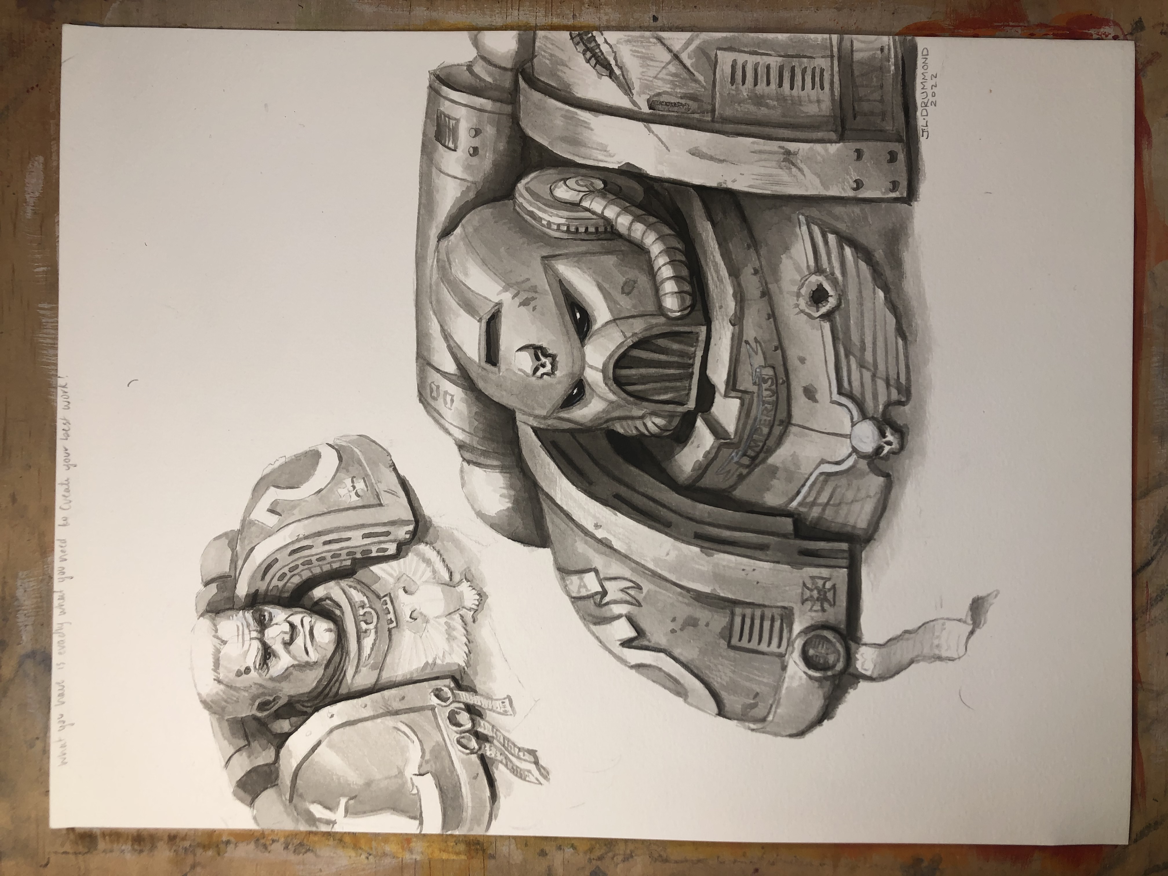
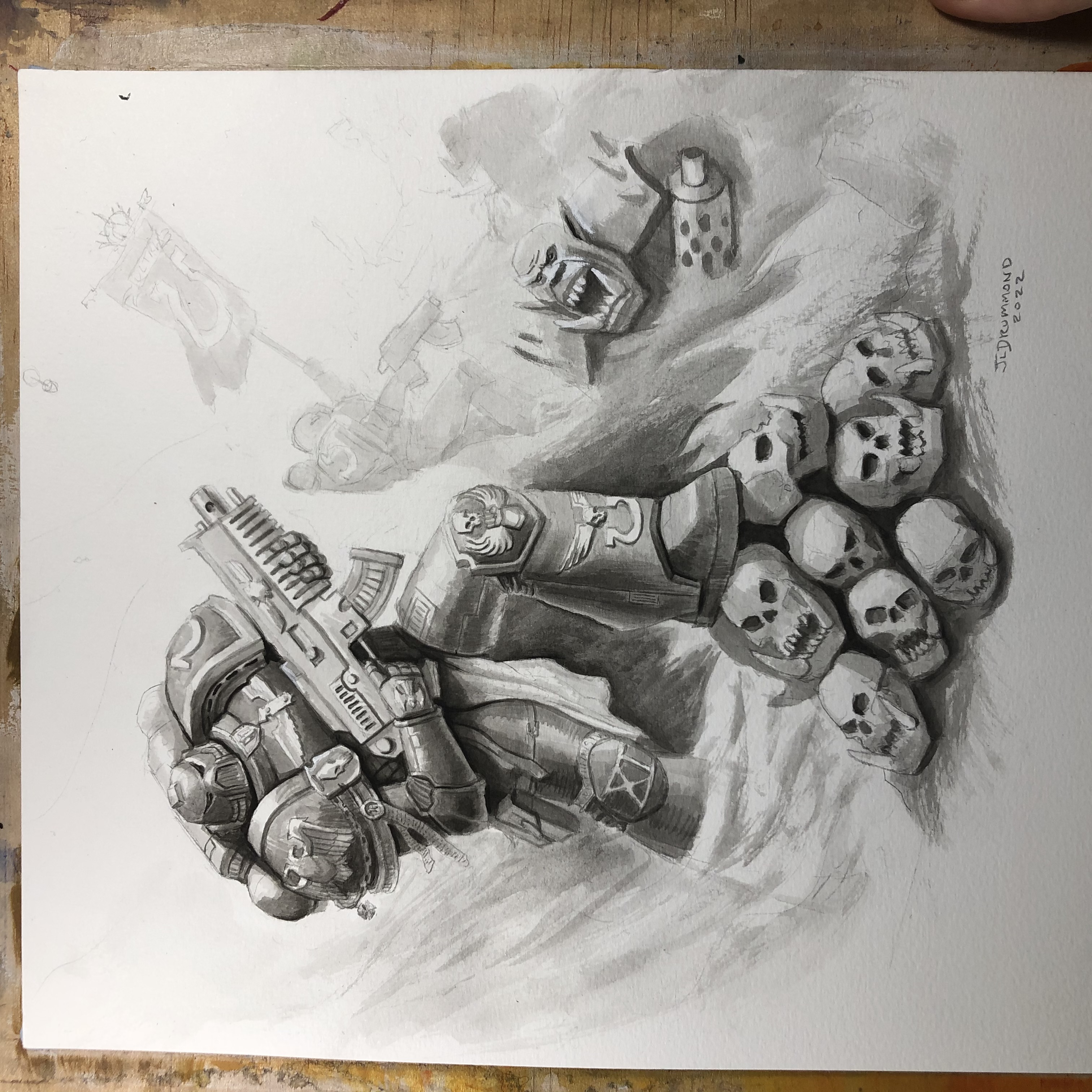
Anyway here's some random Warhammer 40k fan art I did, the portraits were a little older and I finished them off recently and the figure is recent. They are pencil and ink wash, I am trying to hit that sweet Paul Dainton style but I think he uses more pen and opaque gouache so I'll have to keep trying!


Posts: 3,345
Threads: 37
Joined: Aug 2013
Reputation:
234
40k stuff ok sign me in!!!
Posts: 201
Threads: 3
Joined: Jan 2021
Reputation:
3
Wow, you have improved, a lot. Your final renders look far less flat. And, thanks for introducing me to a new concept artist in your mentor. His work is amazing and I can see the influence!
|
![[Image: ICgE8Qx.jpg]](https://i.imgur.com/ICgE8Qx.jpg)
![[Image: f6GchN5.jpg]](https://i.imgur.com/f6GchN5.jpg)
![[Image: YlpMhra.jpg]](https://i.imgur.com/YlpMhra.jpg)
![[Image: 3q9PrYk.jpg]](https://i.imgur.com/3q9PrYk.jpg)
![[Image: ICgE8Qx.jpg]](https://i.imgur.com/ICgE8Qx.jpg)
![[Image: f6GchN5.jpg]](https://i.imgur.com/f6GchN5.jpg)
![[Image: YlpMhra.jpg]](https://i.imgur.com/YlpMhra.jpg)
![[Image: 3q9PrYk.jpg]](https://i.imgur.com/3q9PrYk.jpg)


![[Image: 1IioOrP.jpg]](http://i.imgur.com/1IioOrP.jpg)
![[Image: ha9p060.jpg]](http://i.imgur.com/ha9p060.jpg)


![[Image: haoIhs0.jpg]](http://i.imgur.com/haoIhs0.jpg)
![[Image: moZCStH.jpg]](http://i.imgur.com/moZCStH.jpg)
![[Image: gdrWjsq.jpg]](http://i.imgur.com/gdrWjsq.jpg)
![[Image: ULpzq7H.jpg]](https://i.imgur.com/ULpzq7H.jpg)
![[Image: zY0OP8B.jpg]](https://i.imgur.com/zY0OP8B.jpg)
![[Image: BhA5fBm.jpg]](https://i.imgur.com/BhA5fBm.jpg)
![[Image: uruZ3Ie.jpg]](https://i.imgur.com/uruZ3Ie.jpg)
![[Image: QmdeYxs.jpg]](https://i.imgur.com/QmdeYxs.jpg)
![[Image: sJdZ3aR.jpg]](https://i.imgur.com/sJdZ3aR.jpg)
![[Image: 0R8vAiE.jpg]](https://i.imgur.com/0R8vAiE.jpg)
![[Image: Yg2cqvu.jpg]](https://i.imgur.com/Yg2cqvu.jpg)
![[Image: yEe7Qg6.jpg]](https://i.imgur.com/yEe7Qg6.jpg)

