02-14-2024, 02:08 PM
Yeah his skin is very flawless. But it is very nice work! Congrats on that, hope you get more work from it!
|
Look what the Sonoran wind just blew in!
|
|
02-14-2024, 02:08 PM
Yeah his skin is very flawless. But it is very nice work! Congrats on that, hope you get more work from it!
02-17-2024, 10:40 AM
Great job on the recent portrait, the skin is handled flawlessly! Love the subtle texture work as well, especially on the beard. Keep up the great work!
02-29-2024, 08:46 AM
(02-14-2024, 06:15 AM)darktiste Wrote: Jephyr that piece is ridiculously taking me by surpris.Not what i was exepecting. Thanks so much Dark! He is very young in spite of the lack of hair up top and isn't really lined but I looked into brushes that Krita has and watched a few videos about adding texture to skin that will really help with future efforts Thanks again
02-29-2024, 09:05 AM
Thank you too JC!
As I wrote to Dark I learned a lot about adding skin texture after reading both your comments which will really help for future portraits. Thanks again! --------------------- Thanks so much George! His beard and hair were why I wanted to paint him in the first place and I did learn a ton. BTW — I went w a friend to where he works and he walked in and had SHAVED OFF HIS BEARD. At first I wondered if he hated my portrait so much that he took it off — but he explained he had a job interview. : ) -------------------- Thanks to all of you again. So I finished a new portrait commission. This one had some interesting lighting to deal with and a good challenge with that jacket. Haven't shared this with his mom yet — hope she likes it : ) And a look at a few steps along the way I came across an older light caricature portrait I was working on of a UK politician who was involved in some kind of scandal and was photographed leaving court. I really love his 'haunted' expression and those LINES — unless I get too busy I think this will be the next one I finish Thanks for lookin' in. Ciao Daggers
02-29-2024, 12:27 PM
You did a genius move and applied the feedback not everyone would have it it seem to pay off big time.
You really capture the youthful joyfulness of that little creature i am sure is mom will be please. You got a nice contrast between the youth and the old.A perfect series to revisit rendering those juicy skin texture. A face is like a story you really capture their story and you don't even have to add a twist to it. I like how you used the blur tool to create some contrast in the detail of the texture or maybe it just as you hinted you didn't finish it but i think actually it already work pretty well. You could certainly learn to dive into the ''less is more'' kinda approach being a bit more loose and playing around with that concept.I am saying this in contrast to the more ''hyper realistic vibe'' that have emerge recently in this sketchbook...
03-08-2024, 09:45 AM
Hi Daggers,
Thanks very much, Dark — I really appreciate the encouraging feedback! His mom did like her son's portrait — so that was good news. ---------------- Although I did add more polish on my final most recent light caricature (you'll find below) — I did leave some of that looseness you suggested. Usually I go over every area and make sure I've refined everything to a high degree — but leaving some looseness made it more fun. I also found when sharing that last portrait of Emilio — that several people asked if it was a photo or a digital painting — so if people just think it's a photo — it kinda defeats the purpose of all that work. So I'll definitely keep working at a 'less is more' kind of approach — so thanks again, Dark. ------------------ Anywho — here's today's offering: My digital painting/'light caricature' of UK politician Kim Howells (based on a news photo of him leaving court a few years ago). Thanks for looking into my corner of the Dagger's whirled : ) Ciao fer now
03-08-2024, 02:18 PM
If i was to study the concept of less is more i would look into speed painting .It the closest thing that as the initial intent of being able to drive you around with less yet still hook you by it boldness, the expressiveness,it storyline etc... it strenght is to force you to use all the fundamental in a minimalic way into something that pack a punch.
Studying how to create the focal point and how to make ''visual check point'' to move the eye accross the composition is also a key to reducing the workload i believe. I think you could also do some study using a photo bashing approach because it force you to manage noise and to simplify and since light is already present in those picture sometime it force an awareness of light and shadow because photo often have to be adjusted to fit a scene. When you scale something down you loose pixel and that mean you loose detail but still need to make it read.The photo bashing path deal more with how fast can i steal something pre existing and transmute.The speed painting portion deal more with is there more tool i could use outside of those that i use that could give me more? Obviously the domain where i would say the concept of less is more is best exemplified is busy environment focus painting due to the share quantity of detail you would have to insert in the work if you didn't have trick to ''force the viewer'' to look where you want it to look. One of the thing i find interesting is when you have to deal with large number of object that repeat in a scene like tree or people how do artist manage to simplify large crowd of people or what trick they have up there sleeve to fill a scene with tree. The idea is that even if speed painting or environnement aren't your cup of tea they deal with certain problem that still occur outside of those specific art scenario.It just that in those area of ''art'' they are ''force to be creative'' in the less or more departement which can be translate into a skill that can be use anywhere else in other field of visual art.
03-14-2024, 07:52 PM
Really nice updates here, the skin for the politician you recently painted is very detailed, natural, and convincing. Great job!
04-23-2024, 10:27 AM
Thanks dark. Appreciate your thoughts
Thanks so much George. The way I paint now compared to the start of that one has changed so much — it was kinda fun to figure out how to merge the old and new techniques together. Thanks again guys. ----------------------- So here's some old and brand spankin' new personal stuff I've managed to crank out (fighting all life's other 'interruptions'). This is another one that started out as a pencil concept from my 'real-world' sketchbook. You may notice the Pieter Bruegel vibe that I managed to slip in. : ) Another one digitally painted over a sketch from a while back. ('Off To Market') And the original sketch (flipped it horizontally for the painting -- obvs) Here's some older stuff Can't believe how fast time has gone — this one from 2017. (I took a photo of my own hand for the reference) A surface anatomy study from when I was in school  Found a cool photo of this beautiful older African woman using an image search and did this light caricature of her beautiful weathered face back in 2019 and added some light surreal elements to it. Thanks for lookin' in Daggers! Ciao fer now
04-24-2024, 06:11 PM
Hey Jephyr,
Thanks for dropping by my sketchbook. It seems we do have a very similar sketching style, although you're much further along than myself. You've got some interesting stuff going on! I love your pencil work, but I am very much big into pencil work. That portrait of Kim Howells is insane. Great stuff!
05-04-2024, 11:16 PM
Awesome updates! I have to say I'm really impressed with how you handle the textures in your work, very convincing and organic. Gives your images a very unique feel. Great stuff!
05-07-2024, 11:38 PM
Really cool studies here! I like the Warthog piece a lot! Keep up the great work!
LEGEND'S SKETCHBOOK_001
To all artists struggling to create and are intimidated by A.I. (anti-imagination)  "Everything has been done, but not by you" "Everything has been done, but not by you" 
05-30-2024, 11:28 AM
Damien: Thanks so much — glad that Kim Howells caricature worked for you.
George: Thank you! I love when I hear my work described as 'unique.' I think that comes from painting under the loose cross-hatching and scribbles from my original sketches and then I often continue that 'sketchiness' as I paint. Glad to hear that catches your eye. Lege: Thanks so much! I had so much fun with that wart-hog pic. Thanks again, fellow Daggers! ----------------------- So I'm still working through older sketches — and this first one is an ancient pencil from a drawing class I took. I've wanted to paint it for a long time and finally got around to it this month. I stuck pretty close to the original concept but reworked the 'crab chassis' — leaning it up and stretching the legs out. 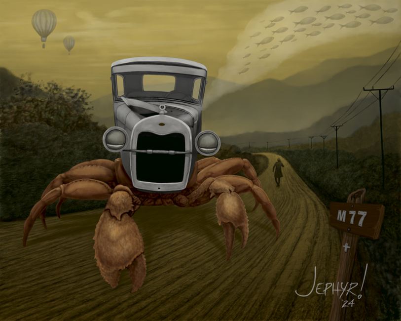 And the original pencil:  This next one is just a goofy, cartoony concept I sketched in 2019 — after I finished the crab pic above this painting happened pretty quickly in comparison. A lot has changed since that original sketch back then — ie: THAT was a common phone size then and it didn't occur to me then if anyone would wonder if 'she' was a 'he' or vice versa back at that time.... Here's some OLD stuff With this one I was just experimenting with design and lighting and had some 'happy accidents' while painting it that I ended up really liking.  I was starting to feel a little more comfortable with digital painting when I did this one and it was actually a re-work of an older pretty horrible first try.  Thanks fer looking in Daggers — until next time......
06-19-2024, 11:45 PM
Awesome updates here! I love the combo of the car and crab, it works incredibly well and feels quite organic. The recent illustration with the ape is excellent, love how you tackled the fur there, very detailed and convincing... and those colors are brilliant! Keep up the great work!
06-28-2024, 04:14 AM
Absolutely love the crab car piece. I'm amazed by your texture work and color usage, as well. I can't wait to see more of your work in the future!
08-08-2024, 01:15 PM
Hello fellow earthlings and others.
Was trying to look through and comment on all the new postings here in SBs but need to move on — so if I missed yours — a thousand pardons and hope to catch you next time. ------------------------- CG: Thanks so much my friend. I was glad to finally put some paint to that old Model-C draw'ring. The ape is actually an older work I did when I was using photoshop and feeling my way around with it but stumbled on some happy 'accidents' on that one that I really liked. SmilingTI: Thank you! I feel a kindred spirit with the type of work you do — so I especially appreciate your encouraging words. Thanks to both of you again! -------------------------- On to some artz Here's some art (New and OLD and a photo thrown in jus' because) I had a lot of distractions this summer but was finally able to finish this first digital painting started LONG ago. 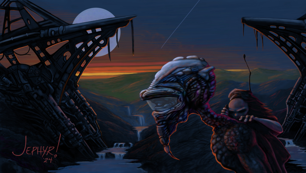 Here's the original digital doodle that began that one. 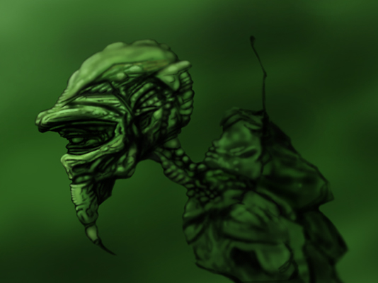 I happened across this old pastel I did when I was attending an open session drawing group and don't think I posted it anywhere before. 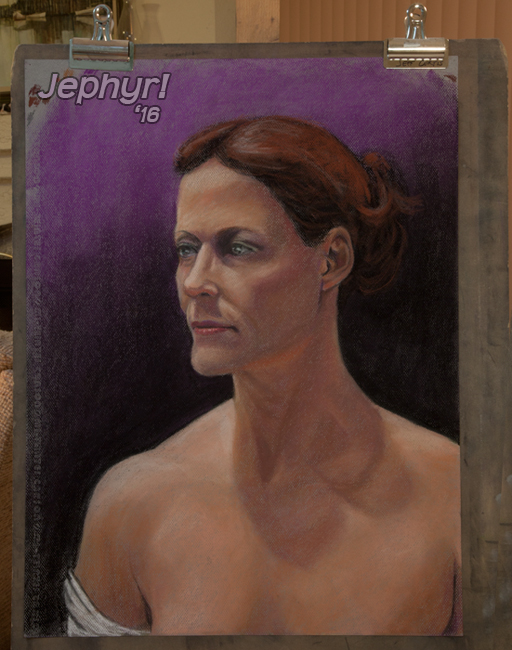 Was on our annual bunny drive — moving 100 to 200 of the meanest, orneriest cotton-tails from the Sonoran Valley to Carson. Saw this purty cactus flowering and snapped a pic. And people think the desert is nothing but a vast wasteland..... : ) 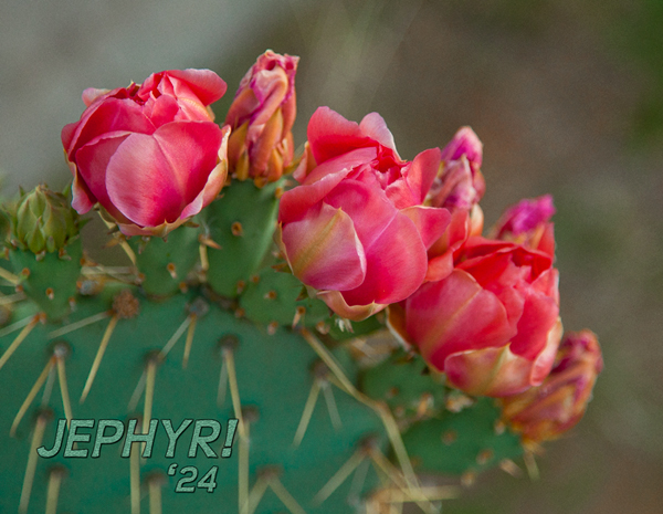 Realized I've never posted my SB icon pic here. I LOVE Frazetta (of course) and have done a lot of fantasy pics with his style in mind — this from 2019. Sometimes I think I should focus more on that, but then again, I enjoy working in so many other styles too, so I just keep creatin' stuff I like. 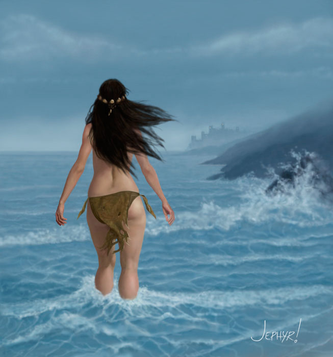 Thanks fer schtoppin' by. Ciao fer now, Daggers!
08-10-2024, 07:31 AM
Edit: Okay, you don't want this critique.
08-10-2024, 09:34 AM
Hey Jephyr
I gotta say, I love your surrealist/fantasy-esque style, I'm a fan of Oddworld and some of your art reminds me a bit Lanning's stuff, but not quite, it's more you, which is great! Just really cool and unique work and I'm looking forward to seeing more
sketchbook | pg 52
"Not a single thing in this world isn't in the process of becoming something else." I'll be back - it's an odyssey, after all
09-28-2024, 12:56 PM
Hi Daggers — long time no see.
--------------------- Zvarthav: Thanks so much for your positive feedback on the 'Almost Home' and 'Model C - Breakdown' — glad you like 'em. I understand you are both a beginner artist and somewhat new to the forum (and come across as a young-in) so I'll offer what I hope is a gentle critique about your the rest of your critique: The Cave Man image you reference was in my FIRST post when I first signed up here SEVEN pages, 150 or so of my original character concepts, and FIVE YEARS ago. You just repeated what Fedodika wrote — which I answered completely and immediately after his post. So there's nothing more I need to say regarding that. I will say though that you need to learn the language of art. What you wrote is the equivalent of a restaurant review about a meal you were served FIVE years ago that was yucky and just ewww and then linking to a recipe/restaurant you like better. It's pointless. So until you learn the language of art and grow a lot more as an artist I ask you — please don't post any more comments here. Thanks -------------------------- smrr: Thank you so much! Odd World hadn't come across my radar and I checked it out. Cool schtuff! I LOVE what you're doing so really appreciate your kind words. Thanks again! ------------------------- So here's some new and old art. I'll start with one from earlier this month but had some internet issues that have kept me off-line.  Ever heard the phrase: 'You can't stop a bird from flying over your head — but you can keep it from making a nest in your hair'? --------------------------------- Here's the old sketch — I think from 2019 or so: 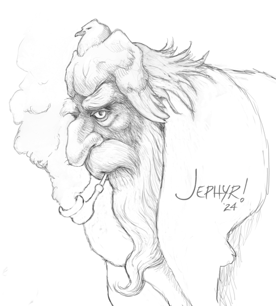 In 2019 I watched all the Boris Karloff 'Frankenstein' movies and sketched a weary 'Frank' coming home from a long day at work and just got around to painting that sketch and adding an appropriate back-ground. Here's the 2019 sketch though I think my painting lost some of it's personality. BTW — If you enjoy old B&W noir I suggest your check out The invisible Man, The Werewolf (with Lon Chaney Jr), Bela Lugosi's Dracula — and the first Frankenstein — masterpieces in my book. ------------------- Here's a WIP I just started:  An' some older stuff I haven't shared here yet: 'Alvin the Barbarian' (from 2017) — worked up from a photo study — but today I'd not worry about including his junk. : ) And another from 2017 — I used Bing translate for the Japanese — so I hope it doesn't just end up being nonsense.  And a photo I took on our recent long-horn bunny drive.  That's it for me. Thanks for looking in. Ciao Daggers! |
|
« Next Oldest | Next Newest »
|