06-26-2020, 07:20 AM
Hello,
Here is some of my art from the past two years. Critique is more than welcome.
![[Image: lewTPlJ.jpg]](https://i.imgur.com/lewTPlJ.jpg)
![[Image: gcS2e45.jpg]](https://i.imgur.com/gcS2e45.jpg)
![[Image: pVR7bEP.jpg]](https://i.imgur.com/pVR7bEP.jpg)
![[Image: Dcr5YhH.jpg]](https://i.imgur.com/Dcr5YhH.jpg)
![[Image: RGMTO64.jpg]](https://i.imgur.com/RGMTO64.jpg)
![[Image: NOFtSta.jpg]](https://i.imgur.com/NOFtSta.jpg)
|
Nirenia's Sketchbook
|
|
06-26-2020, 07:20 AM
Hello,
Here is some of my art from the past two years. Critique is more than welcome. ![[Image: lewTPlJ.jpg]](https://i.imgur.com/lewTPlJ.jpg) ![[Image: gcS2e45.jpg]](https://i.imgur.com/gcS2e45.jpg) ![[Image: pVR7bEP.jpg]](https://i.imgur.com/pVR7bEP.jpg) ![[Image: Dcr5YhH.jpg]](https://i.imgur.com/Dcr5YhH.jpg) ![[Image: RGMTO64.jpg]](https://i.imgur.com/RGMTO64.jpg) ![[Image: NOFtSta.jpg]](https://i.imgur.com/NOFtSta.jpg)
06-26-2020, 07:45 AM
Here's various draw a box exercises.
![[Image: Ww7RjXK.jpg]](https://i.imgur.com/Ww7RjXK.jpg) ![[Image: CzqzSdv.jpg]](https://i.imgur.com/CzqzSdv.jpg) ![[Image: ruMsbRn.jpg]](https://i.imgur.com/ruMsbRn.jpg) ![[Image: IsQhYKA.jpg]](https://i.imgur.com/IsQhYKA.jpg) ![[Image: Vn7bEtr.jpg]](https://i.imgur.com/Vn7bEtr.jpg) ![[Image: 7N4EDsJ.jpg]](https://i.imgur.com/7N4EDsJ.jpg) ![[Image: TulEZGH.jpg]](https://i.imgur.com/TulEZGH.jpg)
06-26-2020, 07:51 AM
More draw a box exercises, and perspective studies.
![[Image: SaUsuCp.jpg]](https://i.imgur.com/SaUsuCp.jpg) ![[Image: dyQGCax.jpg]](https://i.imgur.com/dyQGCax.jpg) ![[Image: ZFthRP7.jpg]](https://i.imgur.com/ZFthRP7.jpg) ![[Image: xk5mKBs.jpg]](https://i.imgur.com/xk5mKBs.jpg) ![[Image: qOedKmU.jpg]](https://i.imgur.com/qOedKmU.jpg) ![[Image: RbT9Vp9.jpg]](https://i.imgur.com/RbT9Vp9.jpg) ![[Image: EuMy5A6.jpg]](https://i.imgur.com/EuMy5A6.jpg) ![[Image: zVsuGpY.jpg]](https://i.imgur.com/zVsuGpY.jpg)
06-26-2020, 11:55 AM
Your art looks like something that would be posted on Elfwood around 2004. I mean that in a positive way. It's very charming. The details and line-work are pleasing to look at.
You mentioned that you're mainly inspired by Korean fantasy illustrators and would like to get to their level. Obviously, no one can tell you for sure how to do what they do (unless someone here speaks Korean and knows of some illuminating interviews, LOL), but it's probably safe to say that it's a mix of studying reality, art fundamentals, and some copy-catting of other artists. So you might be doing as well as you can already, and just need to keep up the grind. There's a strange idea regarding stylized art which I've seen repeated a lot, and which may have been inflicted upon you, which is that you need to get REALLY good at realism before you can do stylized art well. I personally find this doubtful. Artists like Juno Jeong and Dospi obviously had to study real humans in order to draw appealing stylized ones, but can they draw Loomis photo-study figures and faces from imagination, something which even most realist artists cannot do? Extremely doubtful. Since you're looking for critiques, I'll mention the main thing that sticks at me. In the 3/4 (or more like 2/4 in one of them) views of faces, I think you put the eyes too far back in the head relative to the nose and mouth. If that's your stylistic choice, then feel free to stick with it, but it bugs me because it makes me think that the character looks like this in profile (see far right of image: https://i.ytimg.com/vi/_EFfjRgxynU/maxresdefault.jpg) In the second image, it looks like you went with a more naturalistic feature placement, and I think it looks better.
06-26-2020, 12:28 PM
darktiste, thank you.
Pubic Enemy, ah elfwood, I visited that site constantly when I was younger, before deviantart's time. I'm definitely inspired by Korean illustrators. My major weakness is painting and rendering, thats why I've only posted lineart. Perspective is my weakness as well. I have watched some videos of Korean concept artists painting on YouTube (they are in Korean) that have helped a bit. Even though I have used photoshop I want to get my rendering down traditionally before I try photoshop again. The realism philosophy is interesting, I've read that Picasso was really good at realism before he started painting in his trademark style. I think it depends on the style, and I do agree that Juno Jeong and Dospi probably couldn't replicate Loomis. I have a hunch you were referring to Aludra (the witch) for the feature placement. I agree her face looks very 'off' when I look at it. I used a concept art of her as a reference which was heavily anime influenced. When it comes to drawing people I find heads to be the hardest thing to draw (harder than hands) and I will practice drawing them more. Thank you for your response, I really appreciate it.
06-27-2020, 11:53 AM
Regarding realism: I agree that it most likely depends on the style. Though it's worth mentioning that while Picasso was pretty good at doing realistic portraits, he wasn't exactly Bouguereau tier.
Regarding the faces. Yeah, I was referring to Aludra and the drawing of the sphinx; they both have the eyes set very far back. They're still nice drawings though. Heads are very hard. Happy practicing. I hope to see updates!
06-29-2020, 12:09 AM
Very neat style! I agree that it reminds me of classic art from "back in the days" on Elfwood and earlier Deviantart. Love it!
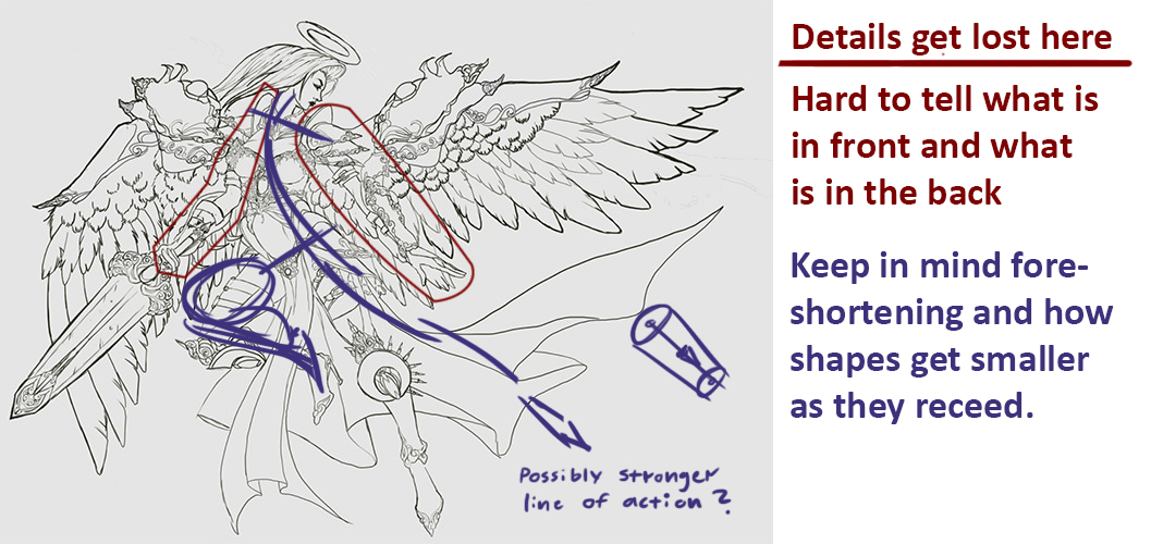
 I have some criticism on one of your images. The main problem i see is that you have put so many details in that its hard to read the shapes and what is supposed to be in front and what is in the back. Some studies of lineweight and balancing details with empty areas would probably benefit you.  Hope to see much more stuff from you soon! Keep posting! :)
06-29-2020, 06:38 AM
Hello,
I saw you did these exercises where you draw 100 straight lines across the page. I tried that once, too and didnt feel it had any effect. Did it have an effect for you?
on DeviantArt
06-29-2020, 07:25 AM
Pubic Enemy, thanks for pointing out that the sphinx also has her eyes set too far back, I wasn't quite sure what other image you were referring to. I'm definitely going to work more on heads, as they are a major weakness of mine.
Zorrentos, thank you for the paint over, I was thinking about redoing that image (I don't like the way her right arm [especially the hand] looks holding the sword). I didn't realize that a lot of the features get lost in the details, this is definitely making me more aware of flaws in the image. graphicnovelist, I found that the ghosting lines exercise from draw a box (point A and B) were more helpful than drawing the lines across the page. I mean, the 100 straight lines did make me a little more confident with my line strokes but not notably so.
06-29-2020, 10:06 AM
usually not a fan of anime style but wow, your linework is incredible, as well as perspective, keep up the good work! would love to see these painted one day. Those are the things i need to work on more myself, very solid work here, not knowledgeable enough in these areas to provide critique, but i'm sure others can.
06-29-2020, 12:34 PM
Welcome to CD. Great start to your sketchbook!
You've already received some great critique but I thought I'd add my two cents in and just say to be more cautious with your proportions going forth, especially in the arm section. Using your third image as an example; the hands are not really relative to the arms, they look like they belong to someone else. The hands are massive for how skinny the arms are, but the arms are also just too small for the body in general. Also, with the glove on the left arm (our right) follow the part near the elbow that is supposed to come to a point. Those two lines should eventually meet, but in your image they aren't there and the angle doesn't warrant the possibility of them meeting behind her arm where we can't see. It's mainly in that image where the issues lie, so it's just something to think about with your drawings going forwards. Keep it up and looking forward to seeing more from you.
06-30-2020, 01:59 PM
Zarkatos, thank you, I'm trying to experiment with styles.
chubby_cat, thank you for the critique. I think the problem with the image too was that I was trying to fit everything on the page and ended up compromising the proportions of the arms. I'm not quite sure what you meant by the lines near the elbow meeting though. Here's the process of a Daeho Cha study: ![[Image: JgeEy7r.png]](https://i.imgur.com/JgeEy7r.png) ![[Image: BPFoTtp.png]](https://i.imgur.com/BPFoTtp.png) ![[Image: ZZJHniu.jpg]](https://i.imgur.com/ZZJHniu.jpg)
06-30-2020, 03:00 PM
Hopefully this helps? Basically those lines don't converge with one and other, which they should do if the glove come to a point (like it does on the other hand)
3rd image is where they meet if I follow your lines. 4th image is how the back angle should look if it's intentional that we don't see the pointed part of the glove. Of course I'm basing this all on the idea that she has two gloves exactly the same. I don't know if it's an OC or canon character, so I could be completely wrong! Maybe she does in fact rock two different style gloves. ![[Image: 258837bcf7c712c3de80bc265416591f24557351.jpg]](https://66.media.tumblr.com/0530fca568c31cec8c3e1038540c8459/6fcac5fd39db0dd3-96/s2048x3072/258837bcf7c712c3de80bc265416591f24557351.jpg)
07-01-2020, 04:22 AM
chubby_cat, oh I see, now I know what you mean. Thank you for clarifying. I thought you meant the parallel lines from her elbow to her wrist, and I was like, huh? I completely overlooked the back of her glove.
07-01-2020, 11:54 AM
I like the simplified values in that Daeho Cha study. It reads very well.
Something about Daeho Cha's art makes me think he starts with reference photos of K-Pop girls and simplifies their facial features. I could be completely wrong about that, but it might be an illuminating thing to practice, anyway.
07-16-2020, 04:02 AM
Hey Nirenia,
i really like your pencil sketches, they are nice and clean just as your lineart. Excited to see more from you!
07-16-2020, 10:23 PM
Yo real quick I think you should move the eye of that chick towards her nose, the way you have it there isn't enough space for the side plane of the head
![[Image: he3yQvQ.jpg]](https://i.imgur.com/he3yQvQ.jpg) ![[Image: Sx6BQev.jpg]](https://i.imgur.com/Sx6BQev.jpg)
Drain gang
06-27-2023, 03:27 PM
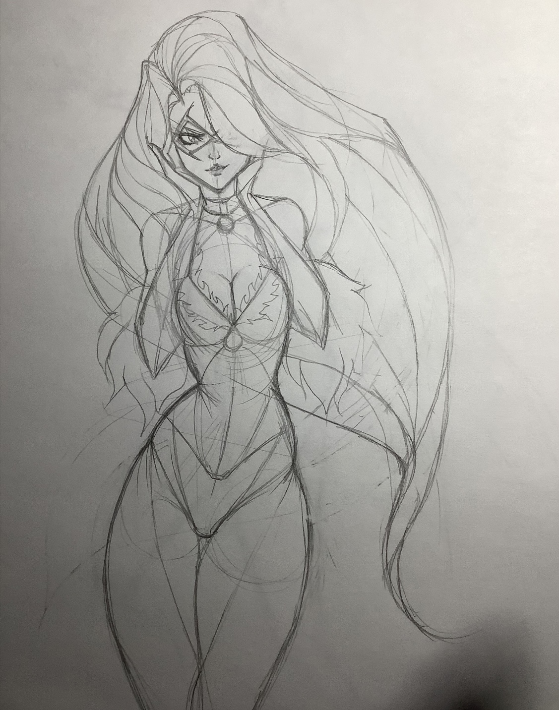
Sorry I haven’t posted here in what seems like forever. I can’t really pinpoint why, and I’m a little embarrassed because I don’t think I’ve improved much (very sporadic drawing). Anyway, I would like to give this another go. Here’s one I sketched tonight that I’d like to work with:

06-27-2023, 07:41 PM
Welcome back!
I like this latest drawing. The face, hair, and overall proportions are looking great. The hips don't seem totally symmetrical, so look out for that if you choose to do more refined lines/paint it etc. |
|
« Next Oldest | Next Newest »
|